Create an Infographic Like a Pro: 10 Tips to Visualise Your Message
Table of Contents
When you create an infographic, you’re not just making a pretty picture but building a powerful communication tool that can transform your business marketing. In our digital-first world, where attention spans are shorter than ever, the ability to create an infographic that instantly communicates complex ideas has become essential for business success.
Professional infographic creation goes far beyond basic design. It’s about transforming dense data, complex processes, and abstract concepts into compelling visual stories your audience can understand, remember, and share. Strategically creating an infographic becomes a valuable business asset that drives engagement, builds authority, and generates measurable results for months or even years.
At ProfileTree, we’ve mastered the art and science of creating an infographic that delivers real business impact. Our clients across Northern Ireland, Ireland, and the UK have discovered that when an infographic is created with strategic intent and professional execution, it becomes one of the most effective marketing tools—driving traffic, generating leads, and establishing your brand as an industry authority.
What is an Infographic?
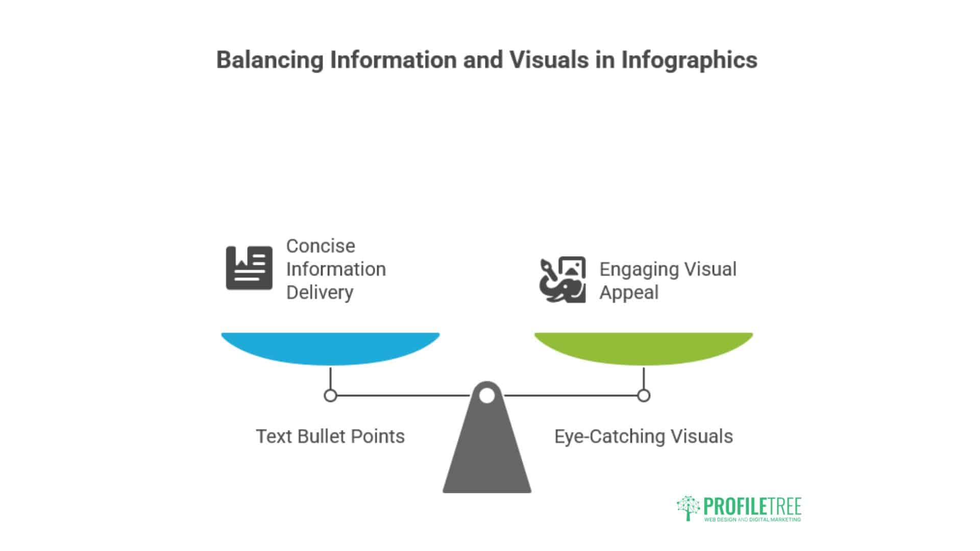
An infographic is a pictogram. This means it combines summary text bullet-point ideas with interesting and eye-catching visuals. An average person can spend just a few minutes reading an infographic and get a nice overview of what may otherwise be a very complex subject.
Colourful infographics help people process information. Care must be taken in the infographic design to avoid excessive clutter that makes the infographic hard to read. The infographic content also needs to be factual, engaging, and valuable.
Studies reported by Xerox show that people are up to 25 times more likely to comprehend information when shown using pictograms. In fact, the reader’s attention span seems to increase by 82% when infographics are used instead of just plain text.
However, it doesn’t stop there. An infographic is also helpful when giving public presentations about a particular concept. While the presenter explains the details to the audience, the attractive visuals make it easy to follow.
Moreover, the infographic serves as an outline guide for the presenter to help make sure the topic is covered logically and organised without leaving out a discussion of essential parts of the lecture or presentation.
Outline Presentation in Infographics
Incorporating the concept of an outline presentation in your infographic can significantly enhance its structure and readability. Here’s how to effectively use this approach:
- Hierarchical Structure
- Use a clear hierarchy that mimics a traditional outline
- Main points become primary sections
- Sub-points become subsections or supporting elements
- Visual Cues
- Use indentation or connecting lines to show relationships between ideas
- Employ numbering or bullet points to indicate order and importance
- Progressive Disclosure
- Arrange information from general to specific
- Allow viewers to grasp the main ideas before diving into details
- Consistent Formatting
- Use consistent colours, fonts, and styles for each level of the outline
- This helps viewers quickly understand the structure of the information
- Clear Headings
- Use descriptive headings that summarise the content of each section
- This allows viewers to quickly scan and understand the overall message
Example Outline Structure for an Infographic: I. Main Topic A. Subtopic 1 1. Supporting point 2. Supporting point B. Subtopic 2 1. Supporting point 2. Supporting point II. Secondary Topic A. Subtopic 1 B. Subtopic 2
By incorporating these outline presentation techniques, your infographic will guide viewers through the information in a logical, easy-to-follow manner, enhancing comprehension and retention of the key messages.
Suitable Infographic Subjects
As we just explained, infographics are all about making information clear and engaging, so good subjects tend to be those that benefit from visual aids and can be broken down into digestible chunks. Here are some areas to consider:
- Data visualisation is a classic strength of infographics. An infographic can turn numbers into a compelling visual story if you have statistics, comparisons, or trends to explain.
- Processes & How-Tos: Infographics can excel at explaining step-by-step processes like crafting something, using a product, or completing a task.
- Comparisons & Contrasts: Do you need to compare different features, products, or ideas? Infographics can use visuals to highlight key similarities and differences.
- Complex Topics: Infographics can break difficult subjects like scientific concepts, historical events, or social issues into manageable pieces with illustrations and clear text.
Here are some specific ideas that can be explained in infographics:
- Current Events: Recent news stories or trends with data and visuals.
- Health & Wellness:Guidance on healthy habits, fitness routines, or nutrition information.
- Science & Technology: Scientific discoveries, new technologies, or visualisation of the parts of something complex.
- Business & Marketing: Company data, marketing strategies, or product comparisons.
- History & Timeline: Historical events or timelines of essential dates.
The best infographic ideas target a specific audience and have a clear goal. Think about what information you want to convey and who you want to reach, and then choose visuals that will resonate with them.
Strategic Infographic Design Process
Creating infographics that deliver business results requires a structured, strategic approach. Here’s the proven process that ProfileTree uses to develop high-performing visual assets for our clients.
Phase 1: Discovery and Strategic Planning
Creating effective infographics begins with understanding your business objectives and target audience. We work with clients to identify:
- Primary Goals: Are you looking to generate leads, educate customers, or build brand awareness?
- Target Audience: Who needs to see this information, and how do they prefer to consume content?
- Key Messages: What are the 3-5 most important points your audience needs to understand?
- Distribution Strategy: Where will this infographic be shared and promoted?
“The most successful infographics we create at ProfileTree always start with a clear strategic objective. When you know exactly what you want to achieve, the design decisions become much clearer,” says Ciaran Connolly, Director of ProfileTree.
Phase 2: Research and Data Collection
Professional infographic creation requires solid research foundations. This involves:
- Primary Research: Conduct surveys, interviews, or business data analysis to create unique insights.
- Secondary Research: Gathering relevant industry statistics, trends, and supporting data from credible sources.
- Fact Verification: Ensuring all data points are accurate, current, and properly attributed.
- Story Development: Crafting a compelling narrative that connects your data points into a coherent, engaging story.
Phase 3: Content Planning and Structure
Before any design work begins, we develop a detailed content plan that includes:
- Information Hierarchy: Determining which information should be most prominent
- Flow and Sequence: Creating a logical progression that guides the viewer’s eye
- Key Statistics: Identifying the most compelling data points to highlight
- Supporting Elements: Planning icons, illustrations, and visual metaphors
Phase 4: Visual Design and Development
This is where strategy meets creativity. Professional infographic design involves:
- Visual Hierarchy: Using size, colour, and placement to guide attention to the most important information.
- Brand Integration: Incorporating your brand colours, fonts, and visual style to maintain consistency.
- Custom Illustration: Creating unique visual elements that differentiate your infographic from competitors.
- Typography: Selecting fonts that enhance readability while maintaining visual appeal.
- Colour Strategy: Using colour psychology to support your message and create emotional connections.
“We’ve found that businesses that invest in custom-designed infographics see significantly better engagement rates than those using template-based solutions. The data tells a clear story—professional design drives professional results,” explains Ciaran Connolly.
Phase 5: Review, Refinement, and Optimisation
Professional infographic development includes multiple review cycles:
- SEO Optimisation: Adding proper alt text, file names, and metadata for search visibility
- Content Review: Verifying accuracy and ensuring key messages are clear
- Design Review: Assessing visual impact and brand alignment
- Usability Testing: Ensuring the infographic works across different devices and platforms
Infographic Design Best Practices
Following established best practices separates successful infographics from those that fail to achieve their objectives. These proven strategies will help you create infographics that perform consistently across all platforms.
Optimising for Digital Performance
- File Formats and Sizes: Create multiple versions optimised for different platforms – high-resolution PDFs for print, optimised JPEGs for web, and social media-specific formats.
- SEO Considerations: Use descriptive filenames, alt text, and surround your infographic with relevant written content to improve search visibility.
- Social Media Optimisation: Create platform-specific versions that work within each social network’s image requirements and user behaviour patterns.
- Accessibility: Ensure your infographic is accessible to users with disabilities by providing alternative text descriptions and maintaining sufficient colour contrast.
Content Strategy Integration
- Blog Integration: Embed infographics within relevant blog posts to increase engagement and time on page.
- Lead Generation: Use infographics as downloadable resources to capture contact information and build your email list.
- Sales Enablement: Create infographics that help your sales team explain complex services or demonstrate value propositions.
- Content Repurposing: Break larger infographics into smaller social media posts, presentation slides, or email newsletter content.
Measuring Success and ROI
Professional infographic design should deliver measurable results:
- Engagement Metrics: Track shares, likes, comments, and time spent viewing your infographic.
- Lead Generation: Monitor how many leads your infographic generates through downloads or contact form submissions.
- Website Traffic: Use analytics to see how much referral traffic your infographic drives to your website.
- Brand Awareness: Monitor mentions and backlinks generated by your infographic across the web.
- Conversion Impact: Track how infographic viewers progress through your sales funnel compared to other content consumers.
Industry-Specific Applications
- B2B Technology: Create infographics that explain complex software features, implementation processes, or industry trends.
- Professional Services: Develop infographics that showcase methodology, case study results, or industry expertise.
- Healthcare: Design infographics that simplify medical procedures, explain health benefits, or present research findings.
- Financial Services: Create infographics that explain complex financial concepts, investment strategies, or market analysis.
- Education and Training: Develop infographics that break down learning objectives, course content, or skill development paths.
Working with Professional Design Teams
When partnering with a professional design agency like ProfileTree, you can expect:
- Strategic Consultation: We help you identify the most effective infographic strategy for your specific business goals.
- Complete Project Management: From initial concept through final delivery, we handle all aspects of infographic development.
- Brand Consistency: We ensure your infographic aligns perfectly with your existing brand guidelines and marketing materials.
- Multi-Format Delivery: Receive your infographic in all necessary formats for different marketing channels and use cases.
- Performance Optimisation: We create infographics optimised for search engines, social media, and mobile viewing.
- Ongoing Support: Post-launch support for promotion strategies and performance optimisation.
Advanced Infographic Techniques
Modern infographic design goes beyond static images to include interactive elements and sophisticated data visualisation. These advanced techniques can significantly boost engagement and effectiveness.
Interactive and Animated Elements
Modern infographic design increasingly incorporates interactive elements:
- Hover Effects: Reveal additional information when users hover over specific elements.
- Clickable Sections: Link different infographic parts to relevant pages on your website.
- Animated Sequences: Use motion graphics to explain processes or reveal information progressively.
- Embedded Videos: Include video elements within your infographic for enhanced engagement.
Data Visualisation Excellence
Professional infographic design requires expertise in data visualisation:
- Chart Selection: Choose the most appropriate chart type for your specific data – bar charts for comparisons, line charts for trends, and pie charts for proportions (used sparingly).
- Data Accuracy: Ensure all statistics are properly sourced, current, and presented without misleading visual manipulation.
- Storytelling Through Data: Create compelling narratives that help readers understand not just what the data shows, but why it matters.
- Progressive Disclosure: Present complex information in digestible chunks that build understanding step by step.
Emerging Trends in Professional Infographic Design
- Minimalist Aesthetics: Clean, simple designs that focus attention on key information without visual clutter.
- Custom Illustration: Moving away from stock icons toward unique, brand-specific visual elements.
- Bold Typography: Using typography as a design element, not just for information delivery.
- Sustainable Design: Creating infographics that work effectively across multiple campaigns and periods.
Conclusion: Create an Infographic
Infographics are easy to understand and easy to forward to others. They thrive on shareability, which makes them a very convenient way to communicate with customers and potential clients. Organisations that publish infographics frequently become an authority on a specific niche topic.
So, consider promoting your creation on social media or including it in a blog post. Remember, the goal is to inform and engage. By following these steps and unleashing your creativity, you can transform complex information into an infographic that cuts through the noise and enlightens your audience.
Now, prep your content, explore visual options, design a masterpiece, and share your message with the world, one infographic at a time!
FAQs
How much does professional infographic design cost?
Professional infographic design typically costs between £ 500 and £3,000, depending on complexity, research requirements, and the number of concepts needed. At ProfileTree, we provide detailed quotes based on your specific requirements and business objectives.
How long does the infographic design process take?
A professional infographic usually takes 2-4 weeks from initial briefing to final delivery. This includes time for research, concept development, design, revisions, and optimisation. Adjusted timelines can accommodate rush projects.
What information do I need to provide for infographic design?
You must provide your business objectives, target audience information, key messages, existing data or research, brand guidelines, and preferred timeline. If needed, we can help with additional research and data collection.
Can infographics help with SEO?
Yes, professionally designed infographics can significantly boost SEO through increased engagement, social shares, backlinks, and improved time on site. They also provide opportunities for keyword optimisation and content marketing.
Ready to create a professional digital marketing campaign that drives real business results? Contact ProfileTree today to discuss your project requirements and discover how strategic infographic design can transform your marketing effectiveness.
ProfileTree—Your partner for professional web design, digital marketing, and visual communication solutions across Northern Ireland, Ireland, and the UK.