Neuromarketing: Techniques, Examples and How It Works
Table of Contents
Neuromarketing applies brain science to marketing decisions. It uses tools like EEG, eye-tracking and biometrics to measure how people actually respond to ads, packaging and websites — rather than relying on what they say in a survey. For marketing managers trying to understand why some campaigns connect and others fall flat, it offers a more honest read on consumer behaviour.
This guide covers how neuromarketing works, the techniques behind it, real-world examples, and what the science means for practical marketing decisions — including how SMEs can apply core neuromarketing principles without expensive lab equipment.
What Is Neuromarketing?
Before exploring the techniques and applications, it helps to understand what separates neuromarketing from conventional consumer research — and why the distinction matters for anyone making marketing decisions.
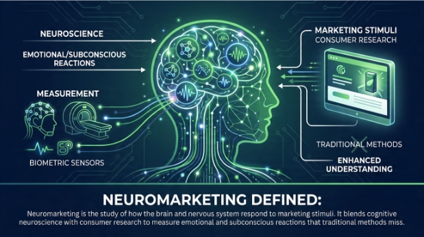
Neuromarketing defined
Neuromarketing is the study of how the brain and nervous system respond to marketing stimuli. It blends cognitive neuroscience with consumer research to measure emotional and subconscious reactions that traditional methods miss.
The term was first coined by Ale Smidts in 2002, though the academic study of consumer decision-making has roots stretching back decades. What changed was access to technology: as fMRI scanners and EEG headsets became more refined, researchers could begin mapping which areas of the brain activate in response to a price, a logo or an ad narrative.
Why it matters for marketing
Consumer decisions are rarely as rational as people report. When someone fills in a survey, they give considered, socially acceptable answers. When they stand in front of a shelf or scroll through a website, their choices are driven largely by emotional and habitual responses that happen before conscious reasoning kicks in. Neuromarketing measures those responses directly.
As Ciaran Connolly, founder of ProfileTree, puts it: “Most marketing is still built around what people say they want. Neuromarketing shifts the lens to what their brains actually respond to — and the two are often different.”
How Neuromarketing Works
Understanding the mechanics helps explain why neuromarketing produces different insights to traditional research — and why those differences are commercially relevant.
The science behind the techniques
The brain processes information across multiple regions simultaneously. The limbic system, which governs emotion and memory, plays a major role in purchase decisions — often before the prefrontal cortex (responsible for rational thought) has had a chance to weigh in. Neuromarketing techniques tap into this process by measuring physiological and neural signals that correlate with emotional engagement, attention and preference.
The most widely studied scenario in neuromarketing is the Pepsi versus Coca-Cola blind taste test. In blind conditions, participants showed stronger neural reward responses to Pepsi. But when they knew which brand they were drinking, responses shifted toward Coca-Cola, with activity concentrated in areas linked to memory and cultural association. The experiment demonstrated that brand perception is processed neurologically, not just intellectually.
Core Neuromarketing Techniques
Several distinct methods sit under the neuromarketing umbrella. Each measures a different type of response, and most commercial research uses a combination rather than relying on a single tool.
EEG (Electroencephalography)
EEG records electrical activity across the scalp in real time. Electrodes placed on the head detect brainwave patterns associated with attention, emotional arousal and memory encoding. Because EEG captures data in milliseconds, it is well-suited to measuring moment-by-moment reactions to video ads, product reveals or website navigation.
It does not produce detailed spatial images of brain activity — that is the role of fMRI — but its speed and relative affordability make it the most common tool in commercial neuromarketing research.
fMRI (Functional Magnetic Resonance Imaging)
fMRI measures changes in blood flow to identify which brain regions are active during specific tasks or exposures. It offers high spatial resolution, making it useful for understanding deeper emotional responses — for example, whether a packaging redesign triggers activity in the reward centre rather than in areas associated with confusion or discomfort.
The cost and logistics of fMRI (participants must lie still in a scanner) mean it is primarily used in academic research and by large brands. It is not a realistic option for most SMEs, but understanding what it has revealed about consumer behaviour is valuable for any marketer.
Eye-Tracking
Eye-tracking records exactly where a person looks, how long they fixate on each element, and the sequence in which they scan a page or display. It is used extensively in website UX research, packaging design and advertising layout.
ProfileTree’s web design services in Belfast draw on eye-tracking research principles when structuring page layouts — understanding where users’ gaze naturally falls helps position key calls to action and product information more effectively.
Biometric Measurement
Biometric methods measure physiological responses including heart rate, skin conductance (galvanic skin response), respiration and facial expressions. Skin conductance, in particular, is a reliable indicator of emotional arousal — it rises when a person is excited, anxious or engaged, and falls when they are bored or disengaged.
These tools are increasingly affordable and portable, which means some of the principles behind biometric research can now be approximated using accessible analytics platforms rather than lab settings.
Facial Coding
Facial coding analyses micro-expressions — involuntary muscle movements that occur in fractions of a second — to identify emotional responses such as surprise, disgust, happiness or confusion. Paul Ekman’s foundational research on universal facial expressions underpins most commercial facial coding software.
It is used commonly in ad testing: brands show participants a commercial and track their emotional response frame by frame, identifying which moments land and which lose the audience.
Real-World Neuromarketing Examples
Theory is useful, but the value of neuromarketing becomes clearer when you look at how established brands have applied it to specific marketing decisions — and what the results showed.
Neuromarketing in packaging design
Campbell’s Soup invested significantly in neuromarketing research in the late 2000s to redesign its packaging. EEG and eye-tracking studies revealed that consumers responded poorly to images of steam rising from the bowl (associated with “too hot”) and that the spoon in the image drew little emotional engagement. The redesign removed the spoon and adjusted the steam to appear more inviting. Sales data showed measurable improvement after the rollout.
Retail environment design
Retailers use eye-tracking and biometric data to identify where attention concentrates on shelves and which product placements capture the most engagement. The principle is straightforward: products positioned in the gaze path at eye level, with packaging that triggers positive arousal, sell at higher rates than equivalent products placed lower or with less engaging design.
Digital advertising
Facebook and Meta have used attention data extensively to understand where users look within their feeds, which ad formats hold attention longest, and what creative elements drive higher recall. This research underpins many of the placement and format recommendations in their advertising best practice guidance.
Cadbury’s sensory branding (UK example)
Cadbury’s use of purple, the specific texture of its chocolate packaging, and the distinctive way products snap are not accidental. The brand has long applied sensory marketing principles — a subset of neuromarketing — to create unconscious associations between those sensory cues and feelings of indulgence and quality. For UK marketers, Cadbury is a useful reference point because the research behind it is grounded in British consumer behaviour rather than US market data.
Neuromarketing vs Traditional Research Methods
| Method | What it measures | Strengths | Limitations |
|---|---|---|---|
| Surveys | Self-reported opinion | Low cost, scalable | Subject to bias; people rationalise |
| Focus groups | Group opinion and discussion | Rich qualitative insight | Social desirability effects; groupthink |
| EEG | Brainwave response in real time | Fast, captures moment-by-moment | No spatial depth; requires specialist analysis |
| fMRI | Brain region activation | High spatial resolution | Expensive; logistically complex |
| Eye-tracking | Visual attention and gaze sequence | Practical; applicable to digital and physical | Does not capture emotional valence |
| Biometrics | Physiological arousal | Objective; increasingly affordable | Arousal alone does not indicate positive or negative response |
The honest position is that neuromarketing complements traditional research rather than replacing it. Survey data tells you what someone consciously prefers. Biometric data tells you how strongly they respond. Neither alone gives the full picture.
Applying Neuromarketing Principles Without Lab Equipment
The most common misconception about neuromarketing is that it requires expensive specialist technology. The underlying principles — reduce cognitive load, trigger emotional engagement, use visual hierarchy to guide attention — are entirely applicable using tools already available to most marketing teams.
Heatmaps and session recordings
Platforms such as Hotjar and Microsoft Clarity generate website heatmaps that approximate eye-tracking data by aggregating where real users click, scroll and hover. For most SMEs, this is the most practical entry point into neuromarketing-informed web optimisation. Understanding that users rarely read below the fold on a landing page, or that they instinctively scan left-to-right before deciding whether to engage, changes how you structure pages.
A/B testing
A/B testing is one of the most straightforward applications of neuromarketing logic. Instead of asking users which version of a button, headline or image they prefer, you measure actual behavioural responses — click rates, conversion rates, time on page. Behaviour is a more reliable signal than stated preference.
Understanding consumer behaviour through data is a discipline that sits at the intersection of neuromarketing and analytics. The same logic applies: observe what people do, not only what they say.
Colour psychology in web design
Colour is one of the most studied areas in neuromarketing. Research consistently shows that colour affects emotional state and purchasing intent, though responses vary by culture and context. The importance of a well-considered colour scheme in brand and web design is grounded in this evidence base.
Copywriting and cognitive load
Reducing cognitive load — the mental effort required to process a message — is a core neuromarketing principle. Clear, specific, short copy outperforms clever, dense copy in almost every tested context. This is particularly relevant for landing pages and calls to action, where decision fatigue can cause drop-off.
Brand storytelling applies neuromarketing principles directly: narrative structure activates more areas of the brain than factual lists, increases emotional engagement and improves memory retention. That is not a creative opinion; it is measurable.
Social proof and the trust response
Displaying reviews, testimonials and trust signals near decision points responds to neurological patterns around risk aversion. The brain’s threat-detection systems are quietened when social proof signals that others have already made this decision safely. Consistency in brand voice supports this by reducing the cognitive dissonance that undermines trust.
The Ethics of Neuromarketing
Neuromarketing’s ability to identify subconscious triggers raises legitimate ethical questions. The concern is not unfounded: if marketers can identify and activate the neural pathways that drive purchase behaviour without conscious engagement, the line between persuasion and manipulation becomes harder to draw.
The “buy button” myth
One of the most persistent misconceptions in the field is that neuromarketing can locate a “buy button” in the brain — a neural trigger that, if activated, guarantees a purchase. This overstates what the science has found. Brain activation in reward-related areas correlates with preference and emotional engagement; it does not override conscious decision-making or remove personal agency. The evidence shows that neuromarketing can make marketing more resonant, not that it can make it coercive.
GDPR and data ethics in the UK
In the UK and EU, neuromarketing research involving personal data — including physiological data collected from identified participants — falls within the scope of GDPR. Any commercial neuromarketing study collecting biometric data requires informed consent, a lawful basis for processing, and clear data minimisation practices. The Information Commissioner’s Office (ICO) guidance on special category data is relevant, as biometric data used to identify or profile individuals is treated as special category data under UK GDPR.
The Competition and Markets Authority (CMA) has also examined “dark patterns” — design techniques that exploit cognitive biases to direct consumer behaviour against their own interests. While not all neuromarketing applications involve dark patterns, the distinction matters: using insight into human psychology to make a product genuinely more usable is different from using it to obscure cancellation options or manufacture artificial urgency.
Digital marketing ethics and legalities are topics ProfileTree covers in depth for UK and Irish businesses navigating these boundaries.
The Neuromarketing Science & Business Association publishes a code of ethics for practitioners, covering participant consent, data use, and transparency. Any business commissioning neuromarketing research should review it before engaging a provider.
Neuromarketing and the Future of Digital Marketing
AI is beginning to intersect with neuromarketing in ways that will become increasingly relevant for digital marketers over the next few years. Machine learning models trained on large behavioural datasets can predict emotional engagement from creative assets without running individual physiological studies — approximating neuromarketing outputs at scale.
Social media marketing and sales performance is one area where these algorithmic optimisations are already being applied: platform algorithms already use behavioural signals that function as proxies for emotional engagement, even if they are not framed in neuromarketing terms.
The attention span crisis in the digital age has direct implications for neuromarketing-informed content strategy. If the window for capturing attention is narrowing, understanding the neurological mechanisms behind attention becomes more, not less, important.
Frequently Asked Questions
What is neuromarketing in simple terms?
Neuromarketing uses brain science and physiological measurement to understand how people respond to marketing. Instead of asking consumers what they think about an ad or product, it measures their actual neural and physical reactions — eye movement, brainwave patterns, heart rate and facial expressions — to get a more accurate picture of emotional engagement and preference.
What are the main neuromarketing techniques?
The most widely used techniques are EEG (brainwave monitoring), fMRI (brain imaging), eye-tracking, biometric measurement (heart rate and skin conductance), and facial coding. In commercial settings, eye-tracking and EEG are the most common because they are faster and more affordable than fMRI. For smaller businesses, heatmap tools and A/B testing deliver neuromarketing-informed insights without specialist equipment.
Is neuromarketing ethical?
Neuromarketing raises legitimate ethical questions around consent and the potential for manipulation. In the UK, any research collecting biometric data from identifiable participants must comply with UK GDPR. The broader ethical line sits between using psychological insight to make marketing more relevant and useful versus exploiting cognitive vulnerabilities to push people toward decisions they would not otherwise make. Responsible practice — and the Neuromarketing Science & Business Association code of ethics — requires informed consent, data minimisation and transparency.
Can SMEs use neuromarketing?
Yes, though not through expensive lab equipment. SMEs can apply neuromarketing principles through heatmap analysis (Hotjar, Microsoft Clarity), A/B testing, colour psychology in web design, and evidence-based copywriting techniques. These tools measure real behavioural responses — which is the core principle behind neuromarketing — without requiring a neuroscience lab.
What is the difference between neuromarketing and traditional market research?
Traditional research (surveys, focus groups) captures what people say they think or prefer. Neuromarketing captures how they actually respond physiologically and neurologically. The gap between stated preference and actual behaviour is well documented; neuromarketing addresses it by measuring unconscious responses that precede conscious decision-making. The two approaches are complementary rather than competing.
Conclusion
Neuromarketing gives marketers access to data that surveys cannot produce: honest, real-time responses to ads, websites, packaging and brand experiences. For large brands, that means expensive lab studies. For most businesses, it means applying the underlying principles — reduce cognitive load, engage emotion, guide attention, build trust — using the measurement tools already available.
The field is evolving quickly, and its intersection with AI and digital analytics will make these insights more accessible and actionable over the coming years. The fundamentals, though, have been consistent since the term was coined: understand how the brain actually processes marketing, and build campaigns around that reality rather than assumptions.