Designing Landing Pages That Convert: Key Principles
Table of Contents
The digital marketplace demands precision. Every click represents potential revenue, and every visitor presents an opportunity that can either flourish or disappear within seconds. Landing pages serve as the critical bridge between marketing campaigns and business objectives, transforming casual browsers into committed customers through strategic design and purposeful content.
Modern businesses face unprecedented competition for user attention. With average attention spans shrinking and choices multiplying, the pressure on landing pages to perform has intensified dramatically. These specialised web pages must capture interest immediately, communicate value clearly, and guide visitors toward specific actions—all whilst competing with countless distractions.
At ProfileTree, we’ve witnessed firsthand how properly optimised landing pages can transform business outcomes. Through our work with SMEs across Northern Ireland, Ireland, and the UK, we’ve identified the precise elements that separate high-performing pages from those that fail to convert. The difference often lies not in flashy design or clever copy, but in understanding user psychology and implementing conversion-focused principles.
This comprehensive guide examines the science behind landing page optimisation, revealing the techniques that drive measurable results. From understanding visitor behaviour patterns to implementing advanced testing methodologies, we’ll explore how business owners and marketing professionals can create pages that consistently deliver stronger conversion rates and improved return on investment.
Understanding Landing Pages
As we dive into the world of digital marketing, it’s essential for us to have a solid grasp on what landing pages are and why they play a pivotal role in converting visitors into customers or leads. This understanding forms the cornerstone of our practices at ProfileTree.
The Role of a Landing Page
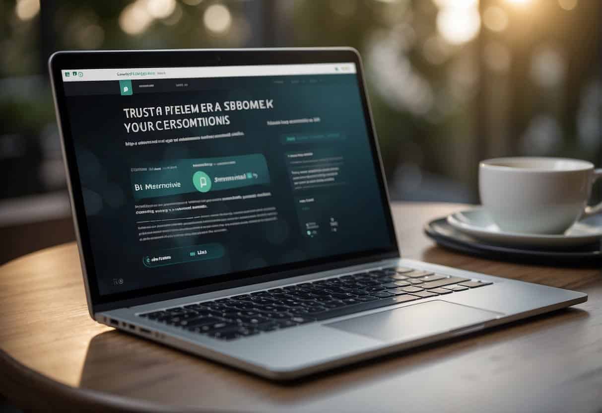
The primary function of a landing page is to serve as the destination for potential customers following a click from an ad, email, or other digital location. This standalone web page is crafted specifically for marketing or advertising campaigns. It’s where a visitor ‘lands’ after expressing interest in your brand, making its design critical for fostering conversions. The success is measured by its conversion rate, the percentage of visitors who take the desired action, such as filling out a form or making a purchase.
Key Components of an Effective Landing Page
Every element of a successful landing page is tailored to encourage users to take action. The headline must be compelling, concisely conveying the value proposition and ensuring visitors stick around. A well-defined call-to-action (CTA), such as ‘Sign Up’ or ‘Download Now’, is essential, guiding users towards the conversion with clarity and convenience. Imagery plays a part too: an attention-grabbing hero image can resonate emotionally with visitors, complementing your message and enhancing engagement.
1. Headline: It’s our mission to create an impactful headline that immediately captures attention and communicates the unique benefit of our offer.
2. Call-to-Action (CTA): We carefully design the CTA button to stand out and encourage clicks; crafting the text to be action-oriented and creating urgency.
3. Hero Image: We select images that reflect our brand, resonate with our target audience, and align with our marketing message, thereby reinforcing our offer.
Incorporating these key components with the expertise and creativity we cherish at ProfileTree ensures that when we deliver a landing page, it’s not just a gateway, but a catalyst for growth.
Advanced Conversion Psychology
Understanding visitor psychology forms the foundation of effective landing page design. Users arrive at landing pages with specific expectations shaped by the preceding interaction—whether from an advertisement, email, or search result. Meeting and exceeding these expectations requires careful consideration of cognitive triggers and behavioural patterns.
The principle of cognitive load applies directly to landing page effectiveness. When visitors encounter too many choices, complex navigation, or overwhelming information, decision paralysis occurs. Successful pages reduce cognitive burden by presenting clear pathways and eliminating unnecessary elements. This approach guides users naturally toward the desired action without confusion or hesitation.
Urgency and scarcity principles, when applied ethically, create compelling reasons for immediate action. Limited-time offers, countdown timers, or stock availability indicators tap into fundamental human responses to potential loss. However, these techniques must reflect genuine constraints rather than manufactured pressure to maintain trust and credibility.
Social validation plays a crucial role in conversion decisions. Visitors seek reassurance that others have successfully used your product or service. Beyond traditional testimonials, consider incorporating usage statistics, client logos, or community indicators that demonstrate widespread adoption and satisfaction.
The reciprocity principle suggests that providing value before requesting action increases conversion likelihood. Free resources, valuable insights, or useful tools create positive impressions that visitors want to reciprocate through their business or contact information.
Design Principles for Conversion
Effective landing page design marries functionality with aesthetics, ensuring that users are not only attracted to the page but compelled to act. Our expertise highlights the essence of visual hierarchy and the power of minimalist design in driving conversions.
Technical Performance and Speed Optimisation
Page loading speed directly impacts conversion rates across all devices and user scenarios. Research consistently demonstrates that even minor delays result in significant conversion losses, with effects particularly pronounced on mobile devices where connectivity may be variable.
Image optimisation represents the most impactful speed improvement for many landing pages. Implementing next-generation image formats like WebP, using appropriate compression levels, and employing responsive images that load different sizes based on device specifications can dramatically reduce loading times without compromising visual quality.
Content delivery networks (CDNs) distribute page assets across multiple geographic locations, reducing the physical distance between users and your content. For businesses serving customers across Northern Ireland, Ireland, and the broader UK market, CDNs can provide consistent performance regardless of visitor location.
Minimising HTTP requests through asset bundling, removing unnecessary plugins, and optimising code structure reduces the complexity of page loading. Every external resource adds potential delay points, making careful evaluation of third-party integrations essential for optimal performance.
Browser caching strategies allow returning visitors to load pages more quickly by storing certain elements locally. Properly configured caching reduces server load whilst improving user experience for repeat visitors, who often represent higher-value conversion opportunities.
Visual Hierarchy and Layout
Visual hierarchy is the strategic arrangement of design elements to signify importance. This guides the user’s eye through a “path” on the page, leading towards a call to action (CTA). There are several elements key to establishing a successful visual hierarchy:
- Size and Scale: Larger elements are naturally more attention-grabbing.
- Color and Contrast: These can be used to highlight important assets like CTAs.
- Whitespace: Strategic use of space can reduce clutter and focus attention.
By implementing these elements thoughtfully, we structure the user’s journey from the moment they land on the page to the moment they convert.
Implementing Minimalist Design
Minimalist design is not just an aesthetic choice; it’s a strategic one. It involves distilling content and design to its most essential elements, providing a clearer path to conversion. Here’s how we use minimalist principles to enhance landing page design:
- Less Is More: By limiting the number of visual elements, we make each one count.
- Focus on Key Brand Elements: A minimalist approach spotlights brand colours, logos, and messaging without the distractions.
Applying minimalism in design ensures the user isn’t overwhelmed and can easily identify their next step. Our brand-centric minimalist approach ensures recognition and facilitates trust, which is essential for conversion. Discover the benefits of minimalism in design.
Integrating these design principles on your landing pages can substantially improve the user experience and boost your conversion rates. We stand by the power of a strong, structured design to not only catch the eye but to hold and direct it towards making that all-important click.
Crafting Compelling Content
Creating content for a landing page requires a deep understanding of the audience and the art of persuasion. A landing page must instantly grasp the attention of the visitor with a strong headline, while the subheadline and overall copy should drive home the value proposition, stimulating visitor engagement and, ultimately, conversions.
Writing an Engaging Headline
An effective headline is the centrepiece of your landing page; it’s our first opportunity to capture interest. This critical statement should be both informative and emotive, encapsulating the core benefit of our offering. It’s well-known in copywriting that a headline must appeal to the reader’s self-interest or curiosity. For instance, “Boost Your Revenue by 300%: Insider Strategies Unveiled” is not just promising an advantage; it’s ensuring the reader they’ll find valuable insights within.
Effective Messaging Strategies
Once we have captivated our audience with the headline, our job is to sustain that interest with compelling copy. The subheadline supports the headline, offering a secondary punch of persuasion, often by expanding on the key benefit. Our body copy must be a coherent, convincing argument that builds towards a single goal: action. We utilise short, clear sentences and active language to communicate our value proposition. Bullet points are excellent for breaking down complex benefits into easily digestible information.
- Know the Audience: Address specific pain points and desires.
- Show, Don’t Just Tell: Use real-world examples to demonstrate value.
- Speak Their Language: Avoid jargon, preferring plain English explanations.
By crafting a narrative around our service or product that resonates on a personal level, we form a connection. For instance, ProfileTree’s Digital Strategist, Stephen McClelland, suggests: “Engage your audience by painting a picture of success; illustrate how our strategies can revolutionise their digital presence, using clear-cut case studies and proven results.”
Our focus lies in providing actionable insights that visitors can understand and envision applying to their own situations. No matter the complexity of our digital campaigns, we make them straightforward to follow, favouring a problem-solution framework that emphasises the transformative effects of our strategies.
Building Trust through Design
When it comes to converting visitors into customers, trust is a pivotal element that can significantly impact the success of your landing page. Through thoughtful design choices, incorporating social proof and genuine customer testimonials, trust can be established, reassuring potential customers of your credibility and the quality of your offerings.
Incorporating Customer Testimonials
Customer testimonials serve as a powerful endorsement of your products or services, directly from those who have experienced them. They provide an authentic voice, showcasing real-life success stories that can influence decision-making. A few strategically placed, genuine testimonials on your landing page can create a connection with prospects, assuring them that their needs can be met and their problems solved. For optimal impact, highlight specific benefits that past customers have gained, making it easy for new customers to see the value in what you offer.
Utilising Trust Marks and Social Proof
Trust marks, such as security badges or endorsements from reputable organisations, signal a safe and secure environment for transactions. Displaying these prominently can alleviate concerns about data privacy or payment security. Similarly, leveraging forms of social proof like media mentions or industry awards can build credibility. Adding a visual representation of these accolades—alongside positive reviews—creates a tapestry of proof that can foster trust and tip the balance in your favour. When visitors see that others have had a positive experience, they are more likely to believe they will too.
By carefully selecting and showcasing elements that promote trust, we can create landing pages that not only attract but also retain customer attention, boosting the likelihood of conversion. It’s not just about the aesthetic of the page; it’s about crafting an experience that resonates with customers on a level that instils confidence and leads to action.
Personalisation and Dynamic Content
Personalised landing pages adapt content based on visitor characteristics, source traffic, or previous interactions. This approach can dramatically improve relevance and conversion rates by addressing specific user needs and preferences.
Geographic personalisation adjusts messaging, offers, or contact information based on visitor location. For businesses serving diverse markets across the UK and Ireland, location-specific content can increase local relevance and trust. This might include regional phone numbers, local case studies, or area-specific service offerings.
Traffic source personalisation tailors content based on how visitors arrived at the page. Users from social media campaigns may respond to different messaging than those from search advertisements or email campaigns. Matching landing page content to the preceding interaction maintains message consistency and improves conversion likelihood.
Behavioural personalisation uses previous site interactions to inform content presentation. Returning visitors might see different offers than new users, whilst visitors who previously viewed specific products could encounter related recommendations or special incentives.
Dynamic content systems allow real-time adjustments without creating separate page versions. These systems can modify headlines, images, offers, or entire sections based on predefined rules, making personalisation scalable across large visitor volumes.
Time-based personalisation adjusts content according to when visitors arrive. Business-focused pages might present different messaging during work hours versus evenings or weekends, acknowledging that user intent and context change throughout the day.
Converting with Persuasive Call-to-Actions
Crafting persuasive calls to action (CTAs) is pivotal in transforming visitors into customers. Our expertise highlights that the core of optimising conversion rates lies in not just the language of the CTA, but also in the meticulous design and placement of the button itself.
Optimising Button Design and Placement
A CTA button should be immediately noticeable and prompt action. To achieve this:
- Utilise contrasting colours to make the button stand out from the rest of the page design.
- Ensure the button size is large enough to be seen but not so large it distracts from your message.
- Place your CTA button above the fold to catch the user’s eye without scrolling.
- Leave ample white space around the button to avoid visual clutter.
Adhering to these design principles can significantly boost your conversion rates.
The Language of Conversion
The words we choose for a CTA influence the user’s decision to click or not. To craft compelling language:
- Use action-oriented verbs that incite enthusiasm or provide a sense of urgency, such as “Get started”, “Discover”, or “Join now”.
- Be specific and benefit-focused, telling users exactly what they’ll gain by clicking.
By carefully selecting the language and placement of our CTAs, we enhance the user’s journey, encouraging the desired action with clarity and appeal.
In our practice, Ciaran Connolly, ProfileTree Founder, often remarks, “The magic of higher conversion rates lies in the subtle art of persuasive CTAs; it’s not just what you say but how you beckon users to the next step of their digital journey.” His insight underscores the delicate balance between user experience and strategic design, ensuring that every element of a landing page serves a purpose towards achieving higher conversions.
Offering Value to Your Audience
Successful landing pages provide tremendous value to visitors, compelling them to exchange their contact information for something they find beneficial. This section unveils how to craft offers and utilise lead magnets effectively to maximise lead generation.
Crafting Exclusive Offers
We believe in the power of exclusivity to drive conversions. By offering something uniquely valuable, such as a free trial or a limited-time discount, you set your proposition apart. For instance, presenting a free trial for a SaaS product not only showcases confidence in your offering but also entices potential customers by lifting the barrier to entry.
Lead Magnets for Lead Generation
A lead magnet is essentially a trade between you and your prospect: their contact information for your valuable content. Think of it as an exchange of trust – they provide you with their email details, anticipating the arrival of insightful and valuable content in their inbox. Take newsletters, for instance: by subscribing, your audience opts in to a steady stream of curated content that adds value to their daily lives, be it through intelligence, entertainment, or educational material. But it doesn’t stop there; webinars, eBooks, and exclusive videos are all powerful lead magnets that can bolster your lead generation efforts, as long as they resonate well with your audience’s interests and needs.
By leveraging these strategies, we position ourselves as the go-to experts who not only understand our audience’s needs but also address them with precision and care. Our offers and lead magnets are designed not just to attract leads but to begin a relationship built on value and trust.
Conversion Rate Optimisation for Different Industries
Various business sectors require tailored approaches to landing page optimisation, as user expectations and decision-making processes differ significantly across industries.
Professional services firms face unique challenges in demonstrating value through landing pages. Potential clients seek evidence of expertise, successful outcomes, and trustworthy partnerships. Case studies, professional credentials, and detailed service explanations become crucial conversion elements for these businesses.
E-commerce landing pages must balance product information with streamlined purchasing processes. Users need sufficient detail to make informed decisions whilst facing minimal friction in completing transactions. Product images, reviews, shipping information, and return policies all influence conversion decisions.
Software and technology companies often deal with complex products requiring careful explanation. Feature comparisons, demonstration videos, free trials, and technical specifications help users understand value propositions. Security certifications and compliance information may be essential for enterprise-focused offerings.
Local service businesses benefit from emphasising geographic relevance, availability, and community connections. Local testimonials, service area maps, and immediate booking options address the specific needs of customers seeking nearby solutions.
B2B services require different trust signals and information compared to consumer-focused offerings. Decision makers often seek detailed ROI calculations, implementation timelines, and comprehensive support information before committing to business solutions.
Optimisation Techniques for Higher Conversions
In this section, we’re going to share some effective optimisation techniques that have been proven to significantly enhance conversion rates on landing pages. These methods are not only reliable but are also informed by our extensive experience and the latest industry research.
A/B Testing for Improved Performance
A/B testing, also known as split testing, is a method we utilise to compare two versions of a webpage against each other to determine which one performs better. To do this effectively:
- Create two variations of your landing page with one element changed, such as the headline, CTA button colour, or form layout.
- Measure the impact on conversions by serving each version to an equal, random segment of your visitors.
- Analyse the results using a statistical significance calculator to ensure that the observed changes in conversion rate are not due to random chance.
Our digital strategist, Stephen McClelland, notes, “A/B testing is pivotal because it’s rooted in real user feedback rather than guesswork. It’s a gold mine for optimising your landing pages to maximise conversions.”
Example of A/B Testing elements:
| Element to Test | Variation A | Variation B |
|---|---|---|
| CTA Button Colour | Green | Red |
| Headline Text | Short and punchy | Detailed and informative |
| Form Fields | Minimal required | Comprehensive |
Note: It’s vital to only test one change at a time to accurately determine the effect of that specific change.
Analysing Visitor Interaction with Heatmaps
Heatmaps are visual representations of where visitors click, move, and scroll on your landing pages. They are incredibly useful for:
- Identifying hotspots where visitor attention is concentrated, which can inform where to place the most critical elements like CTAs.
- Spotting areas of confusion or friction that might be causing visitors to drop off without converting.
Ciaran Connolly, ProfileTree Founder, emphasises, “Heatmaps offer us a window into the user’s journey, revealing both the strengths and weaknesses of our page layouts. By understanding this behavioural data, we can make informed and targeted improvements.”
Key Heatmap Viewpoints:
- Click maps: Show where users are clicking, which can indicate what’s attracting attention and what’s being ignored.
- Scroll maps: Display how far down people are scrolling, helping us understand if important content is being seen.
- Mouse movement maps: Indicate where users are hovering or moving their mouse, which can correlate with eye movement.
Remember, by combining the insights from A/B testing and heatmaps, we gain a comprehensive view of how users interact with our landing pages. These insights enable us to fine-tune and perfect our designs for higher conversion rates.
And for those of you keen to transform knowledge into action, here’s a numbered checklist to guide your optimisation efforts:
- Identify key elements of your landing page to test.
- Develop A/B testing variants for each element.
- Use statistical tools to measure performance differences.
- Implement heatmaps to understand user interaction.
- Analyse heatmap data to locate engagement patterns.
- Integrate findings from both tests to optimise your page.
Landing page optimisation is an ongoing process, and using these techniques continuously will help ensure that your pages are as effective as possible.
Advanced A/B Testing Methodologies
Sophisticated testing approaches go beyond simple element variations to examine user behaviour patterns and conversion funnel effectiveness. Multi-variate testing allows simultaneous evaluation of multiple page elements, revealing how different components interact to influence overall performance.
Statistical significance calculations prevent premature conclusions from testing data. Understanding confidence intervals, sample size requirements, and testing duration helps avoid false positives that can lead to counterproductive changes. Professional testing requires patience and mathematical rigour to generate reliable insights.
Segmented testing examines how different user groups respond to page variations. Mobile users may prefer different layouts than desktop visitors, whilst returning customers might respond to different messaging than first-time visitors. Segmentation reveals optimisation opportunities that broad testing might miss.
Progressive testing builds upon successful variations to create increasingly refined experiences. Rather than testing random elements, systematic approaches identify the most impactful changes and build upon proven improvements. This methodology maximises testing efficiency whilst minimising disruption to existing performance.
Testing beyond conversion rates includes metrics like time on page, scroll depth, and post-conversion behaviour. Understanding the complete user journey helps identify optimisation opportunities that improve both immediate conversions and long-term customer value.
Responsiveness and Mobile Optimisation
In the current digital landscape, the importance of having a landing page that is both responsive and optimised for mobile devices cannot be overstated. We’ll explore how to ensure your landing pages adapt to various devices and enhance the experience for mobile users, serving as a gateway to higher conversion rates.
Designing for All Devices
When crafting landing pages, it’s crucial to create designs that function seamlessly across all devices. Responsive design allows a single web page to adapt its layout and content to fit the screen size it’s being viewed on, from desktops to smartphones. It is imperative to test your landing pages on a myriad of devices to ensure compatibility and maintain design integrity. Elements such as text readability, button size, and interactive features require a meticulous approach to ensure they’re user-friendly on every device.
Enhancing User Experience for Mobile Users
The user experience on mobile is especially critical, with a growing number of users accessing the web from their phones. It’s our job to streamline the experience for mobile users, keeping in mind that design elements need to be touch-friendly and easily navigable. We must pay close attention to aspects like page load speed and ease of navigation; mobile users often have less patience for slow or clunky pages. Eliminate unnecessary content and employ collapsible sections for a sleeker mobile view, ensuring quick access to the most essential information.
By incorporating these practices into your landing page designs, you’re not only aligning with users’ expectations for a fluid experience across all devices but also setting the stage for improved mobile conversion rates. Our approach at ProfileTree is always to provide actionable guidance, so let’s remember that responsiveness and mobile optimisation are non-negotiable elements in designing landing pages that convert.
Advanced Analytics and Attribution
Understanding the complete customer journey requires sophisticated tracking and analysis beyond basic conversion metrics. Multi-touch attribution reveals how different touchpoints contribute to final conversions, informing more accurate optimisation decisions.
Heat mapping and user session recordings provide qualitative insights into visitor behaviour patterns. These tools reveal how users interact with page elements, where they experience confusion, and what captures their attention most effectively.
Conversion funnel analysis identifies specific points where visitors abandon the conversion process. Understanding these dropout points allows targeted optimisation efforts that address the most significant barriers to conversion.
Cross-device tracking acknowledges that modern users often begin interactions on one device and complete conversions on another. Comprehensive attribution requires understanding these multi-device journeys to accurately measure landing page effectiveness.
Post-conversion analysis examines what happens after users complete desired actions. Understanding customer lifetime value, repeat purchase rates, and referral generation helps evaluate the long-term impact of different landing page variations.
Integrating with Digital Marketing Strategies
To maximise the impact of your landing pages, integrate them with a cohesive digital marketing strategy that encompasses SEO and PPC advertising.
Aligning with SEO Best Practices
We understand that successful SEO involves more than just plugging in keywords. For landing pages to truly excel, they should align with SEO best practices, such as:
- Incorporating structured data to enhance rich snippets in search results.
- Optimising for voice search by including conversational phrases likely to be used in verbal queries.
- Local SEO strategies, ensuring your landing page is tailored for geographically relevant searches.
Moreover, technical SEO elements like speed optimisation, mobile-responsiveness, and secure sockets layer (SSL) encryption cannot be overlooked.
ProfileTree’s Digital Strategist – Stephen McClelland mentions, “A landing page that’s been finely tuned for SEO doesn’t just climb the rankings but provides a user experience that search engines like Google reward with higher visibility.
Leveraging PPC Advertising with Google Ads
When it comes to Google Ads, landing pages need to be precisely calibrated to the keywords and ad copy you’re using in your campaigns. Here’s how to ensure they work hand in hand:
- Use targeted, keyword-rich ad text that aligns with the content on your landing page.
- Employ relevant calls-to-action (CTAs) that resonate with the user’s intent from the ad.
- Regularly analyse and employ A/B testing to ascertain the most effective elements of your landing page in converting ad traffic.
By integrating email marketing within this approach, you can offer gated content on landing pages that nurture leads through effective follow-up sequences. It’s an approach that harmonises with our broader digital marketing strategies, driving solid conversions and forming a comprehensive omnichannel experience.
Compliance and Accessibility Considerations
Modern landing pages must comply with accessibility standards whilst addressing privacy regulations that affect user experience and conversion optimisation.
GDPR compliance affects how businesses collect and use visitor data for personalisation and tracking purposes. Cookie consent mechanisms, data processing explanations, and opt-in procedures must be implemented without creating excessive friction in the conversion process.
Accessibility standards ensure landing pages remain usable for visitors with various abilities and assistive technologies. Proper heading structures, alternative text for images, sufficient colour contrast, and keyboard navigation support make pages more inclusive whilst often improving overall usability.
Mobile accessibility considerations go beyond responsive design to address touch target sizes, screen reader compatibility, and reduced bandwidth scenarios. These considerations particularly matter for businesses serving diverse user populations across different devices and connectivity situations.
Privacy-focused optimisation acknowledges growing user concerns about data collection whilst maintaining effective conversion tracking. First-party data strategies and privacy-compliant analytics help businesses understand user behaviour without compromising trust.
Integration with Marketing Automation
Landing pages achieve maximum effectiveness when integrated with broader marketing automation systems that nurture leads and customers through comprehensive engagement sequences.
Email marketing integration allows immediate follow-up with landing page visitors, whether they convert or not. Automated sequences can provide additional information, address common objections, or offer alternative solutions to visitors who didn’t initially convert.
CRM integration ensures that landing page conversions are properly tracked and followed up through sales processes. Automatic lead scoring, assignment, and notification systems help sales teams respond quickly to high-quality leads generated through optimised landing pages.
Social media remarketing allows businesses to re-engage landing page visitors through targeted advertisements on various platforms. This approach provides additional conversion opportunities whilst maintaining brand visibility among interested prospects.
Progressive profiling gradually collects additional information about leads through multiple interactions rather than requesting everything at once. This approach reduces initial conversion barriers whilst building comprehensive customer profiles over time.
Measuring Success and ROI
Tracking the success and ROI of landing pages is essential for optimising your sales funnel and ensuring your traffic is converting effectively. By monitoring specific metrics and analysing data, you can refine your strategies for better performance and higher returns.
Key Metrics to Track
- Conversion Rate: This metric is pivotal as it reflects the percentage of visitors who complete the desired action on your landing page. A high conversion rate often translates to effective landing page design and content.
- Traffic: It’s important to monitor the volume of visitors your landing page is attracting. More traffic can mean higher potential for conversions, provided the traffic is from your target audience.
- Return on Investment (ROI): Calculate your ROI by assessing the cost of your landing page creation and promotional efforts against the revenue generated from conversions.
- Sales Funnel Progression: Understand where your visitors are in the sales funnel. Are they new to your brand or returning customers? Tracking this can inform how to nurture them towards conversion.
To boost your conversion rate, consider optimising your landing pages to maximise conversions.
Interpreting Data for Strategy Refinement
Analysing conversion and traffic data enables us to pinpoint which elements of the landing page are working and which ones need adjustments. Here’s how we can use the data:
- Identify patterns: Look for trends over time or in response to specific changes made on the landing page.
- Segment your audience: Different parts of your audience may react differently. Tailor your content based on these insights.
- Test and optimise: Use A/B testing to trial changes and identify what improves performance.
It’s crucial to iterate on what the data tells us,” states ProfileTree’s Digital Strategist – Stephen McClelland. Each landing page offers unique insights that can drive our digital strategies forward.
By keeping a close eye on these metrics and learning from the data, we continually evolve our approach to ensure every landing page we craft has the best chance of achieving its objectives.
Measuring Long-term Success
Effective landing page optimisation extends beyond immediate conversion metrics to examine long-term business impact and customer value generation.
Customer lifetime value analysis reveals how different landing page variations affect not just initial conversions but ongoing customer relationships. Some approaches may generate more initial conversions but attract lower-value customers, whilst others might have lower immediate conversion rates but attract more valuable long-term clients.
Brand perception studies examine how landing page experiences affect overall brand perception and recommendation likelihood. These qualitative metrics provide insights into the broader impact of optimisation efforts on business reputation and word-of-mouth marketing.
Conversion quality metrics evaluate not just the quantity of conversions but their value and likelihood of resulting in successful customer relationships. Understanding which traffic sources and page variations generate the highest-quality leads helps focus optimisation efforts on the most valuable opportunities.
Competitive analysis tracks how landing page performance compares to industry benchmarks and competitor offerings. This perspective helps identify areas where improvements could provide competitive advantages whilst highlighting successful strategies worth expanding.
Seasonal and trend analysis reveals how landing page performance varies over time, helping businesses anticipate and prepare for changing user behaviour patterns. Understanding these cycles allows for proactive optimisation rather than reactive adjustments.
Quote from Ciaran Connolly
“Landing page optimisation represents the perfect intersection of art and science in digital marketing. Every element serves a purpose, every decision affects outcomes, and every test reveals new opportunities for improvement. The businesses that succeed are those that approach landing pages with both creative vision and analytical rigour, never settling for ‘good enough’ when better results are achievable through systematic optimisation.”
FAQs
When it comes to crafting landing pages that convert, understanding common queries is paramount. Let’s tackle some of the most pressing questions you might have.
1. What elements are essential for creating a high-converting landing page?
Essential elements include a clear and compelling value proposition, persuasive call-to-action (CTA) buttons, engaging visuals, and concise, benefit-driven content. Trust signals such as testimonials and social proof are also crucial.
2. How can one measure and interpret the conversion rate of a landing page effectively?
Measure the conversion rate by dividing the number of conversions by the total number of visitors and multiplying by 100 to get a percentage. Use analytics tools to track visitor behaviour and A/B testing to determine which elements influence conversions.
3. What strategies are effective for optimising landing pages to improve conversion rates?
Effective strategies include A/B testing different elements, customising content to target specific audiences, simplifying the design to focus on the CTA, and ensuring fast loading times. Always be clear about the benefits your product or service offers.
4. In what ways do dynamic landing pages enhance conversion as compared to static ones?
Dynamic landing pages adjust content based on user behaviours or data inputs, making them more relevant and personalised. This can improve engagement and conversions by providing users with a custom-tailored experience.
5. Can you provide examples of successful landing page designs that have led to high conversion rates?
Yes, landing pages like those by MailChimp and Dropbox are often cited for their minimalist design, focusing on strong headlines, compelling CTAs, and clear explanation of benefits, resulting in impressive conversion rates.
6. What common mistakes should be avoided when designing a landing page to maximise conversions?
Avoid overwhelming the user with too much information, multiple CTAs that can cause decision paralysis, slow loading times, and a lack of mobile-optimisation. Ensure that the landing page aligns with the user’s expectations set by the ads or emails they clicked on.