
High-Converting CTA Buttons: A Practical Guide for Better Conversions
Table of Contents
A High-Converting CTA Button, or call to action, is the button or link that tells a website visitor what to do next: buy now, book a call, download a guide, or subscribe. It is the point where interest turns into action. Get the wording, design and placement right, and a CTA button quietly does the work of a good salesperson. Get it wrong, and visitors leave without ever knowing what you wanted them to do.
This guide covers what makes CTA buttons convert, where to place them, how colour and copy affect click-through rates, and how to test and refine them. It also looks at where CTAs sit within conversion-focused web design, because a button only performs as well as the page around it.
What Is a CTA in Marketing?
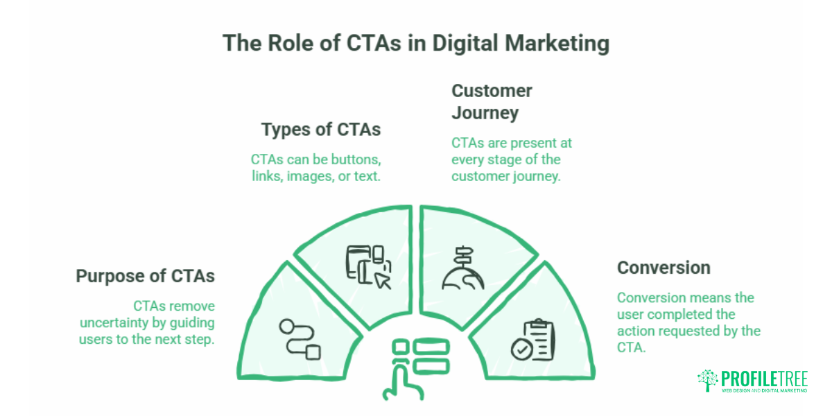
A CTA in marketing is a prompt that asks the reader to take a specific, measurable action. On a website, that usually means a button (“Get a quote”, “Start free trial”), though a CTA can also be a text link, an image, or a line in an email. The purpose of a call to action in digital marketing is to remove uncertainty: it names the single next step and makes taking it easy.
CTAs sit at every stage of the customer journey. A blog reader might see a soft CTA inviting them to read a related guide; a visitor on a service page sees a stronger one asking them to book a consultation. The word “conversion” simply means the visitor did the thing the CTA asked.
Why CTA Buttons Decide Whether a Page Converts
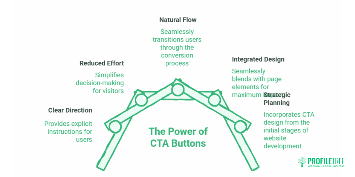
Most websites do not have a traffic problem. They have a conversion problem. Visitors arrive, read, and leave, because nothing on the page tells them clearly what to do or why it is worth doing now. A well-designed CTA button closes that gap.
Strong calls to action reduce friction in three ways. They give clear direction, so visitors are not left guessing. They lower the effort of deciding, because the action is named and obvious. And they create a natural flow from awareness through to a completed action. On an e-commerce product page, a prominent “Add to Cart” button moves a browser toward buying. On a Belfast accountancy firm’s service page, a “Book a free consultation” button gives a hesitant business owner a low-risk first step.
ProfileTree, a Belfast-based web design and digital marketing agency, approaches CTA design as part of how a site is built, not as decoration added at the end. The button, the surrounding copy and the page layout are planned together so each one supports the action being asked for.
“A CTA button isn’t the thing that makes people convert. It’s the thing that gets out of the way once you’ve already given them a reason to. We see clients obsess over button colour when the real problem is that the page never made a clear promise in the first place.” — Ciaran Connolly, founder, ProfileTree
What Makes a CTA Button Convert
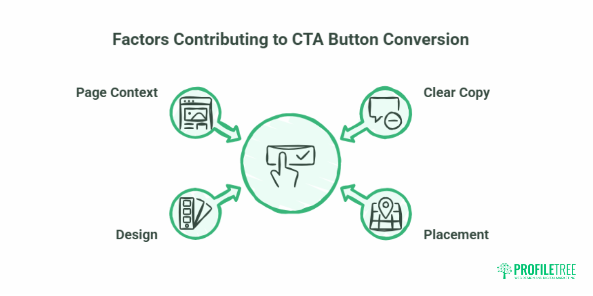
The best practices for CTA buttons come down to four things working together: copy, placement, design, and the page context around them.
Clear, Action-Led Copy
CTA copy should be short, specific, and built around a verb. Two to five words is the working range. “Get Started”, “Download the Guide”, and “Book Your Call” all tell the reader exactly what happens next. Vague labels like “Submit” or “Click Here” leak conversions because they describe the mechanics, not the benefit.
Small wording changes matter more than most people expect. Shifting “Start your free trial” to “Start my free trial” reframes the button in the visitor’s own voice, and businesses testing this phrasing often see a measurable lift. Personalised CTAs that adapt to the visitor (“Resume your order” for a returning customer) tend to outperform generic ones because they feel relevant rather than broadcast.
Placement That Matches Intent
A persuasive button still fails if it appears at the wrong moment. Above-the-fold CTAs, visible without scrolling, suit simple, high-intent actions: a “Sign up free” button on a software homepage, for example. Below-the-fold CTAs work better for considered purchases, where the visitor needs information before committing. The reliable approach is one primary CTA above the fold and a repeat further down, so you capture both the ready-to-act visitor and the one who needs convincing.
Context changes placement, too. In a blog post, a CTA lands best after the reader has had value, not interrupting it. On a service landing page, the CTA should be repeated at each decision point. Give the button breathing room with white space, and avoid crowding the page with competing buttons that split attention.
Design and Colour
A CTA has to be seen before it can be clicked. The button colour should contrast clearly with the rest of the page while staying on-brand, so it draws the eye instead of blending in. Colour also carries association: red and orange read as urgent, green as positive and safe, blue as stable and trustworthy. There is no single best colour; contrast against the specific page matters more than the colour itself.
Practical design points: make the button large enough to tap easily (a minimum of around 44 by 44 pixels), use rounded corners, which tend to feel more inviting, and choose a bold, readable font. A hover state confirms the button is interactive.
The Page Around the Button
This is where CTA design meets conversion-focused web design. A button cannot rescue a page that buries its value proposition, loads slowly, or asks for too much. The strongest CTA in the world will not convert if the visitor has not been told, clearly and early, what they get and why it is worth their time. Conversion-focused web design treats the whole page as a path to a single action, with the CTA as its endpoint.
Primary, Secondary, Soft and Strong CTAs
Not every visitor is ready for the same step, so most well-built pages use more than one type of CTA. The table below sets out the common distinctions.
| CTA type | What it asks for | Best used for | Example |
|---|---|---|---|
| Primary | The main goal of the page | High-intent visitors | “Book a consultation” |
| Secondary | A lower-commitment alternative | Visitors are not ready to convert | “See our work” |
| Soft | Low commitment, research stage | Top-of-funnel readers | “Learn more” |
| Strong | High commitment, decision stage | Bottom-of-funnel visitors | “Buy now” |
Soft CTAs sit comfortably above the fold and on blog content, where the visitor is still weighing things up. Strong CTAs belong at the decision points, where the visitor already has what they need to act. Pairing a bold primary CTA with a quieter secondary option lets you serve both without forcing a choice too early.
Testing and Improving Your CTAs
Even a well-designed button can usually be improved, and the only reliable way to know is to test. A/B testing (also called split testing) shows different versions of a CTA to different segments of your audience and measures which performs better.
Useful things to test include the copy (“Start free trial” versus “Try for free”), the button colour, the size and placement, and whether urgency or social proof in the surrounding text changes behaviour. Track three metrics: click-through rate (how often the button is clicked), conversion rate (how often a click leads to the completed action), and engagement across pages. A high click-through rate paired with a low conversion rate is a useful warning sign: people are clicking, but something after the click, often an unclear next step or a trust gap, stops them from finishing.
ProfileTree often builds this testing capability into client work and, through digital training, shows in-house marketing teams how to run their own CTA tests rather than depending on an agency for every change.
Designing CTAs for Mobile
Mobile traffic now outweighs desktop for most businesses, so a CTA that works on a phone is not optional. Buttons need to be thumb-friendly and easy to tap, with that same 44 by 44 pixel minimum and enough space around them to prevent mis-taps. Sticky CTAs, which stay visible as the visitor scrolls, keep the action within reach throughout a long page.
Loading speed is part of this. A button that appears late, after a slow render, has already lost some visitors. Google’s Core Web Vitals reward lightweight, fast-loading pages, so keep button designs simple and avoid animations that delay interaction. On a mobile e-commerce page, an “Add to Cart” button should be large, central, and reachable without hunting for it.
CTAs and UK Consent Rules
One area most CTA guides skip: in the UK and Ireland, some calls to action are governed by data protection law. A “Subscribe” or “Sign up” button that collects an email address for marketing is subject to the UK GDPR and PECR, enforced by the Information Commissioner’s Office (ICO). That means consent has to be freely given and unambiguous, so pre-ticked boxes and bundled consent are not compliant.
This affects design, not just legal wording. A consent checkbox crammed against the button, or a cookie banner that obscures the page, adds friction exactly where you want it removed. The workable answer is clear micro-copy, an honest single-action consent, and a layout that keeps the path to the CTA clean. Done well, a compliant form can convert as well as a non-compliant one, and it protects the business from ICO action.
Where CTAs Fit in a Conversion-Focused Website
It helps to see a CTA button as the visible tip of a larger system. Behind every high-converting button sits a clear value proposition, a sensible visual hierarchy, trust signals near the point of decision, a fast page, and a layout that points the eye toward the action. Improving the button alone gives you a small lift. Improving the page that holds it is where the real gains come from.
That is the difference between cosmetic web design and conversion-focused web design, and it is the lens ProfileTree’s web design service applies to client projects: every page is built around the action it is meant to drive, with the CTA as the clearest expression of that goal.
For a closer look at how design choices shape commercial results, this ProfileTree walkthrough is a useful starting point:
Conclusion
A high-converting CTA button is rarely the result of one clever trick. It comes from clear copy, the right placement, a design that stands out, and a page built to support the action. Test your buttons, watch the numbers, and treat each CTA as part of the wider page rather than a standalone element. If your site gets visitors but few of them act, the button is usually the symptom, not the cause: start with the page, and the conversions follow.
Frequently Asked Questions
What does CTA mean in marketing?
CTA stands for call to action. It is a prompt, usually a button or link, that asks a website visitor to take a specific next step, such as buying, subscribing, or booking a call.
What is the purpose of a call to action?
A call to action removes uncertainty by naming the single next step and making it easy to take. It turns passive interest into a measurable action, or conversion.
What is the best colour for a CTA button?
There is no single best colour. What matters is contrast: the button should stand out clearly against the rest of the page while staying consistent with your brand.
How long should CTA button text be?
Two to five words work best. Lead with a verb and name the benefit, so “Get the free guide” rather than “Submit”.
How do I know if my CTA is working?
Track click-through rate and conversion rate. A high click rate with a low conversion rate suggests the button works, but the step after it does not.