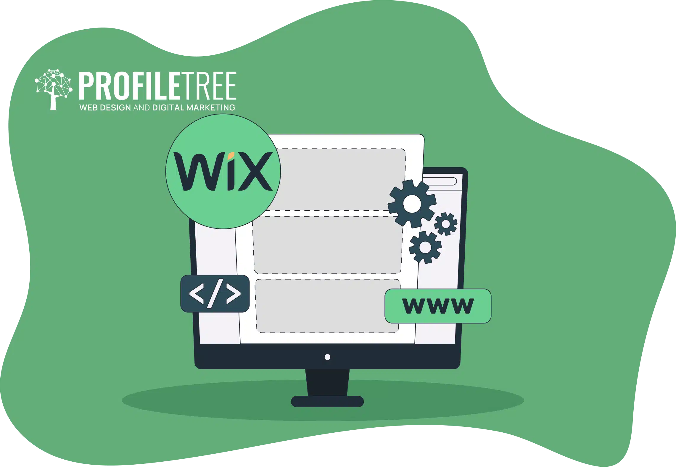
In today’s digital age, online presence is a must for individuals and businesses. Websites serve as virtual storefronts, communication hubs, and information-sharing platforms. Among the myriad website builders available, Wix is a user-friendly tool for crafting professional-grade websites without extensive coding knowledge. In this article, we’ll explore the process of building, editing, and launching a Wix website.
This guide aims to help readers navigate the intricacies of website creation on Wix effectively, from selecting templates to customising design elements and optimising search engines. Whether you’re an entrepreneur, freelancer, or hobbyist, mastering Wix can empower you to establish a compelling online platform tailored to your unique needs and objectives. Join us as we embark on a journey through the fundamentals of website development with Wix.
Table of Contents
Selecting Wix Website Type and Templates
When you begin creating a website on Wix, the first step is determining the website type you want to build. This choice largely depends on the nature of your business or the purpose of your website. Wix offers templates tailored to different categories for e-commerce or non-e-commerce purposes.
For instance, if you plan to launch a shopping website or delve into the fashion blogging world, you’ll find specific templates designed to cater to these niches. The available options include fashion blogs, beauty and fashion blogs, fashion video blogs, and even plus-size fashion blogs. The selection process is straightforward, allowing you to browse the categories and choose the best template that suits your needs.
Naming Your Website and Adding Features
Once you’ve selected a template, the next step is to name your website. While this name can be changed later, choosing something relevant and memorable is essential. After naming your site, you’ll be prompted to add features or functionalities to enhance its functionality. Wix provides a range of recommendations conveniently accessible through the Wix App Market.
For a fashion blog, Wix automatically integrates a blog app, simplifying the process of publishing content. Additionally, depending on your requirements, you can incorporate various other features such as a chatbox, forms, an online store, bookings, events, or a portfolio.
While these options can enhance your website’s capabilities, it’s advisable to consider whether each feature aligns with your goals. For example, if a chatbox isn’t necessary for your fashion blog, you can exclude it from your website.
By carefully selecting features and customising your template, you can create a tailored website that effectively communicates your message and engages your audience.
Choosing a Website Builder Platform
In this stage, we’re again prompted to select our preferred website builder platform: Wix Editor, Editor X, or Wix ADI (Artificial Design Intelligence). Each option caters to different user preferences and technical abilities.
Wix ADI offers an enticing solution for those venturing into website creation for the first time or seeking a straightforward approach. Utilising Artificial Design Intelligence, Wix ADI generates a customised website based on user responses to a series of questions. This automated process streamlines website development, making it the perfect choice for beginners or those with minimal technical expertise.
Upon selecting Wix ADI, users are guided through prompts to provide essential information such as business logo, website name, contact details, and social media links. These inputs generate a personalised website tailored to specific needs and preferences.
Choosing a Theme and Layout
Once the initial information is provided, users are presented with themes. While the available themes may vary, users have various options to suit diverse aesthetic preferences. For instance, themes like serene, grand, minimal, retro, fuse, and prestige may be offered, each showcasing distinct design elements and styles.
After selecting a theme, users are presented with several homepage layout options. These layouts showcase different arrangements of headers, hero sections, contact forms, location details, and footers. Users can choose a layout that serves their vision for the website or opt for a completely blank template to start from scratch.
By guiding users through these steps, Wix ADI simplifies the website creation process, empowering individuals to bring their online vision to life easily and efficiently. Whether you’re a novice or a seasoned web developer, Wix ADI offers a user-friendly solution for creating professional-quality websites in minutes.
Exploring Editor X
For users seeking a more advanced and customisable website-building experience, Editor X offers a robust platform with extensive design capabilities. Unlike Wix ADI, Editor X gives users greater control over the design process, including the ability to manipulate CSS, utilise grid and flexbox layouts, and implement custom breakpoints for responsive design.
Upon selecting Editor X, users are presented with various options for creating their website. They can start from a blank canvas or choose from Wix’s default templates, all of which feature modern and fluid designs. Editor X caters to individuals with varying levels of technical proficiency, allowing users to customise their websites to their exact specifications.
Features and Considerations
Users navigating Editor X will encounter sophisticated design elements like video backgrounds, blended headers, hero sections, and fluid animations. These features create dynamic and visually appealing websites that stand out online. However, it’s important to note that Editor X comes with a higher price compared to the standard Wix editor.
While Editor X offers enhanced design capabilities, users should consider the pricing structure before committing to the platform. The investment may be justified for those prioritising advanced design features and customisation options.
Exploring Wireframes
Wix offers wireframes as a starting point for users who prefer a structured framework. These wireframes serve as templates with predefined layouts, allowing users to focus on content placement without getting lost in the intricacies of design. Wireframes can be particularly beneficial for users who are new to website design or feel overwhelmed by the creative process.
By providing users with a comprehensive overview of Editor X, Wix ADI, and wireframe options, we aim to equip individuals with the knowledge to make informed decisions when building their websites on Wix. Whether you’re a beginner or a seasoned designer, Wix offers a range of tools and platforms to suit your specific needs and preferences.
Exploring Wix Editor Templates
Now that we’ve chosen to proceed with the Wix Editor let’s delve into the various templates that are available to us. Since we opted for a fashion blog, Wix conveniently presents us with templates specifically tailored to this category. We’re greeted with an array of options spanning multiple pages of selections, from fashion blogs to beauty blogs, personal blogs, and beyond.
Choosing Templates or Starting from Scratch
Users can select a template that best fits their vision for their website. However, if none of the default templates align with their preferences, they can opt for a blank template. Like wireframes in Editor X, blank templates allow users to build their website from scratch, offering minimal layouts, classic layouts, one-page layouts, strip headers, and more.
Customisation Options for Different Needs
For those embarking on diverse projects, Wix offers templates tailored to various industries and purposes. Users can find templates suited to their specific needs, whether for business and services, health and wellness, beauty and hair, travel and tourism, restaurants and food, or online stores. Additionally, Wix caters to creative endeavours with photography, design, music, creative arts, video, portfolios, and more templates.
Simplifying Website Creation
With an extensive range of templates covering numerous categories, the Wix website simplifies the creation process for users of all backgrounds and skill levels. Whether seeking inspiration or aiming for a streamlined workflow, Wix’s templates offer a starting point for bringing your website vision to life.
Exploring the Wix Editor Interface
Now that we’ve landed on the preview or editor screens, let’s familiarise ourselves with the layout and essential components needed to build our website. On the left side of the screen, we have a menu featuring various options crucial for constructing our website:
Add Elements: This section allows us to incorporate text boxes, images, videos, buttons, and more into our website design.
Add Section Pages and Menu: Here, we can add new sections, pages, or menu items to our website structure, facilitating visitors’ navigation.
Site Design: This option enables us to customise the design aspects of our website, including themes, colours, fonts, and styles.
Add Apps: We can enhance the functionality of our website by integrating various apps from the Wix App Market, such as contact forms, social media feeds, or e-commerce tools.
My Business Media: This section allows us to manage our website’s media assets, such as images, videos, and audio files.
Content Manager: Here, we can organise and manage the content of our website, including text, images, and other media elements.
Basic Website Building Steps
This section guides the basics of creating essential elements for our website, starting with the header, sections, and footer. We’re currently on the homepage in the top left corner. We will also demonstrate how to create sub-pages, additional pages, and anchor links to enhance navigation.
Optimisation for Desktop and Mobile
At the top of the screen, we have optimisation options for desktop and mobile views. This allows us to ensure that our website looks and functions seamlessly across different devices.
Publishing and Dashboard Access
In the top left corner, we have options to publish the website or access the dashboard. In the dashboard, we manage the website, business apps, settings, and SEO optimisation. Additionally, Wix Editor offers a Velo Developer mode, akin to Editor X’s coding capabilities. This mode allows users to implement custom code and utilise Velo APIs for advanced customisation.
Undo, Redo, and Zoom Options
Lastly, we have convenient undo and redo buttons at the top right corner for reverting changes or redoing actions. We can also adjust the zoom level to better understand our website’s layout.
By understanding and utilising these features effectively, we can confidently navigate the Wix Editor interface and create a stunning website tailored to our specific needs and preferences.
Exploring Integrated Tools and Functions
Upon opening the Wix Editor, you’ll notice that some tools have already been activated. These include grid lines and snapped objects, which will be explained below. Additionally, we have access to the toolbar, layers, and rulers.
Rulers and Layers
While rulers may not be essential for everyone, they can assist in navigating the workspace. However, with snapped objects enabled, rulers might seem redundant. Nonetheless, having an extra navigational tool can be beneficial for some users. Layers, on the other hand, are crucial for organising elements within our sections. Currently, our section is untitled, indicating no elements are present.
Toolbar Functions
The toolbar is invaluable for making adjustments to our website design. For instance, we can effortlessly modify the height and width of sections. We can streamline the design process with options to duplicate or copy sections. Whether duplicating sections with a single click or copying and pasting elements, the toolbar simplifies tasks and boosts efficiency.
Naming Sections and Adding Elements
It’s essential to start by naming our sections for clarity and organisation. Begin with the Hero section, which serves as the main landing area for visitors. Naming sections ensures easy identification and management. Next, we’ll add elements to our section by adding a strip to create a visually appealing layout for our Hero section.
Customising Strips and Columns for Responsive Design
The Wix strip feature enhances responsiveness and ensures your website elements adapt well across different devices. Let’s explore optimising the strip and adding columns for a more dynamic layout.
Firstly, move the strip to the desired position within the section. To determine the ideal screen height, utilise the Tools menu and Toolbar option. Adjusting the height to around 560 pixels aligns perfectly with our vision for the layout.
Adding Columns for Layout Variation
Now, let’s explore adding columns to create a versatile layout. We can divide the strip into multiple sections by selecting the layout and column. For instance, we can add two additional columns to create three distinct areas within the strip.
Fine-Tuning Column Proportions
We’ll adjust the sizes individually to customise the proportions of the columns according to the design vision. For example, designate one column for a social media bar on the right side, another for content in the middle, and a third for additional content on the left side, such as a slider or background imagery.
Managing Column Layout
While we’ve initially divided the strip into columns evenly, we can further refine the layout by adjusting the column proportions. By selecting Manage Columns and making adjustments as needed, we can ensure each column’s size aligns with our design preferences.
Adjusting Column Proportions
To ensure precise column proportions within our strip layout, utilise the Strip Layout feature for seamless adjustments. Let’s refine the proportions and customise the background colour for each column.
Refining Column Proportions
Adjust the proportions of each column from the menu by selecting Layout and then Strip Layout. If there is a slight discrepancy in percentages, we can rectify this by fine-tuning the values. For instance, designate the first column to occupy 60%, the second 30%, and the third 10% of the strip layout.
Adjusting Background Color
Now that we’ve established the desired proportions, let’s enhance the visual appeal of our layout by adding background colours to the columns. With options to choose from solid colours, images, or videos, we can tailor the background to suit the overall design theme of our website.
We can explore various design potentials depending on the nature of our website, whether it’s a blog or an e-commerce platform. By leveraging the customisation features offered by Wix, we can create visually captivating and engaging layouts that resonate with our audience.
Finalising Layout and Design
After ensuring that the proportions and background colours align with our design vision, review the layout to confirm everything is in place. Once satisfied with the adjustments, proceed with further customisation and content creation to bring the website to life.
Adding Elements and Customising the Slider
As our website design progresses, let’s focus on adding elements and customising a slider to enhance visual appeal and functionality.
Selecting Background Colours
To begin, we’ll apply background colours to specific sections of our layout. Opting for a peach colour for one section and a solid black background for another adds depth and contrast to our design.
Introducing Elements
Let’s explore the Elements feature to incorporate various components into our website. We will demonstrate adding a dynamic and interactive slider element ideal for showcasing images or content.
Setting Up the Content Manager
Before adding the slider, we’ll ensure the Content Manager is integrated into our site. This step is crucial for managing collections, dynamic pages, and other content-related tasks.
Adding the Slider Component
We’ll locate the slider gallery component using the search bar and insert it into our layout. Adjustments may be necessary to ensure the slider spans the full width of the designated section.
Customising Slider Images
With the slider in place, we’ll replace the default images with ones more fitting for a fashion blog. Leveraging non-copyright images from sources like Unsplash ensures legal compliance while maintaining visual appeal.
Fine-Tuning Slider Settings
Once images are replaced, we’ll refine the slider’s appearance and functionality. This includes adjusting navigation arrows, image cropping, and transition effects to achieve the desired aesthetic and user experience.
Previewing and Testing
Before finalising changes, we’ll preview the slider to ensure everything aligns correctly and functions as intended. Making any necessary adjustments ensures a seamless and engaging user experience.
Refining Slider Appearance and Header Design
As we finalise the layout and design of our website, we’ll focus on refining the slider’s appearance and ensuring consistency with the header section.
Customising Slider Settings
To begin with, we’ll customise the slider settings to ensure smooth transitions between images and eliminate unwanted elements such as text boxes. We can achieve a visually appealing and fluid slideshow by adjusting parameters such as autoplay duration and image opacity.
Enhancing Image Display
To further enhance the visual impact of our slider, we’ll experiment with techniques like darkening the opacity of images. We can create captivating visual effects that complement our website’s aesthetic by employing tools like filler colour and opacity adjustments.
Implementing Additional Slider Elements
Incorporating additional slider elements allows for creative flexibility and dynamic visual storytelling. We’ll explore options like adding supplementary sliders with varied sizing and placement to create an engaging user experience.
Optimising Header Design
Moving on to the header section, we’ll ensure coherence with the overall design theme by utilising features like box letters for a distinctive and cohesive look. Adjusting settings such as slide duration will ensure synchronisation between different sections for a seamless browsing experience.
Leveraging Animation Effects
To enhance the user experience and add an extra layer of visual interest, we’ll use animation effects. By strategically applying animations, we can create engaging transitions and interactions that captivate and retain our audience’s attention.
Finalising Design Elements
We’ll achieve a polished and visually compelling website by fine-tuning these design elements and exploring creative possibilities. Through meticulous attention to detail and experimentation with various features, we’ll create an immersive online environment that effectively communicates our brand identity and captivates visitors.
As we refine our website, let’s remain open to experimentation and innovation, leveraging the full potential of our design tools to create a truly exceptional online presence.
Key Actions Summary
After reviewing the changes made to the images, adjusting opacity, and fine-tuning the slider timings, it’s evident that the website is taking shape. Let’s summarise the key actions taken in this phase:
Deleting Unnecessary Elements: Text and pop-up functionalities were removed from the images to streamline the design and functionality.
Customising Design: The design elements, such as border, shadow, and spacing, were adjusted to achieve the desired look and feel.
Slider Adjustment: The slider timings were synchronised with the Hero section to ensure consistency and smooth transitions between images.
Fine-tuning Image Effects: Opacity adjustments were made to darken the image and enhance its visual appeal.
Introduction of Box Letter Design: The box letter is a unique design element that adds a distinctive touch to the website’s appearance.
Aligning Slider Timing: The slider timings were adjusted to align with the overall pacing of the website, providing a seamless user experience.
Utilising Animation Effects: Animation effects were employed to add subtle enhancements and visual interest to the website.
By implementing these changes and optimisations, the website now boasts a cohesive design, smooth functionality, and engaging visual elements.
Header Design and Section Integration
As we delve deeper into the website design process, our attention now turns towards crafting the header section to seamlessly integrate with the existing elements. Let’s explore how to refine this crucial component to enhance overall site cohesion.
Adding Additional Sections
Before diving into header customisation, it’s essential to consider the website’s structure. We can incorporate additional sections to provide a comprehensive user experience. Each element contributes to the website’s richness, from dynamic features like testimonials to informative sections about our team.
Customising Section Elements
Utilising pre-made sections offers convenience and efficiency when building our website. We can easily swap out images, adjust text content, and fine-tune design elements such as fonts and sizes to align with our branding and aesthetic preferences. By naming each section, we ensure clarity and organisation in our design process.
Exploring Font Options
The choice of fonts plays a significant role in defining the visual identity of our website. With a diverse range of font styles, we can experiment and select options that resonate with our brand personality. Additionally, the ability to upload custom fonts further expands our creative possibilities, allowing for a truly unique and personalised design.
Enhancing Visual Coherence
We’ll incorporate design elements like colour schemes and border styles across different sections to maintain visual coherence and branding consistency. By harmonising these visual elements, we create a cohesive browsing experience that guides users seamlessly through our website.
Leveraging Design Tools
Wix provides various design tools and features that empower us to bring our vision to life. From customisable layouts to dynamic animations, we can leverage these tools to create engaging and immersive web experiences that captivate our audience.
Finalising Header Design
With a clear understanding of our design objectives and the functionality of each section, we’ll proceed to customise the header section. By aligning its design elements with the overall aesthetic of our website, we’ll achieve a harmonious and visually compelling header that leaves a lasting impression on visitors.
Crafting the Header and Footer
We refine the header and footer sections in this website development phase to ensure seamless navigation and aesthetic appeal. Let’s delve into the process of creating these vital components.
Designing the Header Section
Adding Elements: Begin by incorporating a strip to create the header section. Utilise the toolbar for precise resizing to achieve the desired dimensions.
Managing Columns: Customise the layout by adding and adjusting columns to accommodate various elements. Proportion sizes can be modified to create a balanced visual hierarchy.
Designing Elements: Customise the background colours of each column to enhance visual cohesion. Incorporate the logo and menu items to facilitate navigation.
Menu Customisation: Refine the menu design by adjusting text styles, background fills, and hover effects. Ensure consistency with brand fonts and colours for a polished look.
Scroll Behavior: Choose the header scroll settings to determine its behaviour as users navigate the site. Options include scrolling with the site or freezing in place.
Crafting the Footer Section
Adding Elements: Integrate a strip to create the footer section, allowing for easy content organisation.
Managing Columns: Customise the layout by adding columns and adjusting proportions to accommodate elements such as social media icons and contact information.
Designing Elements: Customise the background colours of each column to create visual distinction. Incorporate elements like maps and social media icons for added functionality.
Advanced Features: Explore additional features like pinning elements to the screen for enhanced user experience and fine-tuning positioning and offsets for optimal display.
Publishing the Website
Finalising Edits: Review the website layout and functionality to ensure everything aligns with your vision.
Publishing: Click the “Publish” button to make the website live. Once published, visitors can access the site and explore its content.
SEO and Dashboard: Access the dashboard to manage SEO settings, create blog posts, and monitor website performance. This is where you can optimise your site for search engines and track traffic metrics.
Additional Options: Consider exploring Editor X for more advanced design capabilities or custom domain integration for branding purposes.
Conclusion
Following these steps, you can create a visually appealing and functional website using Wix. Don’t hesitate to experiment with different design elements and features to personalise your site further. By harnessing the capabilities of Wix’s intuitive tools and features, you can craft a visually stunning website that reflects your brand identity and captivates the audience.
Continue refining your layout and design to create a compelling online presence. By leveraging these integrated tools and functions in Wix, you can navigate the Wix Editor interface effectively and create a captivating website design tailored to your needs and preferences.
Need to know the top free website builders for photographers? All the options for communicating online may make your head spin. So let's uncover the differences...
In our increasingly connected world, the challenge of achieving a harmonious balance between consistency and adaptability in cross-device UX design is more pertinent than ever. When...
In today’s digital-first landscape, customers interact with brands across numerous touchpoints—websites, social media, email, advertisements, and offline mediums. To make a lasting impression and stand out...


