Hide Elements on Wix: A Beginner’s Wix Tutorial
Table of Contents
Learning to hide elements on Wix is one of the first things that separates a tidy, well-built site from one that looks broken on someone’s phone. Wix gives you a lot of design flexibility, and that’s genuinely useful, but it also means mobile layouts don’t always sort themselves out automatically. You have to make deliberate choices about what appears where, and on which device.
Ciaran Connolly, founder of ProfileTree, puts it plainly: “Most small business owners build their Wix site on a desktop and never check how it looks on a phone. That’s where you lose people. A cluttered mobile view can kill a good first impression before a visitor even reads a word.”
What Hiding Elements on Wix Actually Does
Before you start clicking, it’s worth understanding what you’re doing technically. When you hide an element on Wix, you’re not deleting it. The element stays in place on the version you didn’t hide it from (usually the desktop), and it simply doesn’t render on the other view.
This matters for a few reasons:
- You can always unhide it later without rebuilding anything
- Hidden elements don’t affect your desktop layout at all
- They’re not visible to visitors, but they still exist in your site’s structure
It’s a non-destructive way to clean up your mobile experience, which makes it worth using freely.
How to Open the Wix Mobile Editor
Finding the Mobile View Toggle
In the Wix Editor, look for the device icons near the top of the screen. You’ll see a desktop icon and a mobile icon side by side. Click the mobile icon to switch to the mobile editor view.
Once you’re in mobile view, you’re looking at how your site will appear on a smartphone. Changes you make here only affect the mobile version unless you’re editing a section that’s linked across both views. Wix will usually tell you when that’s the case.
What the Mobile Editor Shows You
The mobile editor gives you a condensed view of your site’s elements stacked vertically. Some elements will have scaled down automatically; others may be overlapping, too large, or taking up space they don’t need to. That’s what you’re about to fix.
How to Hide an Element on Wix Mobile
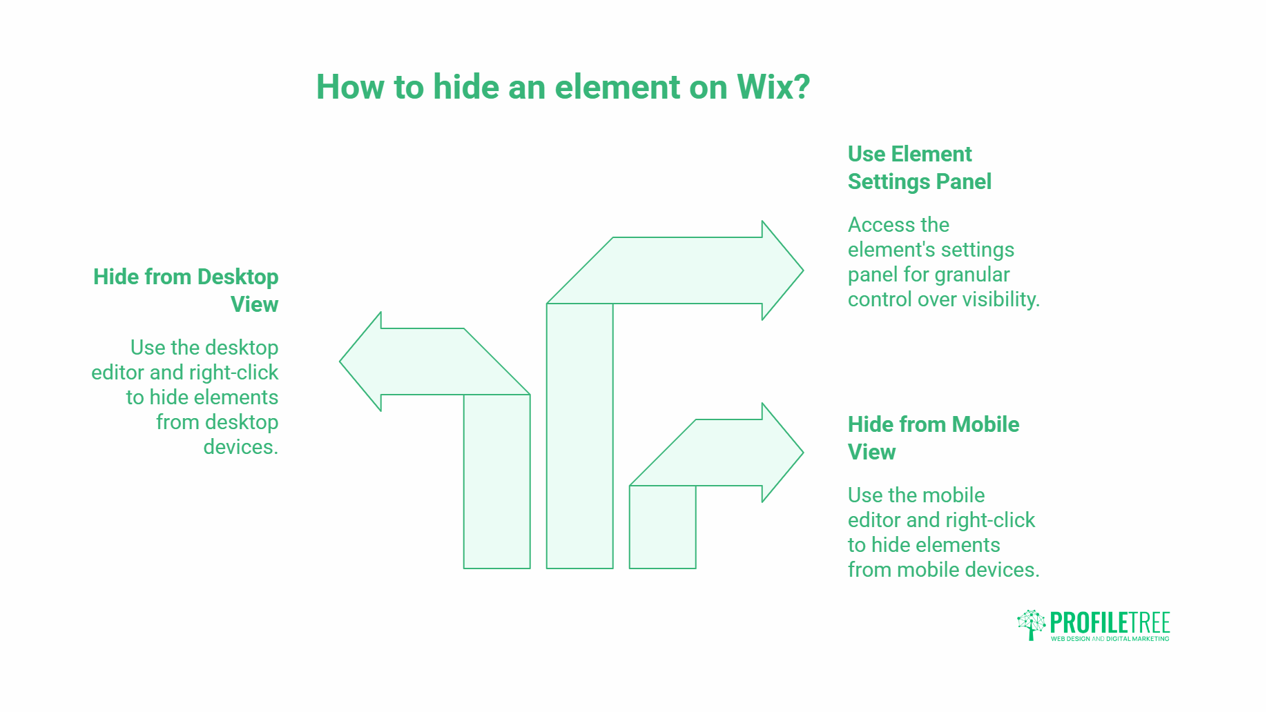
Step-by-Step: Hiding from Mobile View
- Switch to the mobile editor using the icon at the top of the Wix dashboard
- Click on the element you want to hide (a text block, image, button, video, or any other component)
- Right-click on the selected element to open the context menu
- Select “Hide on Mobile” from the options
The element will disappear from your mobile view immediately. It remains fully intact on your desktop layout.
Step-by-Step: Hiding from Desktop View
The process is the same, but you do it in the desktop editor:
- Stay in or switch to the desktop editor view
- Click the element you want to hide on desktop only
- Right-click and look for the hide option in the menu
- Confirm the action
Use this when you have an element designed specifically for mobile (a simplified navigation bar, for example) that you don’t want appearing on the full desktop layout.
Using the Element Settings Panel
Some elements give you a more granular option through their settings panel. Click the element, then look for the settings or display icon in the small toolbar that appears above it. You may see a toggle labelled “Show on Mobile” or “Show on Desktop” depending on which view you’re in. Switching this off achieves the same result as the right-click method.
Which Elements Are Worth Hiding on Mobile?
Not everything needs to be visible on every device. Here are the most common candidates for hiding on mobile:
Decorative Design Elements
Background shapes, dividers, decorative icons, and filler images that add visual depth to a desktop layout often just eat up vertical space on mobile. If an element is purely aesthetic and adds nothing to the content, hide it on mobile without hesitation.
Large Banner Images or Slideshows
Image carousels and wide banner images rarely scale well to mobile screens. They can slow load times and push your actual content further down the page. Consider replacing them with a single, well-cropped image, or hiding the desktop version entirely and building a separate mobile-friendly header.
Redundant Navigation Elements
Desktop sites often include multiple navigation cues: a top menu, a sticky sidebar, and in-page anchor links. On mobile, these can stack on top of each other and confuse the layout. Keep one clear navigation option and hide the rest.
Videos That Autoplay
Autoplaying video backgrounds look polished on desktop but can cause real problems on mobile: high data usage, layout disruption, and slow rendering. Hide them on mobile and replace with a static image if you want to keep the visual impact.
Long Text Sections That Don’t Adapt Well
If you have a multi-column text layout on desktop that collapses into an unreadable wall of text on mobile, consider hiding it and creating a separate, shorter mobile-friendly version of the same content.
How to Rearrange Elements After Hiding
Hiding an element often shifts the layout of what’s left. Wix will sometimes adjust spacing automatically, but not always. After hiding, check the mobile view from top to bottom and look for:
- Gaps where the hidden element used to sit
- Elements that have shifted out of their intended position
- Text or images that are now overlapping
Adjusting Spacing in Mobile View
Click on any element and drag it to reposition it. You can also click and drag the bottom edge of a section to reduce the height if there’s empty space left behind. Wix mobile layout works on a grid, so elements tend to snap into place; use that to your advantage.
Checking the Preview
Before you publish, use the Preview button (top right of the Wix editor) to see how the mobile site looks as a visitor would. Check it on an actual phone if possible, not just the in-browser preview. Screen sizes vary, and the preview doesn’t always match every device perfectly.
Common Mistakes to Avoid
Hiding Too Much
Some beginners hide so many elements that the mobile site loses its core information. A visitor landing on a stripped-back mobile page with no clear offer, no contact information, and no navigation will leave. Be selective: hide what genuinely doesn’t work on mobile, not everything that looks slightly off.
Forgetting to Check Both Views After Changes
Every time you make a change in one view, check the other. A tweak in the desktop editor can sometimes affect how a shared element appears on mobile. It takes thirty seconds and prevents surprises after you publish.
Not Saving Regularly
Wix autosaves, but it’s easy to lose a session of mobile edits if something goes wrong. Save manually using Ctrl+S (or Cmd+S on Mac) after each significant change.
Ignoring Load Speed
Hiding an element visually doesn’t remove it from the page’s code. A large video or image set to “hidden on mobile” still loads in the background, which can slow your mobile page speed. For heavy assets, it’s worth removing them from the mobile editor entirely or replacing them with lighter alternatives. You can learn more about how page speed affects your SEO performance and what to do about it.
Wix Mobile Optimisation Beyond Hiding Elements
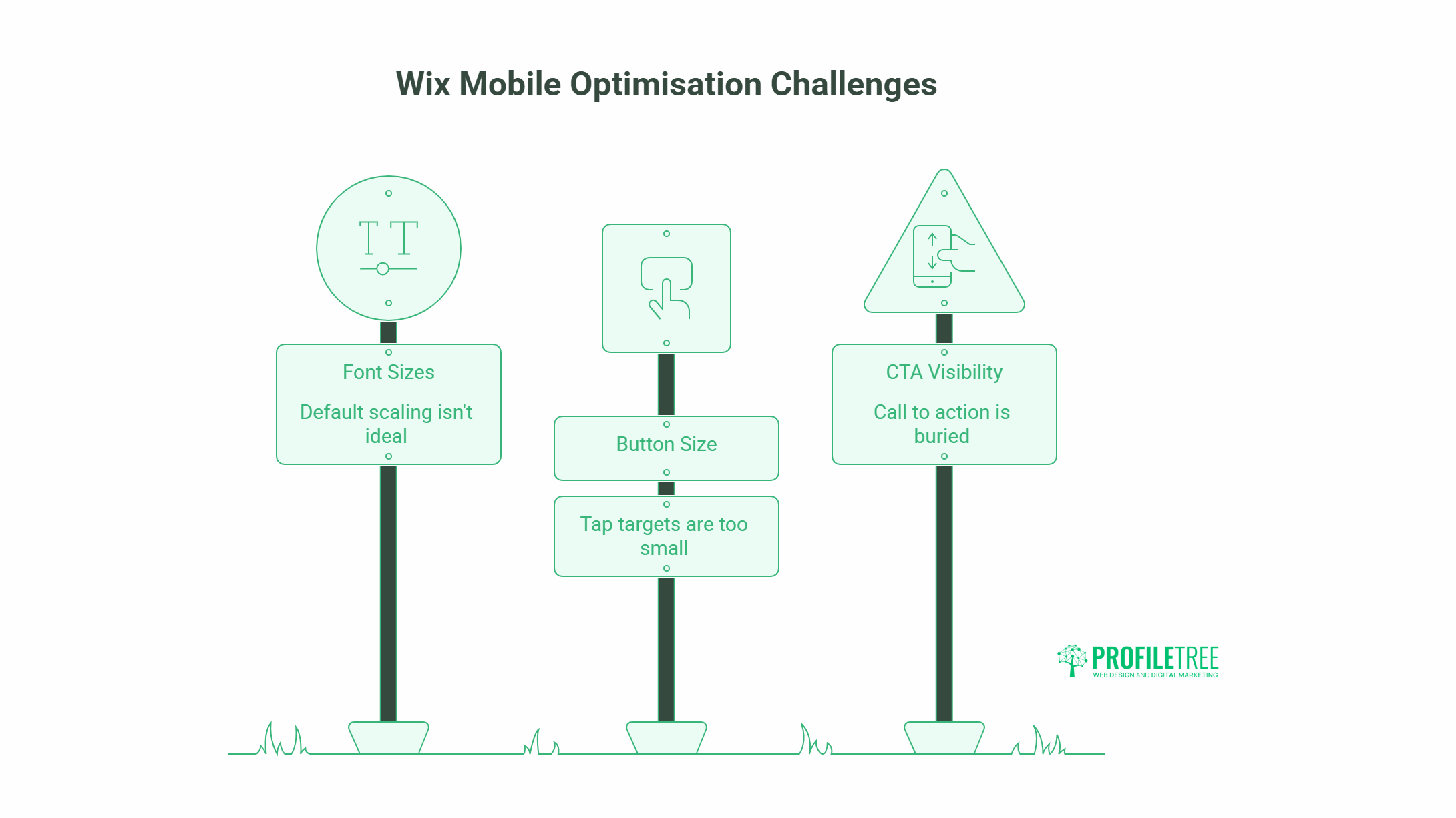
Hiding elements is a starting point, not a complete mobile strategy. Once you’ve cleared up the clutter, there are a few other areas to look at:
Font Sizes and Readability
Wix scales fonts between desktop and mobile, but the default scaling isn’t always ideal. Check that your body text is at least 16px on mobile and that headings don’t run off the screen on smaller devices.
Button Size and Tap Targets
Buttons need to be large enough to tap without accidentally hitting something else. Google recommends at least 48x48px for tap targets. In the Wix mobile editor, you can resize buttons independently of their desktop counterparts.
Contact and CTA Visibility
Your contact number, booking link, or enquiry button should be visible without scrolling on mobile. If your main call to action is buried halfway down the page, your conversion rate will suffer. Move it up, make it prominent, and test it.
For businesses that want to take their website further, ProfileTree’s web design services for Northern Ireland cover mobile optimisation as part of every build, from layout through to speed and conversion testing.
Wix SEO Considerations When Hiding Elements
Hiding elements affects what visitors see, but search engines handle it differently. Google primarily indexes the mobile version of your site (mobile-first indexing), so anything you hide on mobile is, in effect, hidden from Google’s main crawl.
This means:
- Don’t hide content that contains important keywords or information you want ranked
- If you have a key heading or paragraph only visible on desktop, Google may not give it full weight
- Use hidden elements for visual and layout purposes, not for content you need indexed
If you need help thinking through how your Wix content is being indexed, ProfileTree’s SEO audit service can walk you through exactly what Google is seeing.
FAQs: Hiding Elements on Wix
Does hiding an element on mobile affect the desktop layout?
No. Hiding an element in the mobile editor only removes it from mobile view. The desktop version is completely unaffected.
Can I hide elements on specific pages rather than site-wide?
Yes. Changes made in the Wix editor apply to individual pages. If you hide an element on your homepage’s mobile view, it stays hidden only on that page’s mobile version.
Will hidden elements still load and affect page speed?
Yes, hidden elements still load in the background. For performance, consider removing heavy assets from the mobile editor entirely rather than just hiding them.
Can I hide a whole section on mobile?
Yes. Click on the section container rather than an individual element within it, then right-click and choose the hide option. This hides everything inside the section at once.
What’s the difference between hiding and deleting an element on Wix?
Hiding keeps the element on the other view (desktop or mobile) and lets you restore it any time. Deleting removes it permanently from both views.
Does Wix have a dedicated mobile editor separate from the desktop editor?
Wix uses a shared editor with a view toggle. You switch between desktop and mobile views within the same editing interface. Changes to layout and visibility are view-specific, but structural changes to shared elements affect both.