Designing Landing Pages: Convert More Leads Effectively
Table of Contents
Your landing page serves as the digital gateway between interest and action. For UK businesses competing in an increasingly crowded online marketplace, the difference between a mediocre landing page and an exceptional one can mean the difference between thriving and merely surviving. When potential customers click through from your advertising campaigns or other channels, you only have seconds to capture their attention and guide them towards conversion.
The statistics paint a clear picture: the average landing page conversion rate across industries sits at just 2.35%, yet the top-performing pages achieve rates of 11.45% or higher. This dramatic difference isn’t down to luck—it’s the result of understanding user psychology, implementing proven design principles, and continuously optimising based on real user behaviour data.
This comprehensive guide will equip you with the knowledge and practical strategies needed for designing landing pages that don’t just look professional, but actually convert browsers into buyers. Whether you’re a marketing manager planning your next campaign or a business owner looking to maximise your digital marketing investment, these insights will help you build pages that deliver measurable results for your UK business.
So, grab a large cup of coffee and let’s hop into it.
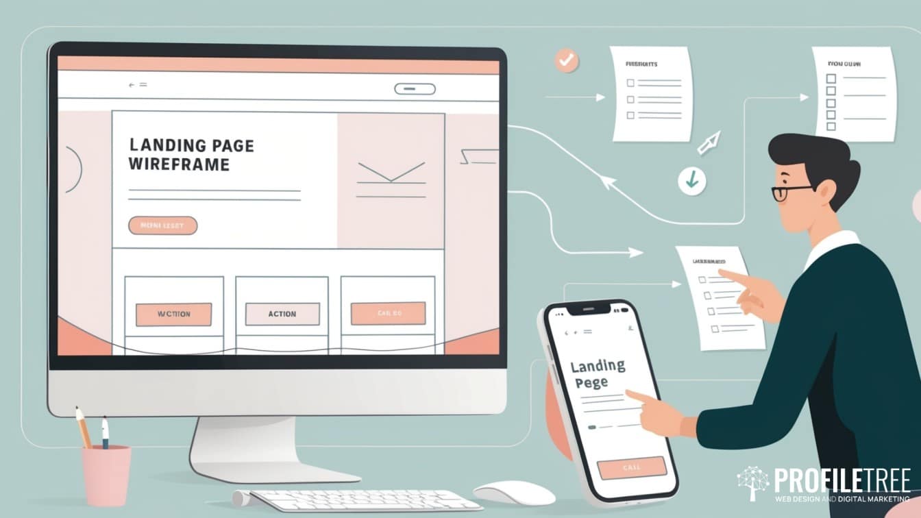
Understanding Landing Pages
A landing page is a standalone web page created specifically for a marketing or advertising campaign. It operates under fundamentally different principles from your main website. While your homepage needs to accommodate diverse visitor intentions—from existing customers seeking support to potential partners researching your company—a landing page has one singular, focused purpose: converting visitors who arrive with a specific intent.
This focused approach allows for several key advantages. First, message alignment becomes possible. When someone clicks an advertisement promising “Free Website Speed Analysis,” they expect to land on a page that delivers exactly that, not your general services overview. Second, you can eliminate distractions that might lead visitors away from your conversion goal. You also gain the ability to track and measure the performance of specific campaigns with precision.
The most effective landing pages follow what conversion specialists call the “traffic temperature” principle. Cold traffic—people who’ve never heard of your business—requires different persuasion techniques than warm traffic—those familiar with your brand. Understanding where your visitors sit on this spectrum shapes every element of your page design.
Types of Landing Pages for UK Businesses
There are distinct types of landing pages, each designed for specific marketing goals and user journeys and each suits different businesses based on their industry, business model, and target audience.
First of all, we have lead generation pages. Those are focused on capturing contact information in exchange for valuable content or consultations. These work particularly well for service-based businesses common throughout the UK market. A Manchester-based accountancy firm might create a landing page offering a “Small Business Tax Planning Checklist” to capture leads during the annual return period.
Secondly, there are product sales pages, which aim for immediate purchases and require comprehensive product information, pricing clarity, and trust signals. UK e-commerce businesses must balance persuasive copy with clear pricing that includes VAT, delivery costs, and return policies that comply with distance selling regulations.
Event registration pages have gained significant importance, especially following the shift towards digital events. Whether promoting webinars, workshops, or hybrid events, these pages must clearly communicate value while making the registration process frictionless.
Lastly, there are the service demonstration pages. Those work effectively for consultancy and agency services. Rather than asking for immediate purchase decisions, these pages encourage prospects to book discovery calls or request proposals, acknowledging the longer decision-making cycles typical of B2B services.
Conversion Psychology Fundamentals

Understanding how people make decisions online forms the foundation of effective landing page design. Cognitive psychology research reveals that users don’t carefully evaluate every element of your page. As a matter of fact, they make rapid, largely unconscious judgements based on visual cues, social proof, and emotional triggers.
The dual-process theory explains this phenomenon. System 1 thinking operates quickly and automatically, processing visual elements, recognising patterns, and making initial judgements about trustworthiness within milliseconds. Meanwhile, System 2 thinking engages in more deliberate analysis, but only after System 1 has decided the page merits attention.
This understanding shifts how we approach landing page design. Rather than simply presenting logical arguments for why someone should convert, successful pages tap into psychological triggers that influence System 1 processing while providing the rational justification that System 2 requires.
Building Trust and Credibility
UK consumers have become increasingly sceptical of online marketing claims, making trust-building essential for conversion success. Research from the Direct Marketing Association shows that 77% of UK consumers research businesses online before making purchase decisions, and 68% will abandon a transaction if they encounter trust concerns.
Social proof operates as one of the most powerful trust-building mechanisms. Customer testimonials become more credible when they include specific details about results achieved, the customer’s location (particularly relevant for local UK businesses), and their job title or company name when appropriate. Video testimonials carry even greater weight, as they’re harder to fabricate and allow prospects to connect with real people.
Professional design quality serves as a trust signal itself. A study by Stanford University found that 75% of users make credibility judgements based on visual design alone. This doesn’t mean your page needs expensive custom graphics—it means ensuring clean layouts, professional typography, consistent branding, and error-free copy.
The Psychology of Colour and Visual Hierarchy
Colour psychology plays a significant role in landing page effectiveness, though cultural context matters. In the UK market, certain colour associations carry particular weight. Blue conveys trustworthiness and stability—unsurprising given its prominence in financial services branding from Barclays to PayPal. Green suggests growth and safety, while orange and red create urgency and excitement.
That being said, colour choice must also align with your brand identity and target audience expectations. For instance, a corporate consulting firm might benefit from conservative blue and grey tones that signal professionalism, while a creative agency could use bolder colours that demonstrate innovation and personality.
Once you’ve established the right colour palette for your audience, visual hierarchy becomes the next critical consideration for it guides users through your content in a logical sequence. The F-pattern describes how users typically scan web pages—reading across the top, scanning down the left side, then reading partially across again. Effective landing pages place their most important elements (headline, key benefit, call-to-action) within this natural scanning pattern.
Ciaran Connolly, Director of ProfileTree, explains: “The most successful landing pages we’ve created for our clients don’t just look good—they understand human psychology. When we combine attractive design with strategic placement of trust signals and clear value propositions, conversion rates often double or triple compared to generic pages.
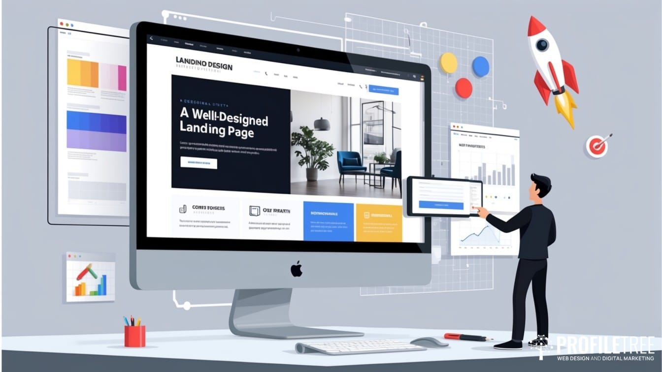
Designing Landing Pages
Understanding user psychology provides the foundation, but translating that knowledge into effective design requires mastering the specific elements that make up a high-converting landing page, with each serving a distinct purpose in guiding visitors towards conversion. Getting these elements right can mean the difference between a 2% conversion rate and a 15% conversion rate.
The following design elements work together to create a cohesive user experience that builds trust, communicates value, and motivates action.
Crafting Headlines That Convert
Your headline represents the most critical element of your landing page—it determines whether visitors stay or leave within the first few seconds. Effective headlines follow proven formulas while remaining authentic to your brand voice.
The benefit-driven headline focuses on what the visitor gains: “Reduce Your Business Energy Costs by 30% in 90 Days” immediately communicates value. The problem-solution headline addresses pain points: “Stop Losing Customers to Slow Loading Websites” connects with a common business frustration before offering a resolution.
Headlines can also be urgency-based, though they won’t work unless authentic: “Limited Spring Training Sessions for UK Small Businesses” creates scarcity without resorting to false claims. We also have number-driven headlines that provide specificity, such as “7 Proven Strategies That Helped 200+ UK Businesses Double Their Online Sales.
Testing headline variations often produces the largest conversion improvements. A property management company in Leeds increased lead generation by 127% simply by changing its headline from “Professional Property Management Services” to “Landlords: Reduce Your Stress and Increase Your Rental Income.
Designing Effective Call-to-Action Buttons
Call-to-action buttons serve as the final gateway to conversion, making their design and positioning crucial for success.
For instance, button colour should contrast sharply with the surrounding page elements while remaining consistent with your brand palette. Size matters—buttons need sufficient visual weight to draw attention without overwhelming other elements.
Button copy requires careful consideration. Generic phrases like “Submit” or “Click Here” miss opportunities to reinforce value. Action-oriented alternatives such as “Get Your Free Analysis,” “Start Your Trial,” or “Download Your Guide” remind visitors of the benefit they’ll receive.
Where you place your button should also follow the user flow naturally. Above-the-fold placement captures immediate interest, but additional buttons throughout longer pages accommodate different reading patterns. Mobile optimisation becomes particularly important—buttons must be large enough for thumb navigation and positioned to avoid accidental clicks.
Form Design and Optimisation
Your contact form stands at the crossroads of interest and conversion—it’s the final hurdle between a curious visitor and a qualified lead. Yet forms present a unique challenge: you need information to follow up effectively, but every additional field you add increases the chance that visitors will abandon the process entirely.
Smart form design follows the principle of progressive disclosure. Rather than overwhelming visitors with lengthy questionnaires upfront, start with the bare minimum and build the relationship gradually. Think of it as a conversation—you wouldn’t ask someone’s budget and company details within minutes of meeting them, so why do it on your landing page?
The key lies in balancing conversion rates with lead quality. A B2B software startup may genuinely need company size and budget information to avoid wasting time on unqualified prospects. However, an online retailer building their newsletter list can capture email addresses first, then gather preferences and demographics through welcome series emails or customer accounts.
Speaking of form completion rates, small details can make substantial differences. Mobile users find top-aligned labels easier to navigate, while desktop users often complete left-aligned forms more quickly, particularly when dealing with familiar industry terminology. Placeholder text works best as helpful examples rather than replacing clear labels entirely. A field showing “Enter your business email” as a label with “sarah.jones@company.co.uk” as placeholder text removes any guesswork.
When visitors do make mistakes—and they will—your error handling can either rescue the conversion or kill it completely. Real-time validation catches issues immediately, allowing users to fix problems without losing momentum. But generic error messages like “Invalid email” frustrate users who don’t understand what went wrong. Compare that with “Please enter a valid email address (example: name@company.co.uk)”—suddenly, the user knows exactly how to proceed.
Building Social Proof and Trust Signals
Generic testimonials fall flat because they sound like marketing fluff. The testimonials that actually convert address real concerns your prospects face.
Instead of “Great service,” showcase specific results: “ProfileTree’s team redesigned our website in just three weeks, and we saw a 40% increase in online enquiries within the first month. Their project management kept everything on track despite our tight deadline.” This addresses timing concerns, proves results, and demonstrates reliability—exactly what nervous prospects need to hear.
Your professional credentials matter more than you might think. UK business owners recognise logos from the Institute of Directors, their local Chamber of Commerce, or industry-specific bodies. These aren’t just decorations—they’re instant credibility boosters that reassure visitors about your legitimacy and expertise.
For B2B services, nothing beats the power of familiar names. When prospects spot customer logos from companies they recognise or businesses similar to theirs, they can suddenly picture themselves working with you. Just remember to get permission before displaying any customer branding—trust works both ways.
Security badges also transform from nice-to-have to absolutely essential when you’re handling personal information. SSL certificates, payment processor logos, and privacy certifications aren’t just technical requirements—they’re the digital equivalent of a firm handshake, helping visitors feel confident about sharing their sensitive data.
Technical Performance Optimisation
Beautiful designs mean nothing if your landing page can’t deliver a smooth user experience. While visitors focus on your content and messaging, technical performance issues work silently in the background, either supporting your conversion goals or sabotaging them entirely. The technical foundation of your landing page often determines whether campaigns succeed or fail, making optimisation a critical investment in your marketing success.
Page Speed and Core Web Vitals
Page loading speed directly impacts conversion rates and search engine rankings. Google’s research reveals a stark truth: bounce rates jump by 32% when loading time creeps from one to three seconds. For UK businesses fighting for local search visibility, this matters even more—Core Web Vitals now directly influence your ranking position.
Google measures three critical performance markers that determine user experience quality. Largest Contentful Paint (LCP) tracks how quickly your main content appears—aim for 2.5 seconds or less. First Input Delay (FID) measures responsiveness—your page should react to clicks within 100 milliseconds. Cumulative Layout Shift (CLS) ensures visual stability, preventing annoying content jumps that frustrate users mid-interaction.
Images typically offer the biggest wins for speed improvements. Modern formats like WebP deliver superior compression without sacrificing visual quality, while lazy loading ensures images below the fold only download when visitors actually scroll to them, instantly reducing initial load times.
Behind the scenes, technical optimisation continues with critical CSS inlining, which embeds essential styles directly into your HTML instead of requiring separate downloads. Meanwhile, minifying your CSS and JavaScript strips out unnecessary characters and comments, shrinking file sizes without touching functionality.
Mobile Responsiveness and Touch Optimisation
With mobile traffic dominating over 60% of UK web browsing, mobile optimisation has shifted from nice-to-have to business-critical. Responsive design gets you started by adapting to different screen sizes, but winning mobile conversions demands deeper attention to user behaviour.
Think thumbs, not cursors. Your buttons and links need at least 44 pixels of height and width—anything smaller becomes a frustrating target for thumb navigation. Equally important is spacing between clickable elements, preventing those annoying accidental taps that send users to the wrong page and straight to your competitors.
Mobile users approach content differently from desktop visitors. They’re impatient, distracted, and scroll-happy, which means your mobile-first content hierarchy must front-load the most critical information. Key benefits and conversion elements can’t hide below the fold—they need prime real estate at the top of the screen.
Forms deserve special mobile treatment beyond basic responsiveness. Smart input types automatically trigger the right keyboards—email fields bring up the @ symbol, phone fields show numbers, making completion effortless. Single-column layouts eliminate horizontal scrolling frustrations, while longer forms work better as multi-step processes that feel manageable rather than overwhelming.
Search Engine Optimisation for Landing Pages
While mobile optimisation ensures visitors can use your landing page effectively, SEO determines whether they can find it in the first place. Landing pages create unique SEO puzzles—especially for paid campaigns where you might actually want to hide pages from search engines to maintain exclusivity.
For organic traffic landing pages, traditional SEO rules apply with a focused twist. Your keyword strategy should laser-target the specific terms driving your campaign. A Manchester digital marketing agency wouldn’t scatter generic SEO terms everywhere—they’d concentrate on “local SEO Manchester” and “Manchester SEO services,” weaving these precise variations throughout their content.
Meta descriptions work differently for landing pages than for typical web pages. Instead of broad appeal, they need surgical precision, aligning perfectly with your advertisement copy or social media posts. This consistency prevents the jarring disconnect that kills conversions when visitors feel they’ve landed on the wrong page.
Internal linking, too, becomes a delicate balancing act. Too many outbound links scatter attention and undermine your conversion focus, but strategic links to supporting content can provide the extra information hesitant prospects need. The trick lies in offering depth without creating escape routes from your primary goal.
Accessibility and Inclusive Design
Just as SEO makes your content discoverable, accessibility makes it usable for everyone, and smart businesses recognise this expands their potential customer base. The Web Content Accessibility Guidelines (WCAG) set standards that help people with disabilities use websites effectively, and UK businesses increasingly face expectations to comply.
Colour contrast ratios form accessibility’s foundation—your text and background combinations must provide sufficient contrast for users with visual impairments. While automated tools can flag obvious problems, real validation comes from testing with actual users who experience these challenges daily.
Alt text transforms images from barriers into bridges. These descriptions help screen readers convey visual content to visually impaired users, provide context when images fail to load, and boost your SEO through image search results. The key lies in describing the image’s purpose within your landing page context, not just what it shows.
Keyboard navigation ensures your page works for users who can’t rely on a mouse. This means creating logical tab order through forms and clickable elements, providing visible focus indicators so users know where they are, and including keyboard shortcuts for essential actions. Good accessibility often signals good overall user experience design.
Testing and Continuous Improvement
Creating a technically sound, well-designed landing page is just the beginning—the real magic happens when you start testing and refining based on actual user behaviour. Even the most experienced designers and marketers can’t predict exactly how visitors will respond to different elements, making systematic testing your most reliable path to higher conversions.
A/B Testing Fundamentals
A/B testing removes guesswork from landing page optimisation by comparing different versions with real user behaviour data. But effective testing isn’t as simple as changing a button colour and hoping for the best—it demands proper setup, statistical rigour, and systematic thinking to avoid costly mistakes.
Smart testing starts with impact potential, not random changes. Headlines, call-to-action buttons, and form fields consistently deliver the biggest conversion wins because they directly influence user decisions. Testing minor details like font choices or button corners might feel productive, but it’s often busy work that delays testing the elements that actually move the needle.
Sample size determines everything about test reliability. Online calculators help you figure out how many visitors you need based on your current conversion rate and the improvement you’re trying to achieve. Cut testing short and you’ll get unreliable data that leads to bad decisions. Run tests too long and you’re wasting time that could generate real improvements elsewhere.
Here’s where many businesses stumble: statistical significance doesn’t automatically mean business significance. Your test might show statistically valid results with a 2% conversion improvement, but if implementation costs exceed the revenue gain, you’ve proven something worthless. Always weigh both statistical confidence and practical business impact before making changes.
Advanced Testing Strategies
Once you’ve mastered basic A/B testing, multivariate testing lets you test multiple elements simultaneously, revealing how different components work together. The catch? These tests demand significantly more traffic to reach statistical significance and can quickly become nightmarishly complex to interpret, making them suitable only for high-traffic sites.
For businesses with limited traffic, sequential testing offers a smarter alternative. Instead of splitting visitors across multiple variations, you run focused A/B tests one after another, using each result to inform your next experiment. This approach builds knowledge systematically without requiring massive visitor volumes.
The most sophisticated testing strategy recognises that your audience isn’t homogeneous. Segmented testing treats mobile users differently from desktop visitors, new prospects differently from returning customers, and social media traffic differently from search visitors. This granular approach often uncovers optimisation gold that broad testing completely misses—like discovering your mobile users respond to different headlines than desktop users, or that social media traffic converts better with video content.
Conversion Rate Analysis and Attribution
Smart analytics go beyond simple conversion counting to map the entire user journey leading to success. By understanding which traffic sources, page elements, and user behaviours consistently correlate with higher conversions, you build a roadmap for future optimisation that’s based on patterns, not guesswork.
The reality of modern customer journeys makes attribution modelling essential. Today’s prospects rarely convert on their first visit—they might discover you through a Facebook advertisement, research you later via organic search, then finally convert after receiving your follow-up email. Without understanding these multi-touch pathways, you’re optimising in the dark and potentially killing the traffic sources that actually drive conversions.
Numbers tell you what happened, but heat mapping and user session recordings show you why. Watching real users interact with your page—seeing exactly where they click, how far they scroll, and where they get stuck—reveals optimisation opportunities that conversion data completely misses. That abandoned form might have a confusing label, or users might be clicking non-clickable elements, expecting them to work.
Measuring Success and ROI
The comprehensive analytics foundation we’ve established enables you to measure what truly matters for business growth—not just conversion rates, but the metrics that impact your bottom line. Cost per conversion, customer lifetime value, and lead quality scores paint the complete picture of campaign effectiveness that conversion rates alone completely miss.
UK businesses face fierce competition, making competitive benchmarking essential for realistic expectations. Industry-specific conversion rate data varies dramatically by sector, but understanding these baselines prevents the frustration of chasing impossible targets or settling for mediocre performance when better results are achievable.
True ROI calculation demands accounting for the full investment picture. Direct costs like advertising spend and development fees are obvious, but indirect costs—time spent on creation and optimisation, opportunity costs of alternative approaches—often dwarf the visible expenses. Only a comprehensive ROI analysis tells you whether your landing page investments actually contribute to business growth.
Regular performance reviews transform data into strategic intelligence. Seasonal patterns emerge that inform future planning—retailers might discover certain elements work better during holiday periods, while B2B service providers often find that decision-making timelines shift throughout the year, affecting optimal follow-up sequences and conversion strategies.
Conclusion
Successful landing page design combines strategic thinking, user psychology, and systematic optimisation into powerful conversion engines. Start by auditing your current pages against these proven principles, identifying the biggest improvement opportunities available to you. Quick wins like headline testing or mobile optimisation deliver immediate results while you develop comprehensive strategies incorporating psychological triggers, accessibility standards, and advanced testing methods successfully.
Landing page optimisation requires ongoing commitment, not one-time fixes or solutions. Market conditions evolve, user expectations shift, and new technologies create fresh opportunities for engagement. Businesses that consistently outperform competitors maintain continuous improvement based on real user data rather than assumptions. This systematic approach delivers reduced customer acquisition costs, improved campaign ROI, and sustainable business growth that compounds over time.
Here’s a landing page services section following that format:
Ready to Transform Your Landing Pages into Conversion Powerhouses?
Don’t let competitors capture the customers your business deserves. Whilst they’re using generic web pages and hoping for conversions, you could be deploying strategically designed landing pages that turn visitors into customers through proven psychological triggers and technical excellence.
We make high-converting landing page creation straightforward and results-focused. Our integrated approach handles every aspect of your landing page transformation—from initial conversion strategy and compelling copywriting to technical optimisation and ongoing performance analysis—ensuring each page aligns with your broader marketing objectives.
Get your landing page consultation today.Contact ProfileTree to discuss how conversion-optimised landing pages can transform your marketing ROI. We’ll analyse your current campaigns, identify conversion opportunities, and provide a clear implementation roadmap that turns your digital marketing spend into measurable business growth.
Call us on 028 9568 0364 or email hello@profiletree.com to schedule your consultation.