
Best Practices for Better Form Design: A Practical UX Guide
Table of Contents
A form is often the last thing standing between a visitor and a sale, an enquiry, or a sign-up. Get it wrong, and people give up: abandonment rates climb as high as 60% when a form feels long, unclear, or fiddly on a phone. Get it right, and the same form barely registers, because the user just finishes it and moves on. This guide covers the best practices for better form design that reduce friction, from field count and labelling through to validation, mobile, and accessibility.
Most of these fixes are cheap to make and obvious in hindsight. If you would rather have them built in from the start, ProfileTree’s website design services treat forms as a conversion point, not an afterthought bolted on at the end.
Why Form Design Decides Whether Visitors Convert
A form is where intent turns into action, so its design has a direct line to revenue. A visitor who wanted to buy or enquire can still walk away if the form gets in the way. That makes form design a commercial concern, not a cosmetic one.
What a Poorly Designed Form Costs You
Long forms, vague error messages, and missing labels all push abandonment up. Studies put abandonment as high as 60% on forms that overwhelm people. Beyond the lost lead, a clunky form makes a business look dated, which feeds straight into how visitors judge the whole brand. The Baymard Institute’s research on checkout usability tracks this in detail and is worth a read if you run e-commerce.
The Most Common Form Types
Contact, registration, checkout, survey, and login forms each have a different job, so each needs a slightly different approach. A contact form should stay minimal. A checkout form should reduce cart abandonment at every step. Matching the design to the job is the starting point for everything that follows.
Core Best Practices for Better Form Design
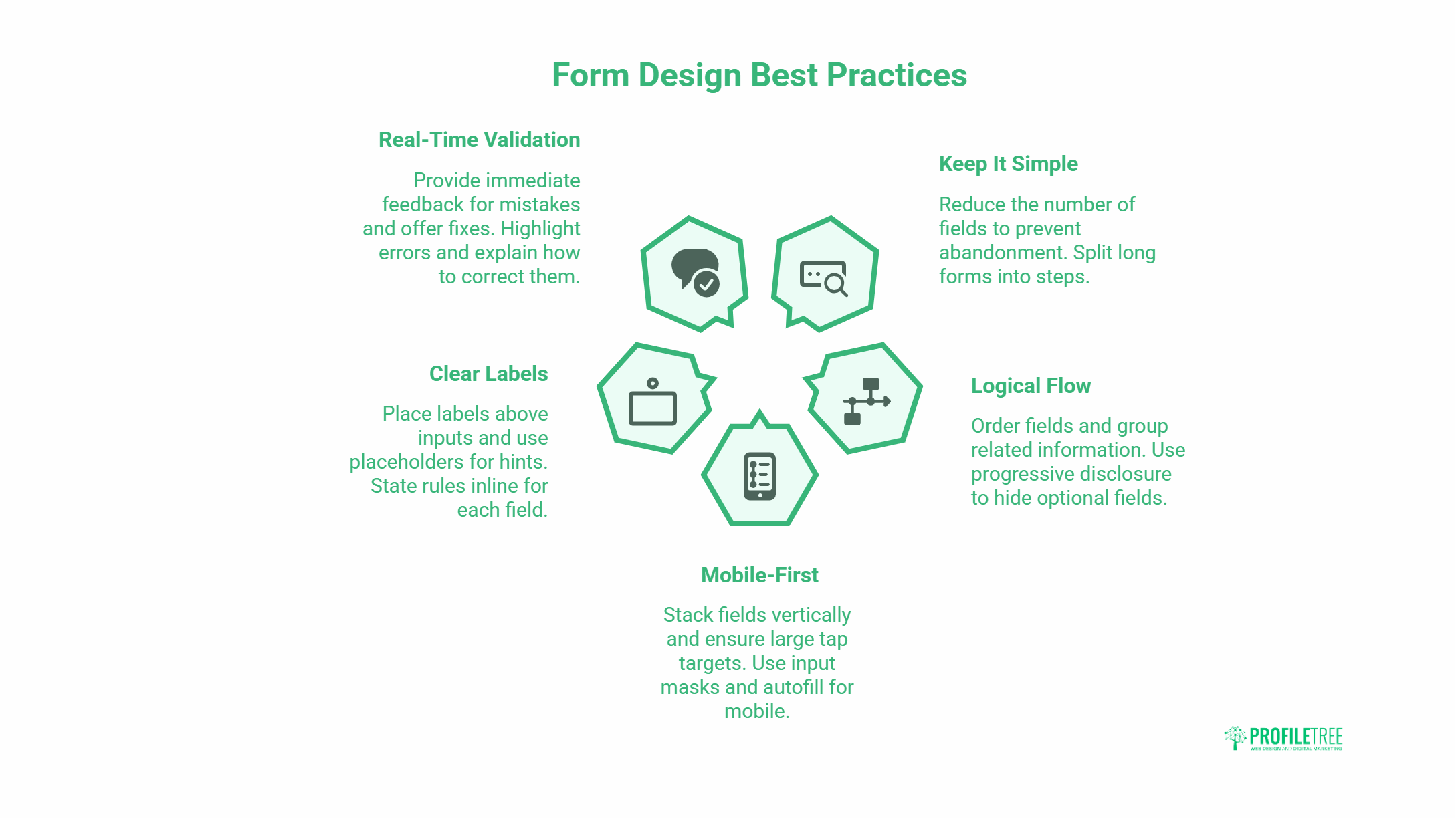
Five principles do most of the heavy lifting: keep it short, order it logically, design mobile-first, label clearly, and validate in real time. The sections below take each in turn.
Keep It Simple and Cut Fields
Every extra field is a reason to abandon. Before adding one, ask whether you genuinely need that information at this stage. A sign-up rarely needs a full postal address; email and password usually suffice. Where a form must be long, split it into clear steps (Shipping, Payment, Review) so progress feels manageable rather than endless.
Use Logical Flow and Grouping
Order fields the way people expect: street, city, county, postcode; first name, then last name. Group related fields under clear headings such as Personal Details or Payment. Progressive disclosure helps too: hide optional fields behind a checkbox (“Shipping to a different address?”) and reveal them only when needed. The form stays clean without losing flexibility.
Design Mobile-First
Most web traffic is mobile, and most failing forms fail on a phone. Stack fields vertically rather than side by side. Make tap targets at least 48 by 48 pixels with space between them. Add input masks (a phone field that formats as you type) and autofill for addresses to cut typing on a small keyboard. This sits inside a broader website development, since responsive form behaviour is a build decision as much as a design one.
Label Clearly and Place Labels Above Fields
Put labels above inputs, not inside them as placeholders. Placeholder-only labels vanish the moment someone starts typing, which causes confusion and errors. Keep a label like “Email address” visible, and use a placeholder only as a format hint. Where a field has rules, state them inline: “Password (at least 8 characters, one number).”
Validate in Real Time With Helpful Errors
Tell people about a mistake as they make it, not after they submit. Place the error next to the field, highlight the field itself, and say what to do: “Please enter a valid email address” beats “Invalid input.” Where you can, offer a fix, such as suggesting an alternative username when the chosen one is taken.
Quick reference: the fix, the problem it solves, and why it matters:
| Best practice | Problem it solves | Impact |
| Fewer fields | Form feels too long | Lower abandonment |
| Labels above fields | Users forget what to enter | Fewer errors |
| Real-time validation | Mistakes found too late | Faster completion |
| 48px tap targets | Mis-taps on mobile | Mobile usability |
| Logical grouping | Cluttered, confusing layout | Easier to scan |
| Clear confirmation | Uncertainty after submit | Trust and reassurance |
“The quickest win on most client forms isn’t a redesign, it’s deletion. Every field you remove lifts completion. We’ve taken eight-field contact forms down to three and watched enquiries jump, because the form stopped feeling like work.”
Ciaran Connolly, founder of ProfileTree
Building Accessible Forms
An accessible form is one anyone can complete, including people using a keyboard or screen reader. It is also a legal and reputational concern. The W3C WCAG guidelines set the standard most organisations aim for.
Keyboard Navigation and Focus Order
Every field, button, and dropdown must be reachable with the Tab key, and the order should follow the visual flow of the form. A logical focus order stops keyboard users from getting lost or trapped halfway through.
ARIA Attributes and Screen Readers
ARIA attributes give screen readers the context that sighted users get from layout. Mark required fields, associated error messages with their field, and announced real-time validation so it is heard as well as seen. Errors should never rely on colour alone.
Contrast and Readable Labels
Light grey text on white fails too many readers. Keep a high contrast ratio between text and background, and use real labels rather than placeholders, which screen readers handle poorly. Accessibility and general usability tend to improve together.
Testing and Optimising Your Forms
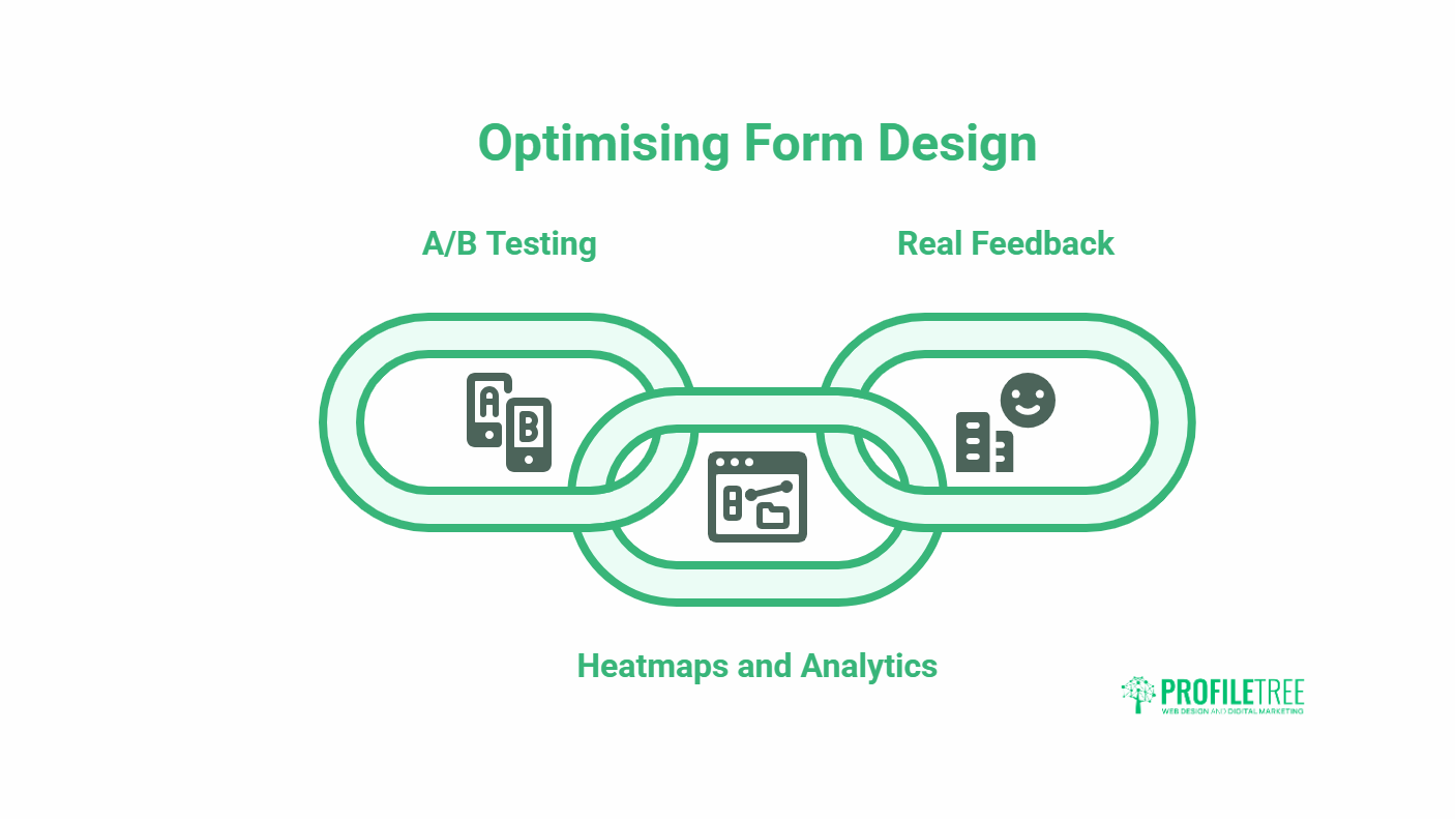
A form is never finished. The data your visitors generate tells you exactly where they struggle, and small, evidence-led changes compound over time. Treat optimisation as ongoing, not a one-off.
Run A/B Tests on the Variables That Matter
Test one change at a time: form length, button wording (“Sign up” versus “Get started”), inline versus pop-up errors, and optional versus required fields. Let the results, not opinion, decide what ships.
Use Heatmaps and Form Analytics
Heatmaps and tools that record field-level drop-off show where people hesitate or quit. If everyone abandons at the same field, that field is the problem. This kind of behavioural insight pairs naturally with search engine optimisation, since the traffic you work hard to earn is wasted if the form at the end leaks it.
Iterate on Real Feedback
Surveys, usability tests, and feedback widgets surface issues that analytics alone miss. Review forms regularly against current expectations, and keep the changes small and measurable so you can tell what actually worked.
Common Form Design Mistakes That Quietly Cost Conversions
Most underperforming forms aren’t broken in any obvious way. They lose people through small, repeatable mistakes that feel minor in isolation but add up across every visitor. Fixing these often matters more than any redesign, because the form is already close and just leaking at the edges.
Asking for Information Too Early
A common error is front-loading a form with everything the business might eventually want to know. Phone number, company size, job title, budget: all requested before the visitor has any reason to trust you with it. Each premature field gives someone a reason to close the tab. Ask only for what you need to take the next step, and gather the rest later once a relationship exists. A first contact form rarely needs more than a name, an email, and a short message.
Treating Required Fields as the Default
When almost every field carries an asterisk, people start abandoning rather than hunting for the one optional box they can skip. Flip the assumption: make fields optional unless they are genuinely essential to the task. Marking the few truly required fields, rather than the many you would prefer, keeps the form short in the user’s eyes even when it isn’t.
Vague or Punishing Error Messages
An error that simply says “Invalid input” tells the user they failed without telling them how to recover. Worse still are forms that wipe everything the moment one field is wrong. Errors should name the field, explain the rule, and preserve everything the person already typed. A message like “Please enter a date as DD/MM/YYYY” does the job; “Error” does not.
Forgetting the Post-Submit Moment
Plenty of forms nail the input experience and then go silent at the finish line. A submission with no confirmation leaves people wondering whether it worked, and some will resubmit or give up. Always close the loop: a clear success message, a sensible next step, and an email confirmation for anything important, like an order or a booking.
How Form Design Connects to the Rest of Your Site
A form never works in isolation. It sits at the end of a journey that began with an advert, a search result, or a social post, and it inherits all the expectations built up along the way. Treating the form as a standalone element, rather than the final step of a wider experience, is why so many otherwise good forms still underperform.
Match the Form to the Traffic Source
Someone arriving from a focused search query has different patience than someone who clicked a curiosity-driven social post. A high-intent visitor will tolerate a slightly longer form because they came to act; a casual one needs the lightest possible ask. Aligning form length and tone with where the traffic comes from is part of a joined-up digital strategy rather than a guess made in isolation.
Keep the Visual Language Consistent
Buttons, spacing, colours, and field styles on the form should match the rest of the site. When a form looks like it was bolted on from a different template, trust drops at the exact moment you are asking for it. Consistent design signals that the same careful hands built the whole journey, which matters most on payment and sign-up steps, where hesitation is costly.
Feed Form Data Back Into Your Content
The questions people ask, the fields they hesitate over, and the messages they send through contact forms are a steady source of real audience language. That insight should shape your wider content rather than sitting unused in an inbox, which is where form performance overlaps with content marketing services. The words your customers use to describe their problem are usually the words that convert them.
Turning Better Forms Into Better Results
Better form design comes down to respect for the user’s time: ask for less, label it clearly, catch errors early, and make it work on a phone. These changes are usually quick and almost always pay back in completed forms. If you want them built into a site that also loads fast and ranks, ProfileTree’s Belfast web design team can handle it end-to-end. Talk to us about your project.
Frequently Asked Questions
What are the best practices for designing website forms for usability?
Keep fields to a minimum, label each one clearly above the input, validate in real time, group related fields logically, and design mobile-first with large tap targets. Together, these cut abandonment and speed up completion.
How do I improve UX with real-time form validation?
Check input as the user types and show feedback immediately beside the field, not after submission. Use specific messages like “Please enter a valid email address” and highlight the field so the problem is easy to find and fix.
How many fields should a form have?
As few as the task genuinely requires. Ask whether you need each piece of information at this stage; if not, drop it or collect it later. A sign-up often needs only email and password.
Should labels go inside or above form fields?
Above the field. Placeholder text inside an input disappears once typing starts, which causes confusion and errors. Keep a visible label and use placeholders only as format hints.
Why do users abandon online forms?
Usually, because the form is too long, the instructions are unclear, errors are vague, or it is awkward on mobile. Abandonment can reach 60% on forms that overwhelm people, so reducing friction is the priority.