Mobile Optimisation for Online Stores: A Practical Guide
Table of Contents
Mobile optimisation is no longer a nice-to-have for online stores; it is the difference between a sale and an abandoned cart. More than 70% of UK e-commerce traffic now arrives through smartphones and tablets, yet most stores still deliver an experience that was designed for a desktop screen. Poor mobile optimisation means slow load times, awkward navigation, and checkout processes that frustrate users before they reach payment. The result is predictable: lost revenue and lower search rankings.
At ProfileTree, a Belfast-based web design and digital marketing agency, we have spent over a decade helping businesses across Northern Ireland, Ireland, and the UK improve their mobile performance. The patterns we see are consistent: stores that treat mobile optimisation as a technical checkbox miss the bigger picture. It is a commercial strategy, and when it is done properly, it drives measurable gains in traffic, dwell time, and conversions.
This guide covers the practical foundations of mobile optimisation for online stores, from responsive design and page load speed through to AI search visibility and conversion-focused UX. Whether you run a small WooCommerce store in Belfast or a Shopify site serving customers across the UK, the principles here apply directly.
Understanding Mobile User Behaviour

Before you can improve mobile optimisation, you need to understand what mobile shoppers actually do. Mobile users behave differently from desktop users in ways that have direct implications for how you build and structure your store.
How Mobile Shoppers Think and Browse
Mobile shoppers tend to browse in short, focused sessions. They are often multitasking, commuting, or shopping during a brief break. Attention is scarce, and patience for a slow or confusing interface is even scarcer. Research consistently shows that mobile users will abandon a page that takes more than three seconds to load, and that abandonment rate climbs steeply with every additional second.
For UK stores, mobile search intent is increasingly local and high-urgency. Queries like “order online Belfast” or “same-day delivery Northern Ireland” spike on mobile and are tied to immediate purchase intent. A well-considered digital strategy for your online store should map these micro-moment behaviours and ensure your pages are positioned to capture customers at the exact moment they are ready to buy.
Adapting to Different Screen Sizes and Devices
The range of devices accessing your store is wider than ever. A responsive design that stretches a desktop layout onto a phone is not the same as a store built for mobile from the ground up. Mobile optimisation requires that every element, buttons, images, menus, and product cards, adapts to the device the customer is actually using.
Modern responsive design uses CSS container queries and fluid grids rather than fixed breakpoints. A product card should adjust its layout based on the space it occupies, not just the screen width. This distinction matters for stores where product listings appear in sidebars, category grids, and full-width slots on the same site. This is one of the areas where investing in professional web design for your e-commerce site pays dividends: a developer building mobile-first from scratch produces a far more stable and performant result than retrofitting an existing desktop template.
Core Technical Pillars of Mobile Optimisation
The technical foundations of mobile optimisation are not glamorous, but they are the most direct levers you have for improving both user experience and search visibility. Google’s mobile-first indexing means the mobile version of your store determines your rankings, regardless of how your desktop site performs.
Page Load Speed and Core Web Vitals
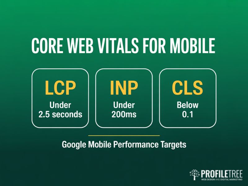
Page speed is the single most impactful technical factor in mobile optimisation. Slow pages lose users, and they lose rankings. Google’s Core Web Vitals framework gives you specific, measurable targets: Largest Contentful Paint (LCP) under 2.5 seconds, Cumulative Layout Shift (CLS) below 0.1, and Interaction to Next Paint (INP) under 200 milliseconds.
INP replaced First Input Delay in 2024 and measures the responsiveness of all interactions across a page visit, not just the first tap. For mobile stores on UK 4G and 5G networks, where connection quality varies, a high INP score means a customer taps “Add to Basket” and nothing happens for a full second. That is a conversion killer. Reducing INP requires breaking up long JavaScript tasks, optimising event handlers, and ensuring visual feedback appears within 200ms of any user action.
| Metric | Good Score | Impact on Mobile Stores |
|---|---|---|
| LCP (Largest Contentful Paint) | Under 2.5 seconds | Hero image and product load speed |
| INP (Interaction to Next Paint) | Under 200 milliseconds | Button responsiveness and tap feedback |
| CLS (Cumulative Layout Shift) | Below 0.1 | Page stability during product browsing |
Image and Video Optimisation
Images and videos are the largest files on most product pages, and they are the first place to look when page speed is suffering. The priority in mobile optimisation is serving the right image at the right size for the device. A 2,000-pixel hero image scaled down to a 400-pixel phone screen wastes bandwidth and slows loading with no visual benefit.
AVIF format now offers up to 30% better compression than WebP at equivalent visual quality, making it the current best choice for product photography on mobile. Pair this with lazy loading, which defers images until they enter the viewport, and you can cut initial page weight dramatically. If you are producing product video content for your store, combining strong visual production with optimised delivery formats gives you both higher engagement and faster load times on mobile.
Browser Caching and Code Streamlining
Browser caching stores static assets locally on a visitor’s device so they do not need to be re-downloaded on each visit. Setting appropriate cache expiry times on stylesheets, scripts, and images reduces load time significantly for returning customers, who are often the most valuable segment for any online store.
Minifying CSS, JavaScript, and HTML removes unnecessary characters and whitespace without changing functionality. Combining multiple scripts into a single file reduces the number of HTTP requests a browser needs to make. If your store runs on WordPress, these improvements are often handled as part of a website development and performance programme rather than one-off fixes, because the underlying build quality determines how well caching and minification work in practice.
Mobile-First Design: Navigation and Thumb Zones
Mobile optimisation demands a genuine mobile-first approach, not a desktop design that has been squeezed onto a smaller screen. As smartphone screens have grown larger, the area comfortably reachable by a user’s thumb has shrunk relative to the display, and this has direct implications for where you place critical controls.
Primary navigation placed at the top of a 6.5-inch screen sits in the hardest-to-reach zone for most users. Shifting key actions, including the basket, search, and account menu, to a bottom navigation bar significantly reduces friction. All touch targets should be at least 44 by 44 pixels. This meets both Google’s recommendation and the WCAG 2.2 accessibility standard, which is increasingly relevant for UK businesses under the Equality Act. According to Google’s own web performance documentation, meeting these thresholds consistently is one of the clearest signals of a site built for real users rather than benchmarks.
Checkout and Conversion: Where Mobile Optimisation Pays Off
The checkout process is where mobile optimisation has the most direct impact on revenue. A store can have excellent product pages and fast loading times but still lose sales if the checkout flow was not built for a mobile screen.
Streamlining the Mobile Checkout Process
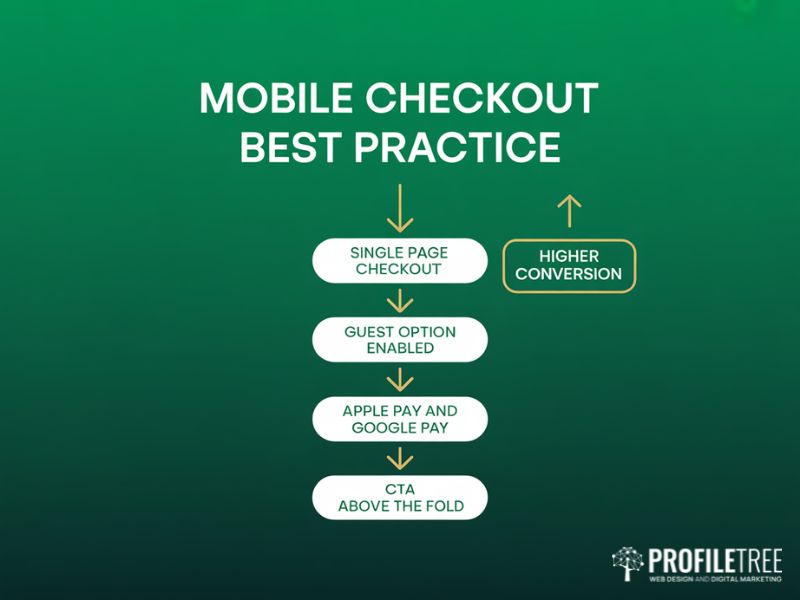
A multi-step checkout is one of the most common reasons mobile shoppers abandon their purchase. Each additional screen is an opportunity to lose them. A single-page checkout, where payment details, delivery address, and order summary are visible without switching between steps, reduces this friction considerably. Guest checkout options remove another barrier; forcing account creation before purchase is a particular irritant for mobile users mid-session.
For UK stores, offering Apple Pay and Google Pay alongside standard card entry is now expected by a significant share of mobile shoppers. These methods complete in two taps and remove the need to type card details on a small screen. Pairing a streamlined checkout with SEO services that drive qualified mobile traffic means you are filling a well-optimised funnel rather than sending high-intent visitors to a checkout that loses them at the final step.
Effective Call-to-Action Design on Mobile
On a desktop, a prominent call-to-action button competes with relatively little surrounding content. On mobile, every element is fighting for a narrow strip of screen space. Mobile optimisation of your CTAs means making them large, clearly labelled, and positioned within the thumb-friendly zone of the display.
Action-oriented labels such as “Add to Basket” or “Buy Now” consistently outperform vague labels like “Proceed” in mobile conversion testing. Contrasting colours that make the button visible against the product image or background are equally important. Placing the primary CTA above the fold on a product page, visible without scrolling, is a basic requirement of good mobile optimisation that many stores still get wrong.
Facilitating Product Search on Mobile
The search bar is the most important navigation tool for mobile shoppers who know what they want. It needs to be immediately accessible, pinned to a visible location rather than hidden behind a menu. Predictive search that surfaces results as the user types removes the need to finish spelling a product name on a small touchscreen keyboard.
Personalised search results weighted on previous browsing or purchase history further improve the experience for returning customers. This is not a feature exclusive to large retailers; WooCommerce and Shopify both support plugin-based search personalisation that is accessible to SMEs.
Mobile SEO and AI Search Visibility
Mobile optimisation and SEO are inseparable. Google’s mobile-first indexing means your mobile experience is your search engine performance. But the landscape has shifted further: AI-powered search results now occupy a significant portion of the mobile screen, changing how organic rankings translate into clicks.
Mobile SEO Best Practices for Online Stores
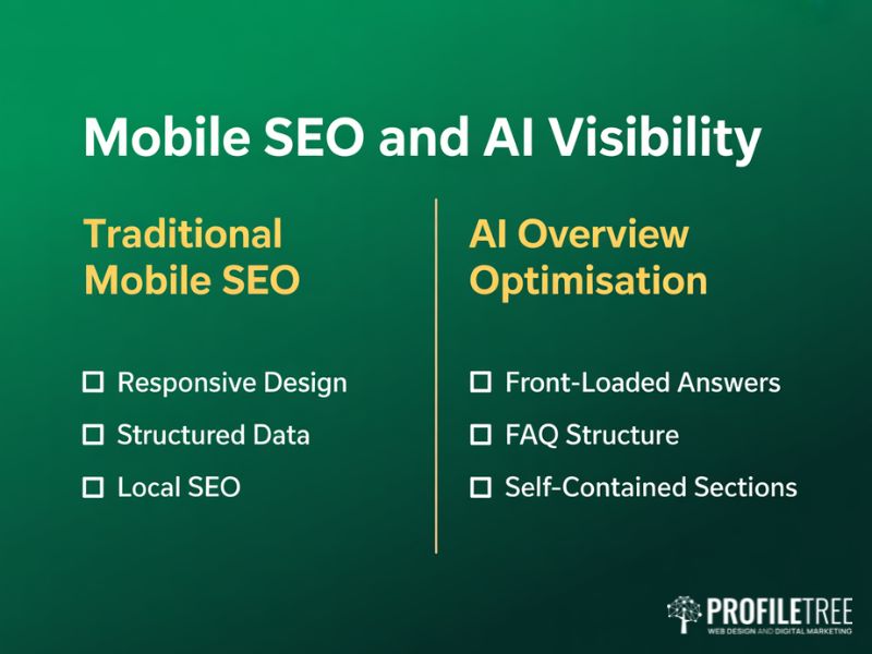
Responsive design is the technical foundation of mobile SEO. A single URL that serves an adapted layout across all devices is simpler to maintain and easier for Google to index than separate mobile and desktop URLs. Structured data markup, including Product schema with price, availability, and review data, helps Google understand your product pages and can produce rich results in mobile search that improve click-through rates.
Local SEO matters more for mobile than for any other channel. Mobile searches with local intent, including queries like “web design Belfast” or “digital marketing Northern Ireland,” have high purchase intent and are growing steadily. For UK stores with a physical presence or a defined service area, a strong content marketing strategy that targets locally relevant queries is one of the most cost-effective ways to build mobile search visibility over time.
Avoid intrusive pop-ups and interstitials on mobile. Google penalises pages that use full-screen overlays blocking content on mobile devices. UK stores that use cookie consent banners, a legal requirement under ICO guidance, need to implement them as footer-docked strips rather than full-screen takeovers. The banner must be dismissible with a single tap and must not cause layout shift when it loads.
AI Overviews and Mobile Search Visibility
AI Overviews in Google Search now occupy the majority of the initial mobile viewport on many queries. On a smartphone screen, the AI-generated response can fill 80% of what the user sees before they scroll. This changes the calculus for mobile optimisation: being in position one organically is valuable, but getting your content cited within an AI Overview is equally important.
Pages cited in AI Overviews almost always rank in the top 20 organic results for that query. AI systems also favour content structured for extraction: clear question-and-answer patterns, self-contained sections that make sense out of context, and front-loaded answers that deliver the key point in the first sentence. Businesses looking to maximise visibility across AI-powered search surfaces should explore how AI marketing and automation tools can support both content structuring and performance monitoring across these new search environments.
As Ciaran Connolly, founder of ProfileTree, puts it: “The stores that will win mobile search over the next three years are the ones that write for both people and AI parsers. Short paragraphs, direct answers, structured data, and fast loading times serve both audiences simultaneously.”
Voice Search and Conversational Queries
Voice search is a mobile-native behaviour, and it continues to grow in the UK. Voice queries tend to be longer and more conversational than typed searches. A mobile user might type “running shoes Belfast” but ask their phone “where can I buy running shoes near me in Belfast?” Mobile optimisation for voice search means including question-based content, FAQ sections with direct answers, and natural language phrasing that matches how people actually speak.
Testing and Continuously Improving Mobile Optimisation

Mobile optimisation is not a project you complete and move on from. Devices change, browsers update, user expectations shift, and your product catalogue grows. The stores that maintain strong mobile performance over time are the ones that build a culture of testing and iteration.
A/B Testing on Mobile
A/B testing compares two versions of a page element to determine which performs better against a defined goal, such as reducing bounce rate or increasing add-to-basket clicks. For mobile optimisation, effective tests are focused and specific. Test one change at a time: the position of the CTA button, the size of product images, the number of checkout steps, or the layout of the navigation menu.
Run tests long enough to gather statistical significance before drawing conclusions. A test run over a weekend may not reflect typical weekday behaviour, and UK public holidays can skew results. Aim for at least two weeks and a minimum of 500 sessions per variant before declaring a winner.
Using Real User Data to Improve Mobile Experience
Analytics tools including Google Search Console, Google Analytics 4, and Hotjar provide direct insight into how mobile users are interacting with your store. Search Console shows which queries bring mobile users to your site and at what position. Heatmaps and session recordings show exactly where users tap, scroll, and drop off. For teams that want to interpret this data confidently in-house, our digital training programmes cover analytics, SEO, and content strategy in practical, business-focused sessions.
User feedback through post-purchase surveys and on-site feedback forms adds qualitative context to the quantitative data. When analytics shows high drop-off on the payment screen, a simple survey question can surface the specific friction point that the numbers alone cannot identify.
Social Media Integration and the Mobile Shopping Journey

Social media and mobile commerce are closely linked. A significant share of product discovery happens on social platforms, and the journey from discovery to purchase is often completed entirely on a mobile device. Mobile optimisation needs to account for this pathway.
Social sharing buttons on product pages allow customers to share items with their networks, acting as free word-of-mouth marketing. Social login options remove friction from the account creation step. User-generated content, including customer photos and reviews, builds trust and can be surfaced on product pages to support purchasing decisions. A well-executed social media marketing strategy that drives traffic from social platforms to a well-optimised mobile store creates a seamless journey from discovery to purchase.
For UK businesses investing in video content and YouTube strategy, embedding video on product pages can significantly extend dwell time and improve conversion rates on mobile. Short-form product demonstrations, customer testimonials, and how-to videos serve both the mobile shopper and the AI search visibility goals discussed earlier in this guide.
Mobile Optimisation Audit Checklist
Use this checklist as a starting point for auditing your online store’s mobile performance. It covers the key areas discussed in this guide.
Technical Performance
- LCP below 2.5 seconds on mobile (test with PageSpeed Insights)
- INP below 200 milliseconds across all interactive elements
- CLS below 0.1 (no layout jumps when the page loads or a cookie banner appears)
- Images served in AVIF or WebP format with appropriate responsive sizes
- Browser caching configured for static assets
- CSS and JavaScript minified; unused scripts removed
Design and UX
- All touch targets at least 44 by 44 pixels with adequate spacing
- Primary navigation accessible without scrolling
- Search bar visible and accessible from all pages
- CTAs above the fold on product pages
- Text readable without zooming at default screen size
Checkout and Conversion
- Guest checkout option available
- Apple Pay and Google Pay enabled
- Checkout steps minimised
- Form fields use correct input types
SEO and AI Visibility
- Product and FAQPage structured data implemented and validated
- Google Business Profile complete and accurate
- No intrusive interstitials; cookie banner is footer-docked
- Key content answers front-loaded in the first paragraph of each section
- FAQ section present with a direct question-and-answer format
What to Do Next
Mobile optimisation for online stores is a continuous commercial priority, not a one-time technical task. The businesses that perform well on mobile in 2026 are those that treat every aspect of the mobile experience as a conversion opportunity: the speed of the product page, the clarity of the navigation, the simplicity of the checkout, and the structure of the content for AI search visibility.
Start with the audit checklist above. Run your top five product pages and your checkout through Google PageSpeed Insights, check your Core Web Vitals scores in Search Console, and test the checkout flow on an actual mobile device rather than a browser emulator. The gap between what you think your mobile experience looks like and what a customer actually encounters is often significant.
ProfileTree works with e-commerce businesses across Northern Ireland, Ireland, and the UK on web design, mobile optimisation, SEO, and digital marketing strategy. If your online store needs a structured improvement programme, our team can audit your current mobile performance and build a prioritised plan. We also offer website hosting, management, and ongoing security updates to ensure your store’s mobile performance is maintained as your business grows.
FAQs
What is the most important first step in mobile optimisation for an online store?
Run your top product pages and checkout page through Google PageSpeed Insights. It gives you a baseline Core Web Vitals score and highlights the specific issues causing the most damage. For most stores, image optimisation and unused JavaScript are the two biggest quick wins.
How does mobile optimisation affect search engine rankings?
Google uses the mobile version of your site for indexing and ranking. If your mobile experience is slower or harder to navigate than your desktop version, your rankings will reflect that. Poor Core Web Vitals scores are a direct ranking signal.
What mobile payment options should UK online stores offer?
At minimum, Apple Pay and Google Pay alongside standard debit and credit card entry. The priority is reducing the number of taps required to complete a purchase. Every additional form field is a potential exit point.
How do I know if my mobile optimisation efforts are working?
Track mobile bounce rate, session duration, conversion rate, and checkout abandonment in Google Analytics 4. In Search Console, filter by device to see whether mobile impressions and clicks are improving over time.
How can AI tools improve the mobile shopping experience?
AI chatbots for e-commerce handle common customer queries instantly, reducing friction for mobile shoppers who cannot find an answer quickly. A well-trained chatbot keeps customers on the page rather than sending them elsewhere, which protects both conversion rate and dwell time.