
Target Audience Design: Practical Strategies That Work
Table of Contents
Design that ignores the audience is guesswork dressed up as creativity. A website built without a clear picture of who it needs to persuade tends to look fine and convert poorly, because nothing on the page speaks directly to the person most likely to buy. Target audience design fixes that by treating every visual choice, from a button colour to a font pairing, as a decision made on behalf of a specific reader.
For SMEs across Northern Ireland, the Republic of Ireland and the wider UK, this matters more than it might elsewhere. Organic search is often the primary route to new customers, and a page that fails to hold attention once a visitor lands can undo weeks of SEO work.
What follows is a practical framework for getting target audience design right, covering research, visual language, UK and Irish localisation and where AI tools genuinely help.
Why Audience-First Design Produces Better Results
Design built around the preferences of the actual buyer changes user behaviour in measurable ways. Time on page increases, bounce rates fall, and conversion rates tend to follow both.
These behavioural signals feed directly into how Google assesses page quality. A design that genuinely suits a target audience is not just better for sales; it supports the page’s ability to rank. This is the connection between audience-centric design and SEO that many design guides skip.
For SME owners in Belfast, Dublin or anywhere in between, this connection is practical rather than theoretical. A page with the right keywords but the wrong visual tone will still lose the visitor within seconds. Target audience design closes that gap.
Define Your Audience Before You Design Anything
The most common design mistake is starting with aesthetics rather than people. Before choosing a colour palette or a font stack, a business needs a clear picture of who the design needs to work for. Getting this step right is the foundation of target audience design; everything that follows depends on it.
Demographics vs Psychographics
Demographics cover the basic facts: age, gender, location, income, and occupation. They are a starting point, not a complete picture. Psychographics go further: what the audience values, what problem they are trying to solve and what a good outcome looks like to them.
A useful question for web design is what a person needs to feel confident enough to act. A B2B audience might need technical credibility and case studies above the fold. A consumer audience might need visual warmth, social proof and a frictionless path to purchase.
| Factor | Demographics | Psychographics |
|---|---|---|
| What does it tell you | Who the person is | How the person thinks |
| Example | Age 35 to 55, Belfast, SME owner | Values local expertise, sceptical of agencies, time-poor |
| Design implication | Device usage, accessibility needs | Tone, trust signals, and content depth |
The UK and Irish Lens
UK and Irish audiences tend to respond better to understated design than the high-energy, heavily saturated style common in US-centric guides. Overstated claims and aggressive calls to action can erode trust with Northern Irish and Irish audiences in particular, where scepticism toward sales language runs deep.
This doesn’t mean boring design. It means earning attention through clarity and credibility rather than noise.
Build Audience Personas That Actually Inform Design
A persona is only useful if it connects research to design decisions. The generic five-step persona template found on most marketing blogs produces documents that sit in a folder and get ignored. A more direct approach to target audience design starts with questions that immediately affect visual choices.
What device is this person most likely using? Mobile-first design is close to non-negotiable for most UK consumer audiences, while B2B buyers skew toward desktop. What level of visual sophistication does this audience expect? A procurement manager at a manufacturing firm has different expectations from a freelance creative.
What does trust look like to this person? For some, it is formal credentials and case studies. For others, it is a recognisable local presence and plain human language. What is the emotional state when they arrive? Are they browsing calmly, or already frustrated with a problem they need solved?
Each answer should translate directly into a design decision. An audience that is mobile-heavy affects navigation, font size and button placement simultaneously.
As Ciaran Connolly, founder of ProfileTree, puts it: “The mistake we see most often is designing for the founder’s taste rather than the customer’s need. A website is not a personal statement; it’s a commercial tool, and it needs to work for the person who’s going to use it.”
Design Best Practices for Mapping Visual Language to Your Audience
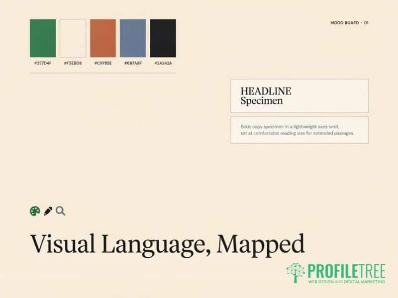
Once the audience is defined, visual choices become more logical than creative in target audience design. Colour, typography, imagery and layout each send signals an audience will recognise as familiar and trustworthy, or register as wrong without knowing exactly why. The design best practices below apply across colour, type and imagery, and work best when checked against the persona built in the previous step rather than applied as a generic checklist.
Colour Psychology in a UK Context
Colour associations are partly universal and partly cultural. In the UK and Ireland, heritage colours such as navy, forest green and warm burgundy tend to read as established and trustworthy. High-contrast, saturated palettes read as modern and energetic but can feel brash in conservative sectors such as legal, financial services or professional trade.
A practical test: look at the top three competitors that an audience already uses. If they all favour muted, professional colour schemes, a wildly different palette creates cognitive friction rather than differentiation. This kind of competitor scan is one of the simplest design best practices available, and it costs nothing beyond an hour of research.
Typography, Legibility and Accessibility
Legibility comes before style. For audiences over 50, serif fonts at larger sizes improve on-screen readability. For younger audiences, clean sans-serif with tight spacing tends to feel more native to digital. Line height and contrast ratios matter for accessibility under WCAG 2.1, the current UK standard for digital accessibility compliance, and ProfileTree’s technical guide to ARIA and website accessibility covers the technical side of this in more depth.
| Audience | Colour Palette | Font Style | Imagery | Tone |
|---|---|---|---|---|
| Gen Z, 18 to 25, urban | Bright, saturated | Clean sans-serif | Candid, diverse | Informal, direct |
| 35 to 55, SME owner | Muted, professional | Serif or neutral sans | Real people, local settings | Practical, confident |
| Over 65, consumer | High contrast, calm | Large serif or sans | Familiar, non-abstract | Plain, reassuring |
| B2B procurement | Neutral, corporate | Geometric sans | Data, process diagrams | Formal, evidence-led |
Localising Target Audience Design for the UK and Ireland
Most design guidance written for a US audience doesn’t translate directly. The target audience design for UK and Irish businesses needs its own cultural read.
British vs American Visual Sensibilities
American design guidance often favours bold claims, bright saturated palettes and maximalist layouts. UK and Irish audiences generally respond better to understatement: measured copy, restrained colour and evidence over enthusiasm. This isn’t a stylistic quirk; it reflects a genuine difference in what reads as trustworthy in each market. A site that swaps UK spelling for US spelling, uses dollar signs, or leans on hyperbolic claims will feel foreign to a Belfast or Dublin visitor, even if the layout is otherwise identical.
Accessibility as a Legal and Design Requirement
The Equality Act 2010 and the Public Sector Bodies Accessibility Regulations 2018 make digital accessibility a legal consideration for many UK organisations, not just good practice. WCAG 2.1 AA is the benchmark most UK digital projects aim to meet, and ProfileTree’s overview of accessibility compliance in website design sets out what that looks like in practice.
In practical terms, this means text contrast ratios of at least 4.5:1 for normal text, keyboard-accessible interactive elements, meaningful alt text on images, form fields with clear labels rather than placeholder-only text, and no information conveyed through colour alone. Around one in five people in the UK lives with some form of disability, so accessible design reaches a meaningfully larger share of any audience, regardless of sector.
Real-World Examples of Audience-Matched Design
Fortnum & Mason’s website uses heritage typography, a muted colour palette and editorial-style photography, choices that suit an audience that associates restraint with quality. Monzo’s app and marketing take the opposite approach: bold colour, flat illustration and conversational copy aimed at a younger, digitally native customer who expects informality rather than tradition.
Neither approach is objectively better. Both work because each speaks directly to the expectations of its own audience, and neither would perform well if swapped with the other. The lesson for SMEs is that a competitor’s visual style is only worth copying if the target audience genuinely overlaps.
Designing for B2B vs B2C Audiences
Most design guides assume a single consumer buyer. B2B design serves a different challenge: multiple stakeholders often review the same page with different priorities.
A procurement manager, a department head, and a chief executive can all land on the same service page. The procurement manager wants specifications and process clarity. The department head wants outcomes and case studies. The chief executive wants credibility signals and reduced risk. Good B2B design satisfies all three without burying any of them.
ProfileTree works predominantly with B2B and SME clients across Northern Ireland, Ireland and the UK, and this shapes how ProfileTree’s website development services are structured: clear process sections, verifiable proof points and accessible contact options placed early rather than buried in a footer. The visual design needs to communicate stability and expertise before it attempts to communicate creativity.
For B2C audiences, emotional resonance matters more. A consumer-facing site needs to answer “does this feel right for me?” within the first few seconds, which is as much a design question as a copywriting one.
Many SME sites try to serve both audiences on the same handful of pages, which is where target audience design earns its keep. Separating a B2B services page from a consumer-facing product page, even within the same site, usually performs better than one page trying to satisfy a procurement manager and a casual browser at once.
Using AI Tools in Your Target Audience Design Workflow
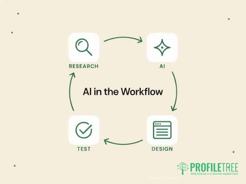
AI tools now sit inside most practical design workflows, though they work best as a way to test and iterate rather than replace the initial research. A designer can describe a persona, such as a time-poor SME owner in Antrim who distrusts sales language, and use an AI image tool to generate several mood board directions for that specific reader rather than a generic brief. The output isn’t final artwork; it is a fast way to compare directions before committing design hours to one.
Vision-capable AI tools can also help pre-test a layout by describing where a viewer’s attention lands first, which is useful for checking whether a call to action or a trust signal is actually prominent before a page goes live. None of this replaces genuine user testing, but it shortens the number of rounds needed to get to something worth testing with real visitors.
Teams building this into their process usually need some structured upskilling first. ProfileTree’s digital training programmes cover this kind of AI-assisted workflow for marketing and design teams who want to use these tools without losing the judgement that makes target audience design work in the first place.
Smaller businesses without a design budget can still apply the same principle using free tools: Google Trends and AnswerThePublic to understand what an audience is actually asking, and low-cost design tools for testing two or three visual directions with a handful of real customers before committing to a final build.
The main risk with AI-assisted design is treating generated output as finished work rather than a starting point. A mood board or mock-up produced in minutes still needs checking against the research done in step one; an AI tool has no knowledge of whether a Belfast trades audience actually trusts navy and cream over bright orange, only what looks statistically plausible. Human judgment, informed by real audience data, still makes the final call.
How Target Audience Design Supports SEO Performance
When a page is built around the right audience, users behave differently. They scroll further, click through more pages and return. These behavioural signals feed into how Google assesses page quality.
The connection runs the other way, too. High impressions with a low click-through rate in Search Console data is often a sign that a title tag and meta description are not speaking to the searcher’s actual need, which is as much a design and positioning problem as a keyword one. Understanding what an audience is actually searching for and designing the page experience to match that intent solves both problems at once.
This is also where visual consistency matters: ProfileTree’s guide to UX consistency across platforms explains why a page that looks and behaves differently from the rest of a site undermines the trust that audience-first design is meant to build. Age-specific design choices matter here too, and ProfileTree’s guide to designing for different generations covers how expectations shift across a five or six-decade age range when visiting the same site.
Turning Audience Insight Into Design Decisions
Target audience design isn’t a stage completed before the real work starts. It runs through every decision: structure, colour, typography, content hierarchy and calls to action. When those decisions are grounded in real audience research rather than personal taste, design stops being subjective and starts being measurable.
Businesses reviewing an underperforming site, or starting a new one, can get in touch with ProfileTree to work through where audience misalignment is costing traffic and conversions.
FAQs
1. What are the four types of target audience?
The four main types are demographic (age, gender, income), geographic (location), psychographic (values, interests, lifestyle) and behavioural (purchase history, usage patterns). Most effective target audience design combines at least two of these rather than relying on demographics alone.
2. How does understanding your target audience influence the design process?
It shapes colour, typography, layout density and tone from the outset rather than as a final polish. Culture affects what is read as trustworthy, age affects legibility and navigation needs, and demographics affect device usage and content depth. Skipping this step tends to produce a site that looks professional but fails to persuade anyone in particular.
3. What design best practices help you reach your target audience?
The design best practices that make the most difference are research before aesthetics, testing colour and typography choices against what the audience’s existing trusted brands use, building in accessibility from the outset rather than retrofitting it and designing separately for B2B and B2C visitors where a page serves both. Small, audience-specific adjustments along these lines usually outperform a complete visual overhaul.
4. Why is the target audience important in design?
Design that doesn’t match audience expectations creates friction and reduces conversions. Audience-first design removes that friction and builds the trust needed for visitors to act, whether that is filling in a form, making a purchase or picking up the phone.
5. How do you design for a specific age group?
Older audiences generally need larger text, higher contrast and simpler navigation. Younger audiences expect mobile-first layouts and visual styles native to the platforms they already use daily. Testing with real users from the target age group catches problems that assumptions miss.