Landing Page Design: A Practical Guide to High-Converting Pages
Table of Contents
Most landing pages fail quietly. The ad spend flows, visitors arrive, and then they leave without converting. The problem is rarely the offer; it’s usually the design. A well-built landing page design removes friction, builds trust quickly, and guides the visitor toward a single decision.
This guide sets out what that looks like in practice, covering structure, psychology, GDPR-compliant form design, and realistic UK cost benchmarks.
What Is a Landing Page?
A landing page is a standalone web page built around one specific goal: a sign-up, a purchase, a consultation request, or a download. Unlike a standard website page, it removes distractions and keeps the visitor focused on taking one action.
In the customer journey, the landing page sits at the moment of decision. A visitor arrives from a paid ad, an email, or a social post, already primed by the message they clicked. The landing page design either confirms that message and moves them forward, or it creates doubt, and they leave.
That distinction matters: the gap between a generic page and a high-converting one isn’t primarily visual. It’s structural. The right layout, the right sequence of information, and the right friction-reduction in the form all contribute more to conversion rates than colour palettes or typography choices.
The Single-Goal Principle
Every element on the page should serve the primary goal. Navigation menus, outgoing links, and competing calls to action all dilute conversion rates. Pages with a single CTA convert at higher rates than those with multiple competing options, because they remove the cognitive burden of choice.
That’s why a landing page used for a paid ad campaign should almost always suppress the main site navigation. Each exit point’s a potential loss of the ad spend that brought that visitor to the page.
Anatomy of a High-Converting Landing Page Design
Understanding the structural components of landing page design is the starting point for improving conversion rates. Each section of the page has a specific job, and the sequence in which you present information matters as much as what you say.
| Old-School Approach | Conversion-First Approach |
|---|---|
| Generic stock photography | Authentic product or team imagery |
| 10+ form fields | 2 to 4 fields with progressive disclosure |
| Single CTA at page bottom | Multiple CTAs: above fold, mid-page, close |
| Aggressive pop-ups on arrival | Timed or exit-intent overlays only |
| Navigation menu retained | Navigation removed to reduce exit points |
| Generic trust badges | Specific reviews, logos, or case study stats |
The Hero Section and the Five-Second Test
The hero section is the portion of the page visible without scrolling. Visitors decide within roughly five seconds whether the page is relevant to what they clicked on. If the headline doesn’t match the message of the ad or email that brought them there, most will leave immediately.
A strong hero section includes four elements: a headline that states the outcome, not the product; a sub-headline that explains how; a primary call to action; and a visual that reinforces the offer rather than decorating around it. Avoid generic stock photography. An image of a real client outcome, a product in use, or a team member converts better than a posed handshake.
CTA Hierarchy: Primary and Secondary Actions
Most landing pages with a single CTA convert less effectively than pages with three to four conversion points, placed at different stages of the page. The logic is straightforward: different visitors reach the decision to act at different points, depending on how much information they need.
Place the primary call to action above the fold. A second CTA sits after the benefits section. A third appears near the social proof. Each CTA can use a different angle, such as a free trial, a demo, or a consultation, without taking the visitor off the page.
Make the call to action label specific. “Get my free quote” outperforms “Submit” because it tells the visitor what they’ll receive. Vague language creates hesitation.
Trust Signals That Actually Work
Generic trust badges, the kind that read “100% Secure” with a padlock icon, have lost most of their persuasive power. Visitors have become accustomed to seeing them on every page, regardless of whether they reflect anything real.
Specific social proof works better. A named testimonial from a real customer, a company logo from a recognisable client, a verifiable statistic about project outcomes, or a screengrab of a Google review all carry more weight than a generic badge. The more specific the proof, the more credible it reads.
Design Principles That Drive Conversions
Good landing page design isn’t about making pages look impressive. The principles that produce high-converting pages are rooted in psychology, not aesthetics. It’s about removing the mental effort required to decide. The principles below come from decades of UX research and are well supported by conversion data from B2B and B2C campaigns alike.
Cognitive Load and Minimalist Design
Cognitive load refers to the mental effort a visitor must expend to process a page. The higher the cognitive load, the more likely they are to abandon the page before converting. Minimalist design reduces cognitive load by limiting the decisions the visitor has to make before reaching the call to action.
In practice, this means limiting the number of fonts to two, keeping the colour palette to three or four values, removing any content that does not directly support the conversion goal, and using whitespace deliberately rather than filling every section. A page that feels spacious and calm is easier to process than one that’s busy.
Button Placement and Visual Hierarchy
Fitts’ Law states that the time required to reach a target is a function of the target’s size and distance. Applied to landing page design, it means CTAs should be large, placed in the natural reading path, and visually distinct from surrounding content.
Use a contrasting colour for the primary CTA button that does not appear elsewhere on the page. This draws the eye naturally without requiring the visitor to search for the next step. Avoid placing important conversion elements in the right rail or footer, where eye-tracking research consistently shows lower attention.
Social Proof 2.0: Beyond the Quote
Testimonials remain useful, but visitors have become selective about which they trust. A full name and company, a recognisable photograph, and a specific claim (“we reduced our cost-per-lead by 40%”) all increase believability. Generic five-word quotes from unverifiable sources don’t.
Video testimonials perform well on landing pages because they’re harder to fake and more engaging to watch than text. A 30 to 60 second clip from a real customer, placed mid-page, can improve conversion rates considerably for higher-ticket offers where visitors need to overcome more scepticism before acting.
“Most landing pages we audit are structurally sound but psychologically wrong. They lead with features rather than outcomes, they bury the social proof, and they give visitors too many choices. Fix those three things and conversion rates improve without any change to the ad spend.”— Ciaran Connolly, Founder, ProfileTree
GDPR and PECR Compliance in Form Design
UK businesses must design landing page forms to meet GDPR and the Privacy and Electronic Communications Regulations (PECR). This isn’t just a legal obligation; it’s a conversion consideration. Forms that comply clearly with data regulations build more trust than those that obscure how data will be used.
Key requirements include: active opt-in checkboxes (pre-ticked boxes aren’t lawful under PECR), a clear statement of how data will be used, and a link to the privacy policy positioned near the form submission button. Avoid vague language such as “by submitting this form, you agree to our terms”, as this does not constitute informed consent.
Data minimisation is also relevant here. Only collect the fields you genuinely need. A landing page that asks for a phone number, job title, company size, and budget before a visitor has engaged with any content will see far lower submission rates than one that asks for a name and email first, with optional detail fields available at a later stage.
B2B vs B2C Landing Page Design: Key Differences
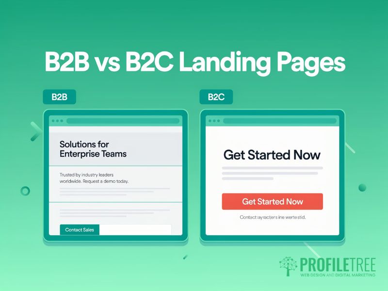
The principles of good landing page design apply across both business-to-business and business-to-consumer contexts, but the execution differs. A B2C page typically leads with a punchy hero section that drives an immediate decision; a B2B page needs to do more to justify the ask. B2B buyers typically have longer sales cycles, more stakeholders involved in the decision, and a higher tolerance for detailed information. B2C buyers tend to decide faster and respond more strongly to emotional triggers and urgency.
Designing for Long B2B Sales Cycles
A B2B landing page rarely closes a deal directly. Its job’s often to generate a qualified conversation: a discovery call, a demo, or a proposal request. This means the page needs to do more work to justify the first step. It must answer the questions a procurement team won’t ignore before they commit to a conversation.
For B2B landing page design, include the following elements that you would not need on a B2C page: company credentials and case study references, named team members with credentials, a clear process overview that sets expectations for what happens after the form is submitted, and pricing transparency or at least a pricing range. Vague pricing is one of the main reasons B2B visitors leave without converting.
ProfileTree’s experience working with SMEs across Northern Ireland and the UK suggests that B2B landing pages which include a process overview, naming the steps between enquiry and delivery, consistently outperform those that skip this. Visitors want to know what they are committing to before they hand over their contact details.
Micro-Conversions for B2B Audiences
Not every B2B visitor is ready to request a quote or book a call on their first visit. Micro-conversions allow you to capture interest at an earlier stage of the decision-making process. A downloadable guide, a free audit, a cost calculator, or a video case study all provide value without requiring the same level of commitment as a sales conversation.
Structure B2B landing pages with a primary CTA for the main conversion goal and a secondary CTA for a lower-commitment micro-conversion. This captures visitors who are not yet ready to buy but who’ll return when the timing’s right.
Technical Performance and Core Web Vitals
Landing page design cannot be separated from technical performance. Even the most high-converting page structure will fail if the page loads slowly or feels sluggish on interaction, losing visitors before the design has a chance to work. Google’s Core Web Vitals, which include Interaction to Next Paint (INP), Largest Contentful Paint (LCP), and Cumulative Layout Shift (CLS), are the primary benchmarks to target.
Pages that load in under two seconds convert at measurably higher rates than slower pages. The practical implications for landing page design are: compress all images (WebP format adds real performance gains over JPEG), defer non-critical JavaScript, remove third-party tracking scripts that are not directly contributing to the campaign, and use a hosting environment with solid uptime and CDN support.
For pages running paid campaigns, even a one-second improvement in load time can have a meaningful effect on cost-per-conversion, because it reduces the drop-off rate before visitors engage with the page content. Use Google PageSpeed Insights and the Chrome User Experience Report to benchmark performance for real-world visitors, not just lab conditions.
ProfileTree’s website design services are built with Core Web Vitals compliance built in from the initial wireframe stage, rather than as an afterthought once the page is live.
How Much Does Landing Page Design Cost in the UK?
Cost is one of the most searched-for topics related to landing page design, and one that most agencies and tools avoid answering directly. The table below reflects realistic UK market rates based on typical project scopes.
| Approach | Typical Cost | Turnaround | Best For |
|---|---|---|---|
| DIY Builder (Unbounce, Leadpages) | £30 to £100/month | 1 to 3 days | Low-budget campaigns, basic offers |
| Mid-weight freelancer | £500 to £1,500 | 1 to 2 weeks | Single campaigns, one-off projects |
| Specialist UK agency | £1,500 to £5,000+ | 2 to 4 weeks | Paid campaigns, A/B testing, full CRO |
DIY builders are a legitimate starting point for businesses running low-ticket or experimental campaigns. The trade-offs are real, though: limited customisation, template blindness (where visitors recognise the layout and disengage), and constraints on performance optimisation. For campaigns with meaningful ad spend behind them, the cost of a professionally built page is typically recovered within the first few months of improved conversion rates.
Custom Design Versus Templates
Template-based landing pages have a recognised problem sometimes called template blindness. Visitors who’ve seen the same Unbounce or Leadpages template on multiple campaigns will register the page layout before they register the content. This doesn’t guarantee failure, but it reduces the distinctive first impression that aids conversion.
Custom landing page design, or even a meaningfully customised template, avoids this problem and allows the page to reflect the specific brand, audience, and offer. For higher-ticket B2B campaigns in particular, a bespoke page signals a level of professionalism that produces more high-converting outcomes than a recognisable template, and builds the kind of trust a generic layout cannot.
ProfileTree’s web development services include bespoke landing page builds for SMEs running paid campaigns, with conversion tracking integrated from day one.
Pre-Launch Checklist: Before Your Landing Page Goes Live
Running through a structured checklist before launching a landing page reduces the risk of avoidable errors that cost conversion rate without being immediately obvious. Use it every time you build or rebuild a landing page design, regardless of campaign size. The following items cover the most common issues found in landing page design audits, including GDPR form compliance and performance checks.
- Headline matches the message of the ad or email that drives traffic to the page
- Primary call to action is visible above the fold on both desktop and mobile
- Form has three fields or fewer for low-commitment offers; an active opt-in checkbox is in place
- The privacy policy link is positioned adjacent to the form submission button
- The navigation menu has been suppressed or removed
- Page loads in under two seconds on mobile (test with Google PageSpeed Insights)
- Social proof includes at least one specific, named testimonial
- Secondary CTA is available for visitors not ready for the primary conversion
- UTM parameters are in place for campaign tracking
- Mobile layout has been reviewed on an actual device, not just a browser emulator
For campaigns managed through ProfileTree’s digital marketing services, this checklist forms part of the pre-launch sign-off process.
FAQs
1. How much does landing page design cost in the UK?
Costs range from around £30 per month for a DIY builder subscription to £1,500 to £5,000 or more for a specialist agency build. The right option depends on campaign scale: a business running £500 per month in paid ads will typically recover the cost of a professional page within the first few months through improved conversion rates. Agency builds typically include conversion tracking, A/B testing setup, and GDPR-compliant form design as standard.
2. What is the best length for a landing page?
Length should match the complexity of the offer. A low-friction offer, such as a free download, converts well on a short page of 300 to 500 words; a high-ticket B2B offer typically needs 1,000 words or more because visitors need more information before committing. The rule is: as long as necessary to answer the intended audience’s main objections, and no longer.
3. Does landing page design affect SEO?
Yes, though most landing pages built for paid campaigns aren’t primarily intended to rank organically. Page speed, mobile-friendliness, and dwell time all feed into Google’s quality signals, affecting Quality Score in Google Ads and directly influencing cost-per-click. A slow or poorly structured landing page design raises ad costs while simultaneously reducing conversion rates.
4. What is a good conversion rate for a landing page?
Average conversion rates vary considerably by industry and offer type. UK SaaS landing pages typically convert at 3 to 5%, lead generation pages for professional services at 4 to 8%, and e-commerce product pages at 1 to 3%. These benchmarks are useful as a starting point, but tracking your own page’s rate over time matters more: a page you’ve improved from 2% to 4% has doubled your return on the same ad spend.
5. Should I remove navigation from a landing page?
Removing the main site navigation from a landing page is strongly recommended in most cases, as it eliminates the most common exit paths for visitors with purchase intent. Studies consistently show that removing navigation improves conversion rates by 10 to 25%. The only exception is long-form informational pages, where anchor links help visitors find sections without leaving.