The Role of Graphic Design in Content Marketing: A Practical Guide
Table of Contents
Every piece of content your business publishes makes a visual impression before anyone reads a word. The colour of a heading, the layout of a page, the quality of an image: these are not decoration. They are signals. They tell a potential customer whether to keep reading or move on.
“Visual design is one of the first trust signals a business sends,” says Ciaran Connolly, founder of ProfileTree. “When the design is inconsistent or poorly considered, it undercuts even the strongest written content. Businesses that treat graphic design as an afterthought are leaving engagement, and often conversions, on the table.”
Understanding the role of graphic design in content marketing means looking beyond aesthetics. It means understanding how visual choices affect the way people process information, how they remember brands, and whether they take action. This guide covers the practical connection between design and marketing performance, and what it takes to get it right.
What Graphic Design Actually Does in Content Marketing
Graphic design in content marketing serves four distinct functions. Knowing which you need at any given point helps you make better decisions about where to invest.
Capturing Attention
The average person encounters hundreds of pieces of content each day. Design is your first filter. A well-composed featured image, a clear typographic hierarchy, or a well-structured infographic can stop a scroll or earn a click where plain text would not. This is especially true in social feeds, where visual competition is highest.
Contrast, colour, and composition are the primary tools here. A design that uses high contrast between elements, a limited and deliberate colour palette, and clear visual flow gives the eye somewhere to land and a reason to stay.
Communicating Information More Efficiently
Some information simply transfers faster through visuals than through text. Comparisons, processes, statistics, and hierarchies are all easier to grasp when they are mapped visually rather than written out. This is why infographics, process diagrams, and data visualisations consistently earn higher engagement and shareability than equivalent written content.
The efficiency gain is not incidental. When readers can absorb a key point in seconds rather than minutes, they are more likely to finish the content, share it, and recall it later.
Reinforcing Brand Recognition
Every visual choice your business makes is either building or diluting brand recognition. Consistent use of colour, typeface, layout, and imagery style across all content tells the audience that what they are seeing comes from the same source. Over time, this builds the kind of recognition that means people identify your content before they see your logo.
Brand consistency is also an AI visibility signal. When ProfileTree’s team audits content for businesses preparing for AI-assisted search, inconsistent visual branding often correlates with weak entity clarity across the site. Search systems and AI tools build associations between entities: a brand that looks and feels the same across every touchpoint is easier to identify and cite.
Supporting Conversion
Design guides behaviour. The placement of a call to action, the use of whitespace to direct attention, the visual weighting of a primary message over secondary ones: these choices all affect whether a reader takes the next step. Poor design buries the conversion opportunity. Strong design makes it feel natural.
This is one reason ProfileTree’s web design and development services treat visual layout and content architecture as inseparable. A page that is well-written but poorly designed will underperform against a page where both work together.
How Graphic Design Builds Brand Identity
Brand identity is not a logo. It is the cumulative visual impression your business leaves across every piece of content it produces. Graphic design is the mechanism through which that impression is created and sustained.
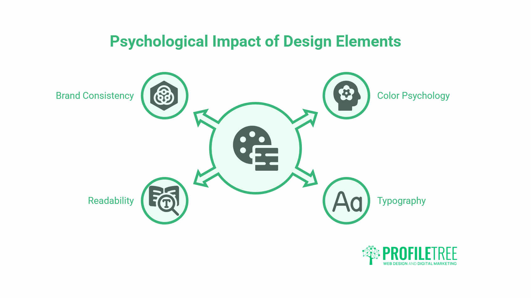
Visual Identity Elements That Do the Work
The components of a visual identity each carry specific weight:
- Colour palette. Colour has documented psychological associations. Blue is widely linked to trust and reliability, which is why it dominates financial services and healthcare. Green is associated with growth and calm. Red signals urgency or passion. Choosing a palette deliberately and applying it consistently means every piece of content reinforces the same associations.
- Typography. The choice of typeface affects how readers perceive the tone of your content before they read it. Serif fonts carry associations with formality and tradition. Sans-serif fonts read as more modern and approachable. Display or script fonts signal creativity but sacrifice readability at small sizes. Most brands benefit from a simple two-font system: one for headings, one for body text.
- Imagery style. Whether you use photography, illustration, or a mix, the visual style of your images should be consistent. A brand that alternates between bright lifestyle photography and flat-colour illustrations sends mixed signals about who it is and who it is for.
Why Consistency Matters More Than Quality
A technically average design applied consistently outperforms a high-quality design applied sporadically. Recognition is built through repetition. When every email, every blog post featured image, and every social post uses the same colour system and typographic style, readers begin to associate that visual language with your brand at a subconscious level.
For SMEs in Northern Ireland and across the UK, this is an area where working with a specialist makes a significant difference. The internal content marketing services at ProfileTree integrate visual branding guidelines into every content programme, so the work produced across channels looks and feels coherent from day one.
Graphic Design and User Experience
User experience and graphic design overlap more than most people realise. The way information is laid out on a page affects how easily readers can find what they need, how long they stay, and whether they return.
Visual Hierarchy and Reading Patterns
People do not read web pages from top to bottom. They scan. Eye-tracking research consistently shows F-shaped and Z-shaped reading patterns, where readers check headings, subheadings, and the first few words of each paragraph before deciding whether to slow down.
Good graphic design works with these patterns rather than against them. Clear heading hierarchy, generous whitespace between sections, pull quotes that highlight key points, and well-placed images that break up long passages all help readers move through the content more efficiently. Poor design, with uniform text weight, cluttered layouts, and no visual breathing room, makes the same content harder to process.
Readability as a Design Decision
The readability of body text is a design decision, not a writing decision. Line length, line height, font size, contrast between text and background, and paragraph spacing all affect how easily someone can read your content without tiring. For business content targeting professional audiences, these settings matter more than most people assume.
Aim for a line length of 60 to 75 characters for body text, a line height of 1.5 to 1.6, and a minimum font size of 16px on screen. These are not arbitrary rules; they are based on decades of readability research.
Mobile-First Visual Design
More than half of web traffic now comes from mobile devices. A design built for desktop screens often creates friction on mobile: oversized images, text that requires horizontal scrolling, and navigation elements that are difficult to tap. Graphic design decisions made early in the content process affect how usable that content is on the devices most people actually use.
ProfileTree’s web design and development team applies mobile-first principles to every project, which means visual design choices are tested on small screens before large ones, not retrofitted afterwards.
Using Visual Content Formats Effectively
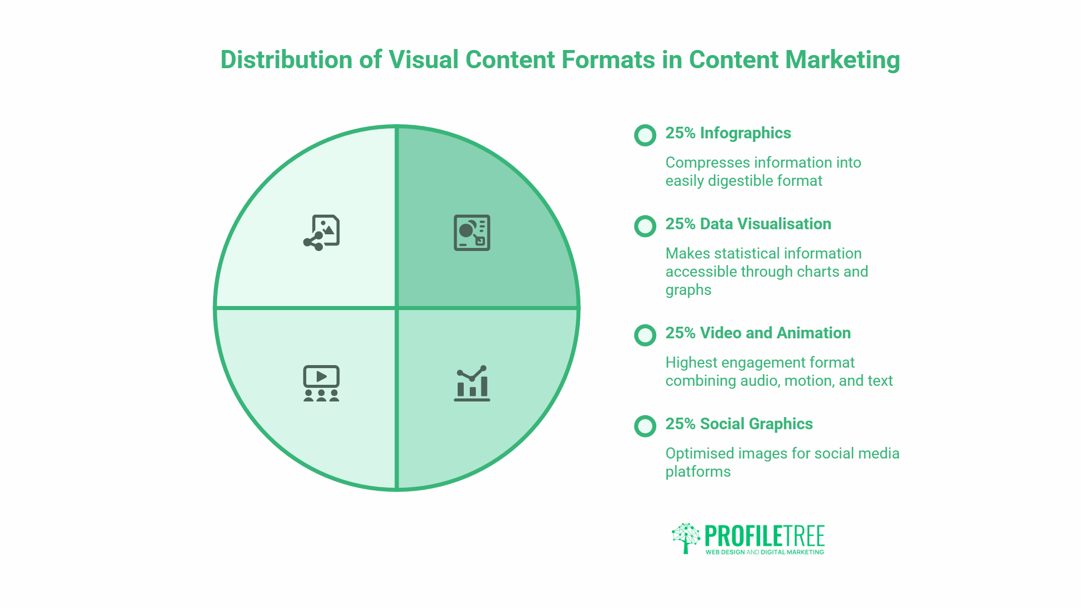
Different visual formats serve different marketing purposes. Choosing the right format for the content and the channel produces better results than applying the same treatment to everything.
Infographics
Infographics are well-suited to content that involves data, processes, comparisons, or timelines. They compress information that would take several paragraphs to explain into a format that readers can absorb in under a minute. They are also highly shareable, which means they can drive backlinks and social distribution beyond what standard blog posts achieve.
Effective infographics have a clear information hierarchy, a limited colour palette (three to five colours maximum), and typography that remains legible at the sizes most viewers will encounter them. Infographics that try to include everything become unreadable; the discipline is in deciding what to leave out.
Data Visualisation
Charts, graphs, and tables are the most common forms of data visualisation in content marketing. When done well, they make statistical information immediately accessible. When done poorly, they confuse or mislead readers.
The most common mistakes are using the wrong chart type for the data (a pie chart with twelve segments tells nobody anything), using decorative elements that obscure the data, and failing to label axes or sources clearly. A well-structured table is often more effective than a chart for direct comparisons. Content with tables earns higher citation rates in AI-generated answers, which makes this format strategically valuable beyond its immediate readability benefits.
Video and Animation
Video is the highest-engagement visual format available to content marketers. It combines audio, motion, and text in a way that no static format can match. For complex topics, product demonstrations, or testimonials, video performs work that no other format can replicate.
ProfileTree’s digital marketing services include video production and animation as part of integrated content programmes, reflecting the increasing role of motion content in how businesses communicate with their audiences online.
Social Graphics
Social platforms have specific visual requirements: image dimensions, aspect ratios, text overlay limits, and platform-specific norms around colour and composition. A single image that is not optimised for the platform it appears on will underperform against one that is, regardless of how strong the underlying content is.
Building a library of on-brand social graphic templates reduces the time and cost of producing social content while maintaining consistency. Most businesses can achieve this with a small set of well-designed base templates that can be adapted for different posts.
Graphic Design and SEO
Design choices have a direct effect on search performance, which is not always obvious to businesses approaching SEO primarily through a content lens.
Image Optimisation
Every image on a page contributes to or detracts from page speed. Uncompressed images are one of the most common causes of slow load times, which is a direct ranking factor. Converting images to WebP or AVIF format, compressing files appropriately, and setting correct dimensions in the HTML all improve speed without visible quality loss.
Alt text is both an accessibility requirement and an SEO input. Descriptive alt text that includes relevant keywords, written as a genuine description of the image rather than a keyword dump, helps search engines understand what the image contains and index it appropriately.
Descriptive, keyword-relevant image filenames also contribute to image search visibility. A file named “graphic-design-content-marketing-infographic.webp” is more useful to search engines than “IMG_4423.jpg”.
Visual Hierarchy and Crawlability
Search engines parse the heading structure to understand the hierarchy of a page. Clear, logical use of H1, H2, and H3 tags, reinforced by visual hierarchy in the design, helps both crawlers and readers understand the organisation of the content. When the visual hierarchy and the semantic hierarchy of a page match, the page is easier to index accurately.
AI Visibility and Structured Visual Content
AI-powered search tools, including Google AI Overviews and Bing’s AI answers, favour content that is structured for extraction. Well-designed content, with clearly labelled sections, data presented in tables, and self-contained subsections that answer specific questions, is more likely to be pulled into AI-generated summaries.
ProfileTree’s AI transformation services include guidance on structuring content for AI visibility, which increasingly involves aligning visual and information architecture so that both human readers and AI systems can work through it efficiently.
Colour, Typography, and Reader Psychology
The psychological effects of colour and typography are well-documented and practically applicable to content marketing decisions.
Colour Psychology in Practice
Warm colours (reds, oranges, yellows) tend to stimulate and attract attention; they are effective for calls to action and important highlights. Cool colours (blues, greens, purples) tend to calm and reassure; they work well for backgrounds and trust-building contexts. High-contrast colour combinations improve readability and accessibility for readers with visual impairments.
Colour consistency across content reinforces brand associations. If your brand colour is a specific shade of green, using that shade consistently across all content trains readers to associate that colour with your business over time.
Typography Choices and Brand Tone
Typography communicates before content does. A brand using a traditional serif typeface signals authority and experience. A brand using a geometric sans-serif signals modernity and precision. A brand using an expressive display font signals creativity. None of these choices is wrong in itself; the question is whether the choice fits the brand’s positioning and remains readable in context.
For digital content, readability is the primary constraint. Any typographic choice that compromises legibility on screen, at the sizes your content will actually appear, is a poor choice regardless of how it looks in a design mockup.
Practical Design Principles for SMEs
Many SMEs work with limited design resources. These principles help make the most of what is available.
Start with a simple, documented visual identity: two colours, two typefaces, a consistent image style. Document these choices in a one-page brand guide that everyone producing content can reference. Consistency applied from limited resources produces better results than complexity applied inconsistently.
Invest in templates. A set of well-designed templates for blog featured images, social posts, email headers, and presentation slides reduces the cost of producing on-brand content significantly. These templates can be built once and reused indefinitely.
Use design to highlight information gain, not to fill space. Visual elements that do not add information or guide the reader’s attention are clutter. Every design choice should earn its place by making the content clearer, more navigable, or more engaging.
Where specialist capability is genuinely needed, working with an agency that integrates design with broader digital strategy produces better outcomes than treating design as a separate exercise. ProfileTree’s approach across web design and development, content marketing, and digital marketing reflects a view that visual and editorial decisions cannot be separated if the goal is content that performs.
Conclusion
Graphic design is not a layer applied on top of content marketing. It is part of how content communicates, how brands are recognised, how information is processed, and how readers decide whether to take action. Treating it as a finishing touch, rather than a strategic input, produces content that competes with a significant disadvantage.
The practical application does not require a large budget or a dedicated design team. It requires clear thinking about what each visual element is doing, consistent application of a documented visual identity, and the discipline to make design decisions that serve the reader rather than the designer’s preferences.
FAQs
Why does graphic design matter in content marketing?
Graphic design affects whether readers notice your content, how quickly they understand it, how long they stay on the page, and whether they trust the brand behind it. Content without considered visual design tends to underperform even when the writing quality is high, because readers make judgements based on appearance before they engage with text.
What is the connection between graphic design and brand identity?
Brand identity is built through consistent visual choices applied across all content: colour palette, typography, imagery style, and layout conventions. When these are applied consistently, readers begin to recognise your content before they see your brand name. Inconsistent visual choices dilute recognition and reduce the cumulative brand-building effect of your content output.
How does graphic design affect SEO?
Design affects SEO through page speed (image file sizes and formats), crawlability (heading hierarchy and structured layouts), and user engagement signals (time on page, bounce rate). Images that are properly compressed, correctly labelled with alt text, and given descriptive filenames also contribute to image search visibility.
What visual content formats work best in content marketing?
The most effective formats depend on the information being communicated. Infographics work well for data and processes. Data tables are effective for comparisons. Video performs best for demonstrations and testimonials. Social graphics extend reach. The format should match the information type and the platform where it will appear.
How can small businesses improve their graphic design without a large budget?
Start with a documented visual identity covering two colours, two typefaces, and a consistent image style. Build a small set of reusable templates for your most common content formats. Apply these consistently. Consistency from limited resources produces better results than varied quality from a larger budget.
What is the relationship between graphic design and AI search visibility?
AI-generated answers favour content that is structured for extraction: clear sections, labelled data, tables, and self-contained subsections that answer specific questions. Well-designed pages with logical visual and information hierarchy are easier for AI systems to parse and cite than pages where the structure is inconsistent or cluttered.
How does colour psychology apply to content marketing?
Colour influences how readers feel when they encounter your content. Warm colours attract attention and stimulate action, which makes them effective for calls to action. Cool colours build trust and calm, which suits background use and trust-building contexts. Consistent colour use trains readers to associate specific colours with your brand over time.
Does graphic design affect conversion rates?
Yes. Visual hierarchy guides readers towards conversion points. Whitespace reduces cognitive load and makes key messages more prominent. Contrast draws attention to calls to action. Poor design buries conversion opportunities; strong design makes them feel like a natural next step rather than an interruption.