White Space in Web Design: Layout, UX and Conversions
Table of Contents
White space in web design is the portion of a page left intentionally unmarked. No text, no images, no buttons. Just space. It sounds simple, but how you distribute that space shapes whether visitors stay, read, and act, or leave within seconds.
For SME owners and marketing managers reviewing a site build or briefing a designer, it’s a concept worth understanding properly. White space explains why a page can feel trustworthy or cluttered before a single word is read. It also explains why the instinct to “fit more in” by compressing spacing so often produces the opposite of what you want.
This guide covers the types of white space, the psychology behind why it works, how it connects to conversion rates and accessibility standards, and the practical CSS decisions that determine whether spacing holds up across devices.
The Four Types of White Space in Web Layouts
White space divides into four distinct categories. Understanding the difference between them matters when briefing a designer or reviewing a layout, because each type serves a different function.
| Type | Definition | Primary Goal | UX Impact | Example |
|---|---|---|---|---|
| Macro | Large gaps between major layout sections | Separate content blocks, create visual breathing room | Reduces cognitive load; signals structure | Space between the hero section and the first content row |
| Micro | Small gaps between individual elements | Improve readability at the text level | Affects legibility; determines how easily text is scanned | Line height, letter spacing, padding inside buttons |
| Active | Space placed deliberately to direct attention | Guide the eye toward a specific element or action | Increases visibility of CTAs, headings, and key messages | Space isolating a “Get a quote” button on a service page |
| Passive | Space that exists by default between standard elements | Maintain natural separation without explicit design decisions | Subtle contribution to overall feel; less controllable | Default line spacing within a paragraph block |
Most web design problems that feel vague, “it looks a bit off,” or “it doesn’t feel professional,” trace back to one of these four types being handled poorly. Macro space that’s too tight makes a page feel rushed. A micro space that’s too generous slows reading. An active space that’s missing means your most important element gets ignored.
Macro vs micro: which matters more for business websites?
Both matter, but macro space tends to be where the bigger commercial decisions are made. A business owner who asks a developer to “add more content above the fold” is usually proposing to compress macro space. The result is nearly always a page that feels less trustworthy, not more informative. Visitors don’t process more; they process less, because nothing has been given priority.
Micro space is more of a technical execution concern. It’s controlled through CSS properties like line-height, letter-spacing, and padding. When microspace is handled well, text becomes readable without effort. When it’s handled poorly, visitors strain to read without knowing why, and they leave.
Active vs passive: the designer’s tool for conversion
Active white space is the most directly commercial of the four types. It’s the space a designer uses intentionally to make something stand out. A contact form surrounded by active white space gets more submissions than the same form buried in a dense layout. A headline given room to breathe carries more authority than one squeezed between competing elements.
This is not a subtle effect. Research from Nielsen Norman Group consistently shows that isolated elements receive disproportionately more attention than elements surrounded by competing content.
The Psychology of White Space: Why It Affects How Visitors Behave
The psychological mechanism behind white space connects to how the brain processes visual information. When a layout is dense, the brain treats it as a high cognitive load, similar to a cluttered physical environment. Visitors feel mild stress, scan less thoroughly, and leave sooner. When a layout gives elements room to breathe, the brain processes it as organised and trustworthy. Visitors slow down, read more carefully, and are more likely to act.
Gestalt psychology provides a useful framework here. The principle of proximity states that elements placed close together are perceived as related. White space, in this context, is what defines groups. Without adequate spacing between sections, visitors cannot tell where one piece of content ends and another begins. The page becomes a single, undifferentiated block of information rather than a structured argument.
The luxury signal: what white space communicates about brand
White space signals quality. This effect is well established in retail and brand design: high-end brands use space generously, because space itself communicates selectivity. A densely packed layout communicates abundance but not discernment. A layout with room reads as considered, confident, and edited.
For a Northern Ireland SME competing on quality rather than price, this matters. A service business whose website feels cluttered is working against its own positioning. The page is communicating “we’re busy trying to fit everything in” rather than “we know exactly what we’re doing.”
Cognitive load and the above-the-fold myth
One of the most persistent misconceptions in SME web briefs is that important content must sit above the fold, the visible area of the page before the visitor scrolls. The assumption is that visitors won’t scroll, so everything must fit on the first screen.
The data on scrolling behaviour doesn’t support this. Studies from UX research organisations, including Nielsen Norman Group, consistently show that visitors will scroll when a page gives them a reason to, when the design signals that something worth finding is further down. White space is part of what creates that signal. A layout that feels composed and unhurried invites exploration. A layout that feels crammed into the first screen feels finished and closed.
White Space and Accessibility: Meeting WCAG 2.2 Standards
Accessibility is where white space becomes a requirement rather than a choice. The Web Content Accessibility Guidelines (WCAG) 2.2 include specific standards that directly govern spacing decisions on business websites.
Success Criterion 1.4.12 (Text Spacing): Users must be able to set line height to at least 1.5 times the font size, spacing following paragraphs to at least 2 times the font size, and letter spacing to at least 0.12 times the font size without loss of content or functionality. A design that breaks when users adjust spacing for readability fails this criterion.
Success Criterion 2.5.8 (Target Size): Interactive elements such as buttons and links must meet minimum size and spacing requirements. Buttons that are too small or too closely spaced create problems for users with motor impairments and for anyone on a touchscreen.
Success Criterion 1.4.8 (Visual Presentation): Line spacing of at least 1.5 within paragraphs and paragraph spacing of at least 1.5 times the line spacing are part of the enhanced visual presentation criteria.
For most SMEs in Northern Ireland and the UK, WCAG 2.1 Level AA compliance is the expected baseline for public-facing sites. Government and public sector contracts often require it explicitly. A web development partner who builds spacing systems into the CSS from the start saves high retrofitting costs later.
Accessibility and mobile: where spacing failures hurt most
The accessibility impact of poor spacing is amplified on mobile. Touch targets that are too small or too closely spaced cause misclicks on small screens. A navigation menu with items 28px tall and 4px apart may work with a desktop mouse, but fails on any phone. WCAG 2.2’s Target Size criterion sets a minimum of 24 x 24 CSS pixels for interactive targets; well-built mobile sites typically use 44px touch targets as a working standard.
ProfileTree’s web development process builds responsive spacing using fluid CSS units from the start, so layouts reflow correctly across screen sizes rather than simply scaling down a desktop design.
White Space and Conversion Rates: The Business Case
The connection between white space and commercial performance is not purely aesthetic. Layout decisions that affect cognitive load have measurable effects on visitor behaviour, and conversion rate optimisation practitioners regularly work with this.
The mechanism works in two directions. First, white space around a call to action increases its visual prominence without changing its size or colour. A button isolated by space receives more attention than an identical button surrounded by competing text. Second, a page that feels organised and considered produces a higher baseline of trust, which affects whether visitors fill in forms, request quotes, or make purchases.
When too much white space becomes a problem
White space can be over-applied. A layout where sections are so widely spaced that the page feels empty creates a different problem: visitors can’t quickly assess whether there is enough content to justify their time. This tends to happen when a designer prioritises visual style over content architecture.
The practical balance is to use active white space generously around elements that need to convert, CTAs, key messages, and contact forms, while maintaining tighter micro spacing within content-heavy sections such as service descriptions and FAQs. The goal is a layout that feels edited, not sparse.
Landing pages and the focused layout
For SMEs running paid campaigns, landing pages benefit significantly from deliberate use of active white space. A landing page presenting a single offer, with generous space around the key proposition and a clearly isolated form, consistently outperforms a version that includes multiple competing messages at the same density. This is one of the most consistent findings in conversion rate work across service businesses.
ProfileTree’s web design process includes a conversion review at the layout stage, ensuring active white space is applied correctly before development begins, rather than retrofitted after build.
Technical Implementation: Building Responsive White Space in CSS
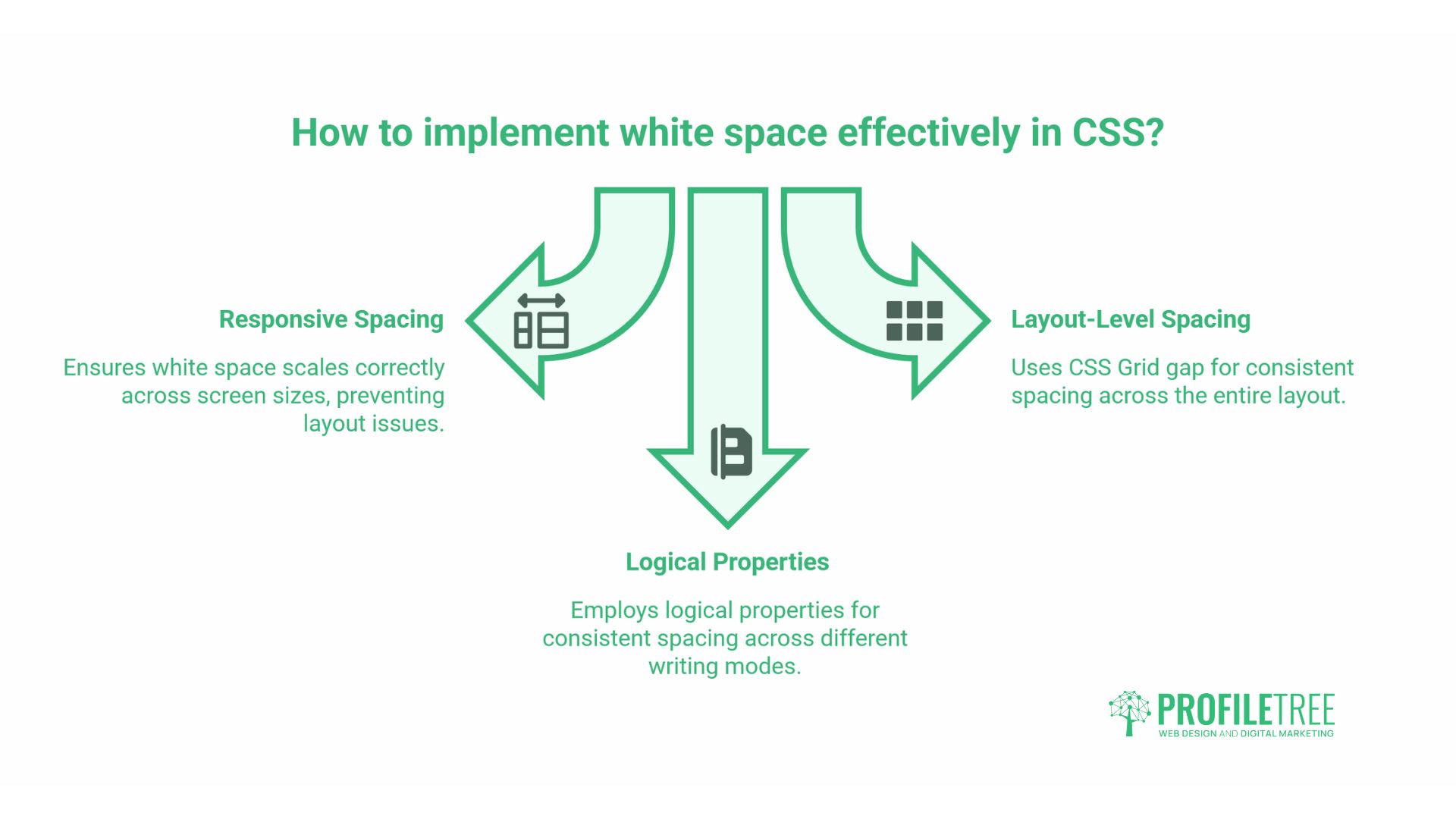
For developers and technically minded site owners, white space is ultimately a CSS problem. The decisions made at the code level determine whether spacing scales correctly across screen sizes or produces layouts that look wrong at certain viewport widths.
Fluid spacing with CSS clamp()
Fixed pixel values for margins and padding create layouts that work at one screen size and look wrong at others. A section padding: 80px on a desktop becomes disproportionately large on a small tablet. The modern approach uses the CSS clamp() function to set a minimum, preferred, and maximum spacing value that scales fluidly:
section {
  padding-block: clamp(2rem, 5vw, 5rem);
}
This single declaration means the section padding scales proportionally with the viewport, never falling below 2rem or exceeding 5rem. The result is spacing that feels correctly proportioned across devices without requiring multiple media query overrides.
CSS Grid gap for layout-level spacing
CSS Grid’s gap Property controls spacing between grid items directly, separating layout spacing from component spacing. This produces more predictable and maintainable results than adding margins to individual elements:
.service-grid {
  display: grid;
  grid-template-columns: repeat(auto-fit, minmax(280px, 1fr));
  gap: clamp(1.5rem, 3vw, 2.5rem);
}
For a three-column services layout on a business website, this approach means the gap between cards scales proportionally with the viewport, maintaining visual balance without separate breakpoint declarations.
Logical properties for consistent spacing
CSS logical properties (margin-block, padding-inline) define spacing relative to the document’s writing direction rather than physical screen edges. For English-language UK sites, this has limited immediate impact, but it future-proofs layouts and aligns with the direction of the CSS specification:
p {
  margin-block: 1rem;
}
This is equivalent to margin-top: 1rem; margin-bottom: 1rem; but is the recommended modern approach. Developers at ProfileTree use logical properties as standard to keep codebases clean and consistent.
ProfileTree’s modern CSS approach builds these fluid systems from the start of each project, reducing maintenance overhead when clients later update content.
White Space in the UK Design Context
White space has a particular resonance in UK digital design. The Government Digital Service (GDS) Design System, which governs how public sector digital services are built in the UK, uses generous spacing as a core principle. The rationale is clarity and trust: services that are easy to use build confidence, and space is one of the primary tools for achieving that.
The GDS approach has influenced how users in the UK read and trust digital interfaces more broadly. A layout that echoes GDS principles, clear spacing, minimal decoration, and content-led hierarchy tends to feel authoritative to UK audiences, including for private sector SME sites.
Functional minimalism vs aesthetic minimalism
There is a useful distinction between functional minimalism and aesthetic minimalism. Aesthetic minimalism removes elements for visual effect. Functional minimalism removes elements because they don’t serve the user. UK design culture, shaped in part by the GDS approach and the plain English tradition in public communication, tends toward the functional rather than the decorative.
For SMEs in Northern Ireland and across the UK, the goal is not a “minimal-looking” website. It’s a website where every element earns its place, space signals what matters, and nothing competes with the main message. The result often looks minimal, but that’s a byproduct of the approach rather than the aim.
Dark mode and negative space: white space isn’t white
The term “white space” is a legacy of print design, where pages were white. In digital design, the concept is better described as negative space, the absence of content-bearing elements. On a dark mode layout, the same principles apply with dark backgrounds. The space between elements still reduces cognitive load, still signals hierarchy, and still directs attention. The colour of that space is irrelevant to its function.
For SMEs considering dark-mode versions of their sites, the spacing decisions remain the same. If anything, dark mode amplifies the effect: light elements against a dark background have higher contrast, and space becomes even more important for preventing visual overload.
Common Mistakes SMEs Make with White Space
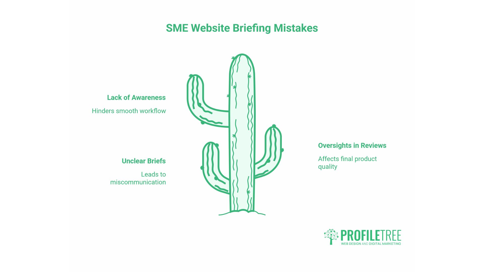
The following mistakes appear regularly in SME website briefs and design reviews.
Treating space as waste. The most common problem. A business owner sees space and thinks, “I could put something there.” The instinct to fill every area comes from a reasonable place; there’s usually something worth saying, but it ignores how visitors process layouts. More content without adequate space produces less comprehension, not more.
Compressing spacing to avoid scrolling. Related to the above-the-fold myth. Reducing spacing to fit more content onto one screen typically produces a page that visitors leave faster, because the layout signals confusion rather than clarity.
Inconsistent spacing across the site. When some sections use 40px padding, and others use 80px, the visual inconsistency registers subconsciously as careless. A spacing system and consistently defined values across all sections prevent this.
Ignoring mobile spacing entirely. A layout that looks well-spaced on a desktop can become uncomfortably dense on mobile if spacing is set in fixed pixels. Fluid spacing with clamp() Or percentage-based values solve this at the build stage.
Overcrowding the navigation. Navigation bars that appear on every page of the site become unusable on mobile and cognitively overloading on desktop. White space around navigation items, combined with a disciplined menu structure, produces faster wayfinding and fewer exits from the navigation area.
The 10-point white space audit
When reviewing a business website for spacing issues, check the following:
- Is there sufficient space between the navigation and the hero section, so the page doesn’t feel cramped at the top?
- Does the hero’s primary CTA have active white space around it, or is it competing with adjacent elements?
- Is line height within body text at least 1.5x the font size?
- Are paragraphs separated by at least 1em of space?
- Do interactive elements meet minimum touch target sizes of 44 x 44px on mobile?
- Is there sufficient space between navigation items to prevent misclicks on touch screens?
- Is macro spacing between sections consistent across the page?
- Does the footer feel visually separate from the last content section?
- Does the page look correctly spaced at 375px viewport width, as well as on desktop?
- Are there any areas where competing elements are equally weighted by space, leaving the eye without direction?
ProfileTree’s web design team runs this kind of layout audit as part of the initial assessment for new and existing client sites.
White Space, SEO, and Core Web Vitals
White space affects SEO indirectly through user behaviour signals. Pages where visitors spend more time and interact more tend to perform better in search over time, because engagement signals form part of how Google assesses page quality.
There is also a direct technical connection through Core Web Vitals. Cumulative Layout Shift (CLS) measures how much page elements move after the initial render. Poor CLS scores often result from elements loading into a space that wasn’t reserved for them, causing content to be pushed down unpredictably. A spacing system that pre-allocates space for dynamic content, images, ads, and embeds, prevents CLS and produces a more stable user experience.
For SMEs investing in professional web design, this connection between spacing decisions, user behaviour, and search performance is worth understanding. A well-spaced site isn’t just better to use; it performs better in organic search and produces cleaner data for conversion analysis.
Conclusion
White space is a structural decision, not a decorative one. How you distribute space across a page determines what visitors notice first, how long they stay, and whether they act. Getting it right means applying active space around the elements that need to convert, building fluid spacing that holds up on mobile, and treating accessibility standards as a floor rather than a ceiling.
If your site feels cluttered, hard to navigate, or isn’t converting the way it should, a web design consultation is a practical starting point.
FAQs
What is the purpose of white space in web design?
White space gives every element room to communicate. It reduces cognitive load, establishes visual hierarchy, and signals to visitors that a layout has been designed with intent. On business websites, it directly affects whether visitors read, stay, and take action.
Is white space always white?
No. The term comes from print design. In digital layouts, it refers to any area free of content-bearing elements, regardless of colour. On a dark mode site, the negative space might be dark grey or black. What defines it is the absence of text, images, or interactive elements, not the background colour.
What are the two main types of white space?
Macro white space covers the larger gaps between major layout sections, such as the space between your header and first content block. Micro white space covers smaller gaps: line height, letter spacing, and padding inside buttons. Both affect usability, but macro space has the greater impact on first impressions.
How much white space is too much?
When a page feels incomplete rather than composed. Use active white space generously around CTAs and key headings, but keep spacing tighter within content-heavy sections. A quick test: can a visitor identify the most important element within two or three seconds? If not, the spacing system needs attention.