Mobile-First Design for Lead Generation: SME Guide
Table of Contents
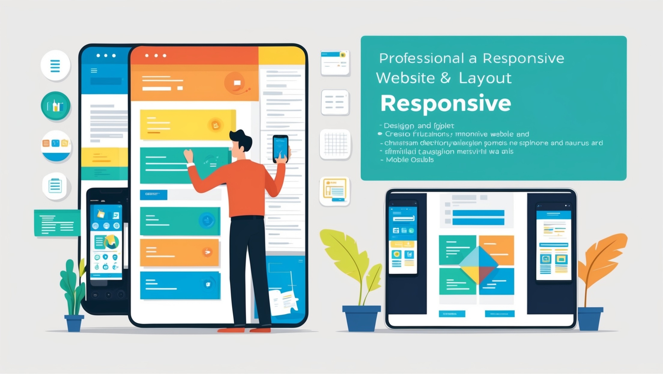
Understanding Mobile-first Website Design
Mobile-first website design represents a fundamental shift in how websites are conceptualised and built. Rather than creating a website for desktop users and then adapting it for smaller screens, the mobile-first approach begins with designing for the smallest screen first, then progressively enhancing the experience for larger devices. For SMEs in Ireland and the UK, adopting this methodology is no longer optional—it’s essential for business success.
The Mobile Usage Landscape in Ireland and the UK
Recent data from the UK Communications Market Report shows that:
- Approximately 87% of UK adults use smartphones as their primary device for internet access
- Mobile devices account for over 60% of all website traffic across the UK and Ireland
- 78% of local searches on mobile devices result in offline purchases
- UK and Irish consumers spend an average of 4.8 hours daily on their mobile devices
For SMEs, these statistics translate to a clear imperative: if your website isn’t optimised for mobile users, you’re potentially missing out on the majority of your market.
The Business Case for Mobile-first Design
Beyond responding to usage trends, mobile-first design offers substantial business advantages:
- Improved Search Rankings: Google’s mobile-first indexing means the mobile version of your website is the primary version considered for ranking and indexing.
- Enhanced User Experience: Mobile-first design forces clarity and prioritisation, often resulting in better user experiences across all devices.
- Faster Load Times: Mobile-optimised sites typically load faster, reducing bounce rates and increasing the likelihood of conversions.
- Cost Efficiency: Building for mobile first and then expanding to desktop is often more cost-effective than retrofitting desktop sites for mobile.
Mobile-first Design Principles for Lead Generation
Mobile-first design plays a critical role in modern lead generation strategies. As more users rely on smartphones and tablets to browse and make purchasing decisions, websites must prioritise responsive, fast-loading, and user-friendly mobile experiences. A mobile-first approach ensures that key conversion elements—such as forms, calls to action, and contact options—are easily accessible and intuitive on smaller screens, ultimately driving higher engagement and capturing more qualified leads.
Clarity of Value Proposition
On smaller screens, communicating your value proposition quickly becomes critical:
- Position your unique selling proposition within the first screen view
- Use concise, benefit-focused headlines that immediately answer “what’s in it for me?”
- Support text with relevant imagery that reinforces your message
- Ensure your brand promise is clear within 5 seconds of landing on the page
Simplified User Journeys
Mobile users have little patience for complex navigation or multi-step processes:
- Reduce the steps required to reach lead generation forms
- Implement clear visual hierarchies that guide users toward conversion points
- Remove unnecessary distractions that don’t contribute to the primary goal
- Use progressive disclosure to gradually reveal information as needed
Touch-Optimised Interactions
Mobile users interact with fingertips, not mouse pointers:
- Make interactive elements at least 44px × 44px (the Apple recommended minimum touch target size)
- Ensure sufficient spacing between clickable elements to prevent accidental taps
- Position key interactive elements in the “thumb zone” for one-handed mobile use
- Provide visual and tactile feedback for all interactive elements
Performance Optimisation
Mobile users often access sites under variable network conditions:
- Aim for page loads under 3 seconds on average mobile connections
- Prioritise content loading so essential elements appear first
- Implement lazy loading for images and non-critical resources
- Use appropriately sized and compressed images for mobile devices
Design Components for Mobile Lead Generation

Effective mobile lead generation relies on thoughtful design components that guide users toward action with minimal friction. From prominently placed call-to-action buttons to streamlined forms and intuitive navigation, each element should be optimised for small screens and touch interaction. Prioritising clarity, speed, and ease of use helps convert mobile visitors into leads by delivering a seamless and engaging experience tailored to their device and behaviour.
High-Impact Headers
The header section is prime real estate on mobile screens:
- Include a compelling headline addressing the user’s primary need or pain point
- Add a short supporting subheadline providing additional context
- Incorporate a strong visual element that reinforces your message
- Position a clear call-to-action button within the initial viewport
Streamlined Navigation
Mobile navigation must balance accessibility with simplicity:
- Implement the “hamburger menu” pattern for secondary navigation items
- Keep primary conversion paths visible outside the collapsed menu
- Use clear, descriptive labels for navigation items
- Consider sticky navigation that remains accessible as users scroll
Lead Generation Forms
Forms are often the final hurdle before conversion:
- Break longer forms into multiple steps to reduce perceived complexity
- Use appropriate input types to trigger the correct mobile keyboard (email, phone, etc.)
- Implement autofill compatibility for faster form completion
- Provide inline validation to catch errors before submission
- Consider using alternative input methods such as selection buttons instead of dropdowns
Social Proof Elements
Social proof becomes even more important on mobile, where trust must be established quickly:
- Display compact testimonials with visual emphasis on the source
- Show recognition logos in a space-efficient slider format
- Incorporate rating stars and review counts near conversion points
- Highlight key statistics or achievements in simple graphic elements
Strategic Calls-to-Action
Call-to-action buttons require special consideration for mobile:
- Make CTAs stand out with contrasting colours and sufficient size
- Use action-oriented, benefit-focused button text (e.g., “Get My Free Quote” rather than “Submit”)
- Position primary CTAs within the natural thumb zone when possible
- Implement sticky CTAs for longer pages to maintain conversion opportunities
Technical Implementation for Mobile-first Lead Generation
Translating design principles into technical implementation requires attention to several key areas:
Responsive Framework Selection
The foundation of your mobile-first website starts with the right technical framework:
- Bootstrap 5: Offers comprehensive mobile-first components with excellent browser compatibility
- Tailwind CSS: Provides utility-first approach for highly customised, lightweight implementations
- Foundation 6: Features robust form handling particularly suited for lead generation
- Custom Frameworks: Consider bespoke solutions for specific business requirements
When selecting a framework, evaluate:
- Performance impact on load times
- Learning curve for your development team
- Flexibility for customisation
- Long-term maintenance requirements
Performance Optimisation Techniques
Mobile performance directly impacts lead generation success:
Image Optimisation:
<!– Responsive images example –>
<picture>
<source srcset=”small-image.jpg” media=”(max-width: 600px)”>
<source srcset=”medium-image.jpg” media=”(max-width: 1200px)”>
<img src=”large-image.jpg” alt=”Description” loading=”lazy”>
</picture>
Critical CSS Delivery:
<head>
<!– Inline critical CSS –>
<style>
/* Critical styles for above-the-fold content */
.header { /* … */ }
.hero { /* … */ }
.cta-primary { /* … */ }
</style>
<!– Defer non-critical CSS –>
<link rel=”preload” href=”styles.css” as=”style” onload=”this.onload=null;this.rel=’stylesheet'”>
<noscript><link rel=”stylesheet” href=”styles.css”></noscript>
</head>
JavaScript Optimisation:
<!– Defer non-critical JavaScript –>
<script src=”app.js” defer></script>
<!– For third-party scripts that aren’t required immediately –>
<script>
window.addEventListener(‘load’, function() {
const script = document.createElement(‘script’);
script.src = ‘https://third-party-service.com/widget.js’;
document.body.appendChild(script);
});
</script>
Form Implementation Best Practices
Forms are critical conversion points that require careful implementation:
Progressive Form Disclosure:
// Example approach using JavaScript
document.querySelectorAll(‘.multi-step-form .next-button’).forEach(button => {
button.addEventListener(‘click’, function() {
const currentStep = this.closest(‘.form-step’);
const nextStep = document.getElementById(currentStep.dataset.next);
// Validate current step before proceeding
if (validateStep(currentStep)) {
currentStep.classList.add(‘hidden’);
nextStep.classList.remove(‘hidden’);
}
});
});
Input Type Optimisation:
<!– Using appropriate input types to trigger correct mobile keyboards –>
<input type=”email” name=”email” autocomplete=”email” placeholder=”Your email address”>
<input type=”tel” name=”phone” autocomplete=”tel” pattern=”[0-9]{11}” placeholder=”Your mobile number”>
<input type=”text” inputmode=”numeric” pattern=”[0-9]*” name=”postcode” autocomplete=”postal-code” placeholder=”Your postcode”>
Form Validation:
// Example of real-time validation for a UK postcode
const postcodeInput = document.getElementById(‘postcode’);
postcodeInput.addEventListener(‘input’, function() {
const ukPostcodePattern = /^[A-Z]{1,2}[0-9][A-Z0-9]? ?[0-9][A-Z]{2}$/i;
if (!ukPostcodePattern.test(this.value)) {
this.setCustomValidity(‘Please enter a valid UK postcode’);
this.classList.add(‘invalid’);
} else {
this.setCustomValidity(”);
this.classList.remove(‘invalid’);
}
});
Testing and Optimisation Workflow
Implementing an effective testing workflow ensures your mobile-first design delivers results:
- Device Testing Matrix: Test on actual devices representing your target market’s most common phones and tablets
- Bandwidth Throttling: Test under various network conditions using Chrome DevTools’ network throttling
- A/B Testing Framework: Implement tools like Google Optimise for testing conversion elements
- Heatmap Analysis: Use services like Hotjar or Crazy Egg to visualise user interactions
- Conversion Funnel Analysis: Set up proper event tracking to identify drop-off points
Industry-Specific Mobile Lead Generation Strategies
Different industries require tailored approaches to mobile lead generation:
Professional Services (Accounting, Legal, Consulting)
Professional service firms in Ireland and the UK should focus on establishing credibility while simplifying complex service offerings:
- Implement qualification quizzes to direct users to relevant service pages
- Offer valuable content downloads in exchange for contact information
- Provide easy scheduling tools for consultations or assessments
- Feature professional credentials prominently to build trust
- Ensure phone numbers are click-to-call enabled with tracking
Retail and E-commerce
For retail businesses, mobile design should focus on reducing friction in the shopping journey:
- Implement persistent shopping carts that maintain items across sessions
- Create simplified checkout processes with minimal required fields
- Use product recommendations based on browsing history
- Enable wishlist functionality to capture leads from browsers
- Implement seamless social login options to reduce registration friction
Property and Real Estate
Property websites have unique requirements for mobile lead generation:
- Create mobile-optimised property search filters
- Implement map-based search interfaces with geolocation
- Allow users to save search criteria in exchange for contact details
- Offer virtual tour scheduling through simplified forms
- Enable instant valuation tools as lead magnets
Hospitality and Tourism
Businesses in Ireland’s and the UK’s substantial tourism sector should consider:
- Implement booking widgets optimised for mobile completion
- Create location-based special offers for nearby mobile users
- Offer mobile-exclusive discounts to encourage direct bookings
- Develop simplified event and availability calendars
- Enable easy reservation modifications through mobile interfaces
Common Mobile Design Mistakes That Hurt Lead Generation
Avoid these frequent mistakes that can significantly reduce your mobile conversion rates:
Excessive Form Fields
The problem: Requiring too much information upfront creates friction and abandonment.
The solution:
- Limit initial form fields to the absolute minimum (often just email and name)
- Request additional information progressively after initial engagement
- Consider using social sign-up options to streamline data collection
- Split longer forms into logical, manageable sections
Poor Touch Targets
The problem: Small or closely packed interactive elements frustrate mobile users.
The solution:
- Ensure buttons are at least 44px × 44px
- Maintain at least 8px spacing between interactive elements
- Make the entire card or container clickable, not just small text links
- Use hover states and visual feedback to confirm interactivity
Intrusive Interstitials
The problem: Popup overlays that block content create friction and trigger Google penalties.
The solution:
- Avoid entry popups on mobile devices
- Use less intrusive bottom banners or slide-ins
- Trigger lead capture elements based on engagement signals
- Ensure all popups can be easily dismissed with clear close buttons
Hidden Contact Information
The problem: Burying contact details frustrates potential leads who prefer direct contact.
The solution:
- Make phone numbers click-to-call enabled and prominently displayed
- Include a persistent contact button in the mobile navigation
- Offer multiple contact channels (call, text, email, chat)
- Implement callback request options for users who prefer not to call
Measuring Mobile Lead Generation Success

Establishing the right metrics ensures you can measure and improve your mobile lead generation:
Key Performance Indicators
Track these essential metrics to evaluate mobile lead generation performance:
- Mobile Conversion Rate: Percentage of mobile visitors who become leads
- Cost Per Mobile Lead: Average cost to acquire a lead from mobile traffic
- Mobile Form Completion Rate: Percentage of users who start and complete forms
- Mobile Page Load Time: Average time to fully load and become interactive
- Mobile Bounce Rate: Percentage of visitors who leave after viewing only one page
- Mobile vs. Desktop Performance: Comparative metrics between device types
Analytics Implementation
Proper analytics setup is essential for accurate measurement:
<!– Enhanced ecommerce tracking for lead form views –>
<script>
gtag(‘event’, ‘view_item’, {
‘event_category’: ‘lead_form’,
‘event_label’: ‘contact_form’,
‘value’: 1
});
// Track form submissions
document.getElementById(‘lead-form’).addEventListener(‘submit’, function() {
gtag(‘event’, ‘generate_lead’, {
‘event_category’: ‘conversion’,
‘event_label’: ‘contact_form_submit’,
‘value’: 25
});
});
</script>
Conversion Rate Optimisation Process
Implement a structured CRO process for ongoing improvement:
- Gather Data: Collect qualitative and quantitative data on mobile user behaviour
- Identify Issues: Use analytics and user testing to find conversion barriers
- Formulate Hypotheses: Create testable theories about potential improvements
- Design Experiments: Develop A/B or multivariate tests to validate hypotheses
- Implement Winners: Deploy successful changes and document learnings
- Repeat Process: Continue the cycle for continuous improvement
Expert Quote
Mobile-first design for lead generation isn’t just about making your website look good on smaller screens—it’s about fundamentally rethinking the customer journey with mobile constraints and behaviours in mind. The most successful SMEs in Ireland and the UK don’t simply adapt desktop experiences; they create purposeful mobile journeys that guide prospects naturally toward conversion while delivering genuine value at every step.” – Ciaran Connolly, Director of ProfileTree
Implementation Roadmap for SMEs
For small and medium businesses with limited resources, this phased approach provides a structured path to mobile-first lead generation:
Phase 1: Foundation (Weeks 1-2)
- Conduct mobile usability audit of existing website
- Analyse mobile traffic patterns and current conversion rates
- Define specific lead generation goals and KPIs
- Identify critical user journeys for optimisation
Phase 2: Essential Optimisation (Weeks 3-4)
- Ensure responsive design implementation across all pages
- Optimise page loading performance for mobile devices
- Simplify primary lead generation forms for mobile completion
- Implement click-to-call functionality with tracking
Phase 3: Enhanced Lead Capture (Weeks 5-8)
- Develop mobile-specific lead magnets (guides, tools, calculators)
- Optimise form layout and user flow on mobile devices
- Implement progressive form filling for longer forms
- Create mobile-optimised landing pages for campaigns
Phase 4: Conversion Rate Optimisation (Ongoing)
- Implement A/B testing framework for key conversion elements
- Establish regular user testing schedule with mobile users
- Create a structured process for testing hypotheses
- Document learnings and best practices for future reference
Advanced Mobile Lead Generation Techniques
As mobile traffic continues to dominate, advanced lead generation techniques are key to capturing and converting users on the go. Beyond basic responsiveness, strategies like smart form autofill, click-to-call functionality, location-based personalisation, and behaviour-triggered pop-ups help engage users at the right moment. These techniques enhance the user experience while maximising conversion opportunities in a mobile-first environment.
Conversational Interfaces
Implement chat-like interfaces for complex form completion:
- Present questions one at a time in a chat-like format
- Use contextual responses based on previous answers
- Allow for natural language input where appropriate
- Create a more engaging, less form-like experience
Micro-interactions and Gamification
Add engaging elements that increase completion rates:
- Implement progress indicators for multi-step processes
- Add subtle animations for positive reinforcement
- Use achievement mechanics to encourage completion
- Create interactive elements that respond to user actions
Personalised Content Paths
Deliver customised experiences based on user behaviour:
- Implement content recommendations based on browsing history
- Dynamically adjust CTAs based on engagement patterns
- Pre-fill form fields from previous interactions when possible
- Tailor lead magnets to demonstrated interests
Voice Input Integration
Incorporate voice technology for easier mobile interaction:
- Enable voice search functionality for product or service discovery
- Allow voice input for form fields where appropriate
- Create voice-guided assistance for complex processes
- Ensure compatibility with screen readers and accessibility tools
Conclusion
Mobile-first design for lead generation represents a critical strategy for SMEs in Ireland and the UK looking to capture and convert prospects effectively in today’s mobile-dominated landscape. By prioritising the mobile experience from conception through implementation, businesses can create streamlined, conversion-focused websites that meet users where they are—on their smartphones and tablets.
The most successful approach combines technical optimisation with user-centric design principles, focusing relentlessly on removing friction from the conversion process while delivering genuine value to prospects. For resource-constrained SMEs, following a structured implementation roadmap allows for progressive improvements that build on one another, ultimately creating a mobile experience that generates a steady flow of qualified leads.
As mobile usage continues to dominate digital interactions across Ireland and the UK, businesses that excel at mobile-first lead generation will gain a significant competitive advantage, connecting more effectively with prospects and turning more visitors into valuable leads and customers.