
Web Design and Development Services
A website is your brand’s digital home, so let us help you make it a welcoming one. We are one of the leading web design and development agencies in Northern Ireland, and we have been doing it for quite some time - since 2011 to be exact.
For the past 10+ years we have learnt not only how to make websites that look great, but websites that perform great too. Because that's what your website should do - look exceptional, attract audiences and act as an extension of your business.
If this resonates with you, then fantastic - we're already on the same page.
Ready to grow online? Start your project today.
Website Design
Our strategic approach to web design transforms your website into more than just a digital platform – it becomes an active salesperson for your business, and an engaging digital storefront that attracts audiences around the clock.
We believe that exceptional web design goes beyond visual aesthetics; it’s about creating a seamless user experience, telling your brand’s story, and leaving a lasting impression that not only draws visitors back but also captivates new ones. Through expert attention to detail, we craft websites that embody your brand identity.
Website Development
Website development is where we bring your digital presence to life. It’s the technical wizardry that powers your website. We believe in informed choices; whether it’s a template, a page builder, or a custom built website, we ensure that you know what you’re getting and why it’s the best choice for your needs.
Our expert web development team, backed by years of experience and a portfolio of successful projects, have a deep understanding of effective web development strategies. We build websites that are stable, secure, and user-friendly, guaranteeing functional online presence for your business.
Website Hosting, Support and Management
Our website hosting services provide your site with a secure and reliable ‘home’. Unlike many web design and development agencies that leave hosting in your hands, we offer a comprehensive solution, handling all aspects necessary to keep your website running smoothly. Beyond hosting, our web support and management services are always at your disposal for updates, maintenance, or any other needs that may arise. We also understand the importance of autonomy, and offer web design and development training as part of our services – empowering you to manage your website independently. We recognise that every client’s needs are unique, tailoring our website support and management packages to fit your specific requirements, and ensuring a professional and personalised service that works for you.
Web Design and SEO Services
A visually appealing and high-performing website is just the beginning; it also needs to be visible to your target audience. That's why we integrate SEO practices into every web design and development project we undertake. Whether you aim to captivate local audiences in Northern Ireland or extend your reach beyond, our SEO services can help you achieve just that.
We ensure that your website appears in the right place at the right time, generating leads and, more importantly - sales. Our SEO specialists tailor your website according to search engine algorithms, helping your business take its place at the top of search engine results.
Ecommerce Website Design
If you’re an online retailer, you need ecommerce web design. It’s your business’ online store, so your products should be displayed clearly, provide smooth website navigation and offer a simple and uncomplicated checkout process.
Responsive Web Design
We ensure that your website will work across different devices – mobile, desktop or tablet. We implement responsive design across all of our website builds. As one of the leading web design agencies in Northern Ireland, we have extensive experience of creating attractive websites that work seamlessly across devices.
B2B Web Development Agency
Our agency understands the unique needs of businesses serving other businesses, you’re like us. Our expert team ensures that your website facilitates effective communication, showcases your products or services professionally, and is optimised for lead generation and conversion.
CRO; Conversion Rate Optimisation Agency
We have built ecommerce stores for our clients across Northern Ireland and beyond, embedding strong calls to action that convert website visitors into purchasing customers. We help you increase sales from your existing web traffic.
Custom Web Design Services
We have built ecommerce stores for our clients across Northern Ireland and beyond, embedding strong calls to action that convert website visitors into purchasing customers. We help you increase sales from your existing web traffic.
B2C Web Design Agency
B2C web design connects your brands to your consumers. Our approach is centred on creating engaging, user-friendly, and aesthetically pleasing websites that resonate with the end-user and appeals to their interests.
Web Design and Development Services - FAQs
Helping your business succeed online is something we are immensely passionate about - but we understand that falling into the rabbit hole of website design and development can become a bit overwhelming.
We’ll do our best to decipher industry jargon and answer some of the questions you might have on our website design and development services. Can’t find the answer you're looking for? Reach out to us and we will be happy to help.
Web design and web development are intricately intertwined yet they are still distinct disciplines that complete different parts of the website-creating process.
Web design focuses on aesthetics and user-centric design principles. Web designers do things like; arranging visual elements, selecting typography, choosing colour theory, etc. to represent the brand identity and appeal to website visitors.
Web development is more concerned with the underlying infrastructure that powers the website. Web developers will use programming languages, frameworks, and databases, in order to create websites with robust functionality.
In short, web design is concerned with how it looks, whereas web development is concerned with how it functions.
Having a website is essential for any modern business, in fact, you could say it’s almost an expectation for businesses to have one in this digitised world.
A website acts as your brand’s digital home. It’s the one space where you have complete control over the design and aesthetics, allowing you to finely tune how your brand presents itself to the world. This control is crucial in maintaining a consistent and compelling brand identity that resonates with customers and stands apart from competitors.
A website also expands your reach exponentially. It makes your business accessible to a global audience 24/7, breaking geographical barriers and opening up broader market opportunities.
Without a website, you risk missing out on potential customers who turn to search engines to find services and products. A well-optimised website increases your chances of appearing in search engine results, driving more traffic and converting visitors into customers.
Ultimately, a website is not just a marketing tool; it is a fundamental aspect of modern business strategy that supports sales, customer connection, and brand growth.
Web design is critically important because it shapes the first impression that potential customers have of your business. Whether it’s online or in-person, first impressions can significantly influence the perception of your brand.
A well-designed website that is sleek, modern, and functional not only enhances the user experience but also communicates professionalism and credibility.
On the other hand, a website with poor design—characterised by a cluttered layout, outdated features, or non-functional elements—can create a negative first impression. Such a site can suggest to visitors that your business may be neglectful of quality and detail, potentially turning away prospective customers.
A well-crafted, user-friendly website is crucial for establishing your business as a serious and trustworthy contender in your industry. By investing in quality web design, you demonstrate to potential customers that your business is reputable and dedicated to providing a positive experience in every interaction.
While having a Facebook and Instagram business page is excellent for social media engagement and brand visibility, these platforms alone are not sufficient for capturing the full spectrum of potential online audiences. Social media is great for building relationships and direct communication with your followers, but it doesn’t replace the need for a website.
A website is crucial because it caters to users who discover businesses through search engines like Google and Bing. Many potential customers use these search engines to look for services and products, and without a website, you’re missing out on that significant segment of the market.
A business website also allows you to have control over brand identity. Unlike social media platforms, where the layout and interaction are defined by the platform itself, a website can be customised to perfectly reflect your brand’s image and message.
The cost of website design and development can vary significantly based on the level of customisation and functionality required. If you need a completely bespoke website built from scratch, this typically involves extensive unique coding, which can be costly due to the expertise and time required.
On the other hand, using website-building platforms like WordPress or Wix can significantly reduce costs. These platforms provide pre-designed templates and user-friendly tools that minimise the need for advanced coding skills.
The choice between these options depends largely on your business’s specific needs. If your business requires unique features, high levels of customisation, or must handle a large volume of traffic, a custom-built website might be necessary. This option gives you more control over both the functionality and the design of your site, tailored to your precise specifications.
However, for many small to medium-sized businesses, a website built using a platform like WordPress or Wix is often sufficient. These platforms are not only cost-effective but also provide ample flexibility and features for most business needs. They allow for a professional online presence without the higher costs associated with custom development.
Ultimately, the best choice will align with your business goals, desired level of control, and budget.
Local Experts for Web Design and Development Services in Northern Ireland
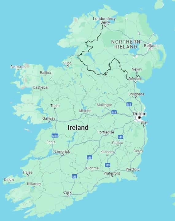
ProfileTree Web Design and Digital Marketing is based in Belfast. We have helped businesses all across Northern Ireland, in Antrim, Armagh, Ballymena, Bangor, Derry, Lisburn, Newry and Omagh. Providing local expertise, and a deep understanding of website design and development solutions.
Whether you’re looking to launch a new website, revamp an existing one, or enhance your digital marketing efforts, ProfileTree is your go-to partner for all your web design and development needs in Northern Ireland. Let us help your business make a statement in the digital world.

We design stunning, user focused websites that present your brand beautifully and convert visitors into customers.

We use the latest development tools to build websites that are optimised for peak performance at all times.

We manage everything from site updates and reports to hosting, allowing you to focus on running your business.

Using the latest SEO techniques, we help your brand get found for the right terms and by the right people.

Navigate the digital landscape with a marketing strategy. Our team crafts comprehensive plans that resonate with your target audience, drive engagement, and boost conversions.

Elevate your digital proficiency. Our in-depth training sessions equip your business with cutting-edge digital marketing techniques to outperform competitors and thrive online.

Captivate and grow your social following. We create tailored social media strategies that ignite engagement, amplify your brand's online presence, and foster lasting connections.

Harness the power of your mailing list. Our precision-targeted email marketing campaigns are engineered to nurture relationships and drive tangible business outcomes.

Elevate your brand with our content marketing mastery. From thought-provoking blogs to eye-catching infographics, we craft content that captivates, informs, and converts your ideal audience.

Capture your audience with compelling video content. Our production team creates visual stories that engage, inform, and leave a lasting impression.

Bring your brand's story to life with authenticity. We craft compelling narratives that strike a chord with your audience, forging a powerful emotional bond with your brand.

Strategic content that drives action. We develop content strategies that align with your business goals, ensuring every piece of content counts.

Empower your business with AI expertise. Our tailored training demystifies AI, equipping your team with the knowledge to leverage its potential for growth and innovation.

Transform customer service with AI chatbots. We develop sophisticated chatbots that elevate user experience, streamline interactions, and deliver unparalleled efficiency.

Transform your reach with AI-driven marketing. Harness data-driven insights for laser-targeted campaigns that captivate, engage, and convert your audience.

Optimise your operations with cutting-edge AI tools. We integrate intelligent solutions that streamline processes, enhance efficiency, and support data-driven decision-making.
Join Our Mailing List
Grow your business with expert web design, AI strategies and digital marketing tips straight to your inbox. Subscribe to our newsletter.