Responsive Design: Building Business Websites for Mobile Users
Table of Contents
Most small business owners discover their site has a mobile problem the hard way: a customer mentions it, an enquiry doesn’t come through, or they check Google Search Console and see a spike in mobile bounce rates. By that point, the damage is already done. Responsive design is the standard approach to preventing that problem, and for UK and Irish SMEs competing in local search, it is one of the most consequential technical decisions you will make about your website.
This guide explains what responsive design is, why it matters for your rankings and revenue, and what to look for when commissioning or auditing a website build.
What is Responsive Design?
Responsive design is an approach to web development where a single website automatically adjusts its layout, images, and content to fit any screen size or device. Rather than building separate desktop and mobile versions of a site, responsive design uses a combination of fluid grids, flexible images, and CSS media queries to deliver a single adaptable experience to every visitor.
The term was first coined by designer Ethan Marcotte in 2010, when smartphones were becoming the dominant browsing device. Today it is not a feature or an add-on. It is the baseline expectation for any professionally built website.
The Three Technical Components (Explained Without Jargon)
- Fluid grids use proportional measurements rather than fixed pixel widths to lay out page elements. A three-column layout on desktop becomes a single-column layout on mobile, with all the same content intact and readable.
- Flexible images scale within their containing elements so they never overflow or distort on smaller screens. This prevents the common problem of images pushing content sideways on a phone.
- CSS media queries act as a set of instructions for the browser. They tell the site how to rearrange itself based on the width of the screen being used. Think of them as conditional rules: if the screen is narrower than 768 pixels, stack these columns vertically instead of side by side.
For a business owner, the practical result is this: one website, one URL, one content management system, and one set of updates that works correctly for every visitor regardless of how they arrive.
Why Responsive Design Matters for UK and Irish SMEs
According to data from We Are Social and DataReportal, mobile phones accounted for around 55 per cent of all web page views in the UK in December 2024, with laptops and desktops accounting for approximately 40 per cent of the remainder (Statista, February 2025). Mobile devices account for the majority of web traffic in the UK, and that share continues to grow. Ofcom’s Connected Nations 2024 report recorded total monthly mobile data traffic growing by 18 per cent year on year to 1,069 petabytes, with 5G traffic increasing by approximately 50 per cent over the same period.
For businesses in Northern Ireland, Ireland, and across the UK, the implications are direct. If a potential customer searches for your service on their phone and lands on a site that does not display correctly, they will leave. They will not pinch to zoom, scroll sideways, or call. They will go to the next result.
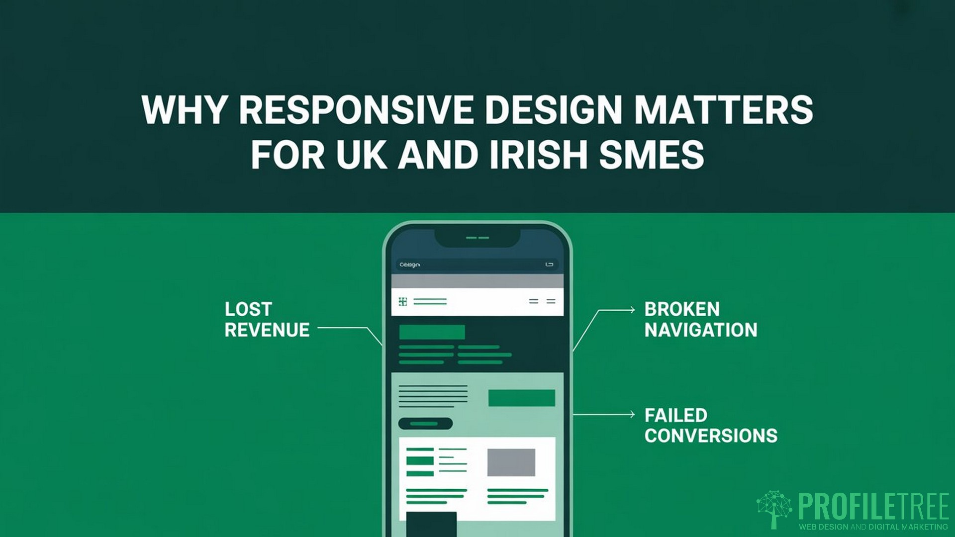
How Non-Responsive Sites Lose Revenue
A non-responsive site typically fails mobile visitors in several specific ways: text is too small to read without zooming, buttons are too close together to tap accurately, navigation menus collapse into unusable formats, and images either overflow the screen or disappear entirely. Each of these is a friction point that breaks the user journey before it reaches a conversion.
This is not a minor inconvenience. For a local solicitor, accountant, or retailer whose primary enquiry channel is their website, a broken mobile experience is a direct revenue loss. Visitors who cannot use the site on mobile will not call the office to follow up.
ProfileTree’s web design team works with SMEs across Northern Ireland, Ireland, and the UK to build sites that perform correctly on all devices from launch. Proper responsive design is part of the development standard, not an optional upgrade. You can find more details on what that process involves on our web design services page.
Responsive Design and SEO: What Google Actually Does
This is the section most articles on responsive design underplay, and it is the most important one for business owners to understand.
Google now crawls and indexes all sites using its mobile Googlebot. This process, known as mobile-first indexing, was completed across the entire web in July 2024. Your desktop site is secondary. If the mobile version of your site is missing content, loads slowly, or delivers a poor experience, that is what Google is evaluating when it decides where to rank you.
What Mobile-First Indexing Means in Practice
Because Google crawls all sites using its mobile Googlebot, a responsive site that presents the same content on mobile and desktop gives Google the best opportunity to crawl and index your full content. Sites where mobile layouts hide or omit content risk that the content will be missed entirely.
If your desktop site has a full-service description but your mobile layout collapses or hides that content behind a tab that does not render correctly on phones, Google may not index it at all. Rankings for those terms can drop or disappear without any other change to the site.
Core Web Vitals and Responsive Performance
Google’s Core Web Vitals are a set of performance metrics that directly affect rankings. Two of the three most important ones are closely tied to responsive design. Cumulative Layout Shift (CLS) measures how much page elements move around as the page loads. On poorly built responsive sites, images and buttons that are not correctly sized for mobile often shift as they load, producing a high CLS score and a ranking penalty. Largest Contentful Paint (LCP) measures how long the main content of the page takes to appear. Oversized images that have not been scaled for mobile devices are among the most common causes of poor LCP on otherwise well-designed sites.
Addressing these is part of technical SEO work, and it is something ProfileTree’s SEO services team audits as a standard part of site reviews.
“Mobile performance is now the primary gatekeeper for page one rankings,” says Ciaran Connolly, founder of ProfileTree. “We see businesses with genuinely good content sitting on page three because their site fails Core Web Vitals on mobile. Fixing the responsive build is often the fastest route to ranking improvement.”
Bounce Rate, Dwell Time, and the Signals Google Reads
According to Google’s own research, 53 per cent of mobile site visits are abandoned if a page does not load within three seconds. When a mobile visitor lands on a non-responsive page and immediately leaves, that is recorded as a bounce. High mobile bounce rates signal to Google that the page is not satisfying the search intent for mobile users. Over time, this suppresses rankings further. A well-built, responsive site keeps visitors engaged, which produces dwell-time signals that support stronger rankings.
Responsive vs Adaptive vs Mobile App: Which Does Your Business Need?
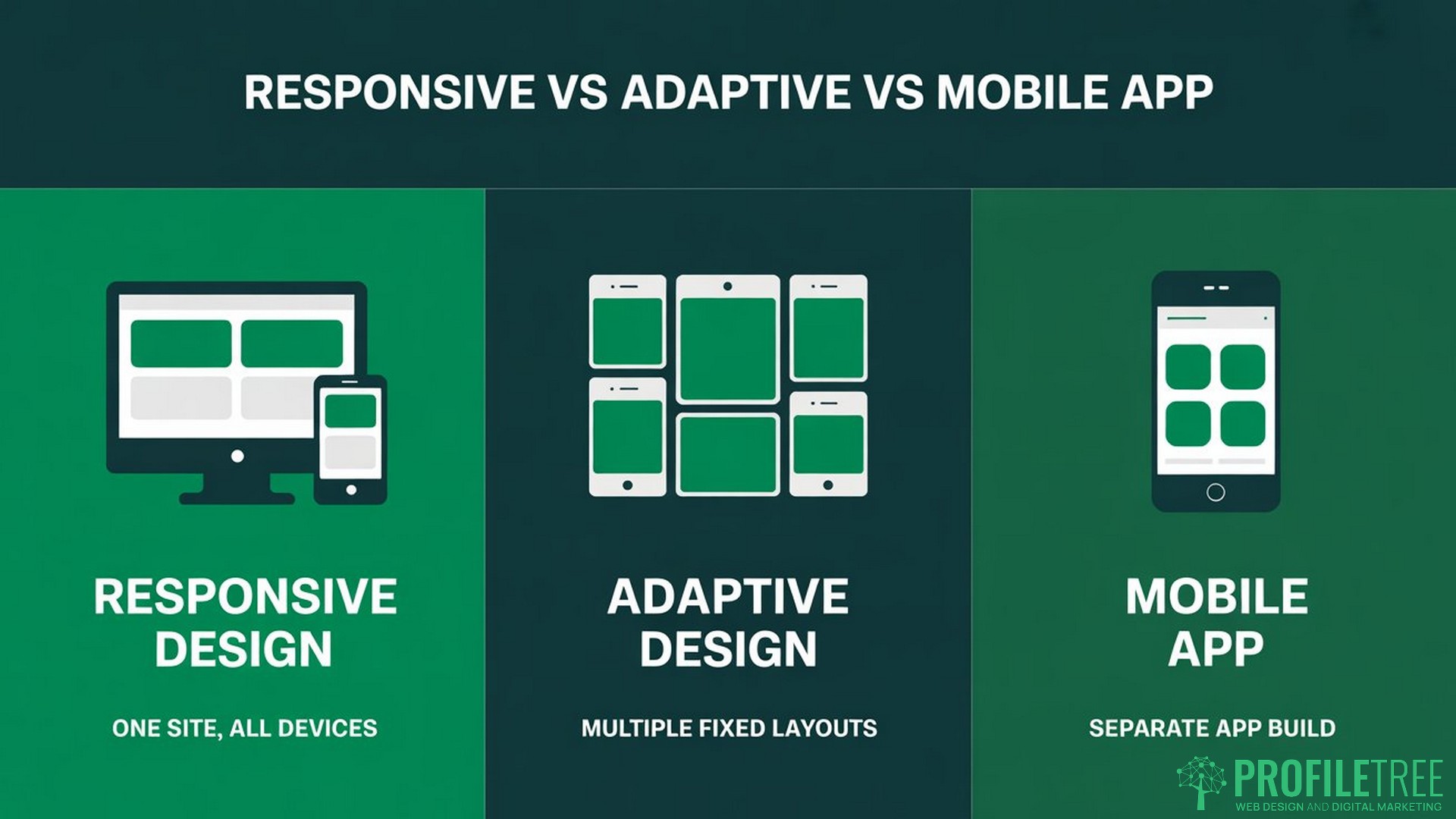
These three terms are often used interchangeably, but they describe different approaches with significantly different costs and outcomes.
| Approach | How it works | SEO impact | Cost | Best for |
|---|---|---|---|---|
| Responsive design | One site, fluid layout | Strong | Moderate | Most SMEs |
| Adaptive design | Multiple fixed layouts triggered by device | Moderate | High | Complex product sites |
| Native mobile app | Separate app built for iOS or Android | None (apps do not rank in Google) | High | High-frequency transactional tools |
For the vast majority of SMEs in the UK and Ireland, responsive design is the correct choice. A native app is appropriate when users need to return to it daily for a specific function, such as booking, tracking, or account management. For a business website whose primary job is to attract new visitors and convert them into enquiries, an app adds cost and maintenance without the SEO benefit.
Adaptive design has specific applications in complex e-commerce environments but requires separate template management for each device type, which increases development and maintenance costs considerably.
The Mobile-First Approach: What It Means for Your Website Build
A mobile-first approach means the design process begins with the smallest screen and works upward to desktop, rather than the other way around. This is a development philosophy, not just a technical method, and it has practical consequences for what ends up on your site.
When designers start with mobile, they are forced to make early decisions about content priorities. What is the one thing a visitor needs to be able to do on this page? If it is calling the office, the phone number needs to be prominent, tappable, and above the fold on a phone screen. If it is filling in a contact form, the form needs to work with a touchscreen keyboard without the fields overlapping or the submit button disappearing.
Starting with a desktop and scaling down often results in compressed versions of desktop layouts that technically work on mobile but are not designed for mobile interaction. Starting mobile-first produces sites where the mobile experience is the primary consideration, with desktop enhancements built on top.
Touch Targets and Mobile Navigation
Tap targets, which are buttons, links, and form fields, need to be large enough to press accurately with a finger. The general guidance is a minimum of 48 pixels in height and width. Smaller targets produce accidental taps on adjacent elements, which frustrates users and increases exit rates.
Mobile navigation also requires specific consideration. The familiar hamburger menu icon works well for condensing navigation on small screens, but the menu it opens needs to be logically structured and easy to close. Breadcrumb navigation helps users understand where they are within a site and reduces the friction of moving between sections.
Responsive Design and Accessibility: The Legal Context for UK Businesses
Accessibility is not separate from responsive design. The two are closely related, and for UK businesses, there is a legal dimension worth understanding.
The broader legal expectation for UK businesses is that their digital services should be usable by people with a range of impairments. The Public Sector Bodies (Websites and Mobile Applications) Accessibility Regulations 2018 set specific technical standards for public sector organisations, and the general direction of travel across UK digital regulation points toward greater inclusivity requirements for all businesses.
Responsive design supports accessibility in several practical ways. Properly scaled text and touch targets help users with motor impairments. Sufficient colour contrast, maintained across all screen sizes, supports users with visual impairments. Keyboard navigation compatibility, which responsive builds need to preserve across breakpoints, supports users who cannot use a touchscreen.
The Web Content Accessibility Guidelines (WCAG) provide the technical standard for accessible web design. A responsive build that ignores accessibility requirements is only partially complete. ProfileTree’s web development process incorporates WCAG considerations as part of the build, not as a separate accessibility audit after the fact.
Inclusive Design as a Business Advantage
Beyond the legal context, accessible and responsive sites perform better commercially. They load faster, work across a wider range of devices and assistive technologies, and signal to Google that the site delivers a quality experience. These are not separate considerations: a well-built responsive site is, by definition, more accessible than a poorly built one.
5 Signs Your Website Is Failing Mobile Users
You do not need specialist tools to identify whether your site has a mobile problem. Here are the five most common warning signs.
- Text that requires zooming to read. If a visitor needs to pinch and zoom to read your service descriptions, your font sizes are not scaling correctly for mobile. Readable body text on mobile is typically 16px or larger.
- Buttons that are difficult to tap accurately. If your call-to-action buttons are small, close together, or positioned near the edge of the screen, mobile users will struggle to interact with them. This is one of the most direct causes of mobile conversion failure.
- Images that overflow the screen or disappear. Images that extend beyond the screen width or collapse entirely on mobile indicate that the image handling is not configured for responsive display.
- Navigation that does not work on touch. Dropdown menus that rely on hover states, which do not exist on touchscreens, are a common legacy problem on sites originally built for desktop. They appear to work on desktop but are non-functional on mobile.
- Slow load times on mobile connections. If your site takes more than 3 seconds to load over a mobile connection, a significant proportion of visitors will leave before the page loads. Oversized images and unoptimised code are the most common causes.
You can test your site’s basic mobile performance using Google Search Console, which flags mobile usability issues directly, or by using Chrome’s developer tools to simulate different device sizes.
Responsive Design Performance: Optimising for Mobile Speed
A responsive layout alone does not guarantee good mobile performance. The build also needs to handle images, code, and server delivery in ways that work well on mobile connections, which are typically slower and less reliable than desktop broadband.
Images are the single largest contributor to slow mobile load times on most business websites. Using modern formats such as WebP, which produces smaller file sizes than JPEG or PNG with minimal visible quality loss at equivalent compression settings, and serving different image sizes to different devices, reduces the data a mobile visitor needs to download before the page becomes usable.
Compressing CSS and JavaScript files and removing unused code reduces the number of server requests the page needs to make before it can display. Hosting content on servers close to your visitors, using a content delivery network where appropriate, reduces the physical distance data needs to travel.
ProfileTree’s website management service covers ongoing performance monitoring, so that sites built to a good standard do not degrade as content is added over time.
Responsive design is not a trend that businesses can afford to defer. Google’s mobile-first indexing means your mobile experience is already your primary digital presence, whether you have designed it that way or not. For SMEs across Northern Ireland, Ireland, and the UK, the practical question is not whether to build responsively but whether the site you currently have meets the standard your customers and search engines expect.
If you are unsure where your site stands, the ProfileTree web design team offers site assessments and can advise on whether your current build needs targeted improvements or a full rebuild. Get in touch to discuss what responsive design for your business website would involve.
Frequently Asked Questions
What are the three main components of responsive web design?
The three core components are fluid grids, flexible images, and CSS media queries. Fluid grids use proportional measurements so page layouts scale across different screen widths. Flexible images resize within their containers without distorting or overflowing. CSS media queries provide the conditional rules that tell the browser how to rearrange the layout at specific screen widths. Together, these three elements ensure a website displays correctly on any device.
Is responsive design better for SEO?
Yes, directly. Google uses mobile-first indexing, which was completed across the entire web in July 2024, meaning it evaluates and ranks your site based on its mobile version. A responsive site that presents the same content on mobile and desktop gives Google the best opportunity to crawl and index your full content. Non-responsive sites risk having their content missed or downranked because it does not render correctly on mobile devices. Responsive design also supports better Core Web Vitals scores, which are a confirmed Google ranking factor.
How much does it cost to make an existing site responsive?
The cost depends on whether the existing site can be updated through theme or CSS changes, or whether the underlying structure needs to be rebuilt. A surface-level patch can sometimes address specific mobile display issues without a full rebuild, but it rarely delivers the same performance as a properly structured, responsive build from the ground up. The honest answer for most legacy sites is that a rebuild is more cost-effective in the long term than repeated patches. ProfileTree can assess your existing site and provide a clear recommendation on which approach makes the most sense.
What is the difference between mobile-friendly and responsive design?
Mobile-friendly typically means a site does not break on mobile: text is readable, content does not overflow, and the page is broadly usable. Responsive design goes further. A responsive site actively adapts its layout, image sizes, and navigation structure to provide an experience tailored to each screen size, rather than simply avoiding the worst failures of a desktop site on a small screen.
How do I test if my site is responsive?
The quickest method is to open your site in a desktop browser, then drag the browser window narrower. A responsive site will reflow its layout smoothly as the window narrows. For a more thorough test, Google Search Console’s Mobile Usability report flags specific issues on your site with details of which pages are affected. Chrome’s developer tools include a device simulation mode that lets you preview your site as it would appear on specific phone and tablet models.
Do I need a separate mobile app if my site is responsive?
For most SMEs, no. A well-built responsive website delivers a fast, usable mobile experience and ranks in Google search results. A native app requires a separate development budget, ongoing maintenance, and sits entirely outside Google’s organic search index. Apps make sense when users need to return daily for a specific function, such as booking or account management. For a business website whose job is to attract and convert new visitors, a responsive site is the more cost-effective and commercially productive choice.