Pricing Page Design: How to Build a Page That Converts
Table of Contents
A pricing page is one of the few pages on your website where a visitor has already decided they’re interested. They know what you offer. They want to know what it costs and whether it’s worth it. That moment is not the place for vague copy, cluttered layouts, or a design that was built as an afterthought.
This guide covers how to design a pricing page that does its job: communicates value clearly, removes friction, and gives the visitor what they need to say yes. Whether you’re selling a SaaS product, a professional service, or a retainer package, the principles here apply, and where they differ, we’ll tell you why.
What Makes a Pricing Page Work
Most pricing pages fail for one of three reasons: they’re too complicated, they’re too vague, or they ask the visitor to make a decision without giving them enough to go on. A well-designed pricing page solves all three at once.
The goal is not to show every feature you offer. It’s to show the right features, at the right level of detail, in an order that makes the decision feel straightforward. Visitors scan before they read. If the structure doesn’t guide them quickly to the tier that fits their situation, they leave.
What to Include on Every Pricing Page
These five elements must be present regardless of your business model:
| Element | What it does |
|---|---|
| Clear pricing tiers | Gives the visitor a mental anchor for comparison |
| Feature breakdown per tier | Lets them match a plan to their actual needs |
| Visible CTA per tier | Removes ambiguity about what happens next |
| Social proof (testimonials, ratings, logos) | Reduces the perceived risk of buying |
| FAQ section | Answers objections without requiring a sales call |
If any of these are missing, the page has a gap. If your pricing is intentionally undisclosed (common in B2B agency or enterprise work), that needs its own section (covered below).
The Psychology Behind Pricing Page Design
How a pricing page is structured influences the decisions visitors make, often before they’ve consciously processed a single word. Three principles account for most of the difference between a page that converts and one that doesn’t.
The Decoy Effect: Why Three Tiers Work Better Than Two
When you give someone two options, the choice is binary: the cheaper one or the more expensive one. Add a third option positioned between them, and something interesting happens. The middle tier starts to look like the obvious choice, especially if it’s highlighted as “Most Popular” or “Recommended.” This is the decoy effect in action, and it’s one of the most well-documented patterns in pricing psychology.
Three tiers is the standard for a reason. Two tiers force a harder decision. Four or more tiers introduce choice overload, in which the cognitive effort of comparing options outweighs the appeal of any single option.
For service businesses, this might look like: Starter (limited scope), Growth (the tier you actually want people to choose), and Pro (full service, highest value). The Growth tier should be designed to win the comparison on obvious value-for-money grounds.
Price Anchoring: Why the Expensive Option Goes First
If your most expensive plan appears first on the page, it sets the reference point for everything that follows. A £500/month plan looks reasonable after seeing £1,200/month. Put the cheapest plan first and you anchor visitors to a lower number, making subsequent tiers feel expensive.
This is not a trick. It’s how the brain processes relative value. Present your highest tier first, left-to-right or top-to-bottom, and let the middle tier benefit from that anchor.
Reducing Choice Overload
The “Most Popular” badge exists for a practical reason: it delegates the decision. When a visitor is unsure which plan fits them, a social cue from other buyers does the work. Keep the badge simple, one tier only, and make sure it’s the tier your sales data actually supports.
Anatomy of a High-Converting Pricing Page
The individual elements of a pricing page matter less than how they work together. Layout, CTA language, and billing toggle design each shape the visitor’s experience at different points in the decision-making process.
Layout and Visual Hierarchy
The pricing table is the centrepiece. Everything else on the page should direct attention towards it and then support the decision after the visitor has engaged with it.
Effective layout principles:
- Place the highlighted (recommended) tier in the centre on desktop, or at the top on mobile
- Use visual contrast, a different background colour or a border, to distinguish the recommended tier without requiring the visitor to read which one it is
- Keep the feature list scannable: short labels, tick marks for included features, clear indicators for excluded ones
- Avoid putting too many features in the table. Show the five to seven that matter most. Link to a full comparison if needed.
CTA Language
The button text on a pricing page carries more weight than most businesses realise. “Get Started” is fine. “Start Free Trial” is better if you offer one. “Book a Call” is appropriate for high-value services where the next step isn’t a self-serve purchase.
What to avoid: vague verbs like “Learn More” (that belongs earlier in the funnel) and aggressive verbs like “Buy Now” on service-based pages where the visitor hasn’t had a conversation yet.
The CTA should describe what physically happens next, not make a promise about what the product will do.
Monthly vs Annual Toggle
If you offer both monthly and annual billing, a toggle switch lets visitors compare without cluttering the table with both sets of numbers. The convention is to default to annual pricing and show the monthly equivalent alongside it, with the saving (e.g. “Save 20%”) visible on the annual view.
One thing that often goes wrong: the discount label disappears, or the toggle doesn’t consistently update every element on the page. This is a development detail, not a design one, but it matters. A pricing toggle that partially updates its view is broken and undermines trust.
Designing for UK and Irish Markets: Localisation and Compliance
This is the section most generic pricing page guides skip entirely. For businesses trading in the UK and Ireland, it matters.
VAT Display: B2B vs B2C
How you display VAT on a pricing page depends on your primary audience. If you’re selling to consumers (B2C), UK consumer protection law requires that displayed prices include VAT. If you’re primarily selling to businesses (B2B), it’s acceptable and common to show prices excluding VAT, provided you make this clear (e.g. “All prices exclude VAT at 20%”).
Getting this wrong creates problems. A B2B customer who sees an ex-VAT price and calculates their budget accordingly, then finds the invoice 20% higher, loses trust immediately. Display the convention your buyers expect and make the VAT status unambiguous.
Currency Localisation Beyond the Symbol
If you serve customers in both the UK and Ireland, displaying prices in a single currency forces someone to do mental conversion arithmetic at the exact moment you want their attention on the decision. Consider offering GBP and EUR options if your audience is genuinely split across the two markets.
For businesses that also target the US market, USD pricing should appear on a separate page or via geolocation, not alongside GBP on the same table. Mixed-currency tables confuse buyers and create support overhead.
UK-GDPR and Lead Forms on Pricing Pages
If your pricing page includes a “Start Free Trial” or “Get a Quote” form, that form collects personal data. Under UK-GDPR, you need a lawful basis for processing that data, and you need to inform the user what you’ll do with it. A brief, plain-English note beneath the form (not a paragraph of legal text, a sentence or two) with a link to your privacy policy is sufficient for most cases.
This isn’t just a legal requirement. Buyers in the UK and Ireland are increasingly aware of data rights. A form that gives no indication of what happens next introduces friction and reduces submission rates.
Mobile UX and Accessibility for Pricing Tables
Pricing tables break on mobile more often than almost any other page element. Getting responsive design and accessibility right here isn’t optional; it’s where a significant share of your visitors will first see your pricing.
Responsive Table Design
Pricing tables are one of the most commonly broken elements on mobile. A three-column table that looks clean on a 1440px screen becomes an unreadable horizontal scroll on a 390px phone.
Two approaches work well:
Stacked layout: Each pricing tier becomes its own full-width card, stacked vertically. The visitor scrolls down through tiers rather than across them. This works well for three tiers or fewer.
Scrollable table with sticky headers: The tier names remain visible at the top as the visitor scrolls down through features. This works better for feature-heavy comparisons. It requires more development effort to implement well.
Whichever you choose, test it on an actual device, not just a browser resize. The behaviour of sticky headers, in particular, varies across browsers and needs manual checking.
Accessibility (WCAG) for Pricing Tables
A pricing table that uses colour alone to convey which plan is recommended fails WCAG 2.1 accessibility guidelines. Users with colour vision deficiencies (around 8% of men in the UK) cannot distinguish a highlighted column if the only signal is a different background colour.
Fix this by combining visual signals: colour plus a visible label (“Most Popular”), colour plus a border, or colour plus a changed position (centre column). Screen readers also require properly structured HTML: <th> elements for column headers, not <td> elements styled to look like headers.
Should You Put Prices on Your Website?
This is one of the most argued questions in B2B web design, and the honest answer is: it depends on what you’re selling and who you’re selling to.
The case for showing prices: Visitors who see a price and stay on the page are pre-qualified. They’ve decided the investment is within their range. It reduces the number of enquiries from buyers who will never convert. For product-led businesses and subscription services, not showing prices creates an immediate credibility problem.
The case for not showing prices: For bespoke services, professional services, or agency work where scope varies significantly, a stated price can anchor expectations before the full picture is known. Businesses that don’t show prices often do so because their pricing is genuinely consultative.
The worst outcome is not showing prices as a default, avoiding them rather than making a deliberate commercial decision. If you’re not showing prices, your page needs a strong alternative: a clear “what’s included,” a process description, or a starting price to anchor expectations.
For most SMEs, a starting price or a defined range is better than nothing. “From £X” is honest, sets expectations, and qualifies visitors without boxing you into a fixed figure.
ProfileTree’s web design team works through this question with clients as part of the website planning process. The answer shapes not just the pricing page but the entire conversion architecture of the site.
Trust Signals That Actually Work
Social proof works on a pricing page only when it’s placed where doubt arises and is specific enough to be credible. Generic testimonials and logo walls added as an afterthought rarely move the needle.
What Belongs on a Pricing Page
Social proof near the pricing table reduces the perceived risk of committing. What works:
- A Google review rating with a number (e.g. “5.0 from 400+ reviews”) near the CTA, not buried at the bottom
- Two or three short testimonials that speak specifically to the value delivered, not generic praise
- Client logos (for B2B businesses), positioned below the pricing table
- Security or payment badges where relevant (SSL, accepted payment methods)
What doesn’t work: walls of testimonials that require scrolling through before reaching the price, generic star ratings with no context, and logos of companies the visitor has never heard of.
FAQ Section
A FAQ section on a pricing page serves a specific function: it handles the objections that would otherwise send a visitor to Google, to a competitor’s site, or to an email thread with your sales team. Put it directly below the pricing table, not at the foot of the page.
The questions should come from real enquiries. What do people ask before they buy? What are the concerns that delay decisions? Those are your FAQ questions.
Page Speed and Technical Performance
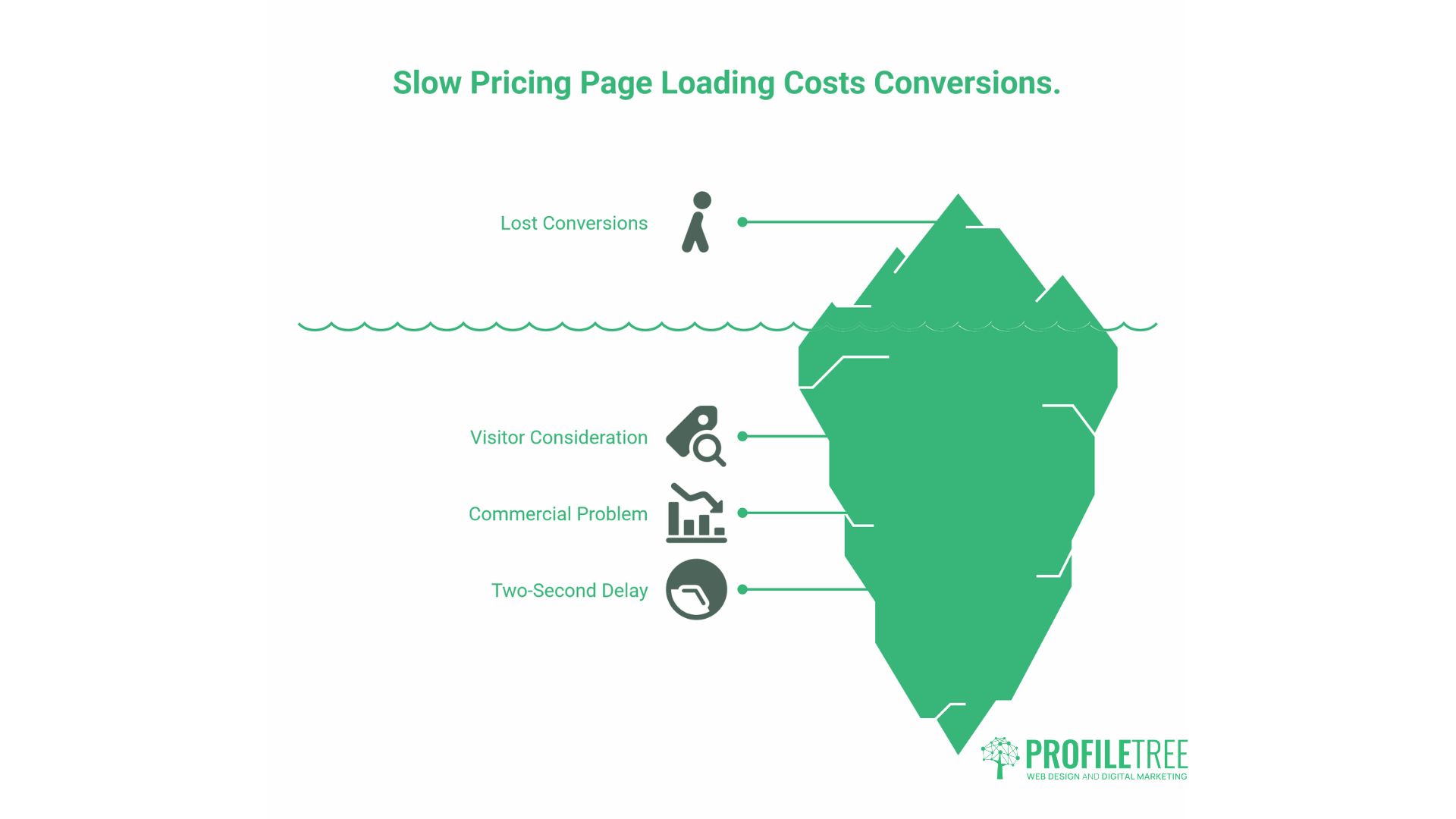
A pricing page that loads slowly costs conversions. This isn’t abstract. A visitor who has decided to review your pricing is actively considering it. A two-second delay at that moment is a real commercial problem.
Common causes of slow pricing pages include large hero images, third-party scripts (chat widgets, analytics, retargeting pixels) that fire on page load, and heavy CSS frameworks for the pricing table itself.
Practical fixes:
- Use WebP format for any images on the page
- Defer non-critical scripts so they don’t block the initial render
- Keep the pricing table in native HTML/CSS rather than a JavaScript-heavy component where possible
- Test with Google PageSpeed Insights and target a mobile performance score above 80
ProfileTree’s web development services include performance auditing as part of the build process. A pricing page that passes the Core Web Vitals thresholds loads faster, ranks better, and converts at a higher rate.
A/B Testing Your Pricing Page
No pricing page is finished at launch. The first version is a hypothesis. Testing tells you whether the hypothesis was right.
What to test:
- CTA button copy (one variable at a time)
- The position of the recommended tier (centre vs. left)
- Whether showing annual pricing by default improves or reduces conversions
- The presence or absence of a free trial offer
- FAQ question: Do more or fewer questions on the page improve time on page and conversion?
Use a tool like Google Optimise (or its replacement), VWO, or a built-in A/B testing feature in your CMS. Run tests for long enough to reach statistical significance: at a minimum, two weeks and a few hundred visits per variant. Decisions made on 50 visits per variant are noise, not signal.
ProfileTree’s digital marketing strategy work includes conversion rate analysis as part of broader campaign planning. Insights from a well-structured A/B test on a pricing page often inform copy decisions across the entire site.
Pricing Page Design for Service Businesses vs Product Businesses
Most pricing page guides are written with SaaS products in mind. Service businesses operate differently, and their designs should reflect that.
| Product/SaaS | Service Business | |
|---|---|---|
| Pricing model | Fixed tiers, self-serve | Often bespoke or consultative |
| CTA | “Start Free Trial” / “Subscribe” | “Book a Call” / “Get a Quote” |
| Decision maker | Often individual | Often team or director-level |
| Key trust signal | User reviews, feature comparison | Starting price or range, where possible |
| Price display | Always show | Often, team or director-level |
| Time to decision | Minutes | Days to weeks |
For service businesses, the pricing page is less a conversion endpoint and more a qualification and trust-building page. Its job is to get the right visitors to take the next step, not to close the sale unassisted.
If you work with SMEs across Northern Ireland, Ireland, or the UK, the digital value proposition work that underpins your pricing page matters as much as the design itself. What you’re selling, to whom, and why it’s worth the price should be resolved before the page is designed.
How a Web Design Agency Approaches Pricing Page Builds
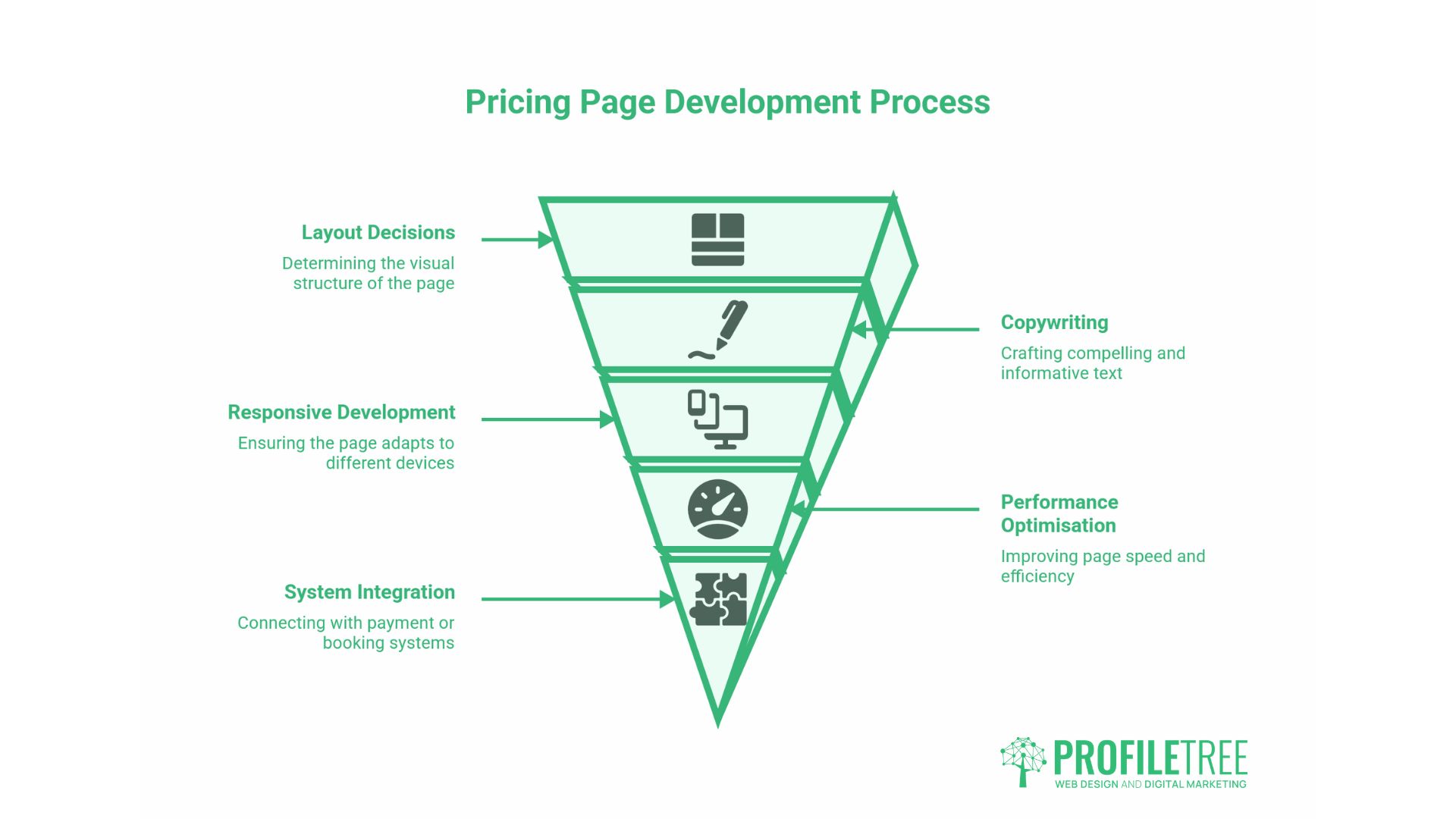
A pricing page is not easy to build well. It involves layout decisions, copywriting, development for responsive behaviour and toggle functionality, performance optimisation, and integration with payment or booking systems.
When ProfileTree builds pricing pages as part of a wider web design project, the process starts with the commercial questions: Who is buying? What do they need to know before they decide? What’s the objection that loses the most deals? Those answers shape the structure. The design and development follow from there.
“The pricing page is often where businesses underinvest compared to the rest of their site,” says Ciaran Connolly, founder of ProfileTree. “They’ll spend weeks on the homepage and service pages and then put together a pricing table in an afternoon. That mismatch shows up directly in their conversion rates.”
If your current pricing page isn’t performing as expected, a structured review of the elements above is usually a faster path to improvement than a full redesign. Start with the data: where are visitors dropping off, what questions are coming to your sales team, and how does your page compare structurally to the pages that rank above you in search results.
Conclusion
A pricing page earns its keep when it gives visitors what they need to make a decision and removes the friction that would otherwise prevent them from doing so. That means the right tier structure, honest and clear copy, social proof placed where it reduces doubt, and a technical foundation that doesn’t undermine the experience on mobile or slow networks.
If you’re reviewing your pricing page or building one from scratch, ProfileTree’s web design team can walk you through the commercial and design questions. Get in touch to start the conversation.
FAQs
What should be on a pricing page?
Every pricing page needs five things: clear pricing tiers, a feature breakdown per tier, a visible call to action for each tier, social proof such as reviews or testimonials, and a FAQ section. For service businesses, also include a starting price or range and a brief description of the engagement process.
How many pricing tiers should you offer?
Three is the most effective number for most businesses. Two tiers force a binary choice, while four or more tiers introduce comparison fatigue, making evaluating options harder than it needs to be. Three tiers also enable price anchoring: a high-priced option makes the middle tier look like an obvious value.
Should you show prices on a B2B service website?
For most B2B service businesses, showing a starting price or a defined range is better than showing nothing. It qualifies visitors before they contact you, thereby building credibility. The exception is genuinely bespoke work where scoping before quoting is unavoidable; in that case, explain the process clearly and make it easy to start that conversation.
How do you display VAT on a UK pricing page?
If you’re selling to consumers (B2C), UK consumer law requires that displayed prices include VAT. For B2B, showing prices excluding VAT is standard, but you must clearly state the ex-VAT status and the applicable rate. Ambiguity here either adds friction through queries or leaves buyers feeling misled when the invoice arrives.