25 Cool Websites That Teach You How to Build a Better Business Site
Table of Contents
Every SME owner has landed on a website and thought: that’s exactly what mine should feel like. Clean, fast, effortless to use, and completely clear about what the business does. That reaction is not accidental. The cool websites that stop people in their tracks are built around deliberate design decisions, and every one of those decisions is something a business in Northern Ireland, Ireland, or the UK can learn from and apply.
This guide moves beyond a standard list. For each cool website featured, there is a specific design or UX lesson that translates into a practical action for your own site. Whether you are planning a first website, preparing for a redesign, or trying to understand why your current site is not converting visitors into enquiries, every cool website on this list gives you a benchmark worth aiming for.
“The most successful business websites are not the flashiest,” says Ciaran Connolly, founder of ProfileTree. “They are the ones that make it completely obvious what you do, who you do it for, and why a visitor should trust you. Study the cool websites that have solved those problems well, and you will have a far clearer brief for your own.”
What Makes a Website Genuinely Cool
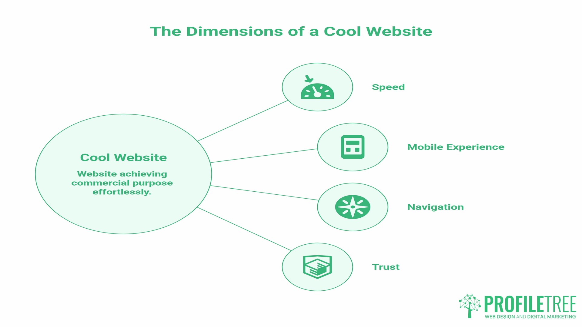
Before getting into the list, it is worth defining the term. From a business perspective, a cool website is not one that wins design awards while confusing visitors. A cool website achieves its commercial purpose while feeling effortless to use. That combination is rarer than it sounds.
The websites that consistently earn that description share a handful of measurable qualities.
Speed That Holds Attention
Google’s research, conducted with SOASTA across millions of mobile sessions, found that 53 per cent of mobile visitors abandon a page that takes longer than three seconds to load. As load time increases from one second to three seconds, the probability of a visitor bouncing rises by 32 per cent. Speed is not a technical nicety; it is the first impression a website makes before a visitor has seen a single word or image.
Mobile Experience Built from the Ground Up
According to StatCounter data, mobile devices accounted for approximately 60 per cent of global web traffic in 2025. Websites that treat mobile as an afterthought, shrinking a desktop layout to fit a smaller screen, consistently underperform against those designed with mobile users as the primary audience. In the UK specifically, mobile accounts for around 57 per cent of web traffic, making mobile-first design a practical necessity rather than a stylistic choice.
Navigation That Does Not Require Thought
Visitors should be able to find what they came for without effort. Every unnecessary click between a visitor and their goal is an opportunity for them to leave. The best cool websites make the right path feel obvious from the moment someone arrives.
A Clear Answer to “Why Should I Trust You”
Within the first few seconds, a business website needs to communicate credibility. This might come through client testimonials, recognisable logos, an explanation of how long the business has operated, or simply the quality of the writing and photography. Absence of trust signals is one of the most common reasons visitors leave without converting.
Business Website Examples Worth Studying
These cool websites are chosen not for novelty but for what they teach. Each one demonstrates a principle your own website could apply.
Stripe
Stripe provides payment processing infrastructure for businesses. The subject matter is complex and technical, but the website is the clearest example of what a cool website can do when explaining a difficult service to a non-specialist audience.
The homepage uses short animated demonstrations to show exactly how the product works before a visitor has read more than a paragraph. Every technical concept is shown, not just described. For any SME selling a service that requires explanation, this approach is directly transferable: use visuals, video, or animation to demonstrate your process rather than relying on text alone.
The lesson for your site: if visitors regularly ask the same question about how your service works, that is a signal that your website is not answering it clearly enough. A short explainer video or a visual process diagram, as ProfileTree’s video production team creates for client sites, can close that gap faster than additional copy.
Notion
Notion is a workspace tool used by teams ranging from freelancers to large organisations. Its website navigates a genuine challenge: the product does many different things for many different types of users, and the site needs to serve all of them without feeling cluttered or unclear.
The solution is a modular layout where each use case is presented on its own terms. A solo writer, a startup team, and an enterprise IT department can each land on the homepage and quickly find a path that speaks to their specific situation.
For SMEs with multiple service lines or different customer types, this is a model worth studying. ProfileTree’s web design work with SMEs regularly addresses exactly this challenge: how to present a range of services without making the site feel unfocused.
Mailchimp
Mailchimp is an email marketing platform. Its website stands out for applying genuine personality to a category of software that often looks identical across competitors. The illustrative style, the conversational copy, and the consistent brand voice make it a cool website in the most commercially meaningful sense: it converts visitors who arrive uncertain into users who feel they understand the product.
The business lesson is about brand voice consistency. The same tone that appears in the headline is used in the button text, error messages, and help documentation. That consistency signals a company that has thought carefully about how it communicates, and it builds trust.
For businesses in Northern Ireland and across the UK, this is a significant opportunity. Most SME websites sound either too formal or too generic. A distinct voice, applied consistently, is one of the most cost-effective ways to differentiate a business online.
Webflow
Webflow is a website builder aimed at designers and developers. Its own website is a direct demonstration of the product’s capabilities: responsive, visually polished, and technically fast. The site effectively argues its own case by existing.
This principle applies directly to any business whose website reflects its expertise. A web design agency with a slow, poorly structured website undermines everything it says about its services. A photography business with low-resolution images faces the same problem. Your website is your most visible piece of work; it either supports or contradicts your claims.
Canva
Canva offers graphic design tools accessible to users without a design background. The website is exceptionally good at showing outputs rather than explaining features. Visitors see finished designs immediately, which builds desire before they have read a single feature description.
The lesson here is about leading with outcomes. Many SME websites lead with process rather than results. Canva’s homepage is a reminder that people buy outcomes, and showing those outcomes is more persuasive than describing them.
Trello
Trello is a project management tool built around a visual board interface. The website mirrors the product’s philosophy: everything is visible, nothing is hidden behind menus, and the most important actions are immediately obvious.
From a UX perspective, Trello’s site demonstrates the value of reducing cognitive load. Visitors should not have to think hard about what to do next on your website. The next step, whether that is reading more, watching a video, or making an enquiry, should be clear and easy to take.
Khan Academy
Khan Academy provides free educational content across subjects from mathematics to computer science. Its website shows how progressive disclosure works in practice. Visitors are not overwhelmed with everything the platform offers on the first screen. Instead, they are guided into a path that matches their level and interest.
For SMEs with genuinely educational content, whether that is a legal firm explaining processes, a financial adviser explaining options, or a training provider explaining course structures, the Khan Academy model is directly applicable. ProfileTree’s digital training services follow a similar principle: content structured to meet learners where they are rather than assuming prior knowledge.
Duolingo
Duolingo is a cool website that teaches languages through gamification mechanics: streaks, points, progress bars, and reward moments. The website conveys all of this before a visitor signs up, making the experience feel appealing before they invest anything.
The principle for SME sites is about reducing perceived risk. Gamification is not necessarily the right tool for every business, but the underlying objective is universal: to make taking the first step feel easy and rewarding rather than uncertain. Free consultations, instant quotes, and visible pricing all serve the same function.
Awwwards
Awwwards curates award-winning website designs with detailed analysis of what makes each one exceptional. It is one of the most useful cool websites available for anyone preparing a website design brief, wanting to understand current design trends, or benchmarking their existing site against what the best designers are producing.
For businesses about to commission a redesign, spending an hour on Awwwards before briefing an agency will sharpen the brief considerably. It also helps establish a shared vocabulary with a design team about what good looks like.
Behance
Behance is a portfolio platform used by designers, illustrators, animators, and creative professionals worldwide. For businesses researching what is possible visually, whether for a website, brand identity, or content marketing, it provides a window into work being done across every industry and style.
Looking outside your own sector is consistently valuable. A professional services firm might find its most relevant design inspiration in how a luxury hospitality brand presents itself online, not in how a competitor with an equally dated website looks.
HubSpot
HubSpot’s website demonstrates how to build trust through content before asking for anything commercial. The resource library, the blog, the free tools, and the academy all exist to help visitors before they become customers. By the time a visitor is ready to consider the paid product, they have already experienced HubSpot’s value directly.
This is the content marketing model at its most effective. For SMEs considering a content marketing investment, HubSpot’s own site is the clearest argument for why it works. ProfileTree’s content marketing services are built around the same principle: create content that answers real questions, and commercial conversations follow naturally.
FutureLearn
FutureLearn is a UK-based online learning platform with university and institution partners. Its website demonstrates how to present a large catalogue of content without overwhelming new visitors: clear filtering, personalised recommendations, and a low-friction sign-up process. For SMEs looking to develop staff, it is also a genuinely useful resource for affordable, structured digital skills training.
Monzo
Monzo is a UK digital bank whose website is one of the clearest, coolest website examples of how to communicate a complex, regulated product in plain, accessible language. Every page avoids jargon. Features are described in terms of what they mean for the customer rather than how they work technically.
For any SME in a regulated sector, whether financial services, legal, health, or property, Monzo’s approach to plain language is worth studying. Accessibility of communication is not just good practice; it directly affects how many visitors convert into enquiries.
Gov.uk
Gov.uk is the benchmark for accessible, clear, functional web design in the UK public sector. Every design decision is made based on whether it helps the user complete their task. It strips away everything decorative that does not serve that purpose.
For SMEs, the lesson is not to replicate the aesthetic but to apply the discipline: for every element on your website, ask whether it helps the visitor move towards the action you want them to take. If it does not, remove it.
The Wayback Machine
The Internet Archive’s Wayback Machine allows anyone to see archived versions of websites going back decades. As a cool website for competitive research, it is underused by most SMEs: you can see how a competitor’s website looked three years ago, track the changes they have made, and draw informed conclusions about where their strategy is heading.
The UK and Ireland Digital Advantage: Cool Websites Made for This Market
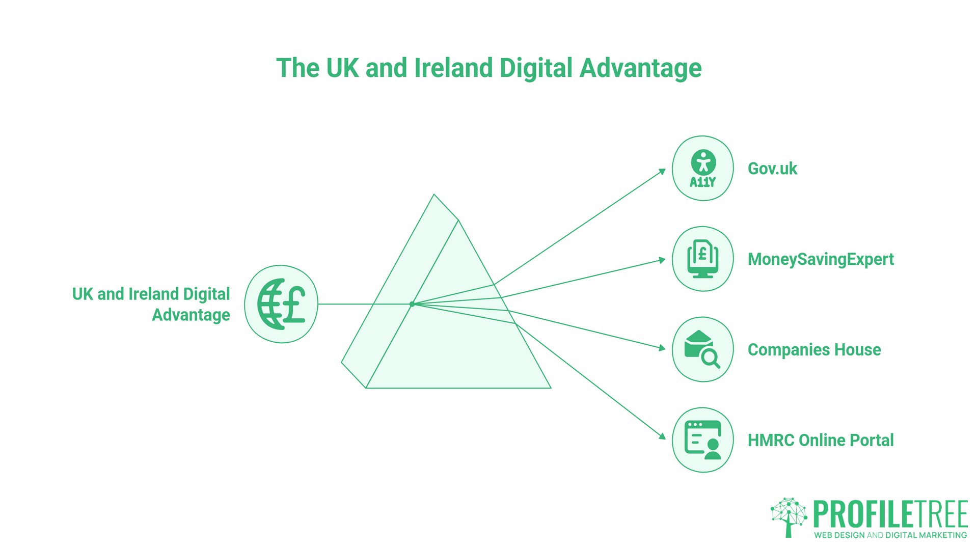
Most cool websites’ lists are compiled with a US audience in mind. For SMEs operating in Northern Ireland, Ireland, and the UK, some of the most relevant business website examples are closer to home.
Not every cool website needs visual flair to be worth studying. These examples may not be conventionally cool websites in the entertainment sense, but they are widely trusted and heavily used. Gov.uk sets the standard for accessibility and plain language in the UK context. MoneySavingExpert demonstrates how content that genuinely serves its audience builds enormous organic traffic and deep trust. Companies House is a practical tool for business research. The HMRC online portal has improved significantly in recent years and offers lessons in how to present complex compliance tasks in a manageable sequence.
Understanding what makes a high-traffic public service site work is directly applicable to SME website planning, particularly when your audience includes users who are not digitally confident.
What Separates an Interesting Website from a High-Performing One
There is a meaningful difference between a cool website that impresses at first glance and one that consistently performs. The most interesting websites, the ones professionals return to as references, tend to share a set of structural qualities that go deeper than visual design.
Clear Information Hierarchy
Visitors scan before they read. The most effective websites organise information so that a scanner can understand what the page is about and where to go next without stopping to read carefully. This means strong headlines, clear subheadings, and visual cues that guide the eye.
Conversion Paths Built In from the Start
Every page on a high-performing business website has a defined purpose. Contact, pricing, portfolio, and service pages all have a role in moving a visitor closer to an enquiry. When those pages are designed in isolation, without considering how a visitor arrives and what they do next, the result is a site where visitors get lost or give up. ProfileTree’s web development process maps these journeys before a single page is built.
Performance That Holds Up Under Scrutiny
A website that looks good in a preview but loads slowly on a mobile connection, fails accessibility checks, or returns errors to search engines is not actually a good website. Tools like Google’s PageSpeed Insights and the WAVE accessibility checker provide free assessments that reveal technical issues invisible to the naked eye.
SEO Built into the Structure
The coolest website in your category is worth very little if no one can find it. Search engine optimisation is not a layer added after a site is built; it informs the URL structure, the heading hierarchy, the internal linking, and the content on every page. ProfileTree’s SEO services work from the site architecture outward, not from individual pages inward.
Applying These Lessons: A Practical Starting Point
Studying cool websites is only useful if it leads to action. These are the steps that translate inspiration into improvement.
Start with your current site’s performance data. Google Search Console and Google Analytics are both free and will show you which pages receive traffic, which queries bring visitors to your site, and where visitors drop off. Most SME owners are surprised by how much this data reveals about what their site is doing and failing to do.
Pick one principle from this list and audit your site against it. If the principle is “lead with outcomes,” look at your homepage and service pages and ask whether they show results or describe processes. If it is “reduce cognitive load,” count the number of options presented to a visitor on your homepage and consider whether any can be removed or deferred.
Brief a designer or developer with specifics, not generalities. A “Make it look more modern” brief is weak. “Reduce the number of navigation items to five, add a short explainer video to the homepage, and ensure the contact button is visible on every page without scrolling” is actionable. The cool websites featured throughout this guide are worth revisiting before any briefing conversation.
A useful starting point for assessing your current site is ProfileTree’s web design overview, which covers the decisions that separate high-converting business websites from those that look the part but fail to deliver
FAQs
What makes a website cool from a business perspective?
A cool website, from a business standpoint, is one that achieves its commercial objective while feeling effortless to use. That means fast load times, clear navigation, a design that builds immediate trust, and content that answers the visitor’s most important questions without requiring effort to find. Visual appeal matters, but only to the extent it supports those goals. A visually striking site that confuses visitors or loads slowly is not performing well, regardless of how it looks.
What are the best cool websites for business design inspiration?
Stripe, Notion, Mailchimp, Webflow, and Monzo are consistently cited by designers and digital strategists as strong examples of business websites. Awwwards and Behance are useful for broader design inspiration across categories. For a UK-specific context, Gov.uk and MoneySavingExpert demonstrate different but equally instructive approaches to serving large, varied audiences through clear design.
How often should a business website be updated?
A full design refresh typically makes sense every 2 to 3 years, depending on how quickly the competitive landscape in your sector is evolving. Content and technical updates should happen continuously: blog posts, case studies, and service page updates keep the site relevant to search engines and to returning visitors. Technical performance, accessibility, and security patches require ongoing attention regardless of design cycles.
Can small businesses afford to implement features seen on leading cool websites?
Most of the principles illustrated by the cool websites in this list do not require large budgets to apply. Clear navigation, fast load times, plain language, and outcome-led content are decisions made at the planning and writing stage, not expensive technical implementations. Some features, like custom animation or complex interactive elements, do require specialist development, but the majority of what makes these sites effective is available to any SME with the right brief and a competent development partner.
How do I know if my website is actually performing well?
Google Search Console shows which queries bring visitors to your site and your average position in search results. Google Analytics shows what visitors do once they arrive: which pages they view, how long they stay, and where they exit. For conversion performance, tracking how many visitors contact you, request a quote, or make a purchase relative to total visits gives a baseline conversion rate to improve against. Most SMEs find that the data from these free tools contradicts their assumptions about which pages are working.
What is a business website example I can show my web designer?
Stripe is the most frequently cited example among digital professionals for service business websites, specifically because of how it explains a complex offering through visuals rather than text. Notion is a strong reference for businesses with multiple service lines or customer types. For tone and brand voice, Mailchimp is useful. For UK businesses specifically, Monzo demonstrates plain-language communication at a high level. Bringing two or three specific references with notes on what you like about each one makes a web design brief considerably more productive.