Mobile-First Strategies: What Every SME Needs to Know
Table of Contents
Mobile-first strategies are no longer a forward-thinking ambition for SMEs in the UK and Ireland. It’s a baseline requirement. With Google using mobile performance as the primary ranking signal and over 60% of web traffic now arriving on smartphones, businesses that still design and plan for desktop first are working against the direction of search, user behaviour, and commercial results.
Asia is worth paying attention to here, not as a distant case study, but as a preview of where Western mobile markets are heading. Markets in China, India, and Southeast Asia reached mobile maturity years ahead of Europe, and the patterns they established (mobile payment integration, app-first commerce, and frictionless UX) are now appearing in Belfast, Dublin, and Manchester.
“The businesses we work with that are seeing the strongest results from their websites are the ones that stopped treating mobile as a version of their desktop site and started building for mobile as the default experience,” says Ciaran Connolly, founder of ProfileTree.
A practical breakdown of what mobile-first strategy actually means in practice, why the Asian market offers a useful model, and how SMEs in the UK and Ireland can apply these lessons to their own digital presence, from web design decisions through to content structure and SEO.
What Do Mobile-First Strategies Actually Mean?
Mobile-first strategy means designing, building, and planning digital content starting from the smallest screen rather than scaling down from desktop. It affects web design, content structure, page speed, navigation, checkout flows, and how a business shows up in search.
Google moved to mobile-first indexing in 2019, which means it now crawls and ranks the mobile version of your site, not the desktop version. If your mobile experience is thin, slow, or poorly structured, your rankings reflect that, regardless of how good the desktop version looks.
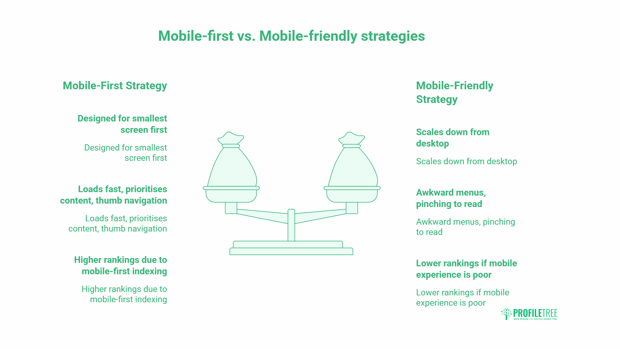
Mobile-First vs Mobile-Friendly: Why the Distinction Matters
A mobile-friendly site scales to fit a phone screen. A mobile-first site is built for the phone screen from the outset, with desktop as the secondary consideration.
The difference is practical. Mobile-friendly sites often carry desktop-sized images, navigation menus that collapse awkwardly, and content blocks that require horizontal scrolling or pinching to read. Mobile-first sites load fast, prioritise the content a phone user actually needs, and structure interactions around thumb navigation rather than cursor clicks.
For SMEs competing in local search in Northern Ireland, Ireland, and the UK, this distinction directly affects whether people stay on your site or leave within three seconds.
Why Asia’s Mobile Markets Are Worth Studying
Asia’s mobile markets are 5 to 10 years ahead of where European markets are now. The conditions that drove rapid mobile adoption there (limited desktop infrastructure, fast 4G rollout, and young demographics) produced consumer habits that are gradually appearing in the UK and Irish markets as mobile becomes the dominant browsing device across all age groups.
Smartphone Adoption and What It Changed
China added over 100 new tech unicorns in 2018 alone, most of them mobile-native businesses. India’s Jio network, launched in 2016, brought affordable 4G to hundreds of millions of people who had never owned a desktop computer. Their first experience of the internet was on a smartphone, which shaped everything from how they shop to how they pay.
The result: businesses in those markets had to build for mobile first or not compete at all. WeChat, the Chinese super-app, became a full commercial platform: payments, shopping, customer service, and social media in a single interface. Alibaba and Shopee built checkout flows optimised for one-thumb operation at 4G speeds.
What This Means for UK and Irish SMEs
UK and Irish consumers aren’t using super-apps, but the behavioural shift is real. According to Ofcom’s 2024 Communications Market Report, smartphones are now the most common device used to access the internet in the UK, with 78% of adults using their phone to go online daily. Google’s own data shows that 53% of mobile users abandon a site that takes longer than three seconds to load.
The practical implication: if your site was built five or more years ago without a mobile-first rebuild, you are likely losing customers before they read a single word of your content.
The Core Components of a Mobile-First Digital Strategy
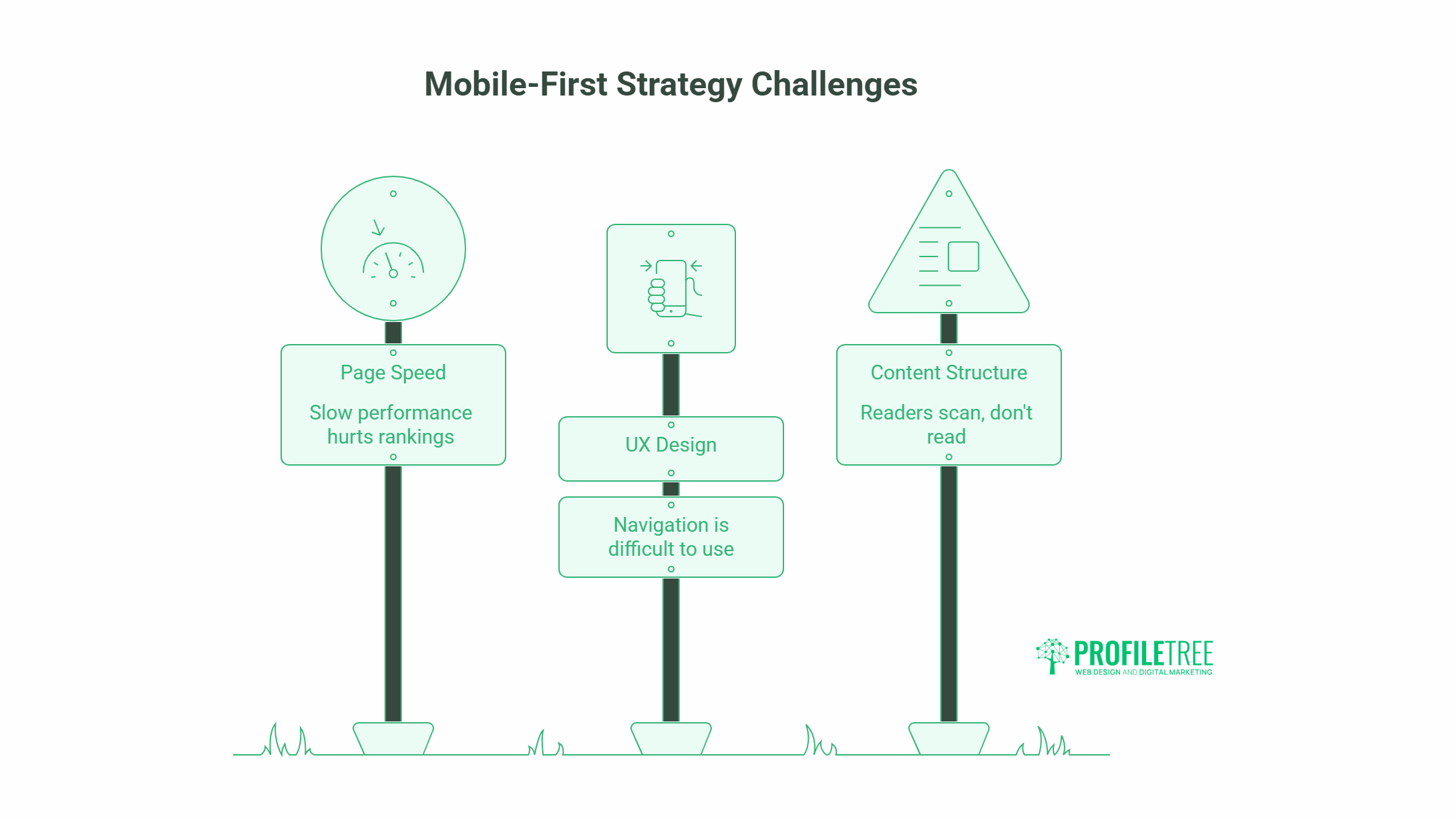
Page Speed and Technical Performance
Page speed is the most measurable mobile-first metric. Google’s Core Web Vitals (Largest Contentful Paint, Interaction to Next Paint, and Cumulative Layout Shift) are direct ranking factors that primarily reflect mobile performance.
LCP should be under 2.5 seconds. INP under 200 milliseconds. CLS under 0.1. Sites failing these thresholds are ranked below sites that pass them, all else being equal.
Common causes of slow mobile performance on SME sites include uncompressed images (the single biggest culprit), render-blocking JavaScript, excessive plugin loads on WordPress, and hosting that isn’t optimised for mobile delivery. A technical SEO audit will identify which of these are affecting your site’s Core Web Vitals scores.
Mobile UX and Navigation Design
Mobile navigation needs to be built around how people actually hold and use a phone. The thumb zone (the area of the screen reachable without adjusting grip) runs roughly from the bottom-centre to the upper-left corner of the screen. Placing primary navigation, CTAs, and form fields within this zone reduces friction and increases completion rates.
For SME sites, this has specific implications:
- Phone numbers should be click-to-call links, not plain text
- Contact forms should have minimal fields: name, email, and one open question outperforms long multi-field forms on mobile
- Menu structures should be flat rather than deep; three taps to reach a service page is two taps too many
- Buttons should have a minimum touch target of 44 x 44 pixels (Apple’s Human Interface Guidelines and Google’s Material Design both specify this)
Content Structure for Mobile Readers
Mobile readers scan before they read. Research from Nielsen Norman Group shows that mobile users spend 50% less time on each page than desktop users, and they scroll rather than read sequentially.
This means content structure matters as much as content quality on mobile. Practically:
- Lead with the answer, not the build-up (the BLUF approach: Bottom Line Up Front)
- Keep paragraphs to two or three sentences
- Use subheadings every 200 to 300 words so people can move through the page by scanning
- Put the most important information above the fold, even on long-form pages
This is exactly the approach that Asian e-commerce platforms applied to product pages: the price, the key benefit, and the buy button are visible without scrolling. The product details follow for people who want it.
Mobile-First SEO: How Rankings Work on Mobile
Google’s mobile-first indexing means your mobile page is the page. If your desktop site has content that the mobile version doesn’t (because it’s hidden behind a tab, inside a collapsed section, or simply not present), Google doesn’t count it.
Local Search and Mobile Intent
Local search is disproportionately mobile. According to Google, 76% of people who search for something nearby on their smartphone visit a business within a day, and 28% of those searches result in a purchase. For businesses in Belfast, Derry, or anywhere across Northern Ireland, appearing in local search results on mobile is a direct commercial lever.
Local SEO for Northern Ireland businesses involves a combination of Google Business Profile optimisation, location-specific page content, consistent NAP (name, address, phone) data, and mobile page performance. All of these compounds: a fast, well-structured mobile page with clear location signals will outperform a slower competitor even if the competitor has more general authority.
Voice Search and Conversational Queries
Mobile search queries are longer and more conversational than desktop queries. People speak questions into their phones: “Who does web design in Belfast?”, “How much does a website cost for a small business?”. This natural language pattern means content should address questions directly, in plain language, with concise answers near the top of each section.
The FAQ section is particularly valuable here. Questions phrased the way people ask them verbally, with direct one- or two-sentence answers, are the format most likely to appear in Google’s featured snippets and AI Overviews.
Mobile Commerce: Lessons from Asia’s E-Commerce Playbook
Frictionless Checkout
Asian e-commerce platforms reduced checkout to its minimum. Shopee’s one-tap buy, WeChat Pay’s in-app payment, Alipay’s stored card infrastructure: all of these emerged because mobile commerce requires less friction than desktop commerce, not more.
For UK and Irish SMEs with e-commerce sites, the same principle applies. A checkout that requires account creation, multiple address fields, and three confirmation screens will see cart abandonment rates of 70% or higher on mobile. WooCommerce development that cuts the mobile checkout to two or three steps can materially improve conversion rates without changing anything about the product or price.
In-App and Social Commerce
Asia’s social commerce model (buying directly within a social platform rather than redirecting to an external site) is arriving in Western markets through Instagram Shopping, TikTok Shop, and Pinterest’s buyable pins. For SMEs targeting younger demographics, the ability to complete a purchase without leaving a social app reduces the friction that causes mobile drop-off.
This doesn’t require building a custom app. It requires that product pages, images, and pricing information are structured for social sharing and that the path from a social post to a completed purchase is as short as possible.
Applying Mobile-First Thinking to Your Digital Strategy
Start with a Mobile Audit
Before making changes, assess where your site actually stands on mobile. Google’s PageSpeed Insights (free) gives Core Web Vitals scores for both mobile and desktop with specific recommendations. Google Search Console’s “Mobile Usability” report flags specific pages with mobile errors. These two tools, used together, give a clear picture of your starting point.
Prioritise the Pages That Matter Most
A full mobile rebuild is rarely the right first step. Prioritise the pages that drive the most commercial value: your homepage, your primary service pages, and your contact page. These are the pages where mobile performance directly affects revenue. Fix the speed, structure, and UX on these pages before moving to the rest of the site.
Build Mobile-First Into New Content
Every new page or article you publish should be written and structured for mobile reading from the start. Short paragraphs, front-loaded answers, clear subheadings, and fast-loading images aren’t just good SEO practice. They match how your audience is actually reading.
ProfileTree’s content marketing services are built around this structure: content that ranks on Google, reads well on a phone, and guides visitors toward a clear next step.
Frequently Asked Questions
What is a mobile-first strategy in simple terms?
Mobile-first strategy means designing and building your website, content, and digital marketing starting from the mobile experience rather than the desktop. It reflects the fact that most web traffic now comes from smartphones, and Google ranks the mobile version of your site.
Does mobile-first apply to small businesses in Northern Ireland?
Yes, and it’s particularly important for local businesses. Most local searches happen on mobile, and Google’s local results are built around mobile intent. A Northern Ireland business with a fast, well-structured mobile site will outperform a competitor with a slow or poorly built one in local search.
How do I know if my site passes mobile-first standards?
Run your URL through Google’s PageSpeed Insights at pagespeed.web.dev. A score above 70 on mobile is a reasonable baseline. Also check Google Search Console’s “Mobile Usability” report for specific errors. If you’re unsure what the results mean or how to fix them, a website audit from ProfileTree will identify the priority issues.
What can UK businesses learn from Asian mobile markets?
Asian markets demonstrate what happens when mobile becomes the dominant channel years ahead of desktop: businesses had to simplify checkout, reduce page weight, and structure content for scanning rather than reading. The UX principles that emerged (fast load times, minimal friction, thumb-friendly navigation) are directly applicable to UK and Irish SME websites today.
How long does it take to see results from mobile-first improvements?
Technical improvements like page speed fixes and mobile usability corrections can show ranking impact within four to eight weeks in Google Search Console. Content and structural changes tend to compound over three to six months as Google re-crawls and re-evaluates the updated pages.