Welcome to our ProfileTree Wix Tutorial for YouTube! In today’s tutorial, we’re diving into the exciting world of website creation using Wix. We’ll walk you through the process of crafting a dynamic and fluid website perfect for today’s digital demands. As we jump in, you’ll notice the website displayed on your screen, a continuation of our last video. This site boasts a unique, cartoony retro aesthetic, setting it apart from many contemporary designs. Join me as we explore this site together, starting with a preview to give you a glimpse of what Wix can do. Let’s get started on this creative journey!
Now, let’s start recreating this site. We’ll begin by opening Wix, which is our main tool for this tutorial. If you’re new to Wix, don’t worry, as we’ll guide you through the initial steps. For this example, we’re assuming our project is a portfolio, and the site we’re working on is named Fincleaver. After logging into Wix and bypassing the chat box, you’ll reach the main dashboard, where you can monitor apps or start customizing your site. For this project, we’ll select a blank template to start from scratch.
Customizing the Header
Our first step in customization involves creating a unique header. Unlike standard headers with a simple layout, we’re aiming for something more innovative. We’ll integrate menu items and potentially use a lightbox feature. To begin, adjust the header colour to match our theme. Next, we’re adding a strip to the header, adjusting its size for a perfect fit. The strip’s background colour is crucial, so we’ll carefully select and match it to our theme.
Adding Menu and Decorative Elements
The next focus is on the menu. We aim to make the header menu functional and visually appealing. First, add an element to the header. For this, we go to the ‘Decorative’ section in Wix. The shape doesn’t matter much initially, as we’ll adjust it later. I chose a simple geometric shape for demonstration. The key part is adding a ‘hamburger’ menu icon, ensuring it stands out by changing its colour to something bold like black.
Incorporating Logos and Titles
Continuing with our Wix site design, the next step is adding a logo. This is a crucial element for branding and identity. After inserting the logo, we’ll focus on the title. I choose a big, bold font for the title, placing it centrally for maximum impact. For this example, we used the ‘Syne’ font at size 32 in bold, ensuring it captures the right attention.
Adding Functional Elements
Next, we’ll enhance our header with practical elements. For instance, if you have an e-commerce component, a shopping basket icon can be added for visual appeal and functionality. Additionally, a ‘Register’ button is a must for user interaction. We’ll create a button, adjust its size, and customize it with a border and transparent background. The button text is set in ‘Syne’ font, bold, with the label ‘Register NY’, and we ensure it’s text-only with no accompanying icon.
Finalizing Header Design
With these elements in place, our header starts to take on a minimalistic yet effective look, echoing the theme of our example site. Adjustments for alignment and size are crucial to achieve a polished and professional appearance.
Creating the Hero Section
Moving on to the hero section, we begin by adding a strip to enhance site responsiveness. We adjust the strip to a precise height of 400 pixels, using the toolbar for accurate measurement. The strip’s background colour is then customized to match our design theme.
Adding Text and Decorative Elements
In replicating our example site, we add essential elements like text for a ‘Live Webinar’ announcement using the ‘Space Grotesque’ font at size 24. We ensure the text is bold and well-aligned. Decorative elements like bullet points are also added for visual interest, using alignment tools for precision placement.
Setting Up Event Details
For event details, we use text elements to display the date and time. In this case, we chose ‘5 November 2023 at 6 pm’. Alignment and formatting tools are again employed for perfect placement and legibility.
Final Touches with Buttons and Alignment
Finally, we return to our header to add a ‘Register’ button, adjusting its size for consistency and visibility. Throughout this process, tools like alignment guides and size adjustment features in Wix help maintain a clean and professional layout.
Customizing Buttons and Finalizing Hero Section
After creating our main menu and title, it’s time to refine the ‘Register’ button. We’ll copy, resize, and adjust the font size of this button for visual coherence. Setting the font size to 20 ensures readability and aesthetic appeal. With this, our hero section, a key focal point of the site, is complete. This section acts as an engaging introduction to your website’s content and offerings.
Next, we introduce another strip to showcase a video, enhancing the dynamic nature of the site. After adjusting the strip size to 582 pixels for consistency, we focus on incorporating a video element. Wix’s video box feature allows easy insertion and customization of video content. For instance, a video related to Bitcoin with a transparent background was chosen. Adjusting the video size to fit our layout, we ensure the video enhances rather than overwhelms the page.
Final Adjustments to Video Section
Fine-tuning the video dimensions is crucial. While trying to set specific measurements (524 x 1341 pixels), we encounter limitations. Thus, we compromise by slightly increasing the strip size to 710 pixels to accommodate the video adequately. These adjustments are vital to ensure a balanced and visually pleasing layout.
Creating Interactive Menu Items
Returning to the header, we now focus on creating a drop-down menu for enhanced navigation. This involves adding interactive elements from Wix’s vast library. We select a lightbox element for its engaging and user-friendly properties. Although we start with a ‘Subscribe’ template, it’s modified to suit our site’s theme and content.
Customizing Lightbox and Adding Content
Adjusting the lightbox involves changing the overlay background to white and modifying the text colour and layout. We aim for a finance-related theme, hence opting for green colours reminiscent of money. This customization process extends to paragraph elements, where we input relevant information such as contact details and page links. We ensure the text style and size (25px) are consistent with the site’s design, making adjustments to line spacing for readability and visual appeal.
Linking Pages for Seamless Navigation
The final step involves linking these menu items to various pages on the site, such as ‘Finances’, ‘Explore’, and ‘Contact’. This enhances user experience by providing easy navigation. We demonstrate how to manage and create new pages within Wix, offering insights into duplicating existing pages for efficiency.
Adding and Linking New Pages
With the hero section and video completed, we move to add and link new pages for seamless site navigation. Adding a ‘Contact’ page is straightforward using Wix’s pre-made templates. Once all pages are in place, including ‘About’ and ‘Contact’, it’s essential to link them properly. This step is crucial for user navigation, ensuring visitors can easily move through the site.
Enhancing Header Navigation
To address the issue of navigating back to the home page, we introduce links in the header. Linking the logo or a specific ‘Home’ text to the homepage ensures users can return easily. Moreover, we delve into header customization options, such as changing scroll settings for a fixed or floating header. This part of the tutorial emphasizes the importance of a functional and user-friendly navigation system in web design.
Optimizing Site Layout and Interactivity
A crucial aspect of web design is ensuring clarity and ease of use. To achieve this, we consider modifying the header layout. For example, by pinning certain elements (like the menu and register button) to specific screen areas, we create a cleaner and more organized header. This technique enhances the user experience by keeping essential navigation elements accessible.
Linking to Lightbox and Finalizing Header
The next step involves linking a vector art piece in the header to a lightbox, a feature that adds interactive elements to the site. This approach keeps the user engaged and enhances the site’s overall interactivity. Renaming and organizing lightboxes and linking them to the appropriate pages are essential for a coherent user experience.
Building an Engaging Content Section
We then focus on adding a new section with strips, a feature that enhances responsiveness and visual appeal. Strips are versatile, allowing for the creation of columns and varied layouts. This section covers how to manage and adjust strips, emphasizing the importance of responsive design in modern web building.
Incorporating Container Boxes and Vector Art
Next, we introduce container boxes and vector art to add depth and dimension to the site. These elements are used to create engaging visuals and interactive features. Adjusting sizes, colours, and borders of these elements is detailed, showing how to tailor them to fit the overall site design.
Adding Hover Effects for Interactive Experience
Finally, we demonstrate how to create hover effects, an essential feature for an interactive website. By adjusting settings on container boxes and vector art, we show how to create dynamic interactions that respond to user movements. This segment highlights the potential of Wix to create a website that’s not only visually appealing but also engaging and user-friendly.
Troubleshooting Hover Interactions
As we approach the final stages of our site design, it’s crucial to fine-tune interactive elements like hover effects. Occasionally, these effects may not work as intended, such as an unwanted colour change on hover. In this part of the tutorial, we troubleshoot such issues, focusing on customizing hover effects to ensure they align with the site’s overall design. This includes choosing the right effect and ensuring the design remains consistent on hover.
Perfecting the Site’s Animation and Layout
Next, we delve into adding and refining animations to enhance the site’s dynamic feel. This involves setting up sections to glide in from specific directions and ensuring these animations are consistent across different elements. We also emphasize the importance of layout adjustments, like aligning images and text within columns for a clean and professional look.
Building the Footer for Comprehensive Information
Creating a Functional and Informative Footer
The footer is an essential part of any website, offering final information and links. In this section, we demonstrate how to build a comprehensive footer. This includes adding contact information, social media links, a newsletter sign-up form, and Google Maps integration. We focus on how to customize these elements for a coherent look that matches the overall site design.
Ensuring User-Friendly Navigation and Links
We also cover how to make the footer user-friendly, ensuring that elements like social media icons are easily clickable and link to the correct URLs. Adjusting the layout and design of these elements is crucial for a visually appealing and functional footer.
Final Review and Site Preview
Previewing and Assessing the Completed Site
With all sections completed, we proceed to preview the entire site. This final review is vital to ensure everything from the header to the footer functions seamlessly and the site’s design is fluid and responsive. We also make last-minute adjustments, such as disabling automatic lightbox pop-ups, to enhance the user experience.
Conclusion and Encouragement for Creativity
In conclusion, this tutorial offers a comprehensive guide to creating a fluid website design using Wix. While this tutorial provides a foundational approach, we encourage viewers to infuse their creativity and content for a unique site. Finally, we invite questions and feedback, reminding the audience of the tutorial’s goal to serve as a starting point for their web design journey.
Conclusion
Thank you for following along with this Wix tutorial. If you have any questions or need further clarification on any steps, feel free to leave a comment below. We look forward to seeing your creative website designs and are here to assist with any additional guidance. See you in the next tutorial!
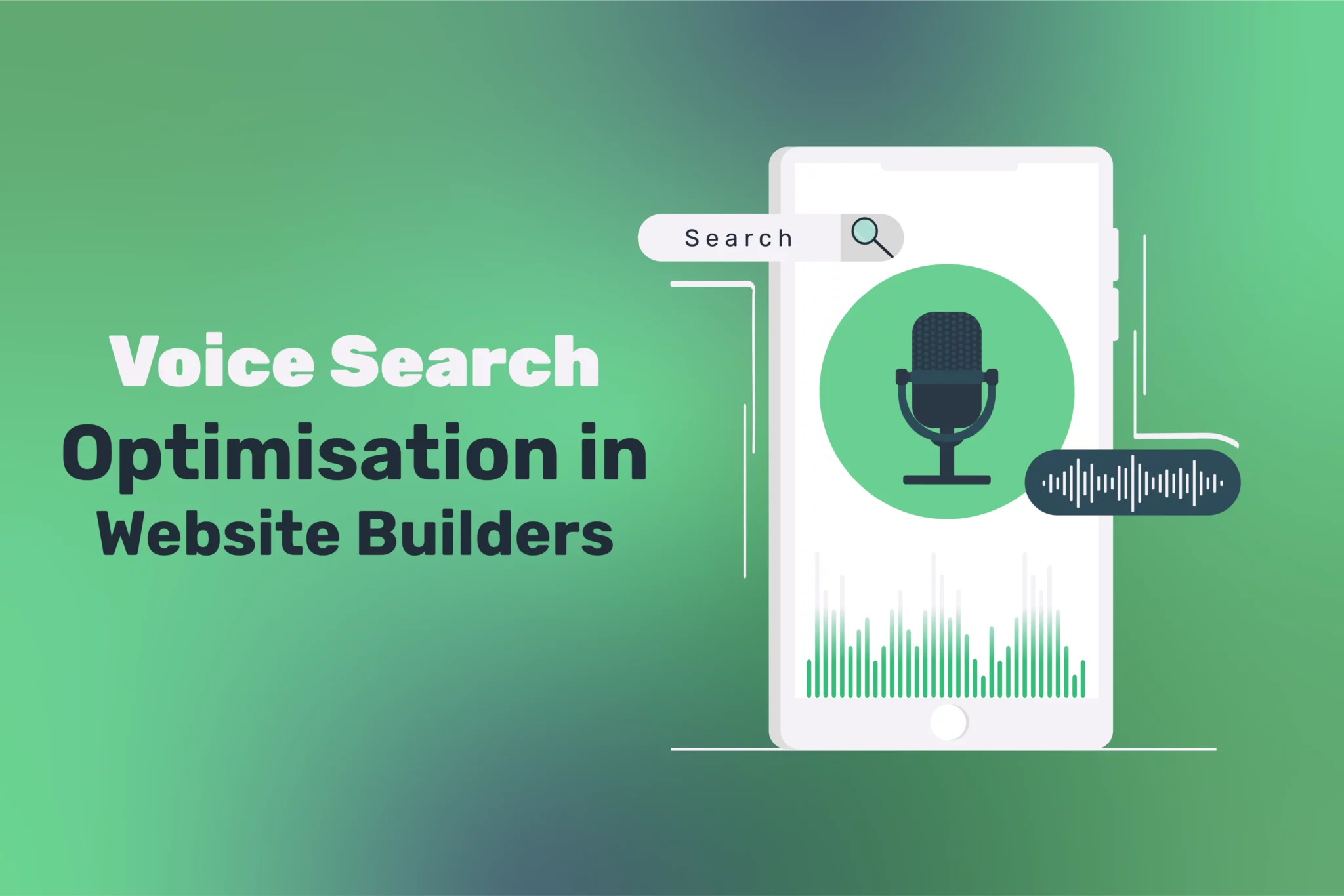
As voice assistants like Siri, Alexa, and Google Assistant grow, voice search optimisation (VSO) has become increasingly crucial for businesses looking to maintain a competitive edge....
All-in-One Website Builders: Hosting, Domains, and Design in 1 Platform have transformed how businesses approach their digital presence, offering streamlined solutions that eliminate the complexity of...
In today’s digital-first landscape, customers interact with brands across numerous touchpoints—websites, social media, email, advertisements, and offline mediums. To make a lasting impression and stand out...