Heatmaps for Website Optimisation: Understanding User Behaviour
Table of Contents
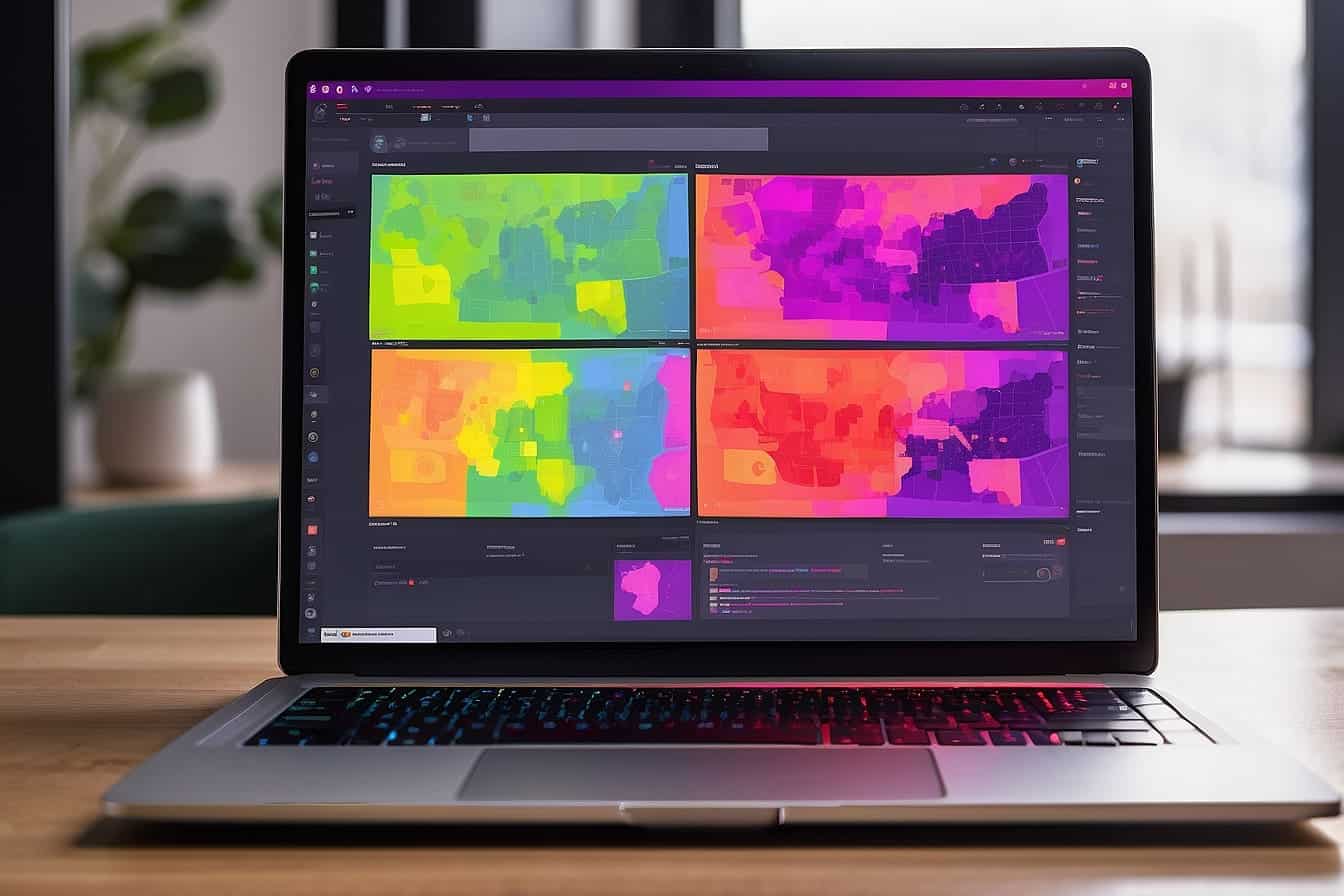
Heatmaps serve as a crucial data visualisation tool that brings a new dimension to analysing user behaviour on a website. By representing different levels of user activity with varying colours—usually warm colours for high user activity and cool colours for lower activity—using heatmaps can provide a clear, intuitive way to understand complex data. We can use heatmaps to see where visitors are clicking, how far they scroll, and what elements of a page are grabbing their attention, which enables us to make informed decisions about site design and content placement.
The goal of leveraging heatmaps for website optimisation is to enhance user experience by making adjustments based on real user interactions. For instance, if a heatmap indicates that a key call to action is being overlooked, we might decide to move it to a more prominent location on the page or make it more visually appealing. Heatmaps also come in various types, including click maps, scroll maps, and move maps—each providing unique insights into how users engage with a website. Armed with such data, we can streamline the user journey, improve engagement, and ultimately increase conversion rates.
By methodically interpreting heatmap data, we open up opportunities to optimise page design, tailor content to user preferences, and conduct A/B testing with a clear understanding of the variables at play. With the insight that heatmaps offer, we can move beyond guesswork, implement changes that matter, and measure the impact directly through improved website performance.
Understanding and Using Heatmaps
In the realm of website optimisation, heatmaps offer a compelling visual representation of data, revealing user interactions on a given page.
Types of Heatmaps
There are several distinct types of heatmaps deployed to analyse user behaviour:
- Click maps show where users have clicked on a page, highlighting the hotspots of interaction.
- Scroll maps indicate how far down users scroll, shedding light on content visibility.
- Movement maps track where a user’s mouse moves across the screen, often correlating to where they are looking.
By employing these different types of heatmaps, we can gain insight into which parts of a webpage attract the most attention and where improvements might be warranted.
The Science Behind Heatmaps
Heatmaps utilise a color spectrum, typically from cool to warm tones, to signify levels of user activity. Colder colours such as blue represent lesser engagement, while warmer colours like red denote areas of high user interaction.
This data origins from a visual representation that allows us to comprehend complex data sets intuitively, by presenting them in a more approachable, graphic format. Heatmaps transform numerical data into a colour-coded analysis, enabling us to quickly identify trends and patterns in website user behaviour. Through this, we’re equipped to make data-driven decisions that can significantly enhance a website’s user experience and effectiveness.
Now, let us draw upon a piece of wisdom from our experience. As ProfileTree’s Digital Strategist, Stephen McClelland, advises, “Heatmaps are pivotal in moving beyond the superficial layer of website analytics. They help us to visualise the user’s journey, painting a picture of their online interactions that’s worth more than numbers alone.”
By grounding our discussion in the specifics of types of heatmaps and their underlying science, we have laid out the foundational elements through which heatmaps inform website optimization strategies.
Collecting Data with Heatmaps
As experts in the field, we understand that utilising heatmaps is pivotal for gathering insightful data on user behaviour. These tools allow us to see beyond basic analytics by visually representing how users interact with our websites, which can be crucial for enhancing usability and conversion rates.
Integrating Heatmap Tools
The first step to collecting meaningful data is by integrating heatmap tools into your website. Solutions such as Hotjar offer a seamless integration process that can be set up with minimal technical skills. Simply by adding a tracking code to your website, you can start collecting real-time user behavioural data. This includes vital information such as clicks, scrolls, and mouse movement patterns, which are then aggregated into a heatmap.
Gathering Comprehensive Data
Once your tools are in place, the focus shifts to gathering comprehensive data. Heatmaps provide a rich visual representation, highlighting areas of high engagement through warmer colours and areas with less interaction with cooler tones. To drill down further, we analyse specific engagement metrics—like where users are clicking most frequently or which parts of a page they’re spending the most time on. This visualisation of data is essential not only in identifying usability issues but also in optimising the user journey to improve overall site performance.
By leveraging this powerful combination of heatmap integration and data analysis, we at ProfileTree ensure that our strategic decisions are driven by actual user behaviour, leading to more effective website optimisations.
Interpreting Heatmap Data
Heatmap data offers critical insights into how visitors interact with your website. Through careful analysis, we can understand user behaviour and identify usability issues, facilitating informed decisions to optimise the site’s design for improved engagement and conversions.
Understanding User Behaviour
When we assess heatmap data, we first observe where users click, how far they scroll, and how they move through our website. Click heatmaps are particularly enlightening, revealing the most and least interacted areas of a page. A complete guide on using heatmaps illustrates that by tracking these clicks, we gain a clear view of user priorities and preferences. The scroll-depth data complement these insights by showing us the exact point where users stop engaging, which can be crucial for understanding the optimal placement of key content and calls to action (CTAs).
Identifying Usability Issues
Interpreting heatmap insights can help us pinpoint pain points within the user experience. For instance, if we notice a high volume of clicks on non-clickable elements, this suggests potential confusion and a need to clarify our website’s design. Other issues might include cluttered layouts leading to decision fatigue or essential CTAs that go unnoticed. Drawing on data, how to interpret Hotjar heatmaps shows prioritising these findings can guide us in streamlining design and leading our users more effectively towards the desired actions, thus fostering better user interactions and higher conversion rates.
By combining the methodical insights from heatmaps with our expertise in web design and SEO, we at ProfileTree consistently enhance the performance of our clients’ digital platforms. “The true power of heatmaps lies in their ability to translate complex user behaviour into actionable website improvements,” shares ProfileTree’s Digital Strategist, Stephen McClelland. With our tailored approach, we ensure your website not only attracts visitors but also engages and converts them successfully.
Optimising Page Design
When using heatmaps to enhance your website’s design, it’s crucial to pinpoint which elements attract the most interaction and to adjust accordingly for increased user engagement and conversion.
Leveraging Design for Engagement
Heatmaps provide visual data that highlight how users interact with your website design. We leverage this data to optimise the placement of key elements such as images and text blocks to enhance user experience. By analysing areas with high engagement, we can strategically place the most valuable content where users are most likely to focus, ensuring they find what they’re looking for seamlessly.
Locating and Enhancing CTAs
Call-to-Action (CTA) buttons are the gateway to converting visitors into customers. Through heatmap insights, we identify the most effective locations for these buttons, ensuring they’re both visible and appealing. Often, non-clickable elements that erroneously attract clicks can be transformed into CTAs to capitalise on user interest. For example, a heatmap may show that visitors frequently click on an image; in response, we can make that image a clickable link to maximise conversion opportunities.
Utilising a heatmap tool, we’re able to refine both the position and appearance of CTAs to resonate more effectively with our audience. It’s not just about making the buttons larger or more colourful; it’s about placing them in a context within the webpage where they naturally draw attention and encourage action.
Ciaran Connolly, ProfileTree Founder, asserts, “The nuanced understanding of user behaviour gained from heatmap data is invaluable for fine-tuning CTAs, as it transcends simple guesswork and provides concrete evidence on which to base design decisions.”
Improving User Engagement
To enhance user engagement on your website, it’s crucial to present content effectively and design layouts that encourage interaction. By using heatmaps, you can identify which areas of your site capture attention and where improvements are needed.
Structuring Content for Attention
Your content should be strategically positioned where it’s most likely to be seen. Scroll heatmaps reveal the portions of your website that attract the most views, indicating where to place your most important content. Users tend to focus on the material that appears without scrolling, so your key messages and calls to action (CTAs) should be prominent in this area.
Maximising Interaction Through Layout
Layouts should be designed to not only attract but also retain user attention and encourage interaction. Heatmaps can show where users are most engaged through clicks, allowing us to optimise the placement of interactive elements like CTAs. A well-placed CTA, aligned with user heatmap data, can significantly increase user engagement.
By using scroll heatmaps, you gain valuable insights into how far users are willing to scroll, informing the length of your content and the placement of important CTAs to maintain engagement throughout their visit.
Enhancing Conversion Rates
Heatmaps are powerful tools in our arsenal for optimising websites, particularly when it comes to enhancing conversion rates. By visualising where visitors focus and click on a page, we can make informed decisions to guide them more effectively towards conversion goals.
Utilising Insights for Conversion
Uncovering insights through heatmaps involves identifying not just where visitors click, but also where they don’t. For instance, we might observe that users are not scrolling down enough to see the call-to-action (CTA) at the bottom of a landing page. Alternatively, a click heatmap could reveal that a non-clickable element is receiving a lot of attention, signalling a potential area to introduce a new CTA.
These insights allow us to strategically tweak page designs to direct users’ attention to areas that matter most for business goals. By rearranging elements to align with users’ natural browsing patterns, we can remove friction points that impede converting and improve our overall conversion rate optimisation (CRO) strategy.
Effective CTAs and Conversion Points
A critical component in harnessing heatmaps for increased conversion lies in the optimisation of CTA buttons and conversion points. By analysing heatmap data, we can pinpoint the most effective placements for CTAs and ensure they’re prominent and inviting. This could mean changing the colour contrast to make them stand out or placing CTAs in locations where users tend to focus based on heatmap analysis.
Besides placement, the messaging of CTAs also plays a significant role in driving conversions. We must ensure that the language is clear, action-oriented, and resonates with the visitor’s intent. Boldly emphasising the benefit that comes from clicking can transform a hesitant visitor into a converting customer. For example, instead of a bland ‘Submit’ button, a vibrant ‘Get Your Free Guide Now’ can work wonders in boosting conversion rates.
By applying these techniques, we adjust and refine the elements of our landing page to create a more compelling and user-friendly path to conversion.
Heatmaps on Different Platforms
In this section, we explore how heatmaps can be used on various platforms, with a focus on desktop and mobile analysis, as well as the implications for responsive design. We’ll outline key differences and considerations for effectively utilising heatmaps to optimise user experience across devices.
Desktop Versus Mobile Analysis
When analysing user behaviour on desktops, heatmaps provide insights based on cursor movements, clicks, and scrolling patterns. These heatmaps can help us understand how users interact with content and what areas of the website capture their attention. On the other hand, mobile devices offer a different interaction, relying on taps, swipes, and the touch interface. The heatmaps on mobiles often reveal a more condensed view of user engagement due to the smaller screen size, requiring a different approach to optimise navigation and content layout.
Comparing heatmap data from both platforms is crucial since it helps us tailor the user experience specifically for each device. For instance, a feature that is hot on desktop may be cold on mobile, suggesting a need for design adjustments. We avoid assumptions that user behaviour is uniform across devices, as we recognise the critical nuances in navigating through a touchscreen versus a mouse and keyboard setup.
Responsive Design and Heatmaps
Heatmaps are an invaluable tool for analysing how well a website’s responsive design adapts to various screen sizes. They enable us to observe where users encounter issues or disengage, helping us optimise the layout and functionality. By examining how elements of a webpage reflow and resize on different devices, we ensure that our design is not only visually appealing but also functional and intuitive.
We are mindful that code and design must work in tandem to create an effective responsive experience. By scrutinising heatmap data, we can identify if certain features are overlooked or if a call-to-action button doesn’t translate well on a smaller screen. This will help guide any necessary code tweaks or design updates to enhance usability across platforms.
A/B Testing with Heatmaps
When optimising a website, A/B testing with heatmaps offers a powerful combination to understand user behaviour and enhance website performance. Through this method, you can employ visual tools to pinpoint areas for improvement and validate your experimental changes with precision.
Setting Up A/B Tests
To begin with, A/B testing involves comparing two versions of a web page to see which one performs better. Set up your A/B test by choosing one variable to change, be it the colour of a call-to-action button or the position of a sign-up form. Then, split your web traffic between the original design (the control) and the modified design (the variation). Use click heatmaps to observe where users are clicking most frequently on each page variant, ensuring that you have a clear goal, such as reducing bounce rate or increasing engagement with a specific section of the page.
- Identify the goal of your A/B test, which might include increasing click-through rates or conversions.
- Select the element you want to test, such as a headline, image, or button.
- Create the variant with the one element changed from the original.
- Split your traffic equally between the control and the variant.
- Run the test for a statistically significant period.
Interpreting A/B Test Results
The results of your A/B tests can be complex, but heatmaps simplify data interpretation by visually displaying user interactions. Evaluate the data by looking at metrics like engagement rate, click distribution, and movement patterns. For example, if the variation shows a concentrated amount of clicks on the intended call-to-action (CTA), it’s likely performing better than the control. A heatmap can reveal if users are behaving as expected, or if they’re trying to click on non-interactive elements—a sign that your design may need adjusting.
- Analyse click patterns to understand which elements are attracting the most attention.
- Look for changes in scroll depth to see if users are engaging more thoroughly with the content.
- Compare bounce rates between the control and variant to assess performance.
- Take note of user flow to determine if the changes are positively guiding users through your intended path.
Through thorough analysis of A/B test results, we not only refine user experience but can also implement direct improvements to the website in a way that’s guided by actual user behaviour. It’s the intersection of qualitative data and quantitative results that allows for a nuanced approach to optimisation and a better understanding of our audience.
Actionable Insights from Heatmaps
Heatmaps are invaluable tools providing clarity on how visitors interact with your website. By analysing the warm and cold areas on your website, you can pinpoint issues and trends, translating raw data into strategic actions, and fostering a culture of continuous improvement.
Translating Data into Actions
When we sift through the data presented by heatmaps, we’re able to extract useful insights directly affecting our website’s performance. For instance, analysis might reveal that users consistently ignore a critical call to action because it’s situated in a ‘cold’ area. By strategically relocating this to a ‘hot’ area, where users typically click, we can optimise for better engagement. Similarly, tracking where users drop off on a page can signal content or design elements that may be causing confusion or disinterest.
- Identify the underperforming areas on your website where users seem to lose interest.
- Reposition vital elements like call-to-actions based on heatmap visualisations, moving them to areas that users interact with the most.
- Streamline the user journey by removing or redesigning confusing navigation links that might be causing user disengagement.
Continuous Improvement Loop
The insights drawn from heatmaps should feed back into a cycle of testing, learning, and optimising. It’s here that we set tangible goals and deploy iterative changes to see how user behaviour is affected. Suppose you’ve got feedback that a page is too cluttered. A heatmap can validate this if you see little interaction on crowded areas. You’d then use this feedback to declutter the page and observe if the heatmap changes. It’s a loop that starts and ends with user behaviour, grounded in their interaction with your site.
- Apply changes based on the heatmap findings to address user friction points.
- Measure the results of the changes by comparing new heatmaps to the old.
- Refine and repeat, incorporating user feedback and emerging trends for a website that truly resonates with your audience’s needs.
By keeping these practices central to our heatmap analysis, we, at ProfileTree, ensure that every piece of data is translated into meaningful actions, propelling your website’s evolution and success.
Best Practices for Heatmap Analysis
When it comes to website optimisation, understanding user behaviour through heatmap analysis is key to improving the user experience and increasing conversion rates. Let’s explore the best practices that will empower you to harness the full potential of heatmaps for your website’s success.
Consistency in Data Collection
Consistency in tracking and analysing user behaviour is crucial for spotting both positive and negative trends over time. It’s important to set up a routine for data collection, as this will ensure the data’s reliability and validity. Using tools like Google Analytics can help to gather comprehensive behavioural data. Moreover, it’s worthwhile to consider gathering data across different devices and time periods to gain a well-rounded view of user interactions.
Benchmarking and Measuring Success
To measure the success of your website’s heatmap data, you must establish clear benchmarks. These benchmarks could include average session duration, bounce rates, or conversion rates. By observing how users navigate your site and interact with content, you can identify areas of the site that need improvement. For instance, a sudden drop-off on a particular page may signal a need for redesign or better content alignment with user expectations.
By regularly reviewing how changes on your site impact these metrics, you can iteratively refine your strategy to optimise for success. It’s like piecing together a puzzle; each tweak based on heatmap data brings you closer to a complete picture of user engagement and satisfaction.
Remember, the goal is not just to attract clicks but to guide users smoothly towards conversion points. Conversions are the ultimate indicator that your site is not just ‘seen’, but that it truly resonates with your audience.
Case Studies and Examples
In this section, we’ll be focusing on how heatmaps have been employed by businesses for website optimisation, with a specific look at the e-commerce sector and informational websites. We’ll explore real-world applications that demonstrate the transformative effects heatmaps can have on user experience and sales.
E-commerce Optimisation
Heatmaps are a powerful tool that we in the e-commerce sphere deploy to understand customer behaviour on key landing pages such as a homepage or a product page. In one striking example from the online retailer Booking.com, heatmaps provided deep insights that helped reduce high bounce rates. By leveraging this AI-enhanced technology, the company could identify and resolve design elements that were causing user friction.
- Booking.com’s Website Optimization:
- Goal: Minimise bounce rates and improve user engagement
- Approach: Applied heatmaps to study user interactions
- Outcome: Enhanced site design based on data-driven analysis
Improving Information Websites
When it comes to informational websites, the application of heatmaps is particularly intriguing, as they assist in fine-tuning content placement and navigation to keep visitors engaged. An example of this is how a leading news portal used heatmaps to optimise their homepage, leading to a significant uptick in online readership and time spent on site.
- Leading News Portal’s Content Engagement:
- Goal: Increase reader engagement and time on site
- Approach: Utilised heatmaps to track readers’ content interaction
- Outcome: Improved content layout that led to longer visit durations
By integrating these data-driven methods, we’ve seen sales and user satisfaction soar, substantiating the impact of heatmaps on website optimisation. Through such case studies, we gather that a meticulous analysis of heatmap data can substantially alter how users perceive and interact with e-commerce and information websites alike.
FAQs
Heatmaps are an invaluable tool for website optimisation. They allow us to visualise user behaviour, clearly identifying which areas of a site are engaging visitors the most, and which may require improvement. Let’s explore some common questions about using heatmaps effectively.
How do I interpret user behaviour using a heatmap on my website?
Interpreting user behaviour on your website with a heatmap involves looking at where users click, move, and scroll. Areas that receive more activity are typically warmer in colour on the heatmap. This can indicate where visitors are most engaged or where they may be experiencing confusion.
What are the best practices for implementing heatmaps in website analytics?
When implementing heatmaps, it’s crucial to define clear goals for what you want to learn. Ensure that the data collected is substantial enough to identify patterns. Regularly updating heatmaps is also important to accommodate changes in user behaviour and website updates. We recommend aligning heatmap data with other analytic tools for the most accurate insights.
In what ways can heatmaps contribute to the optimisation of conversion rates?
Heatmaps can pinpoint where users are dropping off or becoming disengaged, allowing us to make data-driven decisions on layout changes, call-to-action placements, and content adjustments. By optimising these elements based on heatmap data, we significantly increase the likelihood of conversion.
How can I use heatmaps to identify usability issues on my site?
Usability issues become apparent when heatmap patterns show that users are clicking on non-clickable elements, frequently leaving the page from a particular point, or not scrolling to important content. Diagnosis and resolution of these issues can lead to a smoother user experience.
What are the differences between click, move, and scroll heatmaps, and how can each type inform website enhancements?
Click heatmaps show where users are clicking and help us understand what draws their attention. Move heatmaps track where the cursor moves and can indicate reading patterns, while scroll heatmaps reveal the depth users scroll to, informing us about content engagement levels. Each type gives unique insights that can guide us in refining our website design and content strategy.
How can I integrate heatmaps with other analytical tools like Google Analytics for a comprehensive website analysis?
To achieve a comprehensive analysis, integrate heatmaps with tools like Google Analytics to compare user behaviour data with other metrics like bounce rates and conversion paths. This combination enables us to have a holistic view of user interactions and the performance of different site elements.