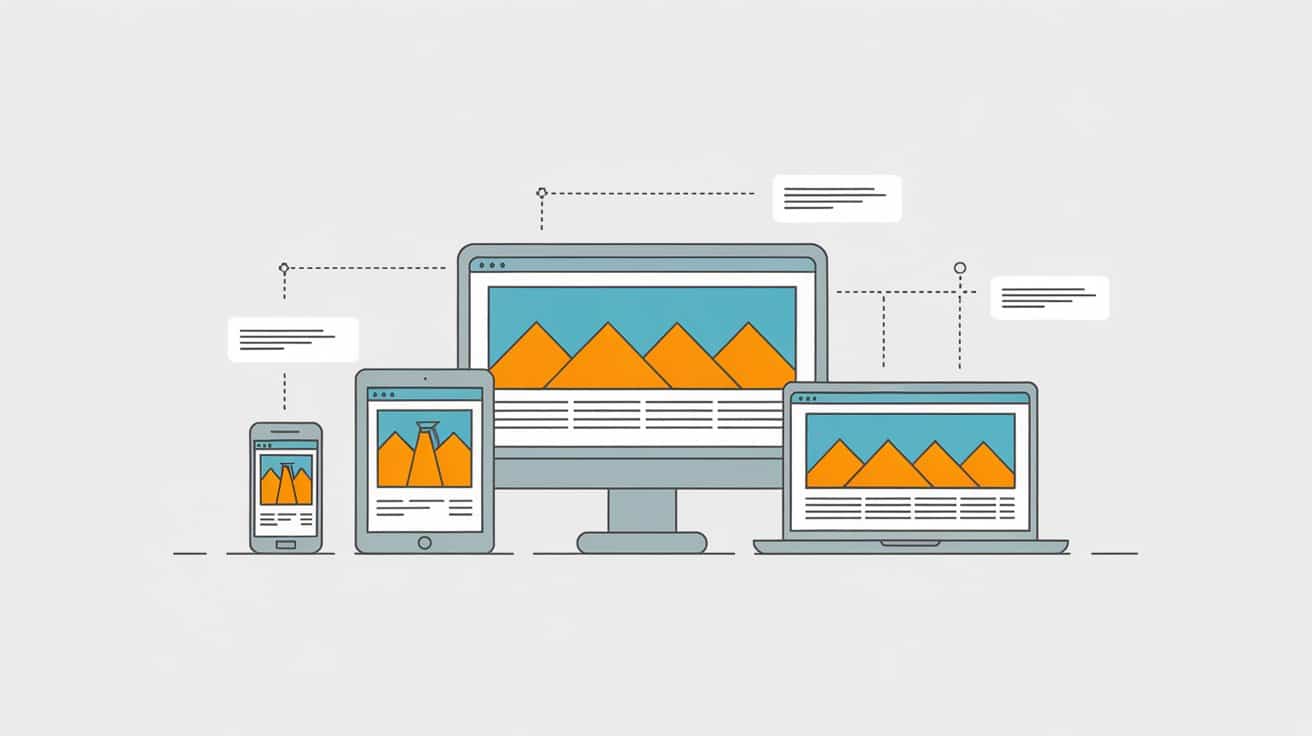
In the fast-evolving world of web design, ensuring your website delivers a seamless experience across a variety of devices is more important than ever. As mobile usage continues to dominate, and with the constant introduction of new screen sizes and resolutions, choosing the right design approach has become crucial for success.
In 2025, the debate between responsive and adaptive design remains at the forefront of web development discussions. While both aim to improve user experience, they achieve this in different ways. So, how do you decide which approach is best for your website?
Responsive design is a web design approach that uses flexible grids, fluid images, and CSS media queries to ensure a website’s layout and elements adjust seamlessly to fit different screen resolutions, from desktops to tablets and smartphones:
Flexible Grids: This technique involves using percentage-based widths for page elements rather than fixed pixel sizes. This allows elements to resize proportionally when the screen size changes, ensuring that the layout adjusts without distorting the content.
Fluid Images: Images are also scaled proportionally using CSS, so they resize based on the viewport’s width. This ensures that images remain crisp and appropriately sized on any device without requiring separate images for different screen sizes.
CSS Media Queries: Media queries are used to apply different styles depending on the device’s characteristics, such as screen width, height, resolution, and orientation. For example, a mobile user might see a simplified layout, while desktop users might experience a more complex version of the same page.
Advantages
A key advantage of responsive design is the ability to offer a consistent and smooth user experience across all devices. Users won’t need to zoom in, scroll horizontally, or deal with layouts that don’t fit their screen properly. The layout adjusts dynamically to the user’s device, providing a streamlined and enjoyable experience regardless of whether they’re browsing on a smartphone or desktop.
For developers, this adaptability also ensures that their website will remain functional and user-friendly, even as new devices with varying screen sizes are introduced in the future.
Google and other search engines also favour responsive websites in their rankings. A responsive design means that the site’s content is accessible via a single URL, eliminating the need for separate mobile and desktop URLs. This reduces issues with duplicate content and ensures that the page authority is not split between two versions of the same page, which can enhance SEO performance.
Additionally, mobile-friendliness is a key ranking factor for Google, so having a responsive design improves the chances of ranking higher in search results.
Easy maintenance is also a plus point. The fact that responsive design only has one codebase to manage simplifies the maintenance process because updates and changes need to be made only once rather than across multiple versions of the site. This is especially beneficial for businesses looking to save time and resources on web development and ongoing maintenance.
Disadvantages
That being said, responsive design still comes with a few drawbacks.
For instance, it can sometimes result in slower loading times on smaller screens. This occurs because the same set of assets—such as images, videos, and scripts—must be loaded across all devices, even if some of those assets are not needed for smaller screens.
To mitigate this, web developers often use techniques like responsive images (with the srcset attribute) to serve smaller files for smaller devices, but performance can still be an issue if not optimised carefully.
Implementing responsive design can also be more complex, especially for websites with intricate designs or very specific requirements. For example, large-scale e-commerce sites with many product variations or sites with complex layouts may struggle to maintain a clean, consistent experience across devices. Responsive design may require more detailed coding and attention to various breakpoints, which can make it more time-consuming and challenging to implement for highly customised websites.
Adaptive Design
Adaptive design takes a different approach from responsive design by serving distinct layouts based on specific screen sizes or device types.
Instead of using fluid grids and flexible images that adjust automatically, adaptive design relies on predefined screen size breakpoints to determine which version of the page to display. This means that the website detects the user’s device and delivers the appropriate layout or content tailored to the specific screen size, offering a more targeted design for each device type.
This also means that adaptive design uses multiple sets of code, each tailored for specific devices or screen sizes, unlike responsive design, which uses a single set of code that adapts dynamically.
For example, a desktop version of the page will be served to users on larger screens, while a simplified mobile version will be presented to smartphone users. These versions are often built separately, allowing developers to create unique layouts optimised for each device, ensuring that content is delivered in the most effective way for that particular screen.
Advantages
One of the major advantages of adaptive design is performance optimisation. By serving different layouts and files based on the user’s device, adaptive design can deliver smaller, more optimised assets for mobile or tablet users, which can result in faster page load times.
For example, mobile users will typically receive smaller images and simpler code than desktop users, which helps reduce page weight and loading times. This can be particularly beneficial for users on slower mobile networks, enhancing the overall user experience.
In this sense, adaptive design provides greater control over the user experience for specific devices. Since developers can design distinct layouts for different screen sizes, they have more flexibility in creating custom, tailored experiences for each device type. This means that websites can be designed to take full advantage of the unique features and capabilities of specific devices.
For instance, a desktop layout might feature complex navigation and detailed images, while the mobile version focuses on simplicity and ease of use, catering specifically to mobile users’ needs.
Disadvantages
One major limitation of adaptive design is that it’s less adaptable to future devices or screen sizes.
Since adaptive design relies on predefined breakpoints, it’s possible that new devices with unique screen sizes or resolutions might not be covered by the existing layouts. This could lead to issues where users on newer devices experience a less-than-optimal browsing experience, requiring frequent updates to accommodate new devices or screen resolutions.
Another disadvantage of adaptive design is the maintenance complexity since it requires more resources to manage and update. Each layout needs to be tested and maintained separately, which can become time-consuming and costly for businesses that need to ensure their website functions properly across a range of devices.
Furthermore, any updates or changes made to the website often need to be implemented across all versions, which creates a more fragmented and complicated workflow compared to a responsive design with a single codebase.
From an SEO perspective, adaptive design can present challenges. Since different versions of the website are served based on the device, content duplication can create issues. Each layout is often delivered on a different URL, which may be treated as separate pages by search engines. This can result in the dilution of page authority and negatively impact SEO rankings.
Additionally, managing proper redirects between the different versions of the site can be complex, and failing to implement them correctly can cause crawlability issues for search engines.
Responsive vs Adaptive Design: Choosing the Right Approach
When deciding between responsive and adaptive design for your website in 2025, it’s essential to weigh several key factors to ensure the chosen approach aligns with your needs, audience, and long-term objectives.
Let’s break down these factors to help guide your decision:
Budget
Responsive design is often considered the more cost-effective option in the long run, especially for businesses and projects with a limited budget, thanks to the single-codebase-for-all-devices feature we mentioned earlier, which means that fewer resources are needed for updates and adjustments, ultimately saving both time and money.
In contrast, the initial development of adaptive design is often more costly since it requires multiple sets of code to tailor to different devices or screen sizes. Additionally, maintaining several versions of the website can increase long-term costs, as updates must be made individually for each version.
Complexity of the Website
The complexity of your website’s design and features is a critical factor in selecting the right approach.
For sites with intricate layouts or specialised functionalities that need precise optimisation across devices, adaptive design offers greater control. For instance, e-commerce platforms with large product catalogues, complex filtering options, or detailed product pages can benefit from tailored, device-specific layouts that enhance performance and usability on different screens.
Conversely, if your site is straightforward and adheres to standard design principles, responsive design is likely a more practical and cost-effective choice. It simplifies development and is well-suited to websites with minimalistic layouts or basic content structures, efficiently handling elements like grids and images to provide a seamless user experience across devices.
Ultimately, sites with clean and simple designs thrive on the flexibility of responsive design, while those requiring detailed navigation, intricate animations, or heavily customised interfaces may achieve better results with adaptive design’s targeted approach.
Target Audience
Understanding the devices and screen sizes most frequently used by your target audience is a crucial factor in determining the appropriate design approach.
For example, if your primary audience predominantly uses mobile devices to access your website, then a responsive design might be the best choice since it ensures a consistent experience across all devices. Moreover, the fluidity and flexibility of responsive design are beneficial for users who expect smooth, uninterrupted experiences regardless of the device they are using.
On the other hand, if your audience primarily accesses the website from specific devices, such as high-end desktops or certain tablet models, adaptive design might be more suited to your needs. This is particularly useful if you have a niche audience with particular hardware preferences, where a more controlled approach to design and content delivery may enhance usability and performance.
When considering long-term goals, responsive design tends to offer more flexibility since it adapts to any screen size and can easily accommodate new devices and screen resolutions. This makes it a more future-proof option, especially for businesses that want to remain adaptable in an ever-changing digital landscape.
If long-term scalability and flexibility are key concerns for your website, responsive design is generally a more sustainable approach.
Adaptive design, on the other hand, can become limiting in the long term. If new devices are introduced with unique screen sizes or resolutions that are not covered by your existing breakpoints, you may need to update the site’s layout to accommodate these new devices. This could involve additional resources and time to implement new versions of the site, potentially increasing maintenance costs in the future.
Using a responsive framework is one of the easiest and most effective ways to ensure your website is fully responsive. Frameworks like Bootstrap and Foundation come with built-in grid systems and pre-designed components that are optimised for mobile devices and adaptable to different screen sizes.
These frameworks allow you to create a flexible layout structure that automatically adjusts to varying screen widths, making the development process faster and more efficient. A grid system is the foundation of a responsive layout and allows you to divide the webpage into columns and rows that scale and rearrange based on the viewport size.
Moreover, these frameworks often come with pre-styled components such as navigation bars, buttons, forms, and images, which are already responsive and mobile-friendly.
Frameworks also often include CSS and JavaScript utilities that handle common responsive design features such as visibility toggles, responsive typography, and adaptive media queries.
Optimise Images
Images play a crucial role in the aesthetic and functionality of your website, but they can also significantly impact page load times if not optimised properly. In responsive design, images need to scale according to different devices, but without sacrificing load time or quality.
To optimise images for responsiveness:
Use Appropriate File Formats: JPEG is great for photographs, PNG for images with transparency, and SVG for vector images that need to scale infinitely without losing quality. WebP is another emerging format that provides excellent compression and quality and can be a good choice for both performance and visual fidelity.
Serve Different Image Sizes: Use the srcset attribute to serve different image sizes based on the device’s screen resolution and viewport. This ensures that high-resolution images are loaded on devices that can handle them, while smaller images are used for lower-resolution devices, improving load time and performance.
Implement Lazy Loading: Lazy loading is a technique where images are only loaded as they come into the viewport rather than loading all images on page load. This reduces the initial loading time and saves bandwidth, especially on mobile devices with limited data plans.
Compress Images: Tools like TinyPNG, ImageOptim, or Squoosh help compress image files without losing quality, reducing the load time significantly.
First of all, test your website on various devices, including smartphones, tablets, and desktops, across different brands and models. This will help you identify any layout issues, such as text being cut off, elements overlapping, or buttons being too small to tap comfortably.
You should also test across multiple web browsers, as rendering engines may behave differently. For instance, some browsers may not fully support certain CSS properties, causing layout inconsistencies. Use browser tools like Chrome Developer Tools or platforms like BrowserStack to simulate your website on different devices and viewports. These tools allow you to inspect elements, check for responsiveness, and debug issues on the fly.
In addition to technical testing, it’s beneficial to conduct user testing on real devices to observe how people interact with your site. This can help you uncover any usability issues, such as touch targets being too small on mobile devices or navigation menus not being intuitive.
Prioritise Mobile-First
A mobile-first approach is a core principle of responsive design, and it’s becoming increasingly important as mobile usage continues to dominate. Designing for mobile first ensures that your website is optimised for the device that most users access the internet with, and then scaling up to larger screens ensures a seamless transition from one device to the next.
Begin by designing your website for the smallest screen sizes (e.g., smartphones). Focus on the essential content and features, ensuring that the most critical information is easily accessible and that the user interface is simple and uncluttered. Mobile users typically have limited screen space and may be using slower network connections, so it’s essential to optimise content for these conditions.
Once your mobile design is solid, use CSS media queries to adjust the layout for larger screens (e.g., tablets, desktops). As the screen size increases, you can add more complex elements, larger images, and additional content that would not fit on a small screen.
Mobile-first design encourages prioritising fast load times and optimised performance from the outset, which can have positive side effects for desktop users too. A website that loads fast on mobile is likely to load even faster on desktops, offering a better experience for all visitors.
Best Practices for Adaptive Design
If you’re implementing adaptive design, you need to pay close attention to specific practices to ensure the website delivers tailored, high-performing, and user-friendly experiences across various devices.
Below are some of the most important practices to follow when designing an adaptive website:
Define Clear Breakpoints
Breakpoints are at the heart of adaptive design, as they determine how your site’s layout adjusts for different devices. Start by analysing your audience’s most commonly used devices and screen sizes, then establish specific breakpoints for those devices, such as smartphones, tablets, and desktops.
By focusing on these key device categories, you can create tailored layouts for each breakpoint, ensuring an optimised experience across the board. However, avoid setting too many breakpoints to keep the development process manageable.
Leverage Adaptive Frameworks and Tools
Frameworks like Foundation or custom-built solutions allow you to implement adaptive design with efficiency and precision. These tools provide utilities for creating device-specific layouts, navigation, and features while maintaining a consistent user experience.
For example, adaptive frameworks can help design unique homepage layouts for mobile devices and more detailed, feature-rich designs for desktops. Additionally, modern tools often support integration with CSS and JavaScript, enabling smoother implementation of adaptive elements.
Optimise Media and Assets for Each Device
Performance is critical in adaptive design, and optimising media ensures faster load times and a better user experience.
Serve Device-Specific Images: Use techniques like server-side rendering or the srcset attribute to deliver appropriately sized images for each device.
Compress Assets: Utilise tools like TinyPNG or ImageOptim to reduce file sizes without sacrificing quality.
Prioritise Lazy Loading: Only load images and videos as they enter the user’s viewport, conserving bandwidth and improving page speed, particularly on mobile devices.
Thoroughly Test Each Layout
Testing is essential to ensure that all device-specific versions of your website work seamlessly.
Use real devices alongside emulators to check for layout consistency, performance, and functionality.
Test across various operating systems and browsers to ensure compatibility and eliminate inconsistencies.
Choosing between responsive and adaptive design depends on your website’s goals, audience, and complexity. Responsive design is ideal for most websites, offering flexibility, scalability, and ease of maintenance while providing a consistent user experience across devices. Alternatively, adaptive design is well-suited for sites requiring tailored layouts or enhanced performance for specific devices, offering greater control over how content is presented.
By carefully evaluating your site’s unique needs—such as content complexity, target audience, and long-term goals—you can select the design approach that best aligns with your objectives and ensures a seamless experience for your users.
Pop-ups can significantly enhance user engagement and draw attention to important information when integrated thoughtfully into web design. Using pop-ups effectively involves understanding their role in...
Navigating the web design landscape can be daunting for small and medium-sized enterprises (SMEs), especially when it comes to balancing quality with cost. Web design monthly...
Icons are a fundamental element of web design, providing users with an intuitive way to navigate and interact with a website. Utilising icons effectively can greatly...


