WordPress Navigation Menus: Professional Development and Design Guide
Table of Contents
Navigation menus in WordPress are visitors’ primary tool for exploring your site. When structured poorly, menus create friction, increasing bounce rates and damaging conversion potential. When designed well, they guide users efficiently to the content, products, or services they need while supporting search engine optimisation and reinforcing brand professionalism.
WordPress provides flexible menu management, from simple blogs to complex business websites. Yet many site owners never progress beyond basic setup, missing opportunities to improve user experience, site performance and accessibility. Understanding how to properly create navigation menus in WordPress differentiates between a site that converts and one that frustrates visitors.
This comprehensive guide covers everything from fundamental WordPress menu creation to advanced customisation, performance optimisation, and accessibility best practices. You’ll learn menu design principles for different business types, technical implementation details, troubleshooting common issues, and professional strategies that ProfileTree uses when developing high-performance websites for clients across Northern Ireland, Ireland and the UK.
Whether you’re building a new site, redesigning an existing one, or optimising your current navigation structure, this guide provides practical, actionable direction for creating WordPress navigation menus that drive business results.
Understanding WordPress Navigation Systems
Before implementing, it’s worth understanding what WordPress navigation menus are and why they matter for your site’s success. A navigation menu is structured HTML that presents links to key pages, organised in a way that makes sense to visitors and search engines. WordPress handles technical complexity, but the strategic decisions regarding structure, placement, and content remain yours.
What Is a WordPress Navigation Menu?
A WordPress navigation menu is a collection of links organised through the WordPress admin panel and displayed strategically on your site. The primary menu is most commonly found at the top of pages, though many themes support multiple menu locations, including footers, sidebars, and mobile-specific positions.
The menu system in WordPress is theme-dependent. Each theme registers specific menu locations to which you can assign your created menus. A well-coded theme might offer primary navigation, footer navigation, mobile navigation, and additional locations for specific page templates.
WordPress menus support several item types:
- Pages: Direct links to any published page on your site
- Posts: Links to individual blog posts or articles
- Custom links: URLs to external sites or specific internal pages
- Categories: Links to category archive pages
- Tags: Links to tag archive pages
- Custom post types: Links to custom content types added by plugins or custom development
This flexibility allows you to create navigation that reflects your site’s structure and business priorities, not just your page hierarchy.
Why Navigation Structure Matters for Business Growth
Your navigation menu directly impacts three critical business metrics: user engagement, conversion rates and search visibility.
From a user experience perspective, visitors form impressions of your site’s organisation within seconds. A clear, logical menu structure builds confidence and encourages exploration. Research consistently shows that users who quickly locate relevant information spend more time on sites and convert at higher rates.
Search engines use navigation structure as a key signal for understanding site hierarchy and content relationships. A well-structured menu helps search engines crawl your site efficiently, understand the most important pages, and establish topical relationships between content areas. This directly influences how your pages rank for relevant search terms.
For businesses, effective navigation supports specific commercial goals. E-commerce sites need menus that guide customers through product categories to checkout. Service businesses require navigation that moves visitors from awareness to contact forms or booking systems. Content sites need menus that help readers discover relevant articles and return for more.
“When we develop websites for clients, navigation is never an afterthought,” says Ciaran Connolly, Director at ProfileTree. “The menu structure forms part of our overall digital strategy, designed to guide users towards specific business outcomes while maintaining excellent usability and search performance.”
Creating WordPress Menus: Step-by-Step Implementation
WordPress’s visual interface makes menu creation straightforward, but understanding the process thoroughly helps you avoid common mistakes and implement best practices.
Accessing the Menu Management Interface
WordPress provides two main entry points for menu management: the Appearance Menus page and the Customizer. Each offers different advantages depending on your workflow and what you’re trying to achieve.
Using Appearance > Menus
The traditional menu management interface offers the most control and clarity, particularly when building complex menu structures or managing multiple menus.
- Log in to your WordPress admin panel.
- Navigate to Appearance > Menus.
- You’ll see a page with two main sections: menu structure on the left and available items on the right.
This interface shows all registered menu locations for your theme and allows you to create, edit and delete menus. It’s beneficial when you need to see the complete menu structure at once or make bulk changes.
Working Through the Customizer
The WordPress Customizer provides a real-time preview of menu changes before publishing them, which helps visualise how navigation will appear to visitors.
- Go to Appearance > Customise
- Select Menus from the Customizer options
- Choose an existing menu or create a new one
The Customizer approach works well for minor adjustments or when you want to see changes in context, but the traditional Menus page offers better visibility for complex navigation structures.
Building Your First Navigation Menu
Creating a functional menu involves several distinct steps: naming it, adding items, organising its structure, and assigning it to theme locations.
Step 1: Create and Name Your Menu
Clear, descriptive menu names help you manage multiple menus efficiently, particularly on larger sites with different navigation for different sections or user types.
- In Appearance > Menus, click “Create a New Menu”
- Enter a descriptive name (e.g., “Primary Navigation”, “Footer Menu”, “Mobile Menu”)
- Click “Create Menu”
Professional practice involves naming conventions clearly indicating each menu’s purpose and placement. This becomes particularly important when working with clients or in team environments where multiple people manage the site.
Step 2: Add Menu Items
WordPress allows you to add various content types to your menu. Understanding how each works helps you create effective navigation.
Adding Pages:
- Look for the “Pages” panel on the left side
- Select the pages you want to include
- Click “Add to Menu”
Most business sites include core pages like Home, About, Services, Products, Blog and Contact in their primary navigation.
Adding Custom Links:
Custom links give you complete control over menu destinations, helpful for external resources, social profiles, or specific page sections.
- Open the “Custom Links” panel
- Enter the full URL in the URL field
- Enter the link text that will appear in your menu
- Click “Add to Menu”
Adding Categories and Tags:
For content-heavy sites, adding category or tag archives to navigation helps visitors find related content.
- Open the “Categories” or “Tags” panel
- Select the taxonomies you want to include
- Click “Add to Menu”
This approach works particularly well for magazine-style sites, blogs, or news sites where content is organised by topic.
Step 3: Organise Menu Structure
Once items are added, you can drag and drop them to create a hierarchy and reorder items. Proper structure makes menus easier to scan and navigate.
Creating Dropdown Submenus:
- Drag a menu item slightly to the right beneath another item
- The indentation indicates it’s now a submenu item
- You can create multiple levels, though best practice suggests limiting to 2-3 levels maximum
Deep menu hierarchies confuse users and create accessibility challenges. If your site needs more than three levels, consider restructuring its information architecture.
Reordering Items:
Simply drag menu items up or down to change their order. Standard convention places the most important or frequently accessed pages first, though this should be tested against actual user behaviour through analytics.
Step 4: Configure Menu Settings
Each menu item offers additional settings that affect how it displays and functions.
- Click the arrow on the right side of any menu item to expand its settings
- Available options typically include:
- Navigation Label: The text that appears in the menu (can differ from the page title)
- Title Attribute: Hover text that appears when users mouse over the link
- CSS Classes: Custom classes for styling specific items
- Link Relationship: Set XFN relationships if needed
- Link Target: Open in new window/tab (use sparingly)
To see CSS Classes and other advanced options, click “Screen Options” at the top of the Menus page and tick the relevant checkboxes.
Step 5: Assign Menu to Theme Locations
Creating a menu doesn’t automatically make it visible. You must assign it to a registered theme location.
- Look for “Menu Settings” at the bottom of the menu structure
- Check the box next to each location where you want this menu to appear
- Click “Save Menu”
Most themes offer at least two locations: primary navigation and footer navigation. Premium themes or those built for specific purposes often include additional locations like mobile menus, sidebar navigation, or top announcement bars.
Managing Multiple Menus for Different Purposes
Professional sites often use multiple menus to serve different purposes or audiences. Common patterns include:
- Primary Navigation: Core pages that represent your main offerings (Services, Products, About, Contact)
- Footer Navigation: Secondary pages like Privacy Policy, Terms of Service, Careers, or additional resources
- Utility Navigation: Account links, shopping cart, search, or other functional tools
- Mobile Navigation: Sometimes different from desktop to accommodate smaller screens and touch interaction
Creating distinct menus for each purpose allows you to optimise the user experience for each context without compromise.
Strategic Menu Design for Different Business Types
Your navigation structure should reflect your business model, content strategy, and user needs. What works for an e-commerce store creates problems for a service business, and blog navigation differs substantially from corporate sites.
Navigation Structure for Service Businesses
Service businesses need navigation that efficiently moves visitors through awareness, consideration, and decision stages. The menu should answer the critical questions: What do you do? Who do you help? How do you work? Why should I choose you?
Recommended Primary Menu Structure:
- Home
- Services (with dropdown for specific service categories)
- About Us
- Case Studies / Portfolio
- Blog / Resources
- Contact
ProfileTree implements this pattern frequently for SME clients across Northern Ireland. The Services dropdown allows detailed categorisation without cluttering the main navigation, while the Case Studies section provides social proof before visitors reach the contact stage.
For professional service firms (consultancies, agencies, legal practices), consider adding:
- Team / Experts (building personal connection and credibility)
- Industries Served (if you serve specific sectors)
- Free Resources / Tools (lead generation)
Key Considerations:
- Keep service categories clear and jargon-free
- Use descriptive labels rather than clever or creative naming
- Prioritise conversion-focused pages (Contact, Free Consultation, Get Quote)
- Include strong calls-to-action in dropdown menus where appropriate
E-Commerce Menu Best Practices
Online stores face unique navigation challenges due to large product inventories, multiple categorisation schemes and the need to balance browsing with direct search.
Recommended Structure:
- Shop / Products (with comprehensive mega menu)
- Categories (organised by product type, use case, or brand)
- Sale / Special Offers
- About / Our Story
- Customer Service / Help
- Account / Login
Advanced E-Commerce Navigation Elements:
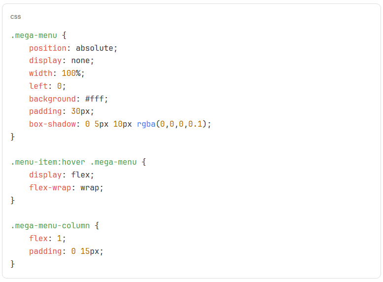
Mega Menus: For stores with substantial product ranges, mega menus allow multi-column dropdowns showing categories, featured products, promotional items and imagery in a single view. This reduces the number of clicks needed to reach specific products.
Search Integration: Prominent search functionality in or near the main navigation is critical for e-commerce. Many users prefer searching directly rather than browsing categories.
Shopping Cart Access: Visible cart icon with item count keeps the checkout process accessible from any page.
Multiple Classification Schemes: Consider offering navigation by:
- Product category (Cameras, Lenses, Accessories)
- Use case (Wedding Photography, Wildlife, Studio)
- Brand (Canon, Nikon, Sony)
- Price range (Budget, Mid-Range, Professional)
Shopify, WooCommerce, and other e-commerce platforms integrate with WordPress to provide these navigation patterns, but practical implementation requires careful planning regarding your specific product catalogue and customer behaviour.
Content Site and Blog Navigation
Sites built primarily around content face different challenges: helping visitors discover relevant articles, encouraging deeper engagement and supporting multiple content formats.
Recommended Structure:
- Home
- Categories (by topic)
- Popular Posts / Featured
- About
- Contact / Subscribe
Content Discovery Features:
- Category-Based Navigation: Organise content by topic area, allowing interested readers to explore related articles. Most blogs benefit from 5-10 main categories rather than excessive granularity.
- Featured Content: Prominently highlight your best or most important content. This might be a rotating featured section or permanent links to cornerstone content pieces.
- Search Functionality: Critical for content sites with extensive archives. Integrate search prominently in the navigation area.
- Newsletter/Subscription: For content businesses, email list growth is often the primary conversion goal. Include clear subscription options in navigation.
ProfileTree’s content marketing strategy for clients typically includes category-based navigation that aligns with SEO keyword themes, helping both user discovery and search performance.
Professional and Corporate Website Structure
Corporate sites need navigation that serves multiple audiences (customers, investors, job seekers, press) while maintaining clarity and purpose.
Recommended Structure:
- Solutions / Products
- Industries / Sectors
- Company (About, Leadership, History)
- Resources (Case Studies, White Papers, Blog)
- Investors (for public companies)
- Careers
- News / Press
- Contact
Multi-Audience Considerations:
Corporate sites often implement audience-specific entry points through navigation segmentation or dedicated landing pages accessible from the main menu.
Consider using mega menus to organise complex information hierarchies without overwhelming visitors. Each column in the mega menu can represent a different audience or content type.
Local Business Navigation Optimisation
For businesses serving specific geographic areas, navigation should support local SEO while addressing the practical needs of local customers.
Key Elements for Local Business Menus:
- Prominent location/service area information
- “Get Directions” or location page links
- Local contact information (phone number visible)
- Service-specific pages targeting local keywords
- Customer testimonials or reviews page
ProfileTree works extensively with local businesses across Belfast and Northern Ireland, implementing navigation structures that support both user needs and regional search visibility. This typically includes location-specific landing pages accessible through the main navigation when businesses serve multiple areas.
Navigation Menu Styles and Visual Design
How your menu looks matters as much as how it’s structured. Visual design affects usability, brand perception and the overall user experience.
Horizontal vs Vertical Navigation
Horizontal Navigation sits across the top of the page, the most common pattern for primary menus. This layout works well for desktop viewing and comfortably supports 5-10 top-level items.
Advantages:
- Familiar to users
- Conserves vertical space
- Works naturally with dropdown submenus
- Standard pattern for most business sites
Disadvantages:
- Limited space as menu items increase
- Can become cluttered on smaller desktop screens
- Requires responsive treatment for mobile
Vertical Navigation appears in sidebars or as full-height navigation panels, and it is more common in application interfaces or specific design styles.
Advantages:
- Accommodates longer lists of items
- Can display more levels of hierarchy visually
- Works well for admin interfaces or dashboards
Disadvantages:
- Consumes valuable horizontal space
- Less familiar to many users
- Can push content down or aside
Most business websites benefit from horizontal primary navigation, with vertical navigation reserved for secondary or contextual menus in sidebars or specific sections.
Fixed vs Sticky Navigation Bars
Sticky Navigation (fixed or floating navigation) remains visible as users scroll down the page, providing constant access to menu options.
Implementation Benefits:
- Improved navigation access from any point on long pages
- Higher conversion rates on long-form content
- Better user experience on mobile devices
- Professional, modern appearance
Potential Drawbacks:
- Consumes screen space (particularly problematic on mobile)
- It can interfere with content if poorly implemented
- May impact Core Web Vitals if it causes layout shifts
- Requires careful design to avoid overwhelming smaller screens
When ProfileTree develops sites with sticky navigation, we implement it thoughtfully with these considerations:
- Compress the menu on scroll (reducing its height after initial view)
- Hide on scroll down, reveal on scroll up (providing access without permanent screen space consumption)
- Mobile-specific behaviour (often hiding sticky navigation on mobile, where screen space is precious)
- Performance optimisation (ensuring sticky positioning doesn’t cause layout shifts)
Hamburger Menus and Mobile Navigation
Mobile devices require different navigation patterns due to limited screen space and touch-based interaction.
Hamburger Menu Implementation:
The three-line hamburger icon has become the standard mobile menu trigger, hiding the full navigation until users tap it. While some UX practitioners debate its effectiveness, it remains the most recognisable pattern for mobile navigation.
Best Practices for Mobile Menus:
- Large Touch Targets: Minimum 44×44 pixels for tappable elements
- Clear Visual Feedback: Highlight or change colour on tap
- Full-Screen or Slide-In: Either take over the full screen or slide in from the side
- Close Button: Prominent, obvious way to dismiss the menu
- Scrollable: If menu items exceed screen height, make the menu scrollable
- Fast Animation: Menu open/close animations should be quick (200-300ms)
Many themes include mobile menu functionality, but custom development often improves the experience. ProfileTree’s WordPress development projects include mobile-specific navigation optimisation that accounts for touch patterns, screen sizes and user behaviour on mobile devices.
Adding Visual Elements to Menus
Images, icons and other visual elements make menus more engaging and easier to scan, particularly in mega menus or sites with numerous navigation options.
Icon Integration:
Icons paired with text labels improve recognition and create visual interest. Common approaches include:
- Icon Fonts: Font Awesome or similar libraries provide scalable vector icons
- SVG Icons: Custom SVG files offer design flexibility and performance
- Image Icons: Traditional image files (use sparingly due to performance impact)
When adding icons to WordPress menus, you’ll typically need to use a plugin that supports icon selection or add them via custom CSS using the CSS Classes field in menu item settings.
Mega Menu Visual Design:
Mega menus benefit substantially from visual design elements:
- Featured product or service images
- Category thumbnails
- Promotional banners
- Descriptive text under menu labels
- Visual separation between sections
These elements transform navigation from a simple list into a rich content preview that helps users understand their options before clicking.
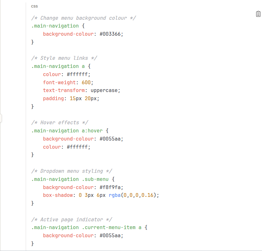
Custom CSS for Menu Styling
WordPress themes provide default menu styling, but custom CSS allows you to match your brand precisely.
Common CSS Customisations:
To add custom CSS to your WordPress site:
- Go to Appearance > Customise
- Select Additional CSS
- Add your custom styles
- Preview changes in real-time
- Click “Publish” when satisfied
For more complex menu styling, consider using a child theme to maintain customisations through theme updates, or work with a developer to implement comprehensive design changes that integrate properly with your theme’s responsive behaviour.
Performance Optimisation for WordPress Navigation
Navigation performance directly impacts user experience and search rankings. Slow-loading menus frustrate visitors and contribute to poor Core Web Vitals scores.
Navigation Impact on Page Speed
Every element in your navigation adds to page weight and rendering time. Common performance bottlenecks include:
- Large CSS Files: Complex menu styles require substantial CSS, particularly for mega menus or heavily customised designs. Minify and optimise CSS files, removing unused styles.
- JavaScript Dependencies: Dropdown functionality, mobile menu toggles and animations often require JavaScript. Minimise dependencies and use lightweight libraries.
- External Resources: Loading icon fonts, images, or other assets from external sources requires HTTP requests and DNS lookups. Where possible, host resources locally.
- Unoptimised Images: Menu items with images (particularly in mega menus) can significantly impact load times. Optimise all images, use appropriate formats (WebP where supported) and implement lazy loading for below-fold menu content.
Core Web Vitals Considerations
Google’s Core Web Vitals measure specific aspects of user experience, all of which navigation can impact:
- Largest Contentful Paint (LCP): If your navigation includes large images or extensive styling, it might affect LCP if it’s the largest element in the viewport. Mobile navigation that takes over the full screen can also impact this metric.
- First Input Delay (FID): JavaScript-heavy navigation, particularly complex mega menus or animated mobile menus, can block the main thread and increase FID. Optimise or defer JavaScript execution.
- Cumulative Layout Shift (CLS): Sticky navigation that appears after page load, dynamic menu content loading, or web fonts causing menu text reflow all contribute to layout shift. Implement proper space reservation and use font-display properties to minimise shift.
Strategies to Improve Core Web Vitals:
- Inline Critical CSS: Include essential menu styling in the page head rather than loading it from external stylesheets
- Defer Non-Critical JavaScript: Load menu interaction scripts after initial page render
- Pre-allocate Space: Reserve space for sticky navigation to prevent layout shift
- Optimise Web Fonts: Use system fonts for navigation or implement optimal font loading strategies
ProfileTree’s web development process includes Core Web Vitals optimisation for all site elements, including navigation, as part of our performance-focused approach to WordPress development.
Efficient Asset Loading
Loading menu assets efficiently reduces unnecessary overhead and improves perceived performance.
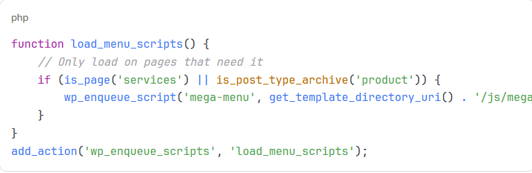
Conditional Loading:
Not all navigation elements need to load on every page. Consider:
- Loading mega menu assets only on pages where the mega menu appears
- Deferring mobile menu scripts on desktop devices
- Conditionally loading icon fonts only if icons are used
Asset Optimisation:
- Minify CSS and JavaScript: Remove whitespace, comments and unnecessary code
- Combine Files: Reduce HTTP requests by combining multiple CSS or JS files
- Use SVG for Icons: Vector graphics scale without quality loss and typically have smaller file sizes than icon fonts
- Optimise Menu Images: Compress images, use appropriate dimensions and modern formats
Code Example for Conditional Script Loading:
Caching Considerations
Proper caching configuration improves navigation performance for repeat visitors.
- Browser Caching: Set long expiration times for navigation assets (CSS, JavaScript, images) that change infrequently—update version numbers when files change to bust the cache.
- Object Caching: WordPress menu data can be cached using object caching plugins or server-level caching solutions. This reduces database queries on each page load.
- Page Caching: Full-page caching solutions store complete HTML output, eliminating the need to generate menus on each request. This provides the most significant performance improvement but requires careful configuration to handle user-specific menu items or dynamic content.
For WordPress sites with complex navigation or high traffic, ProfileTree implements comprehensive caching strategies that balance performance with functionality, particularly when menus contain dynamic elements or personalised content.
Accessibility Best Practices for Navigation Menus
Accessible navigation accommodates all users, including those using assistive technologies, keyboard navigation, or various disabilities. It’s not just about complying with regulations—it’s about reaching the broadest possible audience and providing an excellent user experience for everyone.
Why Navigation Accessibility Matters
Accessible navigation benefits:
- Users with Visual Impairments: Screen readers need proper semantic markup and ARIA attributes to communicate menu structure and state.
- Keyboard Users: People who cannot use a mouse rely on keyboard navigation to access menu items.
- Users with Motor Impairments: Large, well-spaced clickable areas reduce interaction difficulty.
- Cognitive Accessibility: A Clear, predictable navigation structure helps users with cognitive disabilities understand and use your site.
Beyond the moral and practical arguments, accessibility is increasingly a legal requirement. The Equality Act 2010 in the UK requires service providers to make reasonable adjustments for disabled users, which includes website accessibility.
Semantic HTML and ARIA Attributes
Proper HTML structure is the foundation of accessible navigation.
Required Semantic Elements:
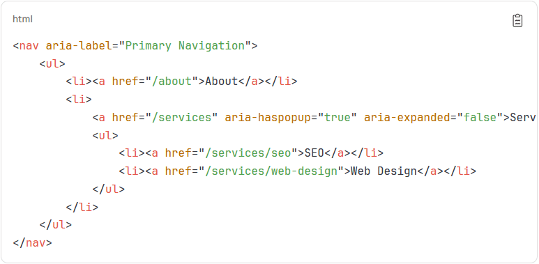
Key ARIA Attributes for Navigation:
aria-label: Provides a name for the navigation landmarkaria-haspopup: Indicates an element has a pop-up menuaria-expanded: Communicates whether a dropdown is currently open or closedaria-current="page": Identifies the current page in the navigation
WordPress themes don’t consistently implement these attributes correctly. Proper ARIA implementation should be a priority in custom development or theme selection.
Keyboard Navigation Requirements
All navigation functionality must be accessible via keyboard alone.
Essential Keyboard Interactions:
- Tab: Move focus forward through menu items
- Shift + Tab: Move focus backwards
- Enter/Space: Activate links or toggle dropdowns
- Arrow Keys: Navigate between menu items (ideal but not required)
- Escape: Close dropdown menus
Focus Management:
Visible focus indicators must show users which menu item currently has keyboard focus. Many themes remove focus outlines for aesthetic reasons, creating accessibility barriers.
CSS for Proper Focus Indicators:
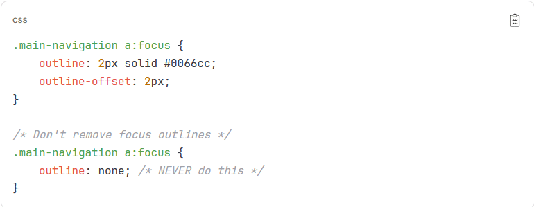
When ProfileTree develops WordPress sites, we implement comprehensive keyboard navigation that exceeds basic requirements, including arrow key navigation and proper focus management throughout complex menu structures.
Screen Reader Optimisation
Screen readers need specific markup patterns to communicate navigation structure effectively.
Best Practices:
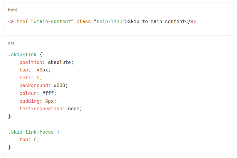
- Skip Links: Provide a “Skip to main content” link at the start of the page, allowing screen reader users to bypass navigation
- Descriptive Link Text: Avoid generic “Click here” or “Read more”—links should make sense out of context
- Landmark Regions: Use
<nav>elements with descriptive labels for multiple navigation areas - Submenu Indicators: Communicate that menu items have dropdowns before users activate them
Example Skip Link Implementation:
Colour Contrast and Visual Design
WCAG 2.1 requires sufficient colour contrast between text and backgrounds to accommodate users with visual impairments.
Contrast Requirements:
- Level AA: 4.5:1 for normal text, 3:1 for large text (18pt+ or 14pt+ bold)
- Level AAA: 7:1 for normal text, 4.5:1 for large text
Use tools like the WebAIM Contrast Checker or browser extensions to verify your menu colours meet these standards.
Additional Visual Accessibility Considerations:
- Don’t rely solely on colour to convey information
- Provide adequate spacing between clickable elements (minimum 44x44px on mobile)
- Use readable font sizes (minimum 16px for body text)
- Avoid low-contrast hover states that reduce readability
Mobile and Touch Accessibility
Mobile navigation requires specific accessibility considerations beyond desktop patterns.
Touch Target Sizing:
WCAG 2.1 recommends minimum touch target sizes of 44×44 CSS pixels for all menu items, hamburger icons, and close buttons.
Mobile-Specific Considerations:
- Hamburger Menu Accessibility: The hamburger icon must be clearly labelled for screen readers
- Close Button Clarity: Provide obvious, accessible means to dismiss mobile menus
- Focus Trap: When the mobile menu opens, trap focus within it until dismissed
- No Hover Dependency: Mobile doesn’t support hover states—all functionality must work via tap
ProfileTree’s mobile development approach prioritises touch-friendly navigation with generous target sizes, clear visual feedback and proper focus management that works across iOS, Android and assistive technology combinations.
Testing Navigation Accessibility
Thorough testing identifies accessibility issues before they affect real users.
Testing Methods:
- Keyboard Testing: Navigate your entire site using only the keyboard, ensuring all menu items are reachable and usable
- Screen Reader Testing: Test with NVDA (Windows), JAWS (Windows) or VoiceOver (Mac/iOS)
- Automated Testing: Use tools like WAVE, axe DevTools or Lighthouse to identify technical issues
- Real User Testing: If possible, recruit users with disabilities to test your navigation
Common Issues to Check:
- Can you reach every menu item via keyboard?
- Are focus indicators clearly visible?
- Does the screen reader announce the menu structure and state correctly?
- Do dropdown menus announce when they open/close?
- Is the current page indicated for screen readers?
- Are colour contrasts sufficient?
- Are touch targets adequately sized on mobile?
Regular accessibility audits should be part of your site maintenance routine, particularly after theme updates or navigation changes.
Advanced Navigation Customisation Techniques
Beyond basic menu creation, WordPress offers powerful customisation options for developers and advanced users who need more control over navigation functionality and appearance.
Dynamic and Conditional Menu Items
Showing different menu items to other users creates personalised experiences and streamlines navigation for specific audiences.
User Role-Based Navigation:
Display menu items only to users with specific roles (administrators, editors, customers, etc.).
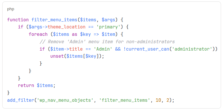
This approach lets you maintain a single menu structure while presenting different items based on user context.
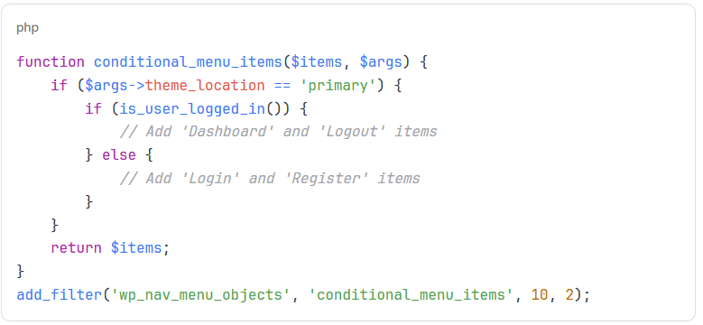
Logged-In vs Logged-Out Navigation:
Typical pattern for membership sites or sites with customer accounts.
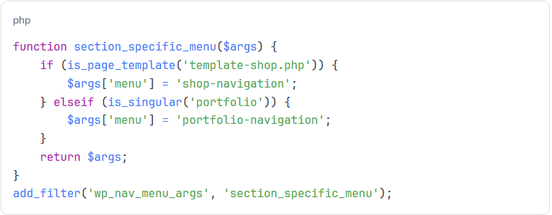
Page-Specific Navigation:
Different navigation structures for different site sections.
These techniques provide flexibility that standard menu management doesn’t offer, though they require comfortable working with PHP and WordPress hooks.
Custom Menu Walkers
Menu walkers control HTML output completely, allowing custom markup, additional content or specialised navigation patterns.
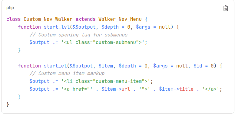
What Is a Menu Walker?
A walker is a PHP class that WordPress uses to generate HTML menus. The default walker produces standard nested lists, but custom walkers let you modify every output aspect.
Basic Custom Walker Structure:
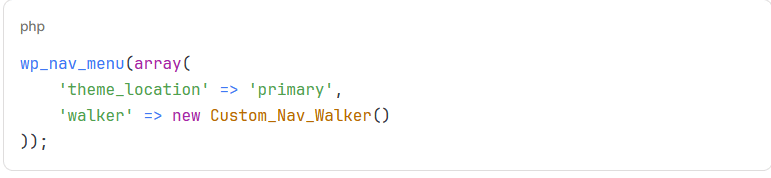
Using Your Custom Walker:
Custom walkers enable advanced navigation patterns like:
- Adding icons or images to specific menu items
- Including metadata or descriptions
- Implementing custom dropdown triggers
- Creating mega menus with custom layouts
- Adding special markup for styling purposes
ProfileTree uses custom walkers when client requirements exceed what standard WordPress menus support, particularly for complex mega menus or navigation that integrates with custom post types and taxonomies.
Integrating Custom Post Types in Navigation
Sites with custom post types (beyond standard pages and posts) often need to include these in navigation menus.
Making Custom Post Types Available:
When registering a custom post type, enable menu support:
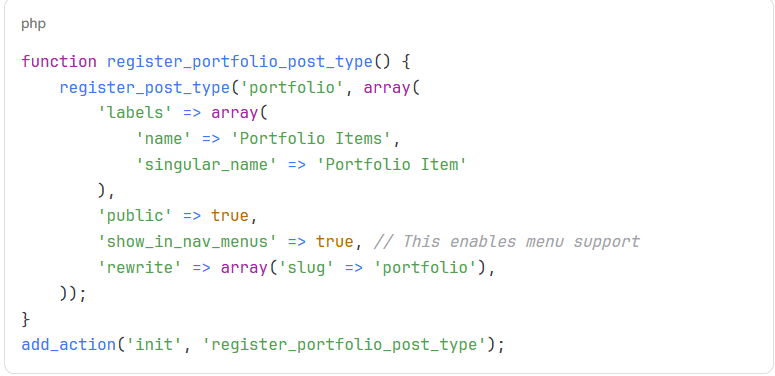
Once enabled, custom post types appear alongside pages and posts in the menu creation interface.
Creating Archive Links:
Link to the archive page for a custom post type:
- Add a custom link to your menu
- Use the archive URL (e.g.,
/portfolio/If your custom post type slug isportfolio) - Label it appropriately
Multilingual Navigation Implementation
Sites serving multiple languages need navigation that accommodates language switching and translated content.
Popular Multilingual Plugins:
WPML (WordPress Multilingual Plugin):
- Adds language-specific menus
- Automatic synchronisation options
- Language switcher widgets
Polylang:
- Creates separate menus per language
- Language switcher functionality
- Free core version available
TranslatePress:
- Visual translation interface
- Automatic menu translation
- Language switcher integration
Implementation Approach:
- Install and configure your chosen multilingual plugin
- Create separate menus for each language
- Translate menu items using the plugin’s interface
- Add a language switcher to your navigation area
Best Practices for Multilingual Navigation:
- Keep menu structures consistent across languages
- Translate menu labels accurately and naturally
- Test navigation flow in each language
- Consider cultural differences in navigation expectations
- Implement proper hreflang tags for SEO
ProfileTree works with clients across Ireland and the UK who need English and Irish language support. We implement navigation structures that maintain consistency while respecting linguistic and cultural differences.
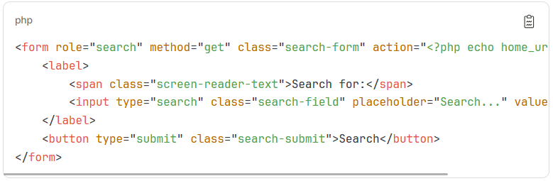
Adding Search to Navigation
Integrated search functionality improves content discovery, particularly on content-heavy sites.
Implementation Methods:
Widget Areas in Navigation:
Some themes include widget areas within navigation, allowing you to add search widgets.
- Go to Appearance > Widgets
- Find widget areas associated with your navigation
- Add a Search widget
Custom Menu Item:
Create a custom link that triggers a search overlay or redirects to a search page.
Shortcode in Menu:
Some plugins allow shortcodes in menu items, enabling search form insertion.
Custom Code:
For more control, modify your theme’s navigation template to include a search form:
Mega Menu Implementation
Mega menus display multiple links, images, and content columns in dropdown panels, which is useful for sites with extensive navigation requirements.
Plugin Solutions:
Max Mega Menu:
- Drag-and-drop builder
- Responsive design
- Icons and images support
- Extensive styling options
UberMenu:
- Advanced mega menu features
- Grid layouts
- Custom content
- Mobile optimised
WP Mega Menu:
- Visual builder
- Multiple layout options
- Widget integration
Custom Development Approach:
For complete control, develop custom mega menus using CSS and JavaScript:
Mega Menu Best Practices:
- Limit to 3-4 columns maximum
- Include visual elements (images, icons) for scannability
- Maintain a clear hierarchy and grouping
- Implement proper keyboard and screen reader support
- Test thoroughly on mobile devices
ProfileTree implements custom mega menus for e-commerce and corporate clients who must display extensive product catalogues or service offerings in an organised, scannable format.
Navigation Menu Troubleshooting
Even well-designed menus encounter technical issues. Understanding common problems and their solutions helps maintain functional navigation.
Menu Not Appearing on Site
Possible Causes and Solutions:
Menu Not Assigned to Location:
- Navigate to Appearance > Menus
- Check that your menu is assigned to the correct theme location
- Save the menu again
Theme Doesn’t Support Menus:
- Verify your theme has registered menu locations
- Check the theme documentation
- Consider switching to a more capable theme
Widget Conflicts:
- Some themes use widgets for navigation
- Check Appearance > Widgets for navigation widget areas
- Try removing conflicting widgets
Cache Issues:
- Clear all caches (plugin cache, browser cache, CDN cache)
- Refresh the page in incognito mode to bypass the browser cache
Menu Changes Not Saving
Common Causes:
PHP Max Input Vars: Large menus with many items can exceed PHP’s input variable limit.
Solution: Increase the limit by adding this to your php.ini file:
max_input_vars = 3000Or add to .htaccess:
php_value max_input_vars 3000Timeout Issues: Server timeout limits may prevent saving large menus.
Solution: Increase PHP execution time in php.ini:
max_execution_time = 300Browser Extensions: Ad blockers or security extensions sometimes interfere with WordPress admin functions.
Solution: Temporarily disable browser extensions and try again.
Dropdown Menus Not Working
Typical Issues:
JavaScript Conflicts: Other plugins or theme code may conflict with menu JavaScript.
Solution:
- Deactivate plugins one by one to identify conflicts
- Check the browser console for JavaScript errors
- Update theme and plugins to the latest versions
CSS Specificity: Theme CSS may override dropdown visibility.
Solution:
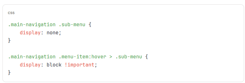
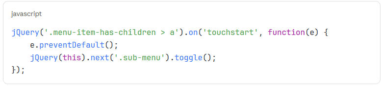
Mobile Touch Issues: Dropdowns designed for hover don’t work on touch devices.
Solution: Implement proper touch event handling:
Styling Problems
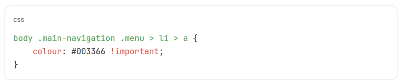
Menu Appearance Doesn’t Match Design:
Theme CSS Conflicts: Theme styles may override your custom CSS.
Solution: Use more specific selectors or !important (sparingly):
Missing CSS Classes: Required CSS classes may not be enabled.
Solution:
- Go to Appearance > Menus
- Click Screen Options at the top
- Enable CSS Classes checkbox
Responsive Breakpoint Issues: Menu may not respond correctly at specific screen widths.
Solution: Adjust media queries in your theme or add custom responsive CSS:
Performance Issues
Slow Menu Loading:
Too Many Menu Items: Excessive menu items increase HTML payload and rendering time.
Solution: Simplify menu structure or implement lazy loading for mega menus.
Unoptimised Assets: Large images or unminified files slow loading.
Solution:
- Compress all menu images
- Minify CSS and JavaScript
- Combine files where possible
- Use a caching plugin
External Resource Loading: Loading fonts or icons from external sources adds latency.
Solution: Host resources locally or use a CDN with proper caching.
SEO Optimisation for WordPress Navigation
Navigation structure influences search engine optimisation through site architecture signals, internal linking and user experience metrics.
Navigation and Site Architecture
Search engines use navigation to understand site structure and content relationships.
Hierarchy Signals: Your navigation menu tells search engines which pages are most important. Pages in the main navigation receive stronger signals than deeply nested pages.
Best Practices:
- Include your most important pages in the primary navigation
- Keep important content within three clicks of the homepage
- Use descriptive, keyword-rich menu labels
- Maintain logical categorisation
ProfileTree’s SEO approach includes navigation architecture planning as a core component of technical SEO, particularly for new websites or site redesigns.
Internal Linking Through Navigation
Every navigation menu creates internal links that pass authority and help search engines discover content.
Link Authority Distribution:
Primary navigation links appear on every page (or most), giving them substantial internal linking power. Use this strategically:
- Link to the pages you want to rank well
- Use keyword-rich anchor text (naturally)
- Keep navigation consistent across the site
Breadcrumb Navigation:
Beyond main menus, breadcrumb navigation provides additional internal linking and helps search engines understand site hierarchy.
Example breadcrumb implementation:
Home > Services > Web Design > WordPress Development
This creates internal links while showing users and search engines the page’s position within the site structure.
Keyword-Rich Menu Labels
Menu labels should balance user understanding with SEO value.
Effective Labelling:
- Good: “Web Design Services” (descriptive, includes keywords)
- Poor: “What We Do” (vague, no keyword value)
- Good:“SEO for Small Business”
- Poor: “Visibility Solutions”
The key is natural, descriptive labels that help users and search engines understand what they’ll find.
Avoid:
- Keyword stuffing (unnatural, excessive keywords)
- Overly creative labels that confuse rather than clarify
- Technical jargon users won’t understand
Mobile Navigation and SEO
Google’s mobile-first indexing means mobile navigation directly affects search rankings.
Mobile SEO Considerations:
- Accessible Navigation: Mobile menus must be easily accessible and usable. Google considers mobile usability to be a ranking factor.
- Fast Loading: Mobile navigation should load quickly. Heavy mega menus or JavaScript-intensive mobile menus harm mobile performance.
- Touch-Friendly: Adequate spacing and target sizes improve mobile usability, which Google considers in rankings.
- Consistent Content: Mobile and desktop navigation should provide access to the duplicate content. Hidden or inaccessible pages on mobile may not be indexed appropriately.
Monitoring Navigation Performance
Track how users interact with navigation to identify optimisation opportunities.
Google Analytics 4 Navigation Tracking:
Set up custom events to track menu clicks:
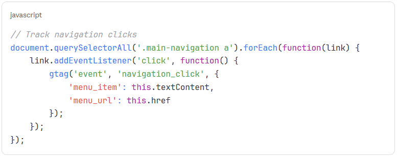
Metrics to Monitor:
- Which menu items receive the most clicks
- Where users go first after landing
- Drop-off points in navigation flow
- Mobile vs desktop navigation patterns
- Time to find specific pages
Use this data to refine navigation structure, reorder items or adjust labelling for clarity.
WordPress Navigation Plugins and Tools
While WordPress includes robust native menu functionality, plugins extend capabilities for specific use cases.
Essential Navigation Plugins
Max Mega Menu
Features:
- Drag-and-drop mega menu builder
- Mobile responsive
- Extensive styling options
- Icon support
- Multiple themes
Best for: Sites needing sophisticated mega menus without custom development.
WP Mobile Menu
Features:
- Dedicated mobile menu functionality
- Custom mobile menu design
- Integration with desktop menus
- Performance optimised
Best for: Sites where mobile navigation needs differ significantly from desktop.
Conditional Menus
Features:
- Display different menus based on conditions
- User role targeting
- Page-specific menus
- Easy configuration
Best for: Membership sites or complex sites with different navigation for different audiences.
Nav Menu Roles
Features:
- Hide/show menu items by user role
- Simple interface
- Lightweight
Best for: Sites where logged-in users need a different navigation than guests.
Accessibility Enhancement Plugins
WP Accessibility
Features:
- Adds skip links
- Improves keyboard navigation
- Enhances focus indicators
- ARIA landmark support
Best for: Improving accessibility across your entire site, including navigation.
Accessibility Suite
Features:
- Comprehensive accessibility toolkit
- Navigation testing
- WCAG compliance checking
- Automated fixes
Best for: Sites requiring thorough accessibility compliance.
Page Builder Navigation Tools
Most page builders include custom navigation tools that integrate with their design systems.
Elementor Pro:
- Custom header builder
- Menu widgets with extensive styling
- Mega menu support
- Mobile menu customisation
Divi Builder:
- Built-in menu module
- Custom header layouts
- Responsive controls
- Hamburger menu options
Beaver Builder:
- Menu module
- Custom header functionality
- Responsive breakpoints
These tools offer visual customisation but sometimes sacrifice some WordPress native menu functionality.
Developer Tools
Query Monitor: A Debugging tool that helps identify menu-related performance issues, database queries and PHP errors.
Browser DevTools: Chrome, Firefox and Edge include robust developer tools for inspecting menu HTML, CSS and JavaScript behaviour.
Accessibility Testing:
- WAVE browser extension
- axe DevTools
- Lighthouse (built into Chrome)
Regular testing with these tools identifies navigation issues before they affect users or search rankings.
Navigation Strategy for Client Projects
When ProfileTree develops WordPress sites for clients, navigation planning begins in the project’s strategic phase, not as an afterthought during development.
Discovery and Planning Phase
Understanding Business Goals:
Navigation must support specific business objectives:
- Lead generation (clear path to contact forms)
- Product sales (efficient access to shop and categories)
- Content engagement (easy discovery of articles and resources)
- Brand awareness (emphasising About, Case Studies, Team)
User Research:
We analyse:
- Target audience expectations
- Competitor navigation patterns
- Everyday user tasks and goals
- Device usage patterns (mobile vs desktop split)
Content Inventory:
Comprehensive content audit identifies:
- All pages requiring navigation access
- Content categories and taxonomies
- Priority pages for prominence
- Pages that don’t need primary navigation
This groundwork informs navigation architecture decisions before any development begins.
Design Phase Navigation Considerations
Wireframing:
Initial wireframes establish navigation structure, placement and hierarchy without visual distraction.
Information Architecture:
Card sorting exercises (with stakeholders or user representatives) reveal intuitive categorisation and labelling.
Responsive Strategy:
Plan specifically how navigation adapts at different breakpoints:
- Desktop full menu
- Tablet condensed menu
- Mobile hamburger menu
Development Implementation
Theme Selection/Development:
Choose themes with flexible navigation support or develop custom themes when requirements exceed available options.
Performance Budgets:
Set specific performance targets:
- Navigation HTML size
- CSS file size
- JavaScript execution time
- Number of HTTP requests
Accessibility From Start:
Build accessibility into development rather than retrofitting:
- Semantic HTML
- Proper ARIA attributes
- Keyboard navigation
- Focus management
Testing and Refinement
Cross-Browser Testing:
Verify navigation works correctly across:
- Chrome, Firefox, Safari, Edge
- iOS Safari and Chrome
- Android Chrome
Device Testing:
Test on actual devices:
- Various phone sizes
- Tablets
- Desktop monitors
User Testing:
Observe real users navigating the site:
- Can they find key pages?
- Do labels make sense?
- Are interactions intuitive?
Client Training
After launch, clients need to understand menu management:
Training Covers:
- Adding and removing menu items
- Creating dropdown structures
- Updating menu labels
- Best practices for menu changes
- When to request developer support
ProfileTree provides comprehensive documentation and training sessions to keep clients confident managing their navigation post-launch.
Future Trends in WordPress Navigation
Navigation patterns continue to adapt as web technologies, user expectations and device capabilities change.
Block-Based Navigation
WordPress’s Full Site Editing (FSE) introduces block-based navigation management, moving away from the traditional menu interface.
Block Navigation Features:
- Visual editing in the site editor
- Direct manipulation of menu appearance
- Integration with other blocks
- Theme.json styling
This approach offers greater design flexibility but requires adapting to new workflows.
AI-Powered Personalisation
Machine learning algorithms increasingly personalise navigation based on user behaviour, preferences and context.
Potential Applications:
- Reordering menu items based on individual usage patterns
- Highlighting relevant categories for returning visitors
- Adjusting navigation based on time, location or device
- Predictive navigation suggestions
ProfileTree explores AI implementation opportunities for clients, including navigation personalisation where appropriate to business goals and user privacy considerations.
Voice and Conversational Interfaces
As voice-activated devices become more common, navigation must accommodate voice commands.
Considerations:
- Clear, naturally spoken menu labels
- Hierarchical navigation that works in voice interaction
- Integration with voice assistants
- Alternative navigation paths for voice users
Gesture-Based Navigation
Mobile devices increasingly support gesture-based interaction beyond simple taps.
Emerging Patterns:
- Swipe gestures for menu navigation
- Long-press for quick access
- Pinch/zoom for menu detail levels
- Device tilt or motion for navigation
Implementation requires careful consideration of accessibility and user preference.
Conclusion: Navigation Menus in WordPress
Navigation menus form the backbone of user experience on WordPress sites. The difference between basic menu implementation and professional navigation strategy manifests in measurable business outcomes: higher engagement, improved conversion rates and better search performance.
Effective WordPress navigation prioritises user needs, builds in accessibility from the start, performs efficiently across all devices and supports your specific business goals. Whether you’re creating menus for a service business, e-commerce store or content site, the principles covered in this guide provide a foundation for navigation that works.
ProfileTree approaches every web design and development project with navigation as a strategic priority. Our team works with businesses across Northern Ireland, Ireland and the UK to create WordPress sites where navigation supports business objectives while delivering an excellent user experience.
Audit your current navigation against the principles in this guide, identify improvement opportunities, and implement changes that will enhance user experience and business performance.