Photoshop Basics for Small Business Web Designers: Amazing Techniques
Table of Contents
Photoshop Basics for Small Business Web Designers – As small business web designers, we understand the importance of leveraging the right tools to create engaging, effective websites for our clients. Adobe Photoshop remains a cornerstone of the web design process, providing various features to craft beautiful, responsive designs. For those of us in the realm of small business, mastering Photoshop helps deliver high-quality visuals and enables us to tackle various design challenges efficiently.
We recognise that the journey to becoming proficient with Photoshop can seem daunting, especially considering its capabilities’ depth and breadth. However, the essence lies in grasping the basics and building upon them. From understanding layers and organisation to mastering the export of web-optimised graphics, every step we take lays the groundwork for more complex tasks. With consistent practice and a focus on key web design elements such as colour theory, typography, and user interface design, we have become well-equipped to produce compelling websites that stand out in today’s digital space.
Getting Started with Photoshop
Before diving into Photoshop, it’s essential to familiarise yourself with the interface, set up your documents correctly, and navigate through the workspace and panels efficiently. This will ensure a smooth workflow as you begin your creative projects.
Understanding the Photoshop Interface
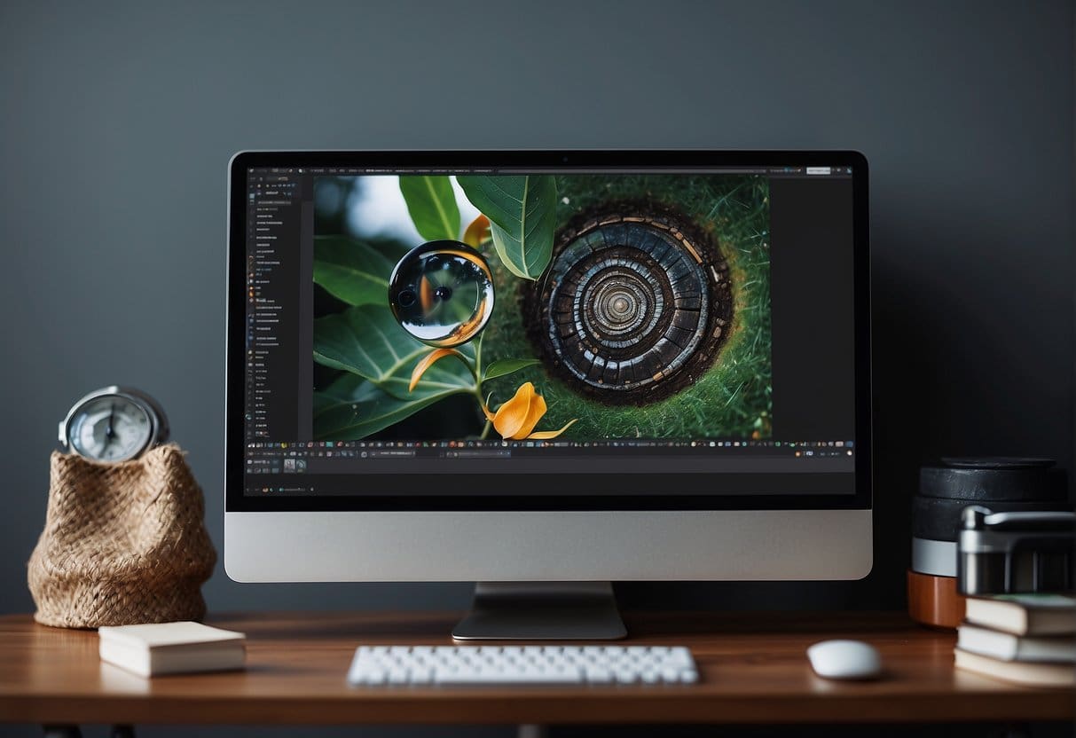
Photoshop’s interface can initially seem daunting, but it’s designed with logic and functionality in mind. When you open Photoshop, you’ll be greeted with a scalable, grey workspace. At the core is the canvas, where your images and designs will come to life. Around the canvas, you’ll find a variety of panels and toolbars. Panels like Layers, Adjustments, and History are some of the most frequently used features, allowing you to manage your project precisely. To customise your layout, you can move panels around, group them, or dock them to tailor to your workflow preferences.
Setting Up a New Document
Selecting the right settings from the outset is crucial when creating a new document. Clicking on ‘File’ and then ‘New’ or using the shortcut Ctrl+N (Cmd+N on a Mac) will open the new document dialog box. Here, you’ll specify the width, height, resolution, and colour mode of your document based on the requirements of your project. For web design, typically, you’d choose a resolution of 72 pixels/inch and a colour mode of RGB. It’s essential to consider these settings carefully, as they determine your design’s quality and final use.
Navigating the Workspace and Panels
The workspace in Photoshop is highly flexible and allows for a personalised layout. You can access different workspaces through the ‘Window’ menu and then ‘Workspace’. As you progress, you’ll likely work with a set of panels that suit your tasks—whether it’s image editing, typography, or creating web graphics. To navigate between panels, click on the named tabs or expand them by clicking on the double arrows at the top of each panel. Remember, you can always reset your workspace to the default settings by going to ‘Window’, ‘Workspace’, and then ‘Reset to Default Workspace’.
Essential Tools for Web Design

In this section, we’ll focus on the fundamental tools every small business web designer needs to master in Photoshop. These tools are the building blocks for creating compelling, professional-looking websites.
Using Selection Tools
Selection tools are the cornerstone of Photoshop, allowing us to manipulate specific areas of an image without affecting the rest. The Marquee, Lasso, and Magic Wand tools each serve different purposes, from simple square selections to complex freeform areas. Mastering these tools enables precise edits and is crucial for tasks such as isolating objects, creating composite images, and much more.
Brushes and Pencil Tools
Photoshop’s Brushes and Pencil tools are versatile for sketching and painting effects. They come in numerous shapes and sizes, and their dynamics can be adjusted to achieve a wide range of textures and strokes. For web design, these tools often come in handy for creating custom backgrounds, button textures, and more artistic elements that give a website a unique touch.
The Type Tool for Web Typography
Effective web typography is pivotal for readability and user experience. The Type Tool in Photoshop allows us to integrate typography into our designs seamlessly, offering access to myriad fonts and precise control over their properties, such as size, kerning, and leading. Properly utilising this tool ensures that textual content is not only legible but also aesthetically harmonious with the overall design.
Layer and Vector Tools
Layers are fundamental to non-destructive editing in Photoshop. They enable us to organise our work and make individual changes without altering the underlying images. Combining layers with Vector Tools expands our capability to create shapes and design elements that are scalable and sharp at any resolution — essential for responsive web design where elements need to adapt to various screen sizes.
Layers and Organisation
When creating designs in Photoshop, small business web designers must effectively manage layers and adhere to organisational best practices. Following structured methods allows for efficient workflows and easy collaboration.
Managing Layers and Groups
In Photoshop, layers are the canvas upon which we paint our digital masterpieces. We organise our layers into named groups to keep our workspace tidy and our workflow efficient. For instance, separating background images, text, and UI elements into different groups allows us to quickly locate and edit specific parts of our design. Imagine layers as pieces of paper stacked upon each other; groups are like folders holding related papers together.
Using Layer Comps for Design Iterations
Layer Comps are our secret weapon when presenting different design options to stakeholders. They allow us to capture various states of our work – showing alternative layouts, colour schemes, or content arrangements – without duplicating and managing multiple files. This means we can swiftly switch between comps when iterating designs, ensuring a smoother review process and saving valuable time.
Smart Objects and Non-Destructive Editing
Smart Objects are a powerful feature that we leverage for non-destructive editing. By converting layers into Smart Objects, we maintain the original characteristics and enable the ability to apply multiple transformations without losing quality. It’s like protecting our artwork with a magic shield; we can scale, rotate, warp, or apply filters, knowing we can always revert to the untouched version.
In conclusion, our primary focus should be using layers and organising them smartly to create a clear structure for our Photoshop documents. By mastering the use of Layer Comps and Smart Objects, we maximise efficiency while preserving the quality of our work, ultimately leading to professional and flexible web designs.
Creating and Optimising Graphics for Web

Web designers must create compelling and optimised graphics. Adequate formats, compression techniques, and an understanding of graphic design principles are crucial for creating a visually engaging and fast-loading website.
Designing Buttons and Icons
Buttons and icons are essential elements of user interface design, guiding users through their interaction with a website. We focus on creating clear, recognisable buttons and icons that make navigation intuitive. For icons, using a vector format like SVG ensures scalability without quality loss. To design effective buttons, we ensure they stand out with a contrasting colour scheme and are large enough to be clicked easily, especially on mobile devices.
Incorporating Logos and Vector Graphics
Logos represent a company’s identity and require careful consideration in their web use. Vector graphics are preferred for logos as they can be resized without loss of clarity. In our work, we ensure that logos are positioned prominently and are consistent in colour and form across different platforms. When incorporating Logos and Vector Graphics, they must be versatile to fit various layouts and screen sizes.
Optimising Images and File Size for the Web
If not optimised correctly, images can dramatically increase a webpage’s load time. We use the ‘Save for Web’ feature in image editing software to reduce file size while maintaining visual quality. JPEG is preferred for photographs due to its compression capabilities, while PNG is reserved for images requiring transparency. Optimising file sizes balances maintaining image quality and ensuring quick page loads to keep our users engaged.
It is our mission to provide businesses with a visually stunning online presence that is effectively optimised for speed and user experience. Our expertise in creating web graphics that captivate and perform underpins our commitment to quality web design.
Colour and Typography in Web Design
We will explore the significant impact colour and typography have on web design, focusing on creating cohesive colour schemes, selecting and pairing typefaces, and adjusting text to ensure readability.
Working with Colour Schemes
When we define colour schemes for a design, our primary tools include the colour wheel and digital colour pickers, which help us select complementary, analogous, or triadic colours. Consistency in colour usage across the website enhances user experience, while the strategic application of accents can draw attention to calls to action. A well-planned colour scheme aligns with the brand’s identity and emotional appeal. For instance, using a colour picker in Photoshop allows for precise colour selection and cohesion.
Selecting and Pairing Typefaces
Typography is not just about choosing a font; it is the art of arranging type to make the text legible and visually attractive. We must balance personality with functionality, often pairing no more than two or three typefaces, one for headings and another for body text, to ensure a readable and dynamic design. Serif typefaces may appear more formal and traditional, while sans-serif fonts often convey a modern and clean aesthetic.
Adjusting Text for Readability
Ensuring text is easily readable is crucial in keeping users engaged. Text size, spacing (including kerning, tracking, and leading), and contrast are essential factors we adjust for readability. Break text into short paragraphs with clear headings and bullet points where appropriate. Photoshop’s tools allow you to refine these aspects and preview how text will appear on different devices. Typography should be informative and accessible so everyone can easily understand and interact with your content.
Through meticulous attention to colour and typography, we can create websites that not only fulfil aesthetic criteria but also function clearly and are user-friendly.
Website Layouts and Interface Design

As we delve into web design, it’s essential to grasp the significance of structured website layouts and user interface design. These elements are crucial for aesthetic appeal, functionality, and user experience.
Creating Flexible Grid Systems
Grid systems are the backbone of web layout design, providing a structural base that ensures consistency across different screen sizes. Our approach involves using a combination of columns, margins, and gutters to create a responsive framework. This flexibility allows elements within the website to resize and reposition themselves fluidly across devices.
Designing an Effective Header
The header of a website is its cornerstone, often the first thing users engage with. We advocate designing a header that is not only visually striking but also highly functional. This includes clear navigation and actionable items like contact information or call-to-action buttons, ensuring the header contributes to an intuitive user journey.
Wireframing and Mockup Techniques
Before any pixels are placed, wireframing the layout provides a clear roadmap for the interface design. We emphasise the importance of this stage in conceptualising the layout and user flow without distractions from design details. Following this, creating detailed mockups in Photoshop enables us to visualise the final product, serving as a blueprint for development.
Based on ProfileTree’s substantial experience, these principles are crucial in crafting effective website layouts and interfaces. For example, ProfileTree’s Digital Strategist, Stephen McClelland, would say, “Ensuring that a grid system is both robust and adaptable forms the cornerstone of responsive design and is something we always prioritise in our projects.”
By stressing these core practices, we can confidently say that we provide small business owners and SMEs with the knowledge to create compelling and user-friendly websites.
Advanced Effects and Compositing
In web design, small business owners can transform their digital presence through the strategic use of advanced effects and compositing in Photoshop. Here, we will explore the techniques that can elevate their website’s visual impact.
Mastering Blending Modes and Filters
Blending modes are the backbone of creative compositing in Photoshop. They allow layers to interact with each other to produce various effects, from subtle texture overlays to dramatic colour changes. For instance, the Multiply blending mode can create depth by darkening colours, whereas the Screen can be used to lighten images without losing detail.
Filters offer additional ways to modify images, from softening to sharpening or creating unique distortions. By applying filters like Gaussian Blur or Lens Correction, you can achieve effects that range from ethereal glow to correcting lens-induced issues.
Utilising Textures and Patterns
Textures and patterns can add realism and depth to your designs. Photoshop provides an array of options to apply or create custom textures that emulate different materials like paper or fabric, adding a tactile dimension to your visuals. Patterns can also be used to fill areas with repeating graphics, adding consistency and visual interest to larger spaces.
Creating Custom Shapes and Brushes
Custom shapes and brushes in Photoshop are powerful tools for creating distinctive graphics and elements unique to your brand. You can design your shapes for icons or motifs that reflect your business’s style. Brushes can be customised to paint with bespoke edges, textures, or effects, making them indispensable for adding a personal touch to your designs.
Incorporating these advanced techniques into your web design projects can significantly enhance your online presence’s aesthetic quality and professionalism. Remember, consistently practising and exploring Photoshop’s vast capabilities will help you refine these skills to produce stunning visual results for your small business website.
Interactive Elements and Animation

Integrating interactive elements and animation into web designs can significantly enhance user engagement and provide an intuitive experience. Through skilful manipulation of GIFs and CSS, these dynamic features can turn static web pages into captivating interfaces.
Designing Animated GIFs
Animated GIFs offer a quick and efficient way to capture users’ attention. We design each frame as a separate layer to create an animated GIF in Photoshop. Once the sequence is laid out, we move to the Timeline panel, where we animate the frames using the ‘Make Frames From Layers’ feature. Remember that animated GIFs should be used sparingly; excessive animations can distract and even decrease the website’s overall performance on some monitors.
- Open Photoshop and create a new file.
- Design each frame on a new layer.
- Open the Timeline panel and create fa rame animation.
- Finalise your animation settings (timing, looping).
- Export the completed GIF using ‘Save for Web’.
Creating Hover Effects and Transitions
Enhancing buttons and grids with hover effects and transitions can make a website feel dynamic and responsive. This is achieved by wielding the power of CSS to create subtle yet impactful visual cues. These effects can guide users through the interface, improving the overall usability and aesthetic appeal. When paired with JavaScript, you can dynamically add interactivity by changing styles based on user actions.
Buttons:
- Use the
:hovera selector to define how buttons change on mouse-over. - Implement transitions for a smooth visual effect.
Grids:
- Apply hover effects to grid items for visual feedback.
- Enhance layout shifts with CSS transitions for fluid movement.
Remember that each CSS property you animate can impact performance, so optimising animations for the best user experience is wise.
Finalising and Exporting for Web
Ensure that your graphical content is optimised for the web before launching a website. This includes saving files correctly, testing across browsers, and organising assets for a seamless handoff to developers.
Saving Files for Web Usage
When preparing images and graphics in Photoshop, use the Save for Web feature to ensure files are optimised for speedy loading while maintaining quality. This function allows us to adjust resolution and compression settings, balancing image quality and file size. It’s essential to choose the correct format (JPEG, PNG, GIF) based on the image’s needs—JPEG for photographs, PNG for transparency, and GIF for simple animations.
Testing Different Browser Resolutions
It’s our responsibility to ensure that our web designs render correctly across various devices and resolutions. One method is to use Photoshop’s Artboard feature, which enables testing designs in different browser resolutions. Creating multiple artboards representing common device sizes allows us to preview and tweak the layout quickly, guaranteeing a responsive and consistent user experience.
Packaging and Organisation for Handoff
We must organise our Photoshop files meticulously before handing them off to developers. Labelling layers, grouping related elements, and providing a logical file structure are all part of an effective workflow. We also package fonts and linked files to ensure developers have all the necessary assets. This level of precision streamlines the development process and avoids potential confusion or delays.
“An orderly handoff can make or break a project’s timeline,” reminds ProfileTree’s Digital Strategist, Stephen McClelland. By maintaining an organised file system and considerate packaging, we pave the way for a seamless transition from design to development.
Building a Web Designer Portfolio

Creating a compelling web designer portfolio is essential to display your projects, skills, and expertise. It is your digital handshake, presenting your design process and inspiration to potential clients or employers.
Showcasing Your Web Design Projects
When displaying projects in your portfolio, include a mix of works that showcase diverse styles, platforms, and industries. For each project, include Key Details:
- Project Name
- Client Name (If applicable)
- Date Completed
- Brief Description: A concise overview emphasising the project’s goals and the solutions provided.
- Skills Utilised: Highlight specific skills, such as responsive design or UX/UI principles.
- Tools Used: Note the software like Photoshop or web development platforms like WordPress.
- Outcome: Both qualitative results and quantitative data, such as increased user engagement or conversions.
Ensure that your work is represented by high-resolution images and that website mockups are presented professionally. Additionally, you might want to create interactive elements within your portfolio that allow viewers to experience the design firsthand.
Demonstrating Design Skills and Process
Your portfolio should also articulate your design process, from the initial client briefing to the final delivery. This could be explained through a series of steps, such as:
- Understanding Client Objectives – Identifying goals and target audience.
- Research and Strategy – Conduct market research and plan the design approach.
- Design and Development – Crafting the aesthetic and technical build of the project.
- Testing and Optimization – Ensuring the site performs well across different devices and browsers.
- Launch and Evaluation – A critical assessment of project success and lessons learnt for future projects.
Proving your ability to follow a comprehensive, strategic process increases your credibility and demonstrates the value you add beyond mere visuals.
Using Inspiration and Case Studies
Incorporate a section on inspiration and case studies in your portfolio to give insight into your creative influences. Include brief narratives that:
- Examine Design Challenges – Show how you’ve overcome complex design issues.
- Outline Creative Inspiration – Share your sources of creativity, whether from modern art, architecture, or web design trends.
A case study or two is adequate for examining particularly successful projects in depth. When constructing these, you can adopt ProfileTree’s technique of marrying data with narrative to provide a story enlightens the reader on the journey from problem to solution.
To quote ProfileTree’s Digital Strategist, Stephen McClelland, “A portfolio should be more than a showcase; it should be a narrative of a designer’s journey through problem-solving and creativity.”
We might pair qualitative feedback from clients with quantitative results to offer comprehensive evidence of our project successes. On a technical note, ensure images and assets are optimised for quick loading times and that your portfolio website is SEO-friendly, considering it’s often the first point of contact with your audience.
Remember, our purpose is to show what we can do and outline how we do it, underpinned by an understanding of what makes design effective and engaging to users and clients alike.
Continuing Education and Resources
In the dynamic world of web design, continuous learning and resource exploration are fundamental for small business designers to thrive. We must stay abreast of the latest design trends and software updates to deliver cutting-edge designs that resonate with our audience.
Finding Online Tutorials and Courses
Numerous online tutorials and courses are available for those keen to enhance their Photoshop skills. These cover everything from website template creation to advanced graphic editing techniques. We can start by exploring introductory classes that teach the basics of Photoshop, such as Adobe Photoshop Level 1: Introduction at Emory Continuing Education, which covers image formats and colour correction.
Staying Updated with Design Trends
Understanding and implementing contemporary design trends are critical for ensuring our websites remain relevant and attractive. With resources like 13 Photoshop Tutorials That Will Help You Boost Your Web Design Game, we can learn how to apply current design styles directly within Photoshop. We must regularly engage with industry blogs and magazines, as these are goldmines for the latest visual trends.
Joining Designer Communities
Communities offer us a platform to discuss ideas, receive feedback, and stay motivated. By joining design forums and groups, we gain access to a wealth of collaborative knowledge and experience. There are communities dedicated to Photoshop users where we can discuss tricks of the trade and gain insights from peers’ work, such as Pluralsight’s Photoshop CC for Web Design course community, which offers tips for onscreen delivery graphics and workflow optimizations.
Remember, by embracing ongoing education and immersing ourselves in the resources available, we can continue to grow as professionals and meet the ever-changing demands of the web design industry.
Frequently Asked Questions
This section addresses common inquiries about starting and enhancing your web design projects with Photoshop.
What initial steps should be taken to design a website using Photoshop?
To kickstart a website design in Photoshop, one should begin by setting up a new document to the typical width of a web page, which ranges from 1200 to 1600 pixels wide. It’s imperative to establish a grid system to maintain a clean and organised layout. Using layers and folders effectively to manage different sections of the design is also essential.
Which Photoshop tools are essential for creating web design templates?
The Rectangular Marquee, Move, and Text tools are foundational for crafting web design templates. The Layer Styles function is crucial for adding effects such as drop shadows or gradients. The Pen tool is indispensable for creating custom shapes and paths. Learn about boosting your web design game with these tools.
How can web designers optimise images for better website performance?
Web designers can optimise images by utilising the ‘Save for Web’ option, which compresses the file size without a noticeable loss of quality, thereby enhancing the site’s load time and performance. The correct format should also be selected, such as JPEG for photos and PNG for transparent graphics. For further details, explore tips for optimising images.
What are the recommended dimensions for a website design in Photoshop?
The recommended dimensions for a website design often align with the most common screen sizes, starting from 1366 pixels wide for desktop displays. However, it’s essential to consider responsiveness, so designing for various screen sizes, including tablets and mobiles, is equally important.
Are there any free resources to learn Photoshop for web designing?
Yes, numerous free resources are available online for learning Photoshop for web design. Websites such as freeCodeCamp offer comprehensive tutorials tailored for web developers that cover the basics of Photoshop. For an introduction to these principles, see Photoshop 101 for web developers.
How does using Photoshop compare with using Figma for small business website design?
With its robust feature set for image manipulation and comprehensive toolset, Photoshop is well-suited for graphic-intensive designs. Figma, on the other hand, is more focused on UI/UX design and collaboration, allowing multiple users to work on the same project in real-time. Each tool has distinctive advantages, and the choice often depends on the specific needs of the design project.