Unlock 15 Professional CSS Techniques for Modern Web Designs
Table of Contents
CSS Techniques for Modern Web Designs have transformed from simple styling tools into sophisticated systems that shape user experiences across every digital platform. The evolution of CSS has brought designers and developers closer to creating visually stunning, highly functional websites that respond seamlessly to user interactions and device variations. As businesses compete for attention online, mastering these advanced techniques becomes critical for creating websites that not only look exceptional but also drive engagement and conversions.
Modern CSS capabilities extend far beyond basic colour changes and font adjustments. Contemporary web design demands fluid layouts, interactive animations, and responsive elements that adapt to countless screen sizes and user preferences. The latest CSS features allow developers to create complex visual effects, implement smooth transitions, and build layouts that were previously only achievable through heavy JavaScript frameworks or complex workarounds.
For business owners and marketing managers seeking competitive advantages online, understanding these advanced CSS techniques provides valuable insight into what separates ordinary websites from extraordinary digital experiences. Whether you’re planning a website redesign, evaluating development proposals, or exploring ways to improve your current digital presence, these techniques represent the foundation of modern web development practices that drive results.
Grid and Flexbox: The Foundation of Modern Layouts
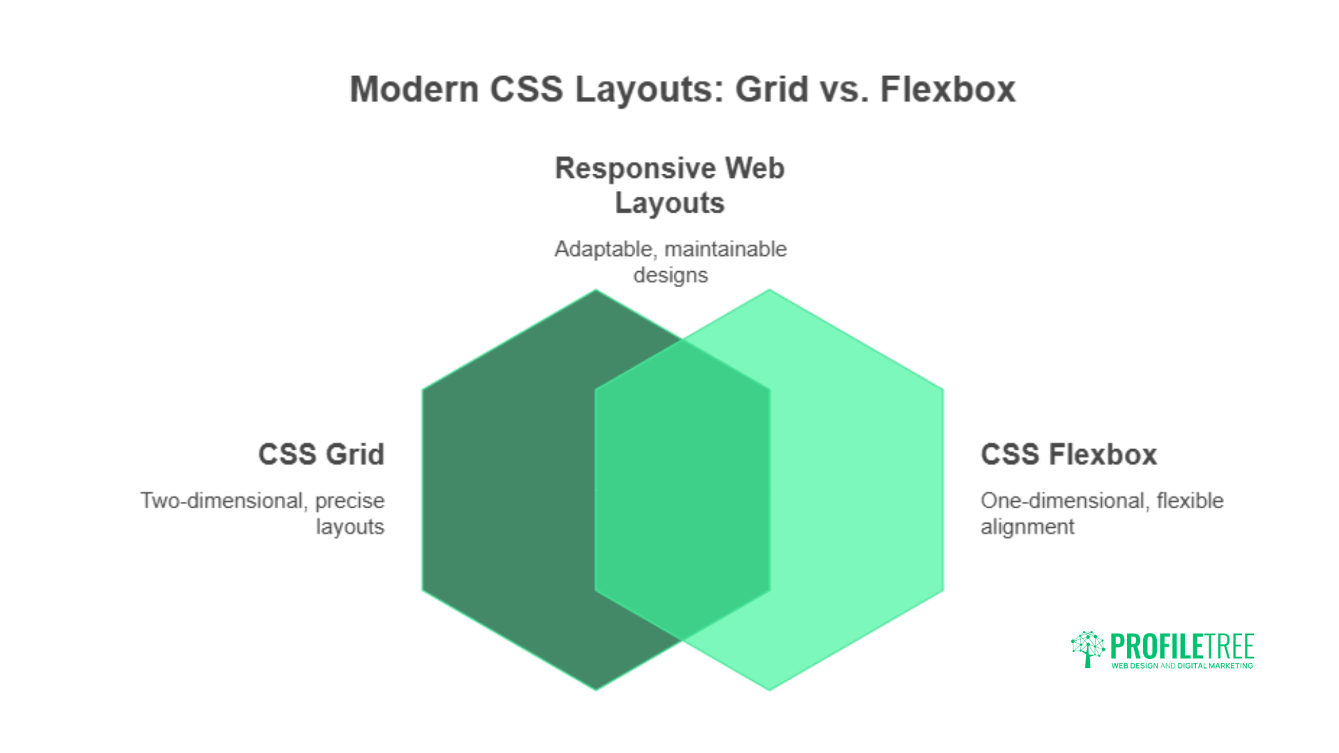
CSS Grid and Flexbox have revolutionised how developers approach layout design, replacing the float-based systems that dominated web development for years. CSS Grid excels at creating two-dimensional layouts where precise control over rows and columns is required, while Flexbox handles one-dimensional layouts with exceptional efficiency.
Grid systems allow developers to create complex, magazine-style layouts that adapt naturally to different screen sizes. The grid-template-areas property enables designers to define layout regions using intuitive naming conventions, making it easier to visualise and modify layouts during development. This approach significantly reduces development time while creating more maintainable code.
Flexbox solves common alignment challenges that previously required complex positioning techniques. The ability to distribute space automatically between elements, align items vertically with a single property, and create responsive navigation systems makes Flexbox indispensable for modern web development.
Practical Grid Implementation Strategies
Professional grid implementations often combine explicit and implicit grid tracks to handle varying content amounts. Using minmax() functions within grid templates creates responsive layouts that adapt to content while maintaining design integrity. The fr unit allows for proportional space distribution that works consistently across devices.
Auto-placement algorithms in CSS Grid can intelligently position elements based on available space, reducing the need for media queries in many scenarios. This automated approach creates more resilient layouts that handle unexpected content variations gracefully.
Custom Properties and CSS Variables: Dynamic Styling Solutions
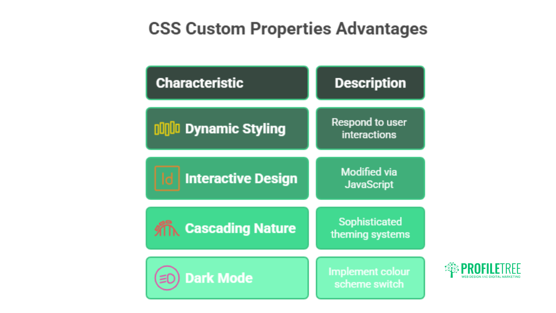
CSS custom properties, commonly known as CSS variables, provide dynamic styling capabilities that respond to user interactions and system preferences. Unlike traditional CSS values, custom properties can be modified through JavaScript, creating interactive design systems that adapt to user behaviour.
The cascading nature of custom properties allows for sophisticated theming systems where changing a single variable can transform entire design schemes. This capability proves particularly valuable for businesses serving diverse audiences or operating across multiple brands.
Dark mode implementations become straightforward with custom properties, as developers can define colour schemes that switch based on user preferences or system settings. The prefers-color-scheme Media query combined with custom properties creates seamless theme transitions that improve user experience.
Advanced Variable Techniques for Modern Web Designs
Contextual custom properties enable component-based styling where individual elements inherit appropriate styles based on their position within the design hierarchy. This approach creates more maintainable code while allowing for greater design flexibility.
Mathematical calculations using calc() Combined with custom properties, create responsive typography and spacing systems that scale proportionally across devices. These calculated values eliminate the need for extensive media query systems while maintaining precise design control.
Animation and Transitions: Creating Engaging User Experiences
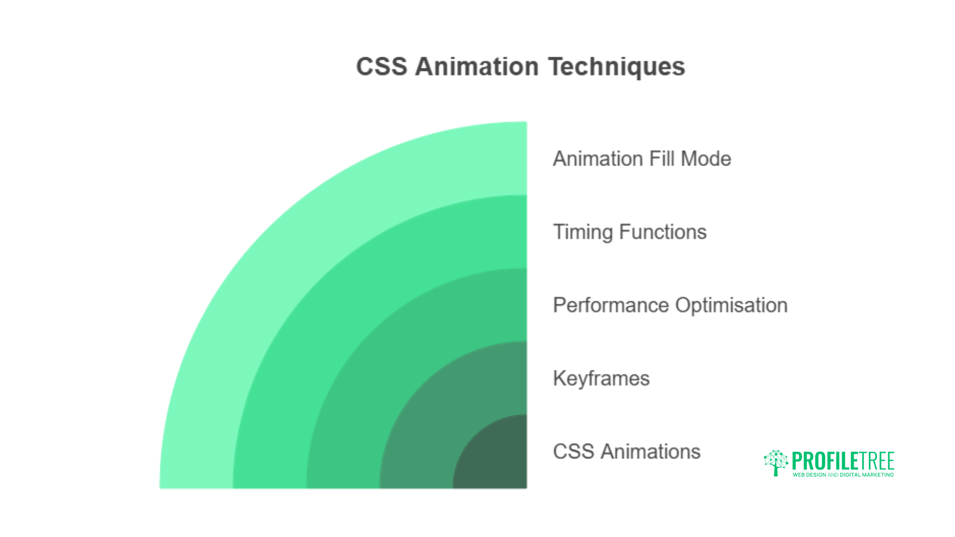
Modern CSS animations go beyond simple hover effects to create sophisticated user interface elements that guide attention and provide feedback. The @keyframes The rule enables complex animation sequences that can run independently or respond to user interactions.
Performance considerations become critical when implementing animations, as poorly optimised effects can significantly impact user experience. Animating only transform and opacity properties maintains smooth frame rates across devices, while will-change Declarations prepare the browser for upcoming animations.
Timing functions control the animation feel, with custom cubic-bezier curves that create distinctive motion characteristics that align with the brand’s personality. The animation-fill-mode property controls element states before and after animations, preventing visual jumps that can disrupt the user experience.
Micro-Interactions and Purposeful Animation
Micro-interactions provide immediate feedback for user actions, creating more responsive interfaces that feel alive and engaging. These subtle animations can include button press effects, form field focus states, and loading indicators that maintain user engagement during processing.
Progressive animation techniques allow effects to build upon each other, creating complex sequences that guide users through interfaces naturally. Staggered animations can reveal content in sequence, drawing attention to important elements while maintaining visual hierarchy.
Advanced Selectors and Pseudo-Elements: Precision Styling
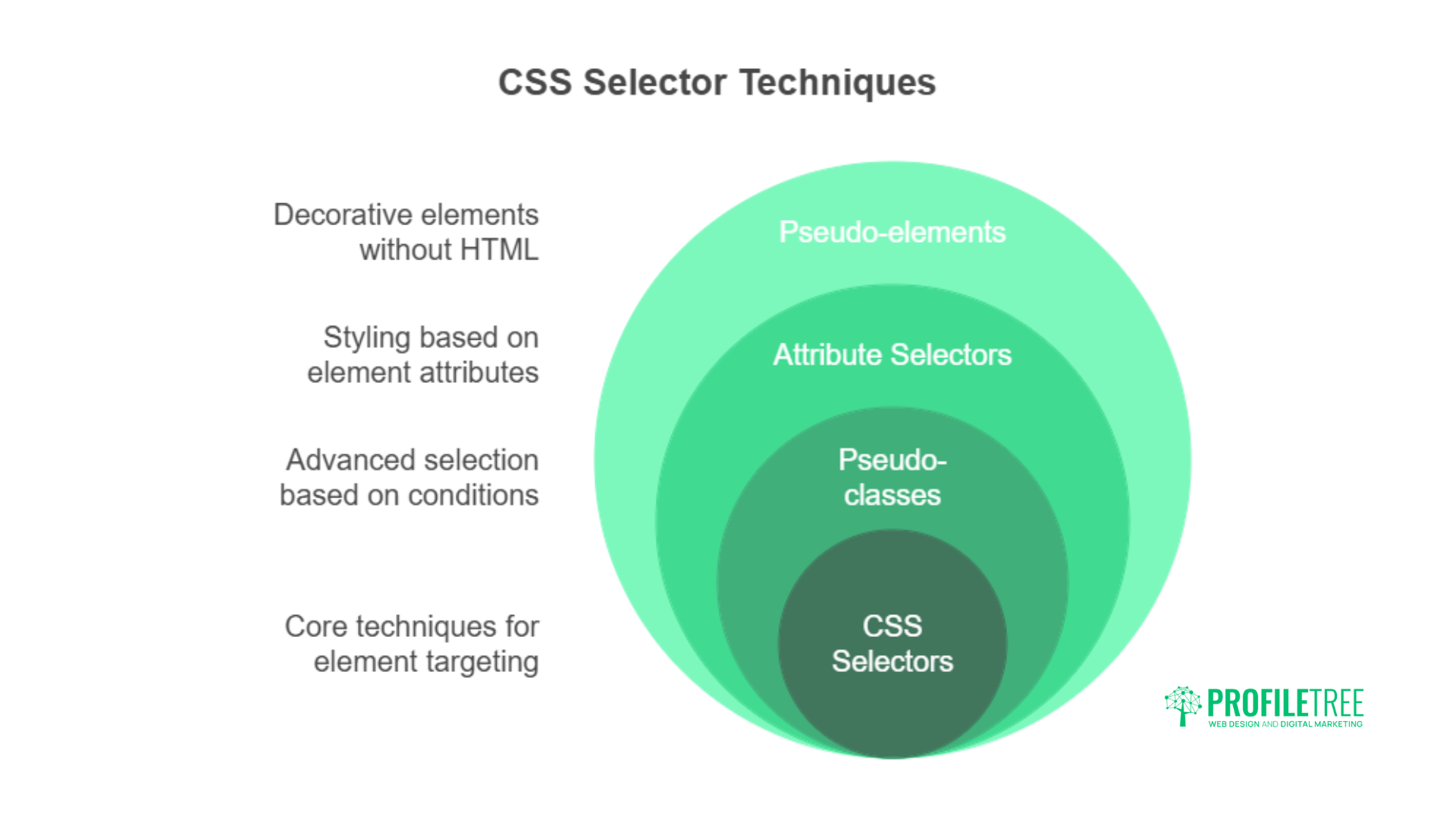
Modern CSS selectors provide surgical precision when targeting specific elements, reducing the need for additional HTML classes and creating cleaner markup. The :has() Pseudo-class, often called the “parent selector,” enables reverse selection based on child element conditions.
Attribute selectors can target elements based on data attributes, creating styling systems that respond to content characteristics without requiring JavaScript. This approach proves particularly useful for dynamic content where traditional class-based styling becomes impractical.
Pseudo-elements like ::before and ::after create decorative elements without additional HTML, enabling complex visual effects while maintaining semantic markup. These generated elements can be animated and positioned independently, creating layered visual effects.
CSS Techniques for Modern Web Designs: Selector Strategies
Structural pseudo-classes like :nth-child() and :nth-of-type() Create pattern-based styling that adapts automatically to content changes. These selectors eliminate the need for JavaScript-based styling while creating visually interesting repeating patterns.
The :focus-within Pseudo-class improves accessibility by highlighting parent containers when child elements receive focus, creating clearer navigation paths for keyboard users. This approach improves user experience without requiring additional scripting.
Container Queries: Context-Aware Responsive Design
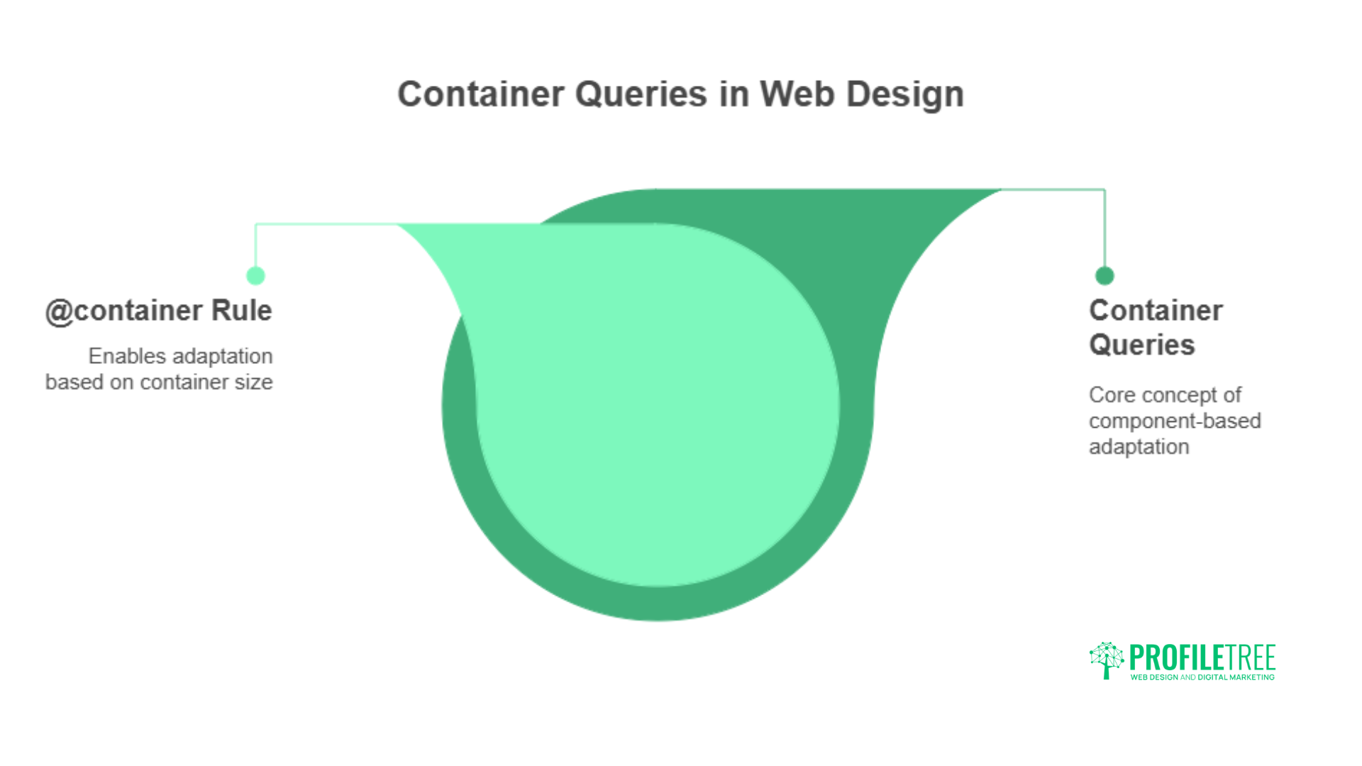
Container queries represent a paradigm shift from viewport-based responsive design to component-based adaptation. Elements can now respond to their container’s dimensions rather than the overall screen size, creating truly modular design systems.
The @container The rule enables components to adapt based on their available space, allowing for more flexible layouts that work across different contexts. This approach proves particularly valuable for content management systems where components appear in varying container sizes.
Container query units like cqw (container query width) and cqh (container query height) Provide sizing relative to container dimensions, creating proportional scaling that maintains design relationships regardless of context.
Implementing Container-Based Design Systems
Component libraries benefit significantly from container queries, as individual elements can adapt to their context without requiring external media queries. This self-contained approach creates more portable components that work consistently across projects.
Nested container contexts allow for sophisticated responsive behaviour where child elements respond to multiple container levels, creating adaptive interfaces that work seamlessly across complex layouts.
CSS Subgrid: Advanced Grid Alignment
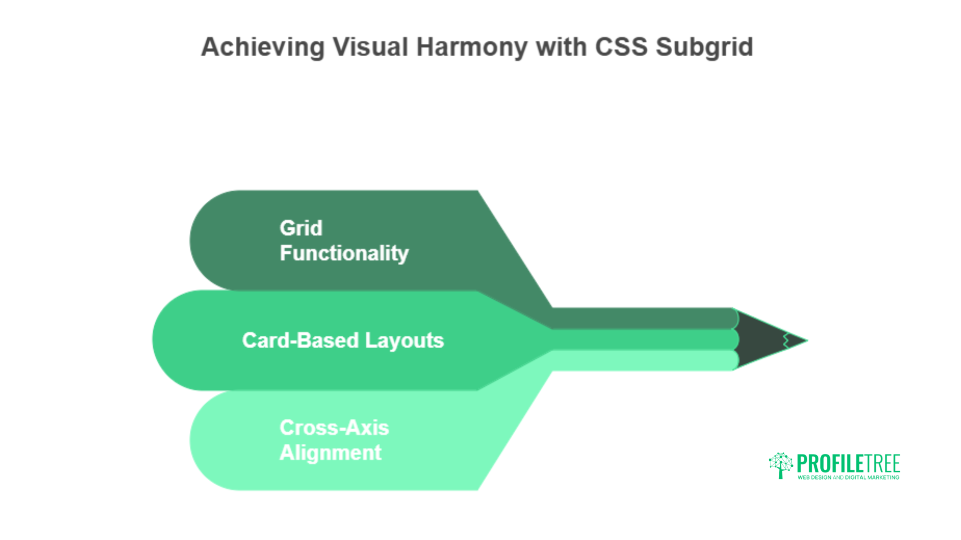
CSS Subgrid extends Grid functionality by allowing nested grid items to align with their parent grid tracks. This capability creates more consistent layouts where child elements maintain alignment with broader design structures.
Subgrid proves particularly valuable for card-based layouts where content lengths vary but visual alignment must be maintained. The ability to align nested elements with parent grid lines eliminates common layout challenges while maintaining clean markup.
Cross-axis alignment in subgrid enables complex layouts where both horizontal and vertical alignment can be controlled precisely, creating magazine-quality layouts that adapt responsively to different screen sizes.
Modern Typography with CSS

Variable fonts provide unprecedented control over typography, allowing single font files to contain multiple weights, widths, and styles. The font-variation-settings The property enables fine-tuned typography that adapts to content and context.
The clamp() function creates responsive typography that scales smoothly between minimum and maximum sizes, eliminating the need for multiple media queries while maintaining readable text across devices. This approach creates more consistent reading experiences.
Text decoration improvements include text-decoration-thickness and text-decoration-skip-ink properties that provide greater control over underlines and text effects, enabling more sophisticated typographic treatments.
Advanced Text Effects and Readability
The text-wrap: balance Property improves headline readability by distributing words more evenly across lines, reducing awkward line breaks that can impact comprehension. This automated approach improves typography without manual intervention.
CSS initial-letter creates drop caps and other typographic effects that were previously only achievable through complex positioning techniques. These decorative elements can be styled and animated independently while maintaining text flow.
Performance Optimisation Through CSS
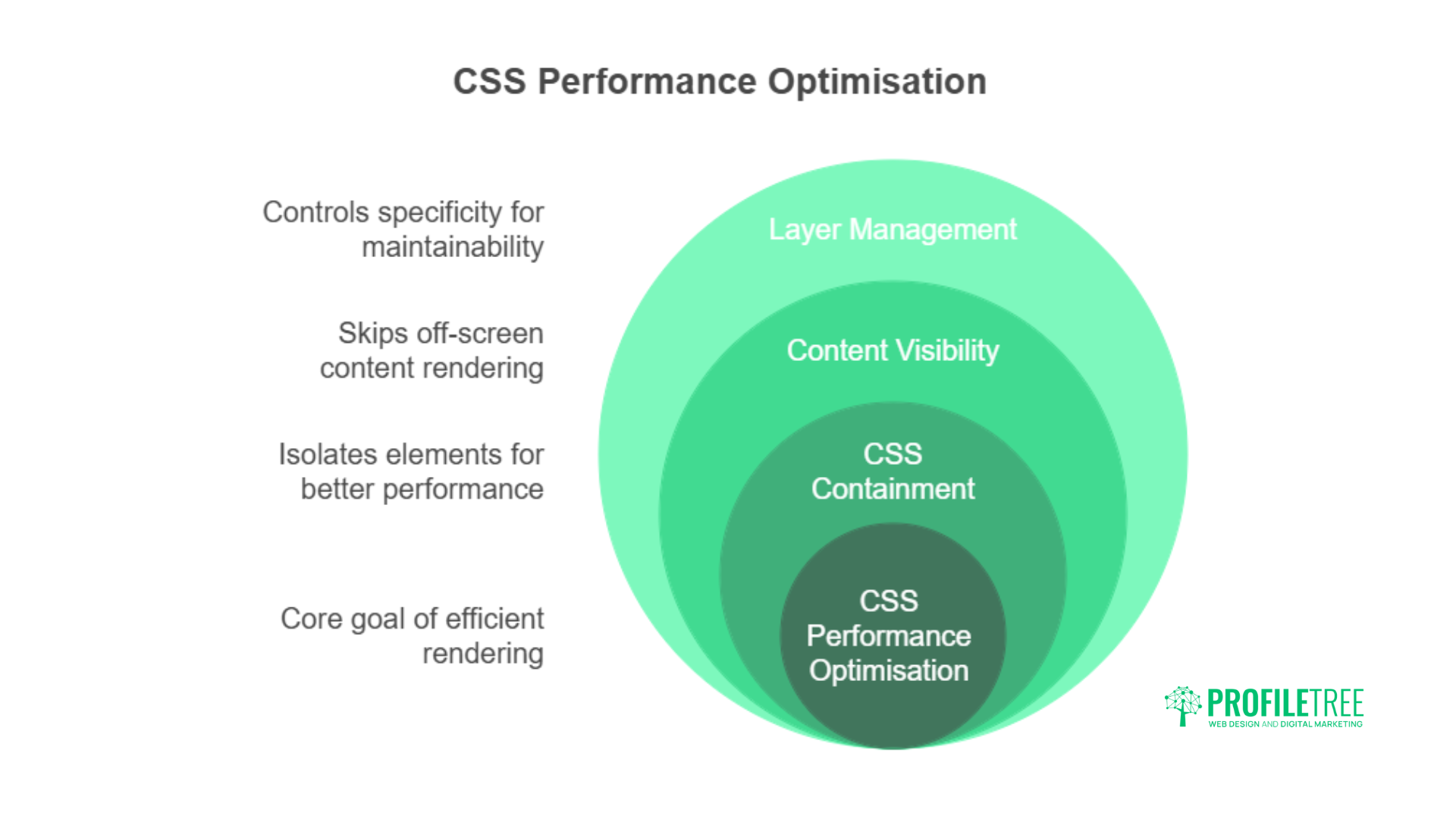
CSS containment using the contain Property isolates elements from broader layout calculations, improving rendering performance for complex interfaces. This optimisation becomes critical for applications with dynamic content or frequent updates.
The content-visibility The property enables rendering optimisations by skipping off-screen content calculations, significantly improving performance for long pages or complex interfaces. This approach reduces initial load times while maintaining smooth scrolling.
Layer management through the @layer The rule provides explicit control over CSS specificity, reducing conflicts and improving maintainability while enabling performance optimisations through more predictable styling hierarchies.
CSS Techniques for Modern Web Designs: Performance Best Practices
Critical CSS strategies involve inlining essential styles while deferring non-critical styling, reducing initial load times while maintaining visual quality. This approach requires careful analysis of above-the-fold content requirements.
CSS-in-JS alternatives using native CSS features reduce JavaScript bundle sizes while maintaining dynamic styling capabilities, improving both performance and maintainability for complex applications.
Accessibility and Inclusive Design
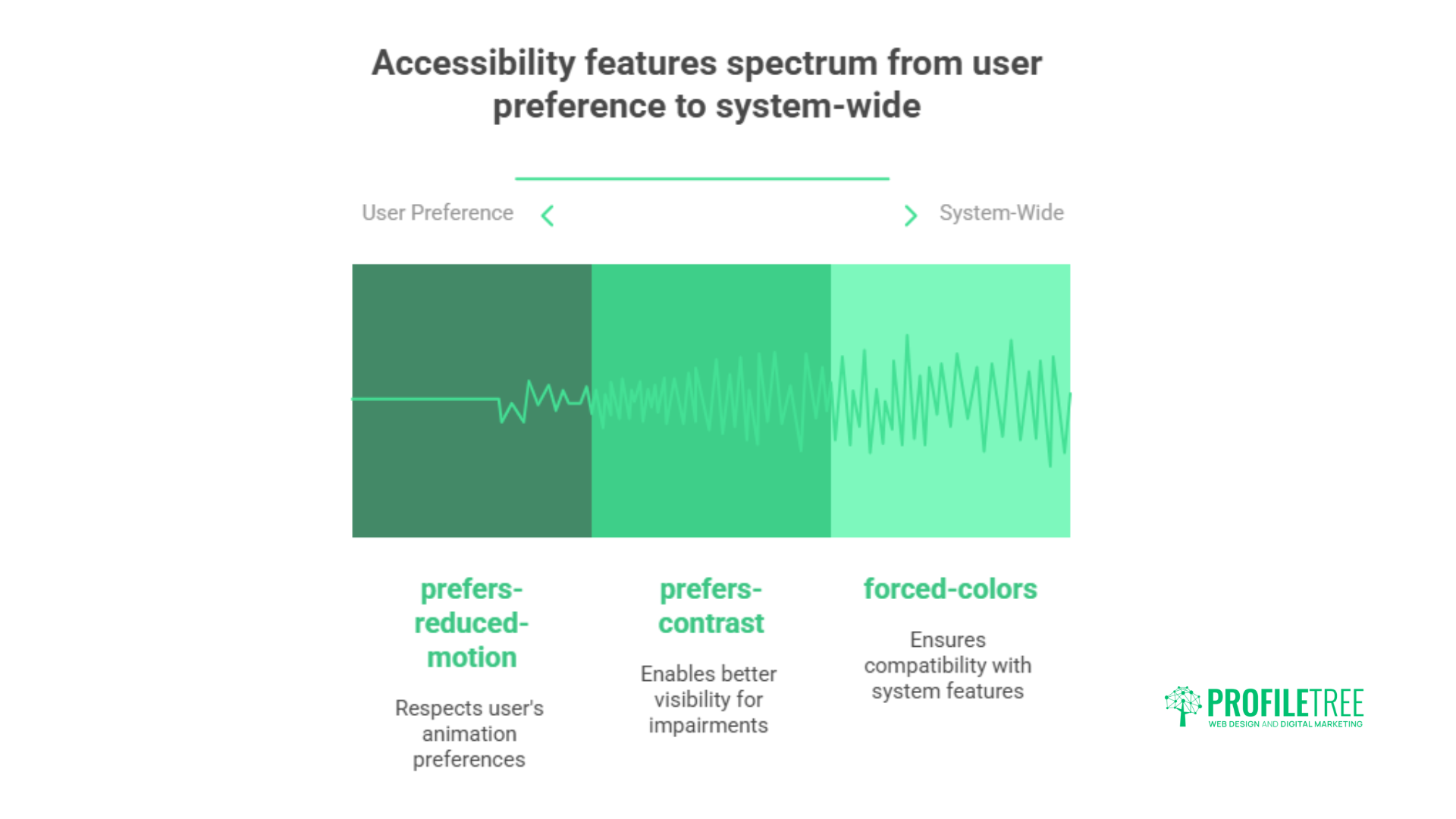
The prefers-reduced-motion Media query respects user preferences for reduced animation, creating more inclusive experiences for users with vestibular disorders or other conditions affected by motion. This consideration becomes increasingly important as animations become more prevalent.
High contrast mode support through the prefers-contrast Media query enables better visibility for users with visual impairments, while forced-colours mode ensures compatibility with system-level accessibility features.
Focus management improvements include :focus-visible pseudo-class that provides appropriate focus indicators for keyboard navigation while avoiding unnecessary focus rings for mouse interactions.
Building Inclusive Design Systems
Semantic colour systems using custom properties enable easy adaptation for different accessibility needs, allowing colour schemes to be modified without affecting design structure. This approach supports both personal preferences and assistive technologies.
Scale-aware typography using relative units combined with user preference queries creates reading experiences that adapt to individual needs while maintaining design integrity.
Future-Proofing CSS Architecture
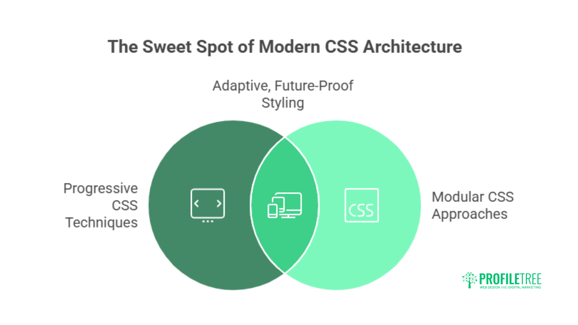
CSS architecture strategies must balance current requirements with future capabilities, using progressive approaches that take advantage of new features while maintaining compatibility with existing systems.
Feature queries using @supports Enable progressive improvement where advanced features are applied only when supported, maintaining baseline functionality across all browsers while providing improved experiences where possible.
Modular CSS approaches using native features reduce dependency on build tools while creating maintainable, scalable styling systems that adapt to changing requirements over time.
“The businesses that succeed online are those that understand their websites are living, breathing tools that must evolve with user expectations,” says Ciaran Connolly, Director of ProfileTree. “Advanced CSS techniques aren’t just about pretty designs—they’re about creating digital experiences that drive real business results.”
How Can ProfileTree Help Your Business?
ProfileTree brings together advanced CSS techniques with strategic digital marketing expertise to create websites that deliver measurable business results. Our Belfast-based team works with businesses across Northern Ireland, Ireland, and the UK to implement modern web solutions that combine cutting-edge design with proven conversion strategies.
Web Design and Development Excellence
Our web design approach focuses on creating websites that rank well, attract traffic, and convert visitors into customers. We specialise in WordPress development and work with Wix, Shopify, and Squarespace platforms. Every website we build incorporates the advanced CSS techniques discussed in this article, from responsive Grid layouts to sophisticated animation systems.
Our development process includes comprehensive accessibility testing, performance optimisation, and mobile-first design principles. We implement custom properties for easy theme management, container queries for responsive components, and advanced animations that guide user behaviour without compromising performance.
SEO and Local SEO Integration
Technical SEO forms the foundation of every website we create. Our team implements CSS techniques that support search engine visibility while maintaining fast loading times and an excellent user experience. We understand how modern CSS affects crawling and indexing, optimising code structure for both users and search engines.
Local SEO strategies are particularly important for businesses serving specific geographic areas. Our approach combines technical excellence with local market understanding, helping businesses in Belfast, Dublin, and across the UK achieve higher rankings for location-based searches.
AI Implementation and Training Services
ProfileTree specialises in bringing artificial intelligence capabilities to small and medium-sized enterprises. Our AI implementation services focus on practical applications that deliver immediate value without requiring extensive technical infrastructure.
We help businesses integrate AI tools for content creation, customer service automation, and data analysis. Our training programmes teach business owners and their teams how to use AI effectively while maintaining quality and authenticity in their communications.
Machine learning applications for website personalisation represent an emerging opportunity for businesses seeking competitive advantages. Our team can implement AI-driven content recommendations, automated A/B testing systems, and predictive analytics that improve user experience while driving conversions.
Content Marketing and Digital Strategy
Content strategy goes hand-in-hand with modern web design, creating cohesive digital experiences that engage audiences across multiple touchpoints. Our content marketing services include blog writing, video production, animation, and social media strategy.
We understand how content affects user behaviour and site performance, creating materials that support both SEO objectives and user experience goals. Our approach combines data-driven insights with creative storytelling that resonates with target audiences.
Digital Training and Workshops
Many businesses struggle to keep pace with rapidly evolving digital technologies. Our training programmes cover SEO fundamentals, accessibility best practices, and AI adoption strategies tailored to specific industry needs.
Workshop formats include hands-on sessions where participants learn to implement basic CSS improvements, understand SEO principles, and explore AI tools relevant to their business operations. These educational services help businesses maintain a competitive digital presence while building internal capabilities.
Conclusion
Advanced CSS techniques form the backbone of modern web development, enabling businesses to create digital experiences that stand out in competitive markets. From responsive layouts using Grid and Flexbox to dynamic styling with custom properties, these techniques provide the tools necessary for building websites that engage users and drive conversions.
For businesses seeking to maximise their digital presence, investing in modern CSS implementation pays dividends through improved user engagement, better search engine performance, and reduced maintenance costs. These techniques represent the current state of web development best practices and provide a solid foundation for future digital growth.
Ready to transform your digital presence with advanced CSS techniques and strategic digital marketing? Contact ProfileTree today to discover how our expertise in modern web design, SEO, and AI implementation can drive measurable growth for your business. Our Belfast-based team is ready to help you create a website that not only looks exceptional but delivers the results your business deserves. Get in touch for a free consultation and see how we can elevate your digital strategy.