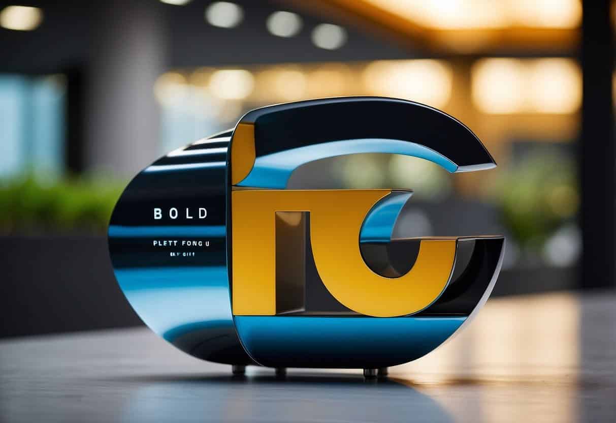
The Role of Typography in Web Design: Enhancing UX and Readability
Table of Contents
Typography is a fundamental aspect of web design, often serving as the backbone of a site’s aesthetic and functional appeal. It’s the craft of arranging type to make the content not only legible but also visually attractive. As we navigate through the digital world, the importance of good typography design becomes increasingly apparent. It’s more than just choosing appealing fonts; it involves understanding the nuances of letter spacing, line height, and font weight, elements which collectively impart a certain mood or atmosphere to a site, enhance its readability, and form a crucial part of its overall user experience.
On a practical level, typography helps to create a visual hierarchy, guiding the reader’s eye through the website content in a structured way. This hierarchy ensures that visitors to the site are drawn first to the most important information, such as headlines and key points, before moving to secondary content.
Furthermore, the clarity of type directly impacts accessibility—everyone, regardless of their ability to consume content, should have a seamless interaction with the text presented. By focusing on the usability aspect, we ensure our sites resonate with a broader audience and meet the necessary standards for inclusivity. Remember, the type on a website is not just about making a statement; it’s about communication and function, speaking to the brand’s identity and the user’s needs alike.
Using Typography in Web Design
Typography is an essential component of web design, deeply impacting a website’s readability and user experience. It involves the strategic use of type to not only convey information but also to enhance the overall design and effectiveness of the site.
Fonts: Choosing the right font is paramount. It’s not simply a matter of aesthetic preference but a crucial part of conveying the right tone and ensuring text is easily digestible across different devices and platforms.
Readability: This is where legibility meets accessibility. Readable typography means that users can easily scan your text without straining. Paying attention to line lengths, spacing, and font size is critical.
Visual Hierarchy: Establishing a clear hierarchy through typography helps users navigate your content. Bold and italic fonts, variable sizes, and colour all play a part in guiding the viewer’s eye to different areas of a web page.
Contrast: High contrast between text and background is vital for visibility. A lack of contrast can make text difficult to read, whereas strong contrast helps to draw attention to the content.
Typography isn’t just about making things look good; it’s about functionality and user experience. We prioritise these aspects in web design, ensuring that audiences are not only captivated but can also easily interact with the content.
Consider the impact of typography on how we process information on a website. For example, let’s listen to what ProfileTree’s Digital Strategist – Stephen McClelland has to say: “Effective use of typography enhances a brand’s voice and ensures that messages are not lost in translation. It is the silent ambassador of your brand identity.”
We encourage you to examine your website’s typography from the font choice to the layout. Is it inviting? Does it guide your visitors effectively? Reflect on these points to ensure your web design is not only aesthetically pleasing but also functional and user-friendly.
The Basics of Typography
In the realm of web design, typography is crucial for crafting effective visual communication. It affects readability, user experience, and the overall aesthetic of a website.
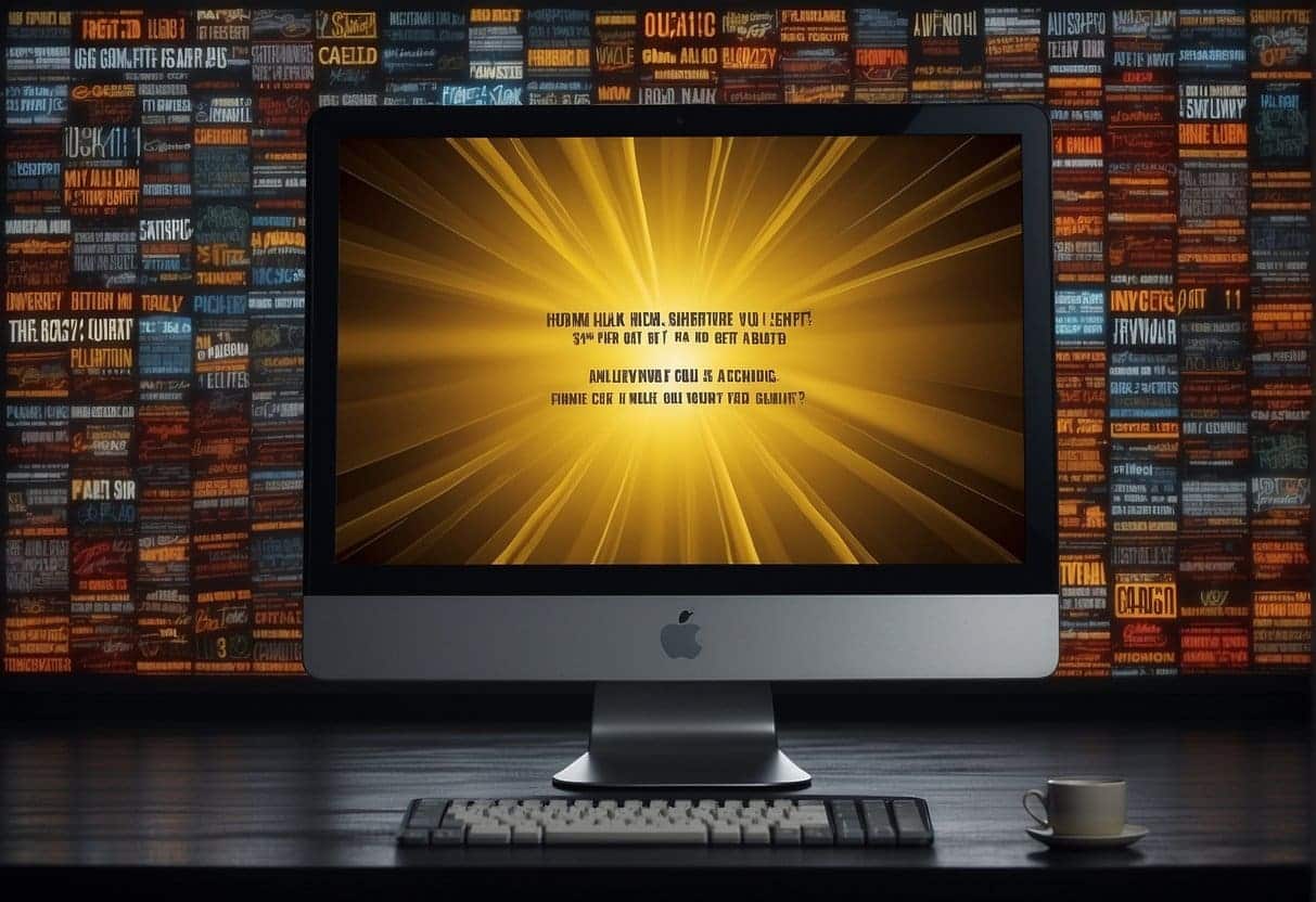
Typefaces and Fonts
A typeface is the design of lettering that can include variations in size, weight (bold), and style (italic). Fonts are the digital implementation of these typefaces, representing a particular size and style. The choice between serif typefaces, which have decorative strokes at the ends of letters, and sans-serif typefaces, known for their clean lines without additional strokes, depends on the intended tone and readability of the text.
Font Sizes and Scaling
Font sizes should be scaled appropriately to enhance readability. Responsive typography ensures that text is legible across different devices and screen sizes. Utilising relative units such as percentages or ems allows text to adapt to the user’s device settings or resize dynamically with the browser window.
Line Spacing and Length
Line spacing, or leading, refers to the vertical space between lines of text and should be set to a comfortable measure to improve readability. Line length impacts the reader’s ease to track from one line to the next; optimal line length is generally considered to be between 50-75 characters.
Typography and Layout
Effective typography uses layout tools like alignment, white space, and spacing to create a coherent visual hierarchy, guiding the reader’s eye across the page. Correct use of these elements can significantly enhance the user experience by facilitating the natural flow of content.
Our expertise at ProfileTree suggests that businesses must not only adopt these foundational principles but also innovate with them to stand apart. “Integrating typography effectively within a design is more than an art; it’s a precise science that can markedly boost user engagement when done right,” says Ciaran Connolly, ProfileTree Founder.
Creating Visual Hierarchy
In crafting an effective web design, establishing a strong visual hierarchy is paramount. This is crucial as it guides the user’s eye through the content and ensures that they can quickly and effectively absorb the most important information. Let’s discuss how we can use headings, contrast, and colour to achieve this goal.
Headings and Subheadings
Headings are the signposts that guide users through the labyrinth of content. They must stand out, setting the scene for the content that follows. We use size, boldness, and font style to differentiate headings from subheadings. The primary heading, or H1, should be the most prominent, with subsequent headings (H2, H3, etc.) presenting a clear and descending order of importance. The Role of Typography in Web Design: Best Practices and Tips demonstrates an effective use of typographic hierarchy, focusing on this pivotal aspect of web design.
Contrast and Colour Usage
Contrast attracts the eye and can be achieved through variations in font colour, size, and weight, creating a visual diversity that delineates sections and elements on a page. The effective use of colour can emphasise important buttons or calls to action, drawing attention to them naturally. However, too much contrast can cause visual chaos, so it’s vital to balance it. When we specify font colour, we aim for a high colour contrast against the background to ensure readability. An article on Creating Visual Hierarchy With Typography elucidates the use of typographic techniques to elevate the visual strategy within a design.
By employing the strategic use of headings and colour contrast, we establish a coherent structure that enhances user experience and interaction with the content.
Enhancing Readability and Accessibility
Ensuring the text is legible and accessible is paramount in web design. Good typography facilitates a seamless user journey and supports universal design principles, which cater to the needs of all users, including those with visual impairments.
Legibility of Text
The choice of typeface significantly impacts the legibility of text on the web. Serif fonts are often used for printed materials; however, sans-serif fonts like Arial or Helvetica are widely favoured in digital spaces for their clean lines and readability on screen. Font size is another critical factor, with a minimum of 16 pixels commonly recommended for body text. Moreover, ample line spacing (also known as leading) and adjusting letter spacing (kerning) can further improve legibility. Contrast between text and background is vital, with a ratio of at least 4.5:1 for normal text as per Web Content Accessibility Guidelines (WCAG) standards.
Design for Screen Size
Responsive design adjusts content to different screen sizes, ensuring information is readable without the need to zoom. Techniques like fluid typography, which utilises viewport units for font sizes, help maintain text legibility across devices. Additionally, it’s crucial to test typography on various devices to guarantee a consistent and accessible experience.
Web Content Accessibility Guidelines
WCAG provides a framework to make web content more accessible to a broader audience, including those with impairments. Adhering to these guidelines means considering factors such as text alternatives for non-text content, sufficient contrast, and the provision of different navigation options. These practices not only aid accessibility but also enhance the overall user experience.
By incorporating these typography fundamentals, we demonstrate our commitment to creating inclusive and accessible digital environments. It is part of our ethos at ProfileTree to encapsulate these standards into every website we craft, ensuring that legibility and accessibility are never an afterthought, but an integral part of our design process.
Typography’s Role in Brand Identity
Typography is an essential tool in creating and maintaining a brand’s identity. It impacts how a brand communicates its personality and ensures consistency across its branding elements.
Conveying Brand Personality
Typography is a silent ambassador of your brand, where specific fonts resonate with distinct brand personalities. For instance, a brand aiming to project a professional and authoritative image may adopt a clean, serif font, which traditionally evokes a sense of respectability. On the other hand, a brand with a more youthful and energetic spirit might choose a bold, sans-serif typeface to convey its modernity and approachability. These typographic choices build an emotional connection, impressing upon customers the characteristics and tone that the brand aims to project.
Consistency in Branding Elements
Ensuring consistency in typographic elements is pivotal for brand recognition. Uniformity in typography fosters a cohesive brand image when integrated across various platforms—from websites to print materials. This consistency aids in establishing reliable brand identity and brand recognition, as customers start to associate particular fonts and typographic treatments with your brand. By repeating the same typographic choices, a brand can become instantly recognisable, instilling a sense of familiarity and trust in its audience.
When considering the vast landscape of digital marketing, the strategic use of typography is a subtle yet powerful way to differentiate a brand from its competitors. Our expertise in creating optimised, visually coherent websites for brands ensures that their typographic choices align with their identity and marketing goals. Embracing this consistent approach in typography helps in forging a brand identity that is both memorable and effective in communicating with the targeted consumer base.
Improving User Experience Through Typography
The strategic use of typography in web design is crucial for enhancing the user experience. Properly utilised, typography can draw user attention to key content, increase readability, and improve the overall usability of a website.
Attention and Hierarchy: By varying font sizes, weights, and styles, we can establish a visual hierarchy that steers attention effectively. Headings and subheadings are given prominence, whilst body text remains clearly readable, guiding users through website content with ease.
Usability and Readability: To ensure text remains legible across devices, responsive typography scales elements like font size and line height. This not just aids in creating an aesthetically pleasing layout but also maintains a high level of readability, which is essential for user retention and engagement.
Consistent Typography: A consistent typographic theme contributes to a cohesive user experience. It helps users navigate and understand content structure quickly.
Accessible Fonts: Choosing fonts that are accessible across various devices is integral. It’s about striking a balance between style and functionality to ensure that users can access and interpret the website’s content with no barriers.
Loading Times: Optimised typography contributes to faster loading times. By selecting web-safe fonts and ensuring efficient font delivery, we prevent user frustration and abandonment due to slow website performance.
We at ProfileTree understand the transformative impact of typography on a website’s success. Our digital strategist, Stephen McClelland, emphasises that “in digital marketing, attention is a currency. The strategic typographic design is like investing in a high-performing asset; it pays dividends in user engagement and satisfaction.”
Incorporating these typographic strategies into web design ensures not only an attractive interface but a user experience that is smooth, satisfying, and conducive to your site’s goals.
Responsive Typography for Multiple Devices
Responsive typography is crucial in ensuring that text is legible and aesthetically pleasing across a diverse range of devices. With the multitude of screen sizes available, from smartphones to large monitors, it’s imperative that our web designs adapt accordingly.
Media queries are fundamental to responsive design, allowing us to specify different typographic settings for various screen sizes. For instance, we might decide that on smaller screens, the font size should be scaled down to maintain readability without excessive scrolling.
When discussing fluid typography, we’re referring to the practice of using scalable units like percentages or viewport units for font sizes. This approach enables text to adjust smoothly as the viewport changes size so that readability is preserved on any device.
Sizes measured in pixels have traditionally been the go-to unit for many designers. However, they don’t offer the same flexibility as relative units like rem (root em) or vw (viewport width) when aiming for responsive typography.
Here is a concise checklist we should consider for responsive typography:
- Ensure font sizes are legible on all devices.
- Use media queries to adjust typography based on screen size.
- Employ fluid typography techniques such as using vw units.
- Opt for relative units over static pixels for better scalability.
Our understanding of responsive typography directly impacts a user’s experience, influencing how easily they can access and absorb information on our websites. It’s our responsibility to design with this in mind, ensuring that all users, regardless of their device, enjoy an optimal viewing experience.
Typography and Emotional Impact
We understand the impact of typography in web design extends far beyond aesthetic appeal. It’s pivotal in shaping how users perceive and interact with content.
Communication & Emotion: Effective typography harnesses the power to evoke emotions and establish tone. The choice of font, size, and colour influences how content is received – whether it instils urgency, serenity, or excitement. Through careful selection, we craft experiences that resonate on an emotional level.
Trust & Professionalism: Trust is built on consistency and professionalism, visually signified through the use of typography. A well-structured typeface conveys reliability and authority, assuring users of the credibility of the content.
Here’s an actionable checklist to leverage the emotional impact of typography in web design:
- Choose fonts that align with your brand’s voice and values.
- Use contrasting font sizes to create a hierarchy and guide users through content.
- Select colours thoughtfully to mirror the sentiment you wish to evoke.
- Maintain font consistency to foster trust and recognition.
- Consider type spacing for readability and comfort.
According to ProfileTree’s Digital Strategist – Stephen McClelland, “The strategic use of typography can transform passive readers into engaged participants, stirring the desired emotion and action.”
In crafting our websites, we utilise typography strategically to not just present information, but to communicate and connect with our audience on a deeper level. Our expertise ensures that each typographic choice amplifies the desired emotion, reinforces trust, and upholds professionalism – all essential for a successful digital presence.
Design Tools and Resources
When embarking on web design, the selection of tools and resources is vital for effective typography. Knowing the right fonts and software can make or break the visual appeal and functionality of a website.
Selecting Fonts
Choosing the correct font family and font weight is crucial for readability and brand representation. A font should be reflective of the company’s character while ensuring optimal legacity. Font sizes must be considered for different devices to maintain usability. Websites like Google Fonts provide a vast selection of free fonts that are practical for web usage. For a more premium selection, Adobe Fonts offers high-quality typefaces that enhance typography design.
- Font Family: Ensure compatibility across devices and browsers.
- Font Weight: Balance between style and readability.
- Font Sizes: Scale for different devices to maintain user engagement.
Typography Tools and Software
Typography tools and software are imperative for creating a cohesive typographic hierarchy and improving the overall user experience. They facilitate testing and user testing to determine the impact of typography on user interaction. Font pairing is another aspect where these tools can be of great assistance, ensuring that the selected fonts complement each other and strengthen the design. Recognised resources such as Font Pair help designers match fonts effectively.
- Typography Tools: Streamline the design process and improve UX.
- Software: Test typography choices with real users.
In line with ProfileTree’s emphasis on innovation and actionable insights, these tools are not just for creating aesthetically pleasing designs but also for meticulous font selection and choice, which ultimately contribute to a website’s success. For those seeking to dive deeper into the realm of web typography, exploring these options can lead to more engaging and professionally crafted websites.
Best Practices in Web Typography
Web typography is pivotal in crafting an effective visual identity for websites. It’s not just about aesthetics; it’s about leading visitors through your content with ease and precision. Here are the fundamental practices to ensure typography enhances the quality and visual appeal of your website:
Choosing Web-Safe Fonts: Always opt for fonts that display consistently across different browsers and devices.
Maintaining Visual Hierarchy: Use font size, weight, and colour strategically to define a clear structure. Headings should stand out from body text, guiding users naturally through your content.
Ensuring Readability: Aim for a font size that allows users to read without strain. Employ adequate line spacing (line-height) to improve the text’s scan-ability.
Aligning to Your Brand: Typography should mirror your brand’s personality. Consider how font choices contribute to your overall visual identity.
Accessibility: It’s our responsibility to ensure text is legible for all users, including those with disabilities. High contrast between text and background colours and resizable text options can make a significant difference.
Here’s a simple action checklist to help you apply these practices:
- Select web-safe fonts that reflect your brand and are easily legible.
- Create a hierarchy with typography by using varied sizes, weights, and colours.
- Test readability across devices, adjusting the font size and spacing as needed.
- Ensure the contrast levels meet accessibility standards.
Remember, typography is more than just typeface selection; it directly affects user interaction and perception. As ProfileTree’s Digital Strategist – Stephen McClelland notes, “Effective typography bridges the gap between user interface and user experience. It’s the subtle art that makes content not just readable but intuitive and compelling.”
The Future of Typography in Web Design
As we look towards the rapidly approaching future of web design, it’s vital to acknowledge the ongoing transformations and the role typography plays within it. Innovations in design software and advancements in web technologies are reshaping how fonts and typography are used in websites. We are already observing a movement towards dynamic typography that adapts to user preferences and contexts, enhancing the overall user experience.
Emerging Trends: In the realm of typography, expect to see a rise in variable fonts. These fonts enable a multitude of variations in weight, width, and other attributes—all contained within a single, compact file. This not only streamlines website performance but also provides designers with greater creative freedom. Moreover, the integration of AI into typography—a trend gaining traction—further allows for a personalised user experience by automatically adjusting type settings based on user behaviour.
Font Styles: With the advent of Web Open Font Format 2 (WOFF2), web designers have an expanded suite of typefaces that promise better compression and faster load times. This will likely encourage a broader use of bespoke fonts that align with brand identity, moving beyond the constraints of traditional web-safe fonts.
Touchpoints for Web Design Enhancement:
- Enhanced readability on various screens and resolutions
- Greater emphasis on inclusive design for a diverse audience
- Fluid typography that works harmoniously with responsive design principles
Actionable Steps for Our SME Readers:
- Consider implementing variable fonts to reduce loading times and increase design flexibility.
- Embrace AI-driven typography tools to create a tailored browsing experience for your audience.
- Stay informed about the latest font delivery technologies to enhance your website’s performance.
Typography isn’t just about choosing attractive typefaces; it’s a critical tool that directly influences navigation and user engagement. Through techniques such as contrastive font pairing and strategic use of type for visual hierarchy, we can direct the user’s attention and create a compelling narrative on web pages.
As ProfileTree’s Digital Strategist – Stephen McClelland notes, “Moving forward, we must treat typography not as a static element but as a dynamic component that interacts with the user, reinforcing the message and the mood of the website.”
In conclusion, embracing these developments in typography will ensure that our web designs remain effective, relevant, and at the forefront of digital experiences.
FAQs
In this section, we address some of the most common queries related to the impact of typography in web design. Understanding these will help you make informed decisions that enhance user experience, readability, and overall aesthetic appeal of your website.
1. How do fonts influence user experience and readability on websites?
When we select fonts for a website, we shape how users perceive and interact with the content. A readable font improves user experience by making text easy to follow, which is crucial for keeping visitors engaged and ensuring the message is clearly conveyed.
2. What are the best practices for using type hierarchies in web design?
Type hierarchy guides users through a website by establishing an order of importance for the content. We use size, weight, and colour to differentiate between headings, subheadings, and body text, which helps users navigate and understand information more intuitively.
3. Which elements constitute effective web typography?
Effective web typography consists of a balanced combination of typefaces, appropriate font sizes, line spacing, and text alignment. These elements work together to create a seamless reading experience, while also contributing to the visual identity of a site.
4. What are the considerations for selecting font pairings in web layouts?
When selecting font pairings, we consider contrast, complementarity, and the purpose of the content. The goal is to pair fonts that balance each other well and suit the tone of the website, while also maintaining readability.
5. How does typography contribute to a website’s overall design and branding?
Typography is a key component of a website’s design and branding. It carries the brand’s personality and sets the tone for its online presence. The right typography can make a brand approachable and distinctive in a crowded digital space.
6. What role does typography play in enhancing website accessibility and navigation?
Typography plays a vital role in enhancing accessibility and navigation by enabling users of all abilities to access and understand the content. Good typography aids in creating a clear visual layout that directs users through the website’s various sections smoothly.