
The Power of Instagram Carousels: A Business Guide
Table of Contents
Instagram carousels are the multi-slide posts that let you share up to ten images or videos in a single swipeable post, and for most businesses, they are the hardest-working format on the platform. They hold attention for longer than a single image, they get a second chance in the feed when someone scrolls past, and they give you room to teach, sell, or tell a story properly instead of cramming everything into one frame. The problem is that most business accounts still post them badly: weak first slides, no structure, and no plan for what happens after the swipe.
This guide covers what an Instagram carousel is, the exact specifications you need, how to build one, and the design and strategy decisions that set a carousel apart from one people scroll past. It is written for business owners and marketing managers across Northern Ireland, Ireland and the UK who want carousels to do a real job, not just fill a content calendar.
What Is an Instagram Carousel?
An Instagram carousel is a single post that displays 2-10 images or videos, which viewers can scroll through by swiping left or right. Where a single image has to land its whole message in one look, a carousel builds a sequence: you can pose a question on the first slide, answer it across the middle, and finish with a clear next step. That structure is why carousels work so well for business accounts that need to explain something, address objections, or walk readers through a process.
The format also behaves differently in the feed. A single image gets one shot at catching the eye. A carousel gets the swipe, a small act of commitment from the viewer, and once someone has swiped, they tend to keep going. That extra dwell time is part of why carousels sit among the highest-engagement feed formats on Instagram, alongside the platform’s own Instagram Reels, which serve a different purpose we cover further down.
If you are still deciding where carousels fit against everything else you could post, it helps to see them as the teaching format. Reels are for reach, Stories are for immediacy, and carousels are for depth. That distinction runs through the rest of this guide.
Instagram Carousel Specifications and Requirements
Before you design anything, get the technical basics right. Uploading the wrong dimensions is the fastest way to lose quality or crop your text. Here are the current specifications for Instagram carousel posts.
| Element | Specification |
|---|---|
| Number of slides | 2 to 10 images or videos |
| Square ratio | 1:1 (1080 x 1080 pixels) |
| Portrait ratio | 4:5 (1080 x 1350 pixels) |
| Recommended orientation | Portrait 4:5 for maximum screen space |
| File formats | JPEG or PNG for images, MP4 for video |
| Target file size | Under 1MB per image to avoid heavy compression |
| Video length per slide | Up to 60 seconds |
| Safe margin for text | Roughly 150 pixels from every edge |
Portrait (4:5) is the ratio worth defaulting to. It takes up more of the screen on a phone than a square, which means more room for your message and a better chance of stopping the scroll. Horizontal crops are the weakest option for feed carousels because they occupy the least vertical space, so avoid them unless you have a specific reason.
Keep the dimensions identical across every slide in a single carousel. Mixing portrait and square images in a single post creates uneven sizing that looks unfinished and disrupts the swipe. If you produce carousels regularly, build a template in Canva or Photoshop at 1080 x 1350 so the sizing and safe zones are handled once, rather than every time. The same principle applies to the social media graphics you produce for other formats: consistent templates save hours and keep a feed looking coherent.
How to Create an Instagram Carousel
Creating a carousel takes three broad steps: design the slides, upload them in order, and write the caption. Here is how to do each properly.
Design the slides first. Work out your sequence before you open Instagram. Decide what goes on slide one (the hook), what the middle slides teach or show, and what the final slide asks the viewer to do. Design in Canva, Adobe Express or Photoshop, keeping to your template and safe margins. Export each slide as a separate high-quality file.
Upload to the app. Open Instagram, tap to create a new post, then tap the multi-select icon to choose more than one image. Select your slides in the order you want them to appear, because you cannot reorder them once you move on. Apply any filters consistently across all slides, then continue to the caption screen.
Write the caption and add alt text. Front-load the caption with your main point, since Instagram truncates longer captions. Add alt text to each slide (more on that in the accessibility section below), tag your location if it is relevant, and add three to five focused hashtags rather than a long generic list.
If you want to schedule carousels rather than post them live, you do not need paid software. Meta Business Suite, Instagram’s own free tool, lets you build and schedule carousel posts from a desktop at no cost. Paid schedulers such as Later or Hootsuite add analytics and calendar views that help if you manage several accounts, but the free route is enough for most single-business setups. Planning ahead this way is far easier when it sits inside a proper content marketing strategy rather than being decided post by post.
One thing you cannot do: add, delete or reorder slides after a carousel is live. You can edit the caption and tags, but the slides themselves are locked. Check the order twice before you publish.
Why Carousels Drive Engagement
Carousels drive engagement through two mechanics that other feed formats do not: the re-serve and the save.
The re-serve is the more interesting of the two. When someone scrolls past your carousel without engaging, Instagram may show them the second slide later in their feed, giving the same post a second chance to catch attention. Search Engine Journal has documented this “second look” behaviour, and it is a major reason carousels remain visible longer than single images. It also means your second slide carries real weight, because for some viewers it is effectively the first thing they see.
The save is the other. Instagram treats saves as a strong quality signal, on the logic that people only save content they intend to come back to. Educational and reference carousels (the kind that explain a process or collect useful tips) tend to earn high save rates, which, in turn, signal to the algorithm that the post is worth showing to more people. This is why carousels reward genuine usefulness: a post people want to keep outperforms one they merely like.
There is a psychological layer underneath all this. The swipe is a micro-commitment, and once a viewer has invested that small effort, they are more likely to continue. Structuring your carousel around open loops (a question raised on one slide and answered on the next) keeps that momentum going. Improving Instagram engagement is less about posting more often and more about building posts that are hard to abandon halfway through.
Carousels vs Reels vs Single Posts
The most common question we hear from businesses is whether they should be putting their effort into carousels or Reels. The honest answer is both, because they do different jobs. This table outlines where each format fits.
| Factor | Carousels | Reels | Single Posts |
|---|---|---|---|
| Primary strength | Depth and retention | Reach and discovery | Speed and simplicity |
| Best use | Teaching, B2B, step-by-step, comparisons | Trends, entertainment, reaching new audiences | Announcements, quick updates |
| Typical engagement driver | Saves and swipe-throughs | Views, shares, watch time | Likes |
| Algorithmic push | Strong, aided by the re-serve | Strongest for reaching non-followers | Weakest of the three |
| Effort to produce | Medium to high | High | Low |
| Shelf life in feed | Long | Medium | Short |
Reels currently get the strongest algorithmic promotion for reaching people who do not yet follow you, so they are the format to lean on when the goal is discovery. Carousels win on retention and depth, which makes them the better choice for turning existing followers into leads or customers. A healthy Instagram presence uses the two together: Reels to bring people in, carousels to give them a reason to stay and act. If you want to go deeper on the video side, our guide to Instagram Reels for business covers that format in full, and the piece on what Reels can do is a good starting point for accounts new to short-form video.
The Continuous (Panoramic) Carousel
One advanced technique worth learning is the continuous carousel, sometimes called a panoramic carousel. Instead of ten separate slides, you design one wide image and split it so it flows across the frames, creating the effect of a single picture the viewer pans across as they swipe. Done well, it is one of the most eye-catching things you can do on a business feed.
The method is straightforward once you understand the maths. For a two-slide panorama in portrait orientation, design a canvas 2160 x 1350 pixels (two 1080-wide slides side by side), then slice it into two 1080 x 1350 sections. Upload them in left-to-right order. For a three-slide version, work at 3240 x 1350 and cut into three. Canva and Photoshop both handle this cleanly, and Photoshop’s slice tool makes the cutting exact.
Keep the important content away from the slice lines, because a face or a headline sitting on the join will look broken. This style suits brand storytelling, product reveals and campaign announcements more than dense educational content, since the flowing image is the point. It rewards planning, which is exactly the kind of production thinking that carries over from a proper video production process into still-image work.
Instagram Carousels for B2B and Professional Services
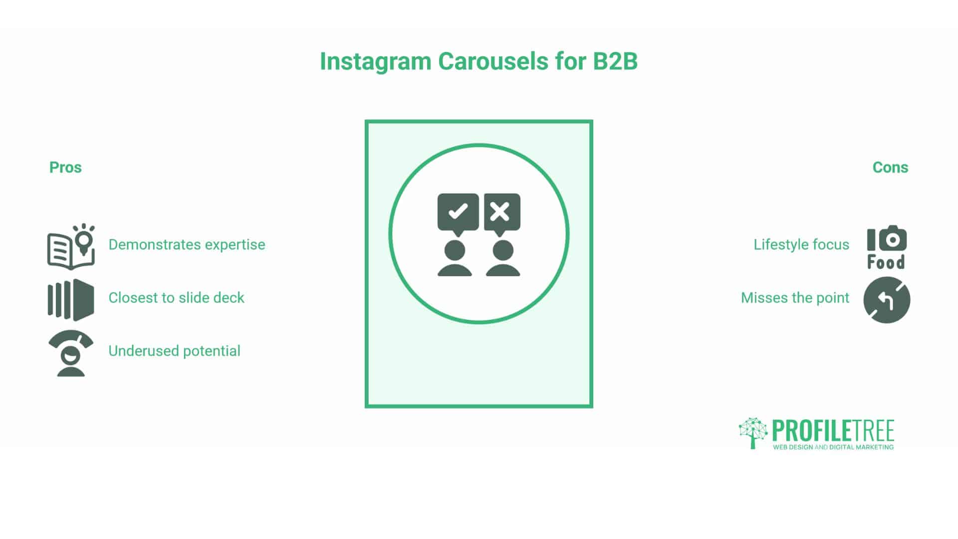
Most carousel advice online assumes you are a lifestyle brand posting brunch photos. For B2B companies and professional services, that advice misses the point. Carousels are the closest Instagram gets to a slide deck, which makes them ideal for demonstrating expertise, and this is the area where the format is most underused by serious businesses.
Treat a B2B carousel as an educational deck. A framework that works well: open with a result or outcome, introduce your method on slide two, then give each component its own slide. A process breakdown does the same job for services with a clear sequence, for example, a carousel titled “The 7-Stage Website Development Process That Prevents Project Overruns” with one stage per slide. Myth-busting formats also perform, because correcting a common misconception signals that you know the subject better than the reader does.
There is a real opportunity to repurpose material you already have. A whitepaper, a report or a long blog post can be broken into a carousel of “snackable” slides that point back to the full piece. A Belfast accountancy firm could turn a tax-year-end briefing into a ten-slide summary. A Manchester software company could distil a case study into a before-and-after sequence. This works because the hard thinking is already done: the carousel is a distribution format, not a new piece of research. That approach sits naturally within a wider content marketing strategy, where a single core asset feeds multiple channels.
For lead generation, resist the direct pitch. B2B carousels convert better through conversation than through a hard sell, so a closing slide that asks “Which of these challenges does your business face?” tends to outperform “Book a call now.” The comment it invites is both an engagement signal and a genuine sales lead. If your audience skews toward professional networking, the same content often works as cross-posted material, and our guide to LinkedIn for B2B covers how the two platforms complement each other.
Include one slide that goes deeper than the rest. A single “advanced insight” slide, more technical than the surrounding content, signals to knowledgeable readers that you are the real thing while remaining skippable for everyone else. That balance, accessible on the surface with depth underneath, is what separates a professional B2B carousel from a generic one.
Designing Accessible Carousels
Accessibility is the gap almost every competing guide ignores, and it matters for two reasons: it widens your audience, and in the UK and EU, it increasingly carries legal weight for organisations of a certain size. It also helps your reach, because the same features that aid accessibility feed Instagram’s search.
Add alt text to every slide. Instagram lets you write a description for each image that screen readers announce to visually impaired users. Describe what the slide actually shows rather than stuffing keywords: “Slide showing three statistics on carousel engagement, with a bar chart comparing formats” is useful; a list of hashtags is not. Because Instagram now works partly as a search engine, honest alt text also improves the chance that your post will surface in relevant searches, so it does double duty.
Mind your contrast and font size. Aim for a contrast ratio of at least 4.5:1 between body text and its background, and 3:1 for large headlines, so text stays readable for people with low vision. Avoid setting text over busy photographs; a semi-transparent overlay behind the words fixes most legibility problems. On font size, anything under 30pt gets hard to read on a phone, so size your typography for the smallest screen your audience uses, not the design canvas on your desktop.
None of this adds much time once it is built into your template, and it signals the kind of care that builds trust with an audience. The Instagram Help Centre documents the current alt-text controls if you want the exact steps inside the app.
Making Carousels Searchable
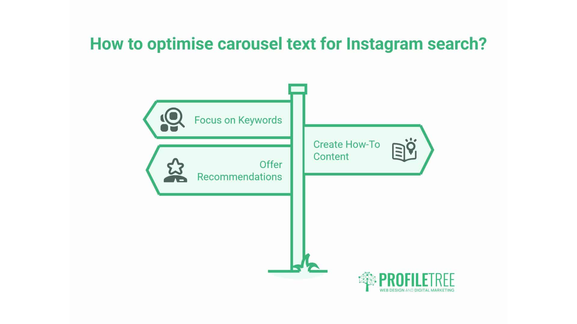
Instagram increasingly behaves like a search engine, especially for younger users looking for how-to content and recommendations, and that changes how you should think about carousel text. Optimising for Instagram search turns a carousel from a one-day post into a source of discovery that keeps working for weeks.
Instagram’s optical character recognition reads the text in your images, so the text on your slides is searchable, not just decorative. Putting a clear, keyword-relevant phrase on slide one (in plain, readable type) gives the platform something to match against searches. This is a genuine reason to write real words on your design rather than relying solely on the caption.
The caption still matters. Front-load it with your primary phrase, since Instagram may cut it off in previews, and use natural variations of your keyword rather than repeating an exact phrase. Hashtags should be focused: three to five relevant tags outperform a wall of generic ones, and mid-size tags (roughly 10,000 to 500,000 posts) give you a better chance of being seen than the most competitive ones, where you get buried in seconds. Our guide to using hashtags goes into how to build a tag set that balances reach and relevance, and a strong set of Instagram captions does more for discovery than most businesses expect. For accounts that want to be found inside the app, it is worth understanding Instagram search and explore as its own channel.
Measuring Carousel Performance
If you are not measuring carousels, you are guessing, and Instagram Insights gives you enough to stop guessing. The trick is knowing which numbers matter for this format specifically.
Save rate is the metric to watch first. Divide saves by reach, and you get a clean read on how valuable people found the post, and because Instagram weighs saves heavily, a high save rate tends to pull more reach behind it. Educational and reference carousels usually save well; purely promotional ones rarely do, which is a useful signal in itself.
Swipe-through rate tells you whether your content holds up past slide one. Instagram does not hand you this figure directly, but you can infer it by comparing how many people saw the first slide against how many saw the later ones. A steep drop-off means your hook is working, but your follow-through is not, or that slide one over-promised. Comments and shares are the high-value signals, because a share puts your post in front of a new audience, and a comment often opens a conversation. Profile visits and link clicks are the ones tied most closely to business outcomes, and they matter more than raw impression counts when you are judging whether a carousel actually earned its keep.
Test deliberately rather than posting on instinct. Run two versions of the first slide and compare early engagement. Try the same content in a problem-solution structure one week and a framework-reveal structure the next. Vary your closing call to action and see which one your audience acts on. Every carousel is a small experiment, and the accounts that improve fastest are the ones treating them that way. Understanding the connection between social media and sales helps you decide which of these metrics to prioritise for your own goals.
Bringing Carousels Into a Wider Strategy
A single good carousel is a nice win. A carousel programme that feeds a wider plan is what actually moves a business forward. That means deciding, in advance, what each carousel is for, which asset it draws from, and where it points people afterwards.
The strongest setups treat carousels as part of a documented content plan rather than as a standalone activity. One core asset, a report, a webinar, a service explainer, can become a carousel, a Reel, a blog post and a LinkedIn update, each cut for its platform. That is the difference between reactive posting and a system, and it is where working with a team that handles social media marketing end to end saves the most time, because the planning, design and measurement all sit in one place.
Planning carousel content around specific business objectives, whether that is building authority, generating leads, or nurturing existing customers, creates a framework for measuring what actually works. The businesses we work with that get the best social media results are the ones that approach content creation strategically rather than reactively. Ciaran Connolly, founder of ProfileTree
For businesses that would rather build the skill in-house, the same thinking can be taught. A short session on structuring carousels, building templates and reading the right metrics gives an internal marketer the tools to run the format properly, and that kind of practical video content strategy work often pays back faster than outsourcing every post. The point is to match the carousel to a real objective, produce it efficiently, and know how you will judge whether it worked.
Where to Start With Carousels
If you take one thing from this guide, make it this: audit what you are already posting and find the pieces that would work better as carousels. A product explanation spread across three posts probably belongs in a single carousel. A long caption nobody reads to the end is often a carousel waiting to happen. Start there, post one well-built carousel a week, and change one variable at a time so you learn what your specific audience responds to.
The businesses that win with this format are not the ones with the biggest budgets. They are the ones who treat each carousel as a small, measurable experiment and build on what the numbers tell them. Get the structure right, respect the specifications, write for accessibility and search, and measure the savings. The rest is practice.
FAQs
What makes Instagram carousels more engaging than single-image posts?
The swipe increases dwell time and signals interest to the algorithm, and the re-serve feature gives the post a second chance by showing slide two to people who scrolled past. Carousels sit among the highest-engagement feed formats as a result.
How many slides should an Instagram carousel include?
Two to ten. Educational content works best with 7 to 10; product showcases often land better with 3 to 5. Use only as much of the content as needed.
What are the dimensions for an Instagram carousel?
Portrait at 1080 x 1350 pixels (4:5) is best for screen space. Square at 1080 x 1080 (1:1) also works. Keep every slide the same size and leave a 150-pixel safe margin.
Why did Instagram show me the same carousel twice?
Instagram re-serves carousels, showing slide two to people who scrolled past slide one. It is a built-in second chance, and part of why carousels stay in the feed longer than single images.