Designing for Touchscreens: Best Practices for Modern Web Development
Table of Contents
The shift to mobile-first browsing has fundamentally changed how businesses connect with their customers. With over 60% of web traffic now originating from mobile devices, touchscreen design isn’t just a nice-to-have feature—it’s business critical. Yet many companies still treat mobile as an afterthought, cramming desktop experiences onto smaller screens and wondering why their conversion rates suffer.
At ProfileTree, we’ve discovered that businesses focusing on touchscreen-first design don’t just improve user experience—they see measurable improvements in search rankings, customer engagement, and sales conversions. This comprehensive guide reveals the principles and technical strategies that separate amateur mobile sites from professional, conversion-optimised web experiences.
Whether you’re a business owner evaluating your current website or a developer seeking to master modern touchscreen implementation, you’ll find actionable insights that bridge the gap between design theory and practical web development.
Core Touch Principles

Creating effective touchscreen design interfaces requires understanding fundamental human factors and interaction patterns. These principles form the foundation for all successful mobile web experiences, influencing everything from button placement to navigation structure.
Understanding Touch Target Fundamentals
The foundation of effective touchscreen design lies in understanding how humans interact with digital surfaces. Unlike desktop interfaces, where cursor precision allows for tiny clickable areas, touch interfaces demand generous, forgiving targets that accommodate the natural variations in human finger placement.
Optimal Touch Target Sizing:
- Minimum viable size: 44×44 CSS pixels (WCAG 2.1 AA compliance)
- Recommended standard: 48×48 CSS pixels for most interfaces
- Optimal comfort zone: 56×56 CSS pixels or larger for primary actions
- Spacing requirements: 8-16 pixels between adjacent interactive elements
The science behind these measurements stems from anthropometric research, which shows that the average adult fingertip contact area ranges from 8 to 10mm, translating to approximately 45 to 57 CSS pixels on standard mobile displays. However, the visual element doesn’t need to fill this entire space—padding around smaller icons ensures adequate touch area without compromising visual hierarchy.
Visual Affordances and Feedback Systems
Beyond touch target sizing, successful interfaces must communicate interaction possibilities through immediate visual cues. Without the hover states available on desktop, mobile interfaces must rely on immediate recognition patterns and responsive feedback systems that guide user behaviour effectively.
Essential Affordance Indicators:
- Consistent button styling with appropriate depth and contrast
- Recognisable iconography following platform conventions
- Clear typography hierarchy indicating interactive elements
- Colour coding that maintains meaning across cultural contexts
- Adequate contrast ratios (minimum 3:1 for UI components, 4.5:1 for text)
Multi-Modal Feedback Implementation:
- Visual feedback: Immediate state changes, ripple effects, colour transitions
- Tactile feedback: Strategic use of device vibration for confirmations
- Auditory cues: Optional sound feedback for accessibility compliance
- Loading states: Clear progress indicators for actions requiring processing time
Gesture Recognition and Mental Models
Modern touchscreen users expect sophisticated gesture support that goes beyond simple tapping. Understanding established interaction patterns helps developers create intuitive experiences that feel familiar and responsive.
Standard Gesture Expectations:
- Single tap: Primary selection or activation
- Double tap: Zoom or alternative action (context-dependent)
- Press and hold: Context menu or additional options
- Swipe gestures: Navigation, dismissal, or content manipulation
- Pinch/spread: Zoom controls for scalable content
- Pan/drag: Content repositioning or scrolling
Implementation Considerations: Gesture conflicts can frustrate users when application gestures interfere with system navigation. For instance, horizontal swipe gestures might conflict with browser back navigation on some devices. Always provide alternative interaction methods and test gesture implementations across different devices and operating systems.
Mobile-First Development
Mobile-first development represents a fundamental shift in web architecture, prioritising touchscreen experiences from the ground up. This approach aligns perfectly with modern touchscreen design principles, ensuring optimal performance across all device types.
Progressive Enhancement Architecture
Rather than starting with desktop designs and scaling down, this methodology begins with the most constrained environment and progressively adds features for larger screens and more capable devices.
Core Mobile-First Principles:
- Content Prioritisation: Essential information and actions receive prime screen real estate
- Performance Budgets: Every element must justify its impact on loading times
- Touch-optimised Navigation: Primary navigation paths designed for finger interaction
- Flexible Grid Systems:CSS Grid and Flexbox for responsive, touch-friendly layouts
- Conditional Loading: Advanced features load only when device capabilities support them
Responsive Layout Strategies
Modern responsive design extends far beyond simple media queries. Today’s touchscreen-optimised layouts require flexible grid systems, container-based queries, and intrinsic web design principles that adapt seamlessly across devices.
Advanced Responsive Techniques:
/* Container-based responsiveness */
@container (min-width: 400px) {
  .card-grid {
    display: grid;
    grid-template-columns: repeat(auto-fit, minmax(300px, 1fr));
    gap: 1.5rem;
  }
}

/* Touch-optimised button sizing */
.touch-target {
  min-height: 44px;
  min-width: 44px;
  padding: 0.75rem 1.25rem;
  border-radius: 0.5rem;
  position: relative;
}

/* Ensure adequate touch area even for smaller visual elements */
.small-icon {
  display: inline-flex;
  align-items: center;
  justify-content: center;
  min-height: 44px;
  min-width: 44px;
}
Viewport Configuration: Proper viewport configuration forms the foundation of responsive touchscreen design. The meta viewport tag controls how browsers interpret your responsive design:
<meta name="viewport" content="width=device-width, initial-scale=1, viewport-fit=cover">This configuration prevents zoom-to-fit behaviours that can break carefully crafted touch interfaces whilst ensuring content utilises the full available screen area on devices with display cutouts.
Touch Event Implementation
JavaScript touch events provide the foundation for creating responsive, native-like interactions within web browsers. Proper implementation of these events is crucial for executing effective touchscreen design.
Essential Touch Event Types:
- touchstart: Initial finger contact with screen
- touchmove: Finger movement across surface
- touchend: Finger lifted from screen
- touchcancel: System interruption of touch sequence
Practical Touch Event Implementation:
class TouchHandler {
  constructor(element) {
    this.element = element;
    this.startX = 0;
    this.startY = 0;
    this.isPressed = false;

    this.bindEvents();
  }

  bindEvents() {
    // Use passive listeners for better scroll performance
    this.element.addEventListener('touchstart', this.handleStart.bind(this), { passive: false });
    this.element.addEventListener('touchmove', this.handleMove.bind(this), { passive: false });
    this.element.addEventListener('touchend', this.handleEnd.bind(this));
  }

  handleStart(event) {
    this.isPressed = true;
    const touch = event.touches[0];
    this.startX = touch.clientX;
    this.startY = touch.clientY;

    // Provide immediate visual feedback
    this.element.classList.add('pressed');
  }

  handleMove(event) {
    if (!this.isPressed) return;

    const touch = event.touches[0];
    const deltaX = touch.clientX - this.startX;
    const deltaY = touch.clientY - this.startY;

    // Implement gesture recognition logic
    if (Math.abs(deltaX) > 50) {
      this.handleSwipe(deltaX > 0 ? 'right' : 'left');
    }
  }

  handleEnd(event) {
    this.isPressed = false;
    this.element.classList.remove('pressed');
  }

  handleSwipe(direction) {
    // Custom swipe handling logic
    console.log(`Swiped ${direction}`);
  }
}
Progressive Web App Integration
Progressive Web Apps (PWAs) bridge the gap between web and native mobile experiences. For businesses implementing comprehensive touchscreen strategies, PWAs offer installation capabilities, offline functionality, and performance benefits that enhance user engagement.
PWA Touch Optimisations:
- Installable Interfaces: Home screen shortcuts for direct access
- Offline Functionality: Service workers enabling offline content access
- Push Notifications: Re-engagement capabilities matching native apps
- Full-screen Experiences: Immersive interfaces without browser chrome
- Hardware Access: Camera, GPS, and other device APIs where appropriate
We’ve seen Northern Ireland businesses increase mobile engagement by up to 40% after implementing PWA functionality. The combination of offline access and app-like feel gives them a competitive advantage, especially when customers have poor connectivity,” notes Ciaran Connolly, Director at ProfileTree.
Touchscreen Performance Optimisation

Touchscreen users demonstrate significantly less patience for slow-loading experiences than desktop users. Performance optimisation becomes critical when implementing effective touchscreen design, as mobile networks and processing power introduce unique constraints.
Touch-Responsive Performance Budgets
Mobile connections often have higher latency and bandwidth constraints, making performance optimisation critical for maintaining user engagement and search rankings.
Performance Targets for Touch Interfaces:
- First Contentful Paint: Under 1.5 seconds
- Largest Contentful Paint: Under 2.5 seconds
- First Input Delay: Under 100 milliseconds
- Cumulative Layout Shift: Under 0.1
- Time to Interactive: Under 3.5 seconds on 3G connections
Smooth Animations and Interaction Feedback
Touch interfaces rely heavily on animation to provide feedback and guide user attention. However, poorly optimised animations create janky experiences that frustrate users and damage credibility.
Animation Performance Best Practices:
/* Use transform and opacity for smooth animations */
.smooth-transition {
  transform: translateX(0);
  opacity: 1;
  transition: transform 0.3s ease-out, opacity 0.3s ease-out;
  will-change: transform, opacity;
}

.smooth-transition.hidden {
  transform: translateX(-100%);
  opacity: 0;
}

/* Avoid animating layout-triggering properties */
.avoid-this {
  transition: width 0.3s ease; /* Triggers layout */
}

.prefer-this {
  transition: transform 0.3s ease; /* Composite layer */
  transform: scaleX(1);
}
Hardware Acceleration Techniques: Modern browsers can offload certain animations to the GPU, dramatically improving performance. Properties like transform and opacity can be hardware-accelerated, whilst changes to width, height, or margin require expensive layout recalculations.
Image Optimisation for Touch Devices
High-density touchscreen displays require sophisticated image delivery strategies. Proper image optimisation reduces bandwidth usage and improves loading times whilst maintaining visual quality across different screen densities.
Responsive Image Implementation:
<picture>
  <source media="(max-width: 480px)"
          srcset="hero-small.webp 480w, hero-small@2x.webp 960w"
          type="image/webp">
  <source media="(max-width: 768px)"
          srcset="hero-medium.webp 768w, hero-medium@2x.webp 1536w"
          type="image/webp">
  <img src="hero-large.jpg"
       srcset="hero-large.jpg 1200w, hero-large@2x.jpg 2400w"
       sizes="(max-width: 480px) 100vw, (max-width: 768px) 100vw, 1200px"
       alt="Professional web design showcase"
       loading="lazy">
</picture>
This implementation serves WebP images to supporting browsers whilst providing fallbacks, and delivers appropriately sized images based on screen dimensions and pixel density.
Accessibility Standards
Accessibility compliance isn’t optional in modern web development. When implementing touchscreen design, the Web Content Accessibility Guidelines (WCAG) provide essential standards that benefit all users whilst meeting legal requirements in many jurisdictions.
WCAG Compliance for Touch Interfaces
WCAG 2.1 introduced specific criteria that address the accessibility of touch interfaces. These guidelines ensure that touchscreen experiences are accessible to users with motor impairments, visual disabilities, and other accessibility needs.
Key WCAG 2.1 Touch Requirements:
- Target Size (AA): Interactive elements must be at least 44×44 CSS pixels
- Pointer Gestures (AA): All functionality available via single-pointer input
- Motion Actuation (AA): Functions triggered by device motion must have alternative inputs
- Orientation (AA): Content must work in both portrait and landscape orientations
Screen Reader and Assistive Technology Support
Touch interfaces must integrate seamlessly with screen readers and other assistive technologies to ensure accessibility. This requires careful attention to semantic markup, ARIA labels, and focus management that goes beyond visual design considerations.
Accessibility Implementation Examples:
<!-- Properly labelled touch controls -->
<button type="button"
        class="touch-target"
        aria-label="Add item to shopping basket"
        aria-describedby="add-help">
  <svg aria-hidden="true" focusable="false">
    <use href="#cart-icon"></use>
  </svg>
  Add to Basket
</button>
<div id="add-help" class="sr-only">
  Item will be added to your basket and you'll be redirected to checkout
</div>

<!-- Touch gesture alternatives -->
<div class="swipe-container"
     role="region"
     aria-label="Product gallery">
  <button type="button"
          class="gallery-nav prev"
          aria-label="Previous image">←</button>
  <img src="product1.jpg" alt="Product detail view">
  <button type="button"
          class="gallery-nav next"
          aria-label="Next image">→</button>
</div>
Inclusive Design Principles
True accessibility extends beyond compliance checkboxes to embrace inclusive design principles. These considerations benefit users with temporary disabilities, environmental constraints, or varying levels of technical proficiency.
Inclusive Touch Design Strategies:
- Multiple Interaction Methods: Provide alternatives to gesture-only controls
- Clear Visual Hierarchy: Ensure interactive elements are easily identifiable
- Error Prevention: Design interfaces that prevent common mistakes
- Recovery Paths: Provide clear undo/correction mechanisms
- Contextual Help: Offer guidance without cluttering the interface
Testing Implementation
Cross-Device Testing Strategies
Rigorous testing validates that touchscreen design implementations work correctly across diverse devices and user scenarios. Effective testing strategies combine automated tools with real-world user observations to identify potential issues before they impact business outcomes.
Cross-Device Testing Strategies
Touchscreen diversity presents significant testing challenges. Screen sizes range from smartwatches to large tablets, with varying touch sensitivities, gesture support, and performance capabilities.
Essential Testing Matrix:
- iOS Devices: iPhone SE through iPhone Pro Max, iPad variations
- Android Devices: Budget through flagship phones, various manufacturers
- Browser Variations: Safari, Chrome, Firefox, Samsung Internet
- Operating System Versions: Current and previous major releases
- Network Conditions: 3G, 4G, WiFi, offline scenarios
Automated Testing for Touch Interfaces
Automated testing catches regression issues and validates basic functionality across multiple configurations. However, these tools cannot replace manual testing for nuanced touch interaction behaviours.
Touch Testing Automation Example:
// Automated touch event testing with Playwright
const { test, expect } = require('@playwright/test');

test.describe('Touch Interface Tests', () => {
  test('should handle touch gestures correctly', async ({ page }) => {
    await page.goto('/touch-demo');

    // Test touch target sizes
    const button = page.locator('.touch-target');
    const boundingBox = await button.boundingBox();
    expect(boundingBox.width).toBeGreaterThanOrEqual(44);
    expect(boundingBox.height).toBeGreaterThanOrEqual(44);

    // Test swipe gestures
    await page.touchscreen.tap(100, 100);
    await page.touchscreen.touchStart(100, 100);
    await page.touchscreen.touchMove(200, 100);
    await page.touchscreen.touchEnd();

    // Verify gesture response
    await expect(page.locator('.swipe-indicator')).toHaveClass(/swiped-right/);
  });
});
User Testing Methodologies
Quantitative metrics tell only part of the story; they provide valuable data, but qualitative insights from user observations drive meaningful interface improvements. Observing real users interacting with touch interfaces reveals usability issues that automated testing cannot detect.
Effective User Testing Approaches:
- Task-based Testing: Observe users completing realistic goals
- Think-aloud Protocols: Understand user mental models and expectations
- A/B Testing: Compare different touch interface approaches
- Heat Mapping: Analyse actual touch patterns and missed targets
- Accessibility Testing: Include users with diverse abilities and assistive technologies
Advanced Touch Patterns and Future Considerations

The touchscreen landscape continues evolving with new input methods and display technologies. Staying ahead of these trends helps future-proof your touch interface investments.
Emerging Touch Technologies
- Haptic Feedback Systems: Advanced tactile responses beyond simple vibration
- Pressure-sensitive Displays: Interfaces responding to touch pressure variations
- Flexible and Foldable Screens: Adaptive layouts for changing form factors
- Hand Gesture Recognition: Camera-based interaction supplementing touch
- Voice Integration: Multimodal interfaces combining touch and voice control
Performance Optimisation Strategies
As touch interfaces become more sophisticated, maintaining smooth performance requires advanced optimisation techniques.
Advanced Performance Techniques:
// Efficient touch event handling with requestAnimationFrame
class PerformantTouchHandler {
  constructor(element) {
    this.element = element;
    this.rafId = null;
    this.touchData = { x: 0, y: 0, isDragging: false };

    this.element.addEventListener('touchmove', this.onTouchMove.bind(this), { passive: true });
  }

  onTouchMove(event) {
    const touch = event.touches[0];
    this.touchData.x = touch.clientX;
    this.touchData.y = touch.clientY;
    this.touchData.isDragging = true;

    // Throttle expensive operations using rAF
    if (!this.rafId) {
      this.rafId = requestAnimationFrame(this.updatePosition.bind(this));
    }
  }

  updatePosition() {
    if (this.touchData.isDragging) {
      // Perform visual updates here
      this.element.style.transform = `translate(${this.touchData.x}px, ${this.touchData.y}px)`;
    }
    this.rafId = null;
  }
}
Common Touchscreen Design Mistakes and Solutions

Understanding frequent pitfalls helps avoid costly redesigns and user frustration. These mistakes often stem from desktop-first thinking applied inappropriately to touch interfaces, highlighting why proper touchscreen design principles are essential.
Critical Mistakes to Avoid
- Insufficient touch targets: Buttons smaller than 44×44 pixels
- Hover-dependent interactions: Features requiring mouse hover
- Dense information layouts: Cramming too much content on small screens
- Inconsistent gesture patterns: Custom gestures conflicting with system conventions
- Poor error handling: No feedback when touch actions fail
Solutions and Best Practices
- Always test on actual devices, not just browser developer tools
- Implement progressive disclosure to manage content density
- Provide clear visual feedback for all interactive states
- Follow platform-specific design guidelines while maintaining brand consistency
- Design for one-handed operation where possible
Measuring Success: Analytics and KPIs

Effective touchscreen design requires ongoing measurement and optimisation. Key metrics help identify successful patterns and areas needing improvement when implementing comprehensive touchscreen design strategies.
Essential Touch Interface Metrics
- Touch Accuracy Rates: Percentage of intended vs. actual touch targets
- Task Completion Rates: User success in completing primary goals
- Time to Completion: Efficiency of touch-based workflows
- Error Rates: Frequency of touch mistakes and corrections
- Engagement Metrics: Time spent, pages viewed, conversion rates
Implementation Example:
// Touch analytics tracking
class TouchAnalytics {
  constructor() {
    this.touchStartTime = null;
    this.touchAccuracy = [];
  }

  trackTouchAccuracy(event, targetElement) {
    const touch = event.touches[0];
    const targetRect = targetElement.getBoundingClientRect();

    // Calculate if touch was within optimal target area
    const withinTarget = (
      touch.clientX >= targetRect.left &&
      touch.clientX <= targetRect.right &&
      touch.clientY >= targetRect.top &&
      touch.clientY <= targetRect.bottom
    );

    this.touchAccuracy.push({
      timestamp: Date.now(),
      accurate: withinTarget,
      targetId: targetElement.id
    });

    // Send to analytics platform
    this.sendAnalytics({
      event: 'touch_interaction',
      accurate: withinTarget,
      element: targetElement.id
    });
  }
}
Conclusion
Mastering touchscreen design requires balancing user experience principles with technical implementation realities. The businesses that succeed in the mobile-dominated landscape understand that touchscreen design directly impacts their bottom line through higher conversion rates, improved search rankings, and increased customer satisfaction. As touch technology continues evolving, the principles outlined in this guide provide a solid foundation for adapting to future innovations.
FAQs About Touchscreen Design
Q: What’s the minimum touch target size for mobile websites?
A: WCAG 2.1 AA standards require a minimum of 44×44 CSS pixels for interactive elements. However, 48×48 pixels is recommended for optimal user experience, with larger targets (56×56 pixels) preferred for primary actions.
Q: How do I test touchscreen functionality without multiple devices?
A: Whilst browser developer tools provide basic testing, they cannot replicate actual touch behaviour. Consider using cloud-based device testing services like BrowserStack or Sauce Labs, and prioritise testing on actual devices for critical user journeys.
Q: Should I disable zoom on mobile websites?
A: No, disabling zoom creates accessibility barriers for users with visual impairments. Instead, design with appropriate text sizes and touch targets that eliminate the need for zooming while preserving user control.
Q: How do I handle conflicts between swipe gestures and browser navigation?
A: Always provide alternative interaction methods for gesture-based features. Consider the direction and context of swipes, avoiding horizontal swipes near screen edges where they might conflict with browser back navigation.
Q: What’s the difference between touchstart and click events?
A: Touchstart fires immediately when a finger contacts the screen, while click events have a 300ms delay on mobile devices (though modern browsers have largely eliminated this delay). For immediate feedback, use touchstart, but ensure click events still work for accessibility.
How ProfileTree Can Transform Your Mobile Experience
ProfileTree specialises in creating touchscreen-optimised websites that don’t just look professional—they convert visitors into customers. Our Belfast-based team combines award-winning design expertise with advanced technical implementation to deliver mobile experiences that outperform competitors.
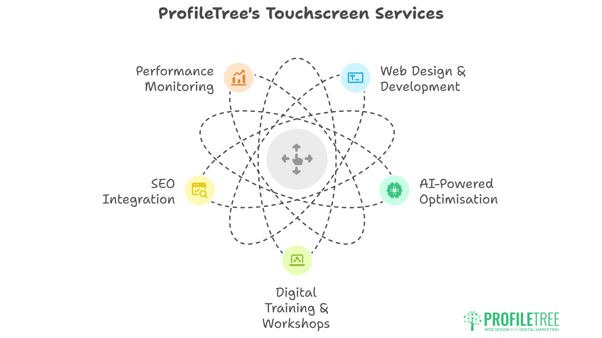
Our Comprehensive Services
- Web Design & Development: We build mobile-first websites using the latest responsive design techniques, ensuring your site performs flawlessly across all touchscreen devices. Our development process prioritises page speed, user experience, and conversion optimisation from the ground up.
- AI-Powered Optimisation: Our AI implementation services analyse user behaviour patterns on your touchscreen interfaces, automatically identifying improvement opportunities and suggesting data-driven optimisations that increase engagement and sales.
- Digital Training & Workshops: We provide comprehensive training programmes helping Northern Ireland businesses understand why designing for touchscreens matters for their bottom line.
- SEO Integration: Our SEO expertise ensures your mobile-optimised site ranks well in Google’s mobile-first index. We understand how touchscreen usability factors into search rankings and implement strategies that boost both user experience and search visibility.
- Performance Monitoring: We provide ongoing analysis of your touchscreen interface performance, tracking key metrics like touch accuracy rates, conversion paths, and user engagement to continuously improve your mobile ROI.
Ready to Maximise Your Mobile Success?
Don’t let poor touchscreen design cost you customers. Our team of specialists can audit your current site, identify improvement opportunities, and implement solutions that drive measurable business growth. From responsive touchscreen design to AI-powered optimisations, we have the expertise to transform your mobile presence.
Contact ProfileTree today to discuss how our proven touchscreen design strategies can improve your mobile conversion rates, search visibility, and customer satisfaction. Let’s create a mobile experience that sets your Northern Ireland business apart from the competition and drives real results for your bottom line.