The Ultimate Landing Page Blueprint for Conversions
Table of Contents
All marketers, business-owners and pretty much anyone involved in digital marketing know very well that a well-designed landing page is more than just a visually appealing website. Rather, it’s a strategic tool for driving conversions, capturing leads and generating sales, one that can set the difference between a successful campaign and a missed opportunity. Landing pages can significantly improve websites’ overall performance and help achieve marketing goals.
In this article, we will explore the essential components of a successful landing page, offer practical tips for optimisation, and provide real-world examples to inspire your design process. By following the guidelines outlined in this article, you can create landing pages that not only impress your visitors but also effectively convert them into customers.
Let’s hop into it.
Key Elements of a High-Converting Landing Page
A landing page is a standalone web page created specifically for marketing or advertising campaigns. It’s where visitors “land” after clicking on a link in an email, social media post, or ad. Unlike regular web pages, which often have multiple goals and links, landing pages focus on a single goal or call to action (CTA).
There are two main types of landing pages:
- Lead generation landing pages: These are used to collect information from visitors, often through a form where users submit details like their name, email, or other contact info in exchange for something valuable (like an eBook, free trial, or webinar).
- Click-through landing pages: These guide visitors towards another step, like clicking a button to complete a purchase or sign up for a service.
Landing pages should be optimised to boost conversions by focusing on a clear, singular message and reducing distractions. They’re a key tool for improving the performance of marketing campaigns.
So, how exactly can we optimise landing pages? Well, by taking care of all the key elements that together make a landing page. Let’s explore them.
Clear and Compelling Headline
A clear and compelling headline is arguably the most critical element of a landing page. It’s the first thing visitors see when they arrive, and it can make or break whether they continue engaging with your content. As online visitors are bombarded with content and often make snap judgements, your headline needs to grab their attention immediately, compelling them to stay on the page instead of bouncing.
More elaborately, visitors should know within seconds what your offer is and how it benefits them, a job that can be well done by a clear and concise headline that distils the message and ensures there is no ambiguity about what’s being offered. Such clarity and conciseness are also preferred by search engines, which can improve your page’s relevance to search queries, helping with SEO performance and user engagement.
A headline should also persuade the visitor with the offer and not just inform them of it. Focusing on the value or problem-solving aspect of your product or service can increase the chances of getting visitors to take the desired action, whether that’s signing up, downloading, or making a purchase.
For example, a headline like “Transform Your Life with Our Personalised Coaching Programme” immediately conveys the benefit of the product or service. Another effective headline could be “Download Our Free Ebook: The Ultimate Guide to [Topic].” This headline clearly states the value proposition and entices the visitor to take action.
Strong Call to Action (CTA)
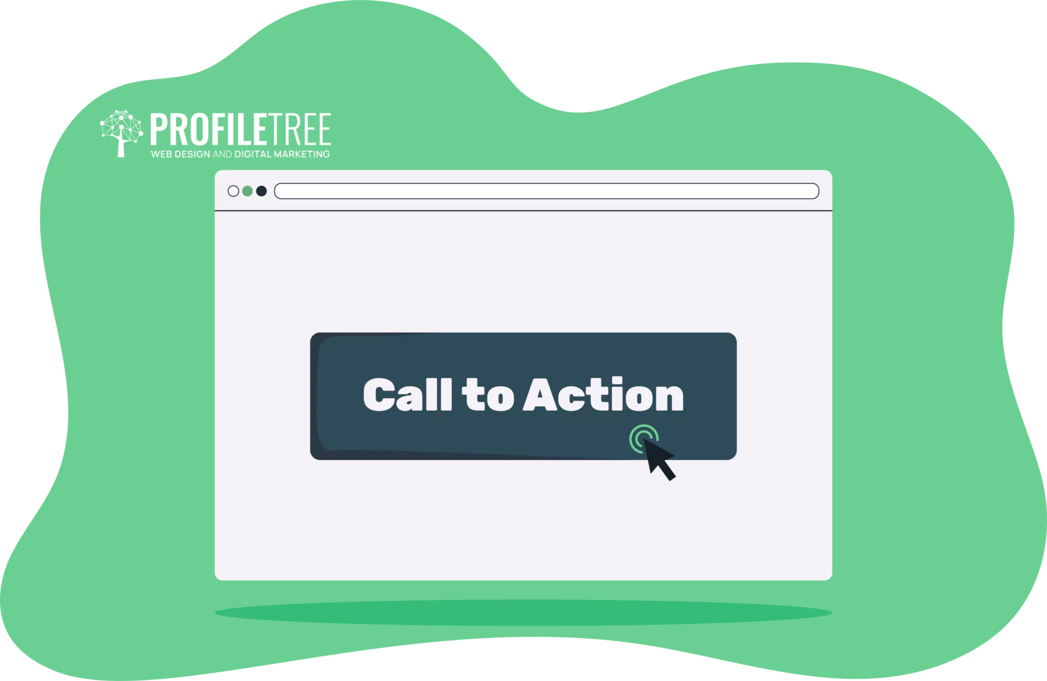
A strong Call to Action (CTA) is a vital component of any landing page. It’s the element that prompts visitors to take the desired next step, which can potentially impact your conversion rates.
Design and Placement of CTAs
The CTA button or text should stand out from the rest of the page through contrasting colours. For example, if your landing page has a light background, a bold, dark-coloured button grabs attention. Use colours that contrast with the rest of the design but still fit your brand identity. Avoid clutter around the button or link so the visitor’s eye is naturally drawn to it.
The button should be large enough to attract attention but not so big that it feels overwhelming. Rounded edges often work better than sharp corners because they appear more inviting. Visual cues like arrows pointing to the CTA can guide users toward taking action. These subtle hints can help nudge visitors toward the desired click.
Place the CTA in areas where it makes sense after the visitor has consumed critical information. For example, if the page explains a product’s benefits, a CTA to “Learn More” or “Get Started” right afterwards can drive action.
Still, remember that the primary CTA should ideally be visible without the visitor having to scroll. This ensures that they can take immediate action, especially if they already know what they want to do. For long landing pages, repeat the CTA at strategic points as the visitor scrolls. This allows them to act whenever they feel ready rather than scrolling back up to find the button.
Use of Action-Oriented Language
The language in your CTA should be clear, direct, and action-oriented to boost the effectiveness of your landing page and attract visitors to convert. Words like Get, Start, Download, Claim, or Try clearly instruct the user on what to do next. Likewise, words like My or Your can make the action feel more personal. For example, Claim My Discount or Get Your Free Trial”* is more engaging than a generic Submit button.
Speaking of generic CTAs, instead of vague phrases like Submit or Click Here, or Learn, which can sometimes be too weak unless paired with strong surrounding text, focus on the value the user will gain. For example, Get My Free Ebook highlights the benefit of taking action. The CTA should remind visitors of the reward for their efforts.
To create urgency and encourage users to act quickly, use phrases like Sign Up Today or Limited Time Offer. Still, make sure you highlight this urgency without being pushy, especially when coupled with time-sensitive offers or limited stock.
Relevant and Engaging Visuals
Visual elements like images, videos, and graphics play a crucial role in enhancing the appeal and effectiveness of a landing page. Besides conveying professionalism, high-quality visuals can capture attention, help visitors quickly grasp the message, understand the offer, and make emotional connections.
Other roles of high-quality images and videos include:
- Humanising the Offer: Images of people using your product or service create a more personal connection. Faces, particularly smiling or happy expressions, have been shown to foster emotional engagement and make the visitor more likely to relate to the product or service.
- Boosting Conversion Rates: Product demo videos, tutorials, or customer testimonial videos can increase understanding of your offer and provide a strong call to action. Studies show that landing pages with video can increase conversion rates by as much as 80%.
- Telling a Story: Visuals can evoke emotions, tell stories, add depth and relatability, and create a narrative around your brand or product. For example, a landing page promoting a fitness programme could include before-and-after photos or videos of real users achieving results.
Alignment with Brand Identity
Since a landing page is often the first impression someone will have of your brand, it’s important that the visuals feel cohesive with your broader marketing efforts (e.g., website, social media, ads) and aligned with your overall brand identity, including colours, tone, and style. Inconsistent visuals, on the other hand, can confuse users and dilute brand recognition.
This can first be achieved by using the same colours and typography as the brand’s visual identity. These elements create a unified and recognisable visual language that builds trust over time. If the visual identity doesn’t match, it could feel disjointed and cause them to leave.
Visuals should also reflect your brand’s values and mission. For example, if your brand promotes sustainability, use images or videos that showcase eco-friendly products, nature-inspired designs, or real-life examples of sustainability in action to reinforce your message. Similarly, luxury brands should use sleek, minimalistic visuals to reflect exclusivity and high quality.
Likewise, the visuals should reflect the emotional tone you want to set for your audience and directly support the messaging and purpose of the landing page. If your brand is playful and youthful, images of vibrant colours, dynamic movement, or energetic people would fit. For a more professional and serious tone, muted colours and clean, minimalist design elements may be more suitable.
Concise and Informative Copy
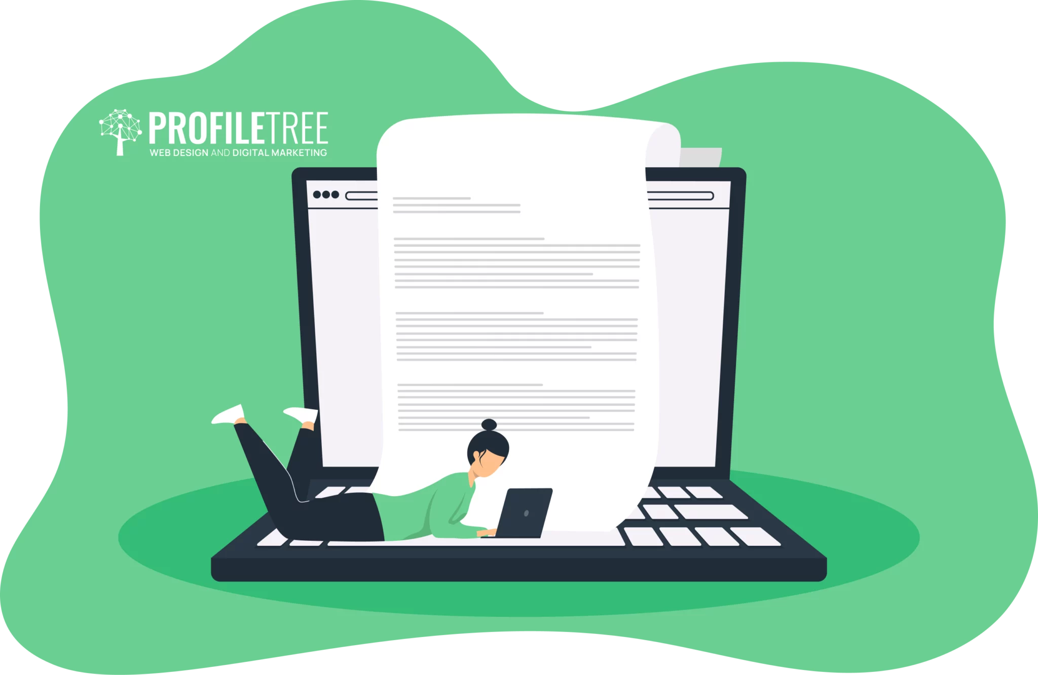
Just like the headline, the text, or “copy,” on a landing page needs to be concise yet informative, delivering key information quickly and clearly since visitors spend only a few seconds deciding whether they’re interested in your offer. It should also convince the user to take the next step.
To do that, use simple, straightforward, short and punchy text to reduce cognitive load and allow visitors to focus on the value you’re offering without feeling overwhelmed by excessive details. This approach keeps the decision-making process friction-free, increasing the likelihood that they will stay on your page.
Use of Bullet Points and Subheadings
Bullet points break down information into easily digestible chunks. They allow visitors to scan the page quickly and pick up on the most important details without reading full paragraphs. This format is ideal for highlighting key features, benefits, or specific points about your product or service.
Subheadings act as visual cues. They organise the page into sections that help visitors quickly understand the structure of the content and find the information they’re looking for. For example, you could break your page into sections like “Features,”“How It Works,”“Pricing,” or “Testimonials.” Each subheading gives the visitor a reason to keep scrolling and explore further.
Subheadings also allow you to present a logical flow of information, taking the reader through the value proposition step-by-step, which can be crucial for conversion.
Reviews and Testimonials
Establishing trust and credibility is essential for any landing page, as potential customers need to feel confident in their decision to engage with your offer.
Customers are more likely to connect with testimonials that reflect their own situations or needs. Personal stories and detailed reviews can resonate deeply, making your offer feel more relatable.
For instance, testimonials that highlight specific challenges and how your product provided solutions to them can create an emotional connection, encouraging users to see for themselves in similar situations.
Reviews, on the other hand, can address common concerns or objections that potential customers may have. When previous customers share their experiences, especially regarding concerns like quality, service, or value for money, it can alleviate doubts for new visitors. Positive reviews can counterbalance any hesitations by showing that your offer delivers on its promises.
Featuring a variety of testimonials from different customer demographics can widen your appeal and demonstrate that your product or service can cater to a broad audience. This inclusivity can further enhance credibility, as it illustrates that many people find value in what you offer.
Certifications and Awards
Whether it’s an industry-standard certification, an award for excellence, or recognition from a reputable organisation, displaying these accolades prominently on your landing page signals to visitors that your brand is credible and trustworthy.
Certifications often indicate that your product or service meets specific standards of quality, safety, or performance. This reassures potential customers that they’re making a sound investment. For instance, if you’re selling a health-related product, displaying relevant health certifications can provide additional assurance about its efficacy and safety.
Sharing awards and recognitions can enhance the perceived value of your offering. When visitors see that your brand has been recognised for its excellence, it elevates their perception of your product or service. This perception can create a psychological bias toward your offer, making visitors more inclined to choose it over competitors.
Best Practices for Landing Page Design
Creating an effective landing page requires careful attention to design principles that enhance user experience and drive conversions. Implementing best practices can significantly improve your landing page’s performance. Additionally, analysing successful landing pages can provide insights into effective design strategies.
Mobile Optimisation
With an increasing number of users accessing websites via mobile devices, it’s crucial to ensure that your landing page offers a seamless experience across all platforms.
This involves optimising load times, ensuring that all elements are easily navigable, and providing a user-friendly interface that works well on smaller screens. Mobile optimisation also includes minimising content that requires scrolling or zooming and ensuring that buttons and links are large enough for easy tapping.
Responsive design ensures that your landing page adapts to different screen sizes and orientations. This approach involves flexible grids, layouts, and images that adjust based on the device being used, as well as crucial design principles that ensure your landing page maintains its visual appeal and functionality regardless of the device. In other words, responsive design helps enhance user experience and reduce bounce rates.
Single-Column Layout
A single-column layout simplifies the visual hierarchy of your landing page, guiding users through the content in a linear fashion. This design choice minimises distractions, making it easier for visitors to focus on the primary message and call to action (CTA). It also encourages users to scroll down rather than navigate through multiple columns, allowing for a more cohesive flow of information.
By limiting the number of visual elements and content types, a single-column layout helps maintain a clean and uncluttered look. This way, the absence of sidebars or multiple columns can streamline the user experience, making it easier for users to engage with the content and take the desired action.
Above-the-Fold Content
Visitors are more likely to engage with your offer when they find it in that portion of the landing page that is visible without scrolling, known as above the fold.
Placing key information—such as a compelling headline and a brief description of your offer—above the fold ensures that users immediately understand the value of what you’re presenting, while a CTA in the same section creates a sense of urgency and motivates users to take action right away. This practice can lead to higher conversion rates, as it caters to users’ short attention spans and their inclination to quickly assess the value of a landing page.
A/B Testing
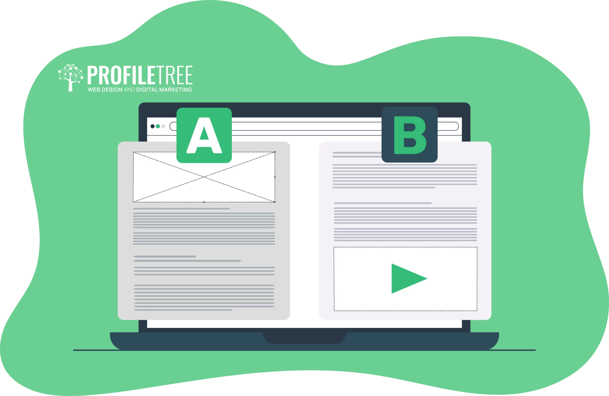
A/B testing involves creating two versions of a landing page (Version A and Version B) to compare their performance. By experimenting with different elements—such as headlines, images, CTA buttons, and overall design—you can identify which variations resonate more with your audience. This method allows you to make data-driven decisions based on real user behaviour rather than relying on assumptions about what might work.
The insights gained from A/B testing can help you refine your landing page to optimise user engagement and conversion rates. By tracking metrics such as click-through rates, bounce rates, and conversion rates, you can determine which design elements effectively capture visitors’ attention and encourage them to take action. Continuous testing and iteration lead to a more effective landing page over time.
Conclusion
Designing a high-converting landing page requires a strategic approach that considers both aesthetics and functionality. By incorporating the key elements discussed in this article, you can create a compelling experience that drives visitors to take action. Remember to focus on a clear and compelling headline, a strong call to action, relevant and engaging visuals, concise and informative copy, and elements that build trust and credibility.
Continuously test and refine your landing pages to identify what works best for your target audience. A/B testing can help you uncover the most effective design elements and optimise your conversion rates. Follow these guidelines and stay up-to-date with industry trends to create landing pages that impress your visitors and drive significant results for your business as well.