Experimental Navigation and Scrolling: Transforming UX
Table of Contents
Your website visitors are bored before they reach your second paragraph. While competitors capture attention with immersive scroll experiences and innovative navigation that tells stories, you’re still using the same dropdown menu from 2010. The digital landscape has evolved beyond clicking through static pages – modern users expect journeys that unfold, interfaces that respond to their movements, and navigation that becomes part of the experience itself. This guide reveals how experimental navigation and non-traditional scrolling transform passive visitors into engaged participants, creating memorable brand experiences that drive conversions and build lasting connections.
The Evolution of Digital Navigation: From Utility to Experience
Traditional navigation served a simple purpose: helping users find information. But as digital experiences mature, navigation has transformed from functional necessity into creative opportunity. The hamburger menu that once revolutionised mobile design now feels dated. Static headers that follow users down the page seem primitive compared to dynamic interfaces that respond, adapt, and guide users through carefully crafted journeys. Belfast agencies pushing creative boundaries understand that navigation isn’t just about wayfinding – it’s about storytelling, engagement, and creating moments of delight that distinguish brands in crowded markets.
The shift from information architecture to experience design reflects changing user expectations. Netflix doesn’t just list shows – it creates an explorative experience through horizontal scrolling carousels. Spotify doesn’t merely catalogue music – it crafts discovery journeys through infinite scroll and contextual navigation. These platforms trained users to expect more than functional interfaces. Now every brand must consider how navigation contributes to their narrative, not just their site structure.
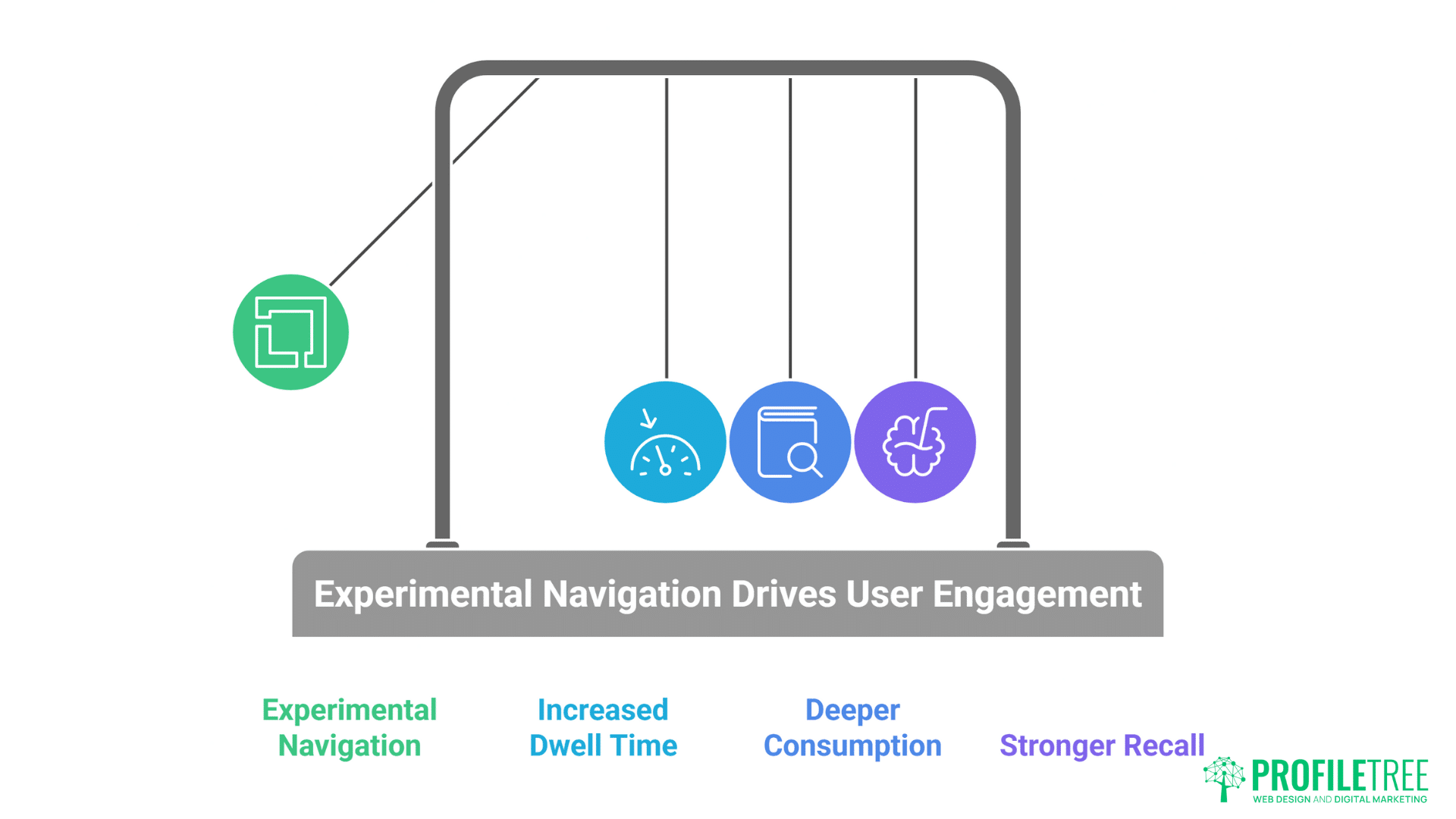
Attention spans haven’t decreased – they’ve become more selective. Users will spend hours exploring interfaces that reward their curiosity but abandon sites that feel predictable within seconds. Experimental navigation captures and maintains attention by creating uncertainty and discovery. When users don’t know what comes next, they keep exploring. This psychological engagement drives metrics that matter: increased dwell time, deeper content consumption, and stronger brand recall.
Mobile-first design catalysed navigation innovation out of necessity. Limited screen space forced designers to reconsider every pixel. Gestures replaced buttons. Scrolling became primary interaction. Touch introduced possibilities desktop never offered. But rather than constraining creativity, mobile limitations sparked innovations now transforming desktop experiences. The best experimental navigation works across devices, adapting interactions to each platform’s strengths while maintaining coherent experience design.
Performance anxiety initially limited navigation experimentation. Designers feared complex interactions would slow sites, hurt SEO, or confuse users. But modern browsers, improved JavaScript engines, and CSS innovations enable smooth, performant experimental navigation. When implemented correctly, innovative navigation enhances rather than hinders performance. The key lies in understanding technical constraints and designing within them rather than despite them.
Understanding Non-Traditional Scrolling Mechanics
Non-traditional scrolling mechanics break away from the conventional vertical or horizontal scroll, offering users a fresh way to explore content. From parallax effects to infinite and sideways scrolling, these methods challenge expectations and create more immersive digital journeys. Understanding how they work is key to designing interfaces that surprise without overwhelming.
Horizontal Scrolling: Breaking the Vertical Monopoly
Horizontal scrolling transforms linear consumption into exploratory journey. Rather than moving down through content, users move across landscapes of information. This sideways movement creates cinematic feeling, like panning across scenes. Fashion brands use horizontal scrolling to showcase collections as continuous narratives. Architecture firms present projects as walkthroughs. The unexpected direction immediately signals unique experience ahead.
Technical implementation of smooth horizontal scrolling requires careful consideration. CSS scroll-snap properties ensure content aligns perfectly. Touch gestures need precise calibration – too sensitive frustrates, too resistant feels broken. Keyboard navigation must work intuitively. Mouse wheel interaction needs translation from vertical to horizontal movement. ProfileTree’s implementations achieve buttery-smooth horizontal scrolling that feels natural despite being unconventional.
Content strategy for horizontal layouts differs fundamentally from vertical structures. Information hierarchy moves left-to-right rather than top-to-bottom. Visual rhythm becomes critical – spacing between elements creates breathing room. Typography must account for extended horizontal reading patterns. Images and text interplay differently when positioned side-by-side rather than stacked. Dublin design agencies mastering horizontal scrolling understand these nuances separate amateur attempts from professional execution.
Responsive design challenges multiply with horizontal scrolling. Mobile devices naturally suit horizontal swipes, but desktop screens vary wildly in width. Ultra-wide monitors stretch content uncomfortably while narrow screens compress it. Successful implementations use container queries, viewport calculations, and intelligent breakpoints ensuring optimal experience across all devices. The investment in responsive horizontal scrolling pays dividends through distinctive brand experiences.
Accessibility considerations require special attention in horizontal scrolling interfaces. Screen readers expect vertical content flow. Keyboard users need clear navigation methods. Motion sensitivity must be respected. Proper ARIA labels, focus management, and alternative navigation options ensure horizontal scrolling enhances rather than excludes. Inclusive design makes experimental navigation available to all users.
Parallax and Multi-Layer Scrolling
Parallax scrolling creates depth through differential movement speeds. Background elements move slower than foreground content, simulating three-dimensional space on flat screens. This technique, borrowed from animation and gaming, transforms static websites into dynamic environments. When users scroll, multiple layers move at different rates, creating immersive experiences that draw viewers deeper into content.
Modern parallax implementation goes beyond simple background movement. Multi-layer compositions include foreground elements, midground content, and deep background atmospherics. Each layer responds differently to scroll position, creating complex choreographed movements. Text might slide in from sides while images scale and rotate. Background videos play based on scroll position. These orchestrated movements transform scrolling from navigation into performance.
Performance optimisation for parallax effects requires sophisticated techniques. Naive implementations trigger constant repaints and reflows, destroying performance. Professional implementations use CSS transforms, will-change properties, and requestAnimationFrame for smooth 60fps scrolling. GPU acceleration moves processing from CPU to graphics card. Intersection Observer API ensures animations only run when visible. These optimisations maintain smooth scrolling even on modest devices.
Storytelling through parallax creates narrative progression. Each scroll reveals new information, building toward climactic moments. Environmental organisations use parallax to show climate change impacts – users scroll through time seeing consequences unfold. Product launches reveal features progressively, building anticipation. Educational sites layer information density, allowing users to control learning pace. The scroll wheel becomes a time machine, microscope, or journey controller.
Subtlety distinguishes professional parallax from amateur attempts. Excessive movement causes motion sickness. Overdone effects distract from content. Professional implementations use parallax as accent, not assault. Movement should enhance message, not overshadow it. Belfast studios creating effective parallax understand restraint creates more impact than excess.
Scroll-Triggered Animations and Interactions
Scroll-triggered animations reward user progression through content. As visitors move down pages, elements animate into view, creating dynamic reveals that maintain engagement. Text fades in, images slide from sides, graphics assemble themselves. These micro-interactions transform static content into living documents that respond to user actions.
Timing and choreography separate professional scroll animations from jarring amateur attempts. Elements should animate in logical sequences, creating visual hierarchy and guiding attention. Too many simultaneous animations overwhelm. Delayed animations feel sluggish. Professional implementations create rhythms that feel natural, almost musical in their progression. Each animation serves purpose beyond decoration.
Scroll progress indicators show users their journey status. Creative implementations go beyond basic progress bars. Storylines fill with colour as users advance. Characters journey across headers paralleling user progression. Chapters unlock as sections complete. These indicators gamify content consumption, encouraging completion through visual feedback. Users see how far they’ve come and what remains, reducing abandonment rates.
Interactive scroll experiences put users in control of animations. Rather than passive triggering, scroll position directly controls animation states. Users can scroll forward and backward, watching animations play and reverse. This scrubbing interaction, familiar from video editing, gives users agency over their experience. They control pacing, can revisit moments, and feel actively engaged rather than passively consuming.
Performance considerations for scroll animations require careful optimisation. Hundreds of elements checking scroll position every frame destroys performance. Professional implementations use Intersection Observer API, debouncing, and throttling to minimise calculations. Animations use CSS transforms rather than position changes. GPU-accelerated properties ensure smooth motion. The goal is imperceptible performance impact despite complex animations.
Innovative Navigation Patterns
Innovative navigation patterns push beyond standard menus and buttons, reshaping how users move through digital spaces. Instead of relying on fixed structures, they experiment with gestures, layered designs, and adaptive interactions. This shift not only modernizes interfaces but also redefines how users discover and engage with content.
Radial and Circular Navigation
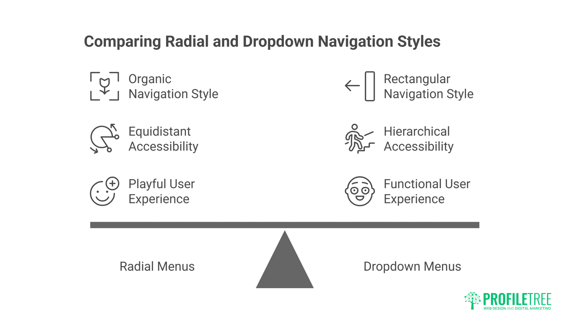
Radial menus explode options outward from central points, creating organic navigation that feels playful yet functional. Rather than rectangular dropdowns, options arc around triggers like flower petals. This circular arrangement places all options equidistant from centre, eliminating hierarchy while maximising accessibility. Creative agencies use radial navigation for portfolio pieces, letting work samples orbit around central themes.
Mathematical precision underlies effective radial navigation. Calculating positions requires trigonometry – sine and cosine functions determine element placement. Animation paths follow circular or spiral trajectories. Touch targets need careful sizing to prevent accidental activation. The underlying complexity remains invisible to users experiencing smooth, natural interactions.
Context-sensitive radial menus adapt based on user behaviour. Options change based on current page, user history, or interaction patterns. A photographer’s portfolio might show different navigation options when viewing portraits versus landscapes. E-commerce sites could present category-specific filters in radial arrangements. This adaptive behaviour makes radial navigation both beautiful and functional.
Mobile implementation of radial navigation leverages touch gestures naturally. Long-press triggers radial menus at touch points. Drag gestures rotate through options. Release selects choices. This gestural interaction feels intuitive on touch devices while maintaining accessibility through alternative activation methods. The same navigation works with mouse hover, keyboard activation, or assistive technologies.
Cultural considerations affect radial navigation adoption. Western users read left-to-right, expecting certain directional flows. Eastern audiences might interpret circular arrangements differently. Clock-wise versus counter-clockwise rotation carries different implications. Successful implementations consider cultural contexts, ensuring navigation feels natural to target audiences.
Gesture-Based Navigation
Touch gestures transform navigation from clicking to conducting. Swipe, pinch, spread, and rotate become navigation commands. Users manipulate content directly rather than through intermediate controls. This immediate manipulation creates visceral connections between action and response. Photography portfolios let users swipe through images. Maps respond to pinch-zoom. Content reacts to device rotation.
Mouse gestures bring touch-like interaction to desktop experiences. Click-and-drag parallels touch swipes. Scroll wheels simulate pinch zoom. Right-click drag enables rotation. These gestures maintain consistency across devices while respecting platform conventions. Users familiar with mobile gestures find desktop equivalents intuitive.
Custom gesture recognition enables unique brand interactions. Specific swipe patterns unlock hidden content. Drawing shapes triggers easter eggs. Multi-touch gestures reveal advanced features. These custom gestures create memorable interactions unique to brands. Users share discoveries, creating viral moments around navigation itself.
Gesture feedback ensures users understand their actions’ effects. Visual responses confirm gesture recognition – ripples follow touches, trails trace swipes, elements respond to proximity. Haptic feedback on supported devices adds tactile dimension. Audio cues provide additional confirmation. This multi-sensory feedback creates rich interactive experiences.
Accessibility alternatives ensure gesture navigation doesn’t exclude users. Every gesture needs keyboard equivalent. Voice commands provide hands-free navigation. Traditional controls remain available for users preferring familiar interactions. Gesture navigation enhances rather than replaces conventional navigation, ensuring inclusive experiences.
Motion-Driven and Sensor-Based Navigation

Device motion sensors enable navigation responding to physical movement. Tilting phones scrolls content. Rotating devices changes perspectives. Shaking triggers actions. These motion controls create playful interactions that surprise and delight users. Gaming websites use tilt controls for character movement. Product showcases rotate based on device orientation.
Webcam-based navigation tracks user movement without touch. Head tracking scrolls content based on viewing angle. Eye tracking identifies focus areas. Hand gestures control interfaces through cameras. These experimental interfaces push boundaries of possible interaction. While not mainstream, they demonstrate future navigation possibilities.
Proximity sensors trigger navigation changes as users approach or retreat. Laptop screens detect user presence, adjusting interfaces accordingly. Mobile devices recognise when held versus placed on surfaces. These contextual adjustments create responsive environments adapting to user behaviour automatically.
Ambient sensors influence navigation based on environmental conditions. Light sensors adjust interface brightness and contrast. Noise levels might simplify navigation in loud environments. Temperature could influence colour schemes. These subtle adjustments create interfaces that feel alive and aware.
Performance and battery considerations limit motion-driven navigation adoption. Constant sensor monitoring drains batteries quickly. Processing motion data requires computational resources. Network latency affects remote sensor processing. Successful implementations balance innovation with practical constraints, using motion enhancement judiciously.
Creating Story-Driven Navigation Experiences
Story-driven navigation turns digital journeys into narratives, guiding users step by step as though they are unfolding a plot. Each interaction becomes part of the story, blending design with storytelling techniques to deepen engagement. This approach transforms navigation from a functional tool into an immersive, memorable experience.
Sequential Storytelling Through Scroll
Linear narratives unfold through scrolling, transforming websites into digital stories. Each scroll reveals new chapters, building narrative tension toward resolution. News organisations pioneered this format with long-form journalism. Now brands use sequential scrolling to tell origin stories, explain complex products, or guide users through purchase decisions. The familiar scroll gesture becomes page-turning mechanism.
Pacing control distinguishes professional scroll narratives from overwhelming walls of text. White space creates breathing room between intense sections. Visual breaks provide rest points. Interactive elements punctuate passive consumption. Variable content density maintains rhythm – dense information followed by visual relief. This orchestrated pacing keeps users engaged through lengthy narratives.
Visual metaphors reinforce storytelling through scroll design. A climate change story might show rising water levels as users scroll down. A company timeline could position users on a journey through decades. Product features might assemble as users progress. These visual narratives communicate beyond words, creating memorable experiences that stick with users.
Character development through scroll creates emotional connections. Mascots, guides, or narrative characters accompany users through content. These characters react to scroll position, offer commentary, and create continuity across sections. Users form relationships with these digital companions, increasing engagement and completion rates.
Resolution and calls-to-action capitalise on narrative investment. After guiding users through stories, conclusive moments feel earned rather than imposed. Users who’ve scrolled through entire narratives are primed for action. Conversion rates increase when calls-to-action follow compelling narratives rather than interrupting them.
Non-Linear Exploration Interfaces
Choose-your-own-adventure navigation puts users in control of their journey. Rather than forcing linear progression, branching paths let users explore based on interests. Each choice leads to different content, creating personalised experiences. E-learning platforms use branching navigation for adaptive learning. Marketing sites create interactive product selectors guiding users to relevant solutions.
Hub-and-spoke navigation creates central points with radiating exploration options. Users venture out from home bases, exploring topics before returning to centre. This pattern suits content with multiple independent sections sharing common themes. Portfolio sites showcase different project types from central galleries. Educational resources present topics branching from core concepts.
Matrix navigation enables movement in multiple directions simultaneously. Users navigate both horizontally and vertically through content grids. Each axis represents different dimensions – time, category, complexity. This multi-dimensional navigation suits complex information spaces requiring flexible exploration. Research databases, product catalogues, and educational resources benefit from matrix navigation.
Network navigation connects related content through associative links. Rather than hierarchical structures, content pieces link based on relationships. Users follow connections discovering unexpected relationships. This Wikipedia-like exploration encourages serendipitous discovery. Knowledge bases, creative portfolios, and exploratory interfaces thrive with network navigation.
Sandbox navigation removes all constraints, letting users explore freely. Elements float in space, responding to physics simulations. Users push, pull, and throw content around screens. While impractical for goal-oriented sites, sandbox navigation creates memorable brand experiences. Creative agencies, artists, and experimental brands use sandbox navigation to demonstrate innovation.
Gamification Elements in Navigation
Progress systems reward users for navigation exploration. Points accumulate for viewing content. Badges unlock for completing sections. Leaderboards compare exploration between users. These gaming mechanics transform passive browsing into active achievement. Educational sites report 300% increase in content consumption through navigation gamification.
Quest-based navigation frames browsing as adventure. Users receive missions to find specific content. Clues guide exploration. Rewards await completion. This quest structure particularly suits educational content, training materials, and marketing campaigns. Users feel accomplished rather than marketed to.
Unlockable content creates anticipation and exclusivity. Navigation areas remain locked until users meet criteria. Time spent, content viewed, or actions taken unlock new sections. This progressive disclosure maintains engagement while preventing overwhelming initial experiences. Premium content, advanced features, and special offers work well as unlockables.
Competitive elements add social dimensions to navigation. Users race through content. Teams collaborate exploring interfaces. High scores get displayed. Social sharing celebrates achievements. These competitive elements transform solitary browsing into social experiences. Marketing campaigns using competitive navigation see viral spread through social sharing.
Reward psychology must balance engagement with manipulation. Gamification should enhance experience, not exploit psychological vulnerabilities. Ethical implementation respects user agency, provides genuine value, and avoids dark patterns. The goal is joyful exploration, not addictive behaviour.
Technical Implementation Considerations
Behind every experimental navigation design lies a set of technical challenges that shape its feasibility. Developers must weigh performance, accessibility, and device compatibility to ensure smooth experiences across platforms. Balancing creativity with practicality is what turns bold navigation ideas into reliable, user-friendly realities
Performance Optimisation for Complex Navigation
JavaScript execution optimisation ensures smooth interaction despite complexity. Modern navigation often requires substantial scripting for animations, scroll tracking, and gesture recognition. Inefficient code creates jank, destroying user experience. Code splitting loads only necessary navigation code. Tree shaking removes unused functions. Minification reduces file sizes. These optimisations maintain performance while enabling innovation.
CSS animation performance requires careful property selection. Transforms and opacity animate smoothly via GPU. Position and dimension changes trigger expensive reflows. Will-change hints help browsers optimise. Contain property limits recalculation scope. Professional implementations exclusively use performant properties, achieving 60fps animations even on modest devices.
Asset loading strategies prevent navigation delays. Lazy loading defers non-critical resources. Progressive enhancement loads core navigation immediately, adding enhancements as resources arrive. Service workers cache navigation assets for instant subsequent loads. These strategies ensure navigation remains responsive regardless of network conditions.
Memory management becomes critical with complex navigation. Scroll listeners, animation frames, and event handlers accumulate memory leaks if not properly managed. Cleanup functions remove listeners. Object pooling reuses animation elements. Garbage collection runs during idle periods. Professional implementations monitor memory usage, preventing degradation over time.
Mobile performance requires special consideration. Limited processing power, battery constraints, and touch responsiveness demand optimisation. Passive event listeners improve scroll performance. Touch-action CSS prevents delay. GPU acceleration leverages mobile graphics chips. Successful mobile implementation requires understanding platform limitations and designing within them.
Accessibility and Inclusive Design
Keyboard navigation must work flawlessly for experimental interfaces. Every mouse and touch interaction needs keyboard equivalent. Tab order should follow logical flow. Focus indicators must remain visible. Skip links provide direct access to content. Keyboard testing ensures navigation remains accessible regardless of input method.
Screen reader compatibility requires careful ARIA implementation. Roles define navigation purposes. Labels describe functionality. Live regions announce changes. Landmarks provide structure. Professional implementations test with multiple screen readers ensuring consistent experience across assistive technologies.
Motion sensitivity accommodation respects user preferences. Reduced motion settings disable animations for users with vestibular disorders. Essential animations remain functional without motion. Alternative navigation methods provide full functionality without animation. This respect for user needs ensures experimental navigation doesn’t exclude motion-sensitive users.
Cognitive accessibility ensures navigation remains understandable. Clear labels avoid ambiguity. Consistent patterns prevent confusion. Help text explains novel interactions. Progressive disclosure prevents overwhelming users. Simple alternatives exist for complex interactions. These considerations ensure navigation innovation doesn’t sacrifice usability.
Progressive enhancement guarantees basic functionality for all users. Core navigation works without JavaScript. CSS animations degrade gracefully. Advanced features enhance rather than replace basic functionality. This approach ensures experimental navigation fails safely, maintaining usability regardless of browser capabilities.
Cross-Browser and Device Compatibility
Browser feature detection enables progressive enhancement. Rather than browser detection, feature detection identifies capabilities. Modernizr or native feature detection APIs check support. Polyfills provide missing functionality where possible. Fallbacks ensure graceful degradation. This approach maximises compatibility while enabling innovation.
Touch event handling differs across devices and browsers. iOS handles touch differently than Android. Mouse events need touch equivalents. Pointer events unify input handling. Testing across real devices reveals subtle differences emulators miss. Professional implementation accounts for platform quirks ensuring consistent experience.
Viewport considerations affect experimental navigation dramatically. Mobile viewports differ from desktop. Tablet orientation changes dynamically. Ultra-wide monitors stretch interfaces. Successful implementations use container queries, viewport units, and responsive techniques ensuring navigation adapts appropriately.
Performance variations between devices require adaptive behaviour. High-end devices handle complex animations smoothly. Budget phones struggle with basic interactions. Progressive enhancement adds complexity based on detected capabilities. This adaptive approach ensures good experience regardless of device power.
Testing methodology for experimental navigation requires comprehensive approach. Automated testing catches basic issues. Manual testing reveals experiential problems. Real user testing uncovers unexpected behaviours. Analytics identify problem areas. Continuous testing throughout development prevents launch surprises.
Measuring Success and User Engagement
Measuring the effectiveness of experimental navigation requires more than just tracking clicks and scrolls. Metrics like time on page, interaction depth, and user satisfaction reveal whether these designs truly enhance engagement. By analyzing both quantitative data and qualitative feedback, designers can refine their approaches to create more impactful digital experiences.
Analytics for Non-Traditional Navigation
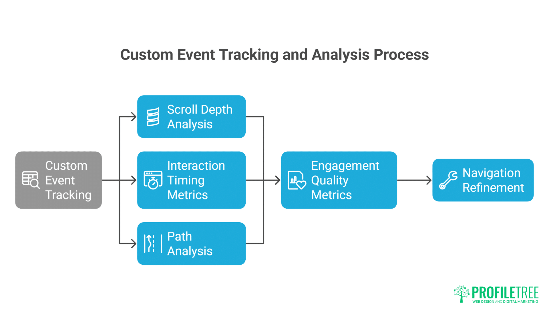
Custom event tracking captures experimental navigation interactions. Standard analytics miss gesture-based navigation, scroll depth, and animation interactions. Custom events track swipes, tilts, and progressive disclosures. This data reveals how users actually navigate versus intended paths. ProfileTree implements comprehensive tracking revealing navigation patterns invisible to standard analytics.
Scroll depth analysis goes beyond simple percentages. Time spent at scroll positions indicates engagement. Scroll velocity reveals scanning versus reading. Scroll direction patterns show exploration behaviour. Heat maps visualise scroll attention. These insights guide navigation refinement based on actual user behaviour.
Interaction timing metrics reveal navigation friction. Time to first interaction indicates discoverability. Duration between interactions shows comprehension speed. Abandonment points identify confusion. Completion rates measure effectiveness. These temporal metrics guide iterative improvement.
Path analysis for non-linear navigation requires sophisticated tracking. Users taking multiple routes to content challenge traditional funnel analysis. Sankey diagrams visualise complex paths. Machine learning identifies common patterns. This analysis reveals unexpected navigation behaviours requiring design adjustment.
Engagement quality metrics matter more than quantity. Dwell time increases might indicate confusion rather than engagement. High interaction rates could signal frustration. Qualitative metrics like rage clicks, dead clicks, and back-forth navigation reveal problems. Balancing quantitative and qualitative metrics provides complete picture.
User Experience Research Methods
Usability testing for experimental navigation requires modified protocols. Think-aloud protocols reveal comprehension challenges. Task-based testing measures effectiveness. Eye tracking shows attention patterns. These methods uncover issues before launch. Belfast agencies use extensive testing ensuring experimental navigation enhances rather than hinders experience.
A/B testing navigation variations identifies optimal implementations. Test radical navigation against traditional. Compare different gesture sets. Evaluate animation speeds. These tests provide data-driven validation for experimental approaches. Sometimes traditional navigation performs better – testing prevents assumption-based decisions.
Heat mapping for gestural interfaces requires specialised tools. Traditional click heat maps miss swipe patterns. Touch heat maps show gesture initiation points. Movement tracking reveals gesture paths. These visualisations identify unexpected interaction patterns requiring design adjustment.
Session recording analysis reveals navigation pain points. Watching real users navigate identifies confusion moments. Repeated attempts indicate discoverability issues. Rage clicking shows frustration. These observations guide specific improvements addressing real problems.
Feedback collection methods must account for navigation novelty. Users might struggle initially with unfamiliar patterns. Longitudinal studies track adaptation over time. In-context feedback captures immediate reactions. Follow-up surveys measure lasting impressions. This multi-stage feedback ensures navigation assessment accounts for learning curves.
ROI and Business Impact
Conversion impact from experimental navigation varies by implementation. Engaging navigation can increase conversions 20-40% through improved engagement. But poor implementation decreases conversions similarly. Success depends on audience alignment, execution quality, and strategic purpose. Measurement must account for both immediate and long-term impacts.
Brand differentiation value transcends direct metrics. Memorable navigation experiences create lasting impressions. Users share innovative interfaces socially. Media coverage amplifies reach. These indirect benefits justify investment despite measurement challenges. Innovative navigation becomes marketing asset beyond functional purpose.
Dwell time improvements from engaging navigation boost SEO performance. Google considers engagement signals for rankings. Increased time on site, reduced bounce rates, and deeper exploration improve search visibility. Experimental navigation driving engagement provides SEO benefits beyond direct conversion impact.
Support cost reduction through intuitive navigation provides hidden ROI. Clear navigation reduces support queries. Self-service improves through better exploration. User satisfaction increases. These operational improvements justify navigation investment through cost savings rather than revenue generation.
Competitive advantage from navigation innovation creates moats. Unique navigation becomes brand signature. Competitors copying appear derivative. First-mover advantage in navigation innovation establishes market position. This differentiation value extends beyond immediate metrics to long-term market positioning.
Best Practices and Common Pitfalls
Exploring experimental navigation offers exciting opportunities, but it also comes with risks if not executed carefully. Designers should focus on clarity, consistency, and accessibility to avoid confusing or frustrating users. Recognising common pitfalls helps strike the balance between innovation and usability, ensuring creative ideas translate into seamless experiences.
Design Principles for Experimental Navigation
Purpose must drive innovation, not novelty. Experimental navigation should solve problems or enhance experience, not exist for its own sake. Many sites implement complex navigation because they can, not because they should. Every innovative element needs clear purpose aligned with user needs and business goals.
User testing throughout development prevents launch disasters. Test early prototypes with real users. Iterate based on feedback. Test again. This cycle ensures navigation works for actual users, not just designers. Belfast’s best agencies test extensively, refining experimental navigation through user feedback.
Fallbacks ensure graceful degradation when experiments fail. Not every browser supports every feature. Not every user appreciates innovation. Provide traditional navigation alternatives. Let users choose their preferred interaction method. This safety net prevents experimental navigation from becoming barrier.
Documentation helps teams maintain complex navigation. Experimental navigation often involves intricate logic and interactions. Document design decisions, interaction patterns, and technical implementation. This documentation ensures navigation remains maintainable as teams change.
Performance budgets prevent navigation bloat. Set limits for JavaScript size, animation complexity, and resource usage. Monitor performance throughout development. When navigation threatens performance, simplify rather than compromise user experience. Speed trumps complexity every time.
Cultural and Demographic Considerations
Generational differences affect navigation acceptance. Digital natives embrace experimental navigation. Older users might prefer familiar patterns. B2B audiences expect efficiency over innovation. B2C audiences appreciate playfulness. Understanding audience demographics guides navigation decisions.
Cultural contexts influence navigation interpretation. Western audiences read left-to-right. Eastern audiences might expect different flows. Colours carry different meanings. Gestures have cultural significance. International sites need culturally aware navigation design.
Industry expectations shape navigation acceptance. Creative industries expect innovation. Financial services require trust through familiarity. Healthcare demands clarity over creativity. Retail benefits from exploratory navigation. Context determines appropriate experimentation level.
Device prevalence in target markets affects implementation. Mobile-first markets suit gesture navigation. Desktop-dominant audiences might not appreciate touch-focused interfaces. Tablet usage enables unique interactions. Understanding device landscape guides navigation priorities.
Accessibility requirements in different regions vary. US ADA compliance differs from EU accessibility directives. UK equality act has specific requirements. International sites must meet highest common standards. Legal compliance shapes navigation possibilities.
Future Trends in Navigation Design
Navigation design is evolving toward more intuitive, personalized, and adaptive experiences. Emerging technologies like AI, voice interfaces, and spatial computing are reshaping how users interact with digital environments. These trends point to a future where navigation feels less like clicking through menus and more like a natural extension of human behaviour.
Emerging Technologies
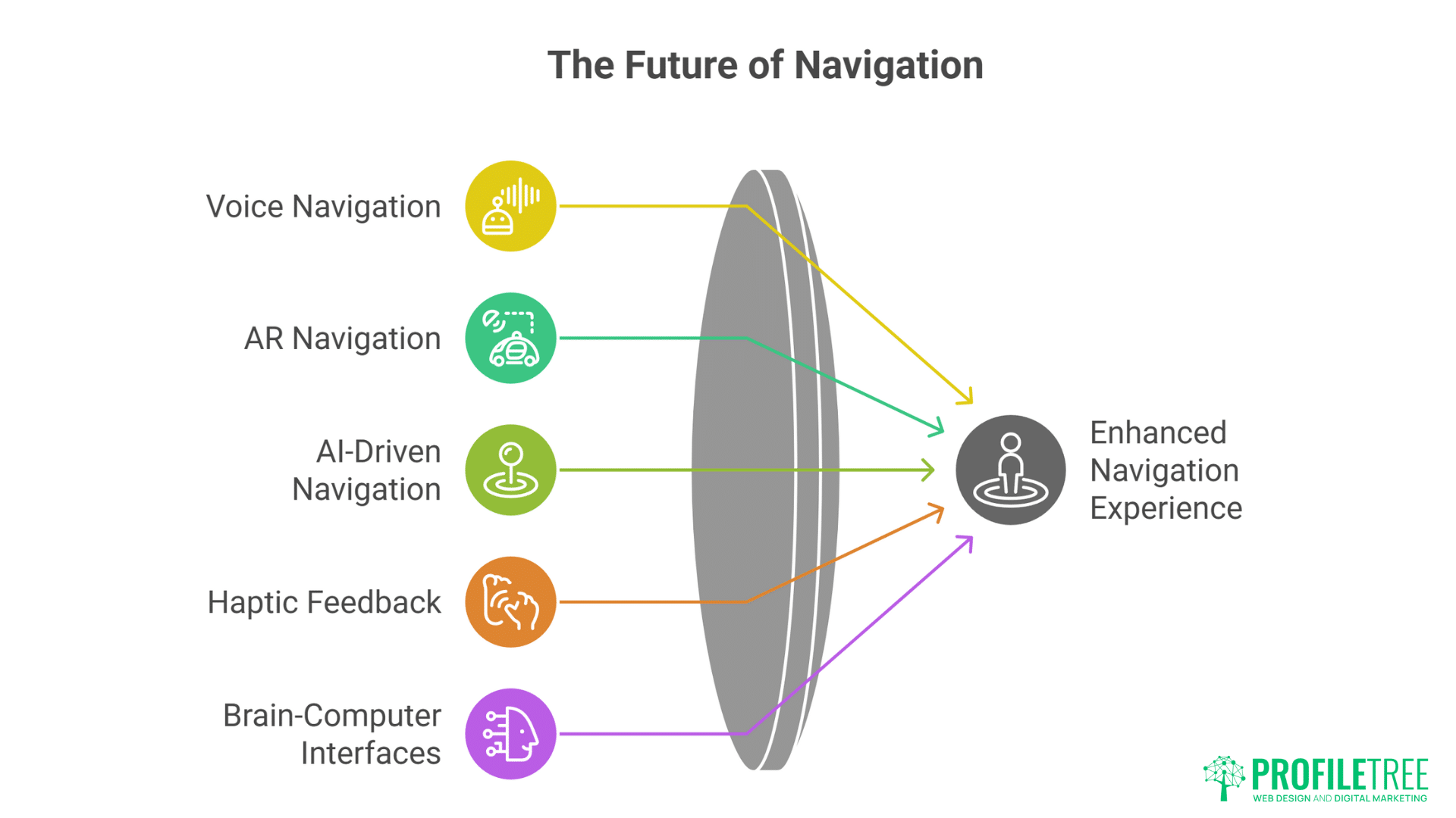
Voice navigation integration transforms interfaces into conversations. Voice commands navigate content. Audio feedback confirms actions. Conversational interfaces guide exploration. This multi-modal navigation suits hands-free scenarios and accessibility needs.
AR navigation overlays digital interfaces onto physical spaces. Phone cameras reveal hidden navigation. Gesture controls manipulate virtual elements. Physical movement navigates digital content. This blend of physical and digital creates entirely new navigation paradigms.
AI-driven adaptive navigation personalises based on behaviour. Machine learning identifies user preferences. Navigation adapts to individual patterns. Predictive interfaces anticipate needs. This intelligence makes navigation feel intuitive and personal.
Haptic feedback adds tactile dimension to navigation. Vibrations confirm actions. Texture simulations indicate content types. Force feedback provides resistance. These tactile cues create rich sensory navigation experiences.
Brain-computer interfaces represent navigation’s far future. Thought controls navigation. Mental focus determines direction. Emotional states influence interface. While currently experimental, BCIs suggest navigation’s ultimate evolution.
Design Philosophy Evolution
Ethical design considerations increasingly influence navigation decisions. Dark patterns face backlash. Manipulative navigation damages trust. Transparent, user-respecting navigation builds loyalty. Ethics become competitive advantage.
Sustainable design principles affect navigation complexity. Energy-efficient animations reduce carbon footprint. Simplified interactions decrease processing requirements. Performance optimisation serves environmental and user needs simultaneously.
Inclusive design becomes standard rather than afterthought. Experimental navigation must work for everyone. Accessibility drives innovation rather than limiting it. Best navigation serves all users equally.
Privacy-conscious navigation respects user data. Tracking-free interactions become selling points. Local processing replaces cloud analytics. Privacy-first navigation appeals to conscious consumers.
Minimalist experimentation finds balance between innovation and simplicity. Subtle innovations often impact more than radical changes. Refined traditional navigation might outperform complex experiments. The trend moves toward thoughtful rather than flashy innovation.
Implementing Experimental Navigation Successfully
Successfully implementing experimental navigation requires blending bold creativity with thoughtful planning. Designers must prototype, test, and refine to ensure the experience feels intuitive rather than disruptive. When executed with user needs at the center, experimental navigation can elevate digital products and set them apart from traditional interfaces.
Strategic Planning Phase
Business case development justifies navigation investment. Identify problems current navigation doesn’t solve. Quantify potential improvements. Calculate implementation costs. Present clear ROI projections. This business case ensures stakeholder buy-in before development begins.
Audience research reveals navigation preferences. Survey existing users about navigation pain points. Observe behaviour patterns. Test competitor innovations. This research grounds navigation design in user needs rather than assumptions.
Competitive analysis identifies differentiation opportunities. Audit competitor navigation approaches. Identify industry conventions worth breaking. Find gaps in current navigation paradigms. This analysis ensures innovation serves strategic purpose.
Risk assessment prepares for potential challenges. Identify technical constraints. Anticipate user resistance. Plan fallback options. Calculate worst-case scenarios. This preparation prevents surprises during implementation.
Success metrics definition enables objective evaluation. Define quantitative goals – engagement, conversion, dwell time. Establish qualitative targets – satisfaction, brand perception. Create measurement frameworks. These metrics guide development and evaluate success.
Development and Testing
Prototype iteration refines navigation concepts. Start with low-fidelity prototypes. Test core interactions. Refine based on feedback. Increase fidelity gradually. This iterative approach prevents investing in flawed concepts.
Technical proof-of-concept validates feasibility. Build minimal implementations. Test across devices. Verify performance. Confirm accessibility. This validation prevents committing to impossible implementations.
User testing throughout development ensures usability. Test with representative users. Observe actual behaviour. Gather feedback continuously. Iterate based on insights. This testing prevents launch surprises.
Performance optimisation happens continuously, not finally. Monitor metrics throughout development. Optimise as you build. Set performance budgets. Never sacrifice speed for innovation.
Launch strategy considers user adaptation. Soft launch to subset of users. Provide tutorials for new patterns. Offer traditional alternatives initially. Phase in experimental features. This gradual approach ensures smooth transition.
FAQs
How much does implementing experimental navigation typically cost?
Basic experimental navigation implementations start from £5,000-£10,000 for small sites. Complex enterprise implementations range from £20,000-£100,000 depending on sophistication. Costs include design, development, testing, and optimisation. However, engagement improvements often deliver 200-300% ROI within 12 months through increased conversions and dwell time.
Will experimental navigation hurt my SEO?
Not if implemented correctly. Google rewards engagement signals – time on site, pages per session, low bounce rates. Good experimental navigation improves these metrics. However, poor implementation blocking content or slowing pages hurts SEO. Ensure crawlability, performance, and accessibility. Test thoroughly before launch.
How do users react to non-traditional navigation?
Initial reactions vary by audience and implementation quality. Digital natives generally embrace innovation. Conservative audiences might resist initially. Success depends on intuitive design and clear value. Most users adapt within 2-3 visits if navigation enhances experience. Provide traditional alternatives during transition periods.
What browsers and devices support experimental navigation?
Modern browsers (Chrome, Firefox, Safari, Edge) support most experimental navigation. Internet Explorer struggles with advanced features. Mobile browsers handle touch gestures well. Tablets offer unique opportunities. Always implement progressive enhancement ensuring basic functionality everywhere. Test extensively across actual devices.
How long does experimental navigation take to implement?
Simple implementations take 4-6 weeks. Complex projects require 3-6 months. Timeline includes design, prototyping, development, testing, and refinement. Rushing experimental navigation guarantees problems. Allow adequate time for iteration and testing. Quality matters more than speed.
Should every website use experimental navigation?
Absolutely not. Experimental navigation must serve purpose. B2B sites might benefit more from clarity than innovation. Accessibility-focused sites should prioritise inclusion. Creative brands benefit from differentiation. Evaluate audience needs, brand positioning, and business goals before pursuing experimental navigation.
How do we measure success of experimental navigation?
Track both quantitative and qualitative metrics. Quantitative: engagement time, bounce rate, conversion, scroll depth. Qualitative: user satisfaction, task completion, brand perception. Compare before/after metrics. Run A/B tests against traditional navigation. Success means improved business metrics, not just creative awards.
Transform Your Digital Experience Today
Experimental navigation represents the frontier of digital experience design. While competitors cling to safe, predictable interfaces, bold brands create memorable journeys that users want to explore. The opportunity to differentiate through navigation innovation won’t last forever – eventually, today’s experiments become tomorrow’s conventions. The question isn’t whether to innovate, but how quickly you can implement navigation that sets you apart.
ProfileTree specialises in creating digital experiences that captivate audiences and drive business results. Our team combines creative vision with technical excellence, ensuring experimental navigation that’s both innovative and effective. We understand that navigation isn’t just about moving through pages – it’s about creating journeys that users remember, share, and return to experience again.
Our web development services encompass everything from initial concept through implementation and optimisation. We don’t just build experimental navigation – we ensure it serves your business goals, engages your audience, and maintains performance across all devices. Our proven process balances innovation with usability, creating navigation that pushes boundaries while remaining accessible to all users.
The digital landscape evolves rapidly. Navigation patterns considered experimental today become standard tomorrow. Businesses that innovate now establish themselves as leaders rather than followers. Don’t let competitors define what’s possible – create digital experiences that set new standards for your industry.
Contact ProfileTree today to explore how experimental navigation can transform your digital presence. Whether you’re ready for radical innovation or subtle enhancement, we’ll help you create navigation that engages users, strengthens your brand, and drives measurable business results. The future of digital navigation is being written now – make sure your brand is part of that story.