Digital Marketing Northern Ireland: Helping Local Businesses Grow Online
Table of Contents
Digital marketing in Northern Ireland has changed significantly over the past few years. Businesses across Belfast, Derry, Newry, and the wider region are competing for the same online visibility — and the gap between those with a proper strategy and those without is widening every year.
At ProfileTree, a Belfast-based web design and digital marketing agency, we work with SMEs across Northern Ireland to build digital strategies that are grounded in data, built for local context, and designed to deliver measurable returns. This guide covers what digital marketing actually involves for a Northern Ireland business, what makes the local landscape distinct, and how to approach it strategically.
What Digital Marketing Covers for Northern Ireland Businesses
Digital marketing is not a single service. For a business operating in Northern Ireland, it typically spans several interconnected disciplines: search engine optimisation, content marketing, social media, paid advertising, email campaigns, video production, and increasingly, AI-powered automation.
The reason these channels work best together is simple. Each one feeds the others. Your SEO brings people to your site; your content keeps them there; your social media builds trust before they arrive; your email nurtures them after they leave. Treating any one channel in isolation tends to produce weaker results and higher costs per lead.
ProfileTree’s digital strategy services are built around this integrated model. Rather than selling individual services and leaving clients to join the dots, we start with the business goals and work backwards to build a channel mix that makes sense for the budget and sector.
The statistics from Northern Ireland’s own business environment make the case for a joined-up approach. According to NISRA, 75% of NI businesses now have a website and 54% use social media — but having a presence is not the same as having a strategy. Most of the businesses we speak to have accounts on several platforms and a website that hasn’t been properly reviewed in years. The challenge is not getting online; it’s using those digital assets effectively.
The Northern Ireland Digital Marketing Landscape
Northern Ireland sits in an unusual position geographically and commercially. Businesses here operate across two distinct markets: the UK mainland, where most regulatory and commercial frameworks apply, and the Republic of Ireland, which operates under EU rules and has its own consumer culture. This cross-border dynamic shapes digital marketing decisions in ways that businesses in Manchester or Edinburgh simply don’t have to consider.
Currency matters. A Northern Ireland business selling to customers in Dublin needs to handle both GBP and EUR. Language and cultural references are broadly shared, but brand tone that resonates in Belfast doesn’t always translate to Cork or Limerick. Regulatory differences — particularly around GDPR implementation and VAT — affect what can be promised in advertising and how data is handled.
For SEO specifically, cross-border targeting creates real opportunities. Many Northern Ireland businesses are well-placed to rank for both UK and Irish search queries, but this requires a deliberate approach to location signals, hreflang attributes, and content that genuinely serves both audiences rather than awkwardly trying to straddle them.
If you’re running digital campaigns that need to serve both markets, ProfileTree’s team understands both contexts from working with clients on each side of the border. Our digital marketing Belfast services extend naturally into cross-border strategy for clients whose customer base spans the island.
Why Local Context Changes the Strategy
Digital marketing principles are universal. Execution is local. A generic approach built on templates designed for London or Dublin businesses will miss the specific market conditions, search behaviour, and cultural context that make Northern Ireland distinctive.
Search volumes are lower here than in major UK cities, which means keyword competition is often more achievable — but also that there is less room for error. Ranking on page two is effectively invisible; ranking number one for a well-chosen local query can generate leads consistently for years. The businesses that invest in search engine optimisation services early tend to see compounding returns, while those who rely entirely on paid advertising face rising costs with no long-term asset to show for it.
Social media usage patterns differ too. Instagram engagement rates tend to be higher in Northern Ireland than UK national averages, partly because of the tighter community networks that characterise life here. Local business stories, community involvement, and behind-the-scenes content perform particularly well. Campaigns built on London-style glossy brand aesthetics often fall flat.
The platform mix also matters. LinkedIn is more effective for B2B businesses targeting professional services clients across the UK and Ireland. Facebook still drives significant lead generation for trades, home services, and local retail. TikTok is becoming relevant for businesses targeting younger demographics, particularly in hospitality and events. Understanding which platform serves which audience — and having content built specifically for each — is where most NI businesses have room to improve.
Measuring What Actually Matters
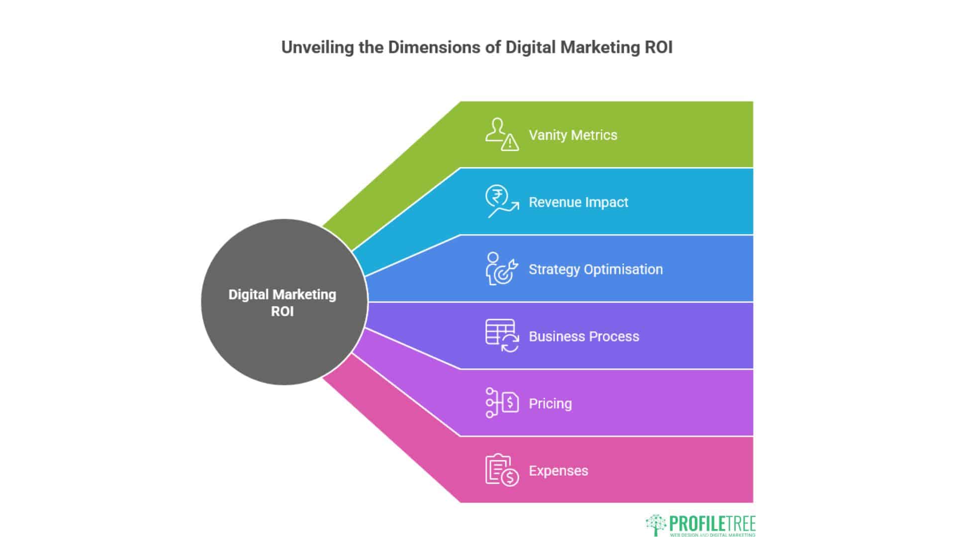
One of the genuine advantages digital marketing holds over traditional approaches is measurability. Every channel, campaign, and piece of content can be tracked. The challenge is knowing which metrics to act on and which to ignore.
Vanity metrics are everywhere. Follower counts, impressions, and likes can look impressive in a monthly report while the business itself sees no material change in enquiries or revenue. The metrics that matter are the ones connected to commercial outcomes: leads generated, cost per lead, conversion rate, and ultimately, return on investment.
The key metrics for Northern Ireland businesses to track:
Return on Investment (ROI) is the headline figure. If your business invests £1,500 per month in digital marketing and generates £7,500 in additional revenue, you’re running at 400% ROI. Every campaign decision should be tested against this figure, not against softer measures.
Cost Per Lead tells you what each new enquiry costs to generate, which allows direct comparison between channels. A social media campaign that generates leads at £8 each is outperforming a paid search campaign generating leads at £45 — even if the paid search campaign drove higher raw traffic.
Conversion Rate measures what percentage of visitors take a desired action. Low conversion rates on a website often point to problems with the page experience, the messaging, or a mismatch between what the advertising promised and what the page delivers.
Traffic Sources tell you where your visitors are coming from. A business that relies entirely on direct traffic or word-of-mouth referrals is vulnerable; one with a balanced mix of organic search, social, and email has more stable foundations.
ProfileTree provides clients with real-time analytics dashboards and monthly ROI reporting so that marketing investment is always visible and accountable. We don’t present vanity metrics as success; we report on the figures that connect to revenue.
AI and Automation in Northern Ireland Digital Marketing
Artificial intelligence is now part of everyday digital marketing practice, not a future consideration. The question for Northern Ireland businesses in 2026 is not whether to use AI, but how to use it effectively without losing the local authenticity that makes regional businesses distinctive.
At ProfileTree, we have been working with AI implementation for several years, and Ciaran Connolly also delivers AI training for SMEs through Future Business Academy. Our view is that AI tools work best when they handle volume and repetition — content scheduling, performance reporting, audience segmentation, ad optimisation — while human judgement handles strategy, tone, and anything that requires genuine local knowledge.
The risk with AI-generated marketing content is that it produces output that sounds generic, avoids anything specific, and fails to connect with the particular audience you’re trying to reach. Northern Ireland audiences are perceptive about authenticity. Content that could have been written for any business anywhere tends to underperform against content that demonstrates genuine understanding of the local market.
Used properly, AI reduces the time spent on lower-value tasks and frees up marketing resource for the work that genuinely moves the needle: strategy, relationships, and creative judgment.
How ProfileTree Approaches Digital Marketing for NI Businesses
ProfileTree was established in 2011 and has completed over 1,000 web and digital projects for businesses across Northern Ireland, Ireland, and the UK. We built our own company on digital marketing and SEO before we offered these services to clients — which means we’ve tested every approach on our own business before recommending it to others.
Our starting point with any new client is always the business goals, not the digital channels. What does the business need to achieve in the next 12 months? Who is the target audience? Where are the gaps between current performance and that goal? From that conversation, we build a strategy that uses the right mix of channels for the specific situation rather than selling a standard package.
We work across all the core digital disciplines in-house: web design and development, content marketing, SEO, social media, video production, digital training, and AI implementation. This matters for Northern Ireland businesses because it means campaigns are genuinely integrated rather than managed by separate agencies that don’t communicate with each other.
A website built to convert, combined with SEO that brings the right traffic, combined with video content that builds trust, combined with a social media presence that maintains visibility between purchases — each element reinforces the others. That’s the model that consistently delivers the strongest ROI for our clients.
Getting Started with Digital Marketing in Northern Ireland
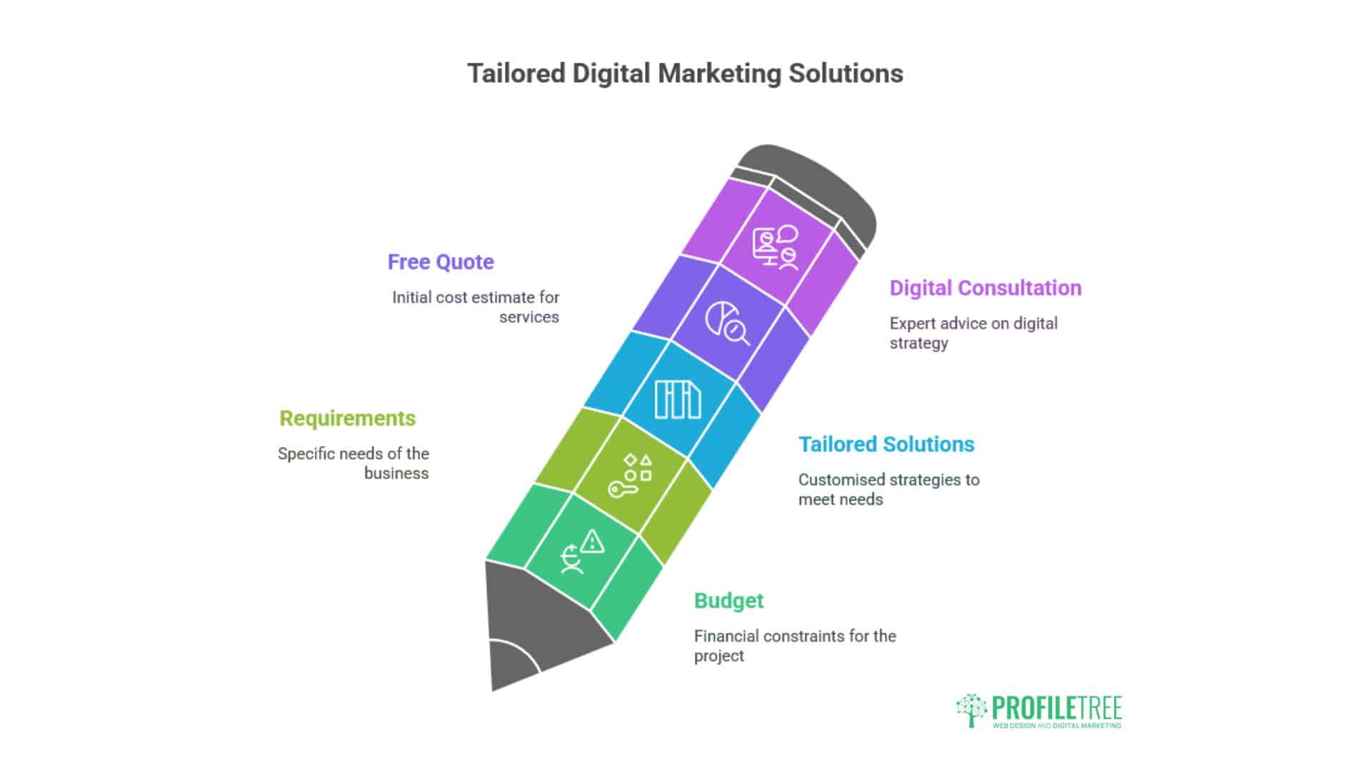
If you’re reviewing your current digital marketing position, the most useful starting point is an honest audit of where you are now. What does your website actually do for your business? Where is your traffic coming from? What does your current cost per lead look like across channels? What are your competitors doing that you’re not?
ProfileTree offers free digital marketing audits for Northern Ireland businesses. One of our team will review your digital channels, assess your current performance, and give you a clear picture of where the most significant opportunities lie — before any conversation about working together.
As Ciaran Connolly, founder of ProfileTree, puts it:
“Most Northern Ireland businesses have better digital assets than they realise, and they’re leaving more on the table than they know. The gap between a website that sits there and a website that actively generates business is usually smaller than people expect — but it requires a clear strategy, not just activity.”
Contact ProfileTree today to book your free consultation, or call 028 9568 0364.
Frequently Asked Questions: Digital Marketing in Northern Ireland
What does digital marketing cost for a small business in Northern Ireland?
Costs vary significantly depending on the services involved and the scale of activity. A basic SEO retainer for a local NI business might start from £500 to £800 per month. A full digital marketing strategy combining SEO, content, social media, and paid advertising typically ranges from £1,500 to £4,000 per month depending on the scope. ProfileTree works with clients across a range of budgets and tailors packages to individual requirements. Contact us for a free quote based on your specific goals.
How long does it take to see results from digital marketing in Northern Ireland?
Paid advertising can generate leads within days of launching a campaign. Organic search (SEO) typically takes three to six months before meaningful ranking improvements appear, and six to twelve months to see consistent lead generation from organic traffic. Content marketing and social media build over time. A realistic expectation for a new digital marketing programme is that you’ll start to see clear directional improvement within three months and material commercial returns within six to twelve months.
Does digital marketing work differently for cross-border businesses in Northern Ireland?
Yes. Businesses serving both Northern Ireland and the Republic of Ireland need to consider different search behaviour, currency handling, regulatory frameworks (particularly GDPR), and cultural nuances in their messaging. SEO strategy needs to account for both .co.uk and .ie search intent. ProfileTree’s team has experience with cross-border digital strategy and can build campaigns that serve both markets effectively without the awkward compromises that come from a one-size-fits-all approach.
What digital marketing channels work best for Northern Ireland SMEs?
This depends on the sector and target audience, but for most NI SMEs, organic search (SEO combined with content marketing) delivers the strongest long-term ROI. Social media — particularly Facebook for consumer-facing businesses and LinkedIn for B2B — builds brand awareness and drives referral traffic. Email marketing is consistently underused by NI businesses and tends to deliver strong returns relative to cost. Paid search and social advertising work well for lead generation campaigns with clear commercial goals.
How do I know if my digital marketing agency is actually delivering results?
You should receive regular reporting that connects directly to commercial outcomes: leads generated, cost per lead, organic traffic growth, and conversion rates. If your agency is reporting primarily on impressions, follower growth, or engagement rates without connecting these to revenue, ask for clarity on the commercial metrics. ProfileTree provides monthly ROI reports and real-time dashboard access so clients can see exactly what their investment is delivering.