Landing Page Examples: What High-Converting Pages Actually Have in Common
Table of Contents
Landing page examples are everywhere online, but most guides either show you polished screenshots from enterprise SaaS companies or list generic principles that don’t translate to real SME campaigns. This guide takes a different approach. It covers the page types that actually work, the structural decisions that move the needle on conversions, and the design mistakes that quietly kill campaigns. The guidance is aimed at business owners and marketing managers who are building or commissioning pages for the first time.
If you’re working with a web design or digital marketing agency, this will also help you brief the work more effectively and evaluate what you get back.
Three things to know before you start:
- Every landing page should have a single, specific goal. Pages that try to do too much convert at a fraction of the rate of focused ones.
- The headline and the call to action matter more than almost anything else on the page. Get those two right first.
- A landing page is not a homepage. If your agency is building you a “landing page” with a full navigation menu, ask why.
What Is a Landing Page?
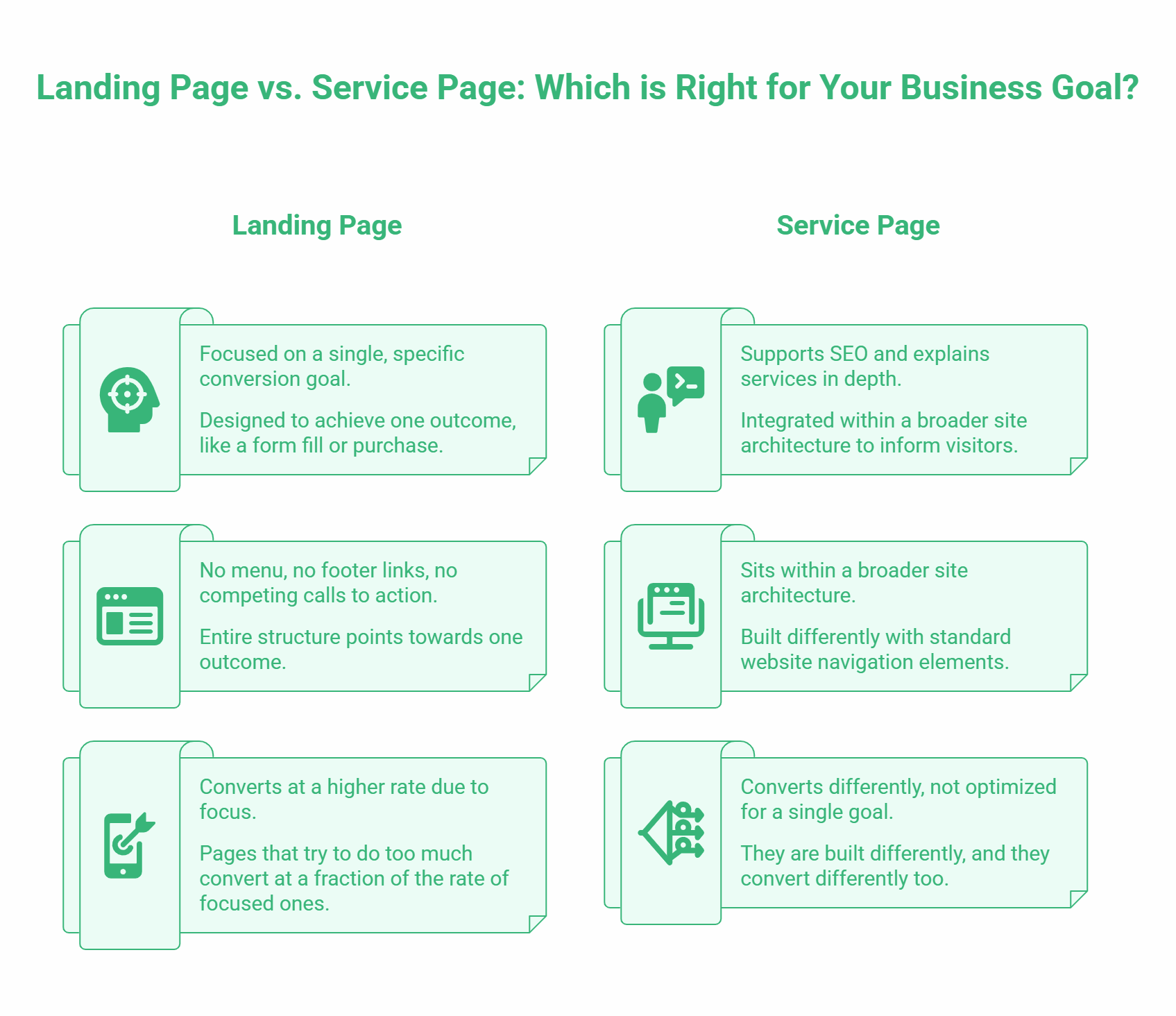
A landing page is a standalone web page built around a single conversion goal. Someone arrives on it (they “land”) after clicking a paid ad, an email link, a social media post, or an organic search result. Unlike a homepage or service page, it has no menu, no footer links to other areas of the site, and no competing calls to action. Its entire structure points towards one outcome.
That outcome could be a form fill, a phone call, a download, a ticket purchase, or a direct sale. What it cannot be is “all of the above.” The moment a page tries to serve multiple goals, it starts serving none of them effectively.
This distinction matters for SMEs because many businesses commission what they call a “landing page” and receive what is, in practice, a service page. Service pages have their place: they support SEO, explain services in depth, and sit within a broader site architecture. But they are built differently, and they convert differently too.
The Five Main Landing Page Types
Different campaign goals call for different page structures. These are the types you’ll encounter most often.
Lead Generation Page
The most common type for service businesses. Visitors arrive, read about an offer or piece of content, and exchange their contact details (usually a name and email address) for something of value: a free consultation, a downloadable guide, a webinar registration, or a quote request.
The offer has to earn the contact information. A vague “sign up to our newsletter” prompt rarely works. A “get a free 30-minute website audit for your Northern Ireland business” offer gives the visitor a clear reason to act.
ProfileTree uses this model for several client acquisition campaigns, pairing a specific, time-limited offer with a short three-field form. The shorter the form, the higher the submission rate; every additional field you add reduces completions.
Click-Through Page
Used mainly in e-commerce and SaaS, where the product or service requires more explanation before a purchase decision. The page does the persuasion work, then sends the visitor to a checkout or sign-up page to complete the transaction.
The click-through structure separates education from conversion. It works because it lets you present the full value proposition without cluttering a checkout process with sales copy.
Sales Page
A long-form page designed to sell without a sales call. Sales pages are more common for digital products, courses, and high-value one-off purchases. They’re typically much longer than other page types because they need to handle every objection the reader might have before they scroll to the buy button.
For most SMEs selling a service, a sales page is not the right format. A lead generation page that books a consultation is usually more effective because the sales conversation happens with a person, not on a web page.
Splash Page
A brief introductory page is placed in front of the main website. Usually minimal: a single message, perhaps an age gate, a language selector, or a temporary announcement. Not a conversion tool in the traditional sense, but useful for managing first-impression experiences.
Coming Soon Page
Built before a product or service launches. Its conversion goal is capturing email addresses from people who want to be notified when the thing is ready. Done well, it builds an audience before launch day. Done badly, it’s just a holding page that tells people to go away and come back later.
What Every High-Converting Landing Page Has
Strip back the design differences between the best landing page examples and you find the same structural elements doing the same jobs.
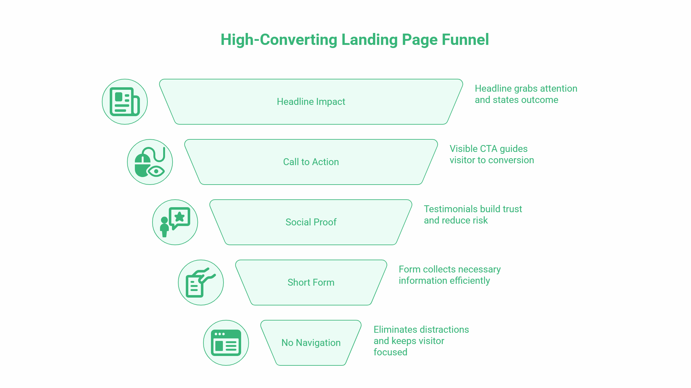
A Headline That States the Outcome
The headline is the first thing a visitor reads, often before the page has fully loaded. It should tell them, in plain language, what they will get or be able to do as a result of this page. Professional WordPress Websites for Northern Ireland Businesses, Built in Six Weeks” is a headline. “Welcome to Our Website” is not.
The most effective headlines follow a simple pattern: who it’s for, what they get, and (where possible) when or how. Long headlines consistently outperform short, clever ones in direct response contexts. Resist the urge to be witty.
A Single, Visible Call to Action
Every page needs one primary call to action, and it should be visible without scrolling on most screen sizes. The button label matters. “Submit” is weak. “Get My Free Quote” or “Book a Website Audit” tells the visitor exactly what happens next.
On longer pages, repeat the CTA at intervals. People who scroll to the bottom are showing strong intent; give them a button there too.
Social Proof Near the Conversion Point
Testimonials, star ratings, client logos, review counts, and case study references all reduce the risk a visitor feels before submitting their details or making a purchase. Place them close to the CTA, not buried at the bottom.
Specific proof outperforms vague proof every time. “Over 1,000 projects delivered since 2011, rated 5 stars on Google” is more persuasive than “clients love working with us.”
Joanne McMillan, who completed mentoring sessions with ProfileTree, described the experience as “extremely valuable” with guidance that was “knowledgeable, practical, and clearly tailored to my business needs.” That kind of specific, outcome-focused language works precisely because it is not generic.
A Short, Relevant Form
For lead generation pages, the form is the conversion mechanism. Standard advice: ask for as little as you need to start the conversation. Name, business email, and one qualifying question is typically enough. Phone numbers increase drop-off unless the next step is a call.
No Navigation
Remove the header menu. Remove the footer links. If your page has the same navigation as the rest of your site, you’re giving visitors eight ways to leave before converting. Every exit point you remove increases the chance they stay and act.
Design Principles That Actually Affect Conversions
The eye moves predictably down a page. Good landing page design uses size, colour, contrast, and spacing to direct that movement: headline first, subheading second, image or proof point third, CTA fourth. Everything else is supporting.
A common mistake is treating every element as equally important. When everything is bold, nothing stands out. A page with a quiet design and one loud CTA button often outperforms one that tries to make every section urgent.
Whitespace
Crowded pages feel untrustworthy. Generous spacing around key elements makes a page easier to read and gives the most important content room to breathe. This is particularly relevant for mobile, where cramped layouts force users to pinch and zoom, and then leave.
Colour for Trust and Action
Colour choice has a measurable effect on conversion, though it’s often overstated. The most practical rule: your CTA button should contrast visibly with the background behind it. If your site uses a navy background and you place a dark blue button on it, people will miss it.
Beyond the CTA, colour consistency builds trust. A page that looks visually coherent with your brand signals professionalism. A page that looks cobbled together from templates signals the opposite.
Mobile Performance
More than half of paid traffic in the UK now comes from mobile devices. A page that loads slowly, requires horizontal scrolling, or hides the CTA below a long block of text on a phone screen will lose those visitors before they read a word.
Page speed is part of this. Google’s research showed that a one-second delay in mobile load times reduces conversions by up to 20%. If you’re spending money on ads to drive traffic to a slow page, you’re compounding the cost of every lost conversion.
“Ciaran Connolly, founder of ProfileTree, puts it this way: ‘We see businesses invest significantly in driving traffic to pages that haven’t been tested on a phone. The creative is polished, the targeting is precise, but the page loads in eight seconds and has a form with eleven fields. That’s where the campaign dies.'”
Common Landing Page Mistakes
Mismatched Message
If a paid ad says “Free website audit for Belfast businesses” and the page headline says “Welcome to ProfileTree,” the visitor doesn’t know they’re in the right place. The headline should mirror the language of whatever sent the visitor there. This is called message match, and its absence is one of the most common reasons for high bounce rates on paid campaigns.
Too Many Goals
A page that tries to generate leads, explain the company’s history, showcase the full service range, and link to the blog is not a landing page. It’s a homepage. Each additional goal dilutes the conversion rate. Pick one.
Unverified Statistics
Many pages are full of conversion rate figures, studies, and “industry average” numbers that have no traceable source. Visitors who are sceptical will notice. Where you cite data, name the source. Where you can’t, don’t use the figure.
Weak or Missing CTA
A CTA is not “Contact Us” in the footer. It is a prominent, benefit-led button placed where a visitor, having read the case for acting, naturally looks next. If your page requires a visitor to hunt for how to get in touch, the design has failed.
Ignoring the Form Confirmation
What happens after someone submits the form matters more than most businesses realise. A generic “thank you” page with no next step wastes the moment. A confirmation page that tells the visitor what happens now (“We’ll be in touch within one working day”), offers a useful resource, and optionally asks them to book a call, does additional conversion work while their intent is still high.
How ProfileTree Approaches Landing Page Design for SMEs
ProfileTree’s web design team in Belfast has built landing pages for clients across Northern Ireland, Ireland, and the UK, spanning sectors from professional services to e-commerce, hospitality to manufacturing. The approach is the same regardless of sector: start with the conversion goal, work backwards to the content, then design around the content.
This is the opposite of how most of these pages get built. Typically, a template is chosen, a headline is added, and the design is retrofitted around whatever content is available. The result looks fine, but converts poorly because the structure was never built around a specific visitor behaviour.
For SMEs with limited budgets for paid traffic, a well-structured conversion page is one of the highest-return investments available. A campaign driving 500 visitors a month to a page converting at 1% generates 5 leads. The same traffic to a page converting at 4% generates 20. The difference is not the ad spend; it’s the page.
If your current website does not have dedicated conversion pages for your key services (pages with no navigation, a single goal, and social proof close to the CTA), that’s worth addressing before increasing any paid or organic traffic investment.
You can find out more about ProfileTree’s web design services for Northern Ireland businesses and how we structure pages for commercial outcomes.
Frequently Asked Questions
What is a landing page, and how is it different from a website page?
A landing page is a standalone page built around a single conversion goal, with no navigation menu and no links to other areas of the site. A standard website page is part of a broader navigation structure and typically serves multiple purposes, from providing information to supporting SEO. Landing pages are used in campaigns where you want to direct traffic to a specific offer and measure the response.
What is a good conversion rate for a landing page?
Conversion rates vary significantly by industry, traffic source, and offer type. A general benchmark for lead generation pages is 2% to 5%, though pages with highly specific offers and well-matched traffic regularly achieve 8% to 12%. Paid traffic typically converts at a lower rate than organic traffic because the intent is less specific. Rather than chasing an industry average, the goal is to test your current page against improved versions and raise your rate over time.
How long should a landing page be?
Long enough to answer every objection a typical visitor has before they’re willing to act, and no longer. For a simple lead generation offer (a free consultation, for example), a focused 600 to 900-word page with strong social proof is often sufficient. For a higher-commitment offer (a purchase, a lengthy sign-up process), a longer page that addresses each concern systematically will typically outperform a short one. Word count is not the goal; completing the conversion is.
Do I need a separate landing page for every campaign?
Not necessarily, but you do need a separate landing page for every distinctly different offer or audience segment. Sending traffic from a Northern Ireland SME campaign to a page written for a UK-wide e-commerce audience will produce poor results regardless of how good the ad is. Message match between the ad and the page is one of the highest-impact variables in paid campaign performance.
What should I include in my landing page form?
As little as possible. For most service business lead generation, name, business email address, and one qualifying question (such as company size or the service they’re interested in) is enough to start a useful conversation. Every additional field reduces submission rates. If you need more information before a meeting, collect it during the call rather than on the form.
Should landing pages be optimised for SEO?
It depends on their purpose. Campaign landing pages (built for paid traffic) are often noindexed because their content is too focused to compete for organic search terms and because you may want to run multiple variants simultaneously. If a landing page is designed to rank organically, it needs to meet standard SEO requirements: a focused keyword, sufficient content depth, internal links, and proper meta data. The two types serve different purposes and should be built differently.