Google Algorithm Updates: Strategic SEO for UK Businesses
Table of Contents
Google’s search algorithm shapes how millions of UK businesses connect with customers online. For business owners and marketing directors, understanding these updates isn’t just about technical SEO—it’s about protecting revenue, maintaining competitive advantage, and planning strategic growth.
This guide translates two decades of algorithm evolution into actionable strategies specifically for UK businesses. Whether you’re managing an e-commerce site in Manchester, a professional services firm in London, or a local business in Edinburgh, you’ll find practical frameworks to diagnose issues, recover from ranking drops, and future-proof your online presence.
Understanding Google Algorithm Updates
Google’s algorithm updates affect how your website ranks in search results. These changes occur thousands of times annually, though only major updates receive public announcements. Understanding the difference between routine adjustments and significant updates helps you respond appropriately and allocate resources effectively.
The search engine processes over 3.5 billion queries daily, with the UK market exhibiting distinct patterns in how updates are rolled out compared to US-based results. For UK business owners, this means algorithm changes often arrive with unique local characteristics that require region-specific strategies.
How Algorithm Updates Work
Google’s ranking systems evaluate hundreds of signals to determine which pages best answer search queries. Core updates recalibrate how these signals interact, often shifting the balance between factors like content quality, technical performance, and user experience metrics.
When an update launches, Google’s systems re-evaluate pages across its index. Pages that previously ranked well might drop if they relied heavily on factors that Google now considers less important. Conversely, pages that excel in newly prioritised areas often gain visibility.
The UK index typically shows higher volatility in the first 72 hours after an update compared to stabilised US results. This delay creates a false sense of security—real impact assessment for UK sites should begin in week two, after regional patterns have settled.
Types of Algorithm Changes
Core Updates represent broad recalibrations of Google’s ranking systems. Released several times a year, these updates affect all types of queries and typically cause the most significant ranking shifts. The March 2024 Core Update, for instance, specifically targeted sites with unhelpful content patterns.
Targeted Updates focus on specific quality issues or spam tactics. The Penguin updates addressed manipulative link schemes, while Panda targeted thin content and excessive advertising. These updates continue to influence rankings as part of Google’s ongoing quality assessment.
Feature-specific updates modify how particular search features function. The Passage Ranking update enhanced Google’s understanding and ranking of specific sections within longer documents, particularly benefiting sites with comprehensive and well-structured content.
“UK businesses often underestimate how algorithm updates affect their bottom line,” notes Ciaran Connolly, Director of ProfileTree. “A two-position ranking drop can mean a 30% traffic reduction for competitive commercial terms. Understanding these updates isn’t optional—it’s business-critical.”
The UK Search Landscape
British search behaviour differs from global patterns in several ways. UK users show a stronger preference for local results, with “near me” searches and location-specific queries driving significant commercial traffic. Google’s algorithm accounts for these preferences through location-based ranking adjustments.
British English variants also play a role. Google’s natural language processing now distinguishes between “solicitor” and “lawyer,” as well as “flat” and “apartment,” matching results to regional terminology. Sites that use authentic UK language and spelling gain advantages in local rankings.
Regulatory factors matter too. UK-specific authorities, such as the Financial Conduct Authority (FCA), the Solicitors Regulation Authority (SRA), and Companies House, provide trust signals that Google’s E-E-A-T assessment recognises. Professional services sites linking to these bodies demonstrate an authoritative UK presence.
Major Google Algorithm Updates: 2003-2026
Two decades of algorithm evolution reveal clear patterns in Google’s priorities. From early spam-fighting measures to sophisticated AI-powered understanding, each major update has redefined best practices for achieving and maintaining search visibility.
This section examines the updates that fundamentally changed SEO strategy, with particular attention to how UK businesses were affected and what lessons remain relevant for current optimisation efforts.
The Foundation Years: 2003-2010
Florida Update (November 2003) marked the first major crackdown on manipulative tactics. This update devastated sites using keyword stuffing, hidden text, and doorway pages—common practices at the time. UK e-commerce sites relying on these techniques saw dramatic ranking drops just before the crucial Christmas trading period.
The Florida Update established that Google would prioritise user experience over manipulation. Sites providing genuine value to searchers began outranking those optimised purely for algorithms. This principle continues to guide Google’s development.
Caffeine Update (August 2009) rebuilt Google’s indexing infrastructure, enabling faster crawling and fresher results. UK news publishers and time-sensitive content creators benefited significantly, as Google could now surface recent content more quickly.
This update reduced the advantage of established sites that relied solely on historical authority. Newer sites producing timely and relevant content can now compete more effectively, particularly for trending topics and current events.
MayDay Update (April 2010) changed how Google assessed long-tail search queries. UK businesses with detailed product pages and comprehensive service descriptions saw improved rankings for specific, low-volume searches that often converted better than competitive head terms.
The Quality Era: 2011-2015
Panda Update (February 2011) introduced automated quality assessment at scale. This update evaluated content depth, originality, and user engagement signals to identify low-quality pages. UK content farms and thin affiliate sites experienced a significant loss of rankings overnight.
Panda particularly affected sites with high ad-to-content ratios. Pages where advertising dominated the above-fold experience saw significant penalties. This update forced a fundamental shift in content strategy—quality became more valuable than quantity.
The update rolled out through multiple iterations, with Panda 4.0, released in May 2014, affecting approximately 7.5% of English queries. Each refresh allowed sites to recover if they improved content quality, establishing the pattern of ongoing quality evaluation that continues today.
Penguin Update (April 2012) targeted manipulative link building. UK businesses that had purchased links or participated in link schemes faced severe penalties. The update assessed both the quality of linking domains and the naturalness of anchor text distribution.
Penguin operated as a filter until its 2016 integration into core ranking systems. Sites penalised by early Penguin versions could only recover by removing bad links and waiting for the next refresh—a process that could take months.
Penguin 4.0 did not just become part of the core algorithm. Over the years that followed, Google progressively handed more of its spam-detection work to SpamBrain, its AI-based spam prevention system. SpamBrain does not replace Penguin’s logic; it extends it. Where Penguin targeted specific patterns (keyword-stuffed anchor text, link farm participation), SpamBrain learns to identify spam signals that are harder to codify as explicit rules.
Hummingbird Update (September 2013) represented a complete rewrite of Google’s core algorithm. This update improved understanding of conversational queries and semantic relationships, laying the groundwork for mobile and voice search.
For UK businesses, Hummingbird meant optimising for user intent rather than exact keyword matches. Pages answering the underlying question behind a search query could now rank even without repeating specific phrases.
Pigeon Update (July 2014) strengthened local search signals. UK businesses with physical locations and optimised Google Business Profiles saw improved rankings for location-based queries. This update more closely connected local results with traditional organic ranking factors.
The Mobile and Quality Refinement: 2015-2020
Mobilegeddon (April 2015) made mobile-friendliness a ranking factor. UK businesses with responsive designs gained advantages as mobile searches increasingly dominated traffic. Sites without mobile optimisation lost visibility on smartphones, where most searches now occur.
RankBrain (introduced in October 2015) introduced machine learning to query interpretation. This AI system helps Google understand ambiguous searches and connect them with relevant results, even when pages don’t contain exact query terms.
RankBrain became the third most important ranking signal, according to Google. For UK content creators, this meant focusing on comprehensive topic coverage rather than keyword density, as the algorithm could now understand context and relationships.
Fred Update (March 2017) targeted low-value content created primarily for advertising revenue. UK affiliate sites and content-light pages with aggressive monetisation saw ranking drops. This update reinforced Google’s emphasis on user-first content.
Medic Update (August 2018) disproportionately affected health and wellness sites, though Google insisted it was a broad core update. UK health information sites needed stronger E-E-A-T signals—expertise, authoritativeness, and trustworthiness became critical ranking factors.
Medical content required clear author credentials, references to medical authorities, and evidence of expertise. This pattern extended to other Your Money or Your Life (YMYL) topics, including finance and legal information.
The Modern Era: 2021-2026
The Page Experience Update (June 2021) introduced Core Web Vitals asranking factors. UK businesses needed fast-loading, stable pages with responsive interactions. Mobile network variability in the UK made optimisation particularly important for reaching customers outside major cities.
Helpful Content Update (August 2022) specifically targeted content created primarily for search engines rather than users. This update affected UK sites with AI-generated content, thin articles, and pages designed around keywords rather than genuine user needs.
Google’s guidance emphasised creating content demonstrating first-hand expertise. UK businesses needed to showcase unique insights, original research, and practical experience rather than repackaging information available elsewhere.
Spam Updates (2023-2024) addressed manipulative practices, including the abuse of expired domains, scaled content production, and exploitation of site reputation. UK businesses using these tactics for quick rankings faced algorithmic penalties.
Core Updates (2024-2026) have emphasised genuine expertise and user satisfaction. The March 2024 update targeted sites with unhelpful content patterns, while subsequent updates refined Google’s assessment of content quality and relevance.
Recent updates indicate that Google is moving toward establishing brand authority and demonstrating expertise. UK businesses need comprehensive digital presences that consistently show quality across owned platforms, social channels, and third-party mentions.
How Algorithm Updates Affect UK Businesses
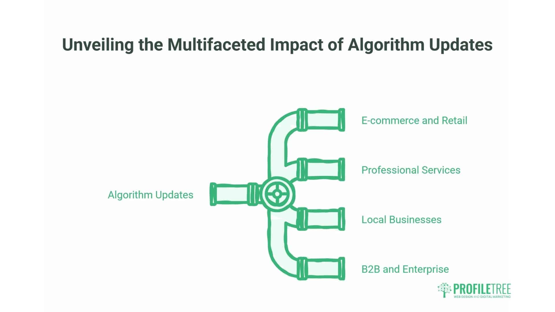
Algorithm updates have a distinct impact on different business sectors. Understanding these patterns helps UK business owners anticipate changes and protect their digital presence during periods of volatility.
The UK market shows unique characteristics during algorithm rollouts. Regional search patterns, local competition dynamics, and British consumer behaviour all influence how updates affect rankings and traffic.
E-commerce and Retail
UK online retailers face intense competition from global giants and local specialists. Algorithm updates often shift the balance between these competitors based on trust signals, product information quality, and user experience factors.
Recent updates have favoured retailers demonstrating a genuine UK presence. Sites with physical stores, British warehouse locations, and UK-specific delivery information rank better for commercial queries. Amazon’s dominance means independent retailers must differentiate through expertise and local authority.
Product page quality matters more than ever. Thin descriptions copied from manufacturers no longer suffice—successful UK retailers add original photography, detailed specifications, and authentic customer reviews that mention UK-specific details, such as delivery times with Royal Mail or DPD.
The rise of product review updates means e-commerce sites need comprehensive, experience-based content. Pages showing products in use, comparing alternatives, and addressing specific UK consumer needs outrank simple catalogue listings.
Professional Services
Law firms, accountants, consultants, and financial advisers operate in highly regulated sectors where trust signals are paramount. Algorithm updates increasingly prioritise sites demonstrating authoritative UK credentials and regulatory compliance.
E-E-A-T assessment for professional services requires clear connections to regulatory bodies. UK law firms should prominently display their SRA registration, financial advisers need to provide FCA authorisation details, and all professional sites benefit from Companies House verification.
Author credentials matter significantly. Articles written by qualified professionals, accompanied by clear attribution and biographical information, tend to rank better than anonymous content. UK professional services sites require author pages that showcase qualifications, experience, and professional memberships.
Local professional services also benefit from geographic specificity. Rather than targeting broad terms like “solicitor,” firms should focus on specific practice areas and locations, such as “employment law solicitor in Bristol” or “commercial property lawyer in Birmingham.”
Local Businesses
UK local businesses—such as restaurants, tradespeople, retailers, and service providers—depend heavily on location-based searches. Algorithm updates affecting local pack rankings and “near me” queries directly impact foot traffic and enquiries.
Google’s proximity calculations have become more sophisticated. In densely urban areas like Greater London or Greater Manchester, the “radius of relevance” has become increasingly narrow. Businesses must optimise for hyper-local terms rather than city-wide keywords.
A plumber shouldn’t just target “plumber in London” but specific neighbourhoods: “emergency plumber in Wandsworth” or “boiler repair in Balham.” This specificity aligns with how UK consumers actually search for immediate local services.
Google Business Profile optimisation remains critical. Complete profiles with accurate hours, recent photos, regular posts, and authentic reviews that include UK-specific details (postcodes, local landmarks, and British terminology) rank better in local search results.
B2B and Enterprise
UK B2B businesses face distinct challenges. Their target audience is smaller and more specialised, search volumes are lower, and buying cycles are longer. Algorithm updates affecting informational content and thought leadership have significant impacts.
Technical and detailed content performs well for B2B queries. UK businesses providing comprehensive guides, case studies, and industry analysis rank for valuable research-stage queries that influence later purchasing decisions.
Brand authority matters increasingly for B2B. Rather than competing solely on keywords, successful UK B2B sites build recognition through consistent thought leadership, industry publication features, and speaking engagements that generate authoritative mentions.
LinkedIn and professional network signals appear to influence rankings for B2B queries. UK businesses with an active professional social presence and regular content distribution across business platforms tend to see stronger organic performance.
The Recovery and Resilience Framework
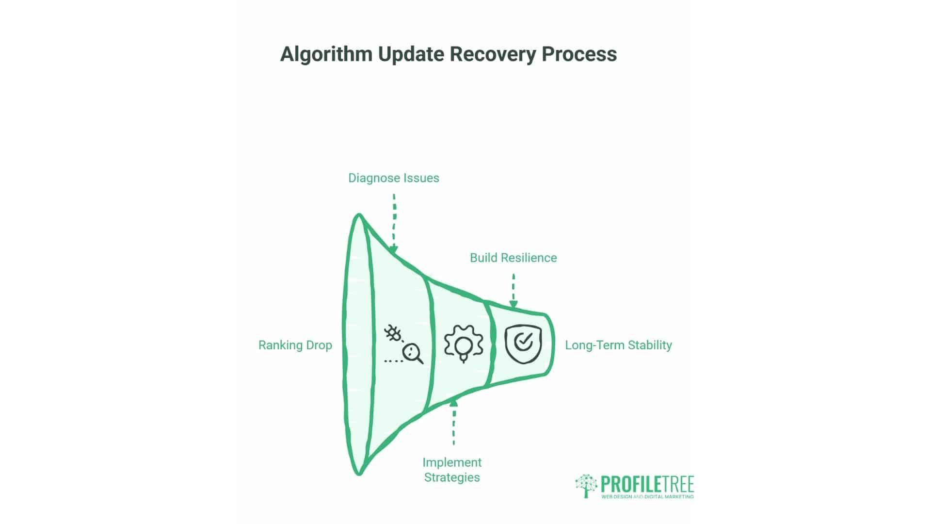
When rankings drop following an algorithm update, UK business owners need systematic approaches to diagnose issues and implement recovery strategies. This framework offers practical steps for assessment, response, and building long-term resilience.
Not every traffic drop indicates an algorithm penalty. Seasonal UK patterns—such as bank holidays, school holidays, and shopping periods—create predictable fluctuations. The framework helps distinguish between algorithmic impacts and natural variations.
Step 1: Diagnosing Algorithm Impact
Begin by confirming whether your traffic drop coincides with a known algorithm update. Check Google Search Console for ranking position changes rather than just impression drops. If rankings fell during an update window, algorithmic factors likely contributed to the decline.
Compare your traffic patterns against typical UK seasonal trends. Summer bank holidays, school half-terms, and the post-Christmas period typically show reduced search activity. If your drop aligns with these periods but rankings remained stable, seasonality may be the primary factor.
Analyse which pages lost visibility. If the drop concentrates on your top-performing content, algorithmic quality assessment may be involved. If newer or lower-quality pages lost rankings, this suggests different issues—possibly technical problems or content gaps.
Review competitor movements. If similar UK businesses gained rankings as you lost them, the update likely redistributed visibility based on quality signals. If the entire sector declined, broader market changes or shifts in search behaviour may be responsible.
Step 2: Content Quality Assessment
Evaluate your content against Google’s Quality Rater Guidelines, which reveal how human assessors judge page quality. These guidelines emphasise E-E-A-T: Experience, Expertise, Authoritativeness, and Trustworthiness.
Experience: Does your content demonstrate first-hand knowledge? UK businesses should showcase unique insights from actual projects, client work, or industry practice. Generic information anyone could write won’t differentiate you.
Expertise: Are the authors qualified in their subjects? Professional credentials, industry experience, and demonstrated knowledge build expertise signals. Clear author bios, including LinkedIn profiles and professional affiliations, strengthen these signals.
Authoritativeness: Is your site recognised as a leader in your field? UK businesses need citations from industry publications, speaking engagements, awards, and mentions from authoritative UK sources that validate your position.
Trustworthiness: Can users rely on your information? Clear contact details, physical UK addresses, transparent business information, privacy policies, and secure connections (HTTPS) all contribute to trustworthiness assessment.
Step 3: Technical SEO Audit
Algorithm updates sometimes expose technical issues that previously didn’t affect rankings. Core Web Vitals—encompassing loading performance, visual stability, and interactivity—now directly influence rankings.
Loading Speed: Test your site on typical UK mobile networks, not just office broadband. Tools like Google PageSpeed Insights reveal opportunities to reduce load times through image optimisation, code minification, and caching improvements.
Mobile Responsiveness: With mobile searches accounting for a significant portion of UK traffic, responsive design is non-negotiable. Test on actual devices across iOS and Android to ensure that navigation, forms, and content function smoothly on smaller screens.
Indexing Issues: Check Search Console’s coverage report for indexing errors, blocked resources, or crawl problems. Pages Google can’t access or properly render won’t rank, regardless of content quality.
Internal Linking: A strong internal link structure helps Google understand the site’s hierarchy and content relationships. UK businesses should connect related service pages, case studies, and supporting content to reinforce topical authority.
Step 4: Link Profile Review
While Penguin now operates in real-time, low-quality backlinks still harm rankings. Review your link profile for suspicious patterns, irrelevant links, or obvious spam.
UK businesses should focus on building relevant local and industry links. Chamber of commerce memberships, local business directories, industry association listings, and partnerships with complementary businesses provide valuable UK-specific links.
Guest posting on reputable UK industry sites, contributing expert commentary to publications, and creating linkable research or tools generates high-quality backlinks that strengthen authority signals.
Disavow truly harmful links—those from obvious spam networks, gambling sites (if you’re not in that industry), or suspicious foreign domains. Use Google’s disavow tool conservatively, as removing legitimate links can do more harm than good.
Step 5: User Experience Optimisation
Google’s algorithms increasingly measure actual user behaviour. Pages where visitors immediately return to search results (“pogo-sticking”) signal poor quality. Sites keeping users engaged show strong relevance.
Enhance the on-page experience by making content more scannable. UK visitors typically skim before reading—use descriptive subheadings, bullet points for key information, and clear formatting that guides attention.
Answer questions directly and early. Avoid burying critical information after lengthy introductions. UK business audiences value efficiency—provide the answer, then support it with detail.
Reduce aggressive advertising and pop-ups. Interstitials that block content on mobile devices, particularly those that harm rankings. UK users expect accessible content without multiple obstacles.
Step 6: Competitive Analysis
Study competitors who gained rankings during the update. Identify what they do better—deeper content, stronger E-E-A-T signals, better technical performance, or more authoritative link profiles.
Gap analysis reveals opportunities. If competing UK businesses have comprehensive service pages while yours are thin, content depth may be holding you back. If they showcase team credentials prominently while yours are buried, E-E-A-T signals need strengthening.
Don’t copy competitors—learn from them. Understand the principles behind their success, then apply those principles in ways that reflect your unique business strengths and expertise.
Step 7: Implementing Recovery Strategies
Recovery requires addressing root causes, not quick fixes. If content quality caused ranking drops, surface-level updates won’t suffice—you need genuine improvements in depth, expertise, and user value.
Prioritise high-impact pages. Focus recovery efforts on content driving significant traffic or revenue. Improving your top 20% of pages typically delivers better results than spreading efforts across your entire site.
Document changes and monitor results. Track which pages you improve, what changes you make, and how rankings respond. This data informs future optimisation and helps identify effective strategies.
Be patient. Algorithm recovery typically takes weeks or months, not days. Google needs time to recrawl content, reassess quality signals, and adjust rankings. Consistent improvement matters more than dramatic one-time changes.
Building Long-Term Resilience
Rather than reacting to each update, UK businesses should build inherently strong digital presences that withstand algorithmic changes. This requires focusing on fundamentals rather than tactics.
Content Excellence: Invest in genuinely useful content that serves your audience’s needs. UK business owners and marketing managers seeking information require practical, actionable guidance—not surface-level articles that merely repackaged common knowledge.
Technical Foundation: Maintain a fast, secure, accessible website. Regular technical audits prevent issues from accumulating. UK businesses should partner with developers who understand both performance optimisation and SEO implications.
Brand Building: Develop Recognition Beyond Search. UK businesses with strong brands—through social media presence, industry participation, PR, and customer advocacy—build algorithmic resilience. Google is increasingly factoring brand signals into its rankings.
User Focus: Align SEO with user needs, rather than relying on algorithmic tactics. UK businesses that genuinely serve customers well—through helpful content, excellent service, and transparent communication—naturally accumulate positive signals that Google’s algorithms reward.
Preparing for Future Updates
Google’s evolution toward AI-powered search and generative experiences will continue. UK businesses should prepare for these shifts now rather than reacting after impacts occur.
AI Overviews (formerly SGE) are gradually rolling out in the UK. These AI-generated summaries appear for many informational queries, potentially reducing organic traffic. Businesses need strategies beyond ranking—building direct audience relationships through email, social media, and repeat visits.
Brand authority becomes more critical as AI systems synthesise information from multiple sources. Being the source that AI references requires establishing genuine expertise and authoritative content that other sites cite as credible.
Structured data and schema markup enable AI systems to better understand your content. UK businesses should implement appropriate schema types—such as Local Business, Organisation, Article, and Product—to increase the likelihood of inclusion in AI-generated summaries.
Conclusion
Google’s algorithm updates will continue evolving, but the underlying principle remains constant: Google rewards websites that genuinely serve user needs. For UK businesses, this means focusing on quality, expertise, and user experience rather than chasing algorithmic tactics.
The businesses that thrive during algorithm volatility are those that build strong fundamentals—excellent content, technical performance, authoritative presence, and genuine value for customers. These qualities transcend any individual update and create resilient digital presences that withstand change.
Whether you’re managing a UK e-commerce site, a professional services firm, or a local business, the strategic framework outlined here provides a foundation for both recovering from ranking drops and preparing for future changes.
ProfileTree helps UK businesses navigate algorithm updates through technical SEO audits, content strategy development, and comprehensive digital marketing support. Our expertise in web design, AI implementation, and digital training positions your business to succeed regardless of algorithmic shifts. Contact us to discuss how we can strengthen your digital presence and protect your search visibility.
FAQs
How often does Google update its algorithm?
Google makes thousands of minor adjustments annually, with major core updates typically occurring three to four times per year. Most changes are small and go unannounced, while significant updates that materially affect rankings are usually confirmed by Google.
How do I know if my site was hit by an algorithm update?
Check Google Search Console for ranking position drops coinciding with known update dates. Compare your traffic patterns against seasonal UK trends. If rankings fell significantly during an update window and haven’t recovered, algorithmic factors likely contributed.
Can I recover from an algorithm penalty?
Most ranking drops are adjustments rather than penalties. Recovery requires identifying which quality signals changed—content, links, technical factors, or user experience—and making genuine improvements. Core update recoveries typically take 3-6 months as Google reassesses quality.
Do algorithm updates affect all websites equally?
No. Updates target specific quality issues or ranking factors. Sites already following best practices often see improvements as lower-quality competitors lose rankings. The impact depends on your site’s strengths and weaknesses relative to the update’s focus.