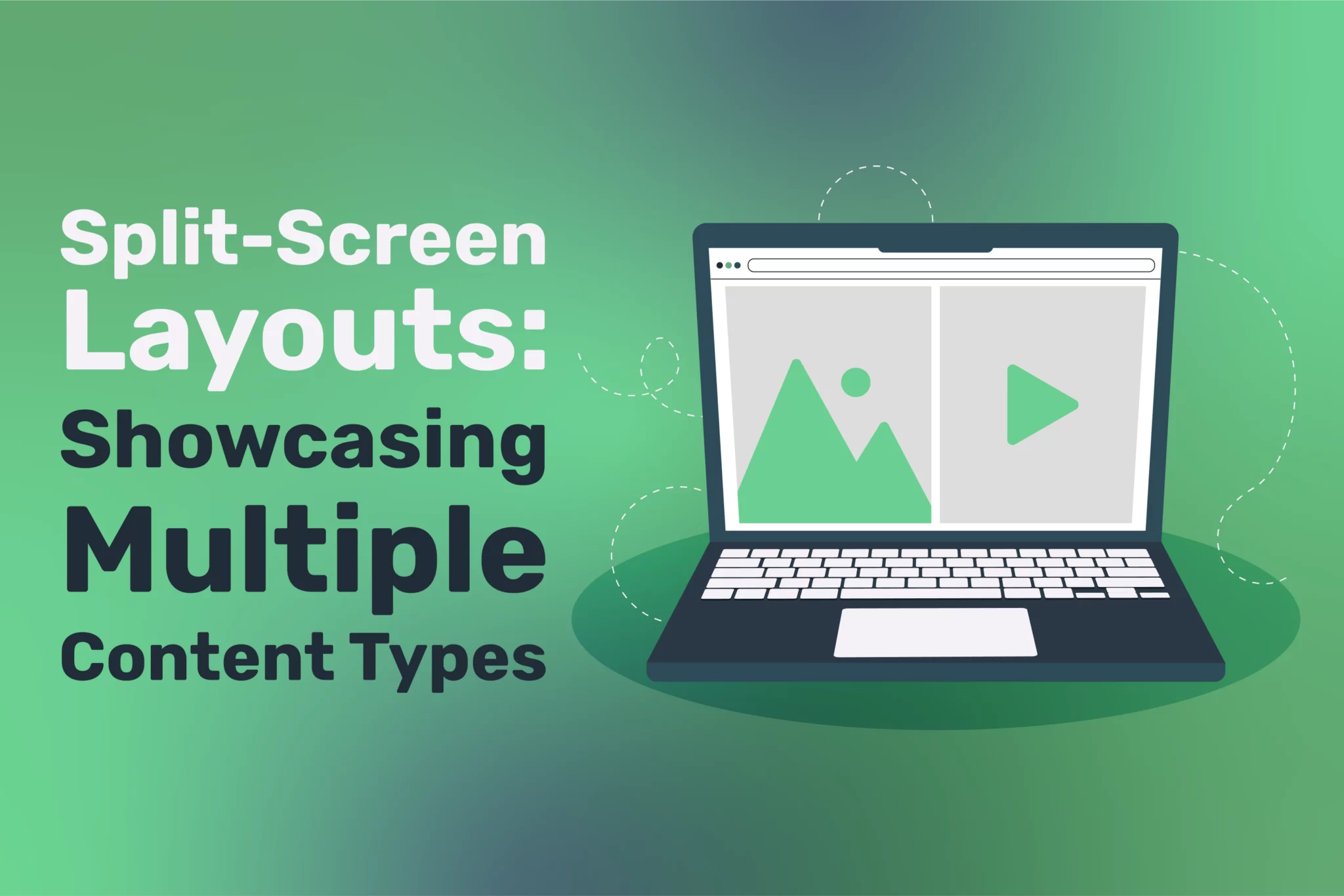
Split-screen layouts have emerged as a hallmark of modern web design, offering a dynamic way to present contrasting or complementary content types. This design technique involves dividing a web page into two or more visually distinct sections, each showcasing different content. Whether contrasting themes, highlighting choices, or creating an immersive visual narrative, split-screen layouts strike the perfect balance between aesthetics and functionality. This article explores split-screen layouts’ essence, advantages, best practices, and use cases, offering insights for designers seeking to elevate their projects.
What Is a Split-Screen Layout?
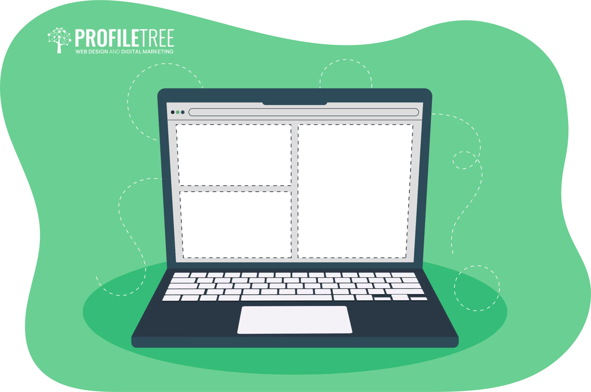
A split-screen layout divides a web page into distinct, side-by-side sections, each acting as a standalone canvas for content. Unlike traditional layouts, where content flows vertically or occupies a single focal point, split-screen designs allow for simultaneous storytelling. This approach can vary from symmetrical halves to creatively asymmetrical divisions.
For example:
E-Commerce: One section might highlight men’s products, while the other showcases women’s collections.
Creative Portfolios: A photographer could juxtapose urban and natural landscapes.
Service Pages: A company might dedicate one panel to detailing its offerings and the other to client testimonials.
These layouts enable the simultaneous delivery of diverse content, fostering a unique and engaging browsing experience.
Benefits of Split-Screen Layouts
The layouts go beyond their aesthetic appeal, offering practical advantages that enhance the user experience and elevate brand storytelling. Below, we delve deeper into the benefits that make them a favoured choice among designers.
Improved Visual Hierarchy
Establishing a clear visual hierarchy is critical in web design for guiding users. Split-screen layouts excel in this area by allowing designers to prioritise content. Each section becomes a focal point, ensuring users can quickly discern the most important information.
For instance:
A technology website might use the left panel to showcase its latest product and the right to explain its features.
A lifestyle blog could feature a striking image on one side and a compelling headline with a call to action (CTA) on the other.
Split-screen layouts highlight key elements using contrasting colours, bold typography, or vivid imagery.
Dynamic Storytelling
Storytelling is a cornerstone of modern marketing, and split-screen layouts offer a unique platform for dynamic narratives. This layout style enables interactive and engaging storytelling, whether contrasting before-and-after scenarios, presenting dual perspectives, or comparing product options.
Enhanced Responsiveness
One of the most significant challenges in web design is ensuring usability across devices. Split-screen layouts, when implemented thoughtfully, naturally lend themselves to responsive design. The split format remains intact on larger screens, while on smaller devices, the panels can stack vertically, maintaining content hierarchy and usability.
Increased User Engagement
By presenting two distinct yet related content types side-by-side, split-screen layouts invite users to explore both sections. This interactive format encourages deeper engagement, as users are naturally drawn to understand the relationship between the two halves.
Minimalist Aesthetic
Minimalism is a prevailing web design trend; split-screen layouts align seamlessly with this philosophy. By dividing content into two primary areas, designers can maintain a clean and uncluttered interface, ensuring that users remain focused on the intended message.
Key Design Principles for Split-Screen Layouts
Creating a successful split-screen layout requires careful consideration of design principles to ensure balance, usability, and visual appeal. Here’s a closer look at these essential guidelines.
Balance and Proportion
While symmetry is the traditional approach, asymmetry can introduce an element of surprise and creativity. The split proportions can vary—such as a 70/30 or 60/40 ratio—depending on the importance of the content on each side. Regardless of the division, the overall design should feel harmonious.
Contrast
Contrast is essential for distinguishing the two sections. Designers can achieve this through:
Colours: Bold colour pairings, such as black and white or complementary hues, create immediate differentiation.
Typography: Combining bold and subtle fonts adds depth and texture.
Imagery: Contrasting visual styles, such as vibrant photos versus monochromatic illustrations, further enrich the design.
Visual Consistency
Despite the division, the two panels should maintain a sense of unity. Consistent spacing, alignment, and typography can achieve this. Unity ensures that the layout feels cohesive rather than fragmented.
Clear Navigation
Split-screen layouts often guide users toward a specific action, such as exploring further content or making a choice. Navigation elements like buttons or hover effects should be intuitive and indicate the next step.
Responsiveness
Ensuring a responsive design is paramount with the increasing use of mobile devices. Split-screen layouts should transition seamlessly to vertical stacks or other formats that preserve usability on smaller screens.
Creative Use Cases for Split-Screen Layouts
Split-screen layouts are versatile and adaptable, making them suitable for various industries and purposes. Below are some inspiring use cases.
E-Commerce Websites
In the competitive world of e-commerce, showcasing products effectively is key. Split-screen layouts enable brands to:
Highlight different product categories.
Contrast new arrivals with bestsellers.
Present a promotional offer alongside a CTA to shop.
For instance, an online clothing retailer might dedicate one side to summer fashion and the other to winter wear, catering to diverse customer preferences.
Portfolio Websites
Creative professionals, such as photographers, artists, and designers, often use split-screen layouts to display their work. This format allows them to:
Showcase contrasting styles, such as abstract and realistic art.
Present individual projects with equal prominence.
Combine text-based descriptions with visuals.
For example, a graphic designer could juxtapose brand logos on one side with website mock-ups on the other, demonstrating versatility.
Landing Pages
Split-screen layouts greatly benefit landing pages designed for marketing campaigns. For example, a software company might use one section to explain its product features and another to provide customer testimonials or a product demo.
For non-profit organisations, split-screen designs are powerful tools for telling their stories. One panel might depict their beneficiaries’ challenges, while the other showcases their efforts to address them.
Implementing Split-Screen Layouts: Best Practices
Designing and implementing split-screen layouts requires a strategic approach to maximise impact and functionality.
Use Grid Systems
Grids ensure precise alignment and consistent spacing, critical for maintaining balance in split-screen designs. CSS frameworks like Bootstrap and Tailwind CSS simplify creating responsive layouts.
Optimise for Accessibility
Accessibility is crucial in web design. Ensure that your split-screen layout is usable by everyone, including individuals with disabilities. This involves:
Providing sufficient contrast between text and background colours.
In today’s multi-device world, responsive design is non-negotiable. Test your layout across various screen sizes to remain functional and visually appealing.
Leverage Animation
Animations can enhance the split-screen experience. For example:
Panels can slide into view as the page loads.
Hover effects can reveal additional details.
Smooth transitions can guide users between sections.
Prioritise Content Hierarchy
Identify the most critical content and ensure it stands out. A split-screen layout offers limited space, so concise and impactful messaging is essential.
Tools and Technologies for Creating Split-Screen Layouts
Modern tools and technologies simplify the creation of split-screen layouts, enabling designers to bring their visions to life.
CSS
CSS properties like flexbox and grid are instrumental in creating split-screen designs. These tools allow for precise control over layout structure and responsiveness.
JavaScript
JavaScript can enhance functionality and interactivity by enabling toggles between panels or adding animations.
Split-screen layouts are a versatile and visually striking solution for showcasing multiple content types. They enhance storytelling, improve user engagement, and provide a clean, minimalist aesthetic. By following best practices and leveraging modern design tools, designers can create layouts that captivate audiences and drive meaningful interactions.
As technology evolves, the potential for innovative split-screen designs grows, offering endless possibilities for creative expression and functional design. Whether crafting a portfolio, building an e-commerce platform, or designing a non-profit website, split-screen layouts provide a canvas for impactful storytelling and user engagement.
FAQs
Are split-screen layouts mobile-friendly?
Yes, when designed thoughtfully. On smaller devices, split-screen layouts can stack vertically, ensuring usability and content clarity. Responsive design techniques like CSS grid or flexbox can effectively adapt the layout to different screen sizes.
Can split-screen layouts support multimedia content?
Yes, split-screen layouts are well-suited for multimedia content. You can display images, videos, animations, or interactive elements on one side while presenting text, captions, or additional details on the other. This enhances user engagement and creates a visually dynamic experience.
Are split-screen layouts future-proof?
Split-screen layouts are adaptable to evolving design trends. With responsive and modular design principles, they can be adjusted for new devices and user behaviours. Emerging technologies, such as augmented reality (AR) and virtual reality (VR), could further enhance their functionality.
Many famous people have said they are going to take a break from social media. Selena Gomez, Tom Holland, and Lizzo have posted before talking about...
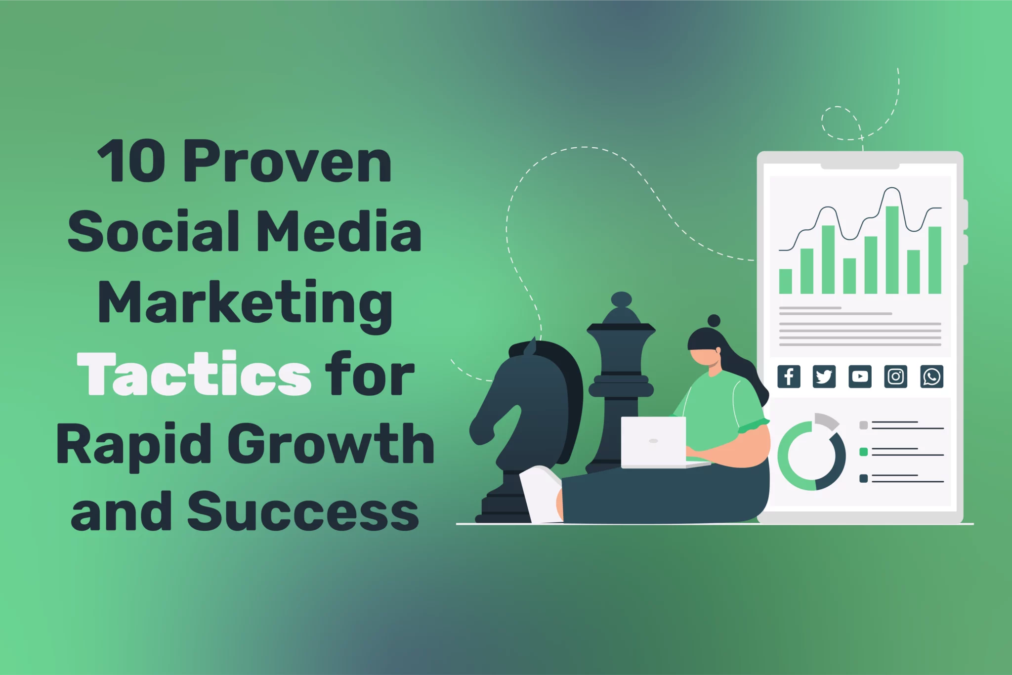
In today's digital age, social media has become an indispensable tool for businesses to connect with their target audience and drive growth. However, with countless platforms...
Social media scheduling tools are indispensable for businesses looking to streamline their social media strategy and maintain a consistent online presence. Selecting the right tool can...


