Accessibility Strategy for SME Websites
Table of Contents
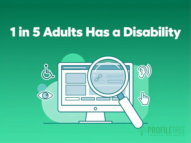
Most small business websites in the UK and Ireland have accessibility problems. Missing alt text, poor colour contrast, forms that can’t be completed with a keyboard alone, headings that skip levels: these aren’t edge-case issues. They affect one in five adults who have some form of disability, and they can expose your business to legal risk under the Equality Act 2010.
Building an accessibility strategy doesn’t require an enterprise budget or a dedicated compliance team. It requires a clear plan, the right sequence of actions, and an understanding of what WCAG compliance actually means in practice for a small business website. This guide gives you that plan, from your first audit through to inclusive design principles and a working accessibility roadmap you can maintain over time.
Why Your Website Needs an Accessibility Strategy
An accessibility strategy is the structured plan that moves your website from its current state to one that works for all users, including those with visual, auditory, motor, or cognitive impairments. Without a strategy, accessibility becomes reactive: issues get fixed only when someone complains, audits produce a list that nobody owns, and the same problems reappear after the next redesign.
The business case for web accessibility is straightforward. The Purple Pound, the collective spending power of disabled households in the UK, is estimated at over £274 billion annually. Businesses that present digital barriers are turning away a customer segment that actively seeks out and rewards accessible brands. A digital accessibility strategy isn’t just a compliance exercise; it’s a commercial decision.
There is also a direct connection between web accessibility and search performance. Many WCAG compliance requirements, such as structured headings, descriptive alt text, clear navigation, and logical reading order, are simultaneously core SEO signals. A more accessible website tends to rank better, load faster, and convert more visitors. ProfileTree’s search engine optimisation services treat accessibility as a standard component of technical SEO, because the two are genuinely inseparable.
The Legal Context for UK and Irish SMEs
UK businesses are covered by the Equality Act 2010, which makes it unlawful to provide services in a way that puts disabled people at a substantial disadvantage without reasonable adjustments. An inaccessible website can constitute indirect discrimination, and the volume of accessibility-related legal actions in the UK has grown year on year. In Ireland, the Equal Status Acts 2000–2018 carry equivalent obligations.
The European Accessibility Act, in force since June 2025, creates direct compliance obligations for any SME selling digital products or services to EU customers, regardless of where the business is registered. Having a documented accessibility strategy is your best evidence of good-faith effort if a complaint or investigation arises.
What a Weak Accessibility Strategy Looks Like
Most SMEs that have attempted accessibility work fall into the same pattern: an automated scan runs, a developer fixes the flagged items, and the issue disappears from the agenda until the next complaint. This isn’t an accessibility strategy. It’s a reactive maintenance cycle that guarantees the same problems will return after the next content update or site redesign.
A genuine digital accessibility strategy assigns ownership, sets measurable standards, establishes a testing cadence, and embeds inclusive design into how your team builds and manages the site from the start. The difference between the two approaches is the difference between treating accessibility as a project and treating it as a process.
What WCAG Compliance Means for Your Website
WCAG stands for the Web Content Accessibility Guidelines, published by the W3C and used as the reference standard for digital accessibility in the UK, Ireland, and across the EU. Understanding what WCAG compliance actually requires is the foundation of any accessibility strategy, because without it, audits produce findings you cannot prioritise and fixes that may not address the real barriers.
The Four WCAG Principles
WCAG is built on four core principles, often referred to by the acronym POUR. Every success criterion in the guidelines maps back to one of these.
| Principle | What It Means | Common Failures | Quick Win |
|---|---|---|---|
| Perceivable | Users must be able to see or hear all content | Missing alt text, no captions on video, low colour contrast | Add descriptive alt text to all images |
| Operable | Users must be able to navigate and interact with all functions | Keyboard traps, no skip links, tiny touch targets | Test full navigation using the Tab key only |
| Understandable | Content and interface must be clear and predictable | Inconsistent navigation, jargon, and unclear error messages | Write form labels and error messages in plain language |
| Robust | Content must work across browsers, devices, and assistive technologies | Invalid HTML, missing ARIA labels, broken screen reader output | Validate HTML and test with a free screen reader |
WCAG Conformance Levels: A, AA, and AAA
WCAG compliance is measured at three levels. Level A covers the most critical barriers; without it, some users can’t access content at all. Level AA is referenced in UK legislation, the European Accessibility Act, and most procurement frameworks. Level AAA, which includes requirements such as sign language for all video content, is generally aspirational for private sector businesses.
For most UK and Irish SMEs, the practical target is WCAG 2.2 Level AA. This is what courts and regulators reference, what public sector contracts require from suppliers, and what responsible web design agencies build to as a minimum. If your site currently has no accessibility provisions at all, reaching Level AA is a realistic goal in phases rather than a single sprint.
What Does a Website Accessibility Audit Cover
An audit is the starting point for any accessibility strategy. It produces a prioritised list of barriers on your existing site so you know where to focus first. A thorough audit uses both automated tools and manual testing, because automated scanners catch only around 30 to 40 per cent of WCAG failures reliably.
Automated tools such as WAVE or Axe identify missing alt text, insufficient colour contrast, absent form labels, and broken heading hierarchies quickly. Manual testing covers the rest: keyboard navigation flows, screen reader compatibility, focus management in interactive components, and whether content makes sense in non-visual reading order. Testing on a mobile device with a basic screen reader catches issues that desktop-only scans miss entirely.
Prioritise your highest-traffic pages first: the homepage, main service pages, the contact form, and any booking or checkout flow. Fixing the ten most visited pages produces the greatest immediate impact for the smallest initial investment and gives you a visible record of progress to share with stakeholders.
How to Build an Accessibility Roadmap
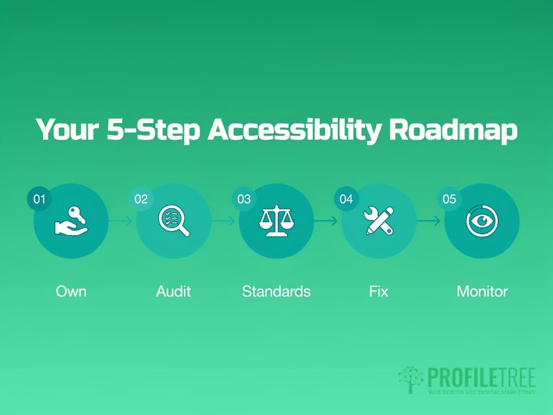
An accessibility roadmap turns audit findings into a sequenced plan of action with owners, timelines, and success criteria. Without it, accessibility work competes with every other development priority and consistently loses. With it, you’ve a defensible record of progress and a clear view of what comes next.
Step 1: Establish Ownership
Before any technical work begins, name the person who is responsible for your accessibility strategy. For an SME, this is often the website owner, a marketing manager, or whoever commissions development work. The critical point is that the person has enough authority to approve the budget and to raise accessibility as a requirement in every brief given to designers, developers, and content creators.
For businesses working with external web development partners, ownership starts in the procurement conversation. Ask directly how the agency handles WCAG compliance in its design and build process. If the answer is “we run a scan at the end,” you’ll inherit a remediation backlog on day one. ProfileTree’s web design services and website development process treat WCAG 2.2 Level AA as a build standard, not a post-launch checklist.
Step 2: Run a Prioritised Audit
With ownership established, the next step is a baseline audit of your current site. Use a combination of automated scanning and manual keyboard and screen reader testing. Log every issue with a severity rating, the WCAG criterion it relates to, and the page or component it appears on. Four severity levels keep triage manageable: Critical (prevents access entirely), Serious (creates notable barriers), Moderate (causes difficulty), and Minor (cosmetic or low-impact).
This prioritised list becomes the foundation of your accessibility roadmap. Critical and Serious issues affecting your highest-traffic pages go to the top of the development queue. Minor issues can be batched and addressed during scheduled maintenance. The audit also establishes your baseline, which you will compare against at your next review to measure progress.
Step 3: Set Measurable Standards
An accessibility strategy needs defined standards, not just a list of fixes. Standards tell your team what “good” looks like so that new content and new features don’t reintroduce the barriers you just removed. For most SMEs, a one-page accessibility checklist is more useful than a 40-page policy document.
A practical checklist for a small web team covers: alt text for all images, correct H1–H2–H3 heading order, WCAG 2.2 Level AA colour contrast ratios, visible form labels, descriptive link text, captions for video, and keyboard accessibility for all interactive elements. When these are the default expectations for every content update, WCAG compliance stops being a remediation project and becomes normal practice.
Step 4: Schedule Regular Reviews
A single audit and fix cycle isn’t an accessibility strategy; it’s a one-off project. The difference is the review cadence. Run monthly automated scans on your highest-traffic pages, a manual audit on a rotating set of pages each quarter, and a full-estate review once a year to reset the baseline and feed the next phase of your accessibility roadmap.
Document every change in an accessibility changelog. “July 2025: Added alt text to all product images. Fixed keyboard trap in navigation menu.” This record becomes your evidence of good-faith progress for regulators and for any client or partner that requires supplier compliance with accessibility standards.
| Phase | Action | Timeline | Owner |
|---|---|---|---|
| 1. Ownership | Name the responsible person; add accessibility to all design and dev briefs | Week 1 | Business owner / Marketing manager |
| 2. Audit | Automated scan + manual keyboard and screen reader testing on the top 10 pages | Weeks 2–3 | Developer or specialist |
| 3. Standards | Write a one-page accessibility checklist for content and development teams | Week 4 | Website owner |
| 4. Remediation | Fix Critical and Serious issues by priority; batch Minor issues | Weeks 5–12 | Developer |
| 5. Monitoring | Monthly automated scans; quarterly manual audits; annual full review | Ongoing | Website owner |
Inclusive Design: Building Accessibility Into Your Website
Inclusive design is the approach that prevents accessibility barriers from being introduced in the first place. Where an accessibility strategy tells you how to find and fix existing problems, inclusive design changes how your team makes decisions during design and development so that fewer problems arise. The two work together: you need the strategy to address what exists, and inclusive design to control what comes next.
What Inclusive Design Means in Practice
Inclusive design doesn’t mean designing separate experiences for disabled users. It means making design decisions that work for the widest range of people from the start. A keyboard-accessible navigation menu is an inclusive design. Sufficient colour contrast between text and background is inclusive design. A form with a visible label on every field, a clear error message, and a logical tab order is inclusive design. None of these requires additional work if they’re considered at the design stage; they all generate costly remediation work if they are not.
The most common point of failure in SME web projects is that accessibility is treated as a final quality-assurance check rather than a design input. A colour contrast problem identified in a QA sprint means changing brand assets, updating design files, and redeploying components. The same problem identified in a wireframe review takes minutes to fix. Applying inclusive design principles early is not just the right thing to do; it is the most cost-effective approach.
Colour, Typography, and Contrast
WCAG 2.2 Level AA requires a contrast ratio of at least 4.5:1 between normal text and its background, and 3:1 for large text. Many brand palettes fail this test, particularly where light text sits on a coloured background. The WebAIM contrast checker lets you test any colour combination before committing to it in a design, and it’s free.
Typography choices affect readability for users with dyslexia and low vision. Clean typefaces at a minimum 16px body size, with line spacing of at least 1.5 times the font size, reduce cognitive load for all users. Avoid all-caps for body copy; it increases reading difficulty and carries no additional emphasis for screen reader users.
Forms, Navigation, and Interactive Elements
Forms are among the most common accessibility barriers on SME websites. Every input field needs a visible label that stays visible when active; placeholder text doesn’t substitute because it disappears when the user starts typing. Error messages must identify the specific field and describe the correct input. “Please check your entry” fails this; “Enter a valid UK postcode, for example BT1 1AA” passes it.
Navigation must be operable by keyboard alone. Every link, button, dropdown, and modal must be reachable using the Tab key and must display a visible focus indicator when selected. Skip links are hidden links at the top of the page that jump to the main content, letting keyboard and screen reader users bypass repeated navigation on every page load.
Images, Video, and Non-Text Content
Every image that conveys information needs descriptive alt text that communicates what the image shows, not what it is called. “IMG_4421.jpg” and “photo of team” fail this; “ProfileTree team meeting in Belfast office” passes it. Decorative images that add no information should have an empty alt attribute (alt=””) so screen readers skip them rather than reading the file name aloud.
Video content needs captions for deaf users and users watching in environments where audio is not practical. Auto-generated captions from YouTube are a starting point but require review and correction; they frequently misread technical terms, brand names, and Northern Irish place names. For short explainer videos, a text transcript alongside the video satisfies both the accessibility requirement and the SEO benefit of indexable text.
Digital Accessibility Strategy: Common Mistakes SMEs Make

Understanding where SME accessibility strategies typically fail helps you avoid the same patterns. The mistakes below are the most common reasons why accessibility work stalls or has to be repeated from scratch.
Treating Accessibility as a One-Time Project
The most common mistake is treating an accessibility audit and fix cycle as a completed task. Every content update, plugin change, and site redesign can introduce new barriers. A digital accessibility strategy that lacks a review cadence will degrade over time, and by the next time anyone looks, the site will have returned to roughly the same state it was in before the first audit.
The fix is simple but requires a commitment: schedule monthly automated scans and quarterly manual checks as standing items in your web management workflow. This takes two to three hours per quarter for a typical SME website and prevents the accumulation of issues that make a full remediation project feel overwhelming.
Relying Entirely on Automated Tools
Automated scanners are fast and consistent, but they catch only a portion of WCAG compliance failures. They cannot tell you whether the reading order of your content makes sense to a screen reader user, whether the purpose of a link is clear from its text alone, whether a form’s error messages are genuinely helpful, or whether the logical structure of a page matches its visual presentation.
Manual testing doesn’t require specialist equipment. Install a free screen reader (NVDA on Windows, VoiceOver on Mac and iOS) and spend 20 minutes navigating your homepage and contact form using only keyboard commands and audio. What you encounter is what a visually impaired user encounters. It takes more time than running a scan, but it produces findings that automated tools can’t.
Separating Accessibility from Web Design Briefs
Many SMEs commission a website and only then request an accessibility audit. By that point, barriers are baked into the design system, the component library, and the content templates. Fixing them post-launch costs far more than specifying WCAG requirements upfront.
Accessibility requirements belong in the design brief, not the QA checklist. When commissioning web design or development work, specify WCAG 2.2 Level AA as a delivery requirement and ask how the agency tests for compliance at each stage of the build. ProfileTree’s digital strategy services include accessibility planning as part of the project scoping process, so compliance requirements are addressed before a single line of code is written.
“The SMEs that struggle most with web accessibility are the ones that treat it as something separate from normal web management. Once you build the checks into your regular workflow, it stops feeling like an extra burden. An accessibility strategy works exactly like an SEO strategy: you set the standards, you review regularly, and you fix what drifts. It’s not a one-off project; it’s a habit.” Ciaran Connolly, Founder, ProfileTree.
Training Your Team on Web Accessibility
A digital accessibility strategy won’t hold unless the people creating and maintaining your website understand what it requires. Technical fixes address the current state of the site; training addresses the cause of new barriers being introduced.
Different roles need different knowledge. Developers need to understand semantic HTML, ARIA, and keyboard accessibility patterns. Designers need to understand colour contrast ratios, touch target sizes, and accessible typography. Content creators need to understand heading hierarchy, descriptive link text, alt text, and caption requirements. Procurement staff need to know which accessibility questions to ask suppliers before signing a contract.
Short, role-specific sessions are more effective than general awareness training. A 90-minute workshop with your content team on writing useful alt text and structuring headings correctly produces more measurable change than a half-day course that covers everything for everyone. ProfileTree’s digital training programmes can be structured around specific accessibility skills for web and content teams, from WCAG fundamentals to practical inclusive design techniques.
FAQs
1. What is an accessibility strategy for a website?
An accessibility strategy is a structured plan that sets out how your website will meet WCAG compliance standards, who owns those standards, and how progress will be reviewed. It covers the initial audit, remediation priorities, the content and design standards your team follows, and the monitoring schedule. Without one, accessibility work is reactive, and the same barriers return after every redesign.
2. What is WCAG compliance, and which level should my SME target?
WCAG stands for the Web Content Accessibility Guidelines, published by the W3C, and sets the international standard for digital accessibility. Compliance is measured at three levels: A (minimum), AA (the standard referenced in UK and EU legislation), and AAA (aspirational for most businesses). For UK and Irish SMEs, WCAG 2.2 Level AA is the practical target, covering colour contrast, keyboard accessibility, form labelling, and heading structure.
3. How does web accessibility affect SEO?
Web accessibility and SEO share many of the same technical requirements: descriptive alt text, correct heading hierarchy, keyboard-accessible navigation, and fast load times are all both WCAG requirements and Google ranking signals. A site that meets WCAG 2.2 Level AA typically performs better in crawlability, Core Web Vitals, and featured snippet eligibility. Investing in your accessibility strategy produces measurable SEO returns alongside the compliance benefit.
4. How often should I review my accessibility roadmap?
Run monthly automated scans on your highest-traffic pages to catch regressions from content updates or development sprints. Conduct a manual audit on a rotating set of pages each quarter for deeper review of interactive elements and content quality. A full-estate review once a year resets the baseline and feeds the next phase of your accessibility roadmap.
5. Does inclusive design mean designing separate versions of my website for disabled users?
No. Inclusive design means making decisions that work for the widest range of users from the start: keyboard-accessible navigation, sufficient colour contrast, clearly labelled forms, and descriptive link text all benefit every visitor, not just those using assistive technology. WCAG compliance requirements are inclusive design principles applied consistently, and they don’t require a separate site or parallel version of your content.