How to Create YouTube Thumbnails That Get More Clicks
Table of Contents
Learning how to create YouTube thumbnails that drive clicks requires understanding both design psychology and YouTube’s native testing tools. When you create YouTube thumbnails following data-driven principles, most creators see improved click-through rates within 2-4 weeks. The biggest wins from creating effective YouTube thumbnails come from using high-contrast visuals, readable text (3-5 words maximum), and YouTube’s “Test and Compare” feature to identify what resonates with your specific audience.
Why Your Thumbnail Determines Your Video’s Success
When someone scrolls through YouTube trying to find something to watch, what captures their attention? A plain, unedited stock image, or a high-quality YouTube thumbnail with colourful text and a clear focal point?
Your YouTube thumbnail is the first impression potential viewers have of your content. When you create YouTube thumbnails strategically, they become the difference between a scroll past and a click through.
The data support this. Videos with custom thumbnails generate significantly higher click-through rates than those using YouTube’s auto-generated frames. Your thumbnail works alongside your title to answer one question: “Is this video worth my time?”
Technical Foundations: How to Create YouTube Thumbnails That Display Properly
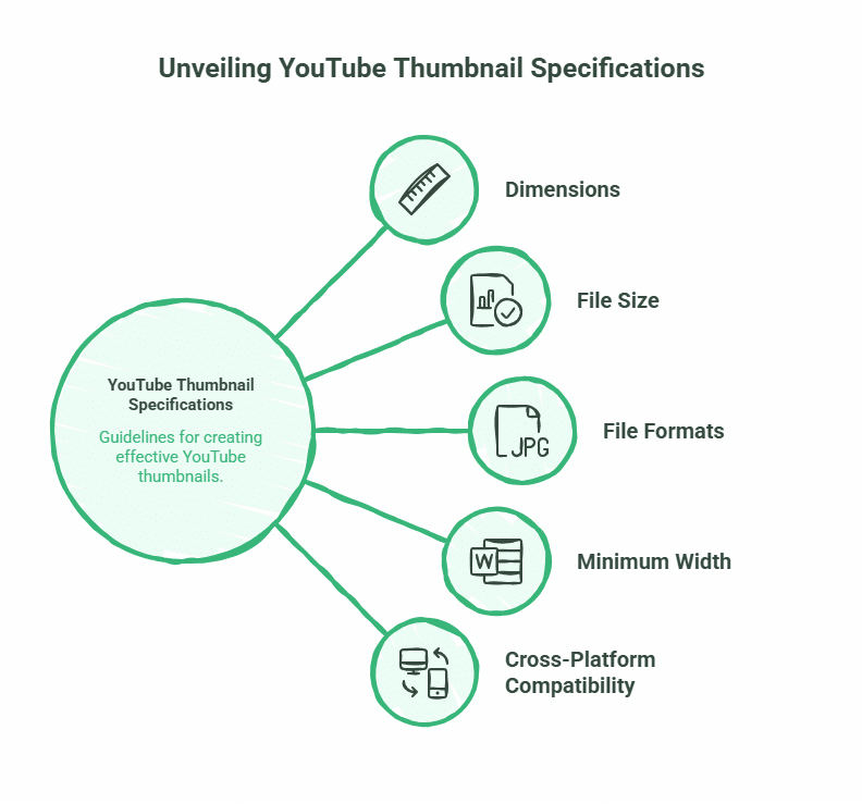
Before exploring design psychology when you create YouTube thumbnails, you need to understand YouTube’s technical requirements. Get these wrong, and your YouTube thumbnail will appear blurry or incorrectly cropped across devices.
Essential specifications for YouTube thumbnails:
- Dimensions: 1280 x 720 pixels minimum (16:9 aspect ratio)
- File size: Under 2MB
- Formats: JPG, PNG, or GIF (JPG recommended for smaller file sizes)
- Minimum width: 640 pixels
YouTube displays thumbnails at various sizes depending on where they appear. Search results, suggested videos, and embedded players all show different dimensions. The 1280 x 720 specification ensures your YouTube thumbnails remain sharp across all placements.
Why these numbers matter: YouTube compresses uploaded images. Starting with a high-resolution file (1280 x 720) gives the compression algorithm more data to work with, resulting in a sharper final image. Upload anything smaller, and you’ll see pixelation, particularly on larger screens.
For Belfast businesses learning how to create YouTube thumbnails, we recommend using design platforms like Canva, which provides pre-sized YouTube thumbnail templates. These templates match YouTube’s specifications exactly, eliminating guesswork when you create YouTube thumbnails.
“Most SMEs don’t realise that learning how to create YouTube thumbnails properly directly impacts their video’s algorithmic performance,” says Ciaran Connolly, founder of ProfileTree. “YouTube’s algorithm considers click-through rate when recommending videos. Better YouTube thumbnails mean more clicks, which signals to YouTube that your content deserves wider distribution.”
The Psychology of the Click: 5 Elements of Good YouTube Thumbnails
Understanding what makes good YouTube thumbnails requires looking at visual psychology and mobile behaviour patterns. When you create YouTube thumbnails, remember that most YouTube views happen on mobile devices, where thumbnails appear small and compete for attention in a feed full of similar content.
Emotional Faces and the “Stop Scroll” Effect
Human faces trigger immediate attention when you create YouTube thumbnails. Faces with clear emotional expressions (surprise, excitement, curiosity) perform better than neutral expressions or no faces at all in YouTube thumbnails.
The expression should match your video’s content. A shocked face works for surprising revelations. A focused, serious expression suits professional tutorials. Avoid forced or exaggerated expressions that feel inauthentic—viewers have developed strong filters for “clickbait faces” that overpromise.
High Contrast and Colour Psychology
Your thumbnail needs to stand out in a feed where dozens of other videos compete for attention. High contrast between your subject and background creates visual separation that catches the eye.
Colour choices matter:
- Red: Creates urgency and grabs attention (use sparingly)
- Blue: Professional and trustworthy (works well for business content)
- Yellow/Orange: Energetic and optimistic (good for entertainment)
- Green: Growth and positivity (suits educational content)
Dark backgrounds with bright subjects or text create a strong contrast. This approach works particularly well for mobile viewing and YouTube’s Dark Mode interface, which 70%+ of users enable.
Text That Communicates Instantly
When you create YouTube thumbnails, text should be minimal and instantly readable. Aim for 3-5 words maximum on your YouTube thumbnails. Any more and viewers won’t process it in the half-second they spend scanning your thumbnail.
Typography principles for good YouTube thumbnails:
- Use bold, sans-serif fonts (Arial Black, Impact, Bebas Neue)
- High contrast between text and background (white text on dark backgrounds or black text on light backgrounds)
- Avoid decorative fonts that sacrifice readability
- Include a subtle drop shadow or outline to ensure text remains readable over busy backgrounds
Your thumbnail text should complement your title, not duplicate it. If your title is “How to Create YouTube Thumbnails That Get More Clicks,” your thumbnail might say “More Clicks” or “Thumbnail Tips.”
The Rule of Thirds and Mobile Layout
The rule of thirds divides your YouTube thumbnail into a 3×3 grid. Placing key elements at the intersection points creates balanced, professional-looking compositions that guide the viewer’s eye when you create YouTube thumbnails.
For mobile viewing specifically, consider the “Z-pattern”—the path most eyes follow when scanning content. Place your most important element (usually a face or main subject) in the top-left quadrant, with supporting text or graphics forming a Z across the frame.
Remember that on mobile devices, YouTube overlays a video duration timestamp in the bottom-right corner of thumbnails. Keep that area clear of important visual elements or text when you make YouTube thumbnails.
The “3-5-1 Rule” for Creating YouTube Thumbnails
This framework simplifies how to create YouTube thumbnails:
- 3 words maximum on your YouTube thumbnail
- 5 seconds for a viewer to understand what your video offers
- 1 clear focal point (face, object, or text block)
Following this rule when you create YouTube thumbnails prevents cluttered, confusing designs that fail to communicate value quickly.
Mastering YouTube’s Test and Compare Feature
YouTube now provides native A/B testing for thumbnails through its “Test and Compare” tool. This feature represents the most significant thumbnail optimisation opportunity that most creators ignore.
The tool works by showing different thumbnail versions to portions of your audience, then measuring which generates higher click-through rates. After collecting sufficient data (typically 7-14 days), YouTube declares a winner, and you can apply it permanently.
How to Set Up A/B Tests in YouTube Studio
Access the feature through YouTube Studio:
- Navigate to Content > Select your video
- Click the three-dot menu > “Thumbnail test”
- Upload 2-3 thumbnail variations
- YouTube automatically distributes them to your audience
- Review results after the test period
What to test:
- Text vs. no text
- Different facial expressions
- Various colour schemes
- Subject positioning (left vs. centre vs. right)
- Background complexity (simple vs. detailed)
Start with significant differences between variations. Testing a blue background against a green background provides clearer insights than testing two similar shades of blue.
Interpreting Test Results
YouTube provides click-through rate data for each thumbnail variant. The winning thumbnail typically shows a 0.5-2% CTR improvement over alternatives. This might seem small, but across thousands of impressions, it translates to hundreds of additional views.
Look beyond just the winner. Analyse why one thumbnail outperformed others. Was it the colour scheme? The text? The composition? These insights inform future thumbnail creation.
Be cautious with small sample sizes. A thumbnail that wins with only 100 impressions hasn’t proven itself. YouTube typically needs 1,000+ impressions per variant to generate statistically meaningful results.
Creating YouTube Thumbnails for Mobile Dark Mode
YouTube’s Dark Mode interface has fundamentally changed how to create YouTube thumbnails. What worked on bright white backgrounds now fails against dark grey or black when you make YouTube thumbnails for today’s viewers.
Dark Mode intensifies colours and increases contrast in YouTube thumbnails. Thumbnails that looked balanced in Light Mode may appear oversaturated or lose definition in Dark Mode.
Design adjustments when you create YouTube thumbnails for Dark Mode:
- Add outer glows or bright borders around subjects to create separation from dark backgrounds
- Increase the brightness of key elements by 10-15%
- Use neon or highly saturated accent colours sparingly for emphasis
- Test YouTube thumbnails against both light and dark backgrounds before publishing
The majority of YouTube views now happen on mobile devices with Dark Mode enabled. Designing exclusively for Light Mode means your YouTube thumbnails perform poorly for most viewers.
Step-by-Step: How to Make YouTube Thumbnails from Scratch
Let’s walk through the practical process of how to create YouTube thumbnails using free tools. This step-by-step guide shows you how to make YouTube thumbnails that generate clicks.
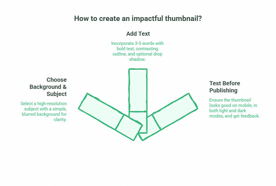
Choosing Your Background and Subject
Start with a clear, high-resolution image of your main subject when you create YouTube thumbnails. This might be a still frame from your video, a custom photograph, or a designed graphic.
Your background should support your subject without competing for attention in your YouTube thumbnail. Simple, slightly blurred backgrounds work well. Solid colours with subtle gradients create professional results without complexity.
For Belfast businesses producing video content and learning how to make YouTube thumbnails, we often photograph thumbnail subjects separately with proper lighting, then composite them onto designed backgrounds. This approach gives complete control over the final result when you create YouTube thumbnails.
Adding Text That Works
Open your design tool (Canva, Photoshop, or similar) and add your 3-5 word text block. Place it in a position that doesn’t obscure your subject’s face or key visual elements.
Layer your text with:
- The main text (white, black, or brand colour)
- A contrasting outline (2-3 pixel thickness)
- A subtle drop shadow (optional, for added depth)
This layering ensures readability across all backgrounds and viewing modes.
Testing Before Publishing
Before finalising your YouTube thumbnails:
- View it at mobile size (scale it down to roughly phone screen dimensions)
- Check it against both light and dark backgrounds
- Show it to someone unfamiliar with your video and ask: “What do you think this video is about?” Their answer reveals whether your YouTube thumbnail communicates clearly
Upload multiple versions to YouTube’s Test and Compare feature if you’re uncertain which performs best when you create YouTube thumbnails.
For businesses managing multiple channels or producing video content at scale, ProfileTree’s video marketing services include professional thumbnail design optimised for your specific audience and industry. We help Belfast businesses learn how to create YouTube thumbnails that consistently drive clicks.
AI-Generated Thumbnails: Using Tools Wisely
AI image generators now produce thumbnail graphics in seconds. Tools like Midjourney, DALL-E, and Stable Diffusion can create custom imagery without photography or complex design skills.
The benefit is speed and cost. The risk is “AI fatigue”—viewers increasingly recognise AI-generated faces and imagery, which can reduce trust and click-through rates.
When AI works well:
- Abstract backgrounds and patterns
- Supplementary graphics and icons
- Text effects and stylised elements
Where AI struggles:
- Authentic human expressions (often appear uncanny or artificial)
- Hand and finger details (frequently malformed)
- Text within images (usually illegible)
If using AI-generated elements, combine them with real photographs or professional design elements. Hybrid approaches balance efficiency with authenticity.
UK Copyright Considerations for Thumbnails
Using images, logos, or content from other sources in your thumbnails carries copyright implications. UK copyright law differs from the US Fair Use provisions that many online tutorials reference.
UK Fair Dealing exceptions allow limited use of copyrighted material for:
- News reporting and commentary
- Criticism and review
- Parody and pastiche
These exceptions have stricter requirements than the US Fair Use. Simply including a branded product or celebrity image because your video discusses them doesn’t automatically qualify.
Safer approaches:
- Use royalty-free image libraries (Unsplash, Pexels, Pixabay)
- Create original photography or graphics
- Purchase stock images with commercial licences
- Use official press materials when provided
For businesses producing regular video content, developing a library of owned thumbnail assets eliminates copyright concerns entirely. This is part of the content strategy work we develop with Belfast clients, creating YouTube channels.
Common Mistakes That Kill Click-Through Rates
Even experienced creators make thumbnail mistakes that suppress their video’s performance. Avoid these:
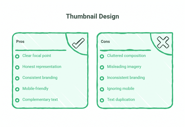
Cluttered compositions: Too many elements, colours, or text blocks create visual confusion. Viewers scroll past rather than attempt to decode your thumbnail.
Misleading imagery: Using shocking or provocative thumbnails that don’t match your video’s actual content generates clicks but also immediate bounces. YouTube’s algorithm interprets this as poor content and reduces your video’s distribution.
Inconsistent branding: Constantly changing thumbnail styles makes your channel look disorganised and unprofessional. Develop a consistent visual identity that makes your videos instantly recognisable.
Ignoring mobile: Designing thumbnails on a large desktop monitor, then never checking how they appear on phones. Text that’s readable at desktop size becomes microscopic on mobile.
Text duplication: Repeating your exact video title as thumbnail text wastes space and provides no additional information. Your thumbnail should add context, not repeat what viewers already see.
The Thumbnail Performance Checklist
Before publishing any video, verify your thumbnail meets these standards:
- ✓ 1280 x 720 pixels, under 2MB file size
- ✓ 3-5 words maximum (or no text if imagery is self-explanatory)
- ✓ Clear focal point in upper-left or centre of frame
- ✓ High contrast between subject and background
- ✓ Readable at mobile thumbnail size
- ✓ Tested against both Light and Dark Mode backgrounds
- ✓ No important elements in the bottom-right corner (timestamp area)
- ✓ Consistent with your channel’s visual branding
- ✓ Subject’s face (if included) shows clear emotional expression
- ✓ No copyrighted imagery without a proper licence
Run through this checklist for every video. Consistency in quality drives consistent performance.
What Makes a Good Click-Through Rate?
Benchmarks vary significantly by niche, but general guidelines help you assess your performance:
- Entertainment/lifestyle: 8-12% CTR indicates strong performance
- How-to/tutorials: 5-8% CTR is solid
- Professional/business: 3-5% CTR is typical
- Niche technical content: 2-4% CTR is acceptable
New channels typically see lower CTRs as they build audience familiarity. An established channel with recognisable branding often achieves higher CTRs than raw content quality alone would predict—viewers click because they trust your channel.
Focus on improving your own CTR over time rather than comparing against arbitrary benchmarks. A 1-2% improvement in CTR can double your video’s views over its lifetime.
How ProfileTree Supports Video Marketing Success
Creating thumbnails that consistently drive clicks requires understanding design principles, audience psychology, and YouTube’s evolving platform features. For Belfast businesses producing video content, this expertise compounds across multiple videos and campaigns.
ProfileTree works with SMEs across Northern Ireland and the UK to develop video marketing strategies that generate measurable results. This includes:
- Professional thumbnail design optimised for your industry and audience
- YouTube channel setup and optimisation
- Video production and editing services
- Analytics review and performance optimisation
- Training your team to create effective video content independently
Whether you need one-off support or ongoing video marketing management, we tailor our approach to your business goals and budget.
Take Action: How to Create YouTube Thumbnails That Work
You now understand the technical requirements, design psychology, and testing tools that drive thumbnail performance. The difference between YouTube videos that succeed and those that stagnate often comes down to learning how to create YouTube thumbnails properly.
Start with your next video. Apply the 3-5-1 rule when you create YouTube thumbnails (three words, five seconds to comprehend, one focal point). Design for mobile first. Test multiple versions through YouTube’s native tools. Track your CTR improvements.
For businesses producing video content across multiple channels, or those wanting to develop professional-grade YouTube thumbnails without the design learning curve, get in touch with ProfileTree. We help Belfast businesses and UK SMEs learn how to make YouTube thumbnails and create video marketing strategies that generate real business results—from initial concept through to thumbnail optimisation and performance analysis.
Frequently Asked Questions
What is the best free YouTube thumbnail maker?
Canva provides the most comprehensive free thumbnail creation tools. It offers pre-sized YouTube templates, extensive font libraries, and stock images. Adobe Express offers similar functionality. Both platforms work in-browser without software installation.
Can I use AI to generate YouTube thumbnails?
Yes, but with caution. AI image generators create custom graphics quickly but often produce faces that look artificial or “off.” Hybrid approaches work best—use AI for backgrounds or graphic elements, then combine with real photographs. Test AI-generated thumbnails against traditional designs to see what your audience prefers.
How many words should be on a thumbnail?
Three to five words maximum. Mobile viewers process thumbnails in under a second. More text reduces readability and comprehension. Many high-performing thumbnails use zero text, relying entirely on strong imagery.
Does the thumbnail text have to match the video title?
No. Your thumbnail should complement your title, not duplicate it. If your title is “How to Create YouTube Thumbnails That Get More Clicks,” your thumbnail might show “Design Tips” or simply a strong visual with no text. The combination of title and thumbnail should tell a complete story.
What is a good CTR for a YouTube thumbnail?
This varies by niche. Entertainment channels often see 8-12% CTRs, while professional/business content typically achieves 3-5%. Focus on improving your own CTR over time rather than comparing against others. A 1% CTR improvement can significantly increase your video’s total views.
Why does my thumbnail look blurry?
YouTube compresses uploaded images. If you upload anything smaller than 1280 x 720 pixels, compression artefacts become visible. Always start with files at or above the recommended resolution. Save JPGs at 90-95% quality for optimal balance between file size and clarity.
Can I change my thumbnail after publishing?
Yes. YouTube allows unlimited thumbnail changes. Many creators improve thumbnails for older videos when they identify better design approaches. Use YouTube’s analytics to identify videos with low CTRs, then test improved thumbnails to boost their performance.
Should my thumbnail include my face?
Human faces attract attention and generate trust. Videos with faces in thumbnails typically achieve higher CTRs than those without. The exception: channels where brand consistency matters more than personality, or content where the visual subject (product, location, concept) is more compelling than a face.