Creating Professional Designs with Canva: UK Business Guide
Table of Contents
Canva has become one of the most widely used design platforms for SMEs across the UK and Ireland, and for good reason. It removes the barrier between a blank page and a polished graphic without requiring years of design training.
That said, most guides stop at “drag, drop, download.” This one goes further. Below, you will find the design principles behind professional output, a walkthrough of Canva’s most overlooked features, and the technical specifications UK businesses need when sending files to print.
From building a consistent brand identity to exporting correctly for A4 print, this guide covers everything you need to create professional designs with Canva. Learn what separates a template-generated graphic from something that genuinely reflects your brand.
Core Design Principles for a Professional Finish

Choosing a polished template is only the starting point. What makes a design look professional is not the template itself, it is the deliberate application of design theory to every element you place on the canvas. Understanding a handful of foundational principles will improve every graphic you create, regardless of the tool you use.
If you are also producing video or motion content alongside your static designs, Canva’s role in a broader marketing strategy is worth reading before you build your first set of assets.
Visual Hierarchy and the F-Pattern
Eye-tracking research consistently shows that readers scan screens in an F-shaped pattern, moving left to right across the top, then down the left margin in shorter horizontal sweeps. Designing with this in mind means placing your most important message at the top left, using size and weight to guide the eye downward.
In Canva, you control hierarchy through font size, contrast, and placement. A heading set at 48pt draws attention before body copy at 14pt. A bold, dark element on a light background registers before a lighter one. Never assume the viewer will read your design top to bottom in sequence; design for the scan.
The Rule of Odds and Negative Space
Designs built around an odd number of elements (one, three, or five focal points) tend to feel more natural than even groupings, which can look rigid or overly symmetrical. When you are arranging product shots, icons, or feature blocks in Canva, group them in threes rather than pairs or fours wherever the layout allows.
Negative space, the empty area around and between elements, is just as functional as the content it surrounds. Crowding a design with text and imagery to fill every pixel is one of the most common signs of an amateur output. White space signals confidence and makes each element easier to process individually.
Colour Theory: Moving Beyond Default Palettes
Canva’s suggested colour combinations are a reasonable starting point, but they are also used by thousands of other businesses. Professional colour work begins with understanding relationships between hues: complementary colours sit opposite each other on the colour wheel and create contrast; analogous colours sit adjacent and feel harmonious; triadic combinations use three evenly spaced hues for vibrancy without clashing.
For most SMEs, a working palette of three to four colours is sufficient. Define a primary colour, a secondary that complements it, a neutral (usually off-white or warm grey), and one accent for calls to action. Resist the temptation to introduce additional hues as the design grows. If you want to explore the psychological impact of colour choices in more detail, colour scheme principles covers the theory behind palette decisions.
Setting Up Your Professional Brand Kit
A Brand Kit is one of Canva Pro’s most valuable features for any business producing design assets at volume. It centralises your colours, fonts, and logos in one place so that every team member starts from the same foundation, regardless of what they are creating or who created the previous version.
Northern Ireland businesses attending events or collaborating with agencies across Belfast and beyond will recognise how quickly brand inconsistency emerges when multiple people handle design independently. If you want regional context on where those businesses operate, Connolly Cove’s guide to Northern Ireland’s top cities gives a sense of the commercial landscape across the region.
Building a Unified Brand Identity
Open the Brand Kit from the left sidebar in Canva Pro and add your exact hex colour codes, not approximations. Upload your logo in multiple formats (PNG with transparent background, SVG if available) and set your primary and secondary typefaces. Every design you subsequently create will have these assets one click away.
The practical difference is significant. Without a Brand Kit, designers pull from memory or previous files, introducing slight variations in colour codes and font weights that accumulate into a visually inconsistent brand over time. With it, consistency becomes the default rather than the exception. If your brand strategy needs development before you formalise it in Canva, brand storytelling examples illustrates how leading brands build coherent visual narratives.
Maintaining Consistency Across Platforms
A Brand Kit becomes most useful when your team is producing content across multiple channels simultaneously: a social media graphic on Tuesday, a printed flyer on Wednesday, an email header on Thursday. Each format has different dimensions and colour rendering requirements, but the brand elements themselves should remain identical.
Canva’s Magic Resize feature (Pro) lets you adapt a single design to multiple formats without rebuilding from scratch. The Brand Kit means that when the resize happens, fonts and colours carry over accurately rather than defaulting to Canva’s substitutes. Set up template files for your most frequently used formats, save them to a shared team folder, and treat them as the only starting point for new designs.
Logo Hierarchy and Usage Rules
A Brand Kit should reflect the same logo hierarchy you use in your brand guidelines: primary logo, horizontal variant, icon-only version, and reversed (white) version for dark backgrounds. Uploading all variants means designers can select the appropriate version for each context without improvising.
Set clear rules within your team about which version applies where. The primary logo on a white background, the reversed version on a navy or dark photograph, the icon-only version at small sizes where the full logotype becomes illegible. These decisions, made once and embedded in shared templates, prevent the kind of ad hoc logo usage that gradually erodes brand recognition.
Advanced Canva Pro Workflows for Teams
For small businesses managing design independently, the free version of Canva covers the basics. For teams producing content at scale, Canva Pro introduces workflow features that save substantial time and reduce the risk of version-control errors. The comparison below sets out where the meaningful differences lie.
| Feature | Canva Free | Canva Pro |
|---|---|---|
| Brand Kit | Limited (1 kit) | Multiple kits, full asset library |
| Background Remover | Not included | Included |
| Magic Resize | Not included | Included |
| Custom Font Upload | Not included | Included |
| PDF Print Export (CMYK) | Not included | Included |
| Team folders and permissions | Basic sharing | Full folder structure and roles |
| Storage | 5GB | 1TB |
All prices and figures in this guide are indicative UK examples and correct at the time of writing; use them as a benchmark rather than fixed quotations.
For teams producing content frequently, the time saved by Magic Resize and the Background Remover alone tends to justify the subscription cost within the first month of regular use.
Using Magic Studio for Faster Workflows
Canva’s AI suite, Magic Studio, includes several tools that reduce repetitive design tasks. Magic Write generates copy suggestions within designs; Magic Eraser removes unwanted background elements from photos; Magic Edit allows you to describe a change and have the AI apply it. These are production tools, not creative replacements.
The practical approach is to use Magic Studio for the mechanical parts of design work: removing backgrounds, resizing images, generating initial copy drafts, and producing variations of an existing asset. The design decisions, hierarchy, layout, colour, typography, remain yours.
AI-generated design elements benefit from the same critical eye as any other asset. If you want to understand how AI is reshaping content creation workflows more broadly, Canva’s AI features covers the full Magic Studio suite in depth.
Version Control and Collaborative Approval
Canva does not offer tracked changes in the way a word processor does, but it does provide version history (Pro) and commenting. Enable version history on key brand assets so you can roll back if a team member makes an unintended change. Use the commenting feature to keep feedback attached to the specific design rather than scattered across email threads.
For approval workflows, the most practical approach is to assign clear permissions: designers work in edit mode, stakeholders review in view-only mode and add comments, and a named design lead makes final changes before export. This mirrors a proper studio approval process and prevents the common problem of multiple people making conflicting edits simultaneously.
Technical Specs: Designing for the UK Market
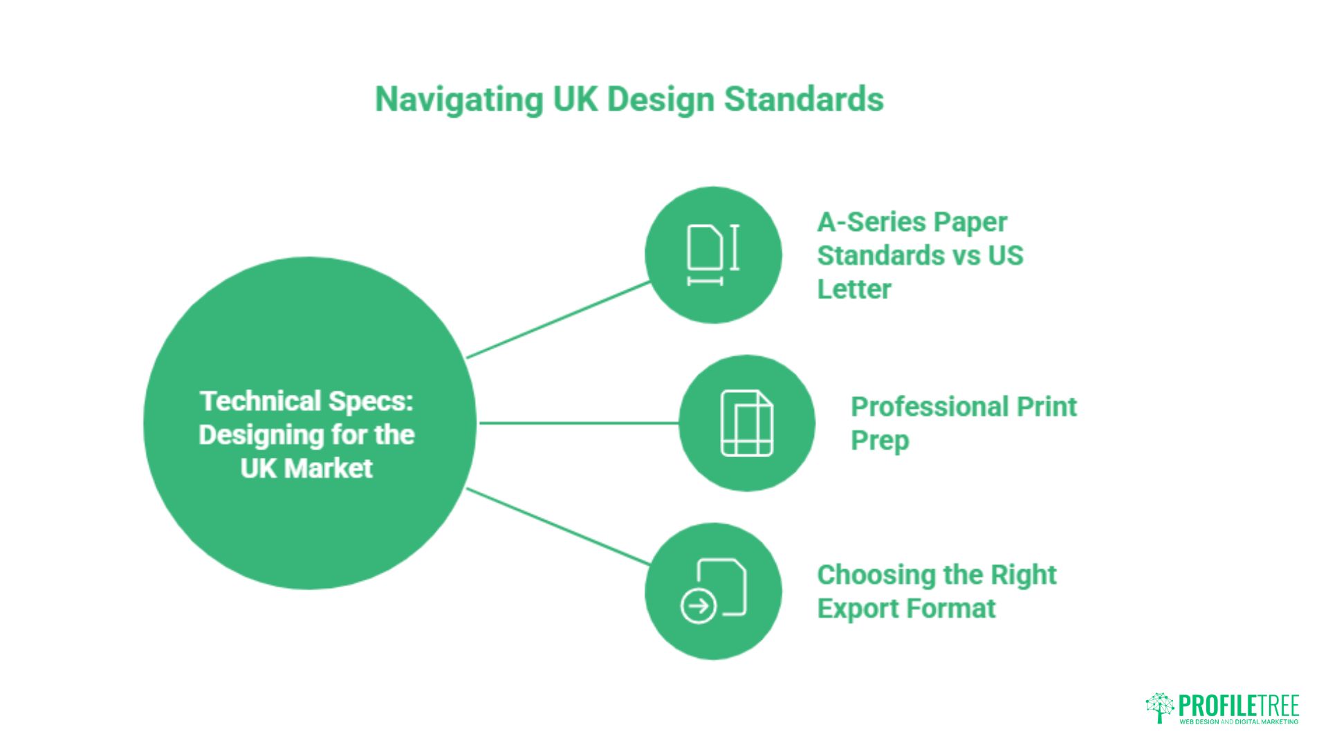
One of the most significant gaps in most Canva guides is the absence of UK-specific technical detail. American platforms default to US Letter (8.5 x 11 inches), US print standards, and RGB colour workflows. UK businesses printing through local suppliers need different settings, and getting them wrong can result in rejected files or colour shifts between screen and print.
Understanding where design sits within a broader digital marketing effort also matters. Graphic design in content marketing explores how visual assets support SEO, social reach, and conversion alongside their print function.
A-Series Paper Standards vs US Letter
UK printers use the ISO 216 A-series standard. The table below gives the dimensions you need when setting up documents in Canva for common UK print formats.
| Format | Dimensions (mm) | Common Use | Recommended DPI |
|---|---|---|---|
| A3 | 297 x 420mm | Posters, large flyers | 300 DPI |
| A4 | 210 x 297mm | Letterheads, brochures, reports | 300 DPI |
| A5 | 148 x 210mm | Flyers, booklets | 300 DPI |
| A6 | 105 x 148mm | Postcards, invitations | 300 DPI |
| Web/Screen | Variable (px) | Social media, email, digital ads | 72 DPI |
When creating a new design in Canva, select “Custom size” and enter the dimensions in millimetres. Add 3mm bleed on all sides (covered below) to the document size to give the printer the required margin.
Professional Print Prep: Bleed, Slug, and CMYK
Bleed is the area of your design that extends beyond the finished trim edge. UK printers typically require 3mm of bleed on all four sides, meaning an A5 flyer (148 x 210mm) should be set up at 154 x 216mm to include bleed. Any background colour or full-bleed image must extend to the bleed edge; if it stops at the trim line, a white strip will appear on the final printed piece.
In Canva Pro, enable bleed by going to File > Print bleed when exporting as a PDF for print. This adds the required margin and also applies crop marks, which show the printer exactly where to cut. Export using PDF Print (not PDF Standard), select CMYK colour space, and set resolution to 300 DPI. Screen-optimised RGB exports will produce noticeable colour shifts when put through a commercial printing press.
Choosing the Right Export Format
The export format determines both the quality and the usability of your file. Using the wrong one is one of the most common mistakes SMEs make when sending design assets to agencies, developers, or printers.
- PDF Print (CMYK, 300 DPI): Use for anything going to a UK print supplier. Retains vector text and paths where possible.
- PNG (transparent background): Use for logos, icons, and web graphics that need to sit on varying backgrounds. Lossless compression preserves sharp edges.
- SVG: Use for logos intended for web use, as SVG scales without quality loss at any size.
- JPG: Use for photographic content where file size matters and transparency is not required. Not appropriate for logos or graphics with text.
- MP4: Use for animated designs or presentations exported as video.
“One of the most common requests we receive from SMEs is to fix a design someone has already paid for,” says Ciaran Connolly, founder of ProfileTree. “In most cases, the design itself is fine, but the export format and colour profile are wrong. Getting the technical side right at the outset saves a significant amount of time and reprinting cost.”
Designing for Accessibility (WCAG 2.2)
Accessibility is a professional standard, not a bonus feature. For UK public sector organisations, meeting the Web Content Accessibility Guidelines (WCAG) 2.2 is a legal requirement under the Public Sector Bodies Accessibility Regulations 2018. For private sector businesses, accessible design widens your audience and signals professionalism. Canva includes an Accessibility Checker in Pro that flags common issues within your design before export.
Accessible design also tends to be better design. High-contrast text, clear hierarchy, and legible type sizes all improve comprehension for every reader, not just those with visual impairments. If you are producing infographics as part of your content output, creating infographics covers how to structure visual data so it communicates clearly across different viewing contexts.
Contrast Ratios and Colour Accessibility
WCAG 2.2 Level AA requires a contrast ratio of at least 4.5:1 between body text and its background, and 3:1 for large text (18pt or 14pt bold and above). In practice, this means dark text on a light background or light text on a dark background. Mid-tones and low-contrast combinations (pale grey text on white, yellow text on light orange) fail the standard and are difficult to read for a significant portion of your audience.
Use Canva’s colour contrast checker or a third-party tool such as the WebAIM Contrast Checker before finalising any design. Do not rely on how something looks on your monitor; calibration varies between screens and the standard exists for good reason.
Typography and Legibility
Body text in digital designs should sit at a minimum of 16px (approximately 12pt). Decorative or script fonts, however visually appealing, should be reserved for display headings only and never used for body copy or captions. Set line height at 1.5 times the font size for body text to give sufficient space between lines for comfortable reading.
Avoid justified text alignment in Canva designs intended for screen use. The uneven word spacing it creates in narrower columns reduces readability for users with dyslexia. Left-aligned text is the standard for body copy across digital contexts.
Alternative Text and File Accessibility
When exporting designs for use on a website or within a digital document, images require alternative text that describes the visual content for screen-reader users. Canva does not embed alt text in exported PNG or JPG files; this must be added within your CMS or document editor after export. PDF files exported from Canva Pro can include basic accessibility tagging, though complex layouts may require additional work in Adobe Acrobat Pro to meet full PDF/UA standards.
For web-published designs, consider whether the content could be delivered as HTML text with CSS styling rather than a flat image. A designed price table, for example, is far more accessible and indexable as HTML than as a PNG export of the same table.
Avoiding the “Canva Look”: Expert Design Tips
There is a recognisable aesthetic that emerges when a design relies too heavily on Canva’s default templates: certain font combinations, predictable layout patterns, and stock photos that appear on thousands of other businesses’ materials. Avoiding this does not require abandoning the platform; it requires using it more deliberately.
Professional design on any platform comes from applying principles to the tool rather than letting the tool dictate the design. The same logic applies to how Canva’s AI tools should be used: as accelerators for decisions you have already made, not as substitutes for those decisions.
Typography: Breaking the Default Pairing
Canva’s suggested font pairings are used by a large proportion of its user base. Uploading your own brand typefaces (Pro feature) immediately differentiates your output. If you do not have licensed fonts, choose from Canva’s library with intention rather than accepting the default. Pair a serif display face with a clean sans-serif body, or a geometric sans at large sizes with a humanist variant at reading sizes. Avoid using more than two typefaces in a single design.
Resist using the same font at multiple weights as a substitute for a genuine hierarchy. A title, subheading, body, and caption should feel visually distinct from each other through a combination of size, weight, and spacing, not just weight alone.
Stock Photography and Original Imagery
Stock photography from Canva’s library is convenient, but the most-used images are immediately recognisable. Where possible, use original photography from your business: real team members, real premises, real products. This also improves E-E-A-T signals if the design is published on your website, since Google specifically values original imagery over stock.
If you must use stock, filter by authenticity. Lifestyle photography with genuine human interaction, or high-quality abstract photography, tends to age better than the generic handshake-and-laptop imagery that dominated the early 2010s. Canva’s premium stock library (Pro) has broader selection than the free tier, but the selection principle remains the same.
Grid-Based Layout and the Professional Checklist
Canva’s grid tool (activated via the Elements panel) creates alignment guides so every element sits on a consistent structure. Designs built to a grid look intentional; designs that place elements by eye rarely achieve the same visual discipline. Enable guides, snap elements to them, and check alignment before export.
Before finalising any design, run through this checklist:
- Are all text elements aligned to a consistent grid or margin?
- Is the contrast ratio sufficient for all text against its background?
- Are no more than two typefaces in use?
- Does the design include bleed if going to print?
- Is the export format appropriate for the intended output?
- Does the design use your exact brand hex codes, not approximations?
- Have you removed any default Canva elements not central to the design?
- Does the design communicate its primary message within two seconds of viewing?
Conclusion
Canva is a capable platform when used with design knowledge behind it. The businesses that get the most from it are those that treat it as a professional tool with rules and constraints, not a shortcut past design thinking. Apply the principles in this guide and your output will read as considered rather than templated.
If your brand needs more than a design tool can provide, ProfileTree’s content marketing services cover strategy, production, and digital distribution for SMEs across Northern Ireland and the UK. Get in touch to discuss what your brand needs next.
FAQs
Is Canva Pro worth it for professional designers?
For professional use, yes. The key features that justify the cost are the Brand Kit (unlimited), Magic Resize, Background Remover, custom font upload, and CMYK PDF export. Teams producing content regularly will recover the subscription cost in time saved within weeks.
Can Canva be used for professional graphic design?
Canva is well-suited for marketing collateral, brand assets, social media graphics, presentations, and print-ready materials at standard commercial quality. It is not a substitute for specialist software (Adobe Illustrator or InDesign) in contexts requiring complex vector illustration, multi-page publication layout, or advanced typographic control.
How do I keep my colours consistent when printing?
Export your file as a PDF, print from Canva Pro, and select the CMYK colour space option. Canva’s default export is RGB, which is designed for screen display. Commercial printing presses use CMYK, and converting an RGB file at the printer’s end can produce noticeable colour shifts, particularly in blues and oranges. Set your brand colours in CMYK values from the outset and verify with a physical proof before a full print run.
How do I export high-quality designs for UK print?
Use PDF Print export at 300 DPI with bleed enabled. Set your document size to include 3mm bleed on all sides beyond the finished trim size. Select CMYK colour space. For standard A4 output, this means your Canva canvas should be 216 x 303mm before export. Submit the PDF with crop marks to your print supplier; most UK printers (Solopress, Moo, VistaPrint UK) accept this format directly.
What is the best file format for a professional logo in Canva?
Export logos as SVG (for web and developer use, scales without quality loss) or as a high-resolution PNG with a transparent background (for print and presentation use). Avoid JPG for logos as it does not support transparency and introduces compression artefacts around edges. If you need a print-ready version, PDF Print export from Canva Pro preserves vector paths where the design allows.