
Twitter Dimensions: The Complete Image and Video Size Guide
Table of Contents
Twitter dimensions come down to three numbers for most uploads: 400 x 400 pixels for a profile picture, 1500 x 500 pixels for a header, and 1200 x 675 pixels for a single post image. Everything else on X is a variation on those ratios. This guide covers exact Twitter dimensions for every image, video and card format, including Twitter header size, Twitter image size, Twitter post size and Twitter post dimensions, plus the parts most guides skip: the safe zone that stops a header cropping badly on mobile, the vertical sizes that now hold more screen space in mobile feeds, the real reason uploads turn blurry, and the current upload limits by account tier.
A header cropped by the profile picture, a post image squeezed into an odd ratio, or a blurry logo tells potential customers a business hasn’t sorted the basics. The specifications below are the ones ProfileTree’s social media marketing services team works to when building assets for client accounts across Northern Ireland, Ireland and the UK. Whether you manage one company account or run social profiles for several clients, use this as a working reference: check the cheat sheet, then read the sections that affect the assets you’re building this week.
Quick Reference: Twitter Dimensions Cheat Sheet
Before the details, here are the Twitter dimensions you’ll reach for most often: Twitter header size, Twitter profile picture size, Twitter post size, Twitter post dimensions and Twitter image size across every format X supports. Save this table and check it before every upload; getting the aspect ratio right the first time avoids the re-export and re-upload cycle that wastes half an hour before a launch. Print it, pin it to your team’s shared drive, or drop it into your content calendar template so nobody has to search for these numbers mid-campaign.
| Type | Recommended size | Aspect ratio | Max file size |
|---|---|---|---|
| Profile picture | 400 x 400 px | 1:1 | 2 MB |
| Header image | 1500 x 500 px | 3:1 | 5 MB |
| Single post image | 1200 x 675 px | 16:9 | 5 MB |
| Vertical post image | 1080 x 1350 px | 4:5 | 5 MB |
| Square post image | 1080 x 1080 px | 1:1 | 5 MB |
| Multi-image post (2 to 4 photos) | 1200 x 1200 px | 1:1 | 5 MB per image |
| Video (landscape) | 1280 x 720 px | 16:9 | 512 MB (free accounts) |
| Video (vertical) | 1080 x 1920 px | 9:16 | 512 MB (free accounts) |
| Animated GIF | 800 x 450 px | 16:9 | 15 MB (web), 5 MB (mobile) |
| X Card image | 800 x 418 px | 1.91:1 | 5 MB |
| In-stream ad image | 1200 x 675 px | 16:9 | 5 MB |
Profile Picture and Header Image Dimensions
our Twitter profile picture size and Twitter header size are the first Twitter dimensions worth getting right, since they appear on every post, reply and mention. Get these wrong, and even strong content looks amateur before anyone reads a word.
The recommended Twitter profile picture size is 400 x 400 pixels, uploaded as a square. X applies a circular crop automatically, so keep your logo or headshot centred; anything near the corners gets cut off. The minimum accepted size is 200 x 200 pixels, files must stay under 2 MB, and JPG, PNG or GIF all work. What matters more than the upload size is how the image renders in context: your profile picture displays at roughly 48 pixels in a busy timeline and around 200 pixels on the profile page itself. A detailed logo that reads clearly on your monitor can turn to mush at timeline size, so test it small before you commit.
The Twitter header size sits at 1500 x 500 pixels, a 3:1 horizontal banner capped at 5 MB. This space works well for a service statement, a seasonal campaign or a project highlight, but resist the urge to pack it with text. A header competes with your bio for attention, not replaces it.
The Safe Zone: Why Your Header Gets Cropped
Most guides publish the Twitter header size and stop there, which is why so many headers still look wrong once they’re live. The profile picture overlaps the bottom left corner of the header on both mobile and desktop, and navigation buttons sit over parts of the image on mobile in particular. Keep your logo, key text and any faces within the centre and right two-thirds of the header, treat the bottom 15 to 20% as unusable for anything you need visible, and assume the top and bottom edges may trim slightly depending on screen size.
“The biggest mistake we see is a header designed purely for a desktop preview. Test it on a phone before it goes live, because that’s where most of a brand’s audience will actually see it.” (Ciaran Connolly, founder of ProfileTree)
Build a simple template with those safe margins marked out once, and every future header takes minutes rather than a full redesign each time something needs updating. A 1500 x 500 pixel canvas with a 300 x 300 pixel guide circle marked in the bottom left corner covers most of the problem. The same discipline applies to your Twitter profile picture size; test both together, since a profile picture and header sit side by side on every visit to your profile.
Post Image Dimensions and Aspect Ratios
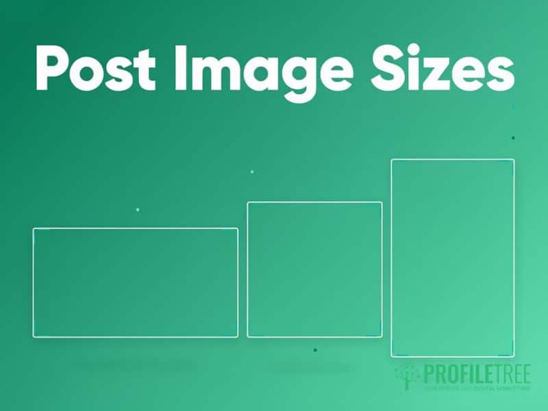
Getting Twitter dimensions right for individual posts affects whether X expands your image in the timeline or squashes it into a small, easy-to-scroll-past thumbnail. The recommended Twitter post size and Twitter post dimensions for a single photo are 1200 x 675 pixels, a 16:9 ratio that displays at full width and reads clearly on both desktop and mobile. If you need more pixel headroom for a detailed graphic, 1600 x 900 pixels holds the same ratio and survives compression slightly better.
X accepts aspect ratios between 2:1 and 1:2 for Twitter image sizes across every post; anything more extreme than that gets cropped automatically, often cutting off exactly the part of the image you wanted to see. Square images (1:1) display, but at a smaller width than a horizontal image, so they’re a weaker choice for portfolio shots or before-and-after comparisons where detail matters. Very tall portrait images suffer the most under this rule; a full-length photo often loses its top and bottom in the timeline crop, so reframe extreme portrait source material before it goes anywhere near a post.
If you’re publishing a series, a case study or a step-by-step guide across several posts, plan the crop before you shoot rather than after. A quick storyboard showing each image at its final Twitter post dimensions saves a reshoot later, and it’s a habit worth building into any content calendar produced through ProfileTree’s content marketing services.
Multi-Image Posts: How Many Photos Can You Add
X currently allows up to four images in a single post, and the platform arranges them differently depending on how many you upload. Two images each display at 700 x 800 pixels, three show one larger image alongside two smaller ones, and four are arranged into an even grid at 700 x 360 pixels each. Because X crops every layout into these fixed shapes from the centre outward, square images at 1200 x 1200 pixels are the safest Twitter post size for multi-image posts; horizontal or portrait photos get cropped to fit, sometimes losing the point of the image altogether.
For a step-by-step post or a before-and-after set, this matters more than it looks. Plan each image to work as a stand-alone square before you upload the set, rather than hoping the crop lands somewhere sensible. Keep faces, text and any key detail in the middle of each frame, then check how the post renders on both a phone and a desktop browser before a campaign goes live; the grid layout can shift a subject’s position enough to change what a viewer notices first.
Vertical and Square Sizes for a Mobile-First Feed
The 16:9 post image is still the safe default, but it is no longer the only sensible choice. Most X usage is mobile, and a 4:5 vertical image at 1080 x 1350 pixels occupies noticeably more screen height in a phone feed than a 16:9 landscape image does. Social teams have borrowed the format from Instagram for exactly that reason: more vertical space means more time in view before a thumb moves the post off screen.
The trade-off is desktop. A 4:5 image displays with padding on either side in a desktop timeline and looks smaller relative to the column than a landscape image does. If your audience is business decision-makers browsing at a desk, landscape still serves you better. If you’re targeting a consumer audience scrolling on a phone at lunchtime, vertical earns its place.
Three sizes cover practically everything:
- 1200 x 675 px (16:9) for announcements, data graphics, screenshots and anything with fine detail or wide text
- 1080 x 1080 px (1:1) for multi-image sets, quote cards and anything that also needs to work on Instagram or LinkedIn
- 1080 x 1350 px (4:5) for single mobile-first posts where screen presence matters more than desktop polish
Anything taller than 4:5 starts risking the automatic crop, so treat 1080 x 1350 as the practical ceiling for a still image rather than pushing to full 9:16. Test one campaign each way and compare the engagement data from your own account rather than assuming a format works; audiences differ enough between sectors that a general rule is a weaker guide than a fortnight of your own numbers.
Video and GIF Dimensions on X
Twitter dimensions for video work differently from still images, and video content on X gets more attention than static posts in most feeds. The technical specifications matter more here than almost anywhere else, since a badly encoded upload can look soft or stutter regardless of how good the source footage was.
The recommended video size is 1280 x 720 pixels at 16:9, with 16:9, 1:1 and 9:16 all supported, depending on where the clip will be watched. Horizontal video suits most business content and displays well across devices; vertical at 1080 x 1920 pixels works for mobile-first clips but looks small on a desktop timeline. The upload ceiling is 1920 x 1200 pixels, so exporting at 1080p gives you the cleanest result: send X a 4K file and it downscales server-side, which hands control of the compression to the platform.
Format matters as much as size. X accepts MP4 and MOV containers with H.264 video and AAC audio, and an audio track is required even for a silent clip. Footage recorded on an iPhone with default settings is usually HEVC (H.265), which the web uploader still rejects, so re-encode to H.264 before you try to post. Variable frame rate files from screen recorders cause the same class of upload failure. Frame rates up to 60fps are supported, though 30fps keeps file sizes manageable for most business content.
Free Accounts vs Higher Upload Tiers
Free X accounts work within a hard cap of 140 seconds (2 minutes 20 seconds) and 512 MB per upload, which suits most promotional clips and short case study videos comfortably. That 140-second limit applies to every free account on every device, and it also applies to posts made through the API and most third-party scheduling tools regardless of what tier the account sits on.
X Premium subscribers can post far longer videos, running to multiple hours from the web at x.com and from iOS, with correspondingly larger file allowances. Two caveats catch people out. Uploads from the Android app remain capped at roughly 10 minutes even on a paid tier, and the longest uploads step down in resolution to stay inside the file ceiling. Standard promoted video is still capped at 140 seconds unless an advertiser has arranged an extension through their account contact. Confirm the current tier-specific limits in your account settings before planning a longer upload, since X revises these allowances periodically.
Animated GIFs follow a simpler rule: 800 x 450 pixels at 16:9, with a 15 MB cap on the web and 5 MB on mobile. X converts every GIF to video internally for smoother playback, but the upload limits still apply as published. Keep colour counts and frame counts low to hit those file sizes without a visible drop in quality.
Add captions to every video you publish. Many people scroll with sound off, particularly in a work setting, and captions make your content usable for anyone who’s deaf or hard of hearing. If native X video is part of a wider content plan, ProfileTree’s video marketing team can help you shoot and edit once, then cut versions sized correctly for X, Instagram and YouTube from the same footage.
Twitter Card and Ad Image Dimensions
Twitter Card dimensions are the Twitter dimensions most businesses overlook, yet they shape how your website looks every time someone shares a link on X. When a link is posted, X pulls a card image and description from that page’s metadata rather than the tweet text alone. Getting this Twitter image size right lifts click-through rates noticeably compared with a plain text link, since a strong preview image gives people a reason to stop scrolling.
The recommended Twitter Card size is 800 x 418 pixels at a 1.91:1 ratio, which matches the summary card with large image format, the most common and most engaging card type. Check that your website’s Open Graph tags reference an image at this size; a mismatched or missing tag means X either shows no image or falls back to a generic one. Test any card using X’s own card validation tool before a page goes live, particularly on service pages you’re actively promoting through ProfileTree’s social media marketing services.
In-stream ad creative follows the same Twitter post dimensions and 16:9 guidance as organic post images. Consistency here matters for brand recognition; an ad that looks visually different from your organic content can feel jarring rather than familiar when someone scrolls past both in the same session.
Image Dimensions and ASA Compliance for UK Brand Content
Getting Twitter dimensions right for a paid or promoted post isn’t only a design question for UK brands; it’s a regulatory one. The Advertising Standards Authority treats promoted posts on X the same way it treats any other advert: the content must be obviously identifiable as advertising before someone engages with it, under the CAP Code that governs UK advertising. ASA guidance on recognising ads on social media sets out what that means in practice, and the short version is that the label has to appear upfront, not part way through.
This is where dimensions and compliance overlap. An “Ad” or “#ad” label buried in the bottom corner of a header or card image, the same corner that gets covered by the profile picture or a mobile navigation button, doesn’t count as clearly identifiable under ASA guidance, even if the label is technically present in the file. Keep any disclosure label inside the safe area described earlier in this guide, ideally within the centre third of the image, so cropping or UI overlays can’t hide it. The platform’s own paid-partnership tag is worth using, but ASA practice treats it as a supplement to a visible caption or overlay disclosure rather than a replacement for one.
This applies to organic influencer content commissioned by a brand as much as it does to paid promotion; if ProfileTree’s social media marketing team manages a campaign involving creator posts, the same placement rule applies regardless of who publishes the image.
The stakes for getting this wrong have increased. Consumer protection provisions in the Digital Markets, Competition and Consumers Act 2024 came into force in April 2025, giving the Competition and Markets Authority power to act directly against unclear advertising disclosure without going through the courts, separate from any ASA ruling. For a Northern Ireland or UK SME running paid social campaigns, that makes a correctly placed, uncropped disclosure label as much a compliance requirement as it is a design choice.
Why Your Images Look Blurry on X

Following the correct Twitter dimensions doesn’t always stop images from looking pixelated once they’re live, and that’s one of the most common complaints from social media managers, regardless of Twitter image size. The cause usually comes down to compression rather than the original file. X compresses every upload to keep load times fast across the platform, and that compression hits some file types and designs harder than others.
The fix that helps most: design every graphic at twice the output size, then export at the recommended dimension. For a 1200 x 675 pixel post image, work at 2400 x 1350 pixels and downscale on export. This keeps detail sharp on high-resolution phone screens without pushing the file over X’s size limits. It costs an extra minute in your design software and saves a support ticket from a client asking why their logo looks soft.
PNG or JPG: Which Format Keeps Text Sharp
The file format you choose changes how X’s compression treats your image. JPG usually produces smaller files for photography and works well for real photos with lots of colour variation; exporting at 85 to 90% quality before upload gives the best result after the platform’s own pass. PNG holds sharp edges better, which matters for logos, screenshots, and any graphic with text overlaid on a solid background. X’s JPG compression introduces visible artefacts around hard geometric shapes and lettering that PNG avoids.
Compress every image before uploading rather than relying on X to do it well. Tools like TinyPNG or Squoosh reduce file size with barely visible quality loss, and a file under 1 MB uploads faster and holds up better through X’s own compression pass than one sitting close to the 5 MB ceiling.
Alt Text and Accessibility for UK Social Media Managers
Getting Twitter dimensions right only solves half the accessibility picture. Alt text describes an image for anyone using a screen reader, and it’s worth treating as standard practice rather than an afterthought, particularly for UK organisations in the public, charity or higher education sectors where accessibility standards aren’t optional.
X allows up to 1,000 characters of alt text per image, though a concise 200 to 250 characters usually covers what matters without over-explaining. Describe the content and context directly rather than starting with “image of”; a screen reader already announces that it’s reading an image. For a data graphic, name the actual data rather than the type of chart: “line graph showing a 40% rise in website traffic between January and June” tells someone far more than “chart showing growth.”
Keep contrast in mind, too. The Web Content Accessibility Guidelines recommend a contrast ratio of at least 4.5:1 for standard text and 3:1 for larger text, and this applies to any text you overlay on an image as much as to your website itself. A high-contrast graphic reads clearly for everyone, not just users with a visual impairment, which is one reason ProfileTree builds accessibility checks into every content marketing project from the outset.
Never rely on colour alone to carry meaning. If a graphic uses red and green to show a negative or positive change, add a plus or minus symbol or an arrow too, since roughly 8% of men have some form of colour vision deficiency and won’t reliably distinguish the two shades. Free colour blindness simulators let you check a design before it goes live, which takes far less time than reworking a graphic after a client or a follower points out the problem publicly.
One Template Set, Several Platforms
Twitter dimensions rarely exist in isolation. Most businesses posting on X are also posting somewhere else, and the fastest way to stop sizing being a weekly decision is to build a single template file covering the handful of ratios that repeat across platforms: 16:9, 1:1, 4:5 and 9:16. Export from those four artboards and you have assets sized for X, Instagram, Facebook, LinkedIn and YouTube from one design session, with the safe margins already marked.
The order matters. Design the vertical and square crops first, then derive the landscape version, because pulling a 16:9 image out of a 4:5 composition is straightforward and doing the reverse usually means recomposing the whole thing. Keep logos and text inside a margin of roughly 10% on every edge so the same file survives whichever platform crops it.
Which platforms deserve a slot in that template set is a strategy question rather than a design one. Our guide to the full list of social media sites breaks down more than 40 platforms by category and audience, which is a more useful starting point than sizing for networks your customers don’t use. Two platforms covered properly will always beat five covered badly, and that shortlist should come out of your digital marketing strategy rather than being decided by whichever account got set up first.
Get the template built once, keep the cheat sheet at the top of this page to hand, and the sizing question stops eating time before every campaign.
FAQs
1. What is the recommended Twitter header size?
The recommended Twitter header size is 1500 x 500 pixels, a 3:1 horizontal banner capped at 5 MB. Keep your logo, key text and any faces within the centre and right two-thirds of the image, since the profile picture and mobile navigation buttons cover roughly the bottom left corner and bottom 15 to 20% of the header on most devices.
2. What is the ideal Twitter profile picture size?
The ideal Twitter profile picture size is 400 x 400 pixels, uploaded as a square file under 2 MB in JPG, PNG or GIF format. X crops every profile picture into a circle automatically, so centre your logo or headshot and keep important details away from the corners, which get cut off in the crop.
3. What is the best Twitter post image size?
The best Twitter post size for a single photo is 1200 x 675 pixels at a 16:9 ratio, which displays at full width in the timeline on both desktop and mobile. For posts with two to four images, use square photos at 1200 x 1200 pixels instead, since X crops multi-image posts into fixed grid layouts regardless of the original shape. Keep the file under 5 MB either way to avoid X compressing it further on upload.
4. How many photos can you post on X?
You can add up to four images to a single X post. The platform arranges them differently depending on the count: two images display side by side, three show one larger image next to two smaller ones, and four form an even grid. Square images at 1200 x 1200 pixels avoid awkward cropping across all three layouts, whichever number you choose to upload.
5. Why does my Twitter header look blurry?
A blurry header almost always comes down to X’s image compression rather than the original file, whatever Twitter header size you started from. Design your header at double the output size, 3000 x 1000 pixels, then export at 1500 x 500 pixels; this keeps detail sharp on high-resolution screens. Uploading as PNG rather than JPG also helps when the header includes text or a logo on a solid background.
Helpful guide. File-size limits are usually where animated GIFs get awkward, especially when the animation still needs to stay readable in chat.