The way we use the internet has changed greatly over the last decade. Responsive design is a reaction to this change. Once upon a time, people accessed the internet using a desktop computer.
Forget inflexible websites confined to desktop screens. Imagine a web page that transforms like a chameleon, adapting seamlessly to any device it lands upon. This, my friends, is the magic of responsive design – the art of crafting websites that dance across smartphones, tablets, and desktops, delivering a flawless experience regardless of the window size.
Responsive design isn’t just a technical jargon; it’s a philosophical shift in website creation. It’s about democratizing access and ensuring everyone, from mobile warriors to desktop dwellers, can navigate your site with ease. It’s about respecting users and adapting to their digital footprints, whether they roam on the go or lounge at their laptops.
In this digital odyssey, we’ll delve into the heart of responsive design. We’ll untangle the technical jargon, unveil its powerful benefits, and equip you with the knowledge to transform your website into a shape-shifting marvel. Along the way, we’ll encounter practical tips, inspiring examples, and a dash of web-design wizardry to ignite your creative spark.
So, buckle up, digital navigators! This journey promises to bend the boundaries of websites and empower you to craft experiences that leave a lasting impression, no matter the screen size.
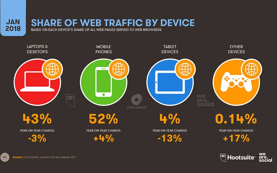
Nowadays, the picture is a lot more varied. Less than half of all browsing sessions are on desktops:
Mobile devices account for more web traffic than ever before. Image credit: HootSuite
More and more people are going online using their phones, tablets, and even their TVs. For businesses, this presents opportunities as well as challenges. For instance, it’s now more important than ever that your site works properly on all sorts of devices.
This is where responsive design comes in.
Table of Contents
What is Responsive Design?
Responsive design is when your site displays differently, depending on what device it is being viewed on. Essentially, the appearance of the site is automatically adjusted to suit the screen on the user’s device.
This involves a combination of the following:
Resizing elements,
Collapsing menus,
Rearranging components of your site,
Displaying different media.
While this may seem quite complicated, most modern web design tools offer responsive design as a native functionality.
Make Your Website Mobile Responsive | WordPress Website | WordPress | WordPress Tutorial
Benefits of Responsive Design
Now that you know what responsive design is, you’re wondering why it is so important. Let’s look at some concrete ways that responsive design can benefit your business.
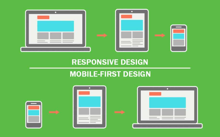
While similar, there are key difference between responsive and mobile-first design. Image credit: ProfileTree
There are many reasons to invest in responsive web design.
Responsive design helps SEO in a range of ways. For instance, by eliminating the need to have dedicated pages for different devices, you eliminate the risk of publishing duplicate content. Additionally, mobile search is becoming increasingly important for acquiring users.
The user experience impact of responsive design is slightly more obvious. Think about how you feel when you click on a site on your phone, and it just doesn’t work properly. Most people will simply leave the site.
This costs you sales.
Poor UX also has an indirect effect on SEO. The more time people spend on your site, the more the search engines will think you’re providing value. All else being equal, pages with higher average-time-spent will outperform their competitors on SERPs.
From a conversion rate optimisation (CRO) point of view, responsive design offers massive benefits. CRO is all about using design elements in the way that leads to the highest rate of conversions.
But the best layout for CRO will vary from device to device.
The Benefits of Responsive Web Design | Web Design | Web Standards | Web Development
Responsive Design Issues
However, responsive design has its downfalls, especially since it’s such an articulate development. There are a fair few disadvantages when it comes to responsive design, but it’s up to you to make a decision about what works for your business.
The drawbacks of responsive design are relatively minor but crucial to know before splashing out.
As a user navigates through their cellular device, the small screen makes it difficult to see what is much clearer on a larger screen. Sometimes, no amount of responsiveness will help with this. A better alternative might be to use accelerated mobile pages (AMPs) instead.
This also factors in the downloading time. The responsive design website takes a longer time to download on a smaller screen. This is because of the transition from the large screen to the small screen.
Another disadvantage would be the accommodation of the responsive design on old browsers. The user has to have a browser that can support responsive design. However, this is becoming less and less of an issue as old browsers become less common.
Responsive design can also cause some problems, although these are limited. Image credit: UnSplash
Responsive Design: How to Measure Device Compatibility
Of course, before you consider investing in responsive, it’s worth figuring out how your present website looks on mobile devices. You have two options to do this.
The first is pretty obvious. You can manually load up your website on a range of devices. However, this isn’t the best way to go about things. For example, your site might be optimised to display nicely on a handful of fixed resolutions, but this doesn’t mean it’s responsive. For another, this method will take quite a long time.
It’s better to use a window resizing tool.
These are available in the development tools of most browsers. For instance, you can switch between viewing a site as a desktop or mobile user by pressing CTRL+SHIFT+M in Google Chrome.
Tips For Creating A Mobile Friendly Site | How To Make A Website | Website Tutorial
Responsive Design Examples
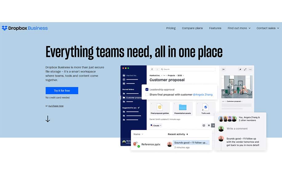
So much about the theory. Let’s take a look at what responsive design looks like in action. In particular, let’s take a look at some high profile brands who use responsive design to create an amazing user experience. First up is Dropbox, the well known file sharing service. Here’s how their site looks on desktop;
DropBox‘s desktop site contains all the key elements of an effective landing page. Image credit: DropBox
And notice how the mobile site is rearranged and simplified:
Their mobile site contains all of the same key elements. Image credit: DropBox
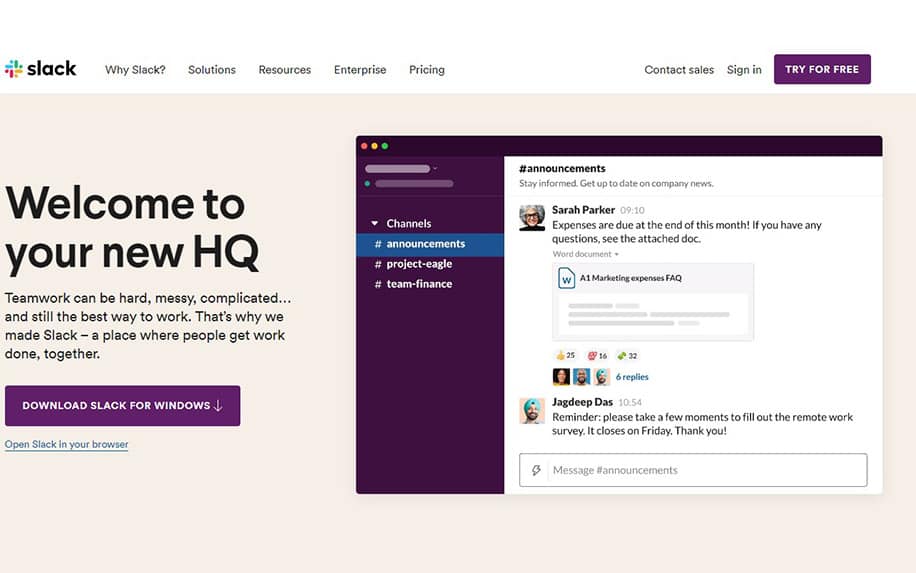
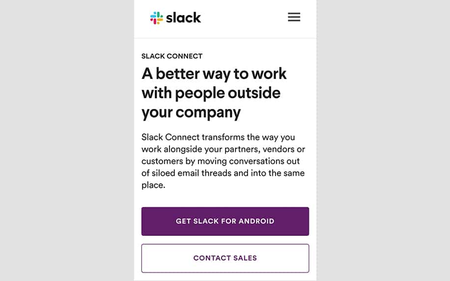
Similarly, here’s Slack’s desktop site:
Slack’s desktop site is also very effective. Image credit: Slack
And their pared down mobile design:
The same elements are present on all devices. Image credit: Slack
In both cases, the presentation is changed to draw better attention to key design elements, including the hero copy, and CTAs.
Everything You Need to Know About Responsive Design
These days, a wide variety of different devices are used to access the internet. This is good for businesses, as it creates more opportunities to reach your customers.
However, it also creates real challenges.
Chief among these is the need to make sure your site looks great and works properly on everything from smart watches to TVs.
Responsive design is a method that allows designs and development to respond to a user’s behaviour and environment. Most often, this involves changing the design of a site to suit the screen on the user’s device.
There are several factors that contribute to responsive design. These factors include screen size, platform and orientation of the website.
The responsive design method is a practice that contains a mixture of flexible grids and layouts. It also includes images and a creative utilization of CSS media inquiries.
The drawbacks of responsive design are minor but crucial. Responsive design can hurt load speeds, and even harm UX on certain older devices.
However, the benefits of responsive design certainly outweigh these. For UX, SEO and CRO, responsive design is a quick and effective way to ensure that you bring the best possible experience to users on all kinds of devices.
Developing a Responsive Website
Crafting a responsive website isn’t just about making things pretty on different screens; it’s about building a digital bridge that welcomes everyone, regardless of their device. So, let’s dive into the essential steps involved in this exciting process:
A. Mobile-First Design Strategy: Think small to conquer big! Start by designing for the smallest screen first, ensuring a flawless experience for mobile users. Then, progressively enhance the layout and features for larger screens like tablets and desktops. This prioritizes the majority of online users and lays a solid foundation for adaptability.
B. Layout and Grid Framework: Ditch the rigid boxes and embrace flexible grids! Frameworks like Bootstrap, Foundation, and Material Design provide pre-built layouts and components that adapt to different screen sizes. These grids act as your invisible construction crew, ensuring elements move and resize gracefully, like well-rehearsed dancers.
C. Testing on Multiple Devices: Don’t just assume, test it! Use online simulators, cross-browser testing tools, and real devices to experience your website from various perspectives. Check for layout shifts, broken elements, and usability issues. Remember, happy users don’t wrestle with awkward interfaces!
D. Maintaining Performance and Speed: A sleek website is useless if it crawls like a snail. Optimize images,minify code, and leverage browser caching to ensure your website loads quickly on any device. Remember, impatient users are just a click away from a competitor’s site.
E. Choosing a Capable Web Development Company: Not everyone is a master builder. If you lack the technical expertise, consider partnering with a skilled web development company that specializes in responsive design. Look for agencies with proven experience, transparent communication, and a portfolio that resonates with your vision.
Bonus Tip: Use progressive enhancement! Build a basic website that works universally, then layer on richer features and functionalities for larger screens. This ensures inclusivity for all users while offering desktop users a more premium experience.
Beyond the Basics: Responsive Design Trends to Impress
Now that you’ve got the technical foundation, let’s explore some trendy elements that can make your responsive website stand out:
A. Minimalist Interfaces: Less is often more! Clean lines, ample white space, and uncluttered layouts create a sophisticated and user-friendly experience. Remember, focus on what matters and let the content shine.
B. Animation and Cinemagraphics: Breathe life into your website with subtle animations and micro-interactions. Play with hover effects, parallax scrolling, and dynamic elements to captivate users and tell your story in a visually engaging way.
C. Bold Typography: Typography isn’t just decoration; it’s a powerful design tool. Choose daring fonts, experiment with text hierarchy, and embrace creative layouts to make your website a visual feast. Remember, readable fonts and clear information are key!
D. Asymmetric Layouts: Ditch the gridlock! Break free from traditional symmetry and experiment with asymmetrical layouts. Think overlapping elements, diagonal lines, and unexpected placements to create a dynamic and eye-catching composition.
Dive into the Deep End: Developing a Responsive Website
Crafting a responsive website isn’t just about making things pretty on different screens; it’s about building a digital bridge that welcomes everyone, regardless of their device. So, let’s dive into the essential steps involved in this exciting process:
A. Mobile-First Design Strategy: Think small to conquer big! Start by designing for the smallest screen first, ensuring a flawless experience for mobile users. Then, progressively enhance the layout and features for larger screens like tablets and desktops. This prioritizes the majority of online users and lays a solid foundation for adaptability.
B. Layout and Grid Framework: Ditch the rigid boxes and embrace flexible grids! Frameworks like Bootstrap, Foundation, and Material Design provide pre-built layouts and components that adapt to different screen sizes. These grids act as your invisible construction crew, ensuring elements move and resize gracefully, like well-rehearsed dancers.
C. Testing on Multiple Devices: Don’t just assume, test it! Use online simulators, cross-browser testing tools, and real devices to experience your website from various perspectives. Check for layout shifts, broken elements, and usability issues. Remember, happy users don’t wrestle with awkward interfaces!
D. Maintaining Performance and Speed: A sleek website is useless if it crawls like a snail. Optimize images,minify code, and leverage browser caching to ensure your website loads quickly on any device. Remember, impatient users are just a click away from a competitor’s site.
E. Choosing a Capable Web Development Company: Not everyone is a master builder. If you lack the technical expertise, consider partnering with a skilled web development company that specializes in responsive design. Look for agencies with proven experience, transparent communication, and a portfolio that resonates with your vision.
Bonus Tip: Use progressive enhancement! Build a basic website that works universally, then layer on richer features and functionalities for larger screens. This ensures inclusivity for all users while offering desktop users a more premium experience.
Beyond the Basics: Responsive Design Trends to Impress
Now that you’ve got the technical foundation let’s explore some trendy elements that can make your responsive website stand out:
A. Minimalist Interfaces: Less is often more! Clean lines, ample white space, and uncluttered layouts create a sophisticated and user-friendly experience. Remember, focus on what matters and let the content shine.
B. Animation and Cinemagraphics: Breathe life into your website with subtle animations and micro-interactions. Play with hover effects, parallax scrolling, and dynamic elements to captivate users and tell your story in a visually engaging way.
C. Bold Typography: Typography isn’t just decoration; it’s a powerful design tool. Choose daring fonts, experiment with text hierarchy, and embrace creative layouts to make your website a visual feast. Remember, readable fonts and clear information are key!
D. Asymmetric Layouts: Ditch the gridlock! Break free from traditional symmetry and experiment with asymmetrical layouts. Think of overlapping elements, diagonal lines, and unexpected placements to create a dynamic and eye-catching composition.
Responsive Design FAQ: Your Questions Answered
Q: Why is responsive design so important?
A: Responsive design ensures your website works flawlessly on all devices, from smartphones to desktops. This improves user experience, boosts SEO, and ultimately increases conversions. In today’s mobile-first world, it’s no longer optional, it’s essential.
Q: I’m not a techie, can I still create a responsive website?
A: Absolutely! There are user-friendly website builders with drag-and-drop interfaces and built-in responsive themes. You can also choose a reliable web development company specializing in responsive design.
Q: What are some common mistakes to avoid in responsive design?
A: Common pitfalls include using large images that slow down loading times, neglecting mobile navigation, and forgetting to test on multiple devices. Always prioritize mobile-first, optimize for speed, and test thoroughly.
Q: What are some trending features I can incorporate?
A: Experiment with minimalist interfaces, subtle animations, bold typography, and asymmetric layouts. Remember, keep it trendy but functional, and always adapt to your brand and audience.
Q: How much does it cost to create a responsive website?
A: Costs vary depending on complexity, features, and whether you do it yourself or hire a developer. Explore website builders for budget-friendly options, or choose an experienced agency for custom solutions.
Q: Where can I learn more about responsive design?
A: Plenty of online resources offer tutorials, articles, and case studies. Check out popular web design inspiration websites, subscribe to YouTube channels, and explore dedicated responsive design platforms.
Conclusion: Embrace the Digital Shift – Go Responsive!
In today’s dynamic digital landscape, responsiveness isn’t just a technical trick; it’s a philosophy. It’s about respecting your users, catering to their diverse screen sizes, and delivering a seamless experience regardless of the device they choose. By embracing responsive design, you open your doors to a wider audience, boost your digital presence, and ensure your website thrives in the ever-evolving online world.
Remember, flexibility is the key to success, and responsive design unlocks the potential for a truly captivating and inclusive online experience.
Dark mode design has emerged as a staple feature in modern digital interfaces, offering an alternative colour scheme that inverts the conventional light interface. This popular...
Nowadays, having a website for your company is a requirement. Therefore, it's crucial to comprehend what web design is in reality and how to develop your...
Influenced by cultural changes, digital design is rapidly evolving to adjust to new work-life which has become increasingly remote over the past year. With this in...


