Creating a Brand Identity: A Practical Guide for SMEs
Table of Contents
Brand identity is how a business looks, sounds, and feels to the people it is trying to reach. For SMEs building or rebuilding their digital presence, getting those foundations right from the start saves significant time and money later.
This guide covers the practical steps involved in creating a brand identity through your website: from choosing a logo and colour palette to setting a consistent tone of voice and measuring whether your brand is actually working.
What Brand Identity Actually Means
Brand identity is the set of visual and verbal signals that tell people who you are, what you stand for, and why they should care. It is not just a logo or a colour scheme. It is the full picture of how your business presents itself, from the typeface on your service pages to the tone of your email sign-offs.
The Difference Between Brand Identity and Branding
Branding is the process of building and managing perception. Brand identity is the tangible output of that process: the specific design choices, language decisions, and visual systems that make your business recognisable.
Think of it this way. Your brand exists in the minds of your customers. Your brand identity is what you put into the world to shape that perception.
The Core Components
A complete brand identity typically includes:
- A logo (primary, secondary, and icon versions)
- A defined colour palette (primary and secondary colours with hex codes)
- Typography choices (heading font, body font, and usage rules)
- A brand voice (tone, vocabulary, and style guidelines)
- Visual style direction (photography approach, illustration style, iconography)
For most SMEs, the website is where all of these come together in one place. That makes your site the most important brand touchpoint you control.
Why Your Website Is Central to Brand Identity
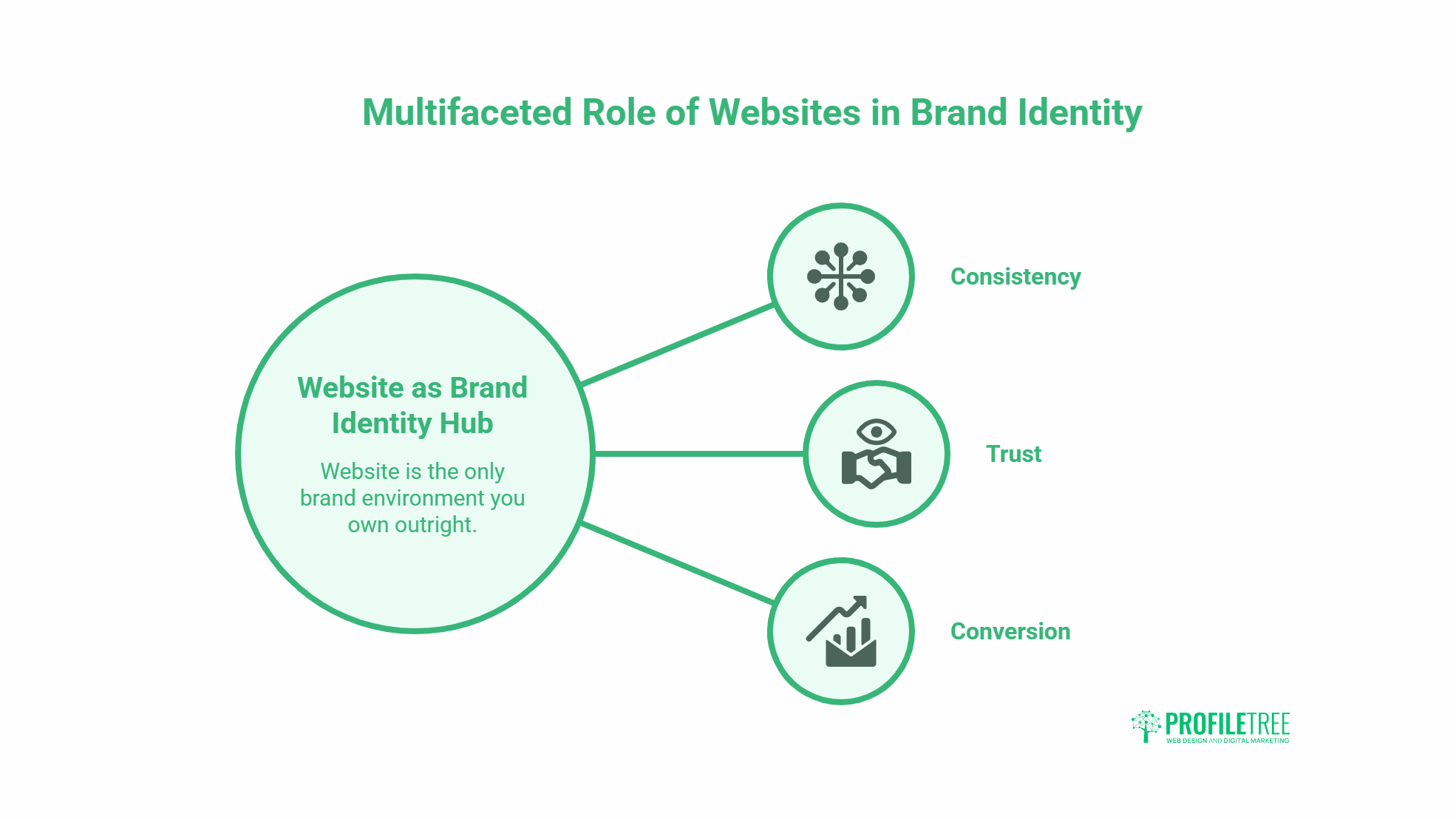
A website is the only brand environment you own outright. Social media platforms change their layouts and algorithms. Printed materials date quickly. Your website, when built with brand identity in mind, can serve as the definitive reference point for how your business should look and communicate.
“Your website is where your brand identity becomes real for most customers,” says Ciaran Connolly, founder of ProfileTree. “An SME that gets its visual identity and messaging right on its website gives itself a platform that can carry consistent signals across every other channel.”
For businesses across Northern Ireland, Ireland, and the UK, ProfileTree’s web design and development services are built around translating brand strategy into functional, conversion-focused websites. The identity work and the design work happen in parallel, not as separate stages.
What Inconsistency Costs You
When brand identity is inconsistent across a website, the effects are measurable. Pages that use different fonts, conflicting colour combinations, or shifting tones create friction. Visitors take longer to form a clear impression of what the business does and whether they trust it. Conversion rates suffer as a result.
Consistency, on the other hand, builds recognition. The more reliably a brand appears the same across pages and contexts, the faster visitors develop familiarity, and familiarity is a precondition for trust.
Choosing a Logo That Works
Your logo needs to work in multiple contexts: the header of your website, a small favicon, a social media profile image, printed on merchandise, and potentially in black and white. That versatility requirement shapes every design decision.
What Makes a Logo Effective
An effective logo is simple enough to be recognised at small sizes, distinct enough to stand out from competitors, and meaningful enough to reflect something about the business it represents. It does not need to be literal. A logo for a web design agency does not need to look like a website. It needs to feel like the kind of business customers want to work with.
Before commissioning or designing a logo, define the attributes you want it to convey. Professional and reliable? Creative and bold? Approachable and friendly? Those adjectives should guide every decision from shape to colour to typeface.
Practical Logo Design Steps
- Research your market first. Look at how competitors present themselves visually. Identify the conventions in your sector. Then consider where you want to sit within that landscape or where you want to deliberately break from it.
- Define your design parameters. Decide on the styles you want to avoid as much as those you want to pursue. Brief any designer clearly on the business, the audience, and the non-negotiables.
- Request multiple formats. A final logo set should include SVG (for web), PNG with transparent background, and a version that works in monochrome. Without these, you will run into problems when applying the logo across different contexts.
- Test at scale. Before signing off, see the logo at 16×16 pixels (favicon size) and on a dark background. Problems that are invisible at large sizes become obvious at small ones.
Building a Colour Palette
Colour is one of the most immediate ways a brand communicates. People process visual information before they read text, so the emotional response your colour palette triggers happens before anyone has read a single word on your page.
Understanding Colour Psychology
Different colours carry different associations, though these vary by culture and context. Some broadly consistent patterns:
- Blue tends to signal trust, reliability, and professionalism: common in finance and technology
- Green is associated with health, sustainability, and growth
- Red can convey energy, urgency, or passion, used carefully in calls to action
- Orange often reads as friendly, approachable, and energetic
- Black carries authority, sophistication, or premium positioning
- Yellow attracts attention and can signal optimism, though it is difficult to use at large scales
These associations are not fixed rules. Context and execution matter more than the colour itself.
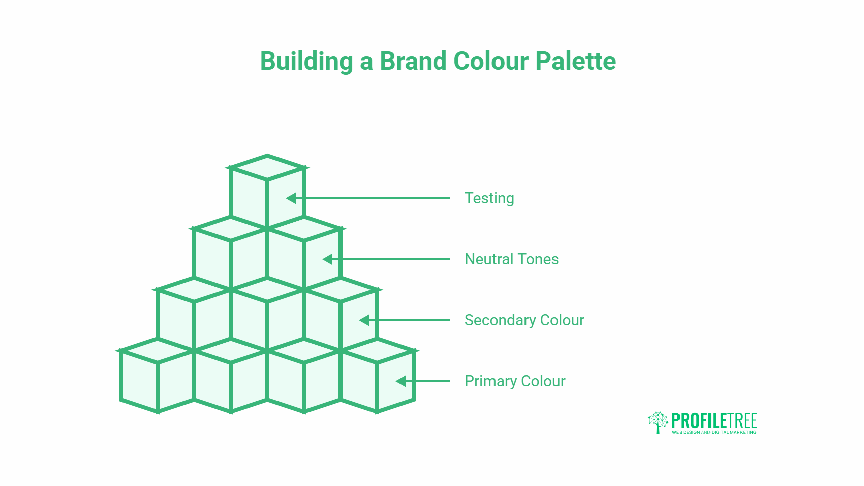
How to Build a Palette for your Website
Start with one primary colour that reflects the personality of the business. Then add one or two complementary or contrasting colours. Finally, define your neutral tones — the backgrounds, borders, and body text colours that the rest of your palette sits against.
A typical website palette might include:
- One primary brand colour (used on buttons, headings, and key accents)
- One secondary colour (used sparingly for contrast or highlights)
- A neutral light colour (page backgrounds)
- A dark neutral (body text)
- A mid-grey (secondary text, borders)
Test your palette across different devices and lighting conditions before committing. Colours render differently on screens with varying calibrations, and what looks great on a design tool may look flat or oversaturated on a mobile screen.
Typography and How It Shapes Perception
Typography affects how visitors perceive a brand before they fully register what they are reading. A carefully chosen typeface signals professionalism. Poor typographic choices, even on a site with strong content, create a sense of unease that visitors cannot always articulate.
Choosing Your Brand Fonts
Most brands need two typefaces: one for headings and one for body text. Occasionally, a third is used for specific accent text or captions.
- Heading fonts carry personality. A bold, geometric sans-serif communicates confidence and modernity. A refined serif suggests authority and heritage. A rounded font reads as approachable and friendly.
- Body fonts need to prioritise legibility above all else. Visitors reading paragraphs of text on a screen should not be conscious of the typeface; it should simply make reading effortless.
Typography Rules that Matter for Websites
- Maintain hierarchy. H1, H2, H3 and body text sizes should be noticeably different from each other. When headings and body text are too similar in size, the page feels flat and is harder to scan.
- Limit font weights. Using too many weights within a single typeface (light, regular, medium, semi-bold, bold) creates visual noise. Pick two or three and stick to them.
- Check performance. Decorative or unusual fonts often require larger file sizes, which adds to page load time. If your brand font slows down the site, it is working against your SEO as much as your design. ProfileTree’s web design and development team always tests font loading as part of performance optimisation.
- Test on mobile. A font that reads beautifully on a desktop can become cramped or unclear on a phone screen. Mobile typography rules, minimum font sizes, appropriate line heights, and comfortable paragraph width are non-negotiable.
Crafting a Brand Voice
Visual identity covers how your brand looks. Brand voice covers how it sounds. For SMEs with websites that include blog content, service page copy, social media, and email, maintaining a consistent voice is just as important as maintaining consistent colours.
Defining Your Voice
Brand voice is defined by four things: tone, vocabulary, sentence structure, and what you choose to talk about. Two businesses could both describe themselves as “professional” and sound completely different in practice, because professional on a law firm’s website means something different to professional on a creative studio’s website.
To define your voice, start by writing down five adjectives that describe how your business communicates. Then, for each one, identify what that means in practice and what it explicitly rules out. For example:
- “Direct” means: short sentences, active verbs, no waffle, rules out: throat-clearing intros, hedging language, padding
- “Knowledgeable” means: accurate, specific, evidence-based, rules out: vague claims, generalisations, unattributed stats
Applying Voice to Website Content
The brand voice should be consistent across all page types, but the register can shift. A service page might be more direct and outcome-focused. A blog post might be more exploratory. An FAQ section might be more conversational. The underlying voice stays the same; the format changes.
Content created through ProfileTree’s content marketing services is developed with each client’s defined voice in mind, from long-form articles to service page copy. A consistent editorial standard applied across all content types does more for brand recognition than periodic, high-quality output with inconsistent tone.
Positioning Your Brand in the Market
Understanding your audience and your competitive position shapes every decision in brand identity. A brand that tries to appeal to everyone typically resonates with no one.
Defining Your Target Audience
Before finalising any brand identity decisions, identify who you are trying to reach. This means going beyond basic demographics. Consider:
- What problems are they trying to solve
- How they evaluate their options
- What language do they use when describing their needs
- Where they encounter the brand (search, social, referral, events)
- What would make them choose you over a competitor
This understanding should inform the visual choices, the tone of voice, and the topics your website content addresses.
Standing Out From Competitors
Look at how the businesses competing for the same customers present themselves. Where do they all look and sound similar? That similarity is often where differentiation is possible.
Ciaran Connolly’s view on this, developed across hundreds of client projects: “True differentiation in brand identity comes from understanding what your customers actually care about, not from what you think makes you distinctive. The two are often different things.”
Building Brand Consistency Across Your Website
Consistency is what transforms a collection of design choices into a recognisable brand. Every page of your website should feel like it belongs to the same family.
Creating a Style Guide
A brand style guide documents the rules that keep everything consistent. At a minimum, it should cover:
- Logo usage rules (minimum size, clear space, colour variations, whatnot to do)
- Primary and secondary colour codes (hex, RGB, and CMYK)
- Typography specifications (font names, sizes, weights, and line heights for each element)
- Photography and image style guidelines
- Tone of voice guidelines with examples
Even a simple two-page reference document is better than no guide at all. When new team members, freelancers, or agencies need to create content for your brand, the guide is what keeps output consistent.
Managing Brand Assets
Store all brand assets in a single, accessible location. This means organised folders with clearly named files for logos, fonts, colour swatches, and approved imagery. Version control matters: when a logo is updated, the old version should be archived, not deleted, so there is a record of what changed and when.
For SMEs running digital marketing campaigns alongside their website, consistent asset management becomes even more important. Assets created for social ads, email campaigns, and landing pages all need to draw from the same approved set.
Measuring Whether Your Brand Is Working
Brand identity is not just a creative exercise. It should produce measurable outcomes: higher recognition, better conversion rates, stronger customer retention, and more referrals.
Signals to Track
- Website engagement metrics. Time on page, scroll depth, and bounce rates give indirect signals about whether visitors are finding the site credible and coherent. A high bounce rate on a well-trafficked page often points to a mismatch between what visitors expected and what they found.
- Direct and branded search traffic. When more people search for your business by name, it indicates growing brand awareness. Tracking branded search volume over time through Google Search Console is one of the simplest ways to see brand recognition increasing.
- Customer feedback. Ask new customers how they found the business and what their first impression was. Responses that use your own language back at you (the words from your positioning, the values from your messaging) are a good indicator that the brand identity is landing.
- Survey data. Periodic surveys asking customers to describe your brand in three words, and comparing those responses to your intended adjectives, tells you whether your identity is communicating what you think it is.
Rebranding: When and How to Refresh
Most brands need to evolve over time. This does not mean a complete overhaul every few years. It means staying alert to when the identity is no longer accurately representing the business.
Signs it May Be Time to Refresh
- The business has grown into new service areas that the current identity does not reflect
- The visual style feels dated compared to current competitors
- Customer feedback reveals persistent confusion about what the business does
- The brand was created without a clear strategy, and the gaps are showing
How to Approach a Rebrand
Start with a diagnosis, not a design brief. Understand specifically what is not working before deciding what to change. In many cases, the logo is not the problem. The issue is in the messaging, the photography style, or the inconsistent application of an identity that was actually well-designed to begin with.
For SMEs considering a rebrand, ProfileTree’s digital marketing services include brand strategy and positioning work that sits upstream of any design decisions.
How AI Is Changing Brand Building
Artificial intelligence tools are changing how SMEs approach brand creation, from logo generation and colour palette suggestions to automated content creation and personalisation. Used well, these tools accelerate the process. Used without strategy, they produce generic output that looks like every other AI-generated brand.
The businesses getting the most value from AI in their brand building are those using it to speed up execution, not to replace strategic thinking. Deciding who you are, what you stand for, and how you want to be perceived still requires human judgment.
ProfileTree’s AI transformation services help SMEs across Northern Ireland and the UK understand where AI tools genuinely add value in their marketing and content processes, and where the human work remains non-negotiable.
FAQs
What is brand identity and why does it matter for SMEs?
Brand identity is the set of visual and verbal elements that define how a business appears to its customers: logo, colours, typography, imagery, and tone of voice. For SMEs, a clear brand identity matters because it directly affects how quickly potential customers build trust. Research consistently shows that consistent brand presentation across channels increases revenue recognition. For businesses competing against larger organisations with bigger advertising budgets, a sharp and consistent identity is one of the most cost-effective ways to close the credibility gap.
How much does it cost to create a brand identity?
Costs vary significantly depending on the scope and who is doing the work. A basic logo and colour palette from a freelance designer might cost £500 to £1,500. A full brand identity system covering logo suite, typography, colour palette, style guide, and brand voice documentation from an established agency typically ranges from £3,000 to £10,000 or more for SMEs. Some businesses start with a minimal identity and build it out over time. The key is having clear documentation from the start, even if the system is simple, so that consistency is maintained as the brand grows.
What is the difference between a brand identity and a logo?
A logo is one element of a brand identity. The identity is the full system: logo, colours, fonts, imagery style, and voice. Many small businesses treat their logo as their brand, which leads to inconsistency when other design decisions are made separately. A business might have a professional logo but use inconsistent colours across its website, social media, and printed materials. The result is a brand that feels fragmented, even if each individual element looks polished.
How do I keep my brand consistent across my website?
Create a simple brand style guide that documents your logo variations and usage rules, your exact colour codes, your chosen fonts and how to use them, and your tone of voice guidelines with examples. Store all brand assets in a central location with clear file naming. Apply the guide to every page of your website, not just the homepage. Consistency is particularly easy to break on blog posts and landing pages, which are often created quickly without checking against the guide.
How long does it take to build a recognisable brand?
There is no fixed answer, but studies on brand recall suggest that consistent exposure is required many times before a brand becomes truly recognisable to a target audience. For SMEs with limited advertising spend, this process takes longer than for businesses running regular paid campaigns. What accelerates recognition is consistency: the same visual identity, the same voice, and the same key messages appearing reliably wherever the audience encounters the brand. A scattered approach, even with high overall volume, builds recognition more slowly than consistent, targeted visibility.
Should I rebrand if my business has grown significantly?
Growth alone is not a reason to rebrand, but growth that takes your business into new markets, new service areas, or new customer segments often is. The test is whether your current identity accurately represents what you do today and who you want to attract. If a significant portion of your new customers are confused about your offer when they first encounter the brand, or if your identity is regularly attracting the wrong type of enquiry, those are practical signals that a refresh is worth considering.