Build Your Team’s Digital Skills with ProfileTree Training
Most businesses in Belfast and across Northern Ireland aren’t short on ambition when it comes to digital marketing. What holds them back is the skills gap between what their teams know today and what they need to do tomorrow. ProfileTree’s digital training programmes close that gap with practical, hands-on sessions built around your business, not a generic syllabus.
Founded in Belfast in 2011, ProfileTree is a web design and digital marketing agency that has trained thousands of business owners, marketing staff, and management teams across Northern Ireland, Ireland, and the UK. Our trainers don’t deliver theory from slides. They manage live campaigns, build websites that rank, and create content that converts, and they bring that direct experience into every session.
What Digital Skills Does Your Business Actually Need?
The answer depends on your sector, your team, and where your biggest growth opportunities are. That said, the businesses we work with consistently identify the same core gaps: search engine visibility, paid advertising, content strategy, social media, and, increasingly, artificial intelligence tools for daily workflows.
Our digital training covers all of these areas, either as standalone sessions or as part of a structured programme designed around your objectives. Whether you’re looking for SEO training in Belfast, PPC coaching, content creation workshops, or LinkedIn training, we can deliver the right session at the right level for your team. Every programme begins with an initial consultation, not a course catalogue.
Our Digital Training Services
ProfileTree's digital training is built for businesses that want to bring skills in-house, not stay permanently dependent on outside agencies. Sessions are available as half-day and full-day workshops, multi-week programmes, one-to-one coaching, and online training delivered via video call.
- SEO Training Belfast & Ireland
- PPC Training Belfast
- Content Marketing & Content Strategy Training
- LinkedIn Training Belfast
- Marketing Automation Training
- Growth Marketing & Digital Strategy
- Social Media & Analytics
Our SEO training is one of the most requested services we deliver. Sessions cover the full range, from fundamentals for teams new to search marketing, through to technical SEO, content SEO, and local SEO for businesses targeting customers in Belfast, Northern Ireland, or the island of Ireland.
We also deliver custom SEO training for corporate marketing teams, tailored to the specific tools, platforms, and search queries that matter to your business. This includes hands-on work with tools such as Google Search Console, Ahrefs, and SEMrush, so your team leaves with practical skills they can apply the following week.
For businesses in Dublin or across Ireland, our SEO training Ireland programme covers Irish market nuances as well as cross-border opportunities.
Our PPC training Belfast programme covers Google Ads from the ground up, including campaign structure, keyword strategy, Quality Score, budget management, and conversion tracking. We also cover Facebook and Instagram advertising, LinkedIn advertising for B2B campaigns, and remarketing strategies.
PPC training is ideal for marketing teams managing advertising spend in-house and for business owners who want to understand what their paid media is actually doing for them.
Content drives organic search, social engagement, and brand authority, but producing content that actually works requires a clear strategy. Our content training covers content planning, keyword-led writing, on-page SEO, and measuring your content performance.
For teams producing video, we cover scripting, YouTube SEO, and distribution. ProfileTree’s own YouTube channels have built an audience of over 750,000 subscribers, which means our video marketing training is grounded in what we’ve tested and proven ourselves.
LinkedIn is the primary channel for B2B lead generation across Northern Ireland and Ireland, yet most business profiles and company pages are poorly optimised and rarely updated. Our LinkedIn training sessions cover:
- profile optimisation,
- content strategy,
- company page management, and
- LinkedIn advertising.
The training comes with practical guidance your team can put into practice immediately.
Marketing automation is no longer the preserve of large enterprise teams. Our marketing automation training introduces tools that are accessible to SMEs, covering:
- email workflows,
- CRM integration,
- lead scoring, and
- reporting.
Your team can work more efficiently without increasing headcount.
For senior marketing staff and management teams, we offer growth digital marketing training that looks across channels and considers the full customer journey. Sessions cover:
- attribution,
- funnel analysis,
- testing methodology, and
- how to build a digital strategy that connects individual channel performance to business outcomes.
Social media training covers platform strategy, content planning, community management, and paid social across Facebook, Instagram, and LinkedIn. For businesses producing video content, we cover YouTube marketing, channel optimisation, and YouTube SEO, drawing on ProfileTree’s experience growing its own channels to over 750,000 subscribers.
Google Analytics 4 training is available as a standalone session or as part of a broader digital marketing programme. Sessions cover GA4 setup, event tracking, report building, and how to connect analytics data to business decisions.
AI Training Through Future Business Academy
ProfileTree delivers AI training for businesses through its sister brand, Future Business Academy. This is the most rapidly growing area of our training provision, and it reflects what we’re seeing across our client base: businesses that adopt AI tools early are outperforming those that don’t.
AI training is available as standalone sessions and as an integrated module within broader digital training programmes. It’s designed for business owners and marketing teams who want to use AI practically, not just understand it conceptually.
Sessions cover prompt engineering for business tasks, AI-assisted content creation, workflow automation using tools such as ChatGPT and Claude, AI strategy development, and responsible AI use. For teams already using digital marketing tools, we also cover how AI integrates with existing platforms, from GA4 and Search Console through to CRM systems and content management.
The ProfileTree AI training and implementation service is the most cited service page on our website in Bing AI search results, with 28 AI citations. If your business is exploring what AI adoption looks like in practice, that page is a useful starting point.
“The businesses that are adopting AI tools properly now, and training their teams to use them well, are going to have a real productivity advantage within 12 months,” says Ciaran Connolly, founder of ProfileTree. “It’s not about replacing people. It’s about giving your team the ability to do more, faster, with better results.”
Ready to Upskill Your Team? Book Your Free Training Consultation Today!
Who Is Our Digital Training For?
Our programmes are designed for SMEs across Belfast, Northern Ireland, Ireland, and the wider UK. Within those businesses, the people who benefit most are:
- marketing managers and executives who want to deepen specific skills,
- business owners who want to understand and direct their digital marketing without relying entirely on external agencies,
- management teams preparing to bring digital functions in-house, and
- in-house marketing teams building capability ahead of growth.
We’ve delivered digital training to businesses across a wide range of sectors, including professional services, retail, hospitality, construction, healthcare, and not-for-profit. Our digital marketing trainers have worked with individual business owners and with full marketing departments.
The specifics of what each session covers are shaped around the audience and their objectives, which is why every programme begins with a conversation about what your business actually needs, not a fixed course outline.
| Generic online course | ProfileTree bespoke training | |
|---|---|---|
| Personalisation | Fixed syllabus, no adjustment for your business | Shaped around your team, tools, and objectives before the first session |
| Local case studies | Generic examples, typically US or global markets | Real examples from Belfast, Northern Ireland, and Irish market clients |
| Post-training support | None. Course ends at the final module | Follow-up session available; trainer accessible after delivery |
| ROI tracking | No measurement of business outcomes | Sessions tied to your KPIs; progress tracked against business goals |
| Grant assistance | No support with regional funding | Invest NI and Enterprise Ireland grant guidance available |
How We Deliver Digital Training
Sessions are available in four formats. All digital training begins with an initial consultation to understand your current skills, tools, and objectives. Whether you are looking for digital agency training to develop an in-house team or a single-session workshop for a business owner, the programme is shaped to your situation before we start. We do not send the same session to every client.
In-person workshops are delivered at your premises or at our Belfast office, depending on what works best for your team. In-person sessions work well for group workshops where you want real-time interaction and the ability to work directly on your own platforms during the session.
Group workshops run as half-day or full-day sessions and are suited to teams of two to twelve people.
Team training programmes run across multiple weeks and are designed for marketing departments or business units that need to build capability across a range of channels. Each session builds on the last, and progress is reviewed at the end of the programme. This digital training can be delivered at your premises or at our Belfast office.
One-to-one coaching is available for business owners and senior marketing staff who want personalised guidance. Sessions focus on your specific challenges, your platforms, and your goals, rather than following a fixed programme structure.
Online training is available for all programmes, making it practical for businesses across Ireland, the UK, or wherever your team is based. Online digital marketing training sessions are delivered live rather than as pre-recorded content, so you get the same interactive experience regardless of location.
What Outcomes Can Your Business Expect?
Digital training delivers different things depending on what your team needs. The outcomes we see most consistently are:
- teams that can manage their own SEO without relying on an external agency for every task,
- marketing staff who can run and optimise paid advertising campaigns with confidence,
- business owners who understand their analytics and can make informed decisions based on data, and
- staff who are using AI tools to save time on content production and routine tasks.
Because our trainers are practitioners who manage real campaigns, the guidance they give is grounded in what’s working now in the Northern Ireland and Irish markets, not what was working two years ago.
For businesses in Belfast and across Northern Ireland, our digital training covers our local delivery in more detail, including session formats available in the city.
Our 4-Step Digital Training Framework
Every ProfileTree digital training programme follows the same four stages, regardless of topic or team size. This structure is what separates a session that feels useful on the day from one that drives measurable change in how your business performs online.
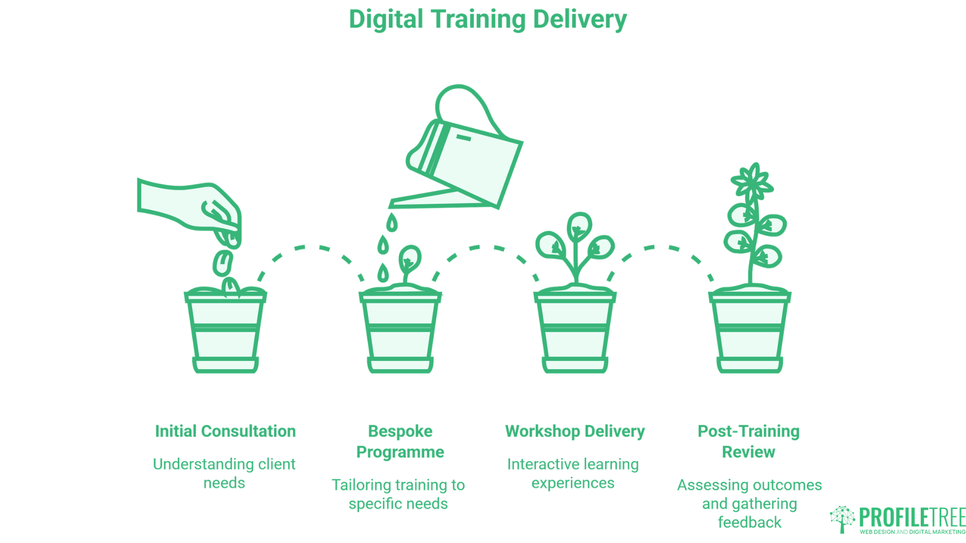
Before any training takes place, we assess where your team currently stands. We review your existing tools, platforms, and skill levels, and identify the specific gaps that are holding back your digital performance. This audit shapes everything that follows.
Based on the audit, we build a digital training programme around your objectives rather than a fixed course outline. If your priority is SEO in Northern Ireland, we focus there. If your team needs to get confident with GA4 and paid social, that is what we build. No filler topics, no irrelevant modules.
Sessions are delivered by practitioners who run live campaigns for clients. Participants work on their own platforms and accounts throughout, so the learning is applied to real content from the first session rather than practised in isolation.
A follow-up session is available after the programme concludes. We review what has been implemented, identify where further support would help, and confirm that the skills are translating into results your business can measure.
Why Choose ProfileTree for Digital Training
ProfileTree has been delivering digital training across Belfast, Northern Ireland, and Ireland since 2011. Over that time, the team has completed more than 1,000 client projects and trained thousands of business owners, marketing staff, and management teams through in-person sessions, online programmes, and one-to-one mentoring.
- 14 years of practitioner experience. Every trainer actively manages client work, so the guidance reflects what is working in the market now, not what worked several years ago
- 750,000+ learners across our YouTube channels. Our ability to explain digital concepts clearly has been tested at scale across audiences worldwide
- 1,000+ projects completed. Digital training is grounded in real project experience across web design, SEO, content marketing, PPC, and AI implementation
- 5-star rating from 460+ Google reviews, independently verified through Google Maps
- Industry experience across professional services, retail, hospitality, construction, healthcare, and not-for-profit. We understand that digital strategy looks different depending on the sector and the market
- Belfast and Northern Ireland specialists. Local context that agencies based elsewhere cannot match, including knowledge of Invest NI funding, the cross-border Irish market, and the specific search behaviour of NI consumers
- AI training through Future Business Academy. For businesses that need to go deeper on AI implementation, our sister brand delivers specialist programmes that go well beyond introductory awareness sessions
What Our Digital Training Clients Say
The reviews below come from business owners and marketing professionals who have completed mentoring and digital training sessions with ProfileTree. They reflect the kind of practical, applied learning that sits at the core of how we deliver.
"I’ve really enjoyed the opportunity to receive mentoring from the wonderful Gabby at ProfileTree. She is incredibly knowledgeable and professional, taking the time to truly understand the needs of my business and offering thoughtful, practical suggestions every step of the way.
Throughout our sessions, we’ve covered a wide range of topics, including improving my website, strengthening my social media presence, SEO, and much more.
I would highly recommend both Gabby and ProfileTree for their exceptional training, expertise and the genuine boost in confidence the experience has given me."
Suzanne Cromie
"We recently completed mentoring sessions with ProfileTree and Gabbi and found the experience extremely valuable. The guidance was knowledgeable, practical, and tailored to our business needs.
In particular, the sessions covering SEO and AI were eye-opening and gave me clear strategies I can implement straight away. Gabbi explained everything in a way that was easy to understand, while still going into the level of detail needed to make real improvements.
I’d highly recommend ProfileTree for anyone looking to strengthen their digital marketing skills or gain better clarity on how to use SEO and AI effectively in their business."
Michelle Duggan
"Thank you so much Ranel from ProfileTree. You've been a brilliant mentor and after each training session my confidence in navigating our newly developed website has grown, as has my use of social media. You are very friendly and patient and I would highly recommend you to anyone seeking to improve their skills in digital marketing."
Joe Magee
These reviews reflect an approach ProfileTree has developed across 14 years and more than 1,000 projects. Digital training is not delivered as a generic course. It’s shaped around the individual business, delivered by practitioners, and followed through until the client can see the difference in their results.
Digital Training FAQs
The most important digital skills for most SMEs are search visibility (SEO and local SEO), paid advertising, content creation and strategy, and an understanding of analytics. Businesses with a B2B focus typically also benefit from LinkedIn skills and email marketing. The right starting point depends on where your biggest gap is. If you’re not appearing in search results for your core services, SEO training is usually the priority. If you’re spending on Google Ads without a clear return, PPC training makes sense first.
Digital training costs vary based on the format, duration, and number of participants. Half-day workshops are available for a few hundred pounds. Multi-session programmes for teams are priced on a bespoke basis following an initial consultation. We work with businesses across a range of budgets and can advise on Invest NI and Enterprise Ireland grant support where relevant. Contact us for a quote based on your specific requirements.
Yes. All of our digital training programmes are available as online training, delivered live by a trainer via video call. This makes it practical for teams across Ireland, across the UK, and for businesses where travel to Belfast isn’t feasible. Online sessions cover the same content as in-person delivery and include the same personalised approach.
Depending on the programme, digital marketing training can cover SEO, PPC, content marketing, social media, email marketing, LinkedIn, Google Analytics 4, marketing automation, and AI tools. Sessions always begin with an assessment of your current position and your objectives, so the content reflects what your business actually needs rather than a fixed curriculum.
It depends on the depth of skills you want to build. A focused half-day workshop can give a team a strong grounding in one area. A full-day session can cover a broader range of topics at an introductory level. For businesses that want to build substantial in-house capability, multi-week programmes covering multiple channels are available. We’ll recommend the right duration during your initial consultation.

Web Design
We design stunning, user focused websites that present your brand beautifully and convert visitors into customers.

Web Development
We use the latest development tools to build websites that are optimised for peak performance at all times.

Website Hosting
We manage everything from site updates and reports to hosting, allowing you to focus on running your business.

Search Engine Optimisation
Using the latest SEO techniques, we help your brand get found for the right terms and by the right people.

Digital Marketing Strategy
Navigate the digital landscape with a marketing strategy. Our team crafts comprehensive plans that resonate with your target audience, drive engagement, and boost conversions.

Digital Marketing Training
Elevate your digital proficiency. Our in-depth training sessions equip your business with cutting-edge digital marketing techniques to outperform competitors and thrive online.

Social Media Strategy
Captivate and grow your social following. We create tailored social media strategies that ignite engagement, amplify your brand's online presence, and foster lasting connections.

Email Marketing Solutions
Harness the power of your mailing list. Our precision-targeted email marketing campaigns are engineered to nurture relationships and drive tangible business outcomes.

Content Marketing Services
Elevate your brand with our content marketing mastery. From thought-provoking blogs to eye-catching infographics, we craft content that captivates, informs, and converts your ideal audience.

Video Production
Capture your audience with compelling video content. Our production team creates visual stories that engage, inform, and leave a lasting impression.

Brand Storytelling
Bring your brand's story to life with authenticity. We craft compelling narratives that strike a chord with your audience, forging a powerful emotional bond with your brand.

Content Strategy Development
Strategic content that drives action. We develop content strategies that align with your business goals, ensuring every piece of content counts.

AI Training
Empower your business with AI expertise. Our tailored training demystifies AI, equipping your team with the knowledge to leverage its potential for growth and innovation.

AI Chatbots
Transform customer service with AI chatbots. We develop sophisticated chatbots that elevate user experience, streamline interactions, and deliver unparalleled efficiency.

AI Marketing
Transform your reach with AI-driven marketing. Harness data-driven insights for laser-targeted campaigns that captivate, engage, and convert your audience.

AI Tools for Business
Optimise your operations with cutting-edge AI tools. We integrate intelligent solutions that streamline processes, enhance efficiency, and support data-driven decision-making.
Join Our Mailing List
Grow your business with expert web design, AI strategies and digital marketing tips straight to your inbox. Subscribe to our newsletter.