Inclusive Animation Design: Accessible Motion Graphics
Table of Contents
Animation captivates viewers in ways static imagery simply cannot achieve. Creating content that reaches the broadest possible audience is essential for businesses, educational institutions, and marketing teams seeking animation services. However, individuals with autism, ADHD, or other neurodiverse traits might find certain animation styles overwhelming when transitions are too abrupt or colours too harsh.
By thoughtfully adapting animation techniques, professional studios can develop truly inclusive animated content—from explainer videos and corporate presentations to training modules and promotional animations—that engages broader audiences without causing sensory discomfort.
This comprehensive guide outlines animation best practices, showcases successful implementation examples, and highlights the commercial benefits of designing animated content with neurodiverse audiences in mind.
The Commercial Case for Neurodiverse-Friendly Animation Services
Neurodivergent individuals—those with conditions including autism spectrum disorder, ADHD, or sensory processing sensitivities—often experience visual and auditory stimuli differently than neurotypical audiences. Some may feel overwhelmed by bright colours, rapid scene changes, or visually complex layouts. By crafting animations with these considerations in mind:
- Animation studios deliver more universally accessible content with improved audience comprehension and engagement.
- Brands commissioning animations build stronger audience loyalty through inclusive design approaches.
- Educational and corporate clients receive more versatile animated assets suitable for diverse learning environments where students or employees require accessible visual materials.
Market Research: A 2025 neurodiversity marketing analysis revealed that approximately 1 in 7 people in the UK identifies as neurodivergent, highlighting the significant audience potential for accessibility-minded animation production.
Professional Animation Techniques: Thoughtful Transitions and Scene Structure
Smooth pacing and deliberate scene transitions are hallmarks of high-quality, neurodiverse-friendly animations. Animation experts ensure viewers can process new information comfortably by using gentle fade effects, visual anchors, and straightforward narrative signposting, building stronger engagement and reducing sensory overload.
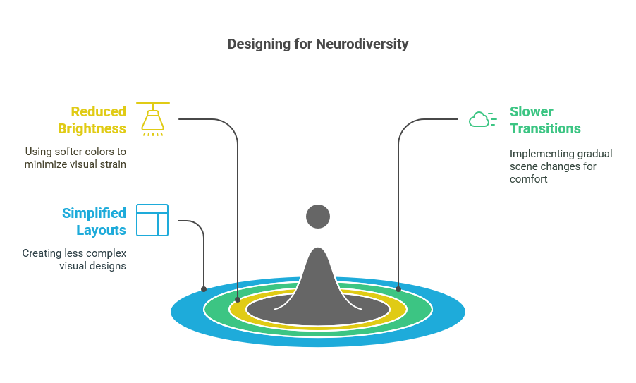
Graduated Scene Transitions
Leading animation studios implement gentle fade transitions or smooth panning effects rather than abrupt cuts or flickering scene changes. These techniques give viewers sufficient time to process new visual information without triggering sensory overload.
Visual Anchoring Elements
Expert animators incorporate consistent background elements or reference points that remain stable throughout the animation sequence. This technique provides cognitive anchoring that helps viewers maintain orientation during scene changes.
Narrative Signposting
Top-quality animated content aligns scene transitions with clear voiceover cues (e.g., “Next, we’ll explore the manufacturing process”). This verbal-visual synchronisation helps viewers anticipate and prepare for upcoming visual shifts.
Animation Production Tip: Professional studios now routinely include a brief visual storyboard or content preview at the beginning of animations—such as “Here are the 5 sections we’ll cover.” This structural clarity mainly benefits viewers with ADHD or autism who appreciate predictable information sequencing.
Animation Design Excellence: Thoughtful Colour Selection and Visual Contrast
Colour choices significantly impact how accessible animations are for neurodiverse audiences:
- Develop moderate colour palettes that avoid highly saturated or neon combinations while still maintaining visual appeal
- Implement carefully tested colour pairings that provide sufficient contrast for legibility without creating visual strain
- Create alternative “low-sensory” versions of animations when brand guidelines require vivid colours that might be challenging for sensitive viewers
Case Study: An Irish e-learning platform commissioning animated educational content discovered that 30% of students with ADHD or autism strongly preferred animations with toned-down colour palettes featuring pastel backgrounds. This thoughtful modification resulted in a 15% increase in average viewing duration for lesson modules and improved information retention.
Animation Sound Design: Audio Considerations for Maximum Accessibility
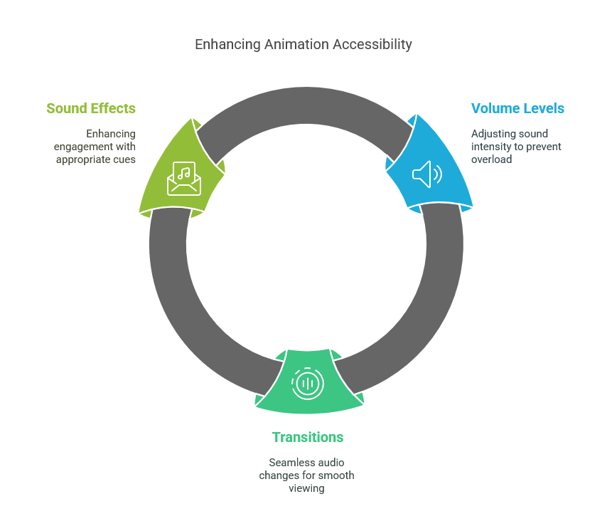
Audio is a pivotal aspect of creating animations that remain comfortable and engaging for all viewers—especially those with sensory sensitivities. By carefully balancing volume levels, transitions, and sound effects, studios can reduce the risk of sensory overload and deliver an inclusive, accessible experience.
Smooth Audio Transitions
Professional animation sound designers implement gradual audio fades between scenes, ensuring viewers aren’t startled by sudden volume changes that can trigger sensory discomfort.
Thoughtful Sound Effect Selection
Quality animation services limit jarring sound effects like crashes, bangs, or high-pitched tones that may overwhelm viewers with sensory sensitivities. Experienced studios reduce volume levels or provide anticipatory visual cues when dramatic audio is necessary for storytelling.
Flexible Audio Options
Premium animation deliverables include separate audio tracks or “low-sound” versions, allowing clients to adjust or eliminate sound elements based on audience preferences and viewing context.
Research Finding: In a 2024 animation user experience study conducted across the UK, production teams who eliminated intense audio stingers and sharp sound effects experienced 20% fewer negative feedback comments from viewers with autism or anxiety conditions while maintaining overall audience engagement.
Animation Applications: Successful Commercial Implementation Examples
Inclusive animations benefit various industries, from educational institutions seeking better learning engagement to businesses promoting brand messages in training or marketing materials. By adopting neurodiverse-friendly design strategies, organizations can broaden their reach and enrich user experiences without sacrificing creativity or message clarity.
Educational Animation Productions
Leading UK animation studios developing content for educational environments implement measured pacing and extended text display times. Consistent character placement and clear visual hierarchy help students follow narrative progression without cognitive overload, resulting in more effective learning outcomes.
Corporate Training Animations
Professionally produced workplace training animations benefit from calm colour schemes and consistent narration styles. Neurodiverse employees particularly appreciate the ability to replay sections, track progress through visual indicators, and engage with content without unnecessarily stimulating elements.
Client Success Story: A Belfast-based corporate training company commissioning animated compliance videos implemented slower, more deliberate transitions throughout their harassment prevention modules. They documented reduced confusion rates, particularly among staff members with ADHD or dyslexia, and measured overall improvement in information retention across all viewer demographics.
Animation ROI: Business Benefits of Inclusive Production Standards
Commissioning inclusive animations delivers measurable commercial advantages:
- Expanded audience reach and improved engagement metrics across diverse viewer segments
- Enhanced brand perception as organisations demonstrate a genuine commitment to accessibility
- Increased content versatility for deployment across educational institutions, government agencies, and corporate environments with stringent accessibility requirements
- Better information retention from all viewers, not just those with neurodiverse conditions
Performance Metric: UK animation studios offering sensory-friendly versions or “low-stimulation” viewing options reported 10–15% improvements in client satisfaction ratings and significantly higher audience engagement metrics across all viewer demographics (Animation Accessibility Survey, 2023).
Expert Insight: Ciaran Connolly, Director of ProfileTree
Creating animation that respects neurodiverse needs isn’t simply about toning down visual elements—crafting a more thoughtful, engaging viewing experience for everyone. When animation studios commit to intentional pacing, balanced colour theory, and considered audio design, they establish deeper connections with audiences who might otherwise feel excluded from visual storytelling while simultaneously improving the experience for all viewers.” — Ciaran Connolly, Director, ProfileTree.
Animation Production: Professional Implementation Guidelines
Ensuring that animations remain accessible and engaging for everyone requires a systematic and professional approach. By incorporating diverse focus group testing, flexible output options, and technical refinements throughout production, studios can produce final content that resonates with neurodiverse audiences while maintaining top-tier creative standards.
Diverse Focus Group Testing
Leading animation services conduct targeted feedback sessions with neurodiverse individuals during production. They gather real-time reactions to identify specific scenes, colour combinations, or transition effects that may cause sensory discomfort, ensuring the final product works for all audience segments.
Flexible Output Options
Professional studios routinely produce multiple versions of animations—standard and “sensory-friendly”—or adopt universal design principles from project inception when client requirements allow, maximising the utility of commissioned content.
Technical Excellence
Expert animators maintain flickering elements below 3 flashes per second to prevent potential seizure triggers. Even stylistically “flashy” sequences are reimagined with smoother, less jarring visual techniques without sacrificing creative impact.
Animation Industry Statistics and Implementation Framework
- 1 in 7 people in the UK identifies as neurodivergent (Neurodiversity Marketing Analysis, 2025)
- Animation studios implementing softer colour palettes documented 15% longer average viewing times among audiences with ADHD (Irish E-learning Performance Data, 2023)
- Optional audio settings reduced negative feedback by 20% in animation user testing while maintaining engagement from neurotypical viewers (UK Animation Experience Research, 2024)
Professional Neurodiverse Animation Production Framework:
- Assessment: Evaluate existing brand style guides and animation requirements against neurodiversity best practices
- Design Adaptation: Implement intentional pacing, consistent visual anchors, and balanced colour palettes
- User Validation: Gather feedback from diverse audience segments, including neurodiverse viewers,s on pacing, colour theory, and audio elements
- Technical Refinement: Fine-tune volume dynamics, reduce visual flicker, and enhance narrative signposting
- Optimised Delivery: Provide clients with flexible playback options to serve different audience needs and viewing contexts
Animation Excellence for Every Viewer
For organisations commissioning animation services, selecting studios with expertise in neurodiversity-focused design ensures productions resonate with broader audiences—including individuals who find typical fast-paced, high-contrast animations overwhelming. Thoughtful transitions, balanced colour theory, considered audio design and systematic user testing create more universally accessible animated experiences without compromising creative vision or brand identity.
From educational animations in Northern Irish classrooms to corporate training videos across the UK, inclusive animation practices drive viewer engagement while delivering superior results for organisations investing in animated content. ProfileTree specialises in producing thoughtful, accessible animated solutions—ensuring the motion graphics we create for your organisation are visually compelling and genuinely inclusive for viewers across the neurodiverse spectrum while maintaining the highest standards of creative excellence.
Conclusion
Investing in neurodiverse-friendly animation is an increasingly crucial step for brands, educators, and organisations aiming to communicate with broader audiences. By implementing deliberate pacing, balanced colour schemes, and considerate sound design, you create animated content that not only meets accessibility standards but also boosts overall viewer engagement and retention. With an estimated one in seven people in the UK identifying as neurodivergent, inclusive animation opens the door to a more diverse, loyal, and appreciative audience.
Neurodiversity-focused animation also delivers strong commercial and organisational returns. It showcases a genuine commitment to accessibility, helping clients and stakeholders meet stringent inclusion requirements while upholding brand identity. Ultimately, the shift towards more thoughtful animation techniques ensures superior experiences for all viewers—enhancing learning outcomes, improving message comprehension, and offering more versatile applications in fields ranging from corporate training to educational programmes.
FAQs
Are inclusive animation practices more expensive to implement?
While planning and testing for neurodiverse-friendly animations can add steps to production, the associated costs are typically outweighed by the benefits: improved audience reach, enhanced brand reputation, and reduced need for multiple revisions down the line. Many studios find that well-integrated inclusive design quickly becomes a seamless part of their regular production workflow.
Do animations designed for neurodivergent viewers lose their creative impact?
Not at all. Inclusive approaches encourage more assertive creative thinking, not less. Balancing colours, optimising transitions, and refining audio elements ensures content remains dynamic and engaging while avoiding overwhelming or alienating viewers.
How can I maintain my brand’s style if I use softer colours?
Professional animation teams are skilled at adapting brand guidelines to accessible colour schemes without compromising brand identity. This can involve choosing complementary, toned-down shades or offering alternate versions where brand colours are subtly adjusted to meet accessibility preferences.