How to Build a Mobile-Friendly WordPress Website
Table of Contents
More than half of all web traffic now arrives from mobile devices, yet most WordPress sites are only technically responsive; they adapt their layout to smaller screens without being genuinely optimised for mobile users. For UK business owners, that gap represents lost revenue, lower search rankings, and a first impression that sends visitors straight back to Google.
A mobile-friendly WordPress website does more than reformat desktop content for a phone screen, however. It loads quickly on 4G, passes Google’s Core Web Vitals thresholds, uses touch-friendly interface elements, and converts mobile visitors into enquiries and sales.
ProfileTree, a Belfast-based web design and digital marketing agency, builds and audits mobile-optimised WordPress sites for SMEs across Northern Ireland, Ireland, and the UK. The practical guidance in this article reflects what we find when we open PageSpeed Insights on a new client’s site, and what we do to fix it.
Why Mobile Performance Is Now a Search Ranking Factor
Google switched permanently to mobile-first indexing in 2024. This means Google’s crawler visits and evaluates the mobile version of your site, not the desktop version, when deciding where to rank your pages. If your mobile experience is slow or broken, your rankings suffer, regardless of how well-structured your desktop site is.
For businesses in Northern Ireland and across the UK, building a mobile-friendly WordPress website has become a direct commercial priority. Ofcom’s 2024 Communications Market Report found that 89 to 91% of UK adults use a smartphone to go online, with mobile accounting for the majority of local search queries. When someone searches “accountant in Belfast” or “plumber near me” on their phone, Google serves results based on how those sites perform on mobile.
There is also a direct conversion case. Google’s own research indicates that a one-second delay in mobile load time can reduce conversions by up to 20%. For a service business generating £5,000 per month from online enquiries, that is £1,000 in avoidable monthly losses from a single technical issue.
“When we audit existing WordPress sites, the mobile performance gap is almost always there,” says Ciaran Connolly, founder of ProfileTree. “Clients are often surprised that their beautiful desktop site is loading in six or seven seconds on mobile. The visual design isn’t the problem, it’s the code underneath it.”
Responsive Vs Mobile-Optimised: What the Difference Means in Practice
There is a distinction worth clarifying before diving into fixes, because it changes what you actually need to do.
A responsive WordPress site adapts its layout to the visitor’s screen size using CSS media queries. This is now standard; almost every modern WordPress theme is responsive. But responsive design simply means the layout adjusts. It says nothing about speed, interactivity, or whether the mobile experience is actually good.
A mobile-optimised WordPress site goes further. It loads quickly on mobile connections, passes Core Web Vitals benchmarks, uses touch targets large enough to tap accurately, avoids layout shifts that jump content around as the page loads, and does not force mobile users to download heavy desktop assets they will never see.
Most SME WordPress sites are responsive but not mobile-optimised. Achieving a genuinely mobile-friendly WordPress website means closing that gap between layout flexibility and actual performance. Closing that gap is where the real ranking and conversion gains come from.
How to Test Whether Your WordPress Site Is Mobile-Friendly
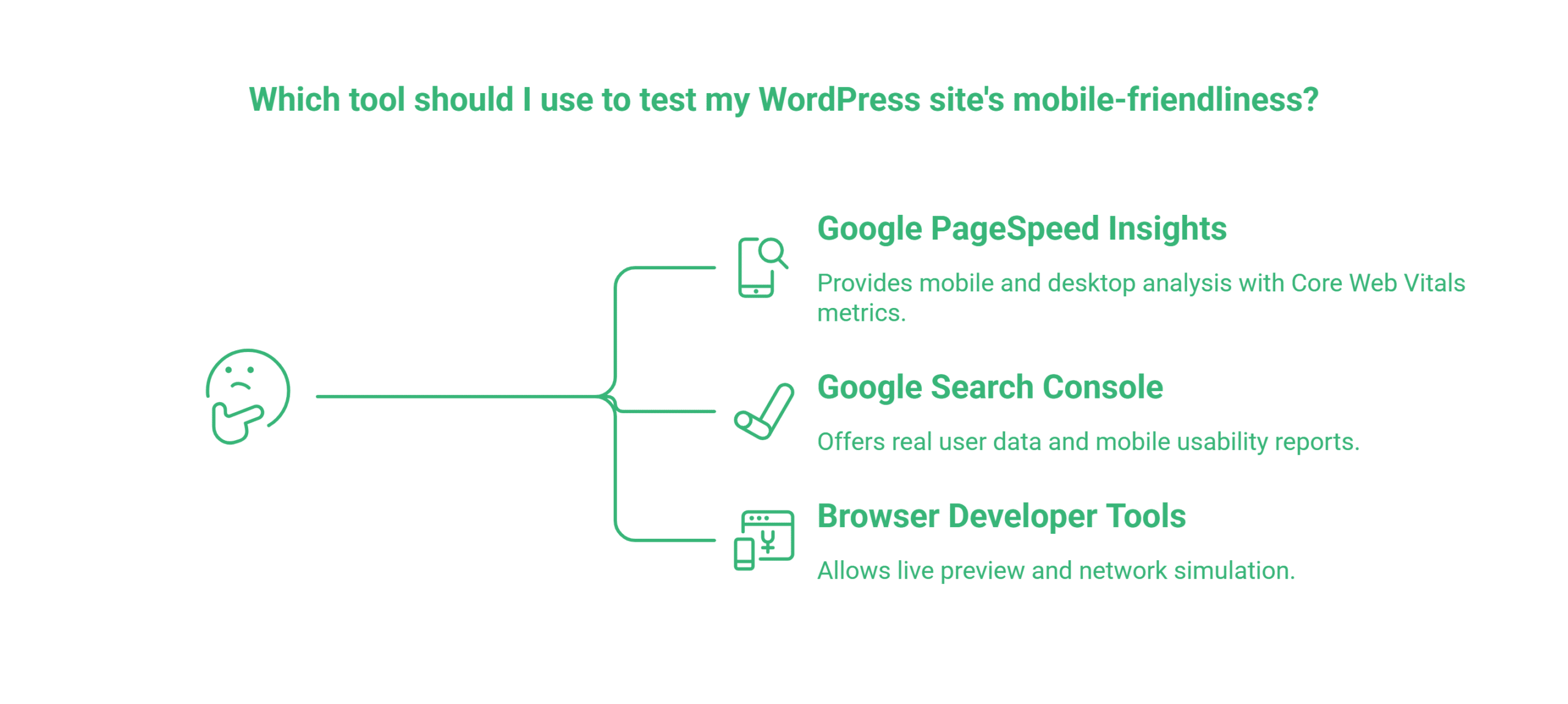
Before making changes, you need a clear picture of where your site stands. Three tools do the job without any specialist knowledge.
Google PageSpeed Insights
Visit pagespeed.web.dev and enter your URL. The tool runs both a mobile and a desktop analysis. Pay attention to the mobile score specifically; a site that scores 90 on desktop but 45 on mobile has a significant problem.
PageSpeed Insights reports four Core Web Vitals metrics for mobile. These are the numbers Google uses when assessing your site:
- Largest Contentful Paint (LCP): How long the main content takes to appear. Aim for under 2.5 seconds.
- Interaction to Next Paint (INP): How quickly the page responds when a visitor taps or swipes. Aim for under 200 milliseconds. This replaced First Input Delay in 2024 and is particularly important on lower-powered Android devices.
- Cumulative Layout Shift (CLS): How much the page content jumps around as it loads. Aim for a score below 0.1.
- First Contentful Paint (FCP): How quickly any content appears at all. Aim for under 1.8 seconds on mobile.
Google Search Console
If your site is connected to Google Search Console, check the Core Web Vitals report under “Experience”. This uses real user data from visitors to your site, which is more accurate than simulated lab tests. The Mobile Usability report shows specific pages with problems, including text too small to read, content wider than the screen, and clickable elements placed too close together.
Browser Developer Tools
In Chrome, open DevTools (F12), click the toggle device toolbar icon, and select a mobile device. This gives you a live preview of how your site renders on various screen sizes. Switch to the Network tab and throttle your connection to “Slow 4G” to simulate the mobile experience of a visitor on a standard UK mobile network.
Six Steps to Make Your WordPress Site Mobile-Friendly
The following steps address the most common mobile performance failures in a logical order. Complete them in sequence, fixing images before addressing your theme, for example, will have a limited effect if the theme itself is the primary source of bloat.
1. Choose a Lightweight, Genuinely Responsive Theme
Your theme is the single biggest variable in mobile performance. A bloated theme adds hundreds of kilobytes of JavaScript and CSS to every page load, and the resulting mobile-friendly WordPress website will struggle to score well in PageSpeed Insights regardless of how much optimisation is layered on top.
Before selecting or switching a theme, test it using PageSpeed Insights on the theme’s demo site. A quality theme should score above 80 on mobile without any additional optimisation. Block themes built for WordPress’s Full Site Editing system, such as Kadence, Spectra One, and GeneratePress, typically perform better on mobile than legacy page builder-based themes because they generate cleaner, lighter code.
Elementor and Divi are capable tools, but they can add 400 to 600 kilobytes of JavaScript and CSS to each page. If you are using either builder, performance depends heavily on how carefully it is configured. Lazy loading, deferred asset loading, and per-page script controls can bring the overhead down considerably, but this requires deliberate management.
What to look for in a mobile-friendly WordPress theme:
| Criterion | Good Threshold | Why it Matters |
|---|---|---|
| Mobile Pagespeed Score (demo) | 80+ | Indicate how the theme performs before plugins |
| Hoempage Weight | Under 1MB | Relevant for visitors on 3G in rural areas |
| Javascript Dependencies | Minimal, no jQuery required for basic functionality | Each script adds a server request |
| Touch Target Sizes | 44X44px minimum on navigation | Prevents accidental taps and misclicks |
2. Use Native Mobile Editing in Your Page Builder
One of the most commonly asked questions about WordPress mobile optimisation is how to edit the mobile version of a WordPress site separately from the desktop version. The answer lies in the responsive controls built into modern page builders, and most WordPress users never use them.
In Elementor, click the device icon at the bottom of the editing panel to switch between desktop, tablet, and mobile views. You can then hide specific elements on mobile (such as a wide desktop banner that does not suit a phone screen), adjust column widths, change font sizes, and modify spacing, all without affecting the desktop layout. These settings are baked into Gutenberg blocks as well through each block’s “Advanced” panel.
This matters because many mobile layout problems are not caused by the theme; they are caused by design decisions made entirely on a desktop screen and never reviewed on mobile. Regularly previewing your pages in mobile view while editing catches these issues before they go live.
3. Compress and Optimise Every Image
Images are the single most common cause of slow mobile page speeds on WordPress sites. A homepage with five or six uncompressed JPEG images at several megabytes each will struggle to load in under four seconds on a typical UK 4G connection, regardless of your theme or caching configuration.
The fix has two parts. First, convert your images to WebP format. WebP files are typically 25 to 35% smaller than JPEG at equivalent visual quality. Plugins such as Imagify and ShortPixel convert and compress images automatically when you upload them, and can bulk-convert your existing media library.
Second, implement responsive images using the srcset attribute so that mobile devices download appropriately sized images rather than scaling down large desktop files. WordPress generates multiple image sizes automatically when you upload, but your theme must properly use srcset in its templates. Check the theme’s documentation or ask your developer to verify this.
Enable lazy loading for images that appear below the fold. WordPress has included native lazy loading since version 5.5. For hero images that appear immediately on load, add loading=”eager” to the image tag to prevent any delay in showing your most important content.
4. Address Core Web Vitals: LCP, CLS, and INP
Core Web Vitals are not a single technical fix; they are a set of performance benchmarks that require targeted attention to each metric. Here is what causes failures on mobile and what to do about them.
Improving LCP on mobile: The largest contentful paint is usually your hero image or main heading. On mobile, it loads slowly when the image is uncompressed, when the server is slow to respond, or when render-blocking JavaScript delays the entire page from starting to load. Caching your site with WP Rocket or LiteSpeed Cache, deferring non-critical JavaScript, and serving images from a CDN are the most effective interventions.
Reducing CLS on mobile: Layout shift is often worse on mobile than on desktop because ads, cookie banners, and notification bars take up a larger proportion of the screen. Reserve space in your layout for these elements so they do not push content around when they load. Add explicit width and height attributes to all images. WordPress does this automatically for images uploaded through the media library, but custom-coded templates sometimes omit them.
Improving INP on mobile: Interaction to Next Paint is determined by how quickly your site responds when a visitor taps a button or link. Heavy JavaScript is the primary cause of poor INP scores on mobile, because phones have less processing power than laptops. Review which plugins are loading JavaScript on each page using the Chrome DevTools Coverage panel, and remove or defer scripts that are not needed.
5. Audit Your Plugin Stack
Every WordPress plugin potentially adds code that your mobile visitor’s phone must download and execute. A site with 30 or 40 active plugins accumulates significant overhead, even if each plugin adds only a small amount.
The audit process is straightforward. Go to your plugins list and ask, for each active plugin: is it still needed? Is it loading scripts on pages where it has no function? Could a built-in WordPress feature or a lighter alternative replace it?
Use a plugin such as Perfmatters to control which scripts and styles load on which pages. This prevents, for example, WooCommerce from loading its JavaScript on blog posts where there is no shop functionality. The performance gains from this kind of asset management can be substantial, often five to ten PageSpeed points on mobile.
A particular word of caution about mobile redirect plugins. Older tools such as WPtouch work by creating a separate mobile version of your site at a different URL, typically m.yourdomain.com. This approach causes SEO problems, creates maintenance overhead, and is no longer necessary or recommended. Use a natively responsive theme instead.
6. Fix Cookie Banners and Pop-Ups for Mobile
ICO-compliant cookie consent banners are a legal requirement for UK businesses operating under UK GDPR. Poorly implemented banners, however, can cover the entire viewport on a phone screen, block content before the visitor has a chance to engage, and directly cause layout shift, all of which damage both user experience and Google’s assessment of your mobile usability.
The fix is to use a cookie banner that sits at the bottom of the screen rather than covering the page, collapses to a small persistent bar once the initial notice has been shown, and does not reappear on subsequent visits once consent has been given. Plugins such as CookieYes and Complianz both offer mobile-friendly banner configurations.
The same principle applies to pop-ups and overlays. Google explicitly penalises intrusive interstitials on mobile pages, content that appears on load and blocks the main content before the user has interacted. If your site uses a pop-up for lead capture, configure it to trigger only on exit intent or after the user has scrolled a certain distance, not on immediate page load.
Essential WordPress Plugins for Mobile Optimisation
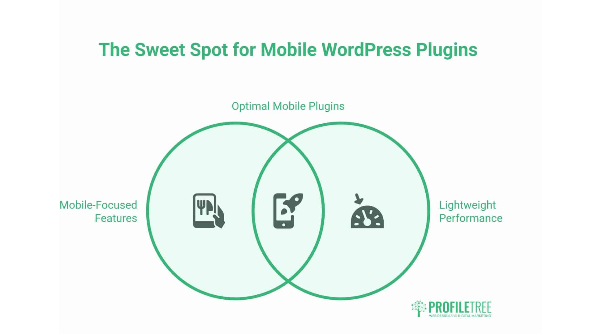
The right plugin stack handles mobile performance without adding excessive overhead of its own. A site with one well-configured caching plugin and one image optimisation plugin will almost always outperform a site with ten loosely configured alternatives.
WP Rocket is the most reliable all-in-one performance plugin for WordPress. It handles page caching, cache preloading, JavaScript deferral, lazy loading, and mobile-specific cache generation. The mobile cache feature is worth enabling if your site serves different content to mobile and desktop visitors.
Imagify or ShortPixel handles image compression and WebP conversion. Both integrate with the WordPress media library and process new uploads automatically, removing the need for manual compression workflows.
Perfmatters provides per-page asset control, allowing you to disable plugin scripts on pages where they are not needed. For sites with multiple active plugins, this consistently produces measurable mobile speed improvements.
WP Mobile Menu is worth considering if your current mobile navigation is a basic hamburger menu. It enables bottom-bar navigation that places your primary pages within easy thumb reach, closer to the navigation pattern of a mobile app than a traditional website.
Before installing any plugin, test your PageSpeed Insights mobile score as a baseline. Install the plugin on a staging site, configure it, and re-test. Some plugins that appear beneficial based on their marketing copy add more weight than they remove.
The Thumb Zone: Designing for Touch Interaction
Mobile users navigate with their thumbs, not a mouse cursor. The reach zone of a thumb on a standard smartphone concentrates at the bottom centre of the screen, with the top corners being the hardest area to reach when holding a phone one-handed.
This has direct implications for where you place your most important buttons and navigation links. Primary calls to action, “Get a Quote”, “Call Us”, “Book Now”, perform better when placed in the lower portion of the screen and in sticky elements that remain visible as the visitor scrolls.
Minimum touch target size is 44×44 CSS pixels, as recommended by the Web Content Accessibility Guidelines. Buttons and navigation links smaller than this cause accidental taps on adjacent elements, which creates friction and abandoned sessions. In Google Search Console, the “Clickable elements too close together” error is a direct flag for this problem, fix it by increasing padding around links and buttons rather than just enlarging the text.
For complex sites with multiple sections, a bottom navigation bar that displays your four or five most important pages as icons works considerably better on mobile than a traditional top hamburger menu. ProfileTree implements this hybrid approach for clients in retail, hospitality, and professional services, consistently finding higher menu engagement rates than the standard hamburger pattern produces.
How Much Does a Mobile-Optimised WordPress Site Cost in the UK?
The cost depends on whether you are building a new site or optimising an existing one.
For a new mobile-optimised WordPress site, most SMEs in the UK and Ireland should expect to invest between £2,500 and £8,000, depending on the number of pages, complexity of functionality, and the amount of custom design work required. This range covers professional theme setup, proper image workflows, Core Web Vitals optimisation from the outset, and content migration where relevant.
For optimising an existing WordPress site, a focused performance audit and remediation project typically costs between £500 and £2,000. This usually covers a full technical audit, image compression across the existing media library, plugin rationalisation, caching configuration, and a final PageSpeed Insights review to verify the improvements.
The clearest signal that your site needs professional attention is a mobile PageSpeed score below 50, a Core Web Vitals “Poor” classification in Google Search Console, or consistent mobile bounce rates above 70% in your analytics. ProfileTree’s WordPress development team provides audits and builds for businesses across Northern Ireland, Ireland, and the UK, with a particular focus on sites that have grown organically over time and accumulated performance debt along the way.
For businesses considering a full rebuild, the web design service works through mobile-first design principles from the initial wireframe stage, avoiding the retrofit problem altogether.
Watch: Mobile WordPress Design Explained
The following video from ProfileTree’s web development channel covers the key principles of mobile WordPress design for business owners, including how to approach Core Web Vitals and what to look for when choosing a theme.
Common Mobile WordPress Problems and How to Fix Them
Several issues appear repeatedly when auditing WordPress sites for mobile performance. Recognising them by symptom speeds up the diagnostic process considerably.
Menu does not open or opens with a visible delay. This is almost always caused by a JavaScript conflict between plugins. Deactivate plugins one at a time to identify the conflict. If the issue persists, consider switching to a lighter mobile menu implementation.
Images overflow the screen width on mobile. Add the following CSS to your theme’s stylesheet or through the WordPress Customiser. This forces all images to stay within their container:
cssimg { max-width: 100%; height: auto; }Site loads slowly on mobile only. If your desktop score is high but your mobile score is low, the most likely cause is JavaScript execution time. Mobile processors handle JavaScript more slowly than desktop machines. Use the Coverage tool in Chrome DevTools to identify JavaScript files that are large and only partially used.
Content jumps around as the page loads. This is a CLS problem. The most common causes are images without explicit dimensions, web fonts that cause text to reflow when they load, and injected content such as cookie banners appearing after initial render. Add width and height attributes to images, use font-display: swap for web fonts, and pre-reserve layout space for banners.
Google Search Console showing “Text too small to read”. This means body text on one or more pages is below 12 pixels on mobile. Set body text to a minimum of 16 pixels and check that your theme’s font settings are not being overridden by plugin stylesheets.
FAQs About Mobile-Friendly WordPress Websites
How do I make my WordPress site mobile-friendly?
Choose a lightweight responsive theme, compress all images to WebP format, install a caching plugin such as WP Rocket, and run PageSpeed Insights to identify what to fix first. The biggest gains almost always come from the theme and images rather than any dedicated mobile plugin.
What is the best mobile-friendly WordPress theme?
For most SMEs, Kadence and GeneratePress are strong choices. Both are lightweight, score well on mobile PageSpeed benchmarks, and work well with major page builders if you need one. Astra is another reliable option. If you are building a content-heavy site and want Full Site Editing flexibility, Twenty Twenty-Five is a solid free option. The key is to test any theme’s mobile score on its demo before committing to a build.
How do I test if my WordPress site is mobile-friendly?
Run your URL through Google PageSpeed Insights at pagespeed.web.dev and check the mobile score and Core Web Vitals results. Then open Google Search Console, go to Experience, and review the Mobile Usability report for any specific pages flagged with errors.
Do WordPress plugins affect mobile performance?
Yes, significantly. Every plugin that loads JavaScript or CSS on your pages adds to the total weight that mobile visitors must download. Plugins are not inherently harmful; well-coded plugins with lean asset footprints cause minimal impact, but sites that have accumulated 30 or 40 active plugins over time almost always have mobile performance problems as a result. Audit your plugin list regularly, remove anything no longer needed, and use a tool such as Perfmatters to prevent plugins from loading assets on pages where they have no function.
How do I optimise images for a mobile-friendly WordPress website?
Install Imagify or ShortPixel to automatically compress uploads and convert them to WebP format. Enable lazy loading for below-the-fold images (WordPress includes this natively since version 5.5) and add loading=”eager” to your hero image so it loads without delay. Make sure your theme properly implements the srcset attribute so mobile devices receive appropriately sized images rather than scaled-down desktop files.
How do I edit the mobile version of my WordPress site separately?
In Elementor, click the device icon at the bottom of the editing panel to switch to mobile view, where you can adjust font sizes, hide specific elements, change spacing, and modify column layouts without affecting the desktop version. Gutenberg blocks offer the same through each block’s Advanced panel. This is built into the page builder itself and does not require a separate plugin.
Taking Action on Mobile Performance
A mobile-friendly WordPress website is no longer a design nicety; it is a baseline requirement for ranking in Google and converting visitors who arrive on phones. For UK businesses, the combination of mobile-first indexing and the dominance of mobile search among local intent queries means that mobile performance directly determines commercial visibility.
The starting point is measurement. Run PageSpeed Insights on your homepage today and note your mobile score. If it is below 70, the gap between your current performance and where it needs to be is costing you in both rankings and conversions.
From there, the fix is methodical: choose a lightweight theme, compress your images, control your plugin stack, and address each Core Web Vitals metric in turn. None of these steps requires specialist knowledge, but they do require systematic attention.
If you would rather have a team handle the audit and implementation, ProfileTree works with SMEs across Northern Ireland, Ireland, and the UK on exactly these projects, from mobile performance audits through to full WordPress rebuilds designed for mobile users from the ground up.