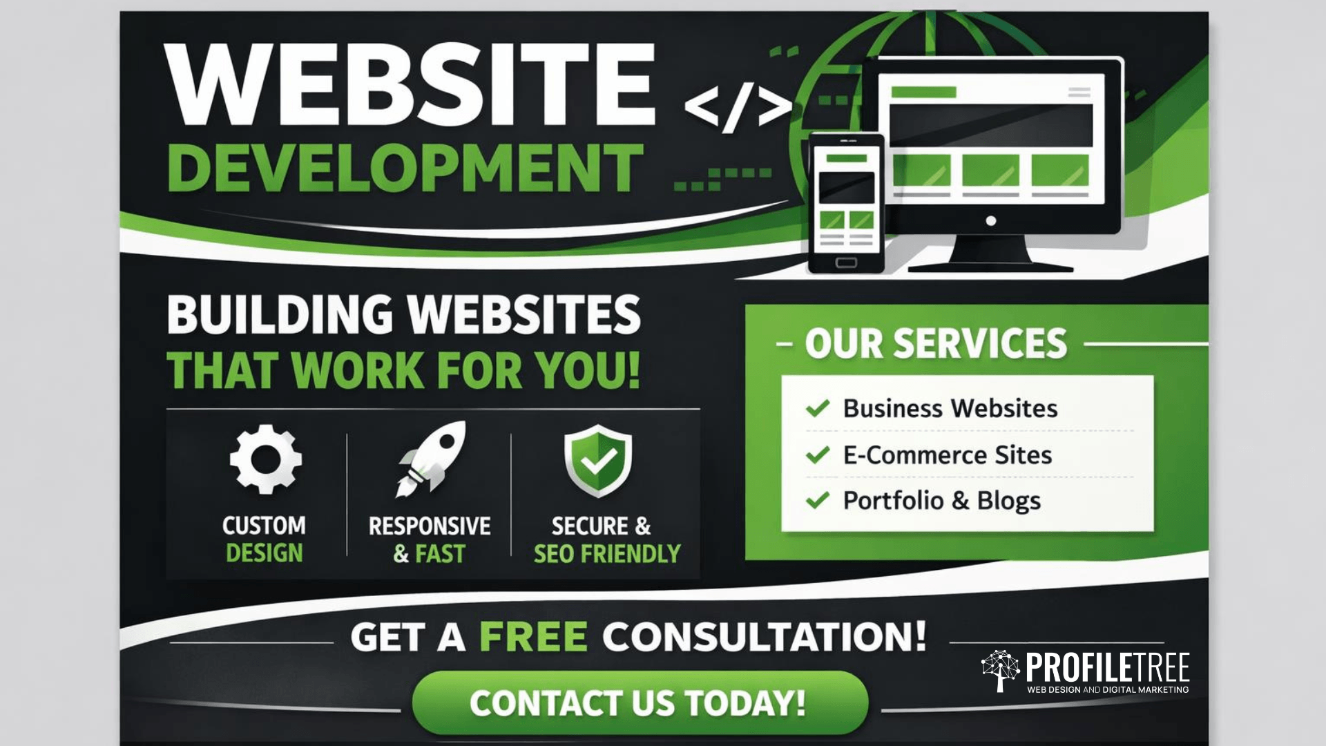
Professional Website Development in Belfast and Beyond
Website development is the technical work that makes a website function. Where web design shapes how a site looks, web development determines how it works: the code, the database, the integrations, the speed, and the security.
ProfileTree is a Belfast-based web design and development agency, founded in 2011, with over 1,000 projects delivered for businesses across Northern Ireland, Ireland, and the UK. Our in-house development team handles the full technical build: from WordPress configuration and WooCommerce store setup through to custom functionality, API integrations, speed optimisation, and ongoing maintenance.
If you are a business owner weighing up what you actually need from a digital agency, understanding the difference between design and development is the first practical step. Not every project needs both equally, and knowing which matters more for your goals helps you invest in the right place.
What Website Development Means At ProfileTree
Many businesses use “web design” and “web development” as interchangeable terms. They are related but distinct.
Website design covers visual layout, branding, user experience, and the way pages look. Website development is the technical implementation: the CMS build, the custom code, the server configuration, the third-party connections, and the performance tuning.
A site can look excellent and still perform poorly in search, load slowly, or fail under moderate traffic; that is a website development problem, not a design problem.
At ProfileTree, our website development work covers:
WordPress Build & Configuration
Custom theme implementation, plugin management, and performance hardening
WooCommerce Store Setup
From payment gateway integration and product catalogue configuration through to checkout optimisation
Custom Functionality Development
Booking systems, membership platforms, directory databases, and bespoke features that standard platforms cannot support out of the box
API Integrations
API integrations connecting your site to the tools your business already uses: CRM platforms, accountancy software, stock management systems, and email marketing platforms
Speed and Core Web Vitals Optimisation
Speed optimisation targeting Core Web Vitals scores and Google PageSpeed benchmarks, including image compression, caching configuration, server response tuning, and code minification
Technical SEO Implementation
Semantic HTML, clean URL structures, XML sitemaps, structured data markup, and proper heading hierarchies built into every project from day one
Platform Migrations
Moving sites between hosting environments or CMS platforms while protecting existing search rankings
“Website development is where the commercial objectives of a business get translated into working technology,” says Ciaran Connolly, founder of ProfileTree. “The design might win the first impression, but the development determines whether the site actually does its job.”
For more on the visual and user experience side of your project, see our web design services.
Who Needs Development Rather Than Design
Not every business enquiry starts with a blank canvas. A significant portion of the website development work ProfileTree handles involves existing sites that need technical improvement rather than a visual refresh.
You need development-led work when:
- Your site loads slowly and is losing organic rankings as a result
- You need to add functionality that your current platform cannot support: bookings, memberships, product filtering, and multi-currency checkout
- You are migrating from one platform to another and need to protect your SEO equity during the move
- Your WordPress installation has become difficult to maintain due to plugin conflicts, outdated core files, or accumulated technical debt
- You need custom API connections to tools your business already uses: accountancy software, CRM platforms, and stock management systems
- Your WooCommerce or e-commerce store is handling transactions, but the checkout is underperforming, and you need conversion rate improvements at the technical level
You need design-led work when you are launching a new brand, refreshing an outdated visual identity, or restructuring the user experience on an existing site.
Most substantial projects involve both. The practical distinction is which discipline drives the brief. Our web design Belfast team works alongside our developers to deliver projects where both matter.
Ready to discuss your project? Start Here!
Our Website Development Process
Knowing what working with ProfileTree looks like before you commit is a reasonable expectation. Our website development process follows a structured sequence that keeps projects on track and clients informed throughout.
Discovery and Technical Scoping
Every project begins with a discovery session covering your business objectives, current technical setup, platform preferences, and functional requirements. This produces a technical specification document outlining the development scope, platform recommendation, integration requirements, and timeline. We do not begin development work until the scope is agreed upon; this protects both parties from scope creep and budget overruns.
Platform Selection and Architecture
Platform choice is driven by your requirements, not our preferences. WordPress suits content-rich sites, membership platforms, and businesses that need extensive plugin ecosystems. WooCommerce extends WordPress for e-commerce operations, where content and selling coexist on the same site. Shopify works well for pure retail operations, prioritising transaction simplicity over content flexibility. Custom builds are justified when platform constraints would require so many workarounds that you would be fighting the tool rather than using it.
We set up development environments separate from your live site. All code goes through version control. No changes reach your live domain until they have been tested internally and signed off by you.
Build and Integration
Development work follows the technical specification, with regular milestone check-ins. We build mobile-first, which means responsive behaviour across devices is built into the architecture from day one rather than added as an afterthought. Technical SEO is integrated throughout: semantic HTML, clean URL structures, proper heading hierarchies, XML sitemaps, and structured data markup are part of every build, not an optional extra.
Third-party integrations (payment gateways, CRM systems, booking tools, email marketing platforms) are configured and tested during this phase. We handle the technical side of connections that your team will rely on daily.
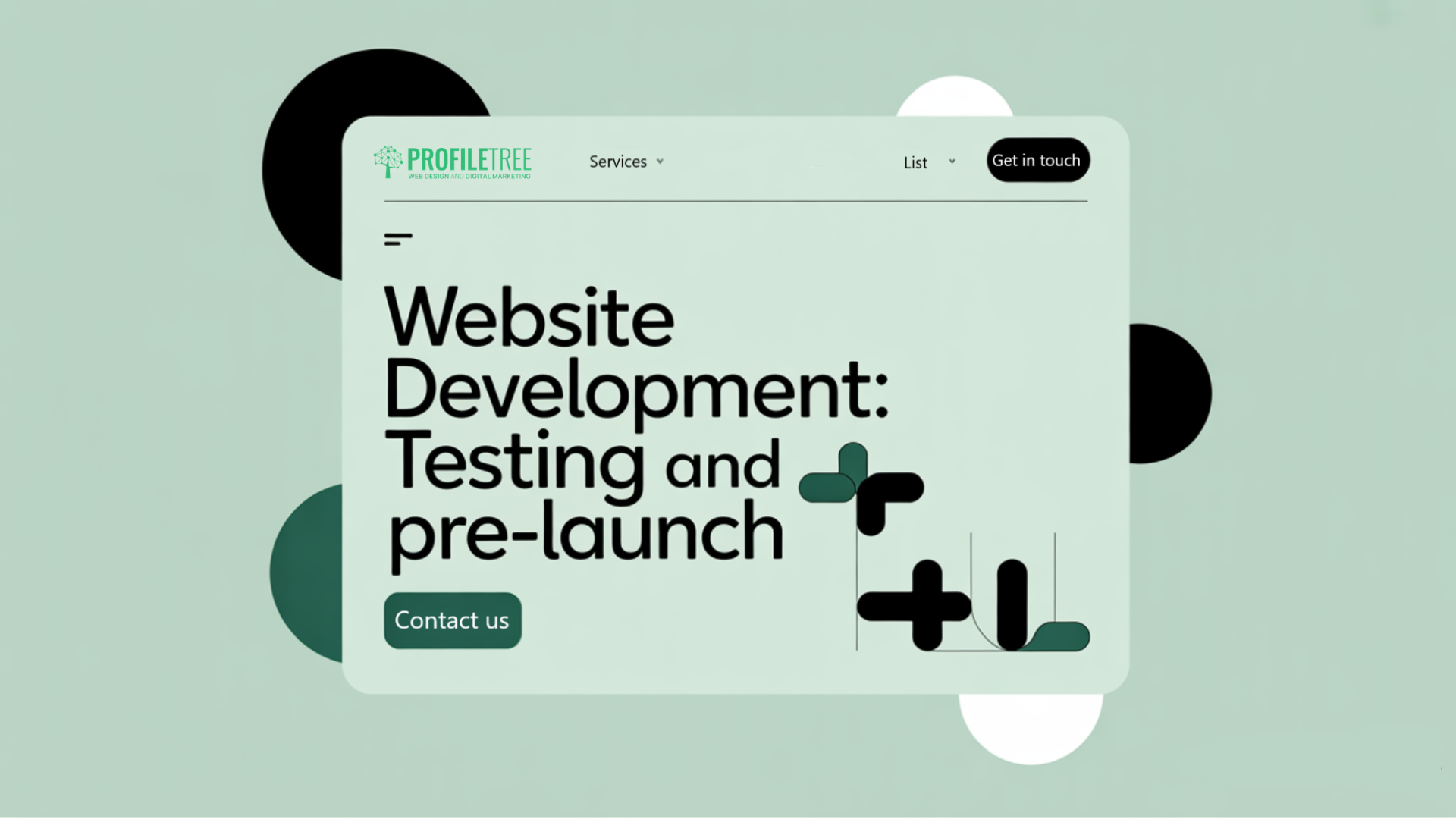
Testing and Pre-Launch
Pre-launch testing covers cross-browser compatibility, mobile responsiveness, form functionality, payment processing, load speed, and security configuration.
We run Google PageSpeed Insights checks and address any issues that would affect Core Web Vitals scores. Then, we resolve broken links, redirect chains, and crawl errors before the site goes live.
Launch and Handover
Go-live is planned rather than rushed. We coordinate DNS changes, SSL certificate activation, and search console verification.
Training sessions cover day-to-day CMS use: content editing, media management, and any platform-specific tools your team will use regularly. We provide screen-recorded walkthroughs alongside live sessions, so your team has a reference point after handover.
Platform Options: Shopify, WordPress, WIX & Webflow
ProfileTree works across the major CMS and e-commerce platforms used by businesses in the UK and Ireland. The right platform depends on what your site needs to do, not on what is easiest for us to build.
Web Design & Development Services
WordPress
WordPress suits businesses that need a content-rich, flexible site with long-term scalability. As an open-source CMS powering a significant share of the web, it offers a plugin ecosystem that covers most business requirements without custom development.
ProfileTree builds WordPress sites for service businesses, professional practices, membership platforms, and organisations that publish regularly. We handle theme implementation, plugin configuration, and performance hardening.
WooCommerce is the natural extension for WordPress when e-commerce functionality is required alongside content management. For businesses in Northern Ireland and Ireland that need to sell online while maintaining editorial control over their site, WooCommerce avoids the complexity of running two separate platforms.
We handle payment gateway setup, product configuration, shipping rules, VAT handling, and checkout optimisation as part of the build.

Shopify
Shopify works well for businesses whose primary purpose is retail, particularly where the catalogue is large, and the team managing the site is non-technical. The trade-off is less flexibility on the content side.
ProfileTree builds and customises Shopify stores for retailers who want a reliable transactional platform without the overhead of managing a self-hosted stack. Where Shopify’s native customisation limits apply, we work within the Liquid templating system and the app ecosystem to extend functionality.
Wix
Wix suits businesses with straightforward requirements and limited budgets. Where Wix becomes limiting is on custom functionality, deeper technical SEO control, and integrations with other business systems. We are direct with clients about when Wix is sufficient and when it will hold them back.

Webflow
Webflow suits businesses that want a visually precise, designer-led build without relying on a traditional CMS or plugin ecosystem. It works well for marketing sites, portfolio builds, and businesses that need granular control over layout without writing custom code.
Where Webflow has limitations is on complex e-commerce operations and deep backend integrations; for those requirements, WordPress or a custom build is usually the stronger choice. ProfileTree works with Webflow for clients where it is genuinely the right fit, and we are direct about when another platform would serve them better.
What Affects Website Development Cost and Timeline
Two of the questions we hear most often from business owners are "how much will this cost?" and "how long will it take?" Both depend on scope, but we can give you a practical framework.
Cost Factors
Platform-based builds using WordPress with customised themes typically range from £2,500 to £8,000 for a professional business website.
WooCommerce and e-commerce projects with payment gateway integration, product management, and customer account functionality range from £5,000 to £15,000, depending on catalogue size and checkout complexity.
Custom web applications requiring bespoke functionality (booking systems, membership platforms, directory databases) start from £10,000 and scale with complexity.
The main cost drivers are functional complexity, the number of third-party integrations, content volume, and whether design and development are being handled together or separately. We provide itemised project quotes before any work begins, so you have full visibility of costs before committing.

Timeline Factors
Standard business websites typically take six to eight weeks from brief to launch. WooCommerce and e-commerce builds run ten to fourteen weeks. Custom web applications with bespoke functionality may require sixteen weeks or more.
The main timeline variable outside of scope is content readiness.
- Projects where copy, images, and product data arrive on time run to schedule.
- Projects where content is delayed stall regardless of how efficiently the development work is proceeding.
We address this in our project scoping by setting content deadlines alongside technical milestones.
What Is Included in a ProfileTree Website Development Project
A website development project with ProfileTree includes more than the build itself. Standard inclusions across all projects cover:
- Technical discovery and specification documentation
- Platform setup and configuration
- Responsive, mobile-first development
- Basic on-page technical SEO (URL structure, meta framework, XML sitemap, robots.txt)
- SSL certificate configuration
- Speed optimisation targeting 90+ PageSpeed scores
- Cross-browser and cross-device testing
- CMS training sessions and documentation
- A defined warranty period covering bug fixes post-launch
Hosting, domain registration, premium plugin licences, and ongoing maintenance retainers are scoped separately. We provide itemised quotes, so you know exactly what you are paying for before work begins.
Why Choose ProfileTree for Website Development
ProfileTree has been delivering website development projects from Belfast since 2011. In that time, we have completed more than 1,000 projects for businesses across Northern Ireland, Ireland, and the UK, and hold a 5-star rating from over 450 Google reviews. That track record matters because website development is a long-term commitment; the agency you choose will be maintaining, updating, and building on what they deliver for years after launch.
Platform recommendations are driven by your functional requirements, not by what is easiest for us to build. Every project uses a separate web development environment, version control, and pre-launch testing before anything reaches your live domain.
Clean URL structures, semantic HTML, Core Web Vitals optimisation, and structured data markup are standard inclusions on every build, not optional extras.
For businesses in Northern Ireland and Ireland, working with a local team means genuine accessibility. We are available for in-person meetings, we understand the regional business landscape, and we are not passing your project to an offshore team after the discovery call.
Our own digital brands (Learning Mole, Connolly Cove, Amazing Food and Drink, and Amazing Cars and Drives) are ProfileTree-built and managed websites operating across education, tourism, food and hospitality, and automotive. They demonstrate what we do in practice: content architecture, SEO-integrated development, and platform scalability built to perform over time rather than just at launch.
Ready to scope your project? Contact us to discuss your requirements!
Ongoing Support and Maintenance
A website is not a one-time project. Software updates, security patches, plugin compatibility, performance monitoring, and content changes require ongoing technical attention, particularly for WordPress installations where the update cadence is frequent and the security implications of falling behind are real.
ProfileTree offers monthly maintenance retainers covering:
- WordPress core, theme, and plugin updates with compatibility testing
- Security scanning and malware monitoring
- Automated daily backups with tested restoration procedures
- Uptime monitoring and incident response
- Performance checks and hosting tuning
- Minor content updates and technical adjustments
Retainer pricing is based on site complexity and the level of support required. WooCommerce and e-commerce sites operating transactional infrastructure need more active monitoring than a corporate brochure site. We structure retainers accordingly, and response times for critical issues are agreed upon before work begins.
One ProfileTree client, Austin Lynch, described the experience: “Within the hour, the cache had been cleared and the website was working properly again. Brilliant service from the team at Profiletree.”
What Our Clients Say About Working With Us
The reviews below come directly from businesses that have worked with ProfileTree on website development and redevelopment projects. They reflect the range of work our team handles: full builds for growing businesses, technical redevelopments for organisations with existing sites, and development work alongside SEO and marketing strategy.
5 Star Overall Satisfaction Rating
Based on 460+ Google Reviews
"We approached ProfileTree for a complete website redesign and development project after our old site was underperforming. As a retail business operating across Northern Ireland, we knew our site needed to reflect both our brand and the customer journey properly. Ciaran was excellent from day one; he asked all the right questions, understood our goals, and put together a structured plan.
The new site is fast, mobile-responsive, and clearly designed with SEO in mind. The layout guides users naturally toward making enquiries and bookings, which is exactly what we needed. On top of that, Ciaran and his developers made sure the backend was easy for our staff to manage. We're now seeing a steady increase in traffic and a big improvement in user engagement. The best part? Local customers in Belfast and Newry are finding us more easily thanks to the search optimisation baked into the site."
Marketing iPhix Tech NI
Marcus brought an exceptional level of developer knowledge to the project, seamlessly complementing our in-house expertise in UX design. Marcus’s technical skills and innovative solutions were instrumental in transforming our ideas into a functional and visually appealing website. His ability to understand our needs and translate them into effective web solutions was invaluable. We are thrilled with the results and are eagerly looking forward to launching and utilising the new website.
Margaret Craig
I had an excellent experience with Profiletree. They helped me with both website development and design, and I couldn't be happier with the results. Their team was professional, attentive, and truly understood my vision. I highly recommend them to anyone looking for top-notch web services.
Kris Reid
Start Your Website Development Project
Every website development project at ProfileTree begins with a straightforward conversation about what you need the site to do. There are no templates to fill in and no automated quotes; just a direct discussion with our Belfast-based team about your business, your current setup, and where development work would make the most practical difference.
Whether you are building from scratch, migrating an existing site, or dealing with a technical problem that has been sitting on the to-do list too long, get in touch with the ProfileTree team to arrange an initial consultation.
Website Development FAQs
Website development is the technical process of building and maintaining a website. It covers everything that happens below the surface of the design: the code that makes pages function, the database that stores and retrieves content, the server configuration that affects speed and security, and the integrations that connect your site to other tools and platforms. Web design determines how a site looks; website development determines how it works.
WordPress suits most SMEs. It is well-documented, widely supported, and gives your team meaningful control over day-to-day content management. A custom build makes sense only when your functional requirements are genuinely unusual and a platform like WordPress would require so many workarounds that you would be fighting the tool rather than using it. We will tell you honestly if WordPress would serve you just as well.
Platform-based builds typically range from £2,500 to £8,000 for a professional business website. E-commerce projects with payment processing and product management range from £5,000 to £15,000. Custom web applications start from £10,000. The main variables are functional complexity, integration requirements, and content volume. We provide itemised project quotes before any work begins, so you have full visibility of costs before committing.
If your site looks dated, you need web design work. If it loads slowly, breaks under moderate use, or cannot support the features your business needs, you need web development. If you are building from scratch, you likely need both. We will identify which applies to your situation during an initial conversation, before any costs are discussed.
Yes, on both counts. ProfileTree builds mobile-first by default, so responsive behaviour is built into the architecture from the start. Every site includes clean URL structures, semantic HTML, XML sitemaps, structured data markup, and Core Web Vitals optimisation as standard. These are not add-ons; they are part of how we build.
Yes. Every project includes a post-launch warranty covering bug fixes. Most clients then move onto a monthly retainer covering platform updates, security scanning, automated backups, uptime monitoring, and minor technical adjustments. Response times for critical issues are agreed as part of the retainer arrangement before work begins.
Yes. ProfileTree is based in Belfast and works with businesses across Northern Ireland, the Republic of Ireland, and the wider UK. Most project work is handled remotely. For clients in Belfast and Northern Ireland, we are available for in-person meetings at key project stages where that is useful.
Most websites need meaningful development work within two to three years of launch. ProfileTree builds with scalability in mind, but we are straightforward about the fact that no build lasts indefinitely without investment. Clients on maintenance retainers get proactive advice on when incremental website development is sufficient and when a more substantial rebuild makes better commercial sense.
You can, and for some businesses that is the right answer. If your requirements are straightforward, a well-configured Wix site built with professional guidance can serve you well. Where self-build platforms become limiting is when you need custom functionality, deeper technical SEO control, or integrations with other business systems. The platform matters less than whether it has been set up correctly.

Web Design
We design stunning, user focused websites that present your brand beautifully and convert visitors into customers.

Web Development
We use the latest development tools to build websites that are optimised for peak performance at all times.

Website Hosting
We manage everything from site updates and reports to hosting, allowing you to focus on running your business.

Search Engine Optimisation
Using the latest SEO techniques, we help your brand get found for the right terms and by the right people.

Digital Marketing Strategy
Navigate the digital landscape with a marketing strategy. Our team crafts comprehensive plans that resonate with your target audience, drive engagement, and boost conversions.

Digital Marketing Training
Elevate your digital proficiency. Our in-depth training sessions equip your business with cutting-edge digital marketing techniques to outperform competitors and thrive online.

Social Media Strategy
Captivate and grow your social following. We create tailored social media strategies that ignite engagement, amplify your brand's online presence, and foster lasting connections.

Email Marketing Solutions
Harness the power of your mailing list. Our precision-targeted email marketing campaigns are engineered to nurture relationships and drive tangible business outcomes.

Content Marketing Services
Elevate your brand with our content marketing mastery. From thought-provoking blogs to eye-catching infographics, we craft content that captivates, informs, and converts your ideal audience.

Video Production
Capture your audience with compelling video content. Our production team creates visual stories that engage, inform, and leave a lasting impression.

Brand Storytelling
Bring your brand's story to life with authenticity. We craft compelling narratives that strike a chord with your audience, forging a powerful emotional bond with your brand.

Content Strategy Development
Strategic content that drives action. We develop content strategies that align with your business goals, ensuring every piece of content counts.

AI Training
Empower your business with AI expertise. Our tailored training demystifies AI, equipping your team with the knowledge to leverage its potential for growth and innovation.

AI Chatbots
Transform customer service with AI chatbots. We develop sophisticated chatbots that elevate user experience, streamline interactions, and deliver unparalleled efficiency.

AI Marketing
Transform your reach with AI-driven marketing. Harness data-driven insights for laser-targeted campaigns that captivate, engage, and convert your audience.

AI Tools for Business
Optimise your operations with cutting-edge AI tools. We integrate intelligent solutions that streamline processes, enhance efficiency, and support data-driven decision-making.
Join Our Mailing List
Grow your business with expert web design, AI strategies and digital marketing tips straight to your inbox. Subscribe to our newsletter.