Video Thumbnail Best Practices That Increase Click-Through Rates
Table of Contents
Your video thumbnail is the first thing a viewer judges, and most of them decide whether to click in under a second. A sharp, well-designed thumbnail can lift your click-through rate (CTR) and feed more views, watch time and engagement back into your channel. A weak one quietly buries good content.
This guide walks through the choices that actually move the needle: visual appeal, text on the image, branding and consistency, plus the testing routine that tells you what works. You will also find practical advice on mobile, accessibility and cultural awareness.
Whether you produce videos in-house or work with a professional video marketing team, these video thumbnail best practices give you a repeatable way to win the click.
Video Thumbnail Visual Appeal
The visual appeal of your thumbnail does most of the work in grabbing attention. It needs to be striking, relevant to the content, and easy to read at a glance. Strong imagery also supports your wider brand storytelling, so the picture you choose should reflect both the video and the channel behind it. Three factors decide whether a thumbnail earns the click.
Relevance to the Content
Make sure the thumbnail reflects the video’s main theme or its standout moment. If the video is a cooking tutorial, show the finished dish. Avoid images that are unrelated or misleading, because that mismatch leads to viewer disappointment and damages your credibility. A thumbnail that promises one thing and delivers another also raises drop-off, which works against you in the algorithm.
Clarity and Quality
Use high-resolution images so the picture stays sharp rather than pixelated. Keep the shot well-lit, since dark or murky images are hard to read on a busy results page. Pay attention to composition too: the rule of thirds helps you place your subject where the eye naturally lands, giving you a balanced and interesting frame.
Eye-Catching Elements
Bright, contrasting colours help your thumbnail stand out from neighbouring ones, so steer clear of muted tones that blend in. Add visually interesting elements such as close-ups, dramatic shots or action sequences to spark curiosity. Some platforms support animated previews; if you use motion, keep it relevant and avoid anything that distracts from the core message.
Focus on these three areas, and you produce thumbnails that look good and tell the viewer what they are getting, which is exactly what prompts a click.
Text Elements
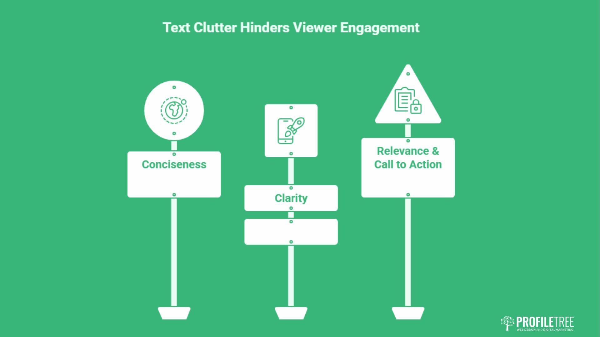
The picture pulls the eye, but the text closes the deal by adding context that the image alone cannot carry. Used well, a few words clarify the topic and nudge the viewer to click. Used badly, text clutters the frame and gets ignored. The principles below keep your wording short, legible and on point.
Conciseness
Aim for two lines of text at most, because longer copy rarely gets read in full. Lean on the words viewers are likely to search for, since relevant keywords help your thumbnail surface in results and lift visibility. Treat the text as a headline, not a paragraph.
Clarity
Pick fonts that are easy to read and that suit the overall design, and avoid anything overly decorative. Keep a strong contrast between the text colour and the background so the words stay legible. Size matters too: the font has to be large enough to read on a small phone screen, not just a desktop monitor.
Relevance and Call to Action
The wording should tie directly to the video’s topic and highlight its most interesting point. A short, active phrase such as “Watch now” or “Learn more” gives the viewer a clear next step. A light sense of timeliness, like “New video”, can add a reason to click without tipping into hype.
Treat text as a partner to the image rather than a substitute for it, and the two together will outperform either on its own. For more on writing copy that converts, ProfileTree’s content marketing services cover the same principles at scale.
Consistency and Branding
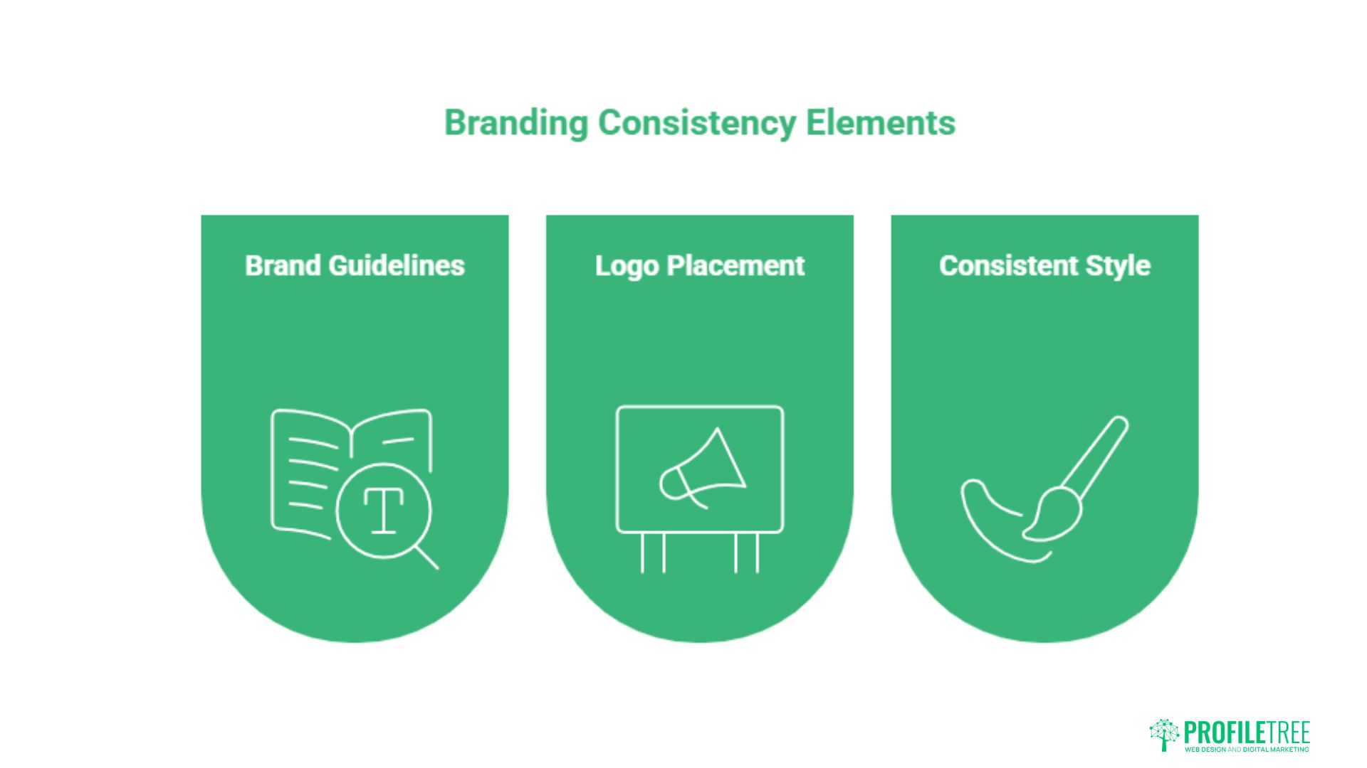
Consistency is what turns a set of one-off thumbnails into a recognisable channel identity. When viewers can spot your videos in a crowded feed, you build trust and repeat views over time. Maintaining brand voice consistency across your thumbnails reinforces who you are at a glance.
Brand Guidelines and Templates
Follow your channel’s established colour schemes, fonts and logo usage so every thumbnail feels part of the same family. Reusable templates that hold your brand elements speed up production and keep the look cohesive. Customise each template to suit the individual video rather than shipping near-identical frames that all blur together.
Logo Placement
Display your channel logo prominently and in the same position on every thumbnail. Consistent positioning helps viewers identify your content instantly and associate it with the value they expect from you. Treat the logo as a fixed anchor point in your layout.
Consistent Style
Keep a steady approach to text, imagery and layout across the channel for a professional, joined-up appearance. Avoid clutter: too many competing elements pull attention away from the main message. Clean, simple frames read faster and perform better.
A strong, repeatable brand identity makes your channel memorable and encourages a loyal audience, which feeds directly into higher viewership and engagement.
A/B Testing and Optimisation
You cannot guess your way to a high CTR. Testing variations and measuring the results turns thumbnail design from an artistic hunch into a data-backed decision. The cycle below shows how to experiment, measure and refine. Linking thumbnail performance back to your wider short-form video strategy gives the numbers more context.
Create Variations and Track Performance
Build multiple versions of a thumbnail with different text, images, colours or layouts, and prioritise the elements you believe affect clicks most, such as the call to action or the main image. Use your platform’s analytics to track the CTR of each version. Watch time, engagement, and audience retention add useful context beyond the click itself.
Analyse Results
Compare variations to find the ones that consistently win, then look for patterns across them. If high-contrast frames or close-up faces repeatedly outperform, that is a signal worth building into your template. The aim is to understand why a thumbnail works, not just which one did.
Iterate and Improve
Feed what you learn back into new designs and keep experimenting. Refreshing the thumbnails on older videos can revive views on content that has gone quiet. Small, steady adjustments compound into a meaningful lift in overall channel performance.
As Ciaran Connolly, founder of ProfileTree, puts it: “A thumbnail is a testable variable, not a final guess. The brands that grow are the ones treating every click as data and refining from there.”
Mobile, Accessibility and Cultural Sensitivity
Most viewers now watch on a phone, and a thumbnail that looks great on a desktop can fall apart on a small screen. Designing for mobile, for accessibility and with cultural awareness widens your reach and protects your reputation. ProfileTree applies the same inclusive thinking in its website design services for businesses across Belfast and the wider UK.
Mobile Optimisation
Cut text down so it does not overcrowd a small display, and prioritise the single most important message. Use larger fonts and readable typefaces so the words hold up at thumbnail size. Keep images simple to avoid distortion, and compress files sensibly to help them load quickly on mobile connections.
Accessibility
Add descriptive alt text so visually impaired users relying on screen readers get proper context, and keep it accurate rather than repeating the video title. Maintain a strong colour contrast between text and background, and check it with a contrast tool. Avoid flashing elements that can trigger seizures in people with photosensitive epilepsy. These same standards underpin good accessible navigation across any digital product.
Cultural Sensitivity
Understand the cultural background of your audience so you do not create imagery that could offend or be misread. Be mindful of symbols that carry different meanings in different places, and steer clear of stereotypes. Treat religious and cultural references with care, and use them only where they are appropriate and respectful.
Designing with these three groups in mind broadens your audience and signals a channel that takes its viewers seriously. For UK and Irish creators, that also means reading local context well; this guide to Northern Ireland cities is a reminder of how regional identity shapes the visuals people respond to.
Conclusion
Strong thumbnails are deliberate, not accidental. Combine clear, high-quality visuals with concise text, consistent branding, and steady A/B testing, then check that every frame holds up on mobile and meets accessibility standards. If you want expert help turning these principles into measurable results, ProfileTree’s video marketing team can support your channel from strategy through to production.
FAQs
What makes a video thumbnail clickable?
A clickable thumbnail uses a sharp, relevant image, strong colour contrast, and short, readable text that matches the video. Faces and clear focal points tend to draw the eye fastest.
Do thumbnails affect SEO?
Indirectly, yes. A higher CTR signals that viewers find your content appealing, which can improve how often platforms suggest your video. Better engagement supports stronger placement over time.
Should I use my face in a video thumbnail?
Faces, especially expressive ones, often lift CTR because viewers respond to human emotion. Test face and no-face versions to see what works for your audience and content type.
Can I change a thumbnail after publishing?
Yes. Updating thumbnails on older videos is a useful growth tactic. A fresher, clearer image can revive views on content that has slowed down.
What is the best size for a video thumbnail?
For YouTube, the recommended size is 1280×720 pixels with a 16:9 aspect ratio. This keeps the image crisp across devices, from large screens to mobile.