
Icons in Web Design: UX, Performance and Accessibility
Table of Contents
Icons do a job that words often cannot: they communicate instantly, cross language barriers, and guide users through an interface without demanding that anyone stop and read. Get them right, and they become a quiet, invisible layer of clarity. Get them wrong, and they create confusion that no amount of copy can fix.
This guide on icons in web design covers the practical decisions that determine whether icons help or hinder, from choosing the right file format for performance to meeting UK accessibility standards that are now a legal requirement for many organisations.
You will find sections on the functional taxonomy of icon types, the UX debate around labels, the technical case for SVGs, accessibility compliance, and what modern AI tools can now do for icon production. A FAQ section follows the conclusion.
Why Icons Matter: Cognition, Speed and Brand Coherence
Icons earn their place in web design not because they look attractive, but because they reduce the cognitive load placed on users. When a visitor encounters a page for the first time, their working memory is already processing layout, typography, colour, and copy simultaneously. A well-chosen icon removes one more decision: it tells the user what something does before they read a single word.
Cognitive Load and Recognition Speed
Cognitive load theory, developed by educational psychologist John Sweller, holds that the human brain has a limited capacity for processing new information at any one moment. Icons exploit the brain’s preference for visual pattern recognition over text parsing. A magnifying glass is processed faster than the word “search”; a shopping trolley is understood before “basket” has been read. This speed advantage is why icons remain a fixture in UI design even as trends come and go.
Recognition speed matters most at decision points: navigation menus, call-to-action buttons, form fields, and error states. These are the moments when users either continue or leave. Icons used consistently at these points create what UX researchers call affordance signals, visual cues that tell a user what an element does and invite interaction.
Brand Coherence and Visual Identity
Beyond usability, icons contribute to brand coherence in a way that is easy to underestimate. A set of icons that share the same line weight, corner radius, and visual rhythm signals professionalism and attention to detail. A set that mixes flat and three-dimensional styles, or pulls from three different libraries, signals inconsistency, and inconsistency erodes trust.
Ciaran Connolly, founder of Belfast-based digital agency ProfileTree, puts it plainly: “An icon set is a microcosm of your brand’s design standards. If your icons are inconsistent, visitors may not consciously notice, but they will feel that something is off. That feeling travels.”
Colour plays a significant role here. Icons should draw from the same palette used across the rest of the interface. For a deeper look at how colour decisions affect user perception, the ProfileTree guide on colour scheme importance is worth reading alongside this one.
When Icons Work Against You
Icons fail when they are used decoratively rather than functionally. An icon placed beside a heading purely because the design feels “empty” adds visual noise without adding meaning. Similarly, icons that represent abstract concepts without a text label create what Nielsen Norman Group famously called “mystery meat navigation”, where users must hover or guess to understand what a button does.
The rule is straightforward: if removing an icon from a design makes no difference to the user’s ability to navigate or understand, the icon was not doing a job. Remove it.
The Functional Taxonomy of Web Icons
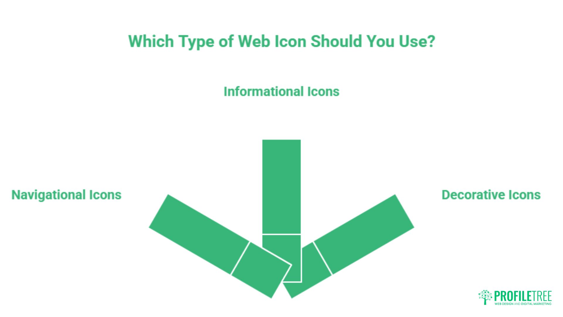
Not all icons serve the same purpose, and treating them as a single category leads to poor decisions about placement, labelling, and accessibility. Understanding the three main types of icons in web design gives you a clearer framework for deciding what belongs where and what treatment each type requires.
Navigational Icons
Navigational icons guide movement through a site or application. They appear in menus, breadcrumbs, pagination controls, and tab bars. The home, burger menu, back arrow, and search icons fall into this category. Because they need to be understood without a second thought, navigational icons should always use conventions that are already established. Inventing a novel icon for “home” is not creativity; it is obstruction.
On mobile interfaces, navigational icons carry additional responsibility. Tap targets must meet a minimum size of 44 by 44 pixels, as specified in the Web Content Accessibility Guidelines (WCAG) 2.2 under criterion 2.5.8. Anything smaller causes frustration for users with motor impairments and older users accessing sites on small screens. The ARIA accessibility guide on ProfileTree covers the coding requirements that support these standards in detail.
Informational Icons
Informational icons communicate status, data, or meaning within content. Warning triangles, tick marks, star ratings, and category indicators all belong here. Unlike navigational icons, informational icons often appear in contexts where the surrounding text provides enough meaning that the icon is reinforcing rather than replacing language. That said, colour alone should never be the only distinguishing factor: a red and green status indicator will be invisible to users with red-green colour blindness unless it also uses shape or a text label.
For organisations in the public sector, or those operating websites governed by the UK’s Public Sector Bodies (Websites and Mobile Applications) Accessibility Regulations 2018, this is not just good practice; it is a legal requirement.
Decorative Icons
Decorative icons exist for visual rhythm and layout support rather than functional communication. They might appear alongside a service list, in a feature section, or as section dividers. Because they carry no meaning that a user needs to interpret, they should be hidden from assistive technologies using aria-hidden="true". Failing to do so forces screen reader users to sit through a recitation of irrelevant image descriptions, which degrades the experience significantly.
Knowing which category an icon belongs to determines every subsequent decision: whether it needs a label, what ARIA treatment it requires, and how prominent it should be in the visual hierarchy.
UX Best Practices: The Labels Debate and Mobile-First Decisions
The question of whether icons need text labels is one of the oldest debates in UX design, and the answer is less clear-cut than either side tends to admit. The evidence from user research, however, leans consistently in one direction.
The Case for Labels
Research from Nielsen Norman Group has consistently found that icon-only navigation performs worse than icon-and-label navigation on comprehension tests, particularly for non-standard icons. In a study of tab bar navigation on mobile apps, labelled icons were identified correctly by a significantly higher proportion of users than unlabelled equivalents. The exception is for icons so universally recognised that labelling feels redundant: the phone icon, the email envelope, and the search magnifying glass sit in this category for most audiences.
For SMEs building websites for broad consumer audiences, the practical recommendation is to include labels for any icon that represents an action, particularly in navigation. The few pixels of vertical space required for a label are a reasonable trade for the reduction in user confusion. For web designers working across diverse client sectors, this principle applies with particular force when the audience includes older users or people less familiar with digital interfaces.
Responsive Design and Icon Behaviour
Mobile-first design has complicated the labels debate further. On narrow screens, space is at a premium, and labels that fit comfortably on a desktop navigation bar may be cut off or push items onto a second line on a 375-pixel viewport. The accepted solution is progressive disclosure: show icons with labels on desktop, collapse to icon-only on mobile, but only for icons that sit within a clearly bounded navigation container, such as a bottom tab bar, where the interface convention carries enough shared understanding.
Hover states add another layer of complexity on desktop. A tooltip that appears on hover can serve as a lightweight label for icon-only interfaces, but hover is not available on touchscreens. Any icon that relies on a hover state for comprehension on desktop is already failing on mobile.
Icon Sizing and Spacing
Sizing decisions affect both usability and visual balance. Icons that are too large dominate the layout and compete with primary content for attention. Icons that are too small become unreadable at standard viewing distances and fail touch accessibility requirements on mobile. A common starting point is 24 by 24 pixels for inline UI icons, scaling to 32 or 48 pixels for featured icons in card-based layouts.
Padding around icons matters as much as the icon size itself. An icon with insufficient surrounding space feels cramped and is harder to tap accurately. A consistent padding rule, applied across the entire icon set, contributes more to visual coherence than any stylistic decision about icon shape or line weight.
Placement and Visual Hierarchy
Icons placed to the left of labels are processed in reading order, meaning the icon is seen first, and the label confirms its meaning. Icons placed to the right work in reverse, with the text providing context and the icon offering visual reinforcement. Left-aligned icons are generally more intuitive for left-to-right reading languages. In right-to-left languages such as Arabic or Hebrew, this convention reverses.
For call-to-action buttons, an arrow or chevron icon to the right of the label has become a widely understood affordance signal for progression: moving forward, downloading, or expanding. This convention is strong enough that most users interpret it correctly without any additional label, though combining the two remains the most reliable approach.
Technical Implementation: SVG, Icon Fonts, and Performance
The file format chosen for icons has a measurable impact on page load speed, rendering quality, and accessibility. This is not a purely aesthetic decision; it is a technical one with real consequences for SEO and user experience. For any team focused on website performance, the format question deserves careful attention.
SVG: The Current Standard
Scalable Vector Graphics have become the dominant format for web icons, and for good reason. SVGs are resolution-independent, which means they render sharply on any screen from a standard 1x display to a 4K retina panel without any increase in file size. They are defined in XML markup, which means they can be manipulated with CSS and JavaScript, allowing for colour changes, hover states, and animations without loading a separate asset.
From a performance standpoint, individual SVG icons are typically between 1 and 5 kilobytes. An SVG sprite sheet, which consolidates multiple icons into a single file loaded once and referenced throughout the page, reduces HTTP requests significantly. For a site using 20 or more icons, the difference between 20 individual requests and one sprite request is meaningful at scale, particularly for users on slower mobile connections in rural areas of the UK and Ireland.
SVGs also carry an accessibility advantage: the <title> and <desc> elements within an SVG can be used to provide text descriptions for screen readers, giving developers fine-grained control over how functional icons are announced. This is considerably more flexible than the alt attribute on a raster image.
Icon Fonts: Still Present, Increasingly Problematic
Icon fonts such as Font Awesome became popular in the early 2010s because they offered a convenient way to load a large library of icons with a single CSS file. Their decline in favour of SVGs stems from several compounding problems. Icon fonts render as text, which means they are affected by browser font rendering settings, subpixel rendering variations, and user-level font overrides. On some systems and browsers, icon fonts appear blurry or misaligned in ways that SVGs do not.
There is also a page weight concern. Loading the full Font Awesome library adds approximately 400 kilobytes to a page for a user who may only see five icons. SVG sprites allow you to load only the icons the page actually uses. For teams concerned with web performance and sustainable design, this difference is worth prioritising.
Icon fonts persist in legacy systems and existing WordPress themes, where the switching cost is high. For new projects, SVG is the more defensible choice on performance, accessibility, and maintenance grounds.
The Format Comparison
| Format | Scalability | Performance | Accessibility Control | CSS/JS Styling | Browser Support |
|---|---|---|---|---|---|
| SVG (inline) | Perfect | Excellent (no extra request) | Full (title, desc, aria) | Full | All modern browsers |
| SVG (sprite) | Perfect | Very good (one request) | Good | Partial | All modern browsers |
| Icon Font | Good | Poor (full library loaded) | Limited | Colour only | All modern browsers |
| PNG/WebP | Poor (fixed resolution) | Moderate | Standard (alt text only) | None | All browsers |
Sustainable Icon Delivery
Digital carbon footprint is a growing consideration for UK businesses, particularly those with sustainability commitments or clients who request environmentally conscious web design. Every kilobyte transferred consumes energy. Unused icon font files, unoptimised SVG exports bloated with editor metadata, and large raster icon images all add unnecessary weight to each page load.
Minifying SVG files by stripping editor metadata (typically added by Figma, Illustrator, or Inkscape on export) can reduce file sizes by 30 to 60 per cent with no visual difference. Tools such as SVGO handle this automatically and can be integrated into build pipelines. For teams serious about performance, running icons through an optimisation step before deployment is as routine as compressing images.
Accessibility Standards for UK and Ireland Web Design
Accessibility in web design has moved from a recommended practice to a legal obligation for a growing range of organisations. Understanding which standards apply, and what they require for icons specifically, is not optional for any team delivering professional digital work in the UK market. The accessibility compliance guide on ProfileTree provides a broader overview; this section focuses specifically on iconography.
WCAG 2.2 and Icon Requirements
The Web Content Accessibility Guidelines 2.2 introduced several criteria with direct implications for icon design and implementation. Success Criterion 1.1.1 requires that all non-text content has a text alternative that serves the equivalent purpose. For functional icons (those that trigger an action or convey information), this means either a visible text label or an ARIA label that conveys the same meaning to screen reader users.
Success Criterion 1.4.11 (Non-text Contrast) requires that user interface components, including icon graphics, have a contrast ratio of at least 3:1 against adjacent colours. This applies to the icon itself, not just any accompanying text. A light grey icon on a white background may look tasteful to a sighted user; it may be effectively invisible to a user with low vision.
The newer Success Criterion 2.5.8 (Target Size, minimum) requires interactive targets to be at least 24 by 24 pixels, with a recommended target of 44 by 44 pixels to support usability for people with motor impairments. For icon buttons, this typically means adding padding around a smaller icon graphic to meet the target size without enlarging the icon visually.
ARIA Implementation for Icons
ARIA (Accessible Rich Internet Applications) attributes give developers fine-grained control over how icons are presented to assistive technologies. The most commonly used attributes for icons are:
aria-hidden=”true” tells screen readers to ignore the element entirely. This is correct for decorative icons that add no information. Applied incorrectly to functional icons, it removes them from the accessibility tree entirely, breaking navigation for keyboard and screen reader users.
aria-label=”Search” on a button containing an icon with no visible text provides an accessible name for the button. The label should describe the action, not the icon itself: “Search” rather than “Magnifying glass”.
role=”img” combined with an aria-label or linked aria-labelledby is appropriate for SVGs that convey meaningful content. This causes the SVG to be identified as an image by assistive technologies rather than being read as raw SVG markup.
The UK Public Sector Bodies Regulations
The Public Sector Bodies (Websites and Mobile Applications) Accessibility Regulations 2018, which implement the EU Web Accessibility Directive into UK law, require public sector bodies to meet WCAG 2.1 Level AA as a minimum, with WCAG 2.2 becoming the expected standard. For private sector organisations, there is no equivalent legal mandate, but the Equality Act 2010 can apply where inaccessible design amounts to discrimination against disabled users.
For organisations in Northern Ireland, Scotland, and Wales, these regulations apply across devolved public bodies as well as central government services. Teams working with public sector clients across the UK should treat WCAG 2.2 Level AA compliance as the baseline, not an aspiration.
Practical Accessibility Checklist for Icons
Before deploying any icon set, the following checks should be completed for every icon in the interface:
Functional icons must have either a visible text label or an aria-label attribute. Decorative icons must carry aria-hidden=”true”. All interactive icon elements must meet the minimum 24 by 24 pixel target size (44 by 44 pixels recommended). Icon graphics must achieve a 3:1 contrast ratio against adjacent colours. No icon should rely solely on colour to convey information. SVG files for functional icons should include a <title> element with a descriptive name.
The Future of Iconography: AI Workflows and Micro-animations
The way icon sets are created and deployed is changing. Two developments in particular are worth understanding for any team involved in web design production: AI-assisted icon generation and animated icons using the Lottie format. Neither replaces the need for design judgement, but both offer meaningful productivity gains when used thoughtfully. For teams weighing AI vs human design workflows, icons are an instructive test case.
AI-Generated Icon Sets
Tools such as Recraft, Adobe Firefly, and purpose-built AI icon generators can now produce entire icon sets from a single prompt describing style parameters: line weight, corner radius, level of detail, and visual tone. The output quality has improved significantly, and for teams working within tight production timelines, AI generation can reduce the time spent creating a 20-icon set from several hours to under 30 minutes.
The caveat is consistency. AI tools can produce icons that each look attractive in isolation but lack the shared visual logic that makes a set feel cohesive. A human designer reviewing AI output for alignment on stroke width, padding, and optical balance is still necessary. The workflow is AI for speed, human judgment for quality control, not AI as a replacement for the design process.
For UK SMEs commissioning web design, this shift has practical implications. Budget constraints that previously made custom icon sets unaffordable are less significant when AI can generate a first draft quickly. The conversation between client and designer now focuses on refinement rather than creation from scratch, which is a more productive use of both parties’ time.
Lottie Files and Micro-animations
Static icons communicate function. Animated icons communicate feedback. A loading spinner, a checkbox that visibly ticks on completion, or a menu icon that morphs into a close symbol are all examples of icons doing more than identifying an action: they are confirming that something has happened. This category of motion design is handled efficiently by Lottie, a JSON-based animation format developed by Airbnb and widely supported across iOS, Android, and the web.
Lottie files are typically smaller than equivalent GIF or video animations, scale without quality loss like SVGs, and can be paused, played, and reversed programmatically. For interfaces where user feedback matters, a subtle Lottie animation on a key interaction point can reduce perceived wait time and increase confidence that an action has registered.
The risk, as with all animation, is overuse. A page where multiple icons animate simultaneously competes for attention and can feel chaotic. Motion should be reserved for moments where it adds meaning, confirmation, progress, or transition, not applied as decoration. Users who have set their operating system to reduce motion (via the prefers-reduced-motion media query) should see static alternatives; this is both good practice and a WCAG consideration.
Icon Libraries Worth Knowing in 2025
For teams that do not require bespoke icon sets, several open-source libraries provide high-quality SVG icons with permissive licences suitable for commercial use. Google Fonts Icons (formerly Material Symbols) offers over 2,500 icons in five weight variants. Lucide is a community-maintained fork of Feather Icons with a clean, consistent line-based design.
Heroicons, created by the Tailwind CSS team, offers both outline and solid variants across a practical set of UI icons. Before using any library in a commercial project, checking the LICENCE.txt file for the specific redistribution terms is essential.
Building a Scalable Icon System for Your Website
Individual icon decisions matter less than the system that governs them. A scalable icon system establishes rules that any designer or developer can apply consistently, regardless of who is working on the project at any given time. It removes ambiguity and reduces the accumulation of inconsistencies that tend to develop over months of iterative development.
Defining Icon System Rules
A usable icon system should document, at minimum: the icon library or set in use, the permitted sizes and the grid they are drawn on, the line weight and corner radius conventions, the colour palette and how icons interact with the design token system, the ARIA treatment rules for each icon category, and the optimisation process before deployment.
For teams working in Figma, icon systems can be managed as component libraries with defined variants for size, state (default, hover, active, disabled), and colour. Developers then reference these components directly, reducing the likelihood of a designer exporting an icon at a non-standard size or a developer pulling an older version from a shared folder.
Testing and Iteration
Icon usability testing does not need to be elaborate to be effective. A simple first-click test, where participants are shown a screen and asked to click where they would go to complete a specific task, will surface any icons that are causing confusion. If more than 20 per cent of participants click in the wrong place for a given icon, the icon is not communicating its purpose reliably. Either replace it, add a label, or both.
Eye-tracking studies provide richer data on where users look first and whether icons are drawing attention to the right areas of the page. For most SMEs, the investment in formal eye-tracking is not warranted, but session recording tools such as Hotjar or Microsoft Clarity provide heatmap data that can reveal similar patterns at considerably lower cost. For teams looking at the broader picture of graphic design strategy, icon performance data feeds into wider visual communication decisions.
Working with ProfileTree on Icon System Design
ProfileTree’s web design team works with businesses across Northern Ireland, Ireland, and the UK to design and build websites where every visual decision, including icon systems, supports both user experience and commercial performance. Whether you are building a new site from scratch or auditing an existing one for accessibility and performance gaps, the team brings practical experience across sectors from professional services to e-commerce. You can read more about what goes into an effective web design process, or explore client work on the ProfileTree projects page.
Northern Ireland’s growing digital sector means that local businesses increasingly compete with UK-wide and international counterparts online. For context on the cities and business communities that form the backbone of this market, Northern Ireland’s cities offer a useful regional background.
Conclusion
Icons are functional assets, not decorations. The decisions that matter most are not aesthetic: they are structural, choosing the right format, applying the correct ARIA treatment, meeting accessibility standards, and building a system that scales without accumulating inconsistencies. Get those decisions right, and the visual choices become straightforward. Get them wrong, and no amount of polish will compensate.
Ready to review your icon system or wider web design? ProfileTree’s team works with SMEs across Northern Ireland and the UK to build websites that perform on speed, accessibility, and search. Contact ProfileTree to discuss your project.
FAQs
Are icon fonts still relevant in web design?
For new projects, SVGs have largely superseded icon fonts. SVGs load only the icons a page actually uses, render consistently across browsers, and offer full ARIA control. Icon fonts load an entire library for every visitor and render as text, which causes inconsistencies across browser font settings. Unless a legacy system makes switching impractical, SVGs are the stronger choice.
What is the correct size for icons on a mobile website?
WCAG 2.2 specifies a minimum interactive target size of 24 by 24 pixels, with 44 by 44 pixels recommended for comfortable use. This is the tappable area, not the visible icon. Padding around a smaller icon can bring the total touch target up to the required size without altering the icon’s visual appearance.
Do all icons need alt text?
No. Decorative icons should carry aria-hidden="true" so screen readers skip them. Functional icons, those that trigger an action or convey information without a visible label, need an accessible name via aria-label on the parent element or a <title> within the SVG.
Where can I find free icons for commercial use?
Google Fonts Icons (Apache 2.0), Lucide, Heroicons, and Phosphor Icons (all MIT licensed) are reliable starting points. The Noun Project offers a free tier with attribution. Always check the LICENCE.txt in any downloaded package before using icons in a commercial project, as terms can vary between authors.
How do I make my icons load faster?
Use SVG format, run files through SVGO to strip editor metadata (typically cutting file size by 30 to 60 per cent), and consolidate frequently used icons into a single SVG sprite. Avoid loading full icon libraries when only a handful of icons are needed. For teams using Vite or Webpack, SVG optimisation can be automated in the build pipeline.