
Mobile-Friendly Websites: A Practical Guide for UK SMEs
Table of Contents
Most UK business owners already know they need mobile-friendly websites. Fewer know exactly what that means in practice, or why a site that looks fine on a desktop monitor can quietly drive away customers the moment someone opens it on a phone. This guide sets out what genuine mobile-friendliness involves, how to check whether your site passes and which problems are worth fixing yourself versus handing to a professional.
The stakes are real. Google indexes the mobile version of your site first, so your search rankings are largely decided by how well your mobile-friendly website performs on a small screen with a variable data connection. If the mobile experience is poor, SEO suffers regardless of how strong the desktop version looks, and a weak mobile-friendly website will hold back every other channel that depends on search.
What Does “Mobile-Friendly” Actually Mean?
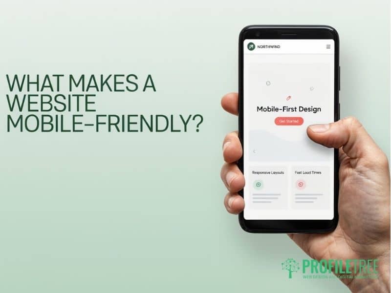
A mobile-friendly website works well when someone accesses it on a smartphone or tablet. That sounds obvious, but it covers a wider range of technical and design decisions than most business owners realise, and it’s rarely something you can judge from a desktop screen.
At a minimum, mobile-friendly websites need to adjust their layout automatically to fit any screen size, load quickly on a 4G connection, display text at a readable size without the user needing to zoom, place buttons and links far enough apart to tap accurately with a thumb and avoid pop-ups that block content on smaller screens. A site can fail any one of these without the owner ever noticing on their laptop.
Responsive Design vs a Separate Mobile Site
The current standard for building mobile-friendly websites is responsive design: a single website that uses CSS media queries to change its layout depending on the device. Content reflows, images resize, and navigation adapts, all from one codebase and one URL. Responsive design is what makes a site genuinely mobile-friendly rather than just technically viewable on a phone.
The alternative, a separate mobile site on a subdomain (typically m.yoursite.com), was common a decade ago, but it’s outdated now. It creates duplicate content issues, requires maintaining two codebases and complicates how Google understands your site. If your business still runs a separate mobile URL rather than a responsive, mobile-friendly website, migrating to a responsive setup should be a priority.
For most SMEs, responsive web design through a well-built WordPress site is the straightforward route to a genuinely mobile-friendly website. The flexibility it gives a developer to adapt layouts per device outweighs the short-term cost and avoids the technical debt that comes with running two separate sites.
Why Mobile-First Indexing Changes Everything for SEO
Google has operated on mobile-first indexing since 2019, but many business owners still don’t fully grasp what that means for their mobile-friendly website’s rankings.
When Google crawls your site, it primarily looks at the mobile version of your pages. The content Google sees on mobile is what gets indexed and ranked, which is precisely why mobile-first indexing makes mobile-friendly websites a ranking factor rather than a design preference. If your mobile version hides content that only appears on desktop, that content may as well not exist from Google’s perspective.
This plays out in a few practical ways. A slow, mobile-friendly website caps your ranking potential from the outset. Mobile navigation that buries key pages means those pages get less link equity from Google’s crawl. And if mobile content is shorter than desktop content, Google simply sees the shorter version, no matter how strong the full desktop page reads.
It connects directly to local search, too. Most near me searches happen on mobile, and local SEO results depend on a searcher being able to load, read and act on your mobile-friendly website within seconds. A slow or broken mobile experience loses you the searchers most likely to visit your premises or pick up the phone, and it undermines local SEO work elsewhere on the account.
The Core Elements of a Well-Built Mobile Site
Getting mobile-friendly websites right comes down to three things working together: speed, layout and structure. Weakness in any one undermines the other two.
Page Speed and Core Web Vitals
Speed matters more on mobile than on desktop. Users on a 4G connection have less patience for slow-loading pages, and Google measures this through Core Web Vitals, a set of performance metrics that feed directly into its ranking algorithm and into whether a site counts as a genuinely mobile-friendly website.
Three Core Web Vitals are most relevant to mobile. Largest Contentful Paint (LCP) measures how long the main content takes to load, with Google’s recommended threshold under 2.5 seconds; a slow LCP on mobile usually points to unoptimised images or a sluggish server response. Cumulative Layout Shift (CLS) measures how much the page moves as it loads; when buttons or text shift position after the page appears ready, users tap the wrong things, and anything above 0.1 is flagged as poor. Interaction to Next Paint (INP) measures how quickly the page responds when someone taps or clicks, and it replaced First Input Delay in 2024 as the standard responsiveness metric for judging a mobile-friendly website.
You can check your own Core Web Vitals scores for free using Google PageSpeed Insights. Enter your URL, and it returns separate scores for mobile and desktop, flagging which specific issues are dragging your mobile-friendly website’s performance down. The most common culprits on SME sites are uncompressed PNG images, where WebP would do the job at a fraction of the size, render-blocking JavaScript, cheap shared hosting with slow response times and fonts loading from third-party servers with no preload instruction.
Ciaran Connolly, founder of ProfileTree, says: “The businesses we see struggling in local search almost always have a mobile experience problem at the root of it. The ranking issue is a symptom. The fix is technical and design-led, not just a case of adding more content.”
Responsive Layout and the Thumb Zone
Responsive design goes beyond making content fit on a small screen. It’s about designing a mobile-friendly website around how people actually hold and use phones: one hand, thumb doing the work, often on the move.
The thumb zone describes the area of a mobile screen that a right-handed user can comfortably reach without shifting their grip. The bottom two-thirds of the screen is easy territory; the top corners are a stretch. Primary calls to action, contact buttons and navigation placed out of reach create friction that converts into lost enquiries, and it’s one of the most overlooked parts of building a mobile-friendly website.
In practice, this means hamburger menus should open from the bottom on mobile rather than the top right corner, contact and phone links should sit within comfortable thumb reach, and form fields need enough vertical space between them to prevent accidental taps. Pop-ups and interstitials that cover content on mobile also trigger a penalty under Google’s intrusive interstitials policy, so these aren’t minor cosmetic choices. A properly built mobile-friendly website removes the friction between a visitor and the action you want them to take.
Navigation, Menus and Content Structure
Long desktop navigation menus become unmanageable on mobile. A site with eight top-level items displayed horizontally on a desktop needs a completely different approach for small screens if it is going to work as a mobile-friendly website.
Well-structured mobile navigation collapses into a clear, tappable menu icon, presents only three to five primary destinations, groups related pages logically rather than listing everything at the same level and makes it easy to return to the homepage from anywhere on the site, all of which sits within the thumb zone rather than fighting against it.
Content structure changes, too. Long paragraphs that read comfortably on a widescreen monitor feel dense on a phone. Short paragraphs, clear subheadings and front-loaded answers match how people actually read a mobile-friendly website: quickly, with intent, looking for the specific thing they came for.
Local SEO and Mobile Search

Local search and mobile search are inseparable. The majority of searches with local intent happen on mobile, and Google Maps results dominate the screen for those queries, which makes a mobile-friendly website one of the foundations of any serious local SEO strategy.
For a Belfast restaurant, a Derry accountant, or a Dublin plumbing company, appearing in the local pack on mobile is worth more than a page-one ranking underneath it. Three factors decide that visibility. Your Google Business Profile needs a complete, accurate address, a correct click-to-call phone number, up-to-date opening hours and regular activity; photos and reviews carry real weight here.
The LocalBusiness schema tells Google precisely what type of business you’re, where you’re located, and how to contact you, and for businesses across Northern Ireland and Ireland, this means including the correct address format, a phone number with the country code, and a service area. Page speed on mobile networks matters as much as either, since rural areas across Northern Ireland, the west of Ireland and parts of Scotland still have patchy 4G coverage; a site that loads in two seconds on a Belfast city connection can take six or seven seconds on a rural signal, undermining an otherwise mobile-friendly website.
A fast-loading mobile-friendly website paired with a well-maintained Google Business Profile consistently produces better local SEO results than either tactic used on its own, because the technical work and the listing optimisation reinforce each other.
How to Test Your Site’s Mobile Performance
You don’t need to pay for a tool to get an honest picture of your mobile-friendly website’s performance. Three free tools cover most of what you need.
Google Search Console’s Mobile Usability report, under Experience, shows pages Google has flagged with specific mobile problems: text too small to read, clickable elements too close together, or content wider than the screen. PageSpeed Insights gives a separate Core Web Vitals score for mobile and desktop, along with a breakdown of specific issues, and its Opportunities section tells you exactly what to fix and estimates the time saving for each one. Chrome DevTools Device Mode, opened via F12 or right-click then Inspect, simulates your mobile-friendly website on various phone screen sizes and lets you throttle the network connection to see how the site behaves on a slow 3G or 4G signal.
Running through all three takes about half an hour for a typical site. What you find tells you whether you’ve isolated fixable issues, a broader performance problem, or structural design problems that need a website audit and professional attention.
Platform-Specific Considerations: WordPress, Wix and Shopify
The platform your site runs on affects what mobile optimisation is actually available to you, and how easily it can become a genuinely mobile-friendly website.
| Platform | Mobile Responsiveness Out-of-the-Box | Speed Optimisation Control | Mobile SEO Flexibility |
|---|---|---|---|
| WordPress | Depends on the theme choice | High (plugins, hosting, caching) | High |
| Wix | Good for most templates | Limited | Moderate |
| Squarespace | Good | Limited | Moderate |
| Shopify | Good for product pages | Moderate | Good for e-commerce |
WordPress gives the most control and the most flexibility, but that cuts both ways. A poorly optimised WordPress site on cheap hosting can perform worse on mobile than a basic Wix site. The platform is a tool; how it’s set up and maintained determines whether the result is an actual mobile-friendly website or one that merely looks responsive on a demo.
For most SMEs in Northern Ireland and Ireland looking to build or rebuild with serious mobile-first design in mind, professionally built WordPress remains the most scalable route to a properly mobile-friendly website. Wix and Squarespace are reasonable starting points for businesses with limited budgets and simple requirements, but they have ceilings, and SEO ambitions that grow beyond basic visibility will typically hit those ceilings before long.
Five Mobile Issues That Hurt Small Business Websites Most

These are the problems that show up most consistently when auditing SME sites.
Images uploaded at full resolution slow down every page they appear on; a photo straight from a modern phone can be several megabytes, and converting to WebP and sizing to actual display dimensions can cut image weight by 60 to 80 per cent with no visible quality loss. A missing viewport meta tag forces browsers to display the desktop version at full width on mobile, requiring users to zoom and scroll horizontally; it’s a five-second fix, but still surprisingly common on sites that otherwise claim to be mobile-friendly.
Intrusive pop-ups that take over the screen on load breach Google’s mobile interstitials policy and can affect rankings directly; if you use them, they’ll need a delay, a clear close button and no coverage of the main content. Unlinked phone numbers displayed as plain text can’t be tapped to call, and wrapping the number in a tel link removes a real barrier for mobile visitors trying to get in touch. Desktop-only navigation, simply shrunk down rather than redesigned, creates tap targets that are too small and menus that are awkward to use; mobile navigation needs to be built as a mobile experience from the start, not adapted from a desktop one.
Fix It Yourself or Get Professional Help
Some mobile problems are genuinely fixable without technical knowledge. Others need a developer.
DIY fixes include compressing and re-uploading images with a tool like Squoosh or TinyPNG, adding alt text to images, reviewing your Google Business Profile for accuracy, checking your site in Chrome DevTools for obvious rendering problems and pulling a mobile usability report from Search Console.
Professional help makes more sense when Core Web Vitals scores are poor, and the cause isn’t obvious, when navigation doesn’t work properly on smaller screens, when mobile conversions are dropping, but the specific friction point is unclear, when the platform has hit its optimisation ceiling, or when you want SEO services that include structured data and local schema done correctly. The audit stage, where a developer identifies what is actually dragging performance down, is often where the most value gets generated, and the cost is typically recouped quickly if a properly mobile-friendly website is a meaningful source of enquiries.
Getting Your Site Mobile-Ready
Mobile-friendly websites aren’t a nice-to-have any more. Between mobile-first indexing, local SEO and the sheer volume of traffic now arriving on phones, a weak mobile-friendly website quietly caps growth on every channel that depends on search. Run the three free checks above first. If the issues are cosmetic, fix them this week. If they point to a structural problem, get in touch for a proper look at what turning your site into a genuinely mobile-friendly website would involve.
FAQs
1. What is the difference between a mobile-friendly website and a responsive website?
A mobile-friendly site works acceptably on a mobile device. A responsive site actively adapts its layout to any screen size, adjusting columns, font sizes, images and navigation based on the device. Responsive design is the current standard and what Google recommends; all responsive sites are mobile-friendly, but not all mobile-friendly sites are fully responsive.
2. Does my website’s mobile performance affect my Google ranking?
Yes, directly. Google uses mobile-first indexing, meaning the mobile version of your site is what gets indexed and used to determine rankings. A slow, mobile-friendly website with poor Core Web Vitals won’t rank as well as a faster competitor, all other factors being equal.
3. How do I check if my website is mobile-friendly for free?
Use Search Console’s Mobile Usability report to see pages Google has flagged with specific problems, PageSpeed Insights for a performance score and a list of fixes and Chrome DevTools Device Mode to see how the site renders on different screen sizes in real time.
4. Why does my website load fast on Wi-Fi but slowly on mobile data?
Mobile connections, particularly 3G and older 4G in rural areas, are slower and more variable than a wired or Wi-Fi connection. Large image files, unoptimised JavaScript and hosting that copes fine on a fast connection become real problems on a slower one. PageSpeed Insights includes a throttled mobile test that shows this impact directly.
5. Should I have a separate mobile website or use a responsive design?
Responsive design on a single URL is the correct approach and what Google recommends. Separate mobile sites create duplicate content issues, require maintaining two versions of every page and are harder for Google to index correctly. If you currently run a separate mobile site, migrating to a responsive setup should be planned in.