Mobile-First Design for Local Business Websites: The Complete Action Blueprint
Table of Contents
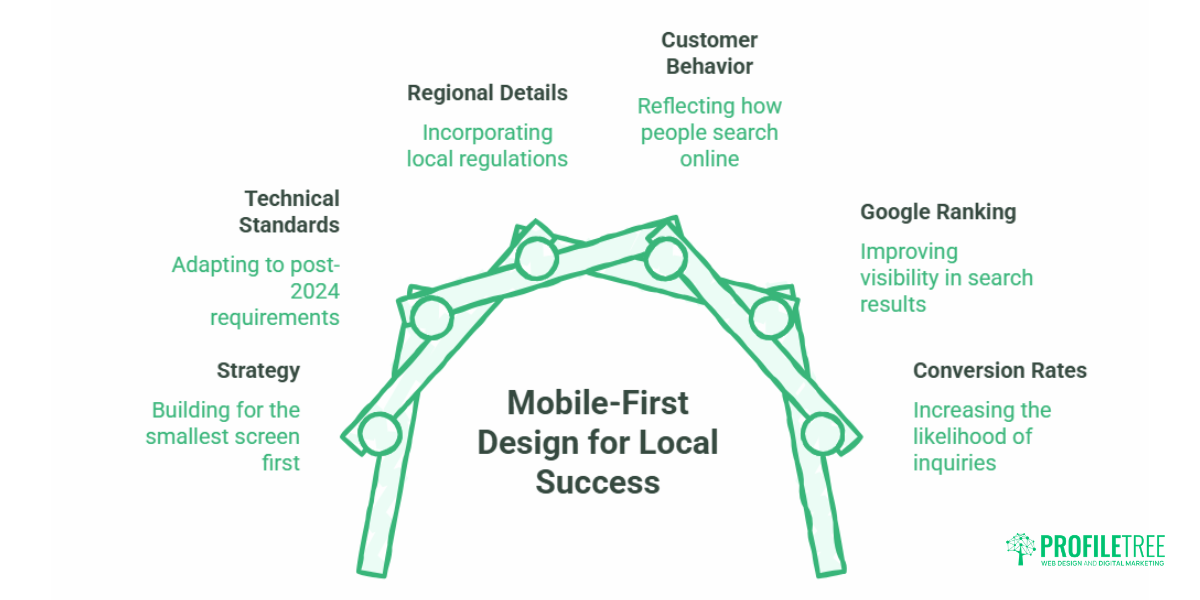
Mobile-first design means building your website for the smallest screen first, then scaling up to tablet and desktop, rather than shrinking a desktop layout to fit a phone. For local businesses across Northern Ireland, Ireland and the UK, this is now the practical baseline: most people who find a tradesperson, salon or restaurant do it on a phone, and Google ranks your site based on that mobile version. This guide covers the strategy, the technical standards that changed after 2024, and the regional details (GDPR cookie banners, click-to-WhatsApp) that most guides skip.
Why Mobile-First Design Dictates Local Business Success
Mobile-first design wins local customers because that is where local customers already are. Google’s own research found that the majority of “near me” searches happen on smartphones, and a large share of people who run a local search on a phone visit a related business within a day. If your site loads slowly or buries your phone number, you lose that visitor to the competitor whose mobile site does the job in three taps.
The shift towards mobile internet usage is one of the biggest changes in digital behaviour. According to Statista, mobile internet usage passed desktop usage worldwide some years ago, and the gap keeps widening. Smartphones have become the main way people browse, shop and contact businesses. A mobile-first design strategy treats that reality as the starting point, not an afterthought.
For an SME owner, the mobile-first approach is really a question about your most valuable enquiries. A Belfast plumber, a Derry hair salon, a Galway café: in each case, the customer is usually standing somewhere with a phone, deciding fast. Getting the mobile-first web design right is the difference between an enquiry and a bounce.
The Financial Picture: What Poor Mobile Conversion Costs
Mobile-first design pays for itself through conversion rate, not aesthetics. The maths is simple enough to run on the back of an envelope. Say a local service business gets 300 mobile visits a month at a 1% conversion rate, which is three enquiries. Lift the mobile experience so the same traffic converts at 3%, and you have nine enquiries from the same visitors. For a trade with a healthy average job value, that difference compounds into real money across a year, with no extra spend on ads.
This is why a mobile-first strategy is a commercial decision before it is a design one. You are not paying for a prettier site; you are paying to stop leaking the traffic you already have. When we plan a build at ProfileTree, the Belfast digital strategy work starts here: which actions matter most on a phone, and how few taps it takes to complete them.
A quick note on honesty: the figures above are an illustration of how conversion maths works, not a promise. Your real numbers depend on your traffic, your offer and your market. The point stands either way: small improvements in mobile conversion move the needle more than most owners expect.
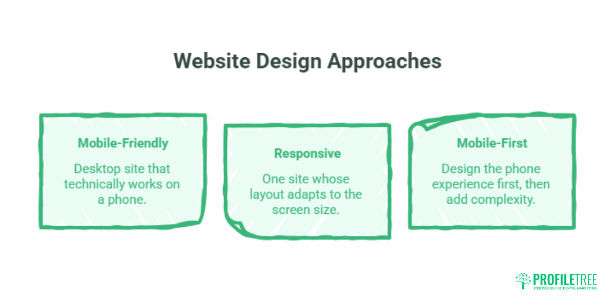
Mobile-First vs Responsive vs Mobile-Friendly: The Practical Difference
These three terms get used interchangeably, and they should not be. Here is the plain-English version.
Mobile-friendly means a desktop site that technically works on a phone: it does not break, but it was not built for the small screen. Responsive means one site whose layout adapts to the screen size using flexible grids and CSS media queries, usually still designed desktop-first. Mobile-first reverses the order: you design the phone experience first, decide what earns its place on a small screen, then add complexity for larger displays.
The reason desktop-first has fallen out of favour is that shrinking a busy desktop page produces slow, cluttered mobile pages. Starting small forces discipline about what actually matters.
| Approach | Where design starts | Core logic | Typical mobile speed | Local UX quality |
|---|---|---|---|---|
| Mobile-first | Smallest screen | Add complexity upward | Fast (lean by default) | Strong |
| Responsive | Desktop, adapts down | Flexible grids and media queries | Moderate | Variable |
| Mobile-friendly | Desktop, tolerated on mobile | Same layout, scaled | Often slow | Weak |
If you want the deeper technical version of how adaptive layouts work, our guide to responsive design best practices covers fluid grids and media queries in detail.
Google’s Mobile-First Indexing and Local SEO
Google’s mobile-first indexing means the search engine crawls, indexes and ranks your site based mainly on its mobile version. Introduced in 2018 and now the default, it changed the rules: if your mobile site is slow, thin or hard to use, your rankings suffer on both mobile and desktop searches. A site that is not properly mobile-ready risks losing organic traffic and the customers that come with it.
For local businesses, this links straight to the Google Map Pack. Mobile experience feeds the engagement signals (low bounce, quick taps to call, time on page) that tell Google your result is relevant and worth showing. Strong mobile UX does not directly rank you in the map pack, but it improves the behaviour that does. Pairing a fast mobile site with sound search engine optimisation is how local businesses earn that visibility. If your industry leans heavily on map results, our piece on AI for local SEO is a useful next read.
Five Core Mobile-First Design Pillars for Local Conversions
This is the working part of the guide: the design decisions that turn mobile visitors into enquiries.
Thumb-Zone Navigation and Touch Target Sizes
Design for thumbs, not cursors. People hold phones one-handed and reach with a thumb, so primary actions belong in the lower third of the screen where the thumb naturally rests. Apple recommends a minimum tap target of 44 by 44 points; Google suggests around 48 by 48 dp. Add padding between tappable items so people do not hit the wrong one.
The hamburger menu remains a sensible way to collapse navigation on small screens, but do not hide your most important link (usually “call” or “book”) inside it. Keep that visible and obvious. Our guide to accessible navigation goes further on menu structure that works for everyone.
Core Web Vitals and the INP Standard
Speed is a ranking factor and a conversion factor at once. In March 2024, Google replaced First Input Delay with Interaction to Next Paint (INP) as a Core Web Vital. INP measures how quickly your page responds when someone taps a button, opens a menu or starts a form. On older or budget phones, heavy JavaScript (bulky interactive maps, non-essential animations, slow calendar widgets) drags INP down and makes the site feel sluggish exactly when a customer is trying to act.
Practical fixes: defer non-essential scripts, prefer CSS-only menus over script-heavy ones, and keep third-party widgets to what you actually need. The older speed basics still apply: compress images, use lazy loading for anything below the fold, reduce HTTP requests, and serve assets through a CDN. Getting this right is core website development work, and ongoing website hosting and management keep performance from drifting after launch.
Mobile-Optimised Forms and Friction Reduction
Every extra form field on a phone costs you enquiries. Desktop forms with ten fields become a wall of typing on mobile. Cut to the essentials, switch on autofill, use the correct input types so the right keyboard appears (number pad for phone fields, for example), and replace fiddly dropdowns with large radio buttons where you can. The goal is an enquiry completed at a bus stop in twenty seconds.
The Mobile GDPR Cookie Consent Dilemma
Here is a regional problem most US-centric guides ignore entirely. UK and EU rules require a cookie consent banner, but on a 6-inch screen, a poorly built banner covers the whole page. That blocks your content on arrival, frustrates visitors, and can trip Google’s intrusive interstitial penalty, which hurts mobile rankings.
The fix is design discipline: keep the banner compact (aim for no more than about 30% of screen height), avoid full-screen overlays, and make accept and reject equally easy. You stay compliant without sacrificing the top of your page. Our walkthrough on GDPR-compliant web forms covers the same compliance mindset for data capture, and the ICO’s cookie guidance is the authoritative UK source.
High-Intent CTAs: Click-to-Call and Click-to-WhatsApp
For a phone user with a problem, the best call to action is the one that needs no typing. A click-to-call link (using a tel: link) turns your number into a one-tap action. For UK and Irish service businesses, click-to-WhatsApp is increasingly the preferred channel: a floating WhatsApp button with a pre-filled message lets someone fire off a quote request while walking, without committing to a phone call. Use both. Click-to-call suits emergencies; click-to-WhatsApp suits the larger group who would rather text.
Industry-Specific Mobile Layout Blueprints
Mobile priorities change with business type, so the layout should too.
An emergency trade or service business, say a locksmith or boiler engineer, needs instant contact above everything. A sticky header with a click-to-call bar, a clear service area, and simple pricing or call-out information. The customer is stressed and wants a human now; do not make them scroll.
A hospitality or experience business, like a restaurant or clinic, has a different job. Put “Book a Table” or “Book Appointment” front and centre, show a clean HTML menu (never a 5MB PDF that forces a download and pinch-zoom), and make directions one tap away. The PDF menu trap is one of the most common mobile mistakes in this sector, and it is easily avoided.
The common thread is matching layout to intent, which is squarely a website design decision. ProfileTree’s founder, Ciaran Connolly, puts it this way: “On a phone, the customer has already decided to act. The only question your design has to answer is how fast you let them.”
The Pre-Launch Mobile-First UX Checklist
Before any local site goes live, run these on your own phone:
- The “fat-finger” test: can you tap every button without hitting a neighbour?
- Is your primary action (call or book) visible without scrolling?
- Does the page load in under three seconds on a 4G connection?
- Run a Lighthouse or PageSpeed Insights audit and check the INP score.
- Is the cookie banner compact, not a full-screen blocker?
- Are forms down to essential fields with autofill enabled?
- Is the text readable without zooming (16px body minimum)?
- Does the menu work for landscape as well as portrait?
- Are images compressed and lazy-loaded?
- Is your phone number a working tap-to-call link, and is NAP data consistent?
Training your own team to run these checks is part of staying mobile-ready between builds; our digital training sessions cover exactly this kind of practical audit.
Conclusion
Mobile-first design is the baseline for any local business that wants to be found and chosen on a phone. Get the fundamentals right (thumb-friendly layout, fast INP, lean forms, a compliant cookie banner and one-tap contact) and you convert more of the traffic you already have. If you want a mobile-first website built and maintained to these standards, talk to the ProfileTree team about your project.
Frequently Asked Questions
What is the main difference between mobile-first and mobile-responsive design?
Responsive design usually starts with a desktop website and adapts elements to fit smaller screens. Mobile-first reverses this, designing the mobile experience first to protect speed and usability before scaling up to desktop.
Does Google rank websites based on their mobile performance?
Yes. Google uses mobile-first indexing, meaning it crawls, indexes and ranks your site based mainly on the mobile version. A slow or hard-to-use mobile site lowers your rankings on both mobile and desktop.
How much does a mobile-first website cost for a UK small business?
It depends on the path you choose. Template-based responsive setups can run roughly £500 to £1,500. A bespoke mobile-first build from an agency, optimised for local SEO, speed and conversions, typically ranges from about £2,500 to £7,500 depending on features like booking integrations. The custom route usually returns more through better mobile conversion and local visibility.
Why does my cookie consent banner keep failing Google’s mobile usability test?
Google penalises intrusive interstitials, pop-ups that block the main content on arrival. On a small screen, standard cookie banners often cover the whole page. Style the banner compactly, keep it to roughly 30% of screen height or less, and avoid full-screen overlays so visitors can see your content immediately.
Is WhatsApp integration better than a phone call button for UK local websites?
For most UK and Irish local businesses, both are best. Click-to-call suits urgent, high-stress needs like emergency call-outs. Click-to-WhatsApp suits general enquiries, quotes and bookings, letting people message on the move without making a call.
How does mobile-first design improve my Google Map Pack rankings?
Indirectly, by improving engagement signals like lower bounce rates and more taps to call. When Google sees that mobile visitors find what they need quickly and take action, it reads your result as relevant and authoritative for local searches and brand loyalty.