Web Typography Basics: Key to Effective Web Design
Table of Contents
You must have experienced it a dozen times before. You visit a website seeking some information, but you find the text difficult to read, the fonts clash, and the overall layout feels annoyingly disorganised. The result is often a frustrating experience that leads you to abandon the site altogether in search of a more pleasant one.
Well, this is typically what happens when website owners don’t invest enough, or at all, in typography.
Contrary to what many of such website owners may believe, typography plays a crucial role in web design that goes beyond mere aesthetics. It’s the art and technique of arranging types to make written language legible, readable, and visually appealing on the web. Each day, its significance grows as it enhances user experience and maintains brand identity—far more than just being a tool to make websites look good.
Consider this article your short web typography basics lesson, where we’ll explore the core concepts of this craft, including how to choose the right fonts, create a clear typographic hierarchy, and implement best practices to enhance both the aesthetic and functional aspects of your website. Whether you’re a seasoned designer or just starting out, mastering web typography will empower you to create digital experiences that captivate and engage your audience.
So, let’s hop into it.
Web Typography Basics
As we mentioned a few lines ago, typography is the craft of organising text to ensure it’s clear, easy to read, and visually attractive. The term itself comes from the Greek words typos, meaning form, and grapho, which means to write, so, together, they imply the art of shaping written text.
Typography has a rich history that spans from the ancient world to the digital age. Initially, it emerged with the invention of writing systems, where the primary focus was on making text legible and consistent. The earliest forms of typography were created using hand-carved or handwritten methods, such as cuneiform tablets in Mesopotamia and Greek manuscripts.
The game-changing moment in typography came with Johannes Gutenberg’s invention of the movable type printing press in the 15th century. This innovation enabled efficient and reusable typesetting, which itself allowed for the mass production of books, leading to standardised typefaces and increased accessibility of written material.
Key Terminology
Over the centuries, typography evolved through various styles and technologies, shaped by key figures and technological advancements.
Besides Johannes Gutenberg who we just mentioned, in the 16th century, Claude Garamond created one of the first widely used “serif” fonts, influencing type design for printed materials. Giambattista Bodoni, in the 18th century, introduced greater “contrast” between thick and thin strokes, which elevated typography as an art form.
In the 20th century, Herb Lubalin advanced the use of “kerning” and “tracking” to balance text visually, while Adrian Frutiger developed the “sans-serif” typeface family “Univers”, which brought harmony to different font weights and styles. Add to this the emergence of the concept of “leading” alongside kerning and tracking as a manual typesetting technique. All three of those were later refined with digital tools in modern design software, optimising text for both print and screen.
We know this isn’t clear enough, maybe at all, so let’s explain what these terms and concepts, which anyone involved in web design and typography must be familiar with, actually mean:
- Serif: A serif is a small decorative stroke or line added to the end of the main strokes of letters in certain typefaces. Serif fonts are known for their classic and formal appearance, which is often used in printed materials like books and newspapers. Examples include Times New Roman and Garamond.
- Sans-Serif: Sans-serif fonts lack the decorative strokes found in serif fonts. They offer a cleaner, more modern appearance and are commonly used in digital design due to their readability on screens. Examples include Arial and Helvetica.
- Leading: Leading (pronounced “ledding”) refers to the vertical space between lines of text. The term originates from the physical strips of lead used in typesetting to separate lines. Proper leading improves readability by ensuring adequate spacing between lines so that text doesn’t appear cramped.
- Kerning: Kerning is the adjustment of space between individual characters in a word. It’s used to correct irregular spacing and ensure that letters are visually balanced. Effective kerning enhances the overall appearance and readability of text.
- Tracking: Tracking refers to the uniform adjustment of spacing between all characters in a block of text. Unlike kerning, which deals with individual letter pairs, tracking affects the overall spacing throughout a section of text. Proper tracking helps in creating a cohesive and aesthetically pleasing text block.
Font Types
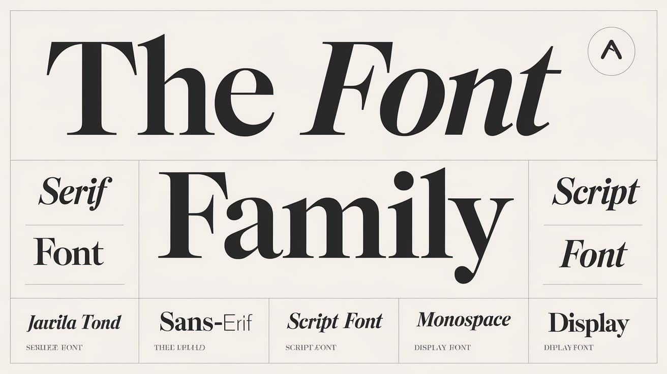
Besides the serif and sans-serif fonts we mentioned earlier, there are several other types of fonts, each with unique characteristics that serve different design purposes. Here’s an overview of some of the main font types:
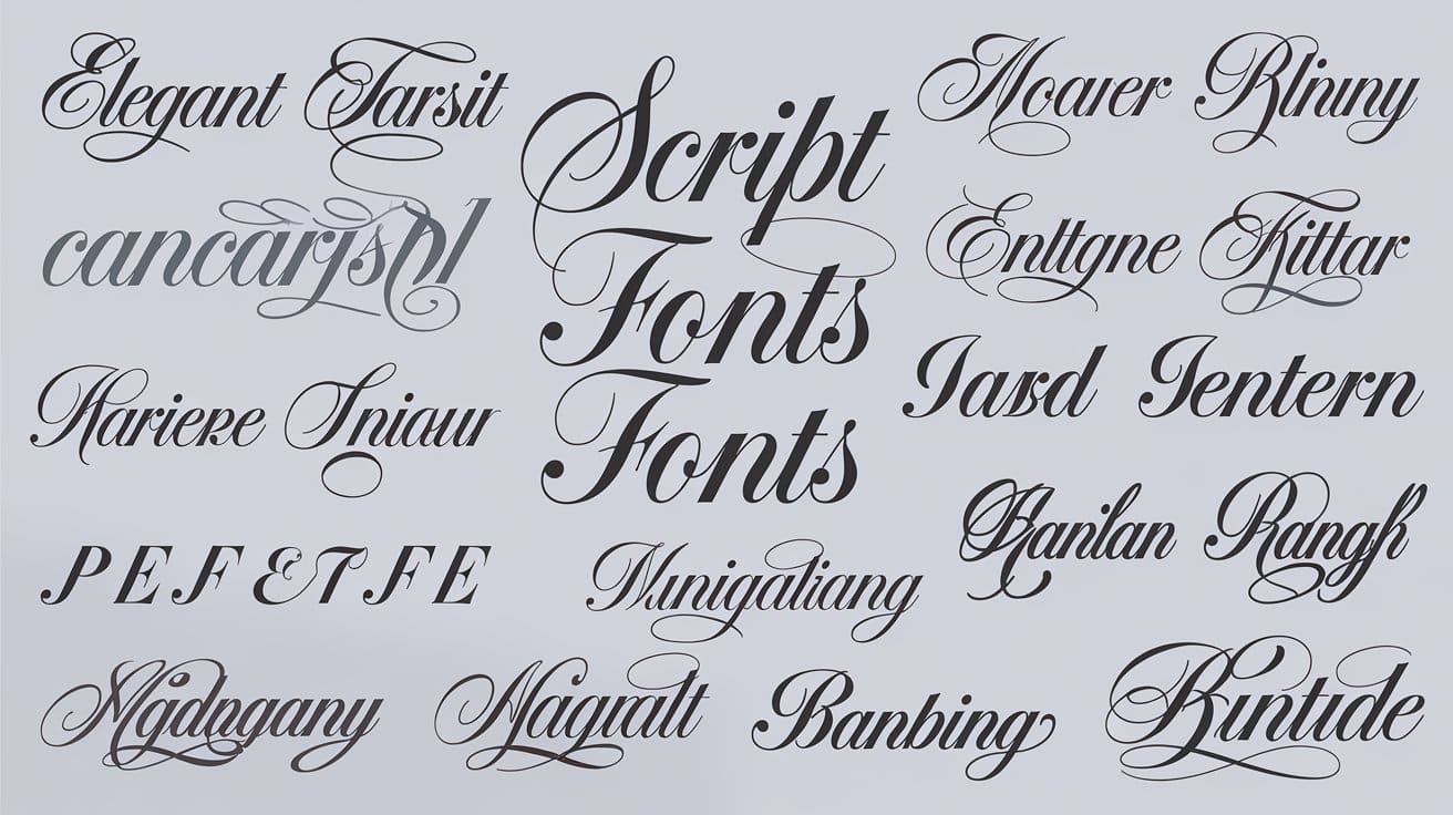
Script Fonts
Script fonts mimic the flow of handwriting and are often used to convey elegance and personal touch. They can range from formal, cursive styles to more casual, handwritten appearances. These fonts are typically used for invitations, greeting cards, and decorative elements. Examples include:
- Brush Script: Mimics the appearance of brush strokes, giving a more casual and dynamic feel.
- Lobster: A bold, modern script font that is popular for its distinct, stylish look.
Display Fonts
Display fonts are designed to be attention-grabbing and are often used for headlines, logos, and other prominent text where visual impact is important. They can be elaborate and decorative, which maks them less suitable for body text but perfect for emphasising key messages. Examples include:
- Impact: Known for its bold and strong presence, often used in headlines and advertisements.
- Bebas Neue: A popular display font with a clean, all-caps design, ideal for large text.
Monospace Fonts
Monospace fonts are a specific category of typefaces where each character occupies the same amount of horizontal space. This uniform spacing creates a grid-like appearance, making them distinct from other font types where character widths can vary. Some examples are:
- Courier: Mimics the look of a traditional typewriter, commonly used in screenplays and coding.
- Monaco: Often used in macOS development environments, offers a clean look with distinct character shapes, making it a favourite among developers.
Geometric Fonts
These are another category of typefaces characterised by their clean lines and shapes, often derived from basic geometric forms such as circles, squares, and triangles. Geometric fonts are known for their modern and minimalist appearance, making them popular in contemporary design. Here are some examples:
- Futura: Features clean, rounded letterforms and is often used in advertising, signage, and branding.
- Century Gothic: Known for its modern and clean lines and is widely used in various design projects, from print media to web design.
The Importance of Web Typography
As the name suggests, web typography pertains to the presentation of text on websites and optimises text for various devices. It, too, is a highly crucial element in the vast digital landscape.
Just like traditional typography, and through appropriate size, line spacing (leading), and character spacing (kerning and tracking), web typography enhances readability and comprehension and guides the reader’s eye through the text, highlighting important information and making it easier for them to engage with the content.
Effective web typography also establishes a clear visual hierarchy, guiding users through the content in a logical manner. By using different font sizes, weights, and styles, designers can emphasise headings, subheadings, and body text, which helps users quickly identify key information. This organisation encourages users to explore content further, and, therefore, increases engagement.
In addition, the choice of typeface can evoke emotional responses and influence the user’s perception of the content. For example, a playful font may convey a sense of fun and creativity, while a serif font may suggest tradition and reliability. This emotional connection can keep users engaged and encourage them to connect with the material on a deeper level.
Web Typography’s Role in Branding and Identity
It doesn’t stop at improving engagement with content, however.
As it turns out, web typography serves as a visual representation of a brand’s personality and values, with different typefaces conveying various traits—modern and clean fonts suggesting innovation, while classic serif fonts imply tradition and reliability. The right typography, then, communicates the brand’s essence and sets the tone for audience perception.
For instance, eco-friendly brands might choose organic or hand-drawn fonts to reflect their commitment to sustainability, while tech companies may opt for sleek, modern typefaces that signal innovation and forward-thinking.
Unique typefaces or distinctive font pairings were also found to create a memorable brand identity that resonates with consumers. This not only makes it easier for them to recognise and remember the brand but also helps the brand stand out from competitors.
Add to this the fact that using consistent typography across all brand materials—such as websites, advertisements, and packaging—reinforces brand identity and ensures a cohesive visual experience. Such consistency also helps consumers develop familiarity and trust with the brand, which contributes to loyalty over time.
Choosing the Right Font
That being said, web typography won’t have such an impact on user experience, engagement, and how brands are perceived if it’s not effective and to be effective, fonts must be chosen right, and to choose fonts right, you mainly need to consider the following three guidelines:
Consider Your Audience
When selecting fonts for a website, it’s crucial to consider the demographic of your audience. Different age groups, cultural backgrounds, and interests may influence how certain fonts are perceived.
For example, younger audiences may resonate more with modern and trendy typefaces, while older users might prefer classic and traditional fonts that are easier to read. Understanding your audience’s preferences allows you to choose fonts that not only align with their tastes but also enhance their overall experience on the site.
Define the Purpose
Defining the purpose of your content is vital in guiding your font choices. Different types of content require different tonalities, and the selected fonts should reflect that. For instance, formal content such as legal documents or academic articles typically benefits from classic serif fonts that convey professionalism and trustworthiness.
In contrast, casual or creative content, like blogs or artistic portfolios, may be better suited to playful or modern typefaces that reflect a more relaxed or innovative tone. Matching fonts to the content type enhances aesthetic appeal and also helps convey the right message to the audience, making the content more impactful and relatable.
Legibility and Readability
Legibility and readability are paramount when selecting fonts for web use, as they directly affect how easily users can engage with the content. Besides the two elements we mentioned before, fonts should also be chosen based on their clarity and ease of reading, particularly on screens where text can appear smaller or distorted. Opting for typefaces with well-defined letterforms, sufficient spacing, and appropriate sizes ensures that users can easily navigate through the text without straining their eyes.
Additionally, designers should consider factors like line height and paragraph spacing to create a comfortable reading experience and make the content more accessible to a wider audience.
Font Pairing Techniques
Font pairing is a crucial aspect of typography that involves selecting two or more typefaces to work harmoniously together in a design. The goal is to create visual interest while maintaining a cohesive look that enhances the overall aesthetic and effectiveness of the text, ultimately drawing attention to important information and conveying the intended message more clearly.
To achieve successful font combinations, designers must consider various factors. Let’s discuss two of those.
Contrast vs. Complement
Creating visual interest in typography often involves balancing contrast with complementarity.
Contrast refers to the difference in style, weight, or size between the fonts used, which helps highlight important elements and create a hierarchy within the text. For example, pairing a bold serif font for headings with a clean sans-serif font for body text can effectively draw the reader’s attention to key points in these two now-different sections.
That being said, it’s essential to ensure that the fonts don’t clash, as this can lead to a disjointed appearance.
Complementarity, on the other hand, involves choosing fonts that naturally enhance each other, often sharing similar characteristics or styles. For instance, using a rounded sans-serif font for headings alongside a slightly more traditional sans-serif font for body text can create a cohesive look while still allowing for visual distinction.
Using Font Families
Sticking to variations within the same font family is another effective font pairing strategy to create visually appealing layouts that are cohesive, functional and able to enhance the overall user experience.
Font families typically include multiple styles, such as regular, bold, italic, and light, which share similar design characteristics, making it easier to create a unified look across different text elements. By utilising variations within the same family, designers can maintain a sense of harmony while introducing contrast through weight, style, or size.
Besides simplifying the pairing process, this approach also enhances readability, as users are accustomed to seeing variations of the same typeface together. Moreover, using a single font family can strengthen brand identity and ensure a consistent visual language throughout the design.
Web-Safe Fonts vs. Web Fonts
Web-safe fonts and web fonts are integral components of web typography, each of which plays a distinct role in shaping how text appears and functions on websites.
First of all, web-safe fonts. These are a set of typefaces foundational to web typography as they provide a reliable and consistent choice for designers. They’re pre-installed on most browsers and operating systems and ensure that text is displayed consistently regardless of the user’s device.
By using web-safe fonts, designers can guarantee that their typography remains readable and visually appealing. They don’t require extra downloads, which leads to faster page load times and improves overall performance. Their widespread availability also makes them easy to implement, eliminating the need for extra code or configurations, which simplifies the design process.
Common examples of web-safe fonts include Arial, Times New Roman, and Verdana.
On the other hand, web fonts are typefaces specifically designed for online use and can be loaded onto a website through CSS. Unlike web-safe fonts, they’re not pre-installed on users’ devices, which allows for a broader range of design options.
Typically loaded from external sources like Google Fonts or Adobe Fonts using the `@font-face` rule, web fonts enable designers to incorporate unique styles into their projects while maintaining a consistent appearance across different devices and browsers. When users access a website with web fonts, their browsers download the specified font files to ensure the correct typography is displayed. Examples include Arial, Times New Roman, and Courier New.
As a result of the creative freedom they provide through offering a diverse array of styles and typefaces, web fonts can significantly enhance brand identity, helping a website stand out from the competition and create a memorable impression on users.
However, they still necessitate additional downloads, which can hinder page loading times, particularly on mobile devices or slower connections. Older browser versions may also not support web fonts, which can result in inconsistent typography experiences for users.
Responsive Typography
Responsive typography is a design strategy that ensures text remains legible and aesthetically pleasing across a wide range of devices and screen sizes. It takes into account the size and style of the font as well as how text interacts with other design elements on the page.
Here are some effective techniques to implement responsive typography:
- Fluid Typography: Fluid typography uses relative units like `vw` (viewport width) and `vh` (viewport height) to create text sizes that scale proportionally with the size of the viewport. This technique allows for a more flexible and dynamic approach to typography, ensuring that font sizes adapt as the screen changes.
- Media Queries: CSS media queries allow designers to apply different styles at specific breakpoints. By defining font sizes, weights, and styles for various screen sizes, designers can ensure that text is optimised for readability and aesthetics on devices ranging from mobile phones to large desktop screens.
- Responsive Units: Using responsive units like `em` and `rem` instead of fixed units like pixels ensures that text scales appropriately based on the user’s settings or the context of the page. This approach enhances accessibility, as users can adjust text size according to their preferences.
- Line Height and Spacing Adjustments: Adjusting line height and letter spacing can significantly improve readability, especially on smaller screens. Increasing line height can prevent text from appearing cramped, while appropriate letter spacing enhances the overall appearance of the text.
- Font Loading Strategies: Implementing font loading strategies, such as using `font-display: swap` in CSS, can improve the performance of typography. This technique allows fallback fonts to display while custom fonts are loading, ensuring that users can read content without delay.
- Consideration of Readability: Choosing typefaces that are inherently legible and adjusting styles (e.g., weight, contrast) based on screen size can improve the overall reading experience. It’s essential to consider how different fonts may render on various devices to maintain clarity.
- Testing Across Devices: Regularly testing typography on various devices and screen sizes ensures that text remains readable and aesthetically pleasing. Emulating different conditions can help identify issues that may arise from responsive design techniques.
- Using CSS Frameworks: Many CSS frameworks, like Bootstrap or Foundation, offer built-in responsive typography features, making it easier to implement consistent and adaptable text styles across different devices without extensive custom coding.
Web Typography Tools
There are numerous typography tools and resources available that cater to various aspects of typography, from font selection and pairing to design and testing. Here’s a brief overview of the different categories of typography tools and resources you can find:
Adobe Fonts
Formerly known as Typekit, Adobe Fonts is a subscription-based service offering a vast library of high-quality web fonts. It integrates seamlessly with Adobe Creative Cloud, providing access to thousands of fonts from various foundries. Some of its features include:
- Font Synchronisation: Sync fonts across your Adobe applications for consistent use in design projects.
- Web Font Embedding: Easily embed fonts in websites using a simple script or CSS, with options for automatic font loading and fallback settings.
- Font Pairing Suggestions: Provides font pairing recommendations based on visual harmony and usage.
Font Squirrel
This is a free resource offering a collection of high-quality, legally licensed fonts for web and print use. It features a variety of font categories and styles. Here are three of its features:
- Web Font Generator: An online tool that converts fonts into web-friendly formats (e.g., WOFF, WOFF2) for use in CSS.
- Font Identifier: Helps identify fonts from images or samples, which is useful for finding similar fonts or matching typography.
- Font Pairing Tools: Offers recommendations and examples for pairing fonts effectively.
Google Fonts
This is a free and open-source font library provided by Google that offers a wide range of web fonts that can be easily integrated into websites. It offers:
- Easy Integration: Fonts can be embedded using a simple link or CSS, with options for customisation.
- Performance: Google Fonts are optimised for web performance, with fast loading times and a global content delivery network (CDN).
- Customisation: Allows you to select specific font weights and styles to optimise load times and match your design needs.
FontForge
FontForge is another open-source font editor that allows users to create and modify fonts. It supports various font formats and provides advanced editing tools. Some features are:
- Font Creation: Create custom fonts from scratch or modify existing ones.
- Import/Export: Supports multiple font formats (e.g., TTF, OTF, SVG).
- Advanced Tools: Includes features for editing glyphs, kerning, and font metrics.
Conclusion
Mastering web typography is essential for creating engaging and user-friendly digital experiences. By understanding the principles of typography we demonstrated in this article, such as font selection, pairing, and responsive design, designers can effectively communicate their brand’s message while enhancing readability and accessibility. Utilising the right tools and resources also allows for experimentation and refinement, and, therefore, the creation of visually appealing web content that resonates with users.
As technology and design trends continue to evolve, staying updated on the latest typography practices will ensure that your website remains both functional and aesthetically pleasing, ultimately fostering a deeper connection with your audience. So, embrace the power of web typography to elevate your web design and leave a lasting impression.