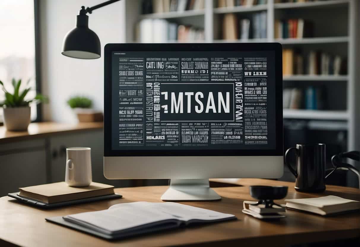
Best Fonts for Marketing Content: Choosing Typography
Table of Contents
In the digital age, the choice of fonts for marketing content on websites is more than just an aesthetic consideration; it’s a strategic one. Selecting the right fonts can significantly influence how your message is received and can ensure that your brand stands out in a crowded digital marketplace. The pivotal role of typography in web design dictates that fonts must not only embody the brand’s persona but must also offer effortless readability to guarantee that the audience can digest and engage with your content.
Understanding the intricacies of web typography will allow us to engage our audience more effectively. It’s about analysing the target demographic to determine what appeals to them and integrating the chosen fonts into the overall design of your site in a way that enhances user experience. It’s crucial to find the balance between innovative design and functional pragmatism, choosing fonts that maintain their legibility on various devices and platforms. From a technical standpoint, being mindful of font licensing and usage rights, as well as the font’s performance in terms of loading times, is fundamental to optimising for a seamless user experience.
Understanding Web Typography
Typography is not merely about selecting attractive fonts; it forms the backbone of effective communication on the web. Fonts carry the personality and the subtle psychological cues that dictate how users interact with content.
The Role of Fonts in Communication
Fonts are crucial for conveying the personality of your brand and setting the tone for your message. We see this as a critical component of the visual language that websites employ. A typeface with clean lines and sans serifs, such as Open Sans, suggests modernity and can be perfect for corporate sites to creative blogs. Conversely, a typeface with graceful serifs can inject a sense of tradition or formality, suitable for brands looking to evoke timelessness or sophistication.
Typography Fundamentals
When considering typography fundamentals, it’s essential to grasp that every font imparts a distinct visual language. The presence or absence of serifs, the font weight, and the letter spacing all contribute to how readable and comfortable the content is to engage with. For instance, the size of your text is strategic: larger fonts for headings capture attention, while smaller, well-spaced fonts can make extended reading on websites more comfortable. The psychology of how we perceive different typefaces shouldn’t be underestimated either; choices here signal to the user what type of content they are engaging with, be it professional, whimsical, or technical.
In our work, we’ve seen that applying a strategic approach to font selection contributes notably to user engagement and brand perception. As ProfileTree’s Digital Strategist, Stephen McClelland says, “The right typeface in the right context isn’t just about aesthetics; it’s a powerful tool for achieving business objectives.” Our strategy isn’t just to follow trends but to understand the ‘why’ behind font choices so we can align with our audience’s expectations and preferences.
Analysing Your Target Audience

Before choosing fonts for your marketing content, it’s imperative to analyse your target audience comprehensively. This allows us to align our typography with both our brand personality and how we want our audience to perceive us.
Aligning Fonts with Brand Personality
Choosing a font that reflects your brand identity is crucial. For instance, a luxury brand might select a font such as Bodoni for its sophistication and high contrast, which conveys a sense of refinement and exclusivity. On the other hand, a company known for innovation might prefer a clean, sans-serif font like Helvetica to communicate modernity and clarity. The key is ensuring that the fonts we choose resonate with our brand voice and amplify the messages we want to communicate.
How Fonts Influence Audience Perception
Fonts have a profound impact on how our messages are received. A study might show that a font like Merriweather is designed for optimal readability on screens, making it a popular choice for websites focused on long-form content. The serifs on letters can often lead readers through lines of text, aiding in the comprehension of complex ideas. By selecting fonts that our audience finds appealing and easy to read, we enhance their overall experience with our content, strengthening their perception of our brand.
By paying attention to such details, we craft a visual presence that speaks directly to the hearts and minds of our target audience, ensuring our brand stands out in a crowded digital marketplace.
Core Font Types for Website Text

In selecting the right font for your marketing content, it’s essential to understand the characteristics and appropriate use of different font types. The choice of font can profoundly affect the readability, user engagement and ultimately the success of your content strategy.
Serif vs Sans-Serif Fonts
Serif fonts are recognised by the small lines or ‘serifs’ at the end of strokes in letters. They have a traditional feel and are often used in print media. For website text, serif fonts like Times New Roman or Georgia are preferred for body text in more formal or traditional industries due to their classic appearance and readability on larger text blocks.
Sans-serif fonts, such as Arial and Helvetica, lack these additional strokes and offer a cleaner, more modern look. They are an excellent choice for digital platforms, enhancing legibility at smaller sizes, which is ideal for web content and screen readability. The Elementor blog notes the popularity and well-regarded status of Helvetica for its simplicity and cleanliness, which is well-suited for user interface design and navigational elements on websites.
The choice between serif and sans-serif fonts largely hinges on the intended impression: serifs often convey a sense of formality and respectability, while sans-serifs are perceived as informal and approachable.
Exploring Script and Display Fonts
Script fonts mimic handwriting, featuring fluid strokes and varying widths. They can add a personalised and artistic touch to a website. However, their elaborate forms can reduce readability, so they should be used sparingly, such as for logos or headings. Script fonts such as Brush Script should not dominate your website’s textual content.
Display fonts are a diverse group designed for large sizes, like headlines or signage. With expressive variations and unique designs, they catch the eye and can effectively convey a website’s personality. However, they are not suited for body text due to their often elaborate designs, which can be overwhelming and challenging to read at smaller sizes.
When incorporating font types into your marketing content, ensure they align with your brand identity and the tone of the message you wish to convey. Carefully chosen fonts can differentiate your SME and help establish a strong online presence.
By employing an informed mix of these core font types, we empower your brand’s voice to speak clearly and attractively to your audience, enhancing your overall digital strategy. As noted by ProfileTree’s Digital Strategist – Stephen McClelland, “Choosing the right font is not just about aesthetics; it’s about communication and ensuring your message is not only seen but felt by your audience.”
Selecting Fonts for Readability and Legibility
When creating marketing content for websites, choosing fonts that are easy to read and understand is imperative. The right typography can make or break the user’s experience, directly impacting engagement and the effectiveness of your content.
The Importance of Font Weight and Spacing
Font weight relates to the thickness of the characters. We often use a thicker font weight, such as bold, to make headings stand out. However, for body text, a medium or regular weight often improves readability, particularly when users are browsing on mobile devices.
Correct spacing is also crucial; this includes both the spacing between characters (kerning) and the spacing between lines (leading). Adequate spacing prevents text from appearing cluttered and allows the eye to follow along easily. Leading should be generous enough to separate lines of text but not so much that it disrupts the reader’s flow. Typically, line height should be around 120% to 145% of the font size for optimal readability.
In terms of legibility, spacing plays a vital role. Too little space can cause the letters to run together, while too much can make it hard for the eye to move naturally from one word to the next. We assess each font’s characteristics, such as x-height and character width, to ensure that it’s not only aesthetically pleasing but also practical for the reader’s ease.
To summarise, while selecting fonts, focus on those that:
- Have a clearly defined font weight that is not too light or too heavy.
- Offer adjustable kerning and leading to enhance text readability.
- Maintain legibility on various devices and resolutions.
Keep in mind, the goal of your website’s typography should be to present information in a way that is effortless to read and aesthetically aligned with your brand’s style.
Integrating Fonts into Your Website’s Design
Choosing the right fonts for websites is crucial for maintaining your brand’s image and ensuring your content is digestible. A meticulously selected font palette and the use of web-safe fonts can significantly improve your website’s user experience.
Creating a Cohesive Font Palette
When designing your website, consistency is key. Our team recommends selecting a font palette that complements your brand’s voice and visual aesthetic. Start with a primary typeface for headings and add a secondary font for body text. When considering font pairing, choose fonts that balance each other. For instance, if your headline font is decorative or bold, opt for a more subdued, readable font for the body copy, like Open Sans. This creates a visually attractive hierarchy.
Utilising Web-Safe Fonts
Ensuring readability across all platforms and browsers is essential, which is where web-safe fonts come into play. These are typefaces that are widely available across different systems, reducing the chance of your website displaying incorrectly. Popular web-safe fonts include Arial, Georgia, and Times New Roman. However, with advancements in CSS, services like Google Fonts offer a wider range of typefaces that are optimised for web use.
In integrating these elements into your website’s design, remember to maintain accessibility and readability as your guiding principles. Our approach at ProfileTree encompasses using website fonts to not only convey your message but also to enhance the overall user experience on your website.
Popular Fonts for Different Marketing Content
Selecting the right fonts for your marketing content on websites is crucial for effective communication. The choice of font can drastically impact how readers perceive the message you’re conveying, whether it be from a headline or a call to action.
Best Fonts for Headlines and Subheadings
Helvetica has long reigned as a firm favourite amongst designers for its clean, crisp lines, making it a go-to choice for headlines and subheadings. Helvetica’s versatility ensures that your headlines grab attention while keeping professionalism intact.
Another excellent font for headlines and subheadings is Noir, with its modern touch and wide array of weights, it can give your headlines that necessary flair, thus speaking volumes about your brand’s character. To see it in action, visit The 40 Best Web Fonts You Should Use In 2024.
Font Choices for Body Text and Calls to Action
For body text, Open Sans is recommended for its readability on various devices and its ability to pair well with more expressive fonts for contrast. It’s particularly useful for longer passages of text due to its clarity and simplicity. For an in-depth analysis of Open Sans and its uses, consider 26 Best Fonts For Websites & Web Design.
When it comes to calls to action, Arial, with its clean simplicity, stands out and is easily readable, nudging users towards interaction. However, the choice here can be more flexible — the key is to ensure it stands out without compromising on legibility.
ProfileTree’s Digital Strategist, Stephen McClelland, notes, “The fonts you choose should not only reflect your brand’s voice but also maintain legibility and comfort for the reader. From the boldness of a headline to the subtlety of a call to action, each font has a role to play in your marketing content.”
Utilising these fonts strategically in your marketing content will give you an edge in creating engaging and effective online presences for your small or medium-sized business. Remember, the font you choose becomes your visual voice; make sure it speaks clearly and compellingly.
Colour and Typography
Choosing the right colours and typography is pivotal for creating effective marketing content on websites. They play vital roles in enhancing readability and conveying emotions, thus influencing user engagement and brand perception.
Enhancing Readability with Appropriate Colour Contrast
To ensure content is easily readable, adequate contrast between the text and background is crucial. High contrast, such as black text on a white background, is typically most legible. Use tools to analyse contrast ratios, aiming for a minimum ratio of 4.5:1 for standard text. This complies with accessibility standards and facilitates a wider audience to engage with your content seamlessly.
Emotion and Colour in Font Selection
The emotional impact of colour on the perception of content cannot be overstated. Warm colours like red and orange can evoke feelings of excitement or urgency, while cooler hues such as blue and green tend to be associated with calmness or trustworthiness. Incorporating these colours into your font selection can subconsciously guide your audience’s feelings towards the brand or message. For instance, choosing a tranquil blue for your call-to-action might lend a sense of reliability, inviting more engagement.
Our expertise at ProfileTree underlines the importance of using such psychological principles in design to enhance user experience. For instance, ProfileTree’s Digital Strategist – Stephen McClelland asserts, “Colour decisions should not be made in isolation; the right palette can significantly increase not only the attractiveness of a website but also its conversion rates.”
Remember: Test your typographical choices across devices to ensure consistency in emotional impact and legibility.
The Technical Side of Web Typography

In the realm of web design, the choice of typography can profoundly influence both the aesthetic of a website and its functional performance. We’ll explore the technical aspects, focusing on font selection for performance and compatibility as well as grasping essential typography terms.
Selecting Fonts for Performance and Compatibility
When choosing web fonts, our priority is ensuring a balance between aesthetic appeal and website performance. Lightweight fonts boost loading times, enhancing usability and SEO rankings as search engines favour fast-loading sites. It’s crucial to select fonts that are compatible across various browsers and devices to prevent discrepancies in design. Tools like Google Fonts provide a repository of fonts that are optimised for web use and ensure consistent rendering across platforms. Also, we consider using system fonts that are pre-installed on most operating systems, which can significantly reduce the load time.
- Font Formats: Use WOFF or WOFF2 for better compression and performance.
- Font Loading: Implement font-display options to control how and when fonts are loaded.
- Font Hosting: Host fonts locally or use reliable CDN sources to decrease latency.
Understanding Typography Terminology
Grasping typography terminology enables us to communicate design tool specifications and ensures precision in creating desired outcomes. Terms like serif, sans-serif, and monospace refer to the general style of a font. Serif fonts, such as Times New Roman, have decorative strokes at the ends of letters, conveying a classic look, whereas sans-serif fonts, like Arial, have a cleaner appearance due to the absence of these strokes. Monospace fonts, where each character takes up the same horizontal space, are often used for coding due to their alignment properties. Other essential terms include:
- Leading (Line height): Vertical spacing between lines of text, crucial for readability.
- Kerning: Adjustment of the space between characters, enhancing visual harmony.
- Tracking: Uniform spacing across a body of text, affecting its overall density and texture.
As we navigate the intricate dynamics of web typography, Ciaran Connolly, ProfileTree Founder, reminds us that “Typography is not just about making words legible; it shapes user experience and brand perception on the web.” This exemplifies our perspective on the strategic role typography plays in effective web design and marketing content.
Font Licensing and Usage Rights
When considering fonts for marketing content on websites, understanding licensing and usage rights is crucial. This not only ensures legal compliance but also aligns the font choices with your brand’s needs.
Navigating Font Licences for Web Use
Using fonts legally requires a licence that grants permission to use a particular typeface in specific ways. Here’s how three key font libraries approach licensing:
- Google Fonts: Offers a selection of free fonts that are open-source under the Apache License or SIL Open Font License. You’re free to use these across your website with no cost.
- Adobe Fonts: Provides a vast collection through a subscription model. Once subscribed, you may use the fonts on your website but you’ll be expected to maintain an active subscription to continue using them.
- Fonts.com: Offers various licenses, including web font licences which depend on monthly page views. Higher traffic sites require higher subscription tiers.
To select the correct font licence, consider the following points:
- Types of Licences: Desktop licence for print and static images; webfont licence for website embedding; digital ad licence for emails and HTML5 digital ads.
- Usage Rights: Understand if modification or distribution is restricted.
- Cost & Subscription Models: This can range from free to subscription-based, affecting your marketing budget.
- Traffic & Reach: High-traffic sites may need scalable licences from services like Fonts.com.
Selecting the appropriate licence for your web content seems daunting; however, by aligning font licences with your website’s specific needs and traffic levels, you can ensure a seamless integration of typography into your marketing strategy.
Optimising Typography for User Experience
Our focus in this article section is on how the right choice in typography can enhance user experience on websites, guiding visual hierarchy, and ultimately boosting conversions.
Balancing Aesthetic and Practical Typography
When we design web content, we understand that typography should not only be visually appealing but also functional. Each font has its personality and psychological impact. For instance, serif fonts often convey formality and tradition, while sans-serif fonts are viewed as modern and clean. Beyond aesthetics, readability is key. A typeface should be legible across various devices and screen sizes. We might pair a striking header font with a more subdued option for body text to maintain readability and create a clean visual hierarchy that directs user focus.
Typography Affecting User Engagement and Conversions
Typography doesn’t just capture attention; it holds it. Strategic font choices can guide a user’s journey down the conversion funnel. For example, clear call-to-action buttons with bold, contrasting fonts can significantly improve click-through rates. On a deeper level, the consistency of your typography reflects the professionalism of your brand, influencing trust and credibility which is paramount in determining whether a user will engage further or convert. It’s not only what we say but how we present it—intuitive and compelling typography becomes a silent ambassador for your brand.
By combining aesthetic fonts with practical layout decisions, we create a balance that serves both the visual appeal and the functional requirements of a site. The right choices in typography can lead to enhanced user engagement and increased conversions, supporting your digital marketing strategy effectively.
FAQs
Selecting the right fonts can drastically improve a website’s effectiveness in engaging and persuading visitors. We consider readability, SEO impact, and typeface personality to guide you in optimising your marketing content.
1. Which typefaces are most effective for website headers in engaging viewers?
For headers, bold and assertive fonts can grasp viewers’ attention effectively. Utilising bold fonts adds weight and authority, making a strong impression and guiding viewers to important content.
2. What are the leading Google Fonts recommended for website use?
Merriweather and Montserrat are amongst the top Google Fonts favoured for their readability and versatility on various devices, essential for maintaining the engagement of website visitors.
3. Can you list the top free typefaces suitable for digital marketing materials?
Some of the best free typefaces for digital marketing include Roboto for its clean readability, and Lato for a touch of elegance without compromising on clarity. These fonts are accessible and suitable for a wide range of marketing materials.
4. What attributes make a font ideal for enhancing the readability of website content?
Fonts designed for on-screen readability, such as Google’s Merriweather, are crafted with strong legibility in mind. Features like adequate spacing and distinguishable letterforms contribute significantly.
5. Which fonts have proven to attract attention in online marketing efforts?5.
Serif fonts like Times New Roman carry a formal-tone attracting attention in traditional settings. For a modern touch, sans-serif fonts like Arial resonate with current viewers, as indicated by their frequent use in marketing applications.
6. How does font choice impact a website’s search engine optimisation?
Font choice affects website loading times, with faster loading contributing to better SEO. Additionally, accessible fonts improve user experience, indirectly influencing search rankings by increasing retention and reducing bounce rates.